|
| Group |
Round |
C/R |
Comment |
Date |
Image |
| 3 |
May 22 |
Reply |
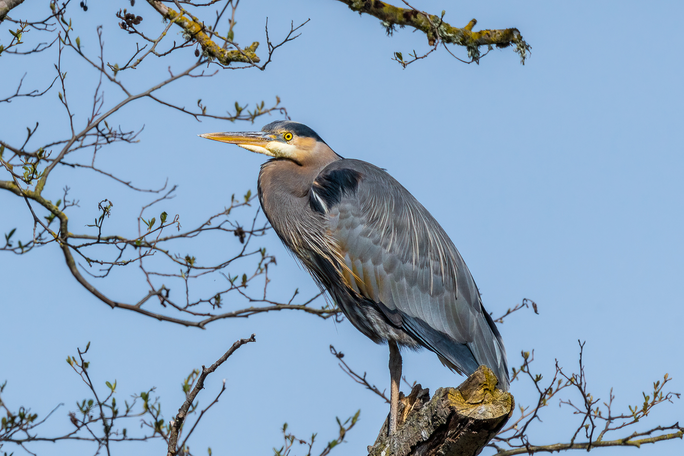
Male heron perched. |
May 20th |
 |
| 3 |
May 22 |
Reply |
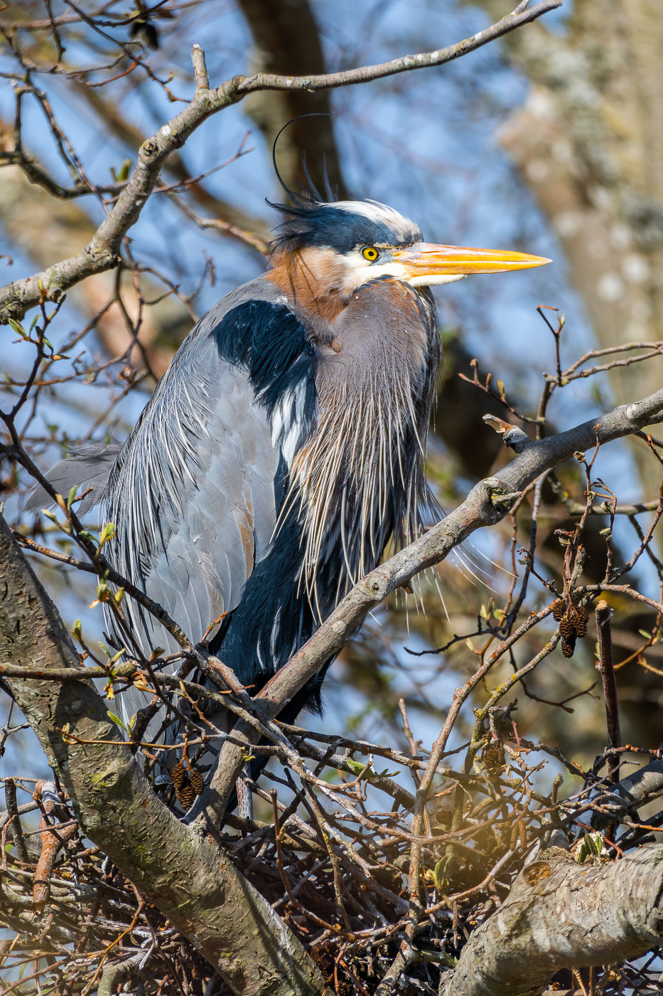
Hi LuAnn. I have a preset on my camera I created for birds and other fast moving subjects. Manual Mode, 1/2000 sec, f/11, Auto ISO, Zone focus mode with tracking enabled. I can change the settings on the fly. I attached two other images: first one is the same composition shot at f/6.3. Much better background, but the bird is soft. Second image is the male perched above the female keeping a look out. Better composition and framed by the branches...but in choosing which image to present initially, I opted for the nesting female, as one generally does not see nesting herons portrayed. But in hindsight, the interest of seeing the nesting female doesn't make up for the other less-than-ideal components of my presented image. |
May 20th |
 |
| 3 |
May 22 |
Reply |
You are correct....not sure how it showed up below your comment though and I don't see a way to delete it on my end. Feel free to remove it from your end, or let me know how to do it from mine. Thanks. |
May 20th |
| 3 |
May 22 |
Comment |
Thanks Kieu-Hahn. Thanks for your comments and the crop suggestion. I appreciate your attempt at "removing" the cluttered background by the square crop, but I fear it simply traded one issue for another - namely that the bird looks boxed in. I think the real problem is two-fold: 1). The natural setting where these birds nest is always going to be cluttered�� and 2) I should have shot the image using several different f-stops and chosen the one that best gave a balance between sharp bird and soft background. I'm still trying to dial in my settings for my long lens and it looks like I need some more practice! |
May 17th |
| 3 |
May 22 |
Reply |
LuAnn, thank you for your additional comments. Observations aside, the "moral" of the story is this: The more one can learn to SEE, the greater and faster one can grow as a photographer. Our Digital Dialog groups foster my ability to see. Thanks again! |
May 14th |
| 3 |
May 22 |
Reply |
LuAnn, I'm not trying to be argumentative, but correct me if I'm wrong: my understanding of lens distortion is that one would see it throughout the image or at least on opposite sides of the frame - i.e., top/bottom or left/right. The fact that there is no apparent distortion at the top of the image and that the model's foot also does not appear to be distorted is what lead me to my previous opinion. |
May 14th |
| 3 |
May 22 |
Reply |
Hi LuAnn. I didn't notice it until you brought it up. I don't think it is distortion. If you look at the angle of the yellow wall compared to the adjacent wall on the left, there appears to be a definite incline to the yellow wall. |
May 14th |
| 3 |
May 22 |
Reply |
(Tell that to the heron! LOL!). Thanks for your comments. |
May 11th |
| 3 |
May 22 |
Reply |
Thank you, Mary Ann! (I don't really consider myself a "wildlife photographer" so I'm always a little tentative about putting those shots out there for all to see. |
May 10th |
| 3 |
May 22 |
Reply |
John, thanks for your comments and recommendation. A challenging environment in which to shoot and a resulting image that is a challenge to edit. I'm still experimenting with ideal aperture when using my long lens and can't seem to get the right balance between subject sharp and background blurry. |
May 10th |
| 3 |
May 22 |
Comment |
LuAnn, thank you for your comments and suggested edit. I do think your edit made an incremental improvement. I especially like how you brought down the exposure / luminance on the tree trunk and branches. It does make the bird stand out better. In my description I didn't discuss my editing, but it was done entirely in LR where I did select subject and increased the exposure and vibrance. I added a vignette of sorts in the upper left and lower right using the radial gradient tool. According to PSA competition rules, vignettes in wildlife photos are not permitted. Nor is one allowed to remove distractions. |
May 6th |
| 3 |
May 22 |
Comment |
Hi Mary Ann. I really like how you captured a fun, interactive moment between the two deer. They are really well placed in the frame and the fog gives the scene a lovely moody feeling. Your choice to keep the image on the dark side enhances the mood. Given the relative lack of color, it would be interesting to see how this image might work in B & W. |
May 6th |
| 3 |
May 22 |
Comment |
Hi Kieu-Hahn. What a lovely image that just screams SPRING! Beautifully composed, with the soft-focus cherry blossoms forming an attractive frame for the Memorial in the background. Your image gave me a peaceful, calm feeling. Well done with no changes needed in my opinion. |
May 6th |
| 3 |
May 22 |
Comment |
Hi Ruth. I'm getting to be a big fan of coastal photography. I like how you framed the catamaran by the boat hoist - a nice composition with symmetry and balance. Your edit choices were appropriate and improved the image in my opinion. As far as the edit goes, I found myself wanting something else to lead my eye more immediately to the boat. I'll try to do a trial edit when I get back to my main laptop, but I'll try to describe what I'm envisioning: 1) Bring up the luminance / highlights on the boat somewhat. 2) Use the brush tool with a 100% feather to create a subtle bright streak from the boat into the foreground water, parallel with the dock on the right side and consistent with the sun angle. (May or may not work, but maybe worth a try!). Nicely timed capture! |
May 6th |
| 3 |
May 22 |
Comment |
Hi John. I think you've captured a really whimsical street image here. I really like the bold, primary colors in the image and you've done a nice job of balancing the exposure by bringing up the shadows. I also think you have a nice eye for composition - either natural or practiced. I appreciate the following components: 1. Placement of your model on the intersection of the vertical and horizontal lower third.
2. Multiple diagonals and triangles formed between the model and background. Model's back forms a diagonal which is continued in the dude's red strap. The model's leg and arm form parallel diagonals.
Overall, a fun, enjoyable and successful image. |
May 6th |
| 3 |
May 22 |
Comment |
LuAnn, I'm being honest when I say I usually hate pictures of tulips! (I have my reasons that I won't go into here)�� but yet again you have managed to produce an image that overcomes my prejudice and captures my attention and interest. The green stripe for sure makes an otherwise "normal" tulip unique and your skill at lighting combined with your editing technique really make this photo stand out. A truly beautiful flower portrait (in spite of it being a tulip 😉). Nicely done. |
May 6th |
7 comments - 9 replies for Group 3
|
| 99 |
May 22 |
Reply |
Thank you, Linda. I appreciate you pointing out the blemishes. Good eye. I like how the masking function works in Topaz Studio 2. You can add an effect to the whole image and then erase the effect where ever you want and it always seems to give a nice, gradual blending from mask to no mask. |
May 10th |
| 99 |
May 22 |
Reply |
Thank you, Barbara. |
May 10th |
| 99 |
May 22 |
Reply |
Thanks Peter. I appreciate your comments and your nitpicks, for it is in the paying of attention to the details (the nitpicks) that make the difference between a photograph that is great and one that is merely good. |
May 8th |
| 99 |
May 22 |
Comment |
Hi Randy. I always try to evaluate our images without reading other members' comments in advance. After forming my own thoughts, I found myself echoing Gerard's. You've captured a strong image with a great story and I think some editing tweaks will make it even better. I, like Gerard, had the idea to light up the windows of the building behind the trains - although not quite as much as he did in his edit. Regardless of the editing nitpicking, your image captures a rare quiet, moody moment in an otherwise frenetic city. I enjoyed it very much. |
May 7th |
| 99 |
May 22 |
Comment |
Linda, I think one of the reasons your image is successful is the fact you made it from the rear - I echo the comments I made on Barbara's image. It stands out due to the unique camera angle. I like your edit and how you brought out all the textures in the animal, the sky and foreground. Nicely done. I do, however, have a suggestion for an alternate title: "PORTRAIT OF A POLITICIAN " ðŸ˜�“ðŸ˜�“ |
May 6th |
| 99 |
May 22 |
Comment |
Hi Peter. Nice composite. I concur with Gerard and Randy about the background and the highlights under the eyes. As edited, the subject and background have similar luminosity with gives the viewer (me) the clue that this is a composite. Toning down the background would do a lot to make the image more believable. I think I would also try to do something with the darkness of his face, as it appears to me as if he's covered in soot. Regardless of the critiques, you've managed to create a nice period piece that evoques a time gone by. |
May 6th |
| 99 |
May 22 |
Reply |
Thanks for your comments, Randy. I originally was going to go with a strictly white background. But on the advice from my monochrome mentor, Lance Lewin, I added a texture (actually a highly modified image of some trees) and then applied a diagonal gradient which resulted in the lower right corner being almost completely white. The idea was to balance the light direction between the background and the flower. |
May 6th |
| 99 |
May 22 |
Reply |
Gerard, thank you. With reference to the suggested edits, I must admit I tend to take my final sliders with an eeny-meeny-mine-mo approach. I did play with the shadows and contrast and decided on this version as I didn't want to eliminate the detail in the depth of the flower. |
May 6th |
| 99 |
May 22 |
Comment |
Gerard, another dramatic image that was nicely composed and edited. And your patience and timing to include the raptor is the cherry on the sundae. I think your high contrast treatment works very well for this image and I particularly like how you managed the sky. In comparing the original with your final, I never would have guessed you could have achieved this result. I would love to know more about your editing. My only critique is that I feel the highlights on the stacks are too strong and I'd prefer to see them brought down a touch. I'm envisioning this printed large on a piece of metallic paper. Nicely done! |
May 6th |
| 99 |
May 22 |
Comment |
Hi Barbara. This is a very nice treatment of your carnations. I think the ambient lighting works especially well and no need to feel badly that your light painting didn't work out as planned. I can't imagine if it had worked that it would have been better. The sharpness of your image is remarkable as is the lovely, subtle tonal variations in the flowers. And the fact that you chose to highlight the back/underside of the flowers instead of the usual and expected front side is another example of why your photos stand out. Beautifully done! |
May 6th |
5 comments - 5 replies for Group 99
|
12 comments - 14 replies Total
|


