|
| Group |
Round |
C/R |
Comment |
Date |
Image |
| 3 |
Apr 22 |
Comment |
Hi Kieu-Hanh. What an interesting flower. You've captured it very well with sharp focus and lovely soft background bokeh. The diagonal of the stem draws my eye right to the blossoms and I think your 4x3 crop is perfect for this image. A lovely, peaceful flower portrait. |
Apr 10th |
| 3 |
Apr 22 |
Reply |
Kieu-Hanh. Your comments actually prove my point that "obvious" isn't always obvious to everyone! Thanks for your input. Always appreciated. |
Apr 10th |
| 3 |
Apr 22 |
Reply |
Thank you, Mary Ann! |
Apr 10th |
| 3 |
Apr 22 |
Reply |
Good point, LuAnn. I'll have to keep that in mind. One thing that group members might find helpful, is, if in our descriptions, we try to remember to include one thing about what we were trying to achieve - our intent for the image. Thanks for reminding us of that. It is good for a group like this, but in camera club or competitions, for instance, the maker does not have the possibility of communicating his/her intent to the judges nor to the viewers. |
Apr 4th |
| 3 |
Apr 22 |
Comment |
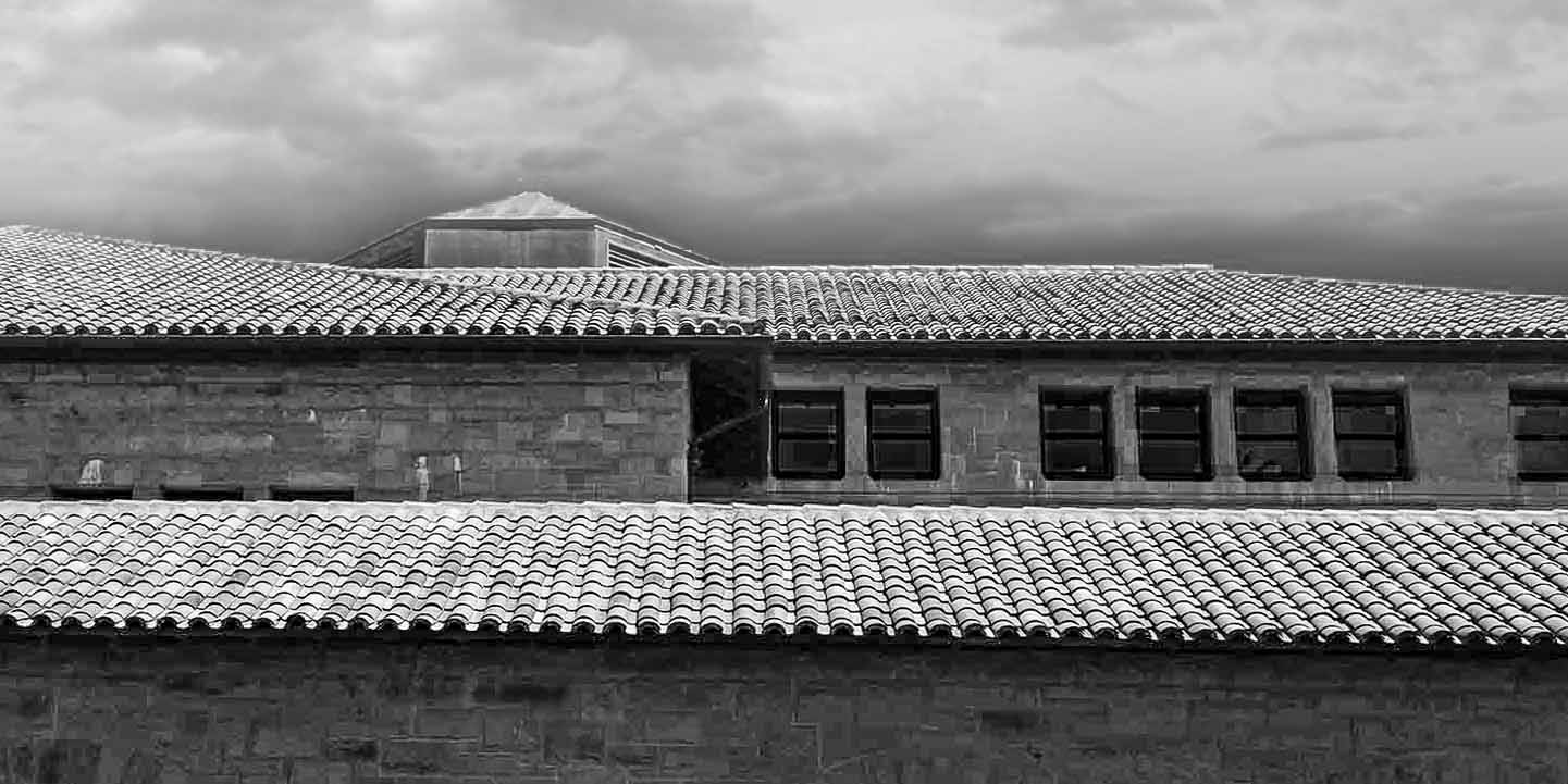
Hi John, and welcome to Group 3! Nice to have you on board. I echo what Bev and Ruth suggested and have some additional observations: The building is indeed interesting, but it really is fairly monochromatic. The use of the red sky replacement takes my eye away from the lovely detail in the building. Is the subject the building or the sky? Where do you want the viewer's eye to go? I also find myself wanting more space at the top of the image - i.e., more sky showing. For me, the crop is too tight up there. I periodically use sky replacements but am often vexed to determine from which direction the sky is being lit, as that factor can make or break the believability of the final image. In your original image, the light is coming from behind you, but your sky replacement has the light coming from behind the building. My suggestion would be to take color out of the equation and render it in B & W as per my edit example. I re-cropped the image to a 1:2 ratio and put the roof line on the upper third and the cupola on the top left third. I chose a different sky where (I hope!) the light is more congruent with the direction of the sun on the building. Lastly I increased sharpness and clarity to bring out some more detail on the building - hopefully making it clear that the building is the subject. Curious to hear what you think. |
Apr 3rd |
 |
| 3 |
Apr 22 |
Comment |
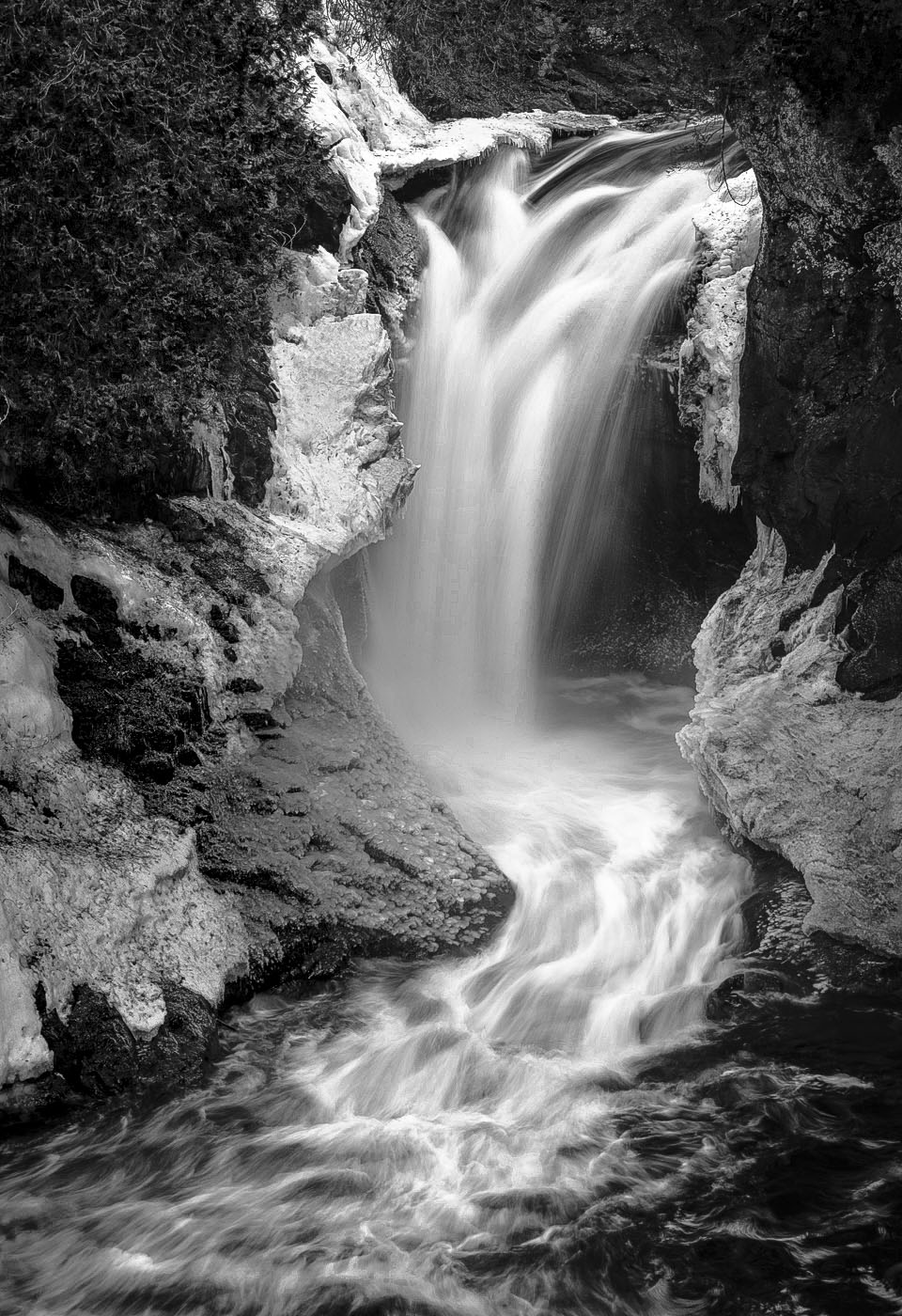
LuAnn,thank you for sharing this beautiful waterfall. I think your use of a slower shutter speed gives just the right amount of softness to the moving water and I like how my eye travels from lower left up along the river to the waterfall. So, compositionally speaking, I think this is a successful image. As a color image I was bothered by the muddiness in the waterfall and river and the overall lack of color interest in the scene. I thought perhaps it would work better in monochrome. I'm curious what you think of my edit. |
Apr 3rd |
 |
| 3 |
Apr 22 |
Reply |
Ruth, thanks for your comments....now you have me thinking about how I could incorporate zebras into my image and make it work! If I find some time, maybe I'll give it a try! |
Apr 3rd |
| 3 |
Apr 22 |
Reply |
Bev, thanks for visiting and your comments are always welcome. Our club does have a Creative / Altered category and definition that refers to the alteration needing to be "obvious". My point was simply that "obvious" isn't always so obvious! Also, in club, we don't show before and after images. I brought it up with the club's president (who also was a judge that night), not to complain but rather to ask for clarification. He agreed that I brought up a good point and suggested the Board should seek to clarify it. I'm glad you like my image and I would look forward to seeing what you come up with. |
Apr 3rd |
| 3 |
Apr 22 |
Comment |
Hi Mary Ann. I really like what you did with the subject matter in this still life. I think the arrangement of the objects works well and makes a pleasing composition. Additionally, the apparent bi-directional lighting enhances the elements. Your choice to leave the depth of the mitt completely in shadow draws the eye to the well-used ball. At first I thought the light reflection in the background was a little distracting, but the longer I enjoyed your image I realized it was an appropriate choice by adding depth to the image. Your image is well exposed, in sharp focus and tells a great story. Nicely done! |
Apr 3rd |
| 3 |
Apr 22 |
Reply |
Thanks for your comments and suggestion, LuAnn. I have a question for you: Do you find it "obvious" that the image has been creatively altered? When I received the club's comments about my print, they wondered why I had placed it in the Creative / Altered category. It led me to have an email exchange with our club's president about the subjectivity of the word "obvious". At what point does an edited image cross over from being a "normal" edit to being "obviously altered"? I used a light touch in my manipulation, but nevertheless, thought it "obvious" that I had gone beyond a "normal" edit. Your thoughts? |
Apr 3rd |
| 3 |
Apr 22 |
Comment |
Hi Ruth. The Galápagos Islands are magical. For me it rates in the top three places I've ever been. Your image reflects the sometimes minute-by-minute drama that is life in the wild. Survival of the fittest. And for those reasons I agree with you that the story is strong. I also think you have a strong composition: leading line of the foreground; interesting shape formed by the momma and chick; dominance of the attacking bird. But it is indeed unfortunate that the other aspects of the photograph (lighting, blurriness of the attacking bird) are not as strong as the story you are wanting to tell. I think you got as much out of the image as you could. Other than the obvious advice to use a faster shutter speed and shoot under better lighting conditions, I have no additional suggestions for improvement. I'm sure, however, it represents a memorable situation from a memorable adventure. |
Apr 1st |
5 comments - 6 replies for Group 3
|
| 99 |
Apr 22 |
Reply |
Gerard, I like your edit. It gives another version - middle ground, as you say. |
Apr 18th |
| 99 |
Apr 22 |
Reply |
Makes perfect sense! thanks for the explanation. |
Apr 12th |
| 99 |
Apr 22 |
Comment |
Randy, great street scene! Your nostalgic musings on Photomats really takes me back...and makes me realize how old I am! Your image has a lot of detail and interest. I know that cutting people's feet off is considered a no-no...but in this case I can overlook that, because I like the added context your crop provides. Yes, ideally, you might have zoomed to a wider angle to include the woman's feet and some of the sidewalk but for me, Barbara's crop is too tight. Nice capture. |
Apr 3rd |
| 99 |
Apr 22 |
Comment |
Hi Peter. Of all your portraits so far, this one is my favorite. Interesting model posed well. Bravo! As far as tweaks to your edit, I like what Stephen did with bringing up the highlights on her face and I like what Linda did by bringing up the whites in her eyes. I prefer your original background, however, as I feel it allows me to focus more on her face. It doesn't bother me that her hair begins to disappear into the background. Well done! |
Apr 3rd |
| 99 |
Apr 22 |
Comment |
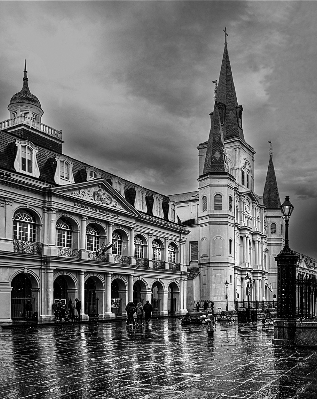
Hi Linda. I like your composition - a perfect scene for monochrome. I think you were definitely on the right track with your edits, but in my opinion, I don't think you went far enough. I've been following Serge Ramelli. He shoots a lot of city images like yours and he is an advocate of painting the scene with light. I thought your image would be suited to his techniques. Basically he uses a multitude of radial gradients to light up or darken selected portions of the image. Here's what I did in Adobe Camera Raw: vertical transform to improve wide angle distortion; darkened the sky and added clarity to entire image; enhanced the brightness on the ground level pillars and their reflections in the pavement; turned on the street lamps; enhanced brightness on individual windows and portions of the far building. |
Apr 3rd |
 |
| 99 |
Apr 22 |
Comment |
Thanks, Peter, for your comments and re-edit suggestion. For my Ghosts image, the primary effect was from Luminar Neo (Orton Effect) and Topaz Studio (Glow filter). Your ripple edit, while interesting, I feel it distorts the flowers more than I would like. As to your comment about being "overbought" , you are correct....but I did push the boundaries especially in the sharp, crispy version as that was the effect I was going for. |
Apr 3rd |
| 99 |
Apr 22 |
Reply |
Barbara, thank you for your comments. Yes, the different versions tell different stories. The sharp, textured version tells an end-of-life story whereas the presented version speaks to the after-life. I rather like them both and I appreciate hearing that you preferred the "crispy" version. |
Apr 3rd |
| 99 |
Apr 22 |
Comment |
Gerard, what stands out for me are the patterns formed by the corn rows. The foreground lines lead my eye to the first horizontal contour line. The line acts as a barrier that momentarily stops my gaze in the center of the image before moving on. It is almost as if I'm there, walking, and pause at the peak of each undulation before continuing up the hill. I wonder what view awaits when I get to the top? Your treatment of strictly black and white (with the exception of the gray in the sky) does, indeed, make the image resemble an etching. It is a stark late winter scene that makes me long for spring! I am not familiar with the lens you used�� is it a fixed f-stop lens that would be the reason you had to focus stack, rather than simply using a smaller aperture? |
Apr 1st |
| 99 |
Apr 22 |
Comment |
Barbara, your image this month strikes a chord with me, as I have been working on a project of back-lit flowers (my image this month is one). I really like the treatment you chose to turn white-on-white into a dramatic final result. I have always found it challenging to capture a portrait of white flowers that I've been happy with. I particularly like how you chose to highlight the center of the flower and allowed the peripheral petals to fade into the dark background. Also, you've managed to do something that, in my opinion, is hard to achieve in a digital image: you have made it look metallic. I can see this image printed on metallic paper with a white mat and a black gallery frame hanging on my wall! Beautifully crafted! |
Apr 1st |
6 comments - 3 replies for Group 99
|
11 comments - 9 replies Total
|


