|
| Group |
Round |
C/R |
Comment |
Date |
Image |
| 3 |
Mar 22 |
Reply |
LuAnn, thanks for asking about my image. Very interesting, as that was not my experience at all. In fact, I went back through my King Penguin images and not a one ( and I took a lot!) has the eyes clearly visible (they also often stand with their eyes closed). You mentioned the judge talked about the sunlight catching the eyes.....so perhaps the fact that the weather on South Georgia was cloudy, rainy and snowy foiled my ability to capture what she described. |
Mar 18th |
| 3 |
Mar 22 |
Reply |
I should have more accurately stated that the subject (= baby gator and the Lilly pad) are in sharp focus. |
Mar 15th |
| 3 |
Mar 22 |
Comment |
Hi MaryAnn. Bravo! I think this composition is a huge improvement over the previous iteration. LuAnn is the expert on still life so I defer to her comments - she makes some good observations from which we all can learn. Thank you for posting this lovely image. |
Mar 9th |
| 3 |
Mar 22 |
Comment |
Hi Kieu-Hanh. I love the overall concept of your image. It is a good composition and an interesting subject. The crop is appropriate. I like the contrast between the white pumpkins in the background and the gourd. I do feel, however, the relatively sharp focus of the pumpkins detract from the gourd. LuAnn's edit does a lot to diminish the pumpkins while keeping context but you might consider trying to blur the pumpkins just a tad and bring up the shadows on the gourd. |
Mar 9th |
| 3 |
Mar 22 |
Comment |
Hi LuAnn. Thanks for your comments and re-edit example. A couple comments about the edit: To me Viveza gave the breast more of a yellowish cast - more so than in my edit. I've never actually used Viveza, so I don't know its capabilities. I'm going to have to check it out.
In reality, these penguins have a white / off white breast and their eyes are very difficult to distinguish (as my "original" demonstrates). In my edit I also used a radial filter on the eye, but kept it subtle. While what you did with the bird's eye makes for a more conventional bird portrait (and probably a more pleasing one to most people's eyes) I just want to be clear that this is not how the bird presents in nature. I like your edit, but curious to know what a wildlife judge would say about altering an animal's appearance to this degree? |
Mar 5th |
| 3 |
Mar 22 |
Comment |
Ruth, I love how you brought out the colors in the Lilly pad and on the little guy's back. (Hard to believe this cute little thing will grow up to be a big scary thing!). Your editing completely eliminated the harsh appearance of the original image and nailed the exposure. The important elements are in sharp focus. Good call on the use of the CPF. Nicely captured. |
Mar 1st |
| 3 |
Mar 22 |
Comment |
Once again, LuAnn, you've captured a lovely still-life. You have a real knack not only for lighting, editing and exposure, but also for arranging the elements in the frame. Even with perfect lighting, exposure and editing, if the composition isn't correct, the image will not be so successful. A lovely image indeed! |
Mar 1st |
5 comments - 2 replies for Group 3
|
| 29 |
Mar 22 |
Comment |
Hi Bob. I really like the geometric abstract you've created. Hard to believe it started out as a flower! You mentioned you used Topaz Swirl and Zoom��. In which of Topaz's many apps are those functions located? I use Topaz Studio 2 frequently, but don't recall seeing these filters. |
Mar 12th |
1 comment - 0 replies for Group 29
|
| 33 |
Mar 22 |
Comment |
Raymond, schönes Foto, wirklich gut gemacht!! Beautiful photograph, really nicely done! Such a peaceful scene. Your patience paid off. The flock of birds adds that "little extra" that makes a already good photo great. |
Mar 12th |
1 comment - 0 replies for Group 33
|
| 43 |
Mar 22 |
Comment |
Harley, I love what you've done with this image - turning garbage into art! Very creative and nicely done. |
Mar 12th |
1 comment - 0 replies for Group 43
|
| 70 |
Mar 22 |
Comment |
San, superbly done! I'm very impressed with your edit. Lovely tones and I particularly like the interplay between the purples, blues and golds. The image is tack sharp and the textures play nicely with the colors. I'd be interested in your editing process and how you got from the relatively monochromatic "original" to your lovely finished edit. |
Mar 18th |
1 comment - 0 replies for Group 70
|
| 99 |
Mar 22 |
Reply |
I did. Thanks, Linda |
Mar 24th |
| 99 |
Mar 22 |
Reply |
Bev, thank you for your comment and for visiting Group 99 |
Mar 18th |
| 99 |
Mar 22 |
Reply |
Thank you, Randy. |
Mar 18th |
| 99 |
Mar 22 |
Comment |
Lance, thank you for your comments. Here are some answers:
1. The smudge - Totally an oversight in my editing that I didn't even notice until my camera club pointed it out at last month's Print Night. I went back to my edit I didn't realize from where the clone was stamped. I have subsequently gone back and fixed the smudge. Lesson: Attention to details matter.
2. Shot was hand-held. Both my camera and lenses have internal stabilization, so not likely a camera shake issue for the lack of sharpness in the bottom right. A conundrum, given how sharp the rest of the image is. I can't be 100% certain, but I usually focus 1/3 into a scene where DOF is important. Question: Does the detail of unsharpness in that corner of the image completely negate the positive qualities of the image? Lesson: Attention to details matter!!
Thanks again! |
Mar 15th |
| 99 |
Mar 22 |
Reply |
Linda, your edit is exactly what I had in mind. Thank you. |
Mar 14th |
| 99 |
Mar 22 |
Reply |
Good distinction, Gerard! Plagiarism is never a good thing. Thanks for your perspective. |
Mar 14th |
| 99 |
Mar 22 |
Comment |
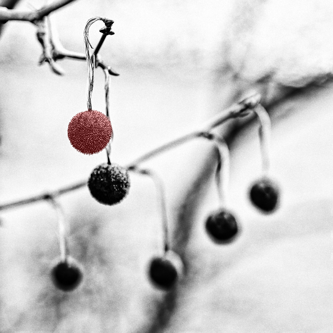
Gerard, sorry - I don't know / understand what happened. I first took your image into Silver EFEX and added Tri X 400 grain - ALL IN MONOCHROME - then I posted it. Next, I took it into Photoshop and made the one seed pod red - then posted that (Two distinctly different renditions!). Now, the all monochrome one disappeared and there are two of the same image (Grain + colorization). Perhaps because I didn't change the title between the two edits? |
Mar 11th |
| 99 |
Mar 22 |
Comment |
...and, just for fun... |
Mar 9th |
 |
| 99 |
Mar 22 |
Comment |
Gerard, I would have also expected an image shot at such a relatively low ISO not to have noise...but I have had it happen to me as well - even at ISO 100. Beats the heck out of me why. Your image is definitely a bit noisy. Digital sensors don't of their own produce grain. I brought your image into Silver EFEX and applied the Kodak TriX 400 film profile. I don't know if you ever, in the "olden days" shot TriX, but it was known for its grain. Attached is my edit and I think the distinction between noise and grain will be clear once you see the edit. Hope this helps. |
Mar 9th |
 |
| 99 |
Mar 22 |
Comment |
Randy, your subject is as quirky and interesting as it is disturbing! I echo Peter's comments about the image not being balanced. The right-side figures really take away from the main subject of the egg heads. I would take Gerard's edit two steps further by cropping out the figures completely and giving more room on the left side. Then use some Photoshop magic to completely darken the background. All that said, I love the image.
Topic for discussion: Is it appropriate to photograph someone else's artwork and then present the photograph as one's own unique piece of art? My image for this month is "guilty(?)" Of the same thing. It is a sculpture. I think the PSA judging guidelines frown upon the practice��but there are some gray areas. Is it okay to have someone else's art piece as a component of a larger composition? If so, when does "being a component" cross the line? |
Mar 9th |
| 99 |
Mar 22 |
Comment |
Hi Gerard! Nice composition and edit. I love the abstract quality of your image and how only one element in the entire scene is in sharp focus. Nice leading lines and the 1:1 crop works really well. Regarding the noise - it bothers the heck out of me and Topaz DeNoise AI is my best friend. Noise is different from grain - something I don't mind at all. Grain can be used to create a certain feeling or mood and you might experiment with this image by pulling it into Silver EFEX and see what grain options would do for your image (not that it needs anything more than what you've done - just for fun!). Nicely done. |
Mar 9th |
| 99 |
Mar 22 |
Comment |
Linda, I think you really got an amazing image. So much detail in his expressive face. I like the background treatment that lets me focus all my attention on that face! Excellent job with nothing to improve. |
Mar 8th |
| 99 |
Mar 22 |
Comment |
Peter, your studio skills are really coming along. As I've mentioned before, I am no expert on portraiture and don't feel like I'm in a position to critique your image. So, to my eye, you've done a great job and achieved your objective and I wouldn't change a thing. Nicely done. |
Mar 8th |
| 99 |
Mar 22 |
Comment |
Hi Barbara. This is a lovely, tranquil scene. I like the image flipped as you did and my suggestions mimic those of Gerard with regard to the crop. I agree that the shadows in the trees could be brought up - but only just slightly. After all, it is a back-lit scene and the trees are in the shade but a little more detail would add a bit more interest. |
Mar 8th |
9 comments - 5 replies for Group 99
|
18 comments - 7 replies Total
|


