|
| Group |
Round |
C/R |
Comment |
Date |
Image |
| 3 |
Feb 22 |
Reply |
Please see my comments below |
Feb 15th |
| 3 |
Feb 22 |
Reply |
Please see my comments below |
Feb 15th |
| 3 |
Feb 22 |
Reply |
Please see my comments below |
Feb 15th |
| 3 |
Feb 22 |
Comment |
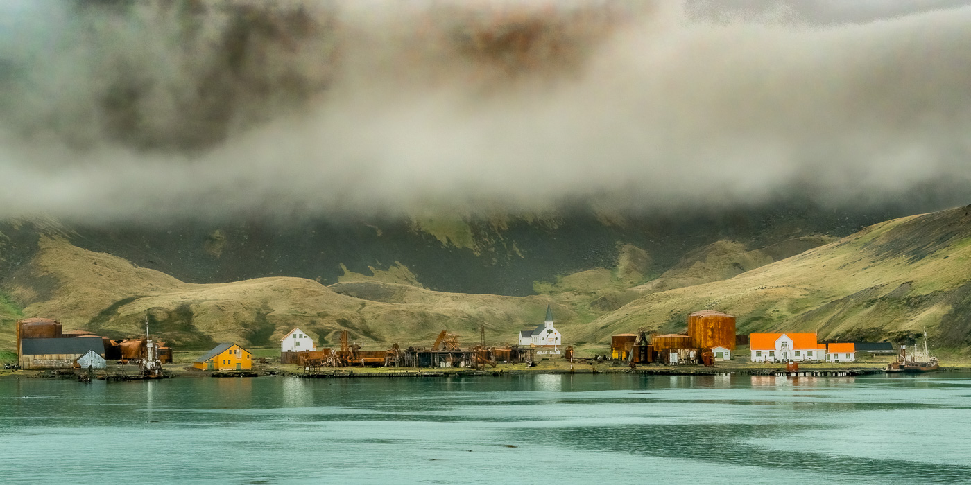
Thanks, everyone for your comments. Looking at the image again, I do see that the white buildings do come off as a bit bright....but that said, they are white buildings against an otherwise dark scene, so they are going to stand out regardless. Best I can do is take the white down a notch - see re-edit below. I think it looks better.
To the point of white balance: I understand what LuAnn is talking about but the day was drab with fog but the sun poked through occasionally. I was after a warmer overall scene to bring some depth and warmth to the image. I actually didn't change the white balance from "as shot". The warmth comes from me having added some vibrance - and I did probably over-do it. In the re-edit, I took the vibrance to a -15 from "as shot". I agree this gives a more authentic appearance to the scene and makes the water appear more natural.
The crop: I wanted to include the entirety of the facility and for me, the patterns in the water add interest and texture to the foreground. Additionally, the water patterns form leading lines and I find the 1/3 - 2/3 division of water:land to be a pleasing composition. |
Feb 15th |
 |
| 3 |
Feb 22 |
Comment |
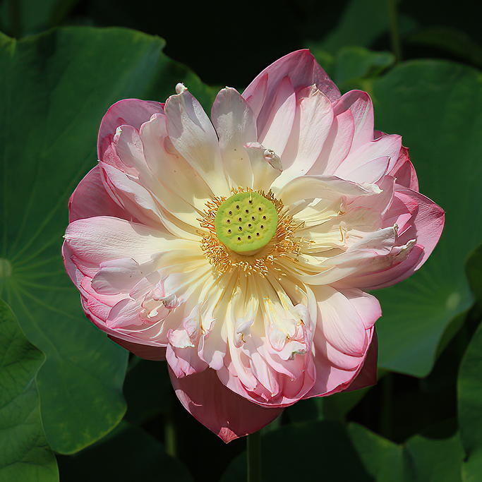
Hi Kieu-Hanh. What a lovely capture of this beautiful (Lotus?) flower. The lighting captures the subtle, pastel shades very nicely. It is really a beautiful flower portrait. Two things did stand out for me: first, the flower looks slightly soft. I see you used a long zoom lens, but you didn't mention at what focal length it was shot. I have found with my 70-300, with these kinds of shots, I have to up the f-stop in order to get my images sharp. Secondly, I found the amount of green leaves and the brightness of them to detract from the beauty of the flower. I took the liberty of bringing your original into Photoshop where I applied the Topaz Sharpen AI filter. This brought the center of the flower into much better focus, but it also had the effect of making the stamens look way too "crispy" - probably a function of it being a jpeg. Next, I lowered the exposure on the leaves and made a square crop to better highlight the flower. |
Feb 10th |
 |
| 3 |
Feb 22 |
Comment |
Lisa, what a fun shot this is! How long did you have to wait for the couple to come along? Your image suits the high-key style very well. I looked at your image for a long time and I debated with myself whether it would work better to crop out the right side of the image entirely to highlight just the couple. But in the end, I think your composition is the better choice. Well done! |
Feb 10th |
| 3 |
Feb 22 |
Comment |
Hi LuAnn. You've created a really pleasing piece of digital art. The down-low perspective really makes a difference here (did you have to lay down on the ground to get the image??). The bokeh is lovely and your treatment in Topaz is not over-done. Amongst "real" photographers, I think digital art often gets a bad wrap as being not "real" photography - and that's a shame. I was very pleased to see some recognition of the genre in the most recent issue of the PSA Journal. I really enjoyed your image. |
Feb 4th |
| 3 |
Feb 22 |
Comment |
Mary Ann, what a nice capture of these iconic houses. The image as you have taken and edited it has no flaws with regard to composition and exposure, etc.. But if I'm being truthful, it is a "snapshot" image that says "I was there". But it begs for a new, different interpretation. Based on what I know about you, I think you are much more creative than this image suggests. What could you do with it that no one has done before? Are you up to doing another version? |
Feb 3rd |
| 3 |
Feb 22 |
Comment |
Hi Ruth! I think you executed your intent perfectly! I looked at your image and said to myself: "What am I looking at?" And it kept my attention as I tried to figure it out. Then I got more confused (in a good way!) when I looked at your original and compared it to your final edit - which further kept my attention. I really like what you did with the image. My only suggestion would be to paint up the highlights (with a brush tool) in the bright areas in the center of the image in order to further bring the viewer's eye toward the center. Well done! |
Feb 3rd |
6 comments - 3 replies for Group 3
|
| 11 |
Feb 22 |
Comment |
Henry, the rock formation makes an ideal subject to portray in monochrome. While the color image provides context that lets the viewer know almost immediately these are rocks, the cropped and edited mono image makes for an intriguing abstract that caused me to linger and study every inch. Your image shows a wide dynamic range and you've done a great job of bringing out the texture in the rocks with your edit. I'm not familiar with Lumenzia and would like to chat with you at camera club to learn more about it. I enjoyed your image very much. |
Feb 12th |
1 comment - 0 replies for Group 11
|
| 17 |
Feb 22 |
Comment |
Peter, I see you decided to show the front side of your subjects in color after portraying their back sides in monochrome in Group 99! Two sides of the same coin. Color works for this side of the coin. Your square crop is particularly effective in emphasizing the diagonals formed by the models' legs and arms as well as those of the ladder. Nice composition. Pleasing portrait. |
Feb 12th |
1 comment - 0 replies for Group 17
|
| 18 |
Feb 22 |
Comment |
Very imaginative, inspiring and well done composite! |
Feb 12th |
1 comment - 0 replies for Group 18
|
| 99 |
Feb 22 |
Reply |
Lance, thank you for your comments. You have a very good point that underscores the importance of learning to "see". I didn't really think about the fact that the diagonal is out of focus and how it would affect the overall composition. I have an idea of how I might manipulate the image to "fix" it. If I'm successful, I'll post the result. |
Feb 26th |
| 99 |
Feb 22 |
Reply |
With my limited Photoshop skills, I attempted to add an element of focus to the blurry edge. It is a quick edit and by no means perfect...and I'm not sure it is an improvement. Trouble with doing this type of reparative work to an image is this: Once you do it, you still have in the back of your mind what the original image looked like and it's difficult to be objective. You know you did something...but when others look at it without having seen the original, will THEY know you did something. |
Feb 26th |
 |
| 99 |
Feb 22 |
Reply |
Lance, thank you for your comments. You have a very good point that underscores the importance of learning to "see". I didn't really think about the fact that the diagonal is out of focus and how it would affect the overall composition. I have an idea of how I might manipulate the image to "fix" it. If I'm successful, I'll post the result. |
Feb 26th |
| 99 |
Feb 22 |
Reply |
Leanne, I like that edit much better. The shadow of the porch overhang creates a natural "vignette". Well done... and thanks for including the original for comparison. Definitely B&W was the way to go! |
Feb 12th |
| 99 |
Feb 22 |
Reply |
Leanne, I like that edit much better. The shadow of the porch overhang creates a natural "vignette". Well done... and thanks for including the original for comparison. Definitely B&W was the way to go! |
Feb 11th |
| 99 |
Feb 22 |
Comment |
Leanne, hello and welcome to the group! My first (and sadly, only) trip to Australia was Melbourne and southern Victoria. A wonderful experience and hope to return some day.
What a great composition - especially given it was taken from the car! The image is sharp front to back and the choice of overall toning really fits the image and adds to the mood. I feel great empathy for the owners of the house. I imagine they don't have a lot of resources which makes the flooding all the more devastating. Really great emotion in this photograph!
I might suggest toning the vignette way down, as I feel it is overdone. I get what you were trying to do with it, but your image is strong on its own and doesn't, in my opinion, need such a heavy-handed edit. I realize the subject is the sandbags and the sign��but I find that my eye wants to see the door in its entirety. Did you capture the whole door? Also, it would be interesting to see the original, unedited version. Thank you for sharing this image with us. |
Feb 10th |
| 99 |
Feb 22 |
Comment |
Randy, interesting story and location for a photo shoot. I think all three images have merit with pluses and minuses. All three exhibit nice tonal range/variation. You didn't mention if your shot was on a tripod or hand-held - but either way you managed to get a nice crisp shot. As far as composition goes, I like the framing of Original 1, as it gives the most context and the window frame itself adds interest. But, the absolute black of the five window panes at the top of the image really throws my eye off. It would be interesting to see how this image might transform if those shadows were opened up.
The presented image makes it clear that the subject is the building on the other side of the window and for me, the window becomes more of a distraction.
Finally, Original 2 is my favorite: It gives context and makes the window and frame a part of the composition. The exclusion of the top of the window frame keeps my eye focused on the building and inclusion of the bottom part adds depth to the image that is lost to me with your presented version. |
Feb 6th |
| 99 |
Feb 22 |
Reply |
Randy��interesting flip. But my brain is having the same issue with your version as yours did with mine. For me, I took the image as I saw it and I'm having trouble seeing it differently. Since you didn't take the image, perhaps it is easier for you to like a different version. It's fun to see how many different presentations can be done with semi-abstract images like this. Thanks for your comments. |
Feb 6th |
| 99 |
Feb 22 |
Comment |
Linda, what a great story your image tells. I really like everything about it - the pose, the expression, the reflection of the coffee mug on the table, the edit. I hope you will make a print and give it to the gentleman as a gift. Really nicely done! |
Feb 4th |
| 99 |
Feb 22 |
Comment |
Peter, it's not often one sees portraits of people's back sides. How refreshing! I know next to nothing about studio portrait photography, but that said, I can't see anything I would change. I really like how the models stand out against the background. As to your question about color vs mono... yes, both images work. My preference is the mono version simply because the color version actually doesn't have much color other than the skin tones - a duo-chromatic image, if you will. Nicely done. |
Feb 4th |
| 99 |
Feb 22 |
Reply |
Thanks, Barbara. I will be using my phone's camera more often now that I know the quality of image it can produce. |
Feb 4th |
| 99 |
Feb 22 |
Comment |
I think for presentation here, the white stroke better delineates the image against the black background. |
Feb 4th |
 |
| 99 |
Feb 22 |
Reply |
I'm replying to my own post�� now that I've had my morning coffee and am a bit more awake, I see you put a thin black border around the image. I keep forgetting the black background in this forum calls for some contrasting border. Your black border works for 3/4 of the image but the bottom of the image gets lost. I think I will play around with it a little more and see if I can find a border that works for all sides. Stay tuned�� |
Feb 3rd |
| 99 |
Feb 22 |
Comment |
Barbara, what a striking image! I love the contrast between the subject and background. Your editing has captured and enhanced the details of the branch and leaves and your lighting casts beautiful highlights and shadows. It would make a striking print and there is nothing I would change about it. Well done! |
Feb 3rd |
| 99 |
Feb 22 |
Comment |
Hi Gerard. I love images like this where I have to study every inch to try to figure out what I'm looking at. Your image holds my attention as my eye explores the light, the shadows and the details. A lot of macro photographers focus stack to get all parts of the subject in focus��and that works well in some cases. In your case, I like how the focus fades which further serves to keep my eye on the in-focus details. As far as suggestions go, two things: First, I would like to see some greater tonal variation in the image and nuance of shading during the editing process. Secondly, I do rather like Linda's suggestion to flip the image. (I believe I know what it is��or rather what "they" are��.but I will keep that to myself until you let us in on the secretI). It looks like this image has the potential to generate a lot of discussion - and what photographer doesn't like their work discussed?!? Nice Job. |
Feb 3rd |
| 99 |
Feb 22 |
Comment |
Hi Linda. Thanks for commenting. On my screen I'm having a great deal of trouble seeing any difference between my original and your rendition. Can you tell me what you did with it? Thanks. |
Feb 3rd |
8 comments - 8 replies for Group 99
|
17 comments - 11 replies Total
|


