|
| Group |
Round |
C/R |
Comment |
Date |
Image |
| 3 |
Jan 22 |
Reply |
YIKES! ...thought I had sized it correctly. Sorry about that! |
Jan 31st |
| 3 |
Jan 22 |
Reply |
.....rules, rules, rules......all begging to be broken! LOL |
Jan 31st |
| 3 |
Jan 22 |
Reply |
.....rules, rules, rules......all begging to be broken! LOL |
Jan 30th |
| 3 |
Jan 22 |
Reply |
Sorry, resolution is the incorrect word - the image size actually hasn't changed, only the apparent size of the image on my monitor. I noticed when I came back from vacation that the images now appear larger on my screen, and therefore easier to make out detail and other nuances. I just assumed there have been some back end changes to the website to cause that to happen. ...has no one else noticed that? |
Jan 30th |
| 3 |
Jan 22 |
Comment |
Thank you, LuAnn, for your comments. It's all about perspective, isn't it - that of the artist vs. that of the audience. The conundrum for an aspiring artist is always when to take guidance from others and when to trust one's own gut. What is great about the DD groups is getting insight into how others view one's work. |
Jan 24th |
| 3 |
Jan 22 |
Comment |
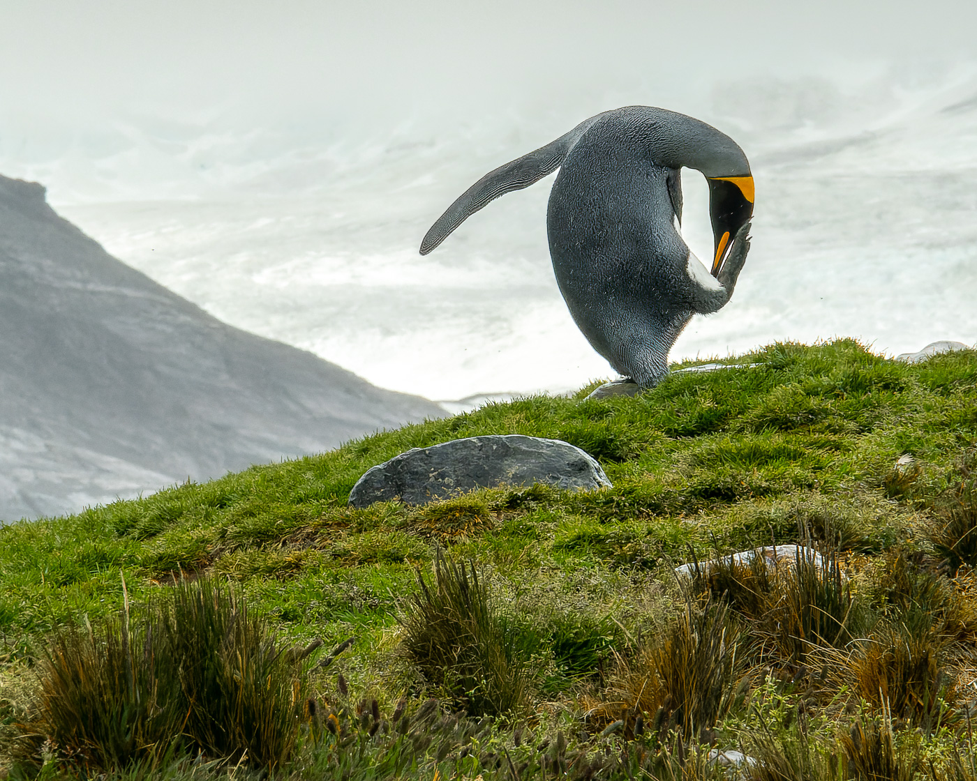
Thank you all for your comments. Regarding the bright background - the image depicts the lighting conditions quite accurately, even with me bringing down the highlights to the maximum. However I didn't want to lose the contrast between the penguin and the snow - intent was to give somewhat of a silhouette effect. On Ruth's suggestion, I changed the crop to a 4x5 ratio to eliminate as much of the bright snow as possible. Does this improve the image? |
Jan 21st |
 |
| 3 |
Jan 22 |
Reply |
LuAnn, I wasn't aware that posed street portraits are not allowed in competition. Is this true universally? I ask only because for the better part of COVID lockdown I was a member of a virtual street photography salon. The host of the salon does street photography exclusively and has put on shows and even published some online exhibitions of his work. We were encouraged to ask people to pose for shots. |
Jan 11th |
| 3 |
Jan 22 |
Comment |
Lisa, what a great Russian street scene! Nice composition. The inclusion of the background elements add context and enhances the story. You were fortunate to have a cooperative subject! It's always a challenge as to whether to photograph people in foreign countries without first asking permission. (While in Venice, I got a very thorough verbal chastising from a gondolier whose picture I took without asking him permission). Your image has a lot of color in it - so much so that I found it a bit distracting. I'm wondering what you think of my monochrome edit? |
Jan 11th |
 |
| 3 |
Jan 22 |
Comment |
Hi Mary Ann. First I want to say that I love the colors in your image and how you captured the water droplets on the "feathers" of the grass. The gentle arching of the feathers and the color transition from green to magenta is particularly pleasing to my eye. I do think it was the right decision to clone out the blade of grass. Overall I feel the image is a little dark and for me, and it would work better for me if it were a bit brighter. Compositionally, I think the feather is placed perfectly in the frame...but I find the stem in the foreground distracting. I think it takes away from the full beauty of the feather.
Now I'm going to say something that is bound to be controversial - and I welcome y'all's comments, agreeing or disagreeing with my stance. So, why not move, bend, break or cut the distracting elements out of the way? Obviously, circumstances and ethics would dictate any such decision. Where was the grass? In some random field, or in someone's garden or a park? Would physically removing the distracting elements cause irreparable damage to the plant? We do, after all, cut flowers from our gardens and bring them into our houses - and we even photograph them as a still-life. While achieving your shot, did you step on or otherwise damage some vegetation in the process? Would cutting or breaking a stem to achieve a composition be any different? If so, how? Do you feel my stance is ethical or unethical - and why? |
Jan 11th |
| 3 |
Jan 22 |
Comment |
Hi Kieu-Hanh. What I like about this image is the color and how the greens, oranges and yellows compliment one another. I also like how the far background is out of focus with nice bokeh. To my eye, however, the entire image is rather soft and I struggle to know whether the flowers are the subject or is it the insect? |
Jan 11th |
| 3 |
Jan 22 |
Comment |
Hi Ruth. This is a very pleasing image of a deer in its natural surroundings. I really liked how you (inadvertently?) captured a bit of the animal's tongue as it was nibbling leaves! To my eye, the image does not lack sharpness - it is sharp where it counts: the head, eyes and antlers. I do agree with the other comments about the tail being too close to the edge of the frame. Otherwise, nicely done. |
Jan 11th |
| 3 |
Jan 22 |
Comment |
Hi LuAnn. Your skill with still-life continues to impress, whether in color or B&W! I wouldn't change anything. The way you managed the lighting in both Group images to highlight the subject(s) and to keep the background dark is particularly effective in keeping the eye focused. Indeed, I don't find anything distracting. I also really like your treatment of the apples in TS2. You did just enough filter percentage to keep me guessing whether the image is a photo or a painting. Nicely done. I also have to mention how much I LOVE the fact that we can now submit and view higher resolution images....FINALLY! |
Jan 11th |
| 3 |
Jan 22 |
Comment |
Thanks, Mary Ann, for your comments. The background is actually a snow covered mountain and a glacier ("glass-see-ur", as our British guide pronounced it). Definitely challenging lighting conditions! That was the best that I could do with the brightness of the background. First adjustment was global with the highlight slider all the way to the left. Then I did a luminosity mask and further reduced the highlights. I tried using the exposure slider with the luminosity mask active, but that just made the snow look a very unnatural gray. Best I could do under the circumstances. |
Jan 11th |
8 comments - 5 replies for Group 3
|
| 99 |
Jan 22 |
Reply |
Scotty would have to be VERY precise with his beam-down coordinates, lest Kirk and Spock be impaled! |
Jan 27th |
| 99 |
Jan 22 |
Comment |
Randy, this made for a really great subject. I couldn't help but think the guy looks like Zorro with an ice saw! You were on the right track, but I do agree with the others that editing to emphasize the subject and de-emphasize the background is a good move. Nice capture. |
Jan 27th |
| 99 |
Jan 22 |
Comment |
Linda, I'm constantly amazed at how rendering an image in black and white can completely transform it. You have successfully taken a "nice" color landscape photo and turned it into more of an abstract. I like how, by removing the color, the image becomes about tonality, light and shadows. I think your crop / composition is spot on moving the emphasis to the reflections. I do like B&W images with blacker blacks and whiter whites, so Gerard's edit is a little more to my liking...but only a little. Nicely done! |
Jan 27th |
| 99 |
Jan 22 |
Comment |
Peter, studio photography often looks contrived to me...but not this image! Had you not divulged it, I would have thought it was captured on the street. The pose is natural and I particularly like the downward angle of the shot and how Rob's eyes are looking up at you as if to say "Bro, what are you doing with that camera in my face?". Very nicely composed, exposed and edited. Well done, indeed! |
Jan 27th |
| 99 |
Jan 22 |
Comment |
Gerard, your composition makes me feel as if the doorway is a portal to a different era. The play of light and shadow adds nicely to the mood. I get a sense that this is a private space and looking through the doorway is almost a violation of that privacy. Including more of the door frame would have emphasized the idea of being on the outside of the room looking in. I like your image as you have presented it. In Linda's crop, I feel the image loses the door that frames the image and for me, I loose the feeling that I described. And your inclusion of a portion of the box/bin makes me wonder what's in it? - adding to the mystery and mood. What doesn't work for me is the highlight on the pipe. It draws attention to the fact it is a modern addition and diminishes the feeling of antiquity. Rather than cropping or cloning it out, I would suggest simply de-emphasizing it by removing the highlight and darkening the shadows. Lastly, I like the bright window and the indistinctness of what's outside which allows my eye to focus on the spinning wheel rather than past it. |
Jan 27th |
| 99 |
Jan 22 |
Comment |
Barbara, I love the play of light and shadows in your image this month. It is well composed and exposed. It is captivating they way the verticals, horizontals and diagonals all compliment one another. Additionally, the texture of the wood floor is a lovely contrast to the texture-less shadows and smooth siding of the house. Lastly, I'm glad you didn't sweep the leaves away before making the photograph - they emphasize the low Autumn sun angle that allowed such a beautiful, elongated shadow. Well done. |
Jan 27th |
| 99 |
Jan 22 |
Comment |
...And on Gerard's suggestion. Definitely adds a completely different perspective. Personally, I prefer my original crop, as I think it has a stronger diagonal which I find appealing. Both work, however. Would love your thoughts. |
Jan 13th |
 |
| 99 |
Jan 22 |
Comment |
On Barbara's suggestion, I brought the image into Silver EFEX and added the thinnest possible stroke. Better? |
Jan 13th |
 |
| 99 |
Jan 22 |
Reply |
Thanks, Barbara. Yes, after Peter's comment I realized the black background of the new PSA Digital site blends with the black negative space in my image and therefore does not represent my crop accurately. Since I edited entirely in Lightroom, do you know a way to add a stroke to an image from within Lightroom without having to take it into a secondary editing app like Silver EFEX? |
Jan 13th |
| 99 |
Jan 22 |
Comment |
Peter, thanks for your comments. My composition was intentional. I see what you mean though, about the "excess" negative space, but I think what might be throwing off your eye is maybe my black background is indistinguishable from the black background of the PSA site? My crop is 1:1 ratio and I intentionally rotated the tree trunk to give a diagonal leading line from bottom left to upper right. |
Jan 11th |
| 99 |
Jan 22 |
Reply |
Linda, thank you for your comments. I keep reading about photographers who can immediately pre-visualize their final result even before they take the shot. I can't always (read: most of the time) do that. When I saw the branch, I had only a vague idea of what I might want to do with it. Once I get an image into LR with basic adjustments, I tend to just play around with it until a particular look makes my brain go BINGO! |
Jan 11th |
9 comments - 3 replies for Group 99
|
17 comments - 8 replies Total
|


