|
| Group |
Round |
C/R |
Comment |
Date |
Image |
| 3 |
Oct 21 |
Comment |
Thanks, Lisa. I've been trying to figure out the abbreviations�� what does "PID" stand for and where on the (very confusing) website do I find the information for entering?
|
Oct 27th |
| 3 |
Oct 21 |
Reply |
Agreed! ...my edit was a bit hasty. |
Oct 15th |
| 3 |
Oct 21 |
Reply |
Thanks, Mary Ann. I generally also prefer more realistic images, but the initial "mistake" photograph got my mind working and inspired me to do this abstract composite. |
Oct 15th |
| 3 |
Oct 21 |
Reply |
Thanks for your comments....do you think it worthy of competition? |
Oct 15th |
| 3 |
Oct 21 |
Comment |
Thanks for your comments, Kieu-Hanh. I always appreciate your perspective. |
Oct 15th |
| 3 |
Oct 21 |
Comment |
I forgot how steamy it can get in Florida! Curious what method you used to do the removal? |
Oct 12th |
| 3 |
Oct 21 |
Comment |
Lisa, this is a fabulous image in my opinion!!! It almost gave me vertigo when I first looked at it. The leading lines! The colors! The exposure! The composition! The reflections! Awesome job! |
Oct 10th |
| 3 |
Oct 21 |
Comment |
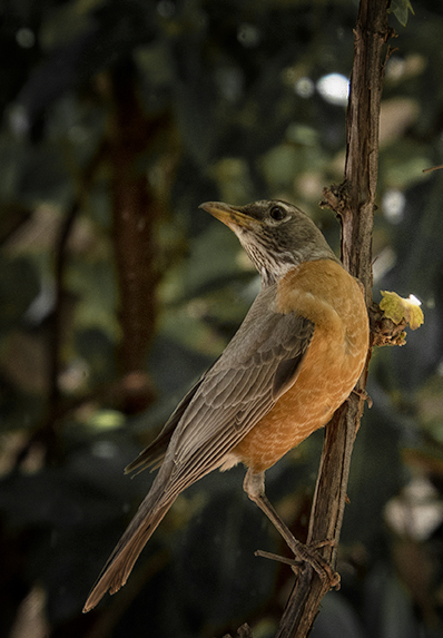
Mary Ann, what a lovely capture of this Robin ..especially so with its unusual pose. Very sharp and nicely exposed. I, too, agree that the branches are extraneous. I wrestle with how much context to keep in an image and I've tended to go the opposite of LuAnn and zoom in for the close-up. I took your image into PS for the crop then used the Color EFX Pro plug in and used the "Add Detail" and "Darken/Lighten Center" filters. Then back into PS to darken and desaturate the background to call more attention to the beautiful bird. |
Oct 10th |
 |
| 3 |
Oct 21 |
Comment |
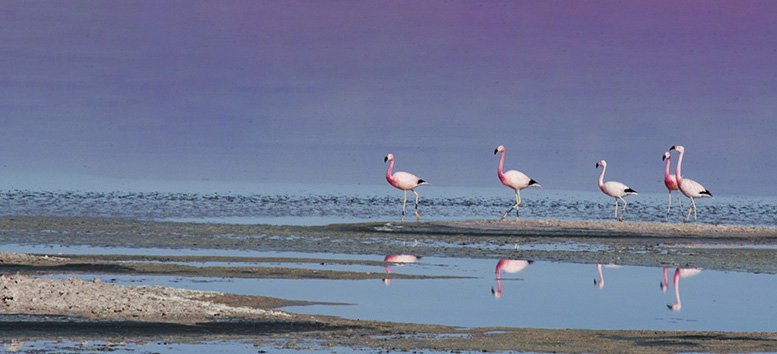
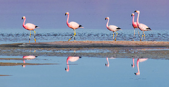
Here's another version. I used Content Aware Fill to remove the background. The algorithm picked up a little of the pink of the birds and mixed it with the blue water to give a purple sky. I increased clarity and added a bit of dehaze. I think I like this version best. |
Oct 10th |
 |
| 3 |
Oct 21 |
Comment |
The position of the birds on the sand bar suggest a panoramic crop. I also increased saturation in the birds and decreased that of the water. (Editing these tiny PSA files in Photoshop is frustrating, but you get the idea). |
Oct 10th |
 |
| 3 |
Oct 21 |
Comment |
Hi Ruth. Aren't Pink Flamingos the best???? I really love how you captured the birds and their reflections in the water. One thing you might consider is a tighter crop, since the birds are your main subject. In my opinion, the background is uninteresting and detracts from these beautiful birds. I'm attaching two cropping alternatives. Curious what you think. |
Oct 10th |
| 3 |
Oct 21 |
Comment |
Hi Kieu-Hanh. I love your image - SO colorful. I'm totally amazed at the quality of images that can be had by pairing a good photographer (you!) with a cell phone camera. Excellent detail and dynamic range and your edit enhances the subject. Well done. Since it was so colorful, I wanted to play around with it in Color EFX Pro. I'm not suggesting my edit is better - just a different version for comparison. Primary filter was the Lighten/Darken Center one. It's a vignette-like filter with a special algorithm. |
Oct 10th |
 |
| 3 |
Oct 21 |
Comment |
Hi Randall. What a beautiful image of this orange Laelia orchid! You are so fortunate in Florida to be able to grow orchids outside. At one time I was quite the enthusiast, having two greenhouses with over 350 plants! Alas, it became work instead of fun to care for them, so now I just admire them when others grow them! Your image seems sharp and well exposed. The square crop enhances focuses my eye on the blossoms and their position in the frame forms nice leading lines. I like your choice of aperture that has left the background out of focus with nice bokeh. The back lighting works well for this image. My only suggestion would be for you to consider cloning out the black line (the hanger?) at the top left of the frame to ensure the viewer's attention stays with the beautiful flowers. Nicely done. |
Oct 10th |
| 3 |
Oct 21 |
Comment |
Hi LuAnn. Good on you for trying something new! I, personally, think the sky replacement feature in PS is amazing. (Hopefully you've had a chance to download all the new skies that Adobe just released). I think your image documents well this old church. Your wide angle lens and low camera angle accentuate the height of the steeple and draws my eye up to the sky (Heaven). I think inclusion of the trees on either side makes a nice frame, further directing the eye to the center-top. Your chosen sky gives me a sunny, cheerful feeling and makes me think of the sky animations in the movie "UP". With regard to the sky and speaking from my own experience, it is advantageous to match the sky as closely as possible to the lighting and exposure of the main subject / foreground��and this is often easier said than done. In your image I feel there is a mismatch. You might consider a couple ways to achieve balance: 1. Play around with the adjustment sliders in the sky replacement window. There are separate sliders for the sky and the foreground and balance can sometimes be achieved by this alone. 2. Separately, brighten up the church. 3. Decrease the highlights in the clouds and decrease the blue saturation / luminance to match the luminance of the sky in your original image. Overall, I do think a sky replacement was the right choice and is an improvement over your original image. [I would like to start a discussion on our Bulletin Board around the question: "Under what circumstances is it appropriate to alter an image?] |
Oct 2nd |
11 comments - 3 replies for Group 3
|
| 26 |
Oct 21 |
Comment |
Tony, as I was going through all the groups' photos, yours caught my eye. I think you have a winning image here! Nicely composed and beautifully edited. The colors are vibrant and well balanced. The monochrome version is also very nice, but I agree with you that the color version wins out. Nicely done! |
Oct 11th |
1 comment - 0 replies for Group 26
|
| 27 |
Oct 21 |
Comment |
Brad, your shot caught my attention as I was perusing this month's images. Absolutely stunning! I've just started playing around with monochrome HDR to bring out a broader range of tones. You've really done an amazing job. |
Oct 11th |
1 comment - 0 replies for Group 27
|
| 41 |
Oct 21 |
Comment |
Hi Kathy. ...besides being quite adept at compositing, you appear to also have a wonderful sense of humor and whimsy! I love your image and the accompanying caption. It made me smile! |
Oct 12th |
1 comment - 0 replies for Group 41
|
| 55 |
Oct 21 |
Comment |
Hi Pauline. Just visiting your group and I was captured by your image. I love the lines and the play of light and shadow. Very nicely done! As an exercise just for myself, I brought your image into Photoshop and played around with it (I am still learning PS). I wondered if inverting it would better allow my eye to follow the lines to the center. I also used two curves adjustment layers to further direct my eye. ...not trying to make it "better" since your version is beautiful as is - just offering up an experimental alternative. Curious what you think. |
Oct 12th |
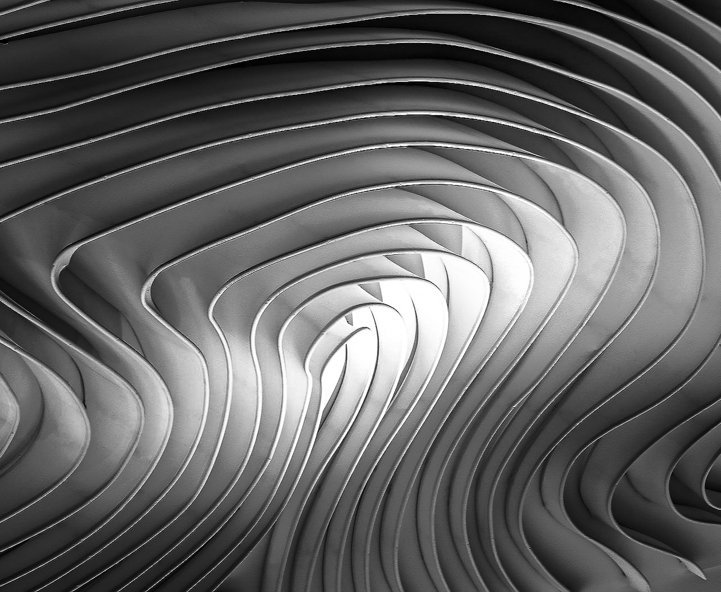 |
1 comment - 0 replies for Group 55
|
| 66 |
Oct 21 |
Comment |
Gary, as someone who is neither a fan of infrared nor portraiture, when I came across your image I felt I had to comment. Your image really caught my eye with the pose, the detail / sharpness, the mood and the lighting...and then to realize it's in infrared! All I can say is WOW - you may have just changed my mind about both portraiture and infrared! Nicely done! |
Oct 12th |
1 comment - 0 replies for Group 66
|
| 99 |
Oct 21 |
Comment |
Randy, this is a perfect image for the month of October��.so creepy and ominous. Abandoned houses makes such great subjects and you've certainly captured this one extremely well. I like your composition and your edit gives a nice range of tones, even if it is on the dark side. I agree with the other comments that the dark image does enhance the mood. The only thing that somewhat bothers me is the brightness of the background and I'm wondering if using a luminosity mask in PS or LR might tone that down a bit? |
Oct 11th |
| 99 |
Oct 21 |
Reply |
Randy, I appreciate your and Gerard's comments about the sky. In this instance I made the decision to keep the sky/clouds as it was when shot. I didn't want the sky to compete with the silos. I assure you the silos are not leaning - I was careful to align the sides to the vertical crop assist lines. What you are seeing is an optical illusion due to the undulations of the surrounding topography. |
Oct 10th |
| 99 |
Oct 21 |
Reply |
AHHHHHHHHH!!!!!!!! |
Oct 3rd |
| 99 |
Oct 21 |
Comment |
Hi Linda. I love old trucks as subject matter and I love your image! I think your lens choice was excellent as was your camera angle. Both serve to accentuate the subject in a very appealing way. Your sky replacement cements the mood and completes the image very well. It appears to me you made extensive use of the Clone Stamp tool in your edit. When I look closely I see several areas in the image where there are repeating patterns. This is particularly apparent in the far right edge and along the top right side of the grass and it draws my eye away from the subject. When cloning you might try changing your sample point more frequently for a more natural look. I enjoyed your image. |
Oct 3rd |
| 99 |
Oct 21 |
Comment |
Peter, I think you've got a very successful image here that works particularly well in mono. Both images are well exposed and exhibit a broad range of tones and the detail you captured in the man's uniform and face makes your composite pleasing and interesting for me to view. Two things you might consider: First, I would have liked see the focus on the ship more closely match the slightly soft background in the original image. With your chosen perspective, your image, had it not been a composite, looks like it could have been taken with a portrait lens - maybe 80mm - in which case one would expect the background to be soft. The other thing that caught my eye was that the smoke appears to be cut off abruptly. This is a tough edit and I wish I could lend some advice as to how you might make it look more natural, but unfortunately, my Photoshop skills are not that advanced. These are small things that do not negate a job well done. |
Oct 3rd |
| 99 |
Oct 21 |
Comment |
Gerard, when I first saw your image, it called to mind a sci-fi film from the late '50s called "Them". A nuclear test caused ants to grow to enormous proportions. I was five years old and it scared the bejesus out of me....so you achieved your goal! At first, I was also distracted by the blurry background and wanted to see greater separation between subject and background. But the more I looked at it I, too, started to imagine that the indistinct shapes were the legs of an army of other bees - or maybe spiders - and they were coming to get me. |
Oct 3rd |
| 99 |
Oct 21 |
Comment |
Hi Barbara. When I first glanced at your image, I thought it was an odd subject without a lot of interest....but then my eye started wandering into the scene. I landed on the left hand trailer and lingered on the details of the grate and texture of the wood. The curve of the drive took me to the other trailer where I was fascinated by the license plate. Then I followed the drive once more to the other three trucks and finally completing the S at the dramatic sky where I admired the texture and tones of the clouds. I appreciate the composition. It is well edited and the focus is sharp front-to-back and you've achieved beautiful, balanced tones over the entire dynamic range. ...did I say uninteresting?...I DON'T THINK SO! Nicely done! |
Oct 3rd |
| 99 |
Oct 21 |
Reply |
Gerard, as always, I appreciate your comments and re-editing suggestions. You are correct - the sun angle was very low in the sky on its way down. Classic Golden Hour light made even more golden by the freshly cut wheat field. In this case, I like what you did with the clouds, but not so much what you did with the crop. To my eye the silos are too squished to the edge of the frame. |
Oct 3rd |
5 comments - 3 replies for Group 99
|
21 comments - 6 replies Total
|


