|
| Group |
Round |
C/R |
Comment |
Date |
Image |
| 3 |
Sep 21 |
Reply |
Wanda, thanks for the compliment. I'm glad you enjoyed it. |
Sep 9th |
| 3 |
Sep 21 |
Comment |
Lisa, I really love your photo. While I've never been to Pittsburgh, I've always heard it isn't a particularly beautiful city but your image would actually make me want to visit. Beautiful composition. Well exposed and tack sharp. Well done, indeed! |
Sep 5th |
| 3 |
Sep 21 |
Comment |
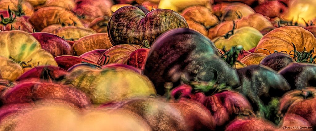
Hi Mary Ann. All those tomatoes have got me craving Caprese Salad! I always love taking photos at farmers' markets...and I see you've had some of the same challenges I have had: Low light, open apertures, longer focal lengths, often lead to images that aren't always sharp from front to back. A tripod and multiple shots with different focus points followed by focus stacking would have been ideal here, but tight quarters with lots of people, make that not really an option. So I was thinking, why not go abstract where the softness can be a positive part of the composition? As an example, I brought your image into Topaz Studio 2 and played around with a few filters. What do you think? |
Sep 5th |
 |
| 3 |
Sep 21 |
Comment |
Hi Kieu-Hanh. You've captured a remarkably sharp image, given it was taken with your phone. I think your tight framing brings all the attention to the treasure hunter, making it clear he - and not the sunrise/beach/landscape - is the subject. Your image keeps my attention as I think about what he might have found. I have a couple of comments about the edit. First, the horizon line tilts down to the right - a quick fix with your in-phone crop tool. In your original image, I rather prefer the soft appearance of the sand. To me, the sand and water in your edited image look over sharpened. Regarding the man's face...I wonder what it would look like had you gone the other direction? That is to say, instead of brightening his face , to have darkened him completely so he appears more of a silhouette against the backdrop of the sunrise. Just a thought. |
Sep 5th |
| 3 |
Sep 21 |
Comment |
Hi Ruth! What a lovely mountain scene. I think you did really well on the focus with the hand-held shot. It is well exposed and I think you did an excellent job with the edit. The highlights in the waterfall were also managed very well. I wish there were just a little more room at the top of the image, as I feel the peak of the mountain looks a bit tight to the edge of the frame. Also, I wonder if using a radial filter on the lowest rock couldn't be used to bring out some more of the details that are hidden in the shadows. Overall, a nice result. |
Sep 5th |
| 3 |
Sep 21 |
Comment |
Kieu-Hanh. Thanks for your comments. I wrestled back and forth about settling on the ideal brightness for the sky. Ultimately, I positioned the clouds such that there was some blue sky at the top of the image, suggesting the darkness was in the distance. In the original photograph from which I borrowed the sky, the subject and foreground were well illuminated and the darker clouds were in the distance. With regard to the use of Gigapixel... I've been experimenting with it. My Sony a6600 is an APSC format with a sensor resolution of 24 Mp and I find that in some instances, giving the resolution a slight bump (in this case 0.5 X) brings a bit more depth to the finished image. |
Sep 5th |
| 3 |
Sep 21 |
Reply |
Oliver, thank you for your comments and the note about the sky. I often have trouble identifying light direction in cloud formations - the light is often diffracted in odd ways. In this particular instance, the sky was from another image I took the day before at evening golden hour. The sun was actually coming from the left. |
Sep 5th |
| 3 |
Sep 21 |
Comment |
LuAnn, your skills with still life photography continue to improve and impress! I think your composition works well as does your thoughtful edit. The cool tones give the image a relaxing feeling. Technically your image is tack-sharp and I enjoyed allowing my eye to wander and pick up the details. One thing I did notice - and found a bit distracting - is the white halo at the "north" end of the two berries on the upper left of the frame. Overall, a very pleasing and well done image. |
Sep 5th |
6 comments - 2 replies for Group 3
|
| 11 |
Sep 21 |
Comment |
Lovely image, Henry! The (tiny) people really give a great sense of scale. Nicely composed and processed. This would make an awesome print! |
Sep 26th |
1 comment - 0 replies for Group 11
|
| 34 |
Sep 21 |
Comment |
Fran, I saw your image in this month's Member Showcase and I really liked it��and your Group image for this month is wild! I love it! As I am diving deeper in learning the ins and outs of Photoshop I find I am enjoying the creative possibilities that go beyond basic photo editing. Your work is inspiring. |
Sep 25th |
1 comment - 0 replies for Group 34
|
| 38 |
Sep 21 |
Comment |
Kurtis, I wanted to compliment you not only on your image here, but also on your image selected for this month's Member Showcase. Nicely done. I've been experimenting with blending monochrome with selected color and I like what you did very much. Nice work all around. |
Sep 25th |
1 comment - 0 replies for Group 38
|
| 99 |
Sep 21 |
Reply |
Hi Barbara. At your request I've posted five images on our group's bulletin board. (images weren't uploading at first due to a file name incompatibility). I'd be interested to know what you think. |
Sep 23rd |
| 99 |
Sep 21 |
Reply |
Linda, what a great edit! I can honestly say with what you've done here that I like this color version better than the monochrome. Not to say that the mono version is bad - it's not - but your edits here give the color image the punch it needs. |
Sep 9th |
| 99 |
Sep 21 |
Reply |
Barbara, to answer your question of why the long exposure:
The workshop was supposed to have an emphasis on long exposures for landscapes.... but one cannot predict the weather. The things that make for interesting long exposures (wind, water, and moving clouds), alas, did not materialize. So we were practicing wherever we could catch some motion in the scene. If you look closely at the weeds in the foreground, they have an etherial softness to them that is a different look than just a DOF issue. I was able to capture that look with an ND filter thanks to the very slight breeze that came up during our time on location.
P.S. Is there somewhere else in the PSA website where I could post a couple more of my long-exposure images? |
Sep 9th |
| 99 |
Sep 21 |
Reply |
Thanks, Linda, for your comments and re-crop suggestion. Yes, that works too and divides the frame into thirds vertically. Because of my long relationship with zooming in to photograph teeth for 36 years, I tend to carry over the "zoom" into my other photography endeavors - hence the tight crop to emphasize the window and the shadows on the inside wall. |
Sep 9th |
| 99 |
Sep 21 |
Comment |
Peter, I must confess that I don't get your image at all. I do, however, appreciate your creativity and the thought process that went into it. Had you not given your detailed description, I would have had no clue what it was I was looking at ...but that said, that is usually the case for abstract images. I agree with you that this is more "conceptual" or "experimental" than abstract. Good for you for throwing it out here and being open to the ensuing conversation. |
Sep 6th |
| 99 |
Sep 21 |
Comment |
Hi Linda - I really like your portrait! The pose, the expression, the exposure, the sharpness / detail are all really well done. I much prefer the original image without the added texture for all the reasons stated by Randy and Gerard. A little editing of the original background, I feel, is all that is needed. |
Sep 5th |
| 99 |
Sep 21 |
Comment |
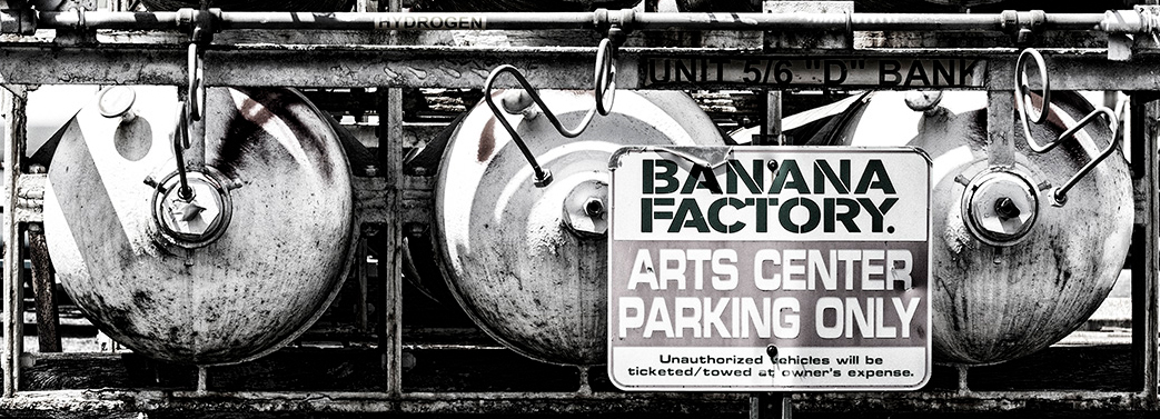
Gerard, this is an interesting industrial image. I find the tanks interesting but I do agree with the others regarding the busy and distracting background - I feel it does detract from the overall success of the image. So... rather than try to redo the photo, or do some editing magic to de-emphasize the background..., what do you think of this option? |
Sep 5th |
 |
| 99 |
Sep 21 |
Comment |
Barbara, I think you've captured a really lovely flower portrait here. Taking away the color allows me to focus on the intricate lines and texture of the flower and I find that very pleasing. The flower is exposed well and is in sharp focus. I find the foliage slightly distracting and I think the image could be improved by deemphasizing it (rather than completely eliminating it) - perhaps by using a color range mask prior to the B&W conversion? Your sepia toning gives the image a warmer feel which suits the flower well. Nicely done. |
Sep 5th |
| 99 |
Sep 21 |
Comment |
Randy, I think you've captured a really nice street image and rendered it well in monochrome. I think both your crops work. Original 2 gives more emphasis on the overall context, and the relationship of the "small" people on the street against the massive urban canyon that is NYC. Your image as presented does give more emphasis on the two guys on the sidewalk and brings in the viewer's eye to a tighter focus. My personal preference is the portrait-oriented Original 2 - I really like the feel of seeing the buildings in their entirety. With all due respect to Gerard, I don't think his crop works at all. |
Sep 5th |
5 comments - 4 replies for Group 99
|
14 comments - 6 replies Total
|


