|
| Group |
Round |
C/R |
Comment |
Date |
Image |
| 3 |
Aug 21 |
Comment |
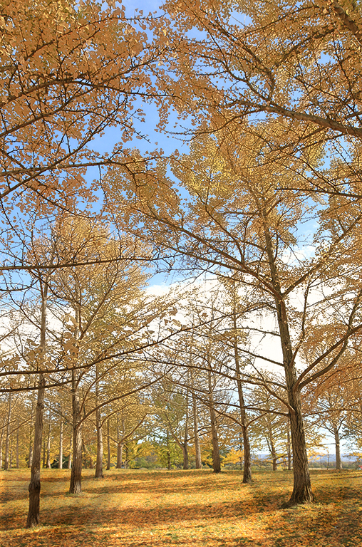
Hi Kieu-Hanh. I think this is a beautiful image that captures a sense of the season as well as the majesty of the Ginkos. I agree that the portrait orientation suits the subject matter better than would a traditional landscape crop. Good choice. I have only just recently learned how to use Range Masking in LR and PS and I thought I'd give it a try on your image. First I burned the lower left and lower right areas of the photo to make the center path stand out more and lead my eye into the center. Then I applied a color range mask to add some saturation and reduced luminance to the tree leaves. Not sure if it's an improvement. |
Aug 9th |
 |
| 3 |
Aug 21 |
Reply |
Thanks for your comments and suggestions. I'll have to give the edit a tweak
|
Aug 9th |
| 3 |
Aug 21 |
Reply |
Thanks, Mary Ann. |
Aug 4th |
| 3 |
Aug 21 |
Reply |
Thanks for your comments. If I have time, I'll try a quick re-edit and see what you think. |
Aug 4th |
| 3 |
Aug 21 |
Comment |
Lisa, how nice you took the time on your vacation to share your image with us! Are you attending the Olympics, or just there coincidentally? I think your image ticks off all the boxes of a good street portrait photo. I feel your crop enhances the composition and I can't suggest any additional edits. I think this is nicely done. |
Aug 4th |
| 3 |
Aug 21 |
Comment |
Randal, I really like your image. I think it is a nicely done portrait of this beautiful bird. The image appears tack-sharp and I think you did a nice job at blurring the background to make the car less obvious. I also very much like how you zoomed in on the subject and then further cropped to enhance the composition. I think the image is beautiful as presented and I have no suggestions for improvement. |
Aug 4th |
| 3 |
Aug 21 |
Reply |
Mary Ann, I think your edit works nicely and I can appreciate the philosophy behind your thinking. With the enhanced luminance of the moth and decreased luminance of the rocks my eye is immediately drawn to the subject. Personally, my preference is a tighter crop to eliminate the dead space��but maker's choice for sure. |
Aug 4th |
| 3 |
Aug 21 |
Reply |
To be honest, I like the second version even better! |
Aug 2nd |
| 3 |
Aug 21 |
Comment |
Hi Mary Ann. How fantastic to capture a closeup of a moth before it up and flies away! Very nice, sharp focus to bring out the color and texture of the insect. I have the same thoughts as LuAnn...plus a few additional suggestions: Besides the distracting twigs, I also found the gray of the rocks didn't allow the brown/orange of the moth to stand out. In my edit, I took it into Photoshop and removed the twigs and cropped down to a square. Then I took it into Topaz Studio 2 and masked out the moth and applied a combination of filters to the background - one to "pointalize", one to blur and one to add a bluish-green tint. Then I increased the luminosity and brightness of the moth before adding a not-so-subtle vignette. It kind of gives the impression the moth is on a shallow pond. I did all of this before I read LuAnn's comments, so I went back and flipped the image so the moth is in the lower left of the frame. Curious what you think. |
Aug 2nd |
 |
| 3 |
Aug 21 |
Comment |
LuAnn, your creativity and studio skills never cease to amaze me! |
Aug 2nd |
| 3 |
Aug 21 |
Comment |
Awesome image, Ruth! Quite the challenge to catch a bee in mid-flight. Good choice of shutter speed to freeze the bee, yet blur the wings. Beautiful color and excellent job at editing. |
Aug 2nd |
6 comments - 5 replies for Group 3
|
| 62 |
Aug 21 |
Comment |
Hi LuAnn - I'm spying on your other group! I think you chose a perfect subject for B & W. I really like your composition and crop. The uprights of the gate are placed in the center of the frame...and the vertical part of the chain is on the third. The diagonals and verticals keep bringing my eye back to the chain where I want to linger. I like this because it captures my imagination and I want to know what's hidden behind. As far as Oliver's suggested edit, I do prefer his treatment of the chain - I think it does bring out more detail and gives a more natural look to the links. But I am not fond of his treatment of the spider webs. To me, their brightness is distracting. Overall, a successful image. |
Aug 5th |
1 comment - 0 replies for Group 62
|
| 99 |
Aug 21 |
Reply |
Thanks Barbara! |
Aug 6th |
| 99 |
Aug 21 |
Reply |
Thank you, Peter. Great idea for a composite image! I mentioned I had originally taken the picture for a different project. That project has yet to materialize mostly because my Photoshop skills are not up to the task��.yet. But I'm working on it! |
Aug 6th |
| 99 |
Aug 21 |
Comment |
Hi Barbara. Beautiful flower and an excellent capture of the bee in flight. ...was that serendipitous, or were you patiently waiting for him to fly into the scene? I like the composition and the bee in-flight adds interest and a bit of whimsy for me. I did find myself wanting to see more detail and brightness in the center of the flower - both the yellow and dark magenta of the surrounding structures. In my flower photos, I will generally use a radial filter on its own or with a range mask to brighten the center. Since you use the Nik Collection, I'm wondering if you've ever tried Color EFX? There is a preset called (I think) "Brighten Center" that works well in some circumstances. And, of course, in Silver EFX, using a control point can achieve a similar result. |
Aug 5th |
| 99 |
Aug 21 |
Comment |
Hi Leanne. I really like your image and your edits in monochrome I feel really enhance the composition. I also like how you brought up the shadows to reveal all the detail in the iron work and bricks. In my opinion, this is a good example of of taking a photo that for one reason or another can't stand on its own merits and, through some creative editing, transform it into something completely different and wonderful and successful. |
Aug 5th |
| 99 |
Aug 21 |
Comment |
Hi Linda. I think the sky replacement was a good choice and I feel it completes the image. I like the feeling of drama and foreboding. You've captured some sharp detail and I found my eye wandering through the image and lingering on those details. I think Alan's and Gerard's editing suggestions are good ones that enhance the composition. Overall, I think it is nicely done. |
Aug 5th |
| 99 |
Aug 21 |
Comment |
Hi Randy. I think this is a really nice street scene that works well in B & W. In my opinion, your crop works well, although I do agree with Gerard about darkening / cloning out the blown out highlight. In my street photography salon (homephotosalon.com), there's been much discussion about cropping or cloning out so-called "distractions". One school of thought is that Street Photography as a genre is more akin to Journalistic Photography in that its main goal is to capture "reality", and if that includes distracting elements, so be it - they were part of the scene. In my opinion, the inclusion of the chairs in the foreground adds some additional context - it tells me you were probably seated at a cafe table and captured this candid scene. Your image causes me to go back to my childhood when I hadn't a care in the world. I really enjoyed your image. |
Aug 5th |
| 99 |
Aug 21 |
Reply |
Peter, I love the color composite...and now I'm torn as to which I like better! Regarding the power pole.... one could already consider the image "inauthentic" due to the fact it is a composite....so I don't think the authenticity gods will object to one more minor manipulation. LOL! But in the end, it is your photo and your call. It's just my opinion and regardless of whether you leave it in or take it out, it doesn't change the fact that you've managed a brilliant and evocative image. Beautifully done, sir! |
Aug 5th |
| 99 |
Aug 21 |
Reply |
Thank you, Leanne! In Silver EFX I used a control point in the center to bring up the brightness and luminance to lead the eye to the center. |
Aug 5th |
| 99 |
Aug 21 |
Comment |
Hi Linda. I think the sky replacement was a good choice and I feel it completes the image. I like the feeling of drama and foreboding. You've captured some sharp detail and I found my eye wandering through the image and lingering on those details. I think Alan's and Gerard's editing suggestions are good ones that enhance the composition. Overall, I think it is nicely done. |
Aug 4th |
| 99 |
Aug 21 |
Comment |
Peter, I am very impressed with your photoshop skills - an excellent composite image! I like your camera angle and the pose of the model. It's as if he has stopped for a hitchhiker and is about to say "Come on, get in". I do rather like the color image and would be keen to see your composite in its color version for comparison. Also, this type of photo would lend itself nicely as an artistic rendering with a drawing filter or cartoon filter. My only suggestion for improvement - and it's a minor one - would be to clone out the power pole in the upper right corner of the image. Overall, I think this is very nicely done. |
Aug 4th |
| 99 |
Aug 21 |
Comment |
Hi Gerard. I particularly like your image for the simplicity of your composition. For me, the monochrome is preferred, as it forces my eye to take in the whole, as opposed to focusing on the individual color. I get a Zen feeling from the B & W. I like how you chose a non-standard crop that I feel fits very well with the strong vertical lines of the subject. I also like how the staggered height of the flowers create a diagonal that offsets the vertical element. Overall, I find it a very pleasing image and can offer no suggestions for improvement. |
Aug 4th |
| 99 |
Aug 21 |
Reply |
Thanks, Gerard. I always appreciate your perspective. This is the only image. As mentioned, it was shot outdoors on a bright, but overcast day. The image was originally meant for an as-yet-to-be-completed project. I think this Winter will give me some rainy-day opportunities to practice my studio skills and experiment more with lighting. |
Aug 4th |
7 comments - 5 replies for Group 99
|
14 comments - 10 replies Total
|


