|
| Group |
Round |
C/R |
Comment |
Date |
Image |
| 3 |
Jul 21 |
Reply |
LuAnn, thanks for the references. As far as any input for Kieu-Hanh, I'm afraid I've got nothing to offer. I don't do sports photography. I've tried panning for some bird photography - with decidedly mixed results - so perhaps those articles will help me too. |
Jul 24th |
| 3 |
Jul 21 |
Reply |
LuAnn, thanks for the references. As far as any input for Kieu-Hanh, I'm afraid I've got nothing to offer. I don't do sports photography. I've tried panning for some bird photography - with decidedly mixed results - so perhaps those articles will help me too. |
Jul 23rd |
| 3 |
Jul 21 |
Comment |
Thanks, Kieu-Hanh. Curious what the other members think of the two different crops. |
Jul 21st |
| 3 |
Jul 21 |
Comment |
Mary Ann - did you feel the PSA Photoshop course was worth the time and effort? I still struggle with layers and masks among other things. I bought Blake Rudis' 30 Days to Photoshop Mastery, but I found him somewhat hard to follow. |
Jul 15th |
| 3 |
Jul 21 |
Reply |
Thanks Ruth. I had the red saturation slider all the way up...but realize now the impact was lost because the image was too dark. Please see my re-edit posted in my reply to LuAnn. Brighter for sure and the red stands out more. |
Jul 15th |
| 3 |
Jul 21 |
Reply |
Thank you! |
Jul 15th |
| 3 |
Jul 21 |
Comment |
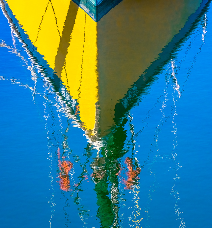
Thanks for your comments, Kieu-Hanh. Attached is my original edit....is this what you were imagining? In the end I decided it was too symmetrical and opted for a 2/3 - 1/3 placement with the vertical reflection of the prow in the right third of the frame. I think both ways work and is a matter of personal preference. |
Jul 15th |
 |
| 3 |
Jul 21 |
Reply |
Hope the increase in brightness comes through in this re-edited image |
Jul 15th |
 |
| 3 |
Jul 21 |
Reply |
Thanks for your comments, LuAnn. I rather like the highly saturated colors - that was intentional, but I see what you mean about the highlights / whites. I played around with the Curves and brightened the image and it did look better. Attached is the histogram of my re-edit. |
Jul 15th |
 |
| 3 |
Jul 21 |
Comment |
Mary Ann, I've had the app Perspective Efex by DXO software but I have never used it (actually I didn't even realize I had it). I took your photo into the app and this is what I was able to come up with. Unfortunately, correcting the vertical perspective eliminated the window from the frame...but the result is quite dramatic when compared to the original. What do you think? |
Jul 11th |
 |
| 3 |
Jul 21 |
Reply |
Mary Ann, between the two,I like the original better because it includes more of the architectural features. I think the main issue with both images is that the lens you used isn't really conducive to this type of photography. A wide angle lens used in a confined space (I'm assuming the interior was fairly confined?) will always distort and the closer the range and the wider the angle, the more distortion you will get. Professional architectural photographers use Tilt-Shift lenses that correct the perspective. If ever you find yourself in a situation like this, you might consider photographing some of the architectural details instead, such as the beautiful iron work on the railing or a feature of a door or window. |
Jul 7th |
| 3 |
Jul 21 |
Reply |
Believe it or not, that is exactly the way the reflection looked in the water. The only edits I did was a crop and a bit of color adjustment. If you look at the unedited original, you will see the same reflection. |
Jul 7th |
| 3 |
Jul 21 |
Comment |
Lisa, very cute and well done. I think Mary Ann's edit does make a small improvement. |
Jul 5th |
| 3 |
Jul 21 |
Comment |
Hi Mary Ann. It looks like a very interesting house. Too bad they don't let you upstairs - I bet it is grand. What I like about your image is the lighting, exposure and edit. All of that works together to give that sense of mystery you were after. What doesn't work for me is the perspective. You didn't say what focal length you used, but I'm guessing it was more toward the wide side given how distorted all of the vertical lines are. It gives me the sense that the big column and the window are about to fall down the stairs. |
Jul 5th |
| 3 |
Jul 21 |
Comment |
Hi Kieu-Hanh! I really like your image. You've managed to really capture the sense of speed and motion. I particularly like how 98% of the image is speed-blur, but her face and head are sharp. My only suggestion would be to bring down the highlights and whites and increase the saturation. I brought your image into Photoshop and used the Camera Raw Filter. Highlights -100; Shadows -15; Whites -100; Blacks -70. I also increased the saturation of the reds and blues and decreased slightly the luminance of those two colors. Curious what you think. |
Jul 5th |
 |
| 3 |
Jul 21 |
Comment |
Randolph, You have captured a whimsical scene. The huge blow-up flamingo in the spa makes it look as if he flew in for a little soak. It's a cute image but my eye keeps getting distracted by the orange whatever-they-are in the back left. I have noticed you rarely mention your editing process... but I think the image would be more successful if you were to bring it into Photoshop or similar and see if you couldn't remove the distractions. |
Jul 5th |
| 3 |
Jul 21 |
Comment |
Ruth, this is a very creative composite image! I would not have thought to blend that background with the flowers, but it works very well, giving the background an abstract quality. You did an excellent job of masking to make your composite seamless. The flowers are sharp and well-exposed and I particularly like how you've brought out the detail and luminance. Very nicely done. |
Jul 5th |
| 3 |
Jul 21 |
Comment |
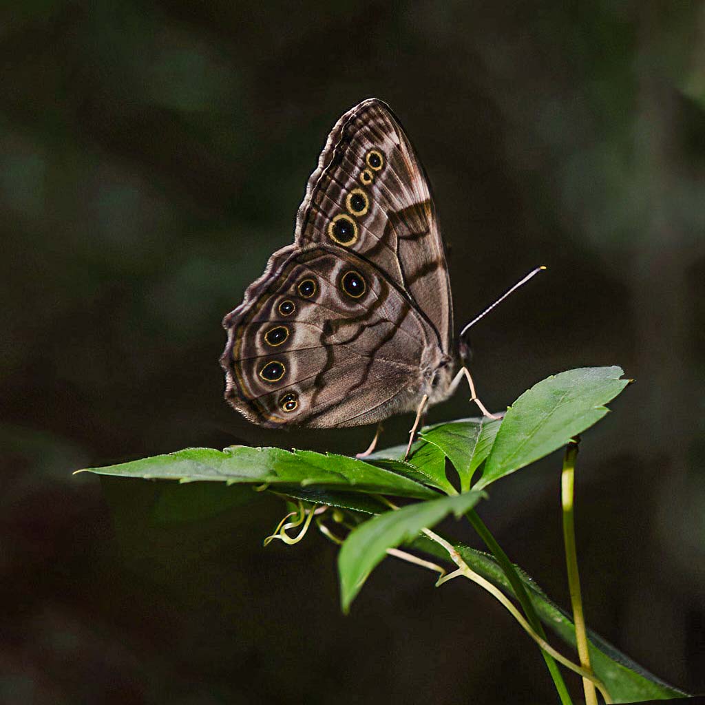
Hi LuAnn! How nice of your butterfly to cooperate! This is a very nice close-up shot with nice detail. The yellow circles on the wings play nicely off the green leaves. Your lighting is your usual "spot-on" and it is exposed well. I do agree with Mary Ann about the background. Also, I found the top-left leaf distracting, especially with the remnant of the brown stem in the original. Similarly, the brown tip of the right hand leaf was drawing my eye away from the subject. Lastly, I felt the crop was too tight on the top. I took the liberty of bringing your image into photoshop. I used context aware fill to remove the distracting elements as well as to add space above the wings. I brought up the color temperature by +24; texture up by +50 and clarity up +25. Let me know what you think. |
Jul 5th |
 |
10 comments - 8 replies for Group 3
|
| 31 |
Jul 21 |
Comment |
Hi Ed. I really like your image. Old, abandoned, discarded and forgotten things are favorite subjects for me. Nice composition and the sky is amazing. I do agree with Paul and I like his edit. |
Jul 21st |
1 comment - 0 replies for Group 31
|
| 50 |
Jul 21 |
Comment |
Lorna, congrats on your member showcase composite image. Nicely done! |
Jul 21st |
| 50 |
Jul 21 |
Comment |
Jeffery, I love your subject and composition, but I do prefer Cindy's edit with its broader range of tones and contrast. The sky replacement adds some needed drama. |
Jul 12th |
2 comments - 0 replies for Group 50
|
| 60 |
Jul 21 |
Comment |
Jane, congratulations of your Member Showcase image, "Dune Walker". Absolutely spectacular and inspiring! |
Jul 21st |
1 comment - 0 replies for Group 60
|
| 64 |
Jul 21 |
Comment |
Stuart, what an amazing composite image! Nicely done! You did a great job with perspective correction and the slight curve in the roof really doesn't bother me. I like it! |
Jul 21st |
| 64 |
Jul 21 |
Comment |
Stuart, what an amazing composite image! Nicely done! You did a great job with perspective correction and the slight curve in the roof really doesn't bother me. I like it! |
Jul 21st |
| 64 |
Jul 21 |
Comment |
Don, I can't imagine this image in anything other than monochrome. I love the perspective and the placement of the vanishing point in the right third of the frame. Nicely done. |
Jul 21st |
3 comments - 0 replies for Group 64
|
| 99 |
Jul 21 |
Reply |
Thanks Stephen! ��.the devil is in the details. That totally escaped me. |
Jul 21st |
| 99 |
Jul 21 |
Reply |
Thank you, Gerard. I always appreciate your thoughtful comments! |
Jul 12th |
| 99 |
Jul 21 |
Reply |
Linda, I LOVE it. Thank you for your re-imagination of my image. I'm always amazed at how the simple act of flipping an image can make such a difference!! And with regard to the transform tool....I'm still learning PS and it didn't even cross my mind to use it. |
Jul 9th |
| 99 |
Jul 21 |
Comment |
Randy, nice capture, especially under the conditions under which you were shooting. At first I thought a tighter crop would draw more attention to the monkey's face, but after I tried it, I didn't like it. Your crop was the right choice. I like Peter's edit. Topaz DeNoise AI is a miracle worker, as is their Sharpen AI - I can't imagine editing photos without them!!! |
Jul 7th |
| 99 |
Jul 21 |
Reply |
Randy, I too, am fascinated by the to-flip-or-not-to-flip concept. Please see my reply on the subject to Linda on what she wrote about Peter's image. |
Jul 7th |
| 99 |
Jul 21 |
Comment |
Linda, I love this image! Your choice of crop / flip, edits and sky replacement all work to make this a very successful image. Nicely done. As to the "flip" - please see my comments about Peter's image and my reply to Linda's re-edit of Peter's image. The to-flip-or-not-to-flip concept fascinates me. |
Jul 7th |
| 99 |
Jul 21 |
Reply |
Linda, I'd like your thoughts on why/when to flip an image. Especially why you think this image is better flipped. It's odd, I think, that some flipped images do have a different feel from the original, but I can't quite figure out why that is. I've asked the question in other groups but never really got any clarity. I have my theory that it may have something to do with Western written language reading from left to right, where the eye is trained to look at the left side of an image first. Does the converse preference hold true, say for Arabic- or Hebrew-speaking people? |
Jul 7th |
| 99 |
Jul 21 |
Comment |
Peter, I like the image and the mood it conveys - I'm just not sure I like the edit. I think Linda was on the right track with her suggestion, but I think the TV needs some emphasis as it is a part of the story. As for the flipping of the image.... I would love a discussion of why/when to flip. |
Jul 7th |
| 99 |
Jul 21 |
Comment |
Gerard, another fine example of your skills. Very creative. They do look like they are talking to one another. Contrary to what Peter said, I do get "heat" from the background...but admittedly perhaps only after having read your summary. Depicting heat with monochrome is a little challenging. It would be interesting to play with this image, using the same background but giving it the slightest red or orange glow. |
Jul 7th |
| 99 |
Jul 21 |
Comment |
Barbara, I think you just created a new off-shoot of Street Photography - - Parking Lot Photography! I like your editing choices, particularly the way you handled the sky and clouds. Very dramatic. I agree with the others about the lamp post.. but oddly, in the original it looks straight. |
Jul 7th |
| 99 |
Jul 21 |
Reply |
Peter and Barbara, thanks for your observations. I agree. Here is a quick re-edit. I pulled a diagonal gradient filter in LR and increased the exposure slightly and increased the contrast. |
Jul 7th |
 |
5 comments - 6 replies for Group 99
|
22 comments - 14 replies Total
|


