|
| Group |
Round |
C/R |
Comment |
Date |
Image |
| 2 |
Jun 21 |
Comment |
Hi Shirley. What a lovely flower portrait - nicely composed and cropped. The Topaz filter is creative and gives a very different look from your original. If it were my choice, I would have also masked out the three main leaves surrounding the flower so the filter only applied to the other, out of focus leaves and remaining background. Regarding your original, I love how the cool tones of the bokeh contrast with the hot pink of the flower. As with my own work, I often can't decide which version of a photograph I like more, and that's where I am with your two versions. Both of your images have merit. Both are well done. |
Jun 10th |
1 comment - 0 replies for Group 2
|
| 3 |
Jun 21 |
Reply |
Dick, thank you for that explanation. I appreciate your eye for detail. Regarding the fuzz... I'm always torn between portraying the "perfect" subject vs the "real" subject. When photographing flowers I've certainly taken liberties, such as snipping off foliage that is in the way, or urging an insect to leave. In this case I didn't notice the fuzz when I took the image. I was part of a group with a guide. I stopped to photograph the flower and the group got way ahead of me, so I was feeling pressured...that, and I was traveling light, so all I had was my camera on this hike. But, certainly good points and I'll definitely add some pipe cleaners to my kit! |
Jun 15th |
| 3 |
Jun 21 |
Reply |
Dick, thanks for your comments. I appreciate the shout out to my composition and editing but I also appreciate and honor LuAnn's comments even though I might not always agree with them. That's what's so great about these groups�� Digital DIALOG groups. It's all about the dialog and whet we can all learn from them. |
Jun 7th |
| 3 |
Jun 21 |
Reply |
LuAnn, I've never stopped to think about the "why" of my liking sharp focus��I just do. Years of looking through 3X magnification to see all the details of of people's teeth��. So it might take me a while to embrace "soft focus" . |
Jun 7th |
| 3 |
Jun 21 |
Reply |
I like it!! Nice job! |
Jun 7th |
| 3 |
Jun 21 |
Comment |
Randolph, I think you were on the right track. Really cool to document a regional culinary tradition, but I find the original image a little too busy. I always struggle with how much context to include and my bias leans to "less is more". Try doing a very tight crop to just include the your wife's hands shelling the peas. I think it is more compelling. |
Jun 7th |
| 3 |
Jun 21 |
Comment |
Hi Kieu-Hanh. How great that you were able to capture this little guy on the stem of a flower. I like the composition and the bokeh is beautiful. I love how you captured the translucence of the insect's wings. What a fascinating creature. Overall, the image seems soft��but I'm assuming your original was your usual sharp focus ��the small file size / resolution of the PSA dictated format is frustrating! |
Jun 3rd |
| 3 |
Jun 21 |
Reply |
Funny you should ask��. Last month, LuAnn suggested a flip of my bird image to have it facing the opposite direction. At first I thought "what difference does it make?", but her suggestion did work better. Upon further thought, we Westerners are used to moving our eyes from left to right, so I flipped the image so the eyes follow the stem from the left up to the flower on the right. |
Jun 3rd |
| 3 |
Jun 21 |
Reply |
LuAnn, thanks for your comments and the suggested re-edit��but, columbine flowers hang down! What I do like about your edit is the background��. What did you do? The original background is blurry and in your edit, the background is sharp. |
Jun 3rd |
| 3 |
Jun 21 |
Comment |
Hi Lisa! As someone who also doesn't really do portrait photography, I feel somewhat ill-equipped to comment on your image. I will make some observations - but don't take them as critiques! Someone with more experience will have to do that and then we can both learn! Here's what I notice: The pose is static - very statue-like; The focus is soft - given your title, was there smoke in the air��or possibly slight motion blur from the slow shutter speed and a long focal length?; The highlights (smoke?) to the right and bottom right seem a little bright; Your subject is interesting and exotic. I like how her face paint somewhat mimics the spiral of her earrings; The color of her costume and necklace contrast nicely with the perfectly blurred background. |
Jun 3rd |
| 3 |
Jun 21 |
Comment |
Hi Mary Ann! You certainly picked a challenging subject under challenging lighting conditions! Black birds are notoriously difficult to photograph and edit well even under ideal lighting situations. Truth to tell, when I first opened your image, it took me several seconds before I found the bird. Unfortunately I think she's lost in the shadows. I do like the diagonals of the cliff face and the way the light reflects off of them. Perhaps a tighter crop - down from the top (to eliminate the distracting tail) and in from the right followed by a little more editing with exposure and curves would bring more attention to the bird. |
Jun 3rd |
| 3 |
Jun 21 |
Comment |
Hi Ruth! Sedona is a magical place and you've managed to capture some of that magic in your photograph. What a beautiful and tranquil scene! You've done an excellent job of composition and editing. The reflection in the water draws the eye into the canyon and makes me want to visit! Very well done! (What is the name of the canyon? I'd love to do that hike the next time I visit) |
Jun 3rd |
| 3 |
Jun 21 |
Comment |
Hi LuAnn! This image shows you have been working hard on developing your composition and lighting skills for still life photography. As you described, all elements were well thought out and well executed. The soft focus adds to the mood. Although my personal preference is toward sharper focus, your decision to soften it is appropriate for the scene you've created. Nicely done! |
Jun 3rd |
6 comments - 7 replies for Group 3
|
| 5 |
Jun 21 |
Comment |
WOW! Very creative. I love the colors - a very nice composite. The perspective seems a bit off, however, with the giraffe looking a little too small standing next to the car�� but in a whimsical composition like this, it doesn't really bother me. I just think of him as a dwarf giraffe! Very fun image. |
Jun 10th |
1 comment - 0 replies for Group 5
|
| 8 |
Jun 21 |
Comment |
Marcus, I love your composition and editing skills. I'm drawn to broken, abandoned, dilapidated and decaying things, as I find it is a challenge to bring out what remains of their beauty. You've really done that here with your image. The "dead" house is set off beautifully by the grass and the lilac tree, which are very much alive. Your sky looks very natural and I wouldn't have guessed it was inserted. Nicely done! |
Jun 10th |
1 comment - 0 replies for Group 8
|
| 47 |
Jun 21 |
Comment |
Hi Ed! I, too, have a fascination with old vehicles. I think you executed your vision perfectly. I can imagine myself discovering an ancient trunk in an attic and pulling this photograph out of it. Very evocative. I also like the wider angle view. Both images work well. Nicely done! |
Jun 16th |
1 comment - 0 replies for Group 47
|
| 50 |
Jun 21 |
Comment |
Hi Lorna! Thought I'd come back for a visit (I've moved to Group 99). I'm a big fan of minimalism and you have created a really captivating minimalist composition. I love it! The discussion above about image flipping was interesting and it is a topic that has come up in my General Group #3. Both images work and my preference is your choice with the boat on the left side of the frame. I think the left/right argument probably has something to do with the way each individual's brain is wired. I brought up the question about how left/right preference might relate to where in the world one is from. Do people from cultures where their language reads from left to right have a preference for an images "handedness" vs people whose language reads right to left? It would be an interesting experiment! |
Jun 16th |
1 comment - 0 replies for Group 50
|
| 62 |
Jun 21 |
Comment |
Bunny, what a wonderfully creative image! When I first looked at it I thought it was a wire and neon sculpture or a wax tablet drawing. I'm not familiar with the "frequency 2.0 workflow" you mention - is that something that is built into the newer iPhones? I would love your explanation. I do agree with Oliver that removing the bubbles improves the image. Overall, nicely done. |
Jun 16th |
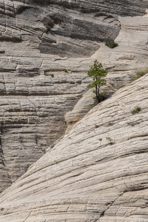
| 62 |
Jun 21 |
Comment |
Hi Luann. You've created a lovely study of minimalist composition, selective focus and tonality. Your attention to detail for the composition (removing all the pine needles except one!) is every bit as evident here as it is in your still-life images. Because of the focus fall-off immediately below the subject, if it weren't for the lone pine needle, it gives the impression of an alien saucer docking on another world. I applaud the fact you are always experimenting and thinking outside the box. |
Jun 16th |
2 comments - 0 replies for Group 62
|
| 99 |
Jun 21 |
Reply |
Thanks for your comments and also for the YouTube info on Yuri you sent via email. Definitely going to check him out. Regarding the mono conversion for the "little tree" - as noted in my reply to Peter, I worked on it in Silver Efex for over an hour and just couldn't get the tree to stand out sufficiently. Maybe Yuri will have some pointers for me. |
Jun 13th |
| 99 |
Jun 21 |
Reply |
Peter, I went back to check my Lr images and realized I actually had taken a telephoto shot of that very tree. Even with the longer lens, I had to crop in pretty far. I played around with the image in Silver Efex for almost an hour, but I couldn't get the tonality, contrast, structure and brightness balanced in such a way that the eye went to the tree. I think, in this instance, the color image works better. What do you think? |
Jun 10th |
 |
| 99 |
Jun 21 |
Reply |
Barbara, thank you for your comments. The entire mountainside was of pretty much uniform tonality. I did use control points to lower the brightness and increase the contrast and structure of the left side. I thought about doing that to the right side, but then I would have lost the differentiation between the two sides. |
Jun 8th |
| 99 |
Jun 21 |
Reply |
Good eye for honing in on that tree up there! I might be able to crop in, but not sure my APSC sensor has high enough resolution to manage a decent image. The trees in Zion and Bryce were fascinating to me and I have several other images where I did just as you suggested and I like the results. Thanks for your comments. |
Jun 8th |
| 99 |
Jun 21 |
Reply |
Randy, I have been playing around with Topaz Mask AI a bit and I find it works well in some situations. It has a background blur function that simulates a wide aperture DOF. It works pretty well most of the time. I'm no Photoshop whiz, but I learned a simple technique to enable you to modify the background without needing to mess with a layer mask: Crop your image first, then use Select Subject. Modify the selection as required, then Invert the selection. Now you can use all your brushes and filters to smudge, blur, spatter, streak - whatever you want. Finish up by deselecting and then going over the perimeter of your subject with a soft blur/smudge brush set to 10 or 15% to eliminate any sharp edges. |
Jun 8th |
| 99 |
Jun 21 |
Reply |
So true! ��and such is the subjective nature of our art form! The artist only has to please him- or herself! |
Jun 8th |
| 99 |
Jun 21 |
Reply |
So true! ��and such is the subjective nature of our art form! The artist only has to please him- or herself! |
Jun 8th |
| 99 |
Jun 21 |
Comment |
Hi Leanne. This is a very nice bird portrait. Recently I have been paying more attention to minimalist compositions and I really like yours. I would have simplified it further, though, by cloning out the lower branch, or, alternatively, cropping up from the bottom to eliminate it and crop in from the right side to position the branch back so it emerges from the lower right corner. As far as the high-key treatment goes, I find the brightness of the white background a little hard to look at. |
Jun 8th |
| 99 |
Jun 21 |
Reply |
Gerard, I think the image on the left is the clear winner of all the monochrome edits. |
Jun 8th |
| 99 |
Jun 21 |
Reply |
Yes, absolutely��but now, although the color and lighting balance in the vase is much better, now it's the color that is distracting. I think it has to be one or the other. |
Jun 8th |
| 99 |
Jun 21 |
Reply |
Hmm��. I love what you did with the bottle/vase! I know we're a monochrome group��but what if you keep the B&W stone base, keep the blue-toned bottle/vase like you have it but reinstate the color of the stem and the flower? |
Jun 8th |
| 99 |
Jun 21 |
Comment |
Hi Linda. I think you captured a lovely scene that epitomizes that area of Louisiana. There are so many interesting elements and details in your image and you did a nice job of in-camera composition. The frame is divided nicely into thirds - the building, the boat and the water/reflection with the main parts of the composition shifted toward the left of the frame. You've done an excellent job with the monochrome conversion - really nice tonality and contrast. Had you not included your original image, my comments would have stopped there. But I must say, in this case I really prefer the color image. It would be fun to see what you might come up with as far as a color edit for side-by-side comparison. In any case, nicely done! |
Jun 8th |
| 99 |
Jun 21 |
Comment |
Hi Randy! First, I really like how you captured the pose of the bird on the cattail. Your focus is sharp (especially considering the lens and the extension tube!) and you even captured a catchlight in the bird's eye. You've done a good job of bringing out the details in the feathers - difficult with a black bird�� but there's something not right about the background and the halos around the wing feathers. I'd be curious if you could tell us a little bit more about your editing workflow on this image. |
Jun 3rd |
| 99 |
Jun 21 |
Reply |
Gerard, thanks for the suggestion on the crop - I do think I like that better. You have a keen eye and I appreciate your comments! |
Jun 3rd |
| 99 |
Jun 21 |
Comment |
Peter, what a beautiful portrait! Your friend has a very interesting face that really lends itself to monochrome. You have posed him well and your final crop works really well. My only suggestion would be for you to clone out the leaf, as I feel it is a distraction to an otherwise excellently composed and edited image. |
Jun 3rd |
| 99 |
Jun 21 |
Comment |
Gerard, I really like this image. I am fond of capturing subjects in states of decline / decay. I enjoy the challenge in creating something beautiful from what normally would be considered not beautiful. Your composition is lovely. My only recommendation would be to decrease the lighting behind the bottle. To my eye the brightness pulls my attention away from the stem and flower. Lastly, I'm making the assumption that your focus was tack-sharp��but I've noticed with the small size of the images to which PSA constrains us, when I zoom in for a closer look, images always look out of focus. |
Jun 3rd |
| 99 |
Jun 21 |
Comment |
Barbara, definitely a good choice for B & W. The intersection of the light stripes with the vertical deck slats creates an interesting optical illusion / 3D effect. It is interesting how your edit made the railing and slats look white, which provides greater contrast and interest when compared to the original. It is interesting how Gerard chose to crop the image�� I would have left the top intact and cropped from the right to remove the post from the composition. I love the diagonals and overall it is a nice study of light and contrast. |
Jun 3rd |
6 comments - 12 replies for Group 99
|
19 comments - 19 replies Total
|


