|
| Group |
Round |
C/R |
Comment |
Date |
Image |
| 3 |
May 21 |
Reply |
Kieu-Hanh,
Thanks for your comments. First, about the Agave...they are Blue Agave and while I did enhance the blue only slightly, that is actually their color. With regard to the background: After the basic edit in Lr, I took it into Photoshop and did the remainder of the editing in the Topaz Studio 2 filter/plug-in. The background wasn't as much replaced as it was altered. I experimented with multiple layers, each time masking out the bird so the changes were primarily to the background. I used the Impression filter twice and then applied a texture. I've attached the original image for you to compare. |
May 31st |
 |
| 3 |
May 21 |
Reply |
Thanks for visiting our group and thanks for your comment! |
May 31st |
| 3 |
May 21 |
Comment |
LuAnn and Ruth
At first I thought you were both crazy for suggesting the flip....until I actually (just now) did it. I'm not sure exactly why flipping it works better, but it DOES! Perhaps is it because we are (in Western Culture) programmed to move our eyes from left to right? I would be very interested to know what someone native to either Israel or any of the Arab countries - both of which read from right to left - would say about the left facing vs right facing image . In any event, thanks for opening my eyes to this. |
May 31st |
 |
| 3 |
May 21 |
Reply |
Thanks, Lisa. Yes, I used some of the techniques I learned through that camera club class. I've been having lots of fun experimenting. |
May 31st |
| 3 |
May 21 |
Comment |
Randolph, I rather like the uncropped image better than the cropped version. The original image gives some context. Another possibility would be to crop in even further to eliminate the distracting sign in the background to really give no doubt what the subject is. Nice that you were able to capture this, as I doubt it is something that happens very often. |
May 17th |
| 3 |
May 21 |
Comment |
Hi Lisa. Nice, dreamy image. There is nothing quite like a tropical sunset! At first glance I thought it might have been a composite image, so thanks for explaining your technique. My observations mirror those of LuAnn and the only other thing I would suggest is to level the horizon. Very creative image. |
May 6th |
| 3 |
May 21 |
Comment |
Hi Kieu-Hanh. I have the same thoughts as LuAnn. I like the soft background and adding the tiny red border was a brilliant addition! You didn't mention at what focal length the image was taken...but I always have to remind myself the DOF is reduced with longer focal lengths and one must compensate by using a smaller aperture. Perhaps f/11 or f/16 wold have gotten the tip of the blossom into better focus. But... smaller apertures may make your background too sharp. To get around that, I have recently been playing around with Topaz Mask AI. It has a function that blurs the background and so far, I've found it to work quite well. |
May 6th |
| 3 |
May 21 |
Reply |
P.S. I resigned from Group 50 and Barbara placed me in the brand new Group 99 Mono |
May 3rd |
| 3 |
May 21 |
Reply |
You've obviously never been to Seattle!!!! (LOL). One can never count on the weather for anything! ...but in seriousness, yes, I have done that in the past. Moral of the story: Make hay while the sun shines! |
May 3rd |
| 3 |
May 21 |
Reply |
I'm finding natural light photography to be very challenging! Just this morning I noticed the sun shining on a flower in my garden. The flower itself was illuminated by the lovely golden hour light and the foliage below the flower was in partial shade. In the time it took me to grab my camera and check the settings, lay down on my belly on my deck and frame the shot, the sun had moved. It couldn't have been more than 1 minute! I got "a" shot...but it wasn't "the" shot I had hoped for. |
May 2nd |
| 3 |
May 21 |
Reply |
Mary Ann, the title says it! The bird is perched on an Agave plant. There is a field of blue agave plants growing in the desert on the other side of our friends' perimeter wall on the Big Island of Hawaii. |
May 2nd |
| 3 |
May 21 |
Comment |
Ruth, Peru is an enchanting country. I loved the scenery and the food, but most of all, the people. Unfortunately I didn't visit the Reed Islands, but you image makes me want to go back and visit them! You've captured an interesting travel/documentary shot with a lot of interest. I'm curious if you were on a tour boat when you took the image? I've often been frustrated on tours as one isn't always able to go to vantage points to get the best angles for "the shot". I'm bothered by the people in the shot being so far away and only seeing them from the back or side. It would've been ideal to capture the boats and people from the front. For me also, the colors do seem oversaturated and the reeds look over-sharpened. |
May 2nd |
| 3 |
May 21 |
Comment |
Hi Mary Ann,
Calla Lillies make such great subjects for art. It's a beautiful arrangement. I particularly like the natural, directional light. For sure, still-life compositions can be tricky to get just right. I have to say, I do like LuAnn's edit as it mostly removes the distraction of the fireplace, moulding and wall. With a still-life, I have learned that the background is as important as the subject. I have a large piece of black velvet fabric that I can haul out and quickly make a backdrop. - very handy when dealing with the sometimes fleeting nature of natural light. I think LuAnn has several large art boards of various colors and textures that she uses. You might give it a try and see what you think. |
May 2nd |
6 comments - 7 replies for Group 3
|
| 99 |
May 21 |
Comment |
Gerard, I think this is a wonderful self portrait and I wouldn't change a thing. It is well exposed, well composed and well edited with nice tonal range and contrast. Rules are made to be broken�� with your title, "Concentration" I would not expect to see much of your eyes. Likewise, I don't think the "rule" of thirds is appropriate in this instance - the extra space at the left of the frame is needed for your gaze. |
May 17th |
| 99 |
May 21 |
Reply |
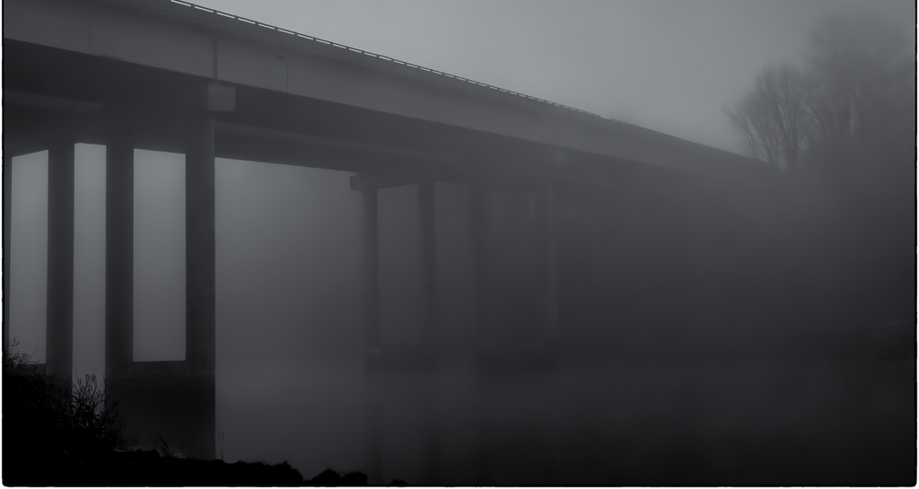
Linda, thank you for sharing your perspective and re-edit. I like how you opened the shadows under the bridge and on the water - it brought out the reflection of the pillars. I appreciate your comment about a boat��but I was going for low-key, stark, minimalist, desolate and eerie. Kind of a "bridge to nowhere". The bridge is the subject and I think the addition of a boat would detract from my intent. |
May 17th |
| 99 |
May 21 |
Reply |
Gerard, thank you for your comments. I'm not sure I quite understand what you meant by the image being a merger of two styles. I'd like to understand more of what you were thinking. I do agree with you about reducing the shadow under the bridge to bring out more detail, but I'm not sure what you were getting at by blurring the left side and the railing. To my eye it just looks like a focusing error. |
May 17th |
| 99 |
May 21 |
Comment |
Thanks for the suggestions - good points. I cropped it a bit from the top, took it into Silver Efex Pro and picked an appropriate preset; toned it with light Selenium and added a slight border - thought I got the border on all 4 sides but looks like I missed the top...but you get the idea. |
May 6th |
 |
| 99 |
May 21 |
Comment |
Hi Linda. What an absolutely beautiful flower portrait!!! Frankly, the color image is "just another flower picture". What you've done with the B & W conversion is spectacular. Lovely tonal range; perfect focus and sharpness; nice detail. I can't see anything I would change. Nicely done! |
May 3rd |
| 99 |
May 21 |
Comment |
Hi Peter! I must confess that I've never been much of a fan of portrait photography in general...but in this case I think you nailed it! I love both images. The lighting and strong color in the original have come across well into B & W. I love the pose - especially the position of your model's eyes. Excellent job at editing as well. My only critique - and it's a small one - I would have liked to see just a little more room above her head, as I think it is cropped just a wee bit too closely. |
May 3rd |
| 99 |
May 21 |
Comment |
Barbara, this is a nicely done composite. The sky ads drama to the image and really sets it off. I do like the composition with the strong leading line of the rock jetty. I am in agreement with Linda, that bringing out the shadows on the lower part of the jetty would improve the image. How about adding the bird back in? |
May 3rd |
5 comments - 3 replies for Group 99
|
11 comments - 10 replies Total
|


