|
| Group |
Round |
C/R |
Comment |
Date |
Image |
| 3 |
Apr 21 |
Comment |
Thanks for your comments and the tip about Eric Pare. Glad you like it. |
Apr 8th |
| 3 |
Apr 21 |
Comment |
Kieu-Hanh, this is a very nice composition. The subject is well placed in the frame and adds a nice pop of color in an otherwise neutral surround. The sunlight off the water in the foreground leads the eye right to the woman and her barge. Your image makes me want to go there! You didn't mention anything about your post-processing and I'm curious. The bridge and sky seem a bit bright and I feel it takes focus away from your subject. I wonder what the effect would be if you decreased the highlights and brought down the exposure on the bridge and sky? Another technique would be to apply a radial filter to the barge. Speaking of focus....I'm always a little wary about commenting on image sharpness here due to the minuscule file size of the images we submit, but it does seem a little soft - perhaps due to the slow shutter speed? I've been amazed at what Topaz Sharpen AI can do in situations like this |
Apr 6th |
| 3 |
Apr 21 |
Reply |
Thanks for your comments, LuAnn. It is sort of the nature of light painting to have a blurred effect - think car headlight streaks in a night time city scene... but that said, I see what you mean. Looking forward to the rest of the members' comments. |
Apr 5th |
| 3 |
Apr 21 |
Reply |
Very cool indeed!!! Thanks for sharing. |
Apr 5th |
| 3 |
Apr 21 |
Reply |
Thanks for your comments, LuAnn. It is sort of the nature of light painting to have a blurred effect - think car headlight streaks in a night time city scene... but that said, I see what you mean. Looking forward to the rest of the members' comments. |
Apr 5th |
| 3 |
Apr 21 |
Comment |
Lisa, what a fun photograph! I'm constantly amazed at the image quality coming out of the newer iPhones. I love the repeating pattern of the hats and the slight color variations. I especially like how you chose to place them diagonally in the frame. Great image as-is...AND it is one of those images that you could have all sorts of fun playing around with. Use a vintage filter; colorize one or more of the hats; or....? |
Apr 4th |
| 3 |
Apr 21 |
Reply |
He isolates the subject and uses a combination of apps and brushes to modify and blend the background. Hard to explain without seeing it done. I'll try my hand at it and send you a few of my attempts. He calls it Digital Art using the photograph as a starting point. We had a brief discussion as to whether it was "real" photography and how photography purists look down on this art form. But really, when does one's editing process cross over from "real" to some variation thereof? Art is subjective and as long as it brings one joy, who cares what others say? Right? |
Apr 3rd |
| 3 |
Apr 21 |
Comment |
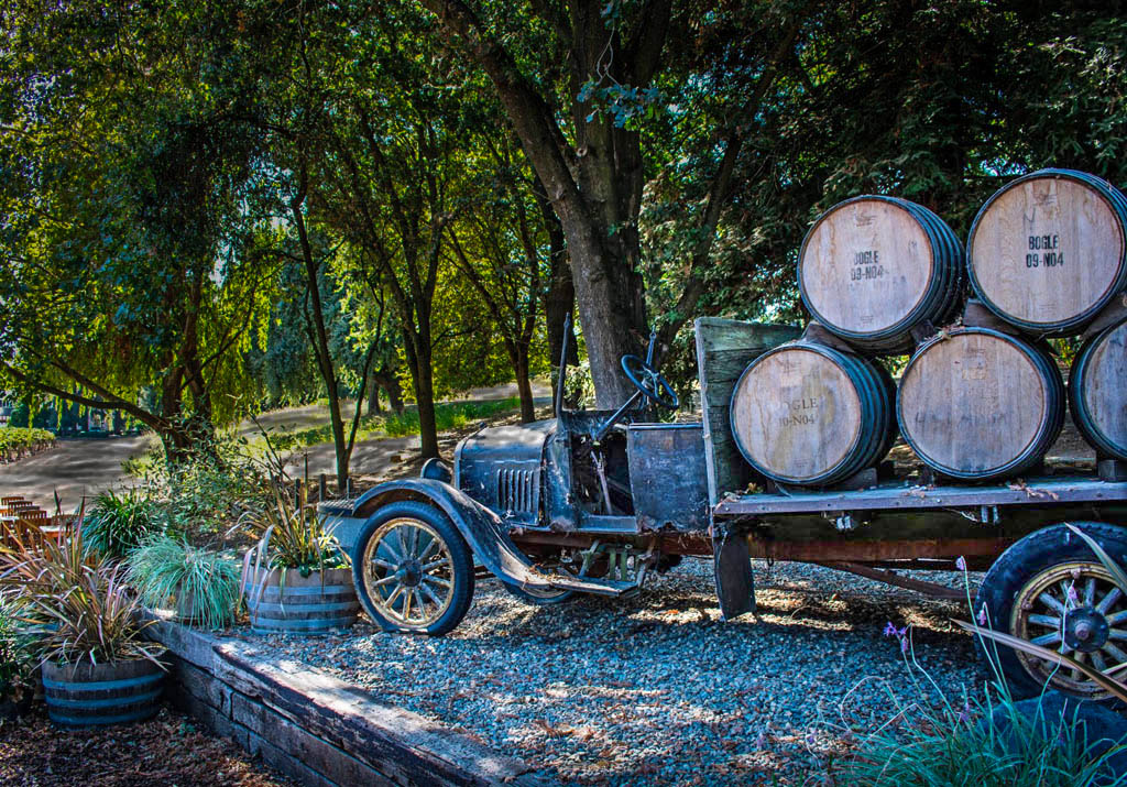
Hi Mary Ann. Old trucks make such fantastic subjects. This one has me imagining what life on the vineyard must have been like when this truck was in use. I picture the entire family pitching in to pick the grapes and make the wine. Your truck is in a beautiful setting but because it's in the shade, my eye is drawn to the light background and the truck doesn't stand out enough from the shadows. I took the liberty of doing a quick re-edit. I used adjustment brushes to decrease the exposure on the bright background and then brought up the exposure on the truck. Curious what you think. |
Apr 3rd |
 |
| 3 |
Apr 21 |
Reply |
Just took a class last night from one of my camera club members on "Creating Digital Art". He works mostly with flowers, keeping the filters on the flowers subtle while doing some amazing things with backgrounds and blend modes. He works from Photoshop and uses multiple plug-ins, each in a different layer to give him the look he's after. Much of what he does is with artistic brushes and he's particularly fond of the Kyle Webster collection of brushes. I haven't checked yet, but he said most of them are available as a free download. |
Apr 3rd |
| 3 |
Apr 21 |
Comment |
Hi Ruth. The image tells a great story with lots of detail to hold interest. Excellent composition and I love how you captured the long shadows from the early morning light and placed them in the foreground. I really like the image. However, the saturated color of the sign and the dog is a distraction for me - especially the sign which, to my eye, looks like it was artificially placed there post-processing. I rather like the subtle color of the flag against the B&W and would love to see a comparison edit if you were to render the sign and the dog with the same subtlety. |
Apr 3rd |
| 3 |
Apr 21 |
Comment |
Hi Luann. It's a lovely image but I must confess, other than the application of the texture, I really don't see much difference from the original. I'm also struggling to see how your focus stacking made a difference...but now it occurs to me maybe your "original" IS the focus-stacked image you used as a starting point. I only see minimal difference between you edit and Beverly's - both are nice. All in all, a nicely done still life. |
Apr 3rd |
6 comments - 5 replies for Group 3
|
| 50 |
Apr 21 |
Comment |
Thanks, Jeffrey. I appreciate the advice. The devil is in the details!
|
Apr 19th |
| 50 |
Apr 21 |
Reply |
Thanks, Lorna. I didn't notice the over-sharpening until you mentioned it. That is an issue when using a highly contrasting background and I'll have to pay more attention in the future. I'm someone who tends to prefer a lot of detail and I admit to using the sharpen, texture and structure sliders maybe a little in excess. Appreciate the comments.
|
Apr 13th |
| 50 |
Apr 21 |
Comment |
Okay, Chuck.... confused again. The image I commented on above is not the "Hammer" image that's up now. So I'll comment again: First of all, thanks for explaining the term "hammer". There was a disconnect. I really am a fan of this type of close up image that shows an interesting part or piece of something much bigger (i.e., the whole truck). I agree that the monochrome image works better. Your f/2 got the "hammer" perfectly in focus while blurring out the brake pedal. Thanks also for talking about your lighting. Expertly done - I would've thought it was natural lighting. Any chance you could specify which LED lights from the HF catalog? |
Apr 4th |
| 50 |
Apr 21 |
Comment |
Cindy, all I can say is STUNNING! The "eyes" have it! Excellent isolation of the subject from the background; beautiful tonality and tack sharp. Exceptionally well done portrait. |
Apr 4th |
| 50 |
Apr 21 |
Comment |
Karl, good image for monochrome, as the red and green of the driver's helmets are a distraction from what you want to portray. Cars are well placed in the frame and the leading lines of the track lead the eye to the almost-shredded tires (did the leading car lose his right front tire later in the lap?). The rear car does fade somewhat into the background in the monochrome image...but that's okay since we're focusing on the worn tires of the lead car. Only suggestion would be to maybe darken the grass in the foreground somewhat in an arc to the left to better direct the eye. Great action image. |
Apr 4th |
| 50 |
Apr 21 |
Comment |
Hi Jeffery. This is an exciting image with a lot of built in tension. You've captured the sensation of speed with your panning technique and your relatively slow shutter speed. How you managed to get the bike and driver tack sharp I'll never know! Looks like you and Karl have a coincidental theme going this month. I think you did a nice job with the B&W conversion, but I have to say I like the color version better. ...just my preference and not a criticism. |
Apr 4th |
| 50 |
Apr 21 |
Comment |
Lorna, this is a beautiful image that captures the drama of the Prairie. The fact that you were able to capture this through your windshield whilst traveling at 100+ km/h is a testament not only to your photography skill, but also to your meticulousness at keeping the windscreen of your car clean!!! (as a photographic joke, it'd be fun to add a squashed bug to the image, LOL). The drama of the sky and the leading lines of the power poles, grass (wheat?) striations and the highway all make for a stunning composition. I agree the B&W works better than the color one. I'm just getting into the nitty-gritty of Silver Efex (do they have a version 4???) and I like playing around with the control points. I took the liberty of doing a quick re-edit to lighten the foreground lanes to give the eye a bright path to follow. I used 12 different control points to lighten the road and protect the adjacent tones. Not sure it's "better" than your edit - just a different variation. Curious what you think? All-in-all, very nicely done! |
Apr 4th |
 |
| 50 |
Apr 21 |
Comment |
Paul, how imaginative on so many levels! One typically doesn't think of photo opportunities in the confines of a public restroom...but I can see why you couldn't pass this one up! Also, using the orange tint gives it a sort of Halloween look about it. A innovative use of "monochrome" that is something other than B&W. I do notice one thing that is different about the two images other than the colorizing: The wall reflection does appear brighter and more distinct in the B&W version and I would like to see that carried over to the colorized version. Very fun image! |
Apr 4th |
| 50 |
Apr 21 |
Comment |
Chuck, what a great image! Someone (you!?) staying up late to get some work done but just couldn't keep your eyes open any more. You've really captured the mood! |
Apr 3rd |
8 comments - 1 reply for Group 50
|
14 comments - 6 replies Total
|


