|
| Group |
Round |
C/R |
Comment |
Date |
Image |
| 3 |
Mar 21 |
Reply |
I really like it. I certainly wouldn't call it "dated"... it's more like "retro". One person's "weird" is another person's "cool", and I think it's cool! It would make a great poster or post card. Curious about the "MEANWHILE". Is that part of the filter or did you add it? Lichtenstein often added text to his images, so maybe that was part of it. Even the font is retro. It's a fun image!
|
Mar 30th |
| 3 |
Mar 21 |
Reply |
Lisa, I'm currently learning Silver Efex. All the experts are telling me that to get the best B&W, you must first make the color version the best it can be prior to taking into Silver Efex. Obviously I was only able to work on your jpeg and I'm sure you could do much better by editing the original. Good luck!
|
Mar 11th |
| 3 |
Mar 21 |
Comment |
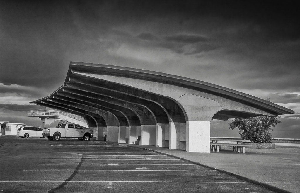
Hi Lisa. What an iconic structure. Now you've got me curious to find more information about it. Excellent subject for monochrome! I think you have a nice image here that just needed a little more editing. I agree with Kieu-Hanh-Hanh about brightening the shadows to reveal the structure (and interest) of the ceiling. The sky is truly dramatic and I'm guessing you chose your crop to include as much of the sky as possible. I think, however, in doing so, there is too much going on that takes away from your main subject. I took your image into LR for a couple of quick adjustments, including a tighter crop, and then into Silver Efex Pro. What do you think? |
Mar 11th |
 |
| 3 |
Mar 21 |
Comment |
Hey everyone. Here is a quick re-edit using your suggestions. Cropped out (most) of the book; Took the image into Photoshop and used Content Aware Fill to eliminate the "lid" and two other distractions. Better? |
Mar 11th |
 |
| 3 |
Mar 21 |
Reply |
Yes, I think you are right. Better without the book and the weird "lid"... although I do like the light quality and angle in the original image better. If I get a chance, maybe I'll re-edit my original and crop out the book and see what I can do with the "lid". Thanks for all your comments!
|
Mar 10th |
| 3 |
Mar 21 |
Comment |
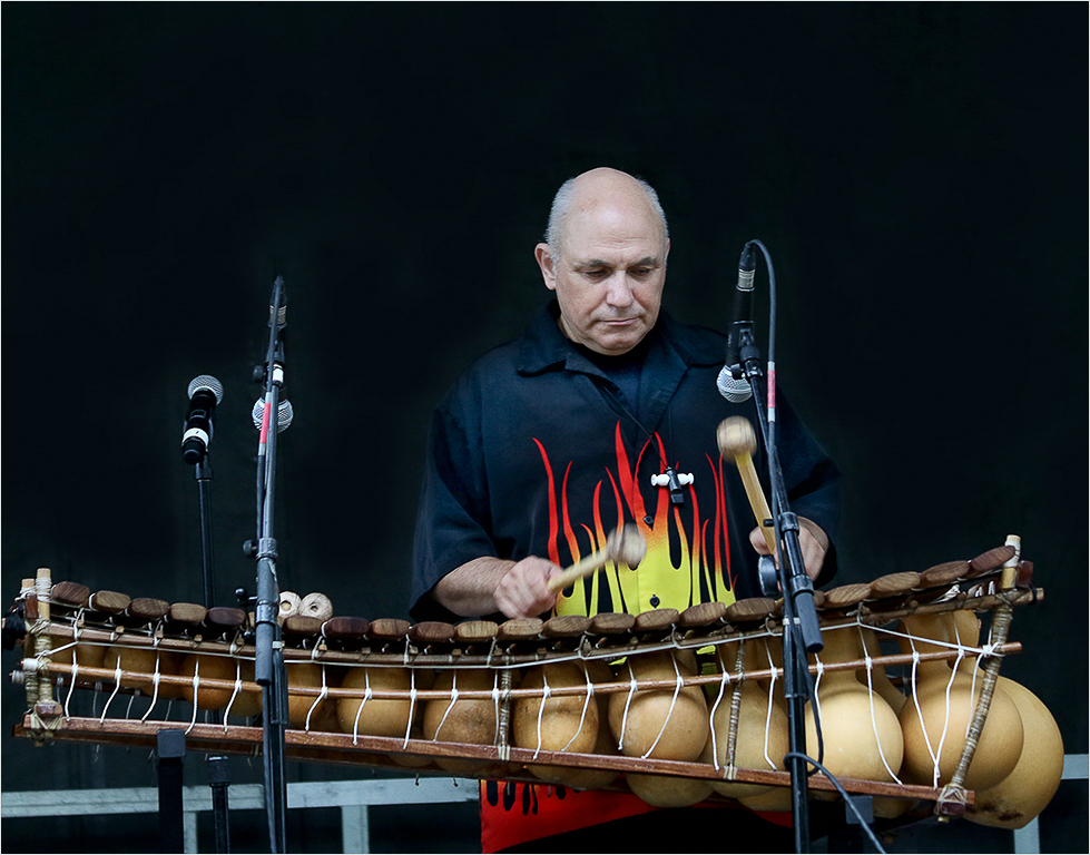
Kieu-Han, I took your image back into LR and used a brush with a 100% feather and 25% flow to gradually increase the exposure - up to 1 full stop. I also increased the clarity and texture slightly. It gives an effect as if there is a spotlight on him and increases the luminance of his shirt to stand out from the background and more closely match the luminance of his face. I obviously worked off of a jpeg, but I think it could be even better working off the RAW file. What do you think? |
Mar 9th |
 |
| 3 |
Mar 21 |
Reply |
Part of me loathes to help Jeff Bezos become even a penny wealthier...but Amazon is so darned convenient! |
Mar 7th |
| 3 |
Mar 21 |
Reply |
What would we do without Amazon? Thanks for the tip! |
Mar 7th |
| 3 |
Mar 21 |
Reply |
What would we do without Amazon? Thanks for the tip! |
Mar 7th |
| 3 |
Mar 21 |
Comment |
Kieu-Hanh, I love this image! Your subject is well positioned in the frame...and is framed by the two microphones and the instrument. He is intent in what he's doing and I particularly like how your shutter speed was slow enough to give motion blur to the "drum" sticks. I know monitors differ, and on mine there is only slight differentiation between the black background and the black of the musician's T-shirt, giving the impression of a floating head. That last comment aside, it is nicely done. |
Mar 7th |
| 3 |
Mar 21 |
Reply |
Yes, for a staged "studio" shot that would certainly be the way to do it. This was a moment in time, and the sunlight lasted less than 3 minutes. The pottery does make a good subject due to the color and textures...so another go at it when I can stage it is a great idea. I don't have a flash unit at the moment... was thinking about investing in a small LED panel for lighting. |
Mar 7th |
| 3 |
Mar 21 |
Reply |
Yes! That would certainly work...and add more interest
|
Mar 7th |
| 3 |
Mar 21 |
Reply |
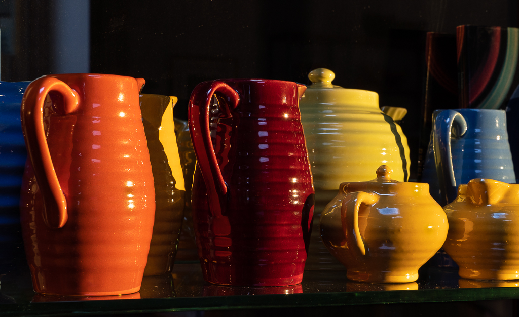
Mary Ann, thanks for your comments. I initially thought about cropping out the book (it is slightly out of focus), but ultimately left it in for two reasons: First is, the line up of pottery lends itself to the panoramic crop. And secondly, I wanted the context the book provides, emphasizing these are collector's pieces. |
Mar 5th |
| 3 |
Mar 21 |
Reply |
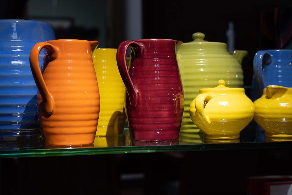
Randolph, it does kind of look like a lid. It's actually the rim of the blue pitcher that is sitting behind the orange pitcher. ...but your observation brings up a conundrum! I'm at a loss to explain why the color change! I've attached another image that was taken at a slightly different angle and as you can see, the pitcher is uniform in color. I went back in the history of my LR edit to double check the original and it shows that the image was captured with the two different colors. I can only surmise the changing natural lighting conditions combined with my cameral angle caused the anomaly. Does anyone else have a better explanation? |
Mar 4th |
 |
| 3 |
Mar 21 |
Comment |
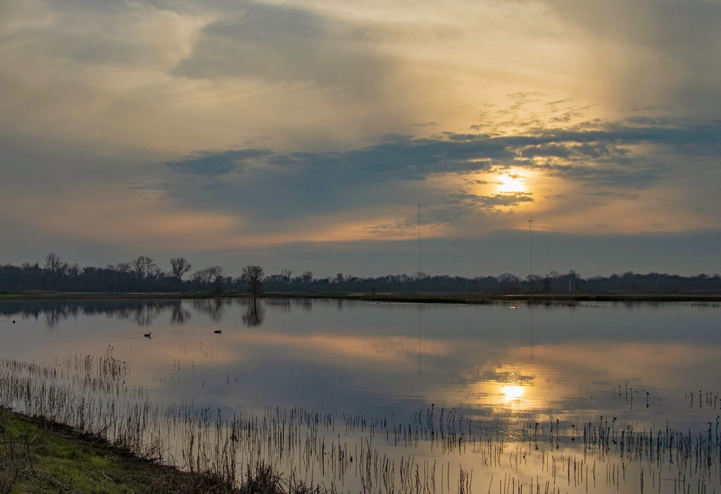
Hi Mary Ann. There is a lot of drama in your image. Interesting foreground; dramatic sky and beautiful reflection. For me, however, the image seems too dark and I wanted to see more detail and color in the foreground and the opposite shoreline and trees. I've started playing around with Luminar AI, so I took your image there and used a high key filter before bringing it back into Lightroom to play with the sky and the reflection. Curious what you think? (Also, Beverly has a point about the twin antennae, but it looks like a tricky edit and I certainly don't have the skill to remove them without ruining the image.) |
Mar 4th |
 |
| 3 |
Mar 21 |
Comment |
Hi Ruth. This image really lends itself to B&W. The directional light plays off of the waves and the children and bluff are nicely silhouetted. There is some nice tonal range in the lower 1/3 of the image and the contrast is beautiful. There are a couple things that I'm noticing: To me, the birds are so far away that they look like dust specks on the sensor and I would consider removing them. The vast amount of cloudless sky on one hand, brings the eye down to the children. On the other hand, my eye keeps going there to see something. It would be interesting to crop the image from the top to create more of a rectangular, almost panorama, format to eliminate some of the sky...and then to take it into Photoshop and experiment with a sky replacement. That said, I do like your image. |
Mar 4th |
| 3 |
Mar 21 |
Comment |
Lu Ann, I don't see your edit |
Mar 4th |
| 3 |
Mar 21 |
Comment |
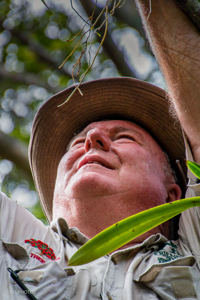
Randolph, as a former orchid grower I've always envied those of you who live in a climate where tropical orchids can be grown out of doors. Your long focal length gave a nice blur to the background, allowing your subject to stand out. Your crop makes the viewer hone in on the man's facial expression showing exertion and concentration on his task . The detail is nice too (do I imagine some sweat on his brow?) and I think your edits of your subject are good. I did, however, find the bright background areas somewhat distracting. I brought your image into Lightroom and used a gradient and a brush to bring down the exposure of the background and also to bring in some detail under the brim of his hat. Let me know what you think. As an image to document the dedication and work it takes to make these beautiful plants available for everyone to enjoy, your image succeeds very well . |
Mar 4th |
 |
| 3 |
Mar 21 |
Reply |
Thanks for the info on foam cores. I will check it out - we have a Michael's near by. |
Mar 2nd |
| 3 |
Mar 21 |
Comment |
LuAnn,
another home run! Very creative and I really like the simplicity. You hit the lighting spot-on and the Topaz filter is just the right amount of texture. Can't see anything I would change. I'm seeing that you use foam core boards... is this something one can purchase at a pro-level camera store, or art supply store? |
Mar 2nd |
9 comments - 12 replies for Group 3
|
| 48 |
Mar 21 |
Comment |
Lloyd, a lovely image! Beautiful composition / placement in the frame. Nice bokeh and the flower pops against the slightly desaturated background. Well done!! |
Mar 4th |
1 comment - 0 replies for Group 48
|
| 50 |
Mar 21 |
Reply |
Thanks. I appreciate your comments. |
Mar 30th |
| 50 |
Mar 21 |
Reply |
Thanks. I appreciate your comments. |
Mar 30th |
| 50 |
Mar 21 |
Comment |
|
Mar 29th |
 |
| 50 |
Mar 21 |
Comment |
Here are two alternative edits. The 1x1 crop focus on the center of the image. The other image crops in slightly from the left after raising the brightness of the darker areas before applying a -20 vignette. |
Mar 29th |
 |
| 50 |
Mar 21 |
Reply |
Thanks for your encouragement. Regarding the crop for the right side... instead of cropping, do you think opening up the shadows on the left side would work? There is already a slight vignette on the image as is. |
Mar 29th |
| 50 |
Mar 21 |
Reply |
Hi Karl. At this time I have yet to enter any PSA competitions. Quite honestly, I'm rather overwhelmed by the PSA website and find it difficult to make sense of it and find what I'm looking for. ...probably my bad, because I simply haven't taken the time to explore and familiarize myself with it. I would, however, like to start entering competitions. |
Mar 17th |
| 50 |
Mar 21 |
Comment |
Cindy, thank you for your comments. One of my camera club's mentors suggested a tighter crop on the left side to eliminate some of the shadowed areas. Thoughts?
|
Mar 15th |
| 50 |
Mar 21 |
Comment |
Cindy, I really like the image and you've handled the lighting really well. What was the lighting source? Your choice of a black background really makes the ball of twine stand out. And the contrast within the ball is also well-balanced. My only comment - more of a wondering really - is why the focus seems soft when I magnify the image only slightly. Your use of a tripod and a small aperture should have rendered the the detail tack-sharp. |
Mar 5th |
| 50 |
Mar 21 |
Comment |
Hi Jeffrey. Good decision on flipping the image so the eye is drawn up from the bottom left instead of down from the top right and your crop is spot on. Your image exhibits a broad tonal range and is very sharp from foreground to background in spite of the f/5.6 aperture. The textures and spiral add a lot of interest. Nicely done image! |
Mar 4th |
| 50 |
Mar 21 |
Comment |
Or, just for kicks, an abstraction done in Topaz Studio 2: |
Mar 4th |
 |
| 50 |
Mar 21 |
Comment |
Or, this: |
Mar 4th |
 |
| 50 |
Mar 21 |
Comment |
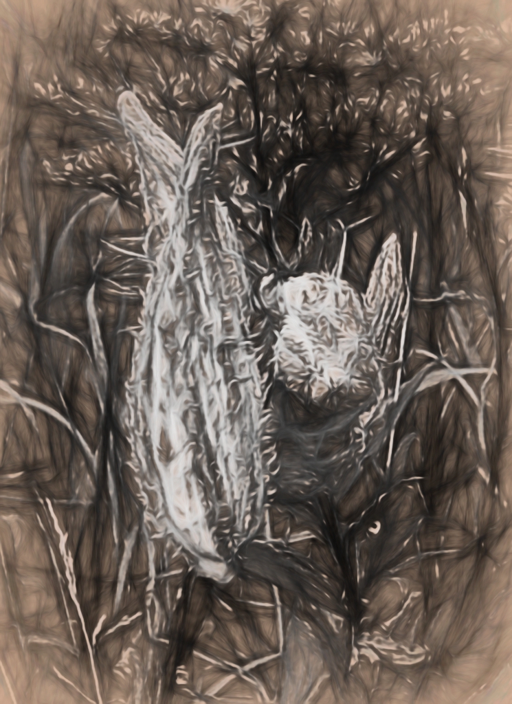
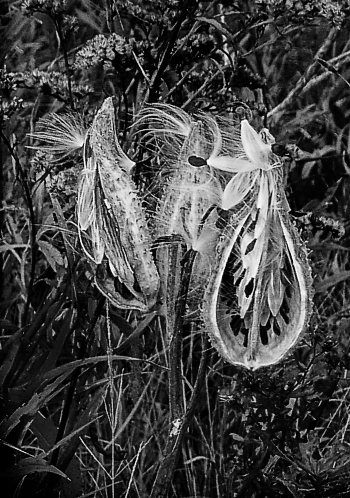
Karl, to be honest, your image doesn't work for me. I think the pods have a lot of interest, but the background is chaotic and your subject gets lost in that chaos. Also, the pod on the left and the pods on the right could easily be two separate subjects. I cropped your image and brought it into Silver Efex for your consideration.
|
Mar 4th |
 |
| 50 |
Mar 21 |
Comment |
Hi Paul,
I think the B&W works just fine! "Better" is certainly a personal preference. Curious what editing software you used. I'm just learning Silver Efex Pro 2, so I played around with your image - specifically with multiple control points. Your tonality more closely matches that of the color image. I chose to lighten the petals slightly so they would stand out more from the background (which I also darkened). I added control points to the anthers to increase their brightness and structure to create a different interpretation. |
Mar 4th |
 |
| 50 |
Mar 21 |
Comment |
Cindy, I really like the image and you've handled the lighting really well. What was the lighting source? Your choice of a black background really makes the ball of twine stand out. And the contrast within the ball is also well-balanced. My only comment - more of a wondering really - is why the focus seems soft when I magnify the image only slightly. Your use of a tripod and a small aperture should have rendered the the detail tack-sharp. |
Mar 3rd |
11 comments - 4 replies for Group 50
|
| 62 |
Mar 21 |
Reply |
Thanks. At some point I'm going to have to re-invest in some flash equipment. When I switched from Nikon to Sony, I sold both of my Macro speed lights so I am currently flash-less in Seattle! |
Mar 2nd |
| 62 |
Mar 21 |
Comment |
Emil,
Awesome image and edit -- especially the clouds! Was that a sky replacement or were you able to pull that out of the original RAW data? Impressive! |
Mar 2nd |
| 62 |
Mar 21 |
Comment |
LuAnn,
You are really mastering your lighting! How you got from "A" to "B" is amazing and a complete mystery to me. I wouldn't have a clue as to how to go about editing the original to get to your end result. Well done. |
Mar 2nd |
2 comments - 1 reply for Group 62
|
23 comments - 17 replies Total
|


