|
| Group |
Round |
C/R |
Comment |
Date |
Image |
| 1 |
Feb 21 |
Comment |
Sol, pretty amazing for a through-the-window, from-the-recliner shot! I'm still working on capturing sharp images of birds in flight and you've nailed it. I particularly like the white-on-white of the bird against the background. Well done. |
Feb 5th |
| 1 |
Feb 21 |
Comment |
WOW, Dennis! What a stunning image! ...and made even more meaningful knowing the story behind it. I love how the sunrise plays against the colors of the teepees. Nice job! |
Feb 5th |
2 comments - 0 replies for Group 1
|
| 2 |
Feb 21 |
Comment |
Hung, the Palouse is such a beautiful area that presents so many photographic opportunities. The rich greens and browns make your image pop. Only comment is perhaps a gradient filter applied to the sky to bring out some more detail and lower the brightness. Or, as Jim suggested, use Dehaze or crop out the sky. It's a beautiful landscape with nice composition. |
Feb 5th |
1 comment - 0 replies for Group 2
|
| 3 |
Feb 21 |
Reply |
Thank you for your comments! |
Feb 15th |
| 3 |
Feb 21 |
Comment |
Thanks for your comments, Bob. |
Feb 6th |
| 3 |
Feb 21 |
Comment |
Wow! What an exotic bird! How can that little branch support the weight of that big bird? I like how you've captured the light on the feathers and the beak, but I want to see more of the subject. I would suggest a tighter crop to bring the attention onto the bird and away from the foliage. |
Feb 6th |
| 3 |
Feb 21 |
Comment |
Mary Ann, my local camera club is sponsoring a free 1 hour webinar on B & W on Feb. 20th. Here's the link to register, if you're interested: https://www.eventbrite.com/e/from-oz-to-kansas-capturing-creating-the-ultimate-digital-black-white-tickets-136959671063 |
Feb 6th |
| 3 |
Feb 21 |
Reply |
(Weird...when did the edit, I completely cropped out the bench but when I uploaded it, the top rail of the bench magically reappear at the bottom of my crop...and now it's magically disappeared! I have no explanation) |
Feb 5th |
| 3 |
Feb 21 |
Reply |
Mary Ann, do you have a preference for one edit over the others? |
Feb 4th |
| 3 |
Feb 21 |
Comment |
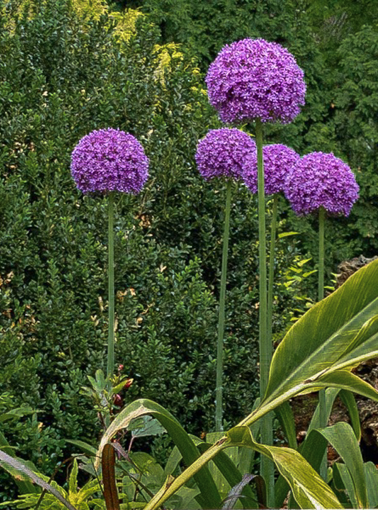
Hi Lisa
Allium, also known as Ornamental Onion, come in all different sizes and can be found in most nurseries in the Spring. You captured the color beautifully and I like how the horizontals of the bench are juxtaposed with the verticals of the stems. Overall, however, I'm not sure the composition works for me. In spite of the f/2.4 aperture the phone's camera didn't blur the background sufficiently to highlight the flowers. You might try using the "portrait mode" on the iPhone to artificially blur the background and put focus back on the flower(s). For me, the bench and flowers compete for my attention and the position of the flowers at the very top, to my eye, makes the image look cut off. I think focusing more on the flowers would have been a better choice. I took the liberty of brining your image into Lightroom and made the following adjustments: Vertical crop; highlights -100; exposure +25; Shadows +15; sharpness +20. I lowered the color saturation of the greens and yellows by -22 to help take attention from the background as well as lowering the green luminosity by -75 and yellow by -8. To call more attention to the flowers, I increased the purple saturation by +35 and lastly did a diagonal radial filter to the lower right of the image and took the exposure down by 0.5 stops to call attention away from the diagonal Cana leaf. What do you think? (Lisa, I'm not sure why, but when uploading my edit, the bench magically reappeared, even though on my end I cropped it out....but maybe it actually works better?) |
Feb 4th |
 |
| 3 |
Feb 21 |
Comment |
Hi Mary Ann. Yes, good on you for experimenting with monochrome! I've just begun that journey myself and I joined another group - #50 - that's dedicated to B &W (after my dismal failure with my December image, LOL). I agree with what LuAnn said all the way around and your second panoramic version does, indeed work better. The only other thing you might consider is cloning out the wooden and chainlink fences in the lower left corner. Otherwise, a beautiful pastoral image. With regard to editing for monochrome, Silver Efex Pro is considered one of the best. |
Feb 3rd |
| 3 |
Feb 21 |
Comment |
Hi Kieu-Hanh. Your image makes me long for Spring. The color of the roses is beautiful and the arbor creates a frame that draws the eye into the garden. The sky seems a little blown-out --perhaps a gradient filter would bring down the highlights and bring out more detail? Also, I find myself wishing that you had taken the shot straight-on, rather than from an angle. Doing so would also have aligned the bricks in the foreground with the horizontal. For me, the skewed angle of the bricks is a bit of a distraction. |
Feb 3rd |
| 3 |
Feb 21 |
Comment |
Ruth, the area around Sedona is so beautiful and presents with so many photo opportunities. You've captured a beautiful scene. I agree with Sharon that the person in the lower third does add a sense of scale and helps the viewer appreciate the grandeur of this place. You handled the edit on the sky and the reflection very well. At first when I looked at your image, I thought it might have been processed with an HDR filter, but I see from your original, the beautiful bright green leaves were exactly as captured. My only suggestion would be to correct the "horizon" line at the far end of the creek - it is slanting ever so slightly down to the right. |
Feb 3rd |
| 3 |
Feb 21 |
Comment |
LuAnn, I love your still-life! The background effect was a perfect color and texture choice to compliment the reds and browns of the pears and cutting board. I like that you didn't reach for a different pear when you discovered it had an internal blemish - I like how photography can show there can be beauty in decay. The detail of leaving the drop of pear juice on the cutting board was also a nice touch. The lighting with the flash worked well and it would be interesting to compare the same composition done with light painting. I've seen several examples of still-lives from other Digital Group members done with that technique to nice effect. I'm eager to try the technique myself. |
Feb 3rd |
8 comments - 3 replies for Group 3
|
| 5 |
Feb 21 |
Comment |
Freddie, I find myself more and more attracted to abstract photography. I love your image! I would love to know more of what you did in post-processing to get from your original to your final....or was it as simple as you described? |
Feb 5th |
1 comment - 0 replies for Group 5
|
| 17 |
Feb 21 |
Comment |
What a nice combination of setting and light for this image. Had you not said so, I would've guessed the image was a composite. ...and I LOVE your shooting technique! The image works particularly well in monochrome (and a nice job on processing). Can you show us the original? |
Feb 5th |
1 comment - 0 replies for Group 17
|
| 22 |
Feb 21 |
Comment |
Mike, I am drawn to unique windows and doors and they are a frequent subject for my photography. You've captured this one beautifully! I love the combination of complimentary colors and textures. I will often bring my window / door photos into Topaz Studio 2 to apply various artistic filters. Sometimes I'll make two or three versions of the same image just for fun. |
Feb 5th |
1 comment - 0 replies for Group 22
|
| 25 |
Feb 21 |
Comment |
Nice flower portrait. It's one of my favorite genres! The black background is perfect to bring out the deep, rich red of the blossoms. Nice triangular composition and nice lighting - was it natural light...or? |
Feb 5th |
1 comment - 0 replies for Group 25
|
| 30 |
Feb 21 |
Comment |
Robert, I really love this image and your monochrome treatment works exceptionally well for the subject. The detail, contrast, lighting are all perfect. I find I am often drawn toward taking images of things in decline or decay. I think there is beauty to be found there. Well done! |
Feb 5th |
1 comment - 0 replies for Group 30
|
| 39 |
Feb 21 |
Comment |
WOW is right! Very inspiring. I would never have thought to frame it in white, but doing so really sets off the image. I would love to see your original and know a little more about your editing process. Love it! |
Feb 5th |
1 comment - 0 replies for Group 39
|
| 50 |
Feb 21 |
Reply |
Thanks, Karl and to everyone for their comments. Much appreciated. |
Feb 20th |
| 50 |
Feb 21 |
Reply |
Yes, I see what you mean. ...the devil is in the details! |
Feb 15th |
| 50 |
Feb 21 |
Reply |
Thanks, Cindy. I appreciate your comments. |
Feb 15th |
| 50 |
Feb 21 |
Reply |
Thanks for your comments, Jeffrey. YES! I like the slight sepia / warming rendition over my edit. And, yes, I was definitely going for "gritty", as I thought it better highlighted the age and state of decay of the piece of machinery. |
Feb 14th |
| 50 |
Feb 21 |
Reply |
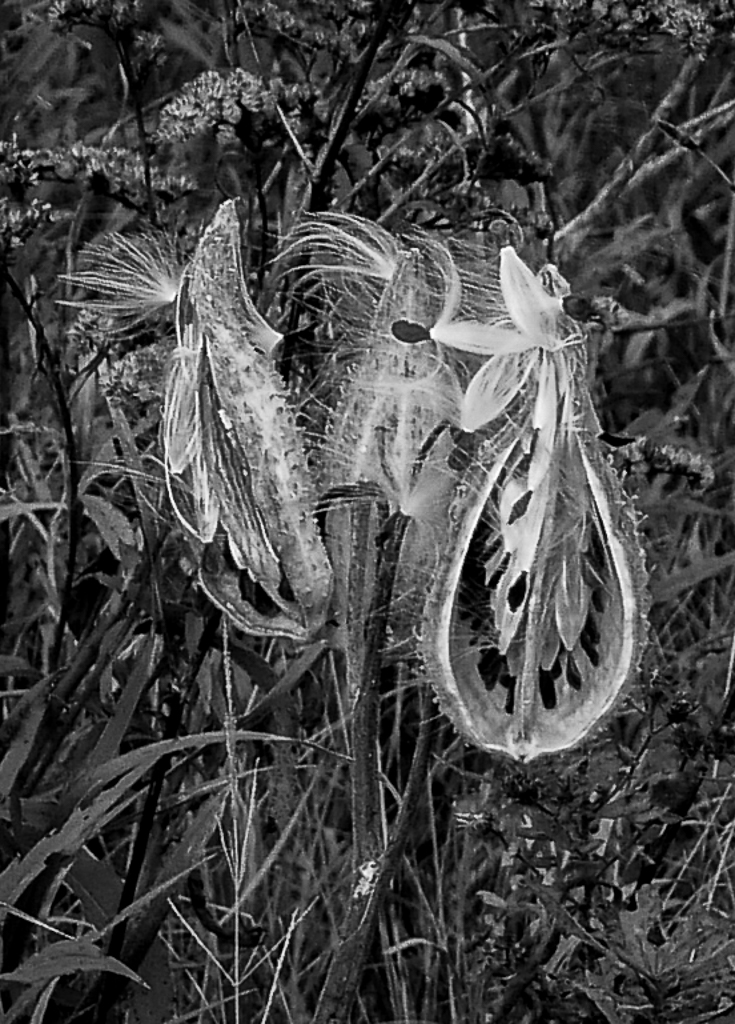
Karl....what happened? The image I originally commented on has been replaced by a different one! ...so here are my comments for the NEW image:
Seed pods make such interesting subjects to photograph. I really like your crop and how sharp the pods are and how blurry the background is. Because the subject and the background have a similar (and rather limited) range of lights and darks, I find the pods do not stand out from the background as much as I would like. I'm not Photoshop expert, but I'm wondering if there is a way to lighten the background to allow the subject to stand out more? Or, I wonder what a reverse vignette (light instead of dark) should look like? Just some thoughts. |
Feb 10th |
| 50 |
Feb 21 |
Reply |
Lorna, I don't understand what's going on...but the image I commented on has been replaced by a completely different one! Same with Karl's. So, please ignore my original and find my comments on the new image below:
Both images are beautiful but I definitely prefer the monochrome version. VERY dramatic. I also love your composition with the leading lines of the road and the wheat(?) converging in the distance. Remarkable is the sharp focus from front to back. You have really captured the beauty of the prairie in this lovely B & W image. |
Feb 10th |
| 50 |
Feb 21 |
Comment |
Hi Cindy. What an intriguing image! So many shapes, textures and range from pure black to pure white. I love how the various components create their own unique reflections. Well done!
|
Feb 10th |
| 50 |
Feb 21 |
Reply |
Lance, THANK YOU for your comments! Your points are well taken and much appreciated. I was going for a gritty, high structure look to accentuate the age and decay of the piece of equipment. You bring up a dilemma I constantly have in my photography: whether to hone in on the subject and let the viewer create their own context....or whether to include more context. Your composition does, indeed, work well and gives the viewer more of a sense of the extent of deterioration around the gears.
I'm new to PSA and newish to monochrome and am eager to improve. I notice you are a mentor. How do I go about getting some mentoring through PSA outside of the digital dialog commentary? |
Feb 10th |
| 50 |
Feb 21 |
Comment |
Hey Chuck. I like the grittiness of your image. Very industrial. Lots of detail and excellent focus from foreground all the way to the mountains. In this case, the sharp background adds interest and context. Could you show us the original? |
Feb 6th |
| 50 |
Feb 21 |
Comment |
Hi Karl. Milkweed has such interesting seed pods and I find myself wanting to see more detail of the pods and less of the busy background. It's too bad this was shot as a jpeg, as you would've had more latitude at adjusting the lights and darks to make the pods stand out more. The image looks a little soft, but I can't tell if it was a focus issue or just because it is a low-res jpeg. I took it into Lightroom, cropped it and brought up the highlights and brought down the shadows / blacks. Lastly, I added a slight vignette. What do you think? |
Feb 6th |
 |
| 50 |
Feb 21 |
Comment |
Jeffrey, this is a lovely image. I particularly like how you've framed the tree and left the foreground dark. It draws the eye to the tree and dramatic sky. Nicely done. ...seems I'm going to have to plan a trip to the Smoky Mountains, as I've seen so many beautiful images from that area - it makes me want to go. |
Feb 6th |
| 50 |
Feb 21 |
Comment |
Lorna, I love your handling of the B & W conversion. In this case, for me the color is distracting but in monochrome, one can concentrate on the beautiful details and different gray tones. The blur of the background is perfect -- I'm amazed you were able to achieve that with the 24mm focal length at f/11. Good job! You have also shown how, even in decay / decline, one can find beauty. Nicely done portrait. |
Feb 6th |
| 50 |
Feb 21 |
Comment |
Paul, nice image that is perfect for monochrome. The original color image is "meh"...but with your B & W edits it really pops. Great contrast and the perfect shutter speed to give that beautiful motion blur to the falls. |
Feb 6th |
6 comments - 7 replies for Group 50
|
23 comments - 10 replies Total
|


