|
| Group |
Round |
C/R |
Comment |
Date |
Image |
| 3 |
Jan 21 |
Reply |
Yes, the closer crop does bring emphasis to the features of the truck. I like my original AND your crop. Each composition tells a slightly different story. |
Jan 17th |
| 3 |
Jan 21 |
Comment |
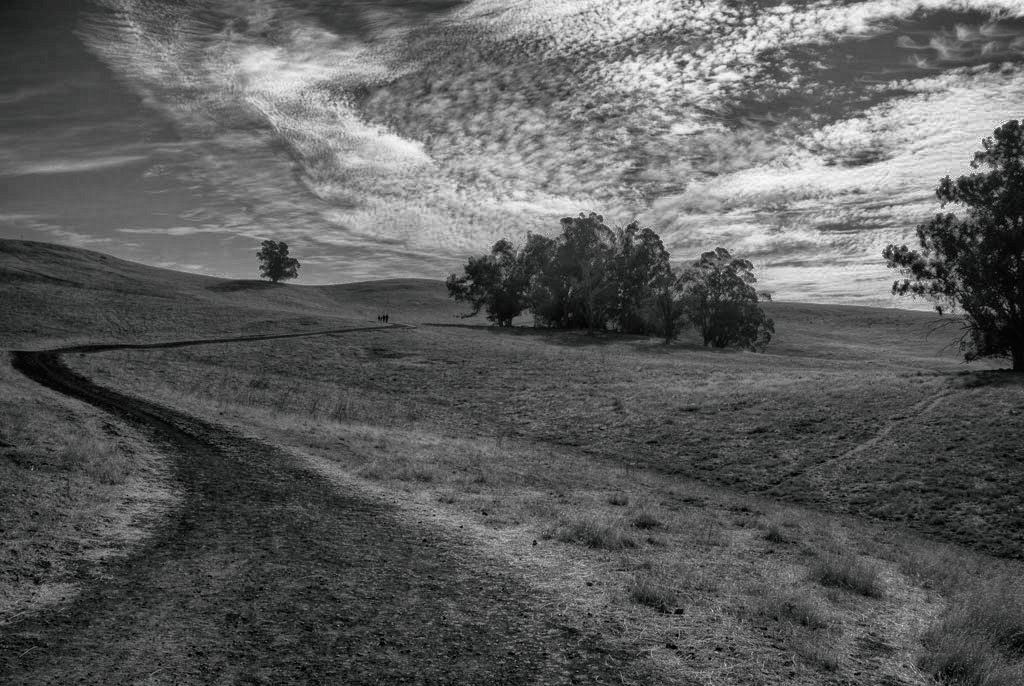
Hi Mary Ann. How special it must be to see the land owned by your g, g, grandparents preserved! What a sense of family history. It is a beautiful image of the countryside. A couple of comments: I like the leading line of the dirt path but it takes my eye to the space between the lone tree on the left and the grove on the right, so I'm torn between focusing on the grove or the tree. I'm finding the lone tree more interesting than the grove....but the clouds over the grove are spectacular. It would be interesting if, on your next excursion, you would walk up to the bend in the road where the other people are and capture the lone tree and insert the clouds in post processing. Due to the fact there is not a lot of color variation in the scene, for me the B&W version does work better. I brought your color image into one of my HDR apps and rendered that in B&W. Do you like the effect? |
Jan 17th |
 |
| 3 |
Jan 21 |
Reply |
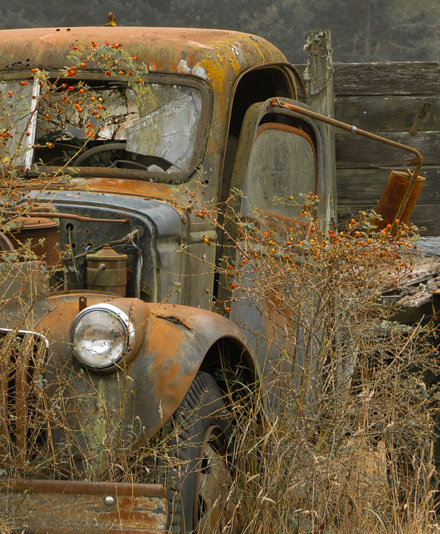
The "artificial" background (an artistic filter applied to give the image a painterly look and somewhat abstract background) was intentional as was the decision to include the entire truck in the frame, grass and all. I wanted to show the truck -in context- just as it sat abandoned in the field. I, too, wished that I could have gotten closer to capture some of the interesting features of the truck that you mention....but climbing through barbed wire and trespassing to do so kind of dampened my enthusiasm! Perhaps a tighter crop to zoom in to some of those features would produce an interesting and entirely different image. I did a quick tight crop. What do you think? |
Jan 14th |
 |
| 3 |
Jan 21 |
Reply |
Yes, I think that does work better! |
Jan 6th |
| 3 |
Jan 21 |
Comment |
LuAnn, I like your additional edits. I did my LR edits before bringing it into Topaz Studio and it didn't even occur to me to do additional editing after Topaz. Great idea I will use in the future! The color in the background is a byproduct of the filtering I did in Topaz. On the day I captured the image, WA State was engulfed in some of the worst wildfire smoke we have ever had and I had to spend a lot of time on my original edits. Here is the original, unedited image. |
Jan 6th |
 |
| 3 |
Jan 21 |
Comment |
Lisa, knowing the back story always enhances my appreciation of an image! As photographers, I think we all have had similar experiences of either slamming on the brakes and backing up (as with my image this month) or making the U-turn and doubling back to capture an image. I love the composition. I also love the stark contrast between the basically monochrome fore-and background and the bold, bright colors of the signs. Curious what edits/enhancements you made to your image in post-production. Some images lend themselves to standing back and taking in the whole...while others - like yours - lend themselves to inspect every detail. I brought your image to full screen and found myself looking at every single sign and when I was done, I moved my attention to the trees and it's then I noticed the birds in the tree in the upper left. Nicely done! |
Jan 5th |
| 3 |
Jan 21 |
Comment |
Kieu-Hanh, you've captured the stillness and tranquility of a late Autumn morning quite nicely. Excellent use of leading lines and the fog only serves to enhance the feeling of depth and mystery. Overall a beautiful image. My only suggestion would be to have eliminated the dotted white line on the pavement at the far left of the image - I find it to be a minor distraction. |
Jan 5th |
| 3 |
Jan 21 |
Comment |
Ruth, what a beautiful abstract that screams The Holidays! I love the colors and how the "zooming" draws the eye to the Christmas tree. Your Photoshop crop and edit that places the tree in the upper right third works to further enhances the composition. I'm not sure, however, the moon works for me. I think it detracts from the overall effect. You have the main element abstracted and the secondary element (the moon) not abstracted and they seem to compete for attention. In a composition such as this, I don't find negative (black) space off-putting. |
Jan 5th |
| 3 |
Jan 21 |
Comment |
Randolph, I had to chuckle at your comment of the "cold" temperature. 54 degrees is T-shirt and shorts weather in Seattle! Germans would call your image "gemütlich". It doesn't quite translate into English but has the sense of a warm, cozy, comfortable, inviting, friendly feeling - and you've captured it well. I particularly like the reflection of the tree lights on the wall and the starburst effect from the candles. A classic Christmas scene. |
Jan 5th |
| 3 |
Jan 21 |
Comment |
LuAnn, I LOVE your image! I have an affinity for old, abandoned things and abandoned trucks / cars are a favorite subject of mine. ...and, quite by coincidence, my image for this month is also an old truck! Your composition is nice with the truck being on the diagonal. My eye lands first on the rusty fender and hood and then is drawn into the image all the way to the old gas pump (which might be a nice subject unto itself). I particularly like how you developed the image with a nice balance between light and shadows and it was appropriate to decrease the exposure on the gas pump to avoid conflict with the main subject, yet keeping it part of the composition. What I can't tell from comparing your final image with the "before" one is whether you used a subtle art filter. (Maybe it's a sign of an accomplished editor that you keep your audience guessing!). In any event, WELL DONE! |
Jan 5th |
7 comments - 3 replies for Group 3
|
| 50 |
Jan 21 |
Comment |
Hi Chuck. Nice to virtually meet you! Nice to capture this bit of history! I really like the composition with the horizontals / diagonals of the tracks and the buildings juxtaposed with the "God Rays" in the enhanced sky. The image shows a nice tonal range and is very nicely done. |
Jan 19th |
| 50 |
Jan 21 |
Comment |
Hi Cindy. Nice to virtually meet you! I am still in the process of figuring out what my photographic genre is but for certain I find I am drawn to still life photography. I really like your image - the composition, lighting and post-processing all are beautifully done. My only comment is that I find the juncture between the felt board and the mirror(?) at the left of the image to be a slight distraction. Perhaps some additional post-processing would blur the juncture to render it less sharp? |
Jan 19th |
| 50 |
Jan 21 |
Comment |
Hi Karl, nice to virtually meet you! Ah....the challenges of trying to take pictures with a dog in tow! The monochrome image definitely works better than the color for all the reasons mentioned by the others. I agree with Lorna that upping the contrast would add impact to the image. Otherwise, a beautiful scene. |
Jan 19th |
| 50 |
Jan 21 |
Comment |
Hi Jeffrey. Nice to virtually meet you! Kudos to you for capturing the elusive Snowy Owl. It is truly a beautiful image. I like both the color and monochrome images and, as is common for me, I have a hard time deciding which I like better. If I might to comment on the color version, I would suggest desaturating the green background so it doesn't compete with the owl. But, of course, in the monochrome image that conundrum goes away and how better to portray a black and white creature than in black and white! Well done! |
Jan 19th |
| 50 |
Jan 21 |
Comment |
Hi Lorna. Nice to virtually meet you! I really like your image and I thank you for showing that even in decay, there can be beauty! Other than the crop suggestions offered by the other members, I can find no fault with your image. Well done! |
Jan 19th |
| 50 |
Jan 21 |
Comment |
Paul, I think your original thought process vis a vis the framing of the boat was a good one - I often do that...but I do agree with the others that the trees have no detail and are distracting. I like your cropped version better and I would go even tighter. I do notice that the original image does not have a wide tonal range which gives some challenges with regard to the monochrome processing. |
Jan 19th |
7 comments - 0 replies for Group 50
|
| 76 |
Jan 21 |
Reply |
Many thanks for the link. I will definitely check it out! |
Jan 19th |
| 76 |
Jan 21 |
Comment |
Heidi, what a stunning image! You've managed to make it look like natural sunlight. I have been doing still life images at home during quarantine on my dining room table and using natural light from the skylight. You have inspired me to try the technique you described. |
Jan 18th |
1 comment - 1 reply for Group 76
|
15 comments - 4 replies Total
|


