|
| Group |
Round |
C/R |
Comment |
Date |
Image |
| 86 |
Jun 23 |
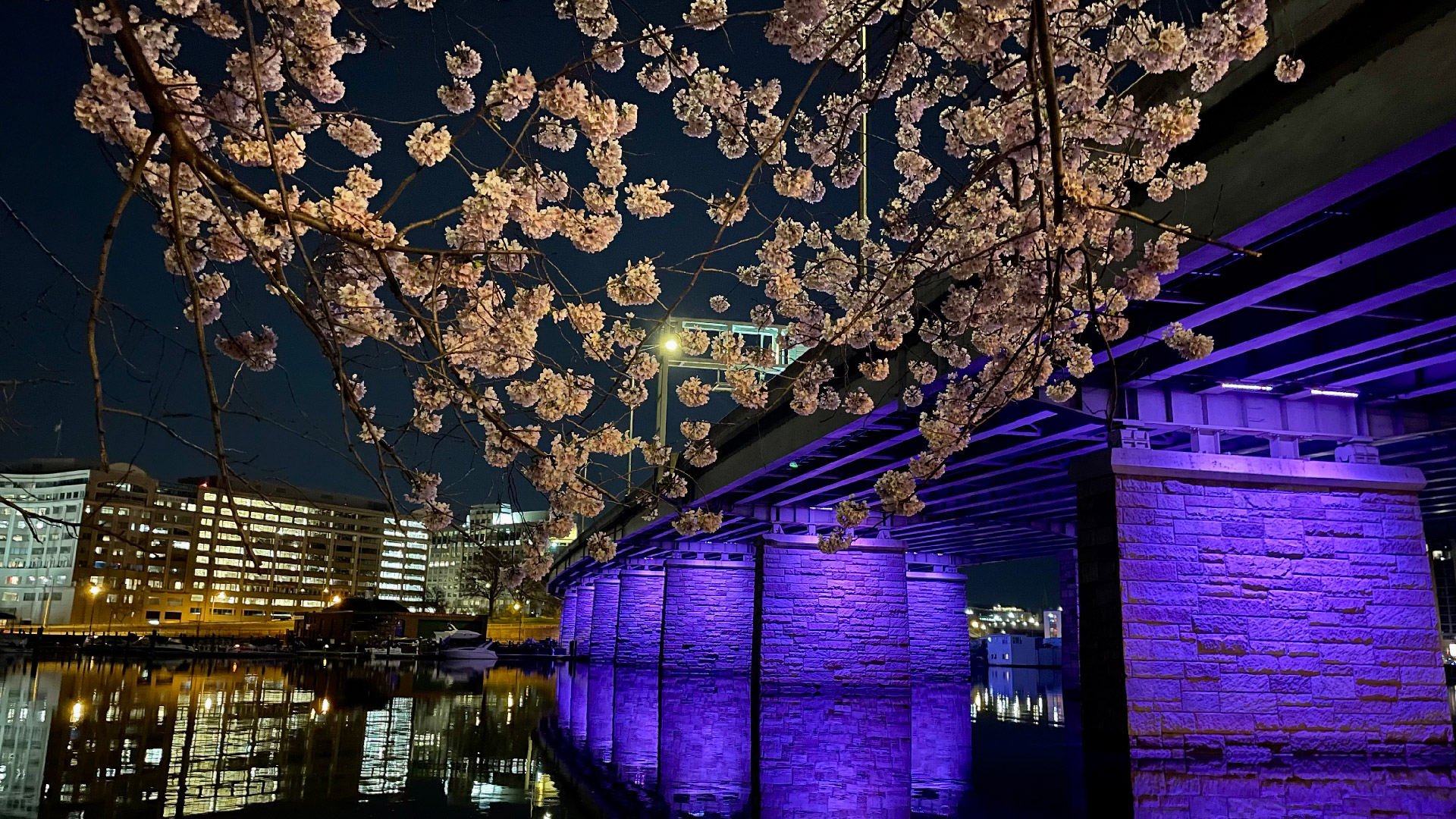
Comment |
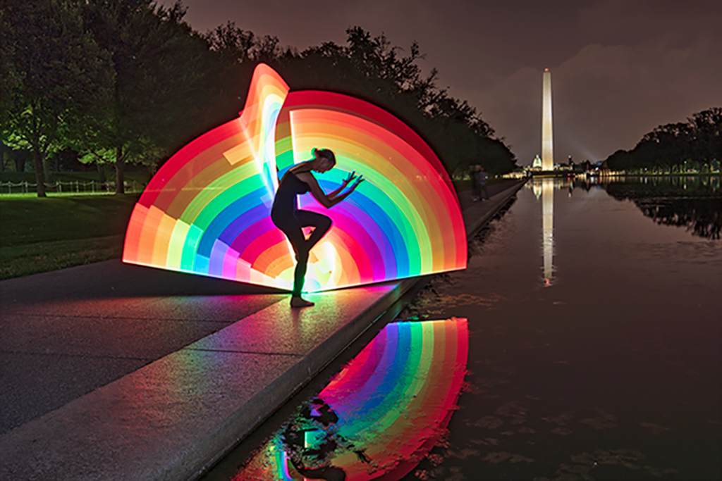
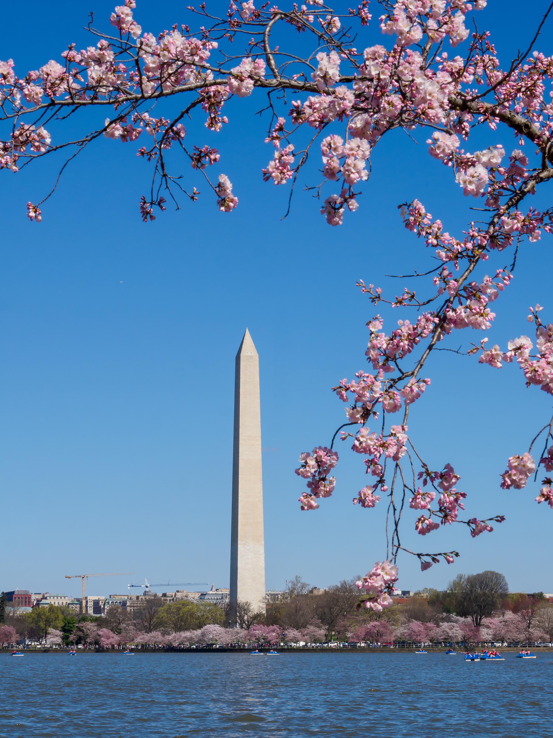
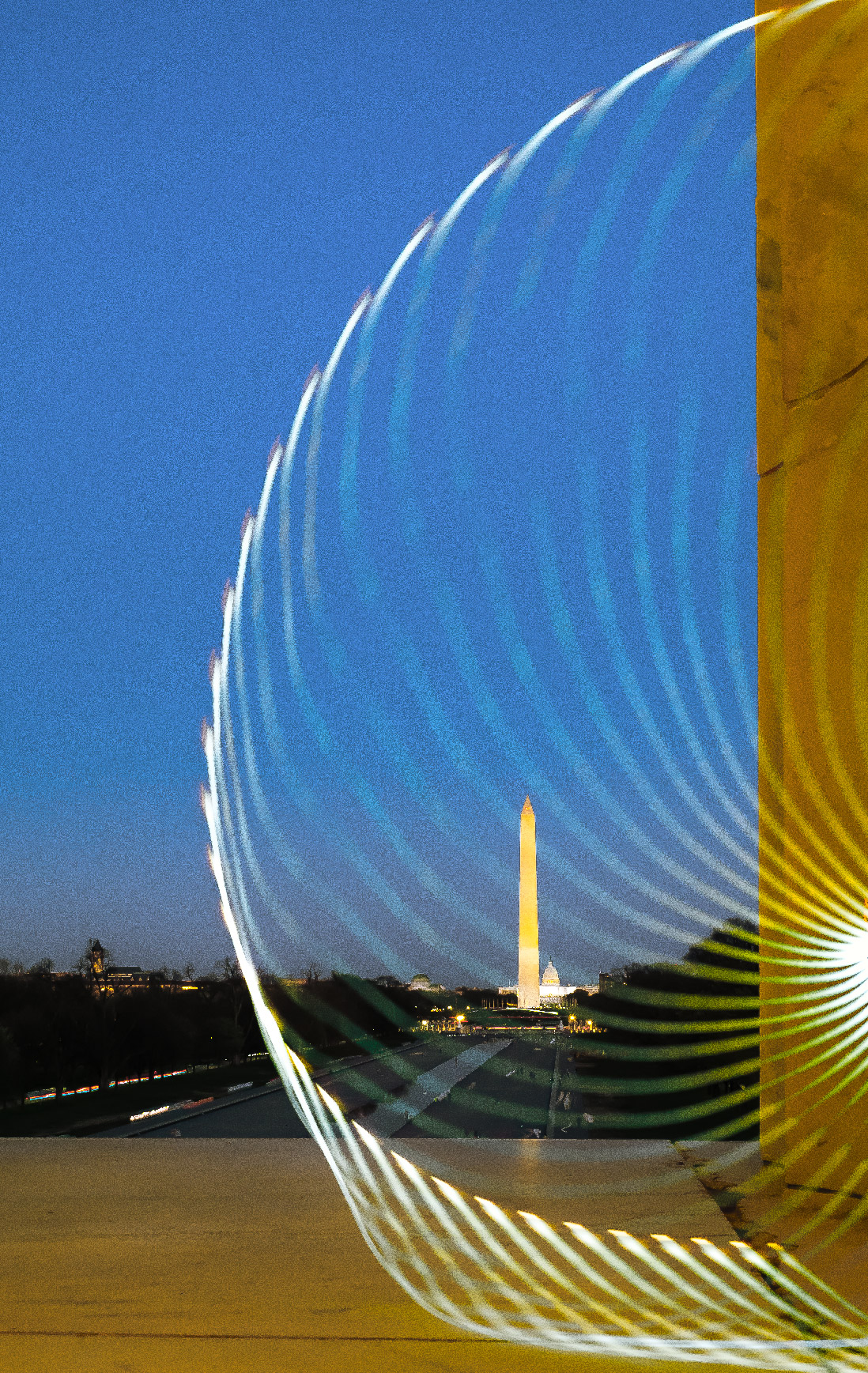
Hello Kieu Hanh, thank you for sharing this photo. In the image, you cleverly chose the background, including Capitol Hill, and also selected the darker area behind to highlight the water reflections. Your post-processing work is well-done, and everything stands out nicely. In my opinion, the size of the photo is somewhat limited horizontally because the left and right sides are not fully visible. Thank you. |
Jun 30th |
| 86 |
Jun 23 |
Comment |
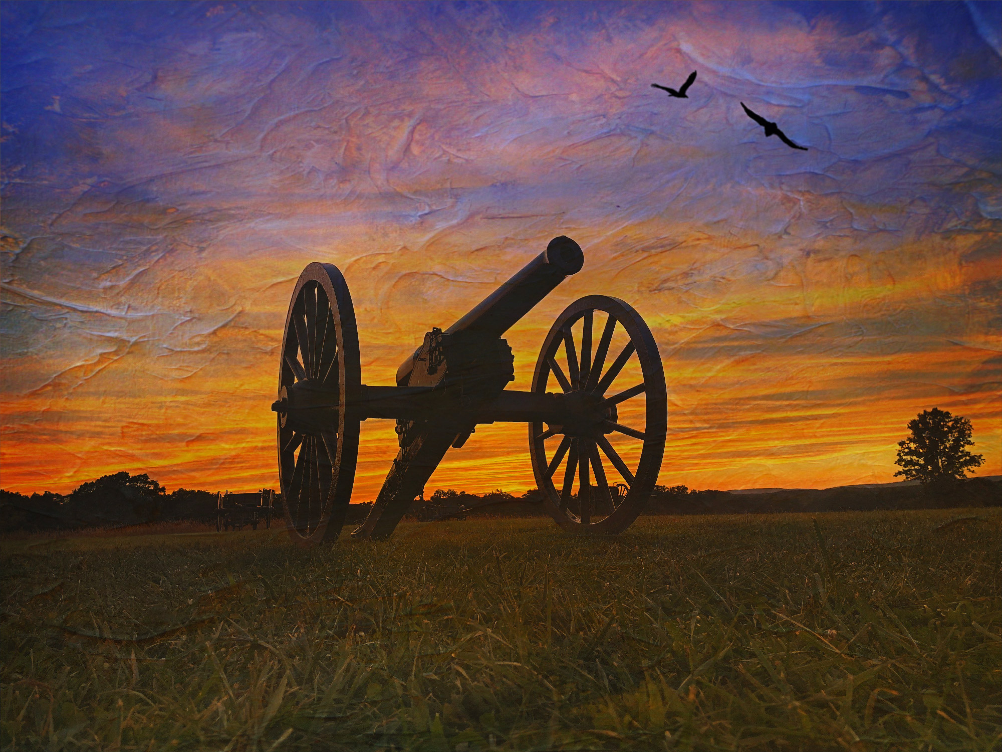
Hi Pat, it's nice to see the old car in your image. I hope it's still in working condition. You have chosen a good composition and the lighting is well-balanced. However, I feel that you may have increased the shadows a bit too much, which has caused the loss of details and the appearance of harsh shadows (gray or purple tones) on car and ground around the car . In my opinion, the original photo could be brighter and more vibrant. Thanks for sharing. |
Jun 30th |
| 86 |
Jun 23 |
Comment |
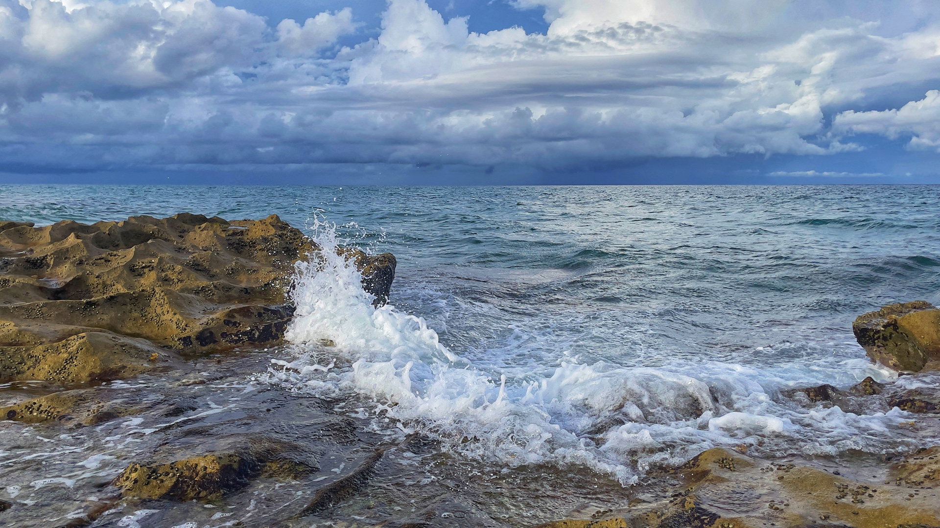
Hi Jack, your photo showcases a skillful handling of light, as you were able to carefully control the exposure on your phone to capture the brightest area without any overexposure or excessive darkness. The composition of the photo is well-balanced, with a sense of depth and prominent leading lines. I would agree with Steven about little edit for this image. Thank you for sharing it. |
Jun 30th |
| 86 |
Jun 23 |
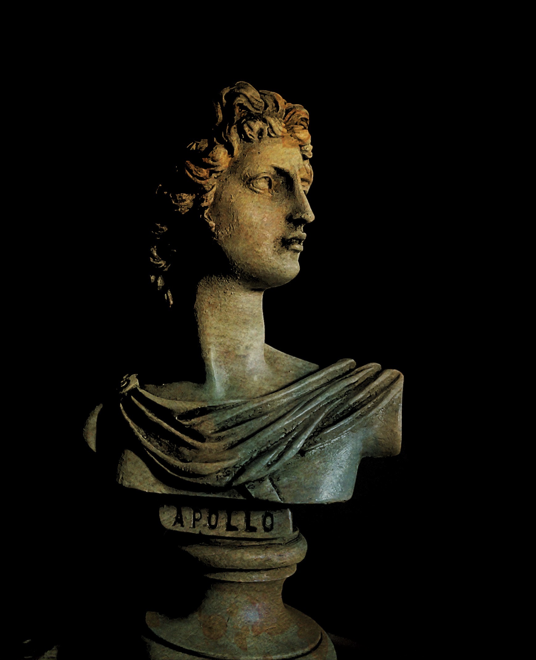
Comment |
Hello Ruth, thank you for sharing the photo. I agree with others that the image is sharp and the colors are well-rendered. I like your choice of texture and pattern for this flower; it beautifully combines the highlights on the petal edges and the shaded areas on the flower stem. Nice image. Thank you. |
Jun 30th |
| 86 |
Jun 23 |
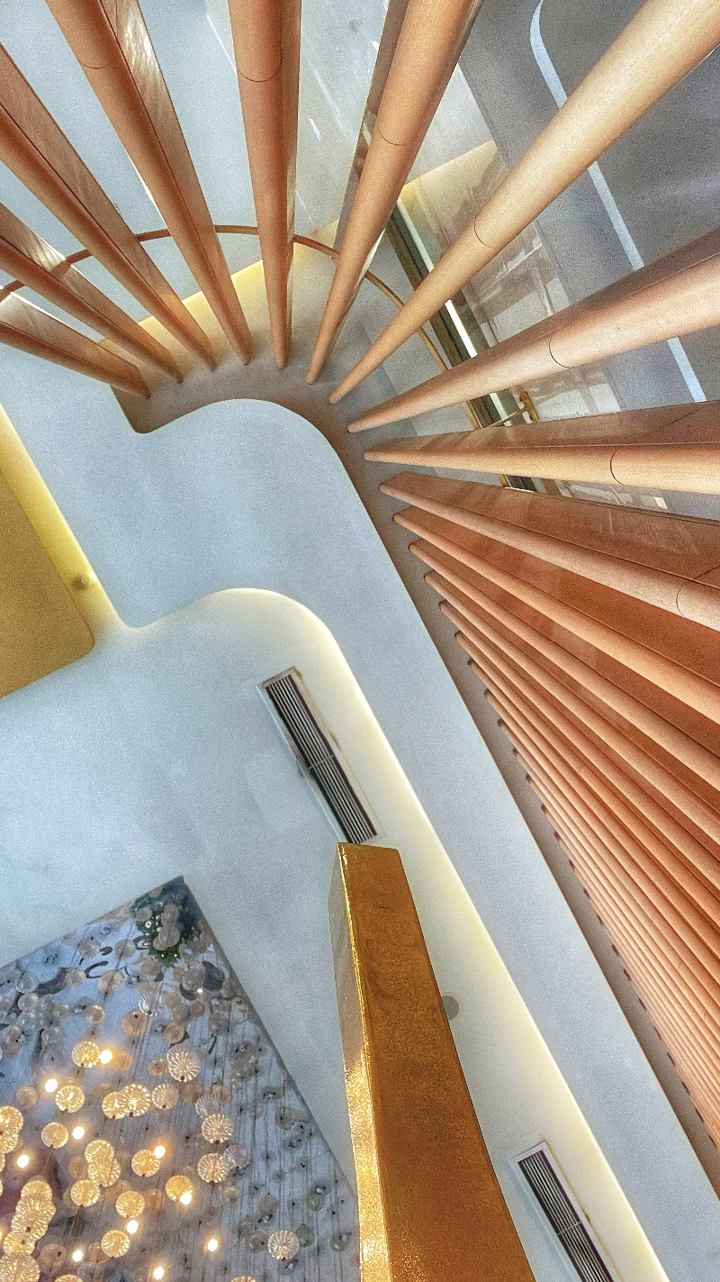
Comment |
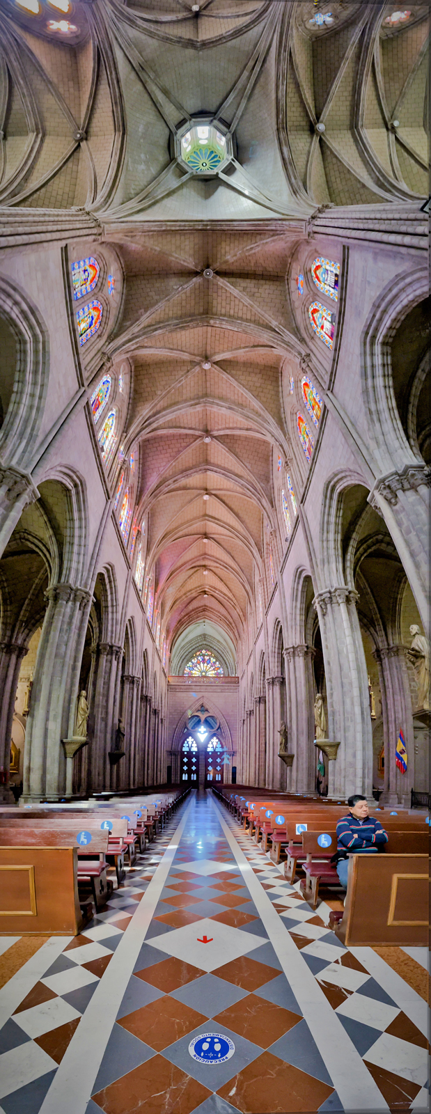
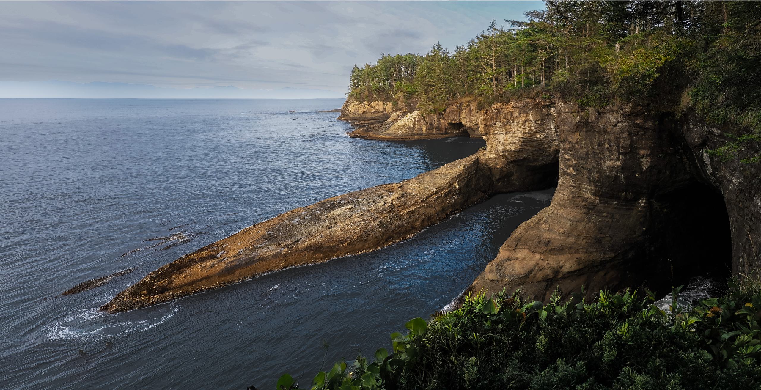
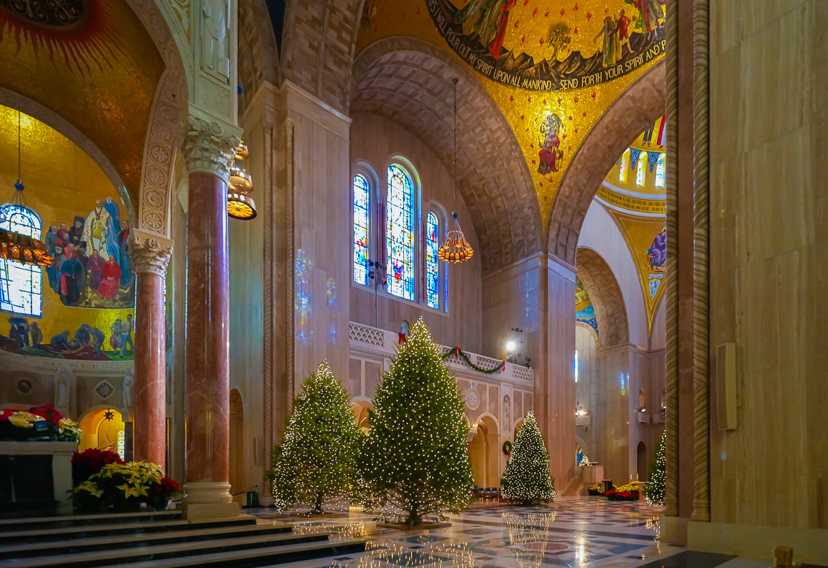
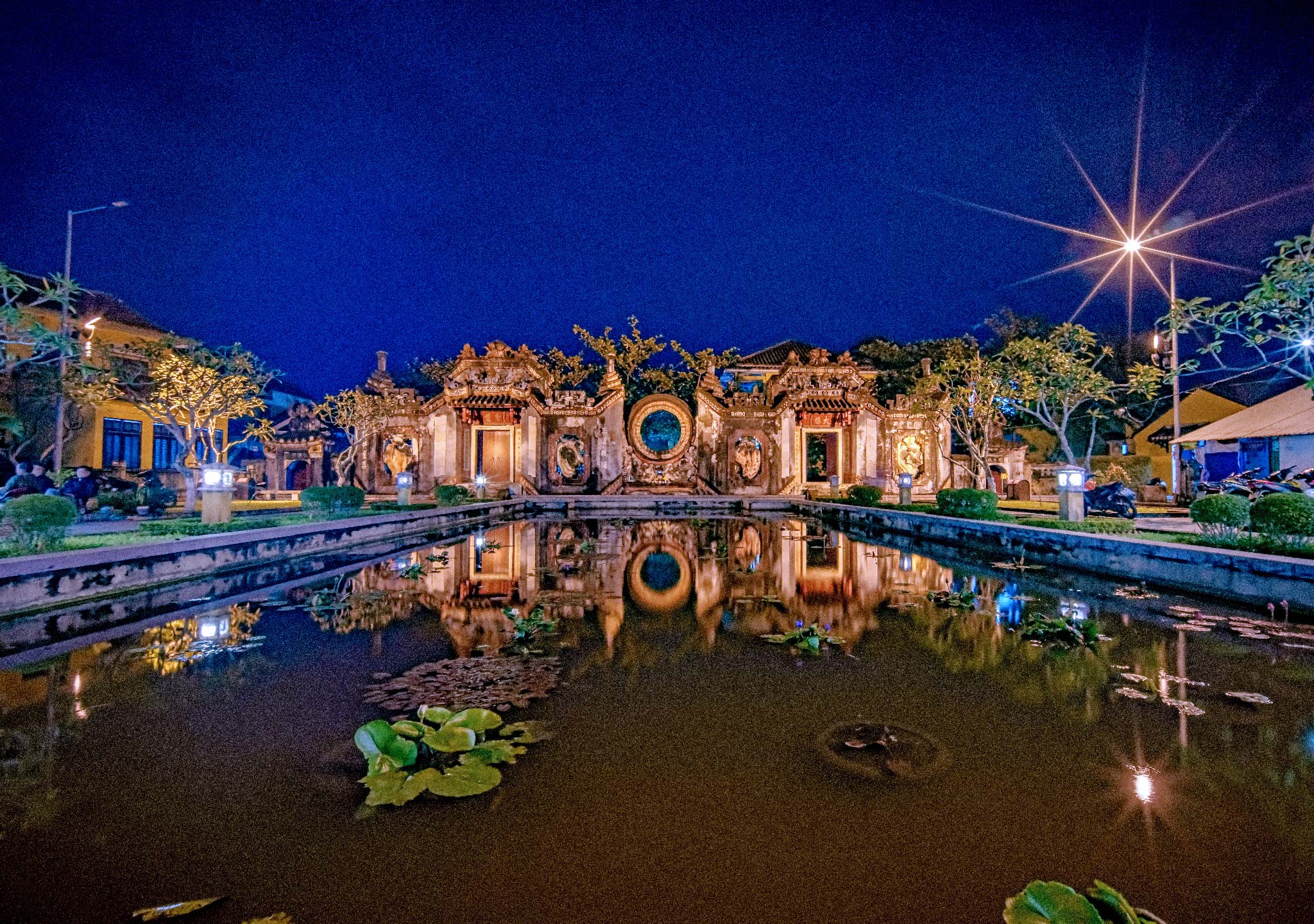
Hi Gene, thank you for sharing. Your photo appears to be perfectly symmetrical, which is a strong point. I didn't pay much attention to the details of the symmetry because this is a real architectural shot, not a drawing. I really like that you chose this layout style, as it allows my eyes to take in the entire picture and start from the bottom and move upward. Well done. Thank you. |
Jun 30th |
| 86 |
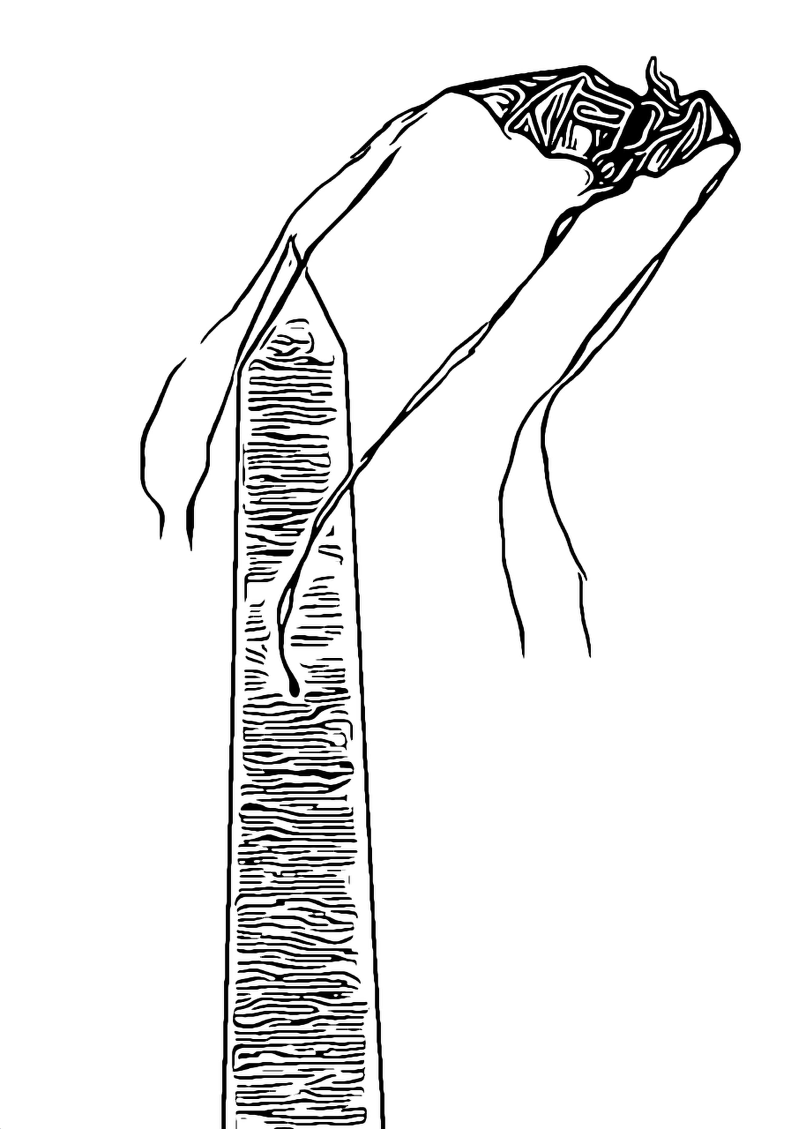
Jun 23 |
Comment |
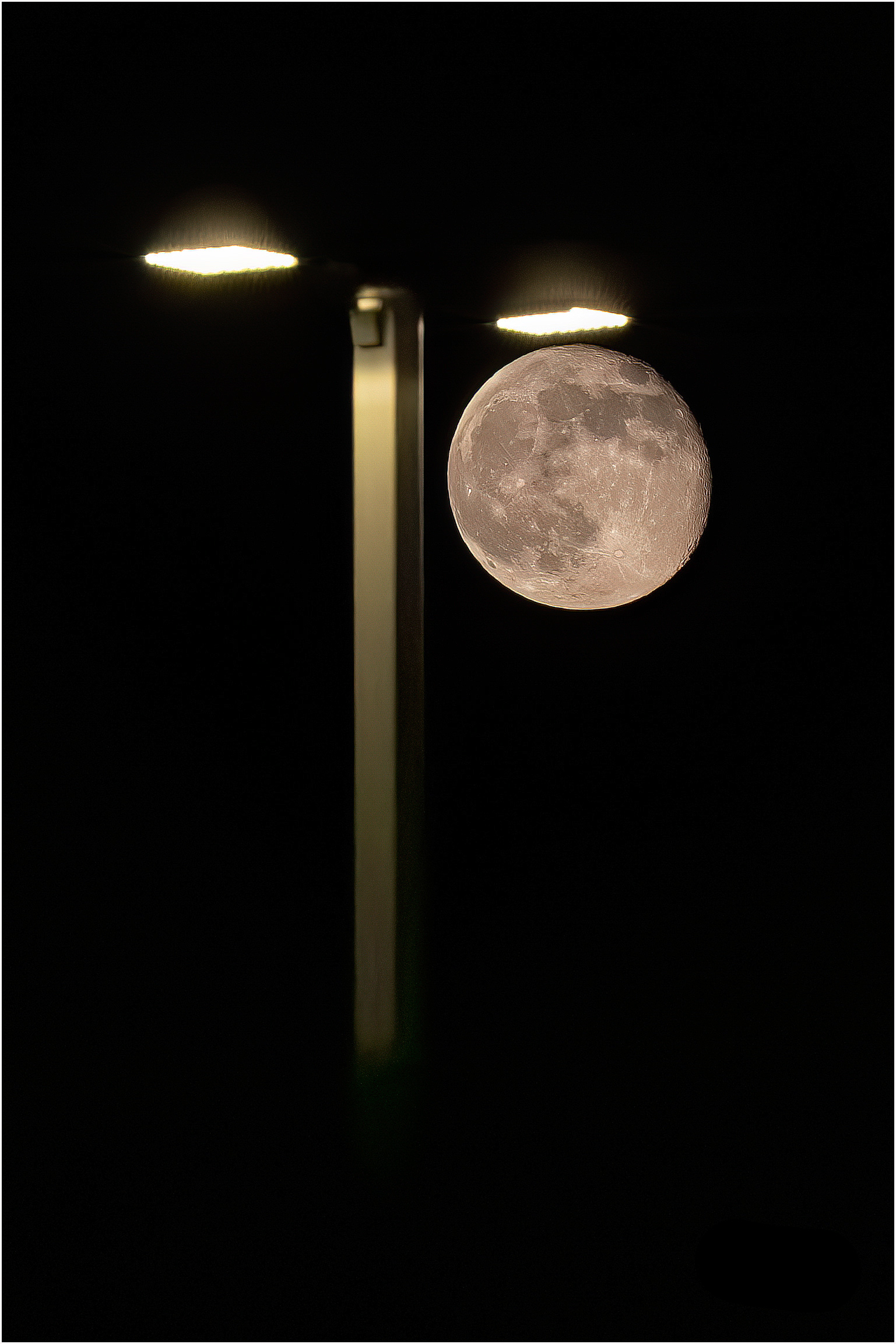
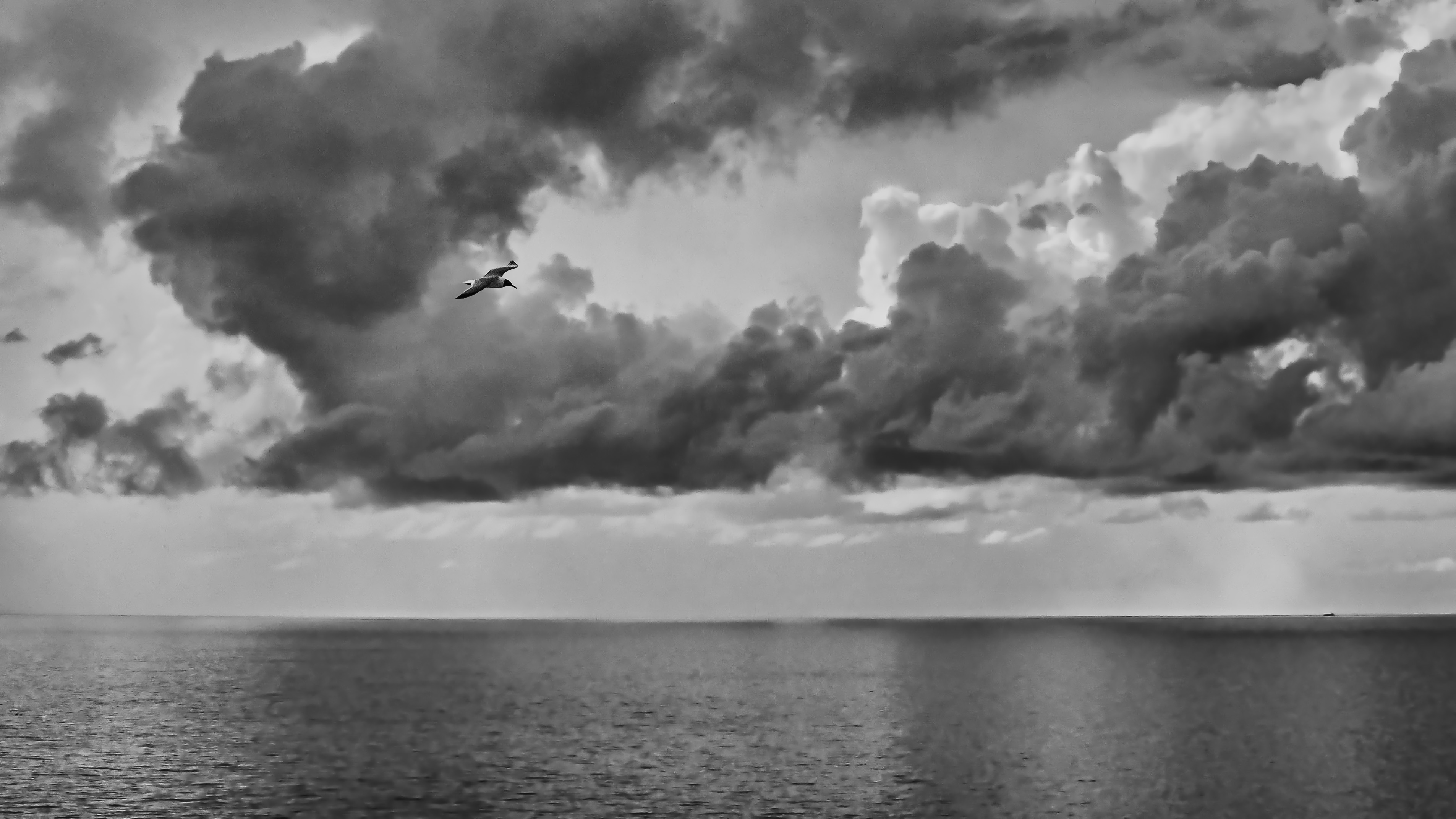
Hi Steven, I really appreciate the creative approach you took with the image. The combination of red, black, and white is blended together beautifully. Even with the image cropped closely, I believe it still maintains its sharpness. Thank you for sharing. |
Jun 30th |
6 comments - 0 replies for Group 86
|
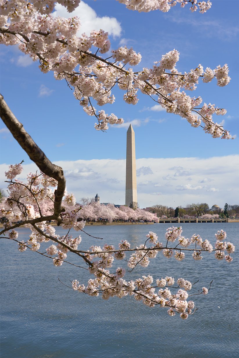
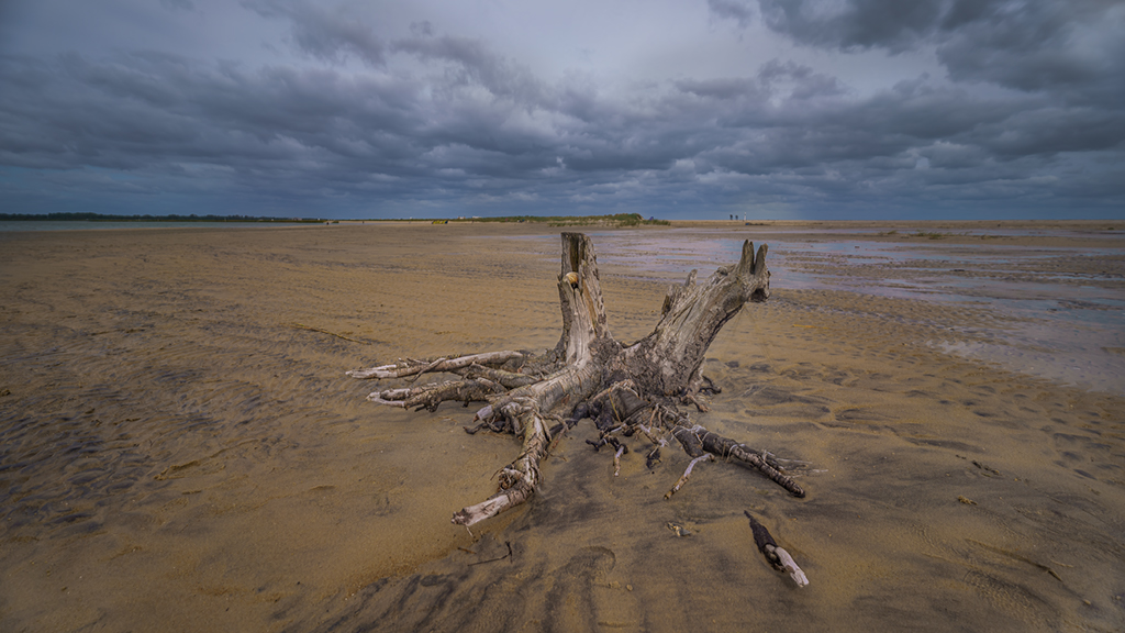
| 88 |
Jun 23 |
Comment |
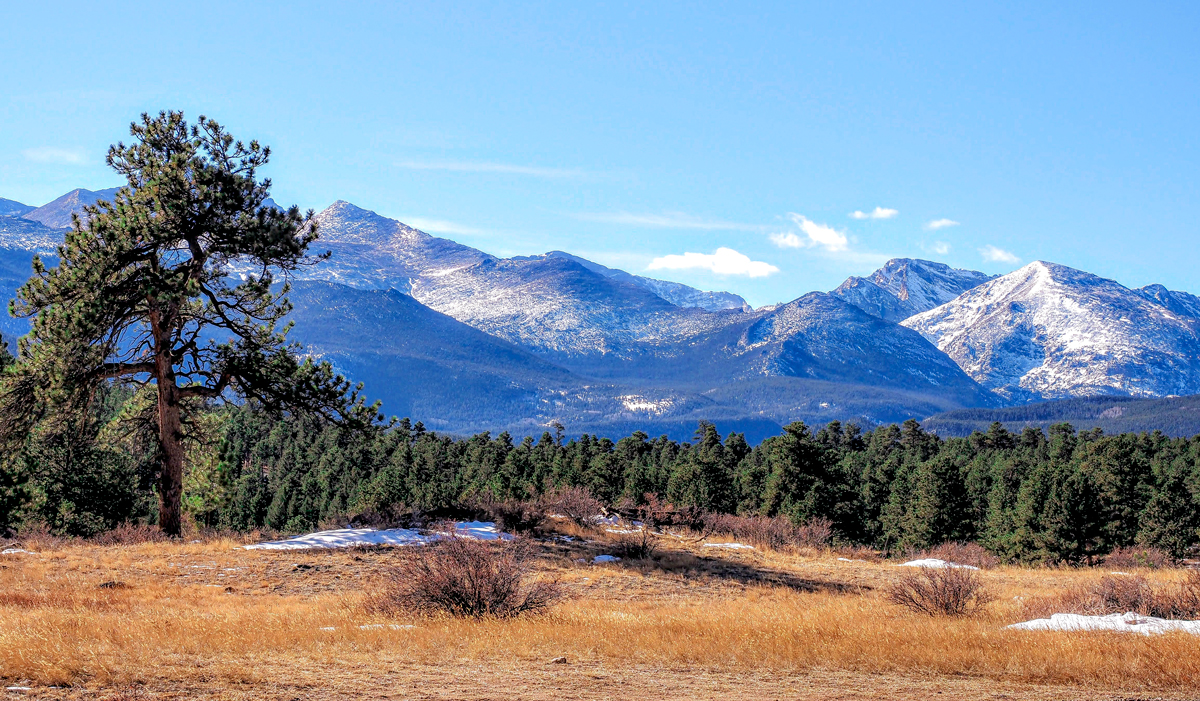
Hello Sanat, thank you for sharing the truly beautiful photo. I am fascinated by your celestial images capturing the landscapes of India, a place I have never had the opportunity to visit. Your photo, in my opinion, stands out prominently with distinct layers, ranging from dark to bright, from foreground to background. These layers lead the viewers to the main subject effectively. The adjustments you made to the shadows and highlights have also enhanced the image. I agree with Charles that the darker portion of the left foreground needs a slight increase in brightness for the shadows. Thank you very much. |
Jun 30th |
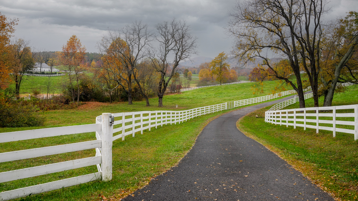
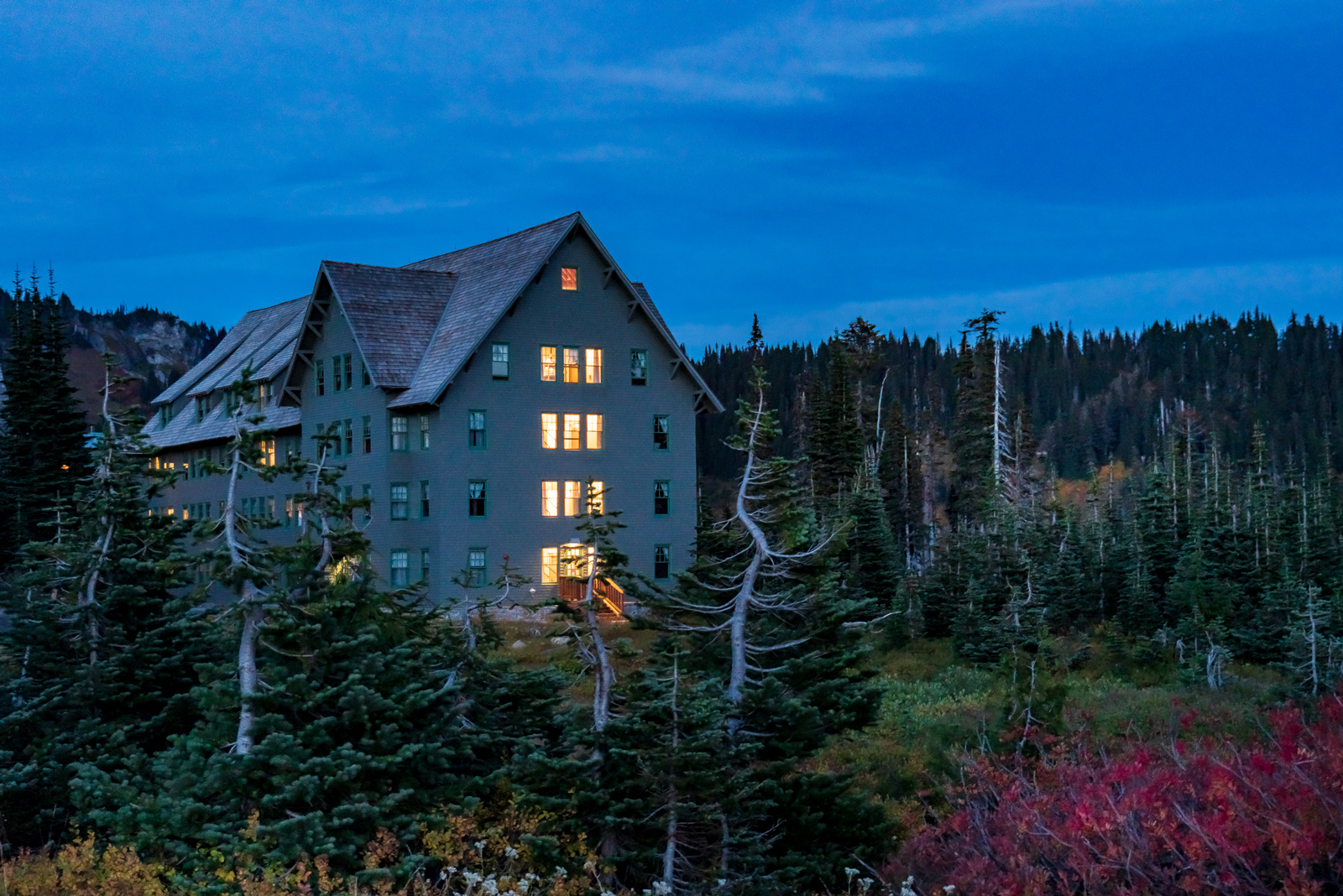
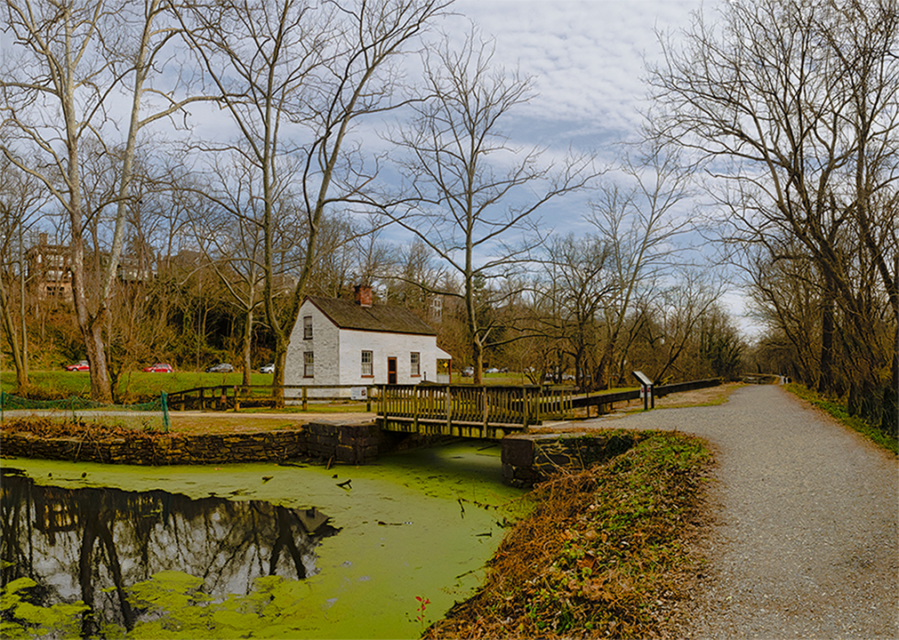
| 88 |
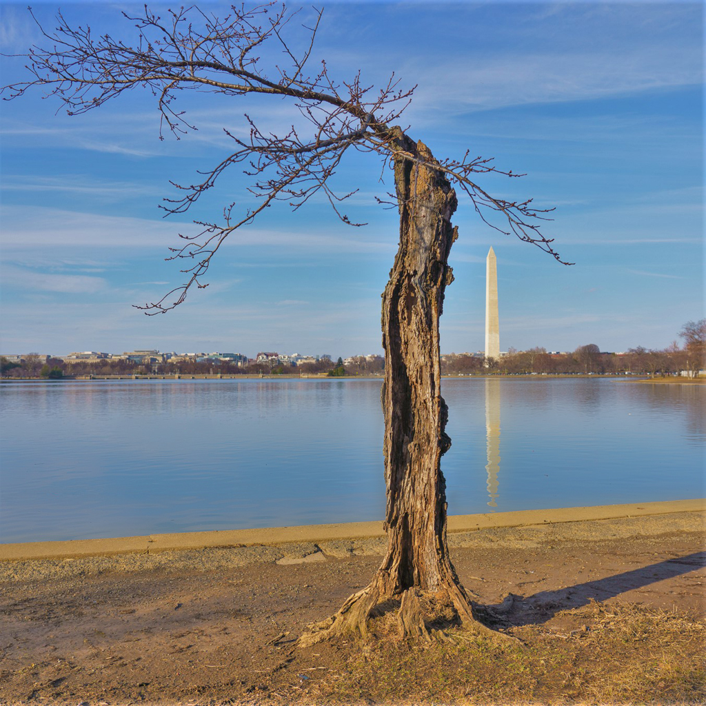
Jun 23 |
Comment |
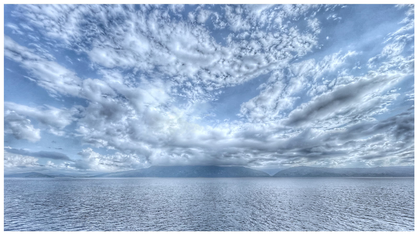
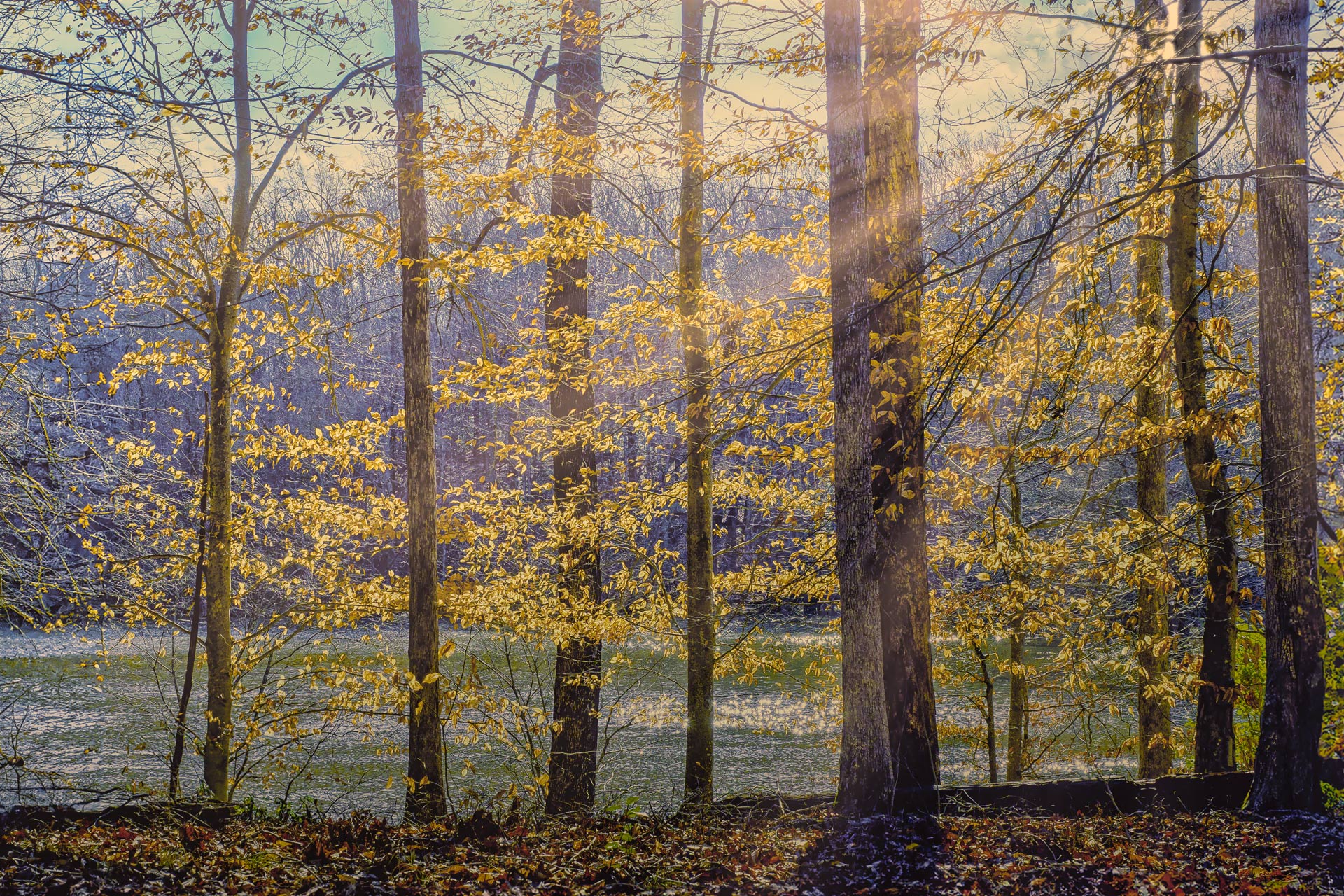
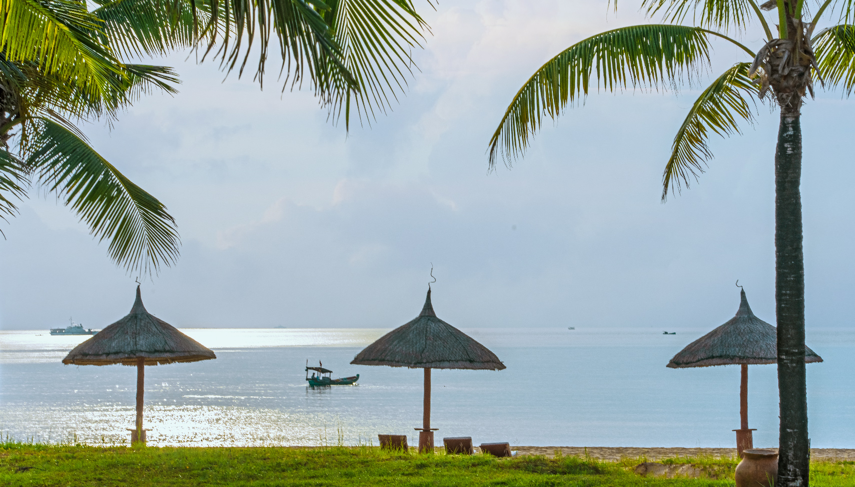
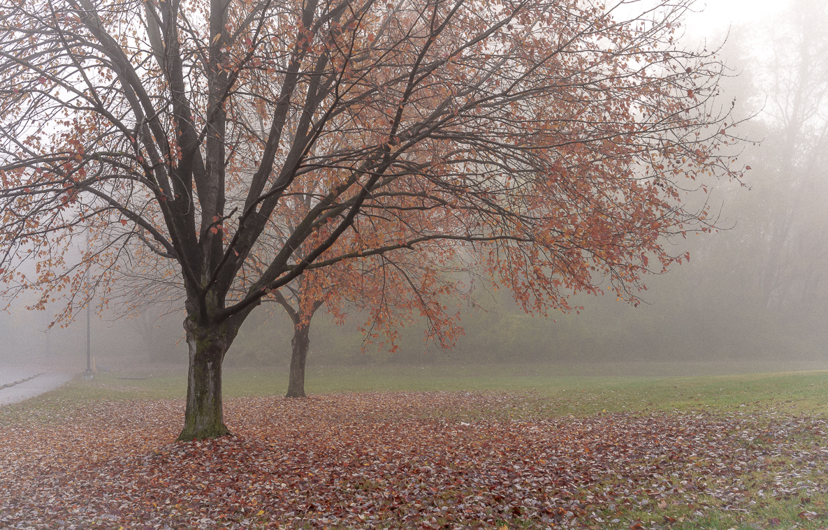
Hi Brian, thank you for sharing the photo, even though you were busy and didn't provide much information about where it was taken and the technical details. The serene and captivating atmosphere of your photo creates a sense of tranquility and stillness for the viewer. It's a beautiful picture with a harmonious composition of different elements. The reflection on the lake surface, the calm sky, and the bare trees contribute to a serene and tranquil ambiance. As a suggestion, I recommend slightly increasing the brightness of the darker portion of the water on the left to make it a bit brighter. Thank you. Well done! |
Jun 30th |
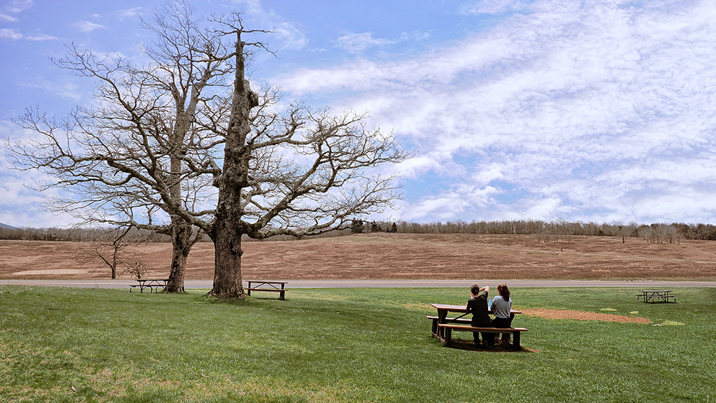
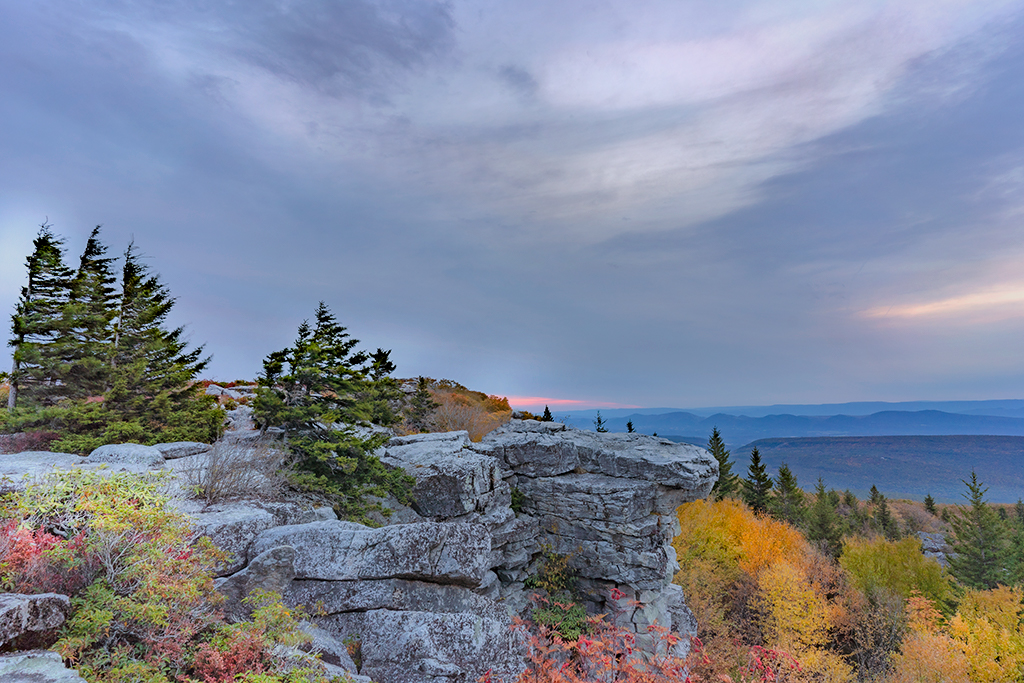
| 88 |
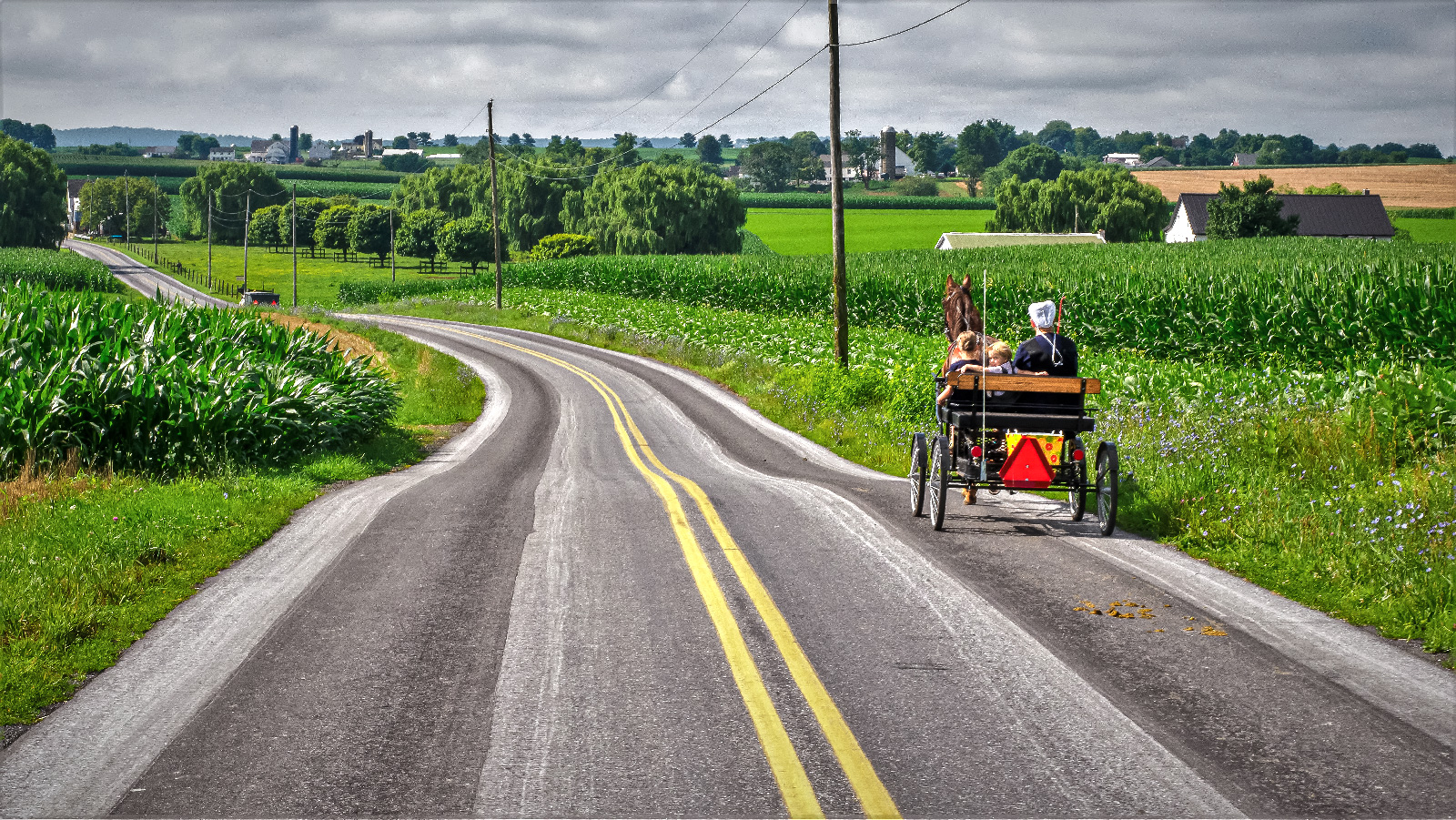
Jun 23 |
Comment |
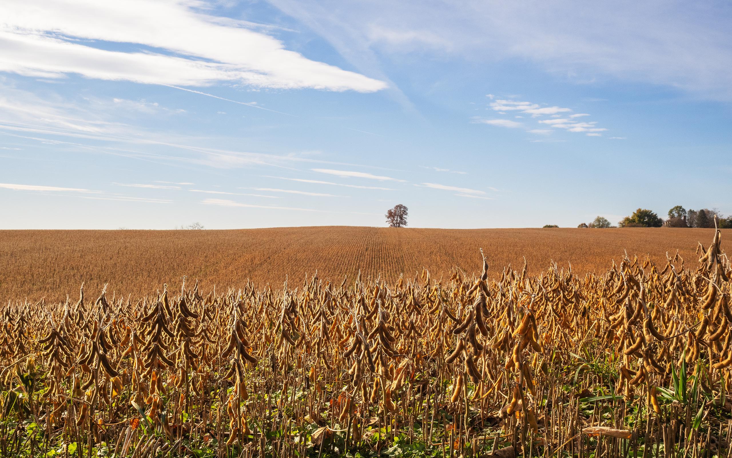
Hi Trey, thank you for sharing. I really like the photos you took of the countryside scenery. In this photo, I noticed that each layer has a distinct color and texture, creating a unique visual appeal. I also noticed that you skillfully cropped the foreground grass to achieve a more balanced composition. However, the cropped portion of the sky at the top narrows down the sky area and cuts off the tree. In terms of colors, in my opinion, the brown hue of the leaves in the original photo seems to stand out more because it can create a tone-on-tone effect with the yellow background. Thank you. |
Jun 30th |
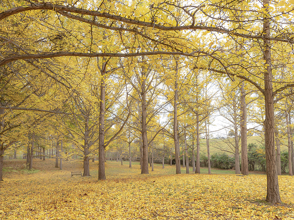
| 88 |
Jun 23 |
Comment |
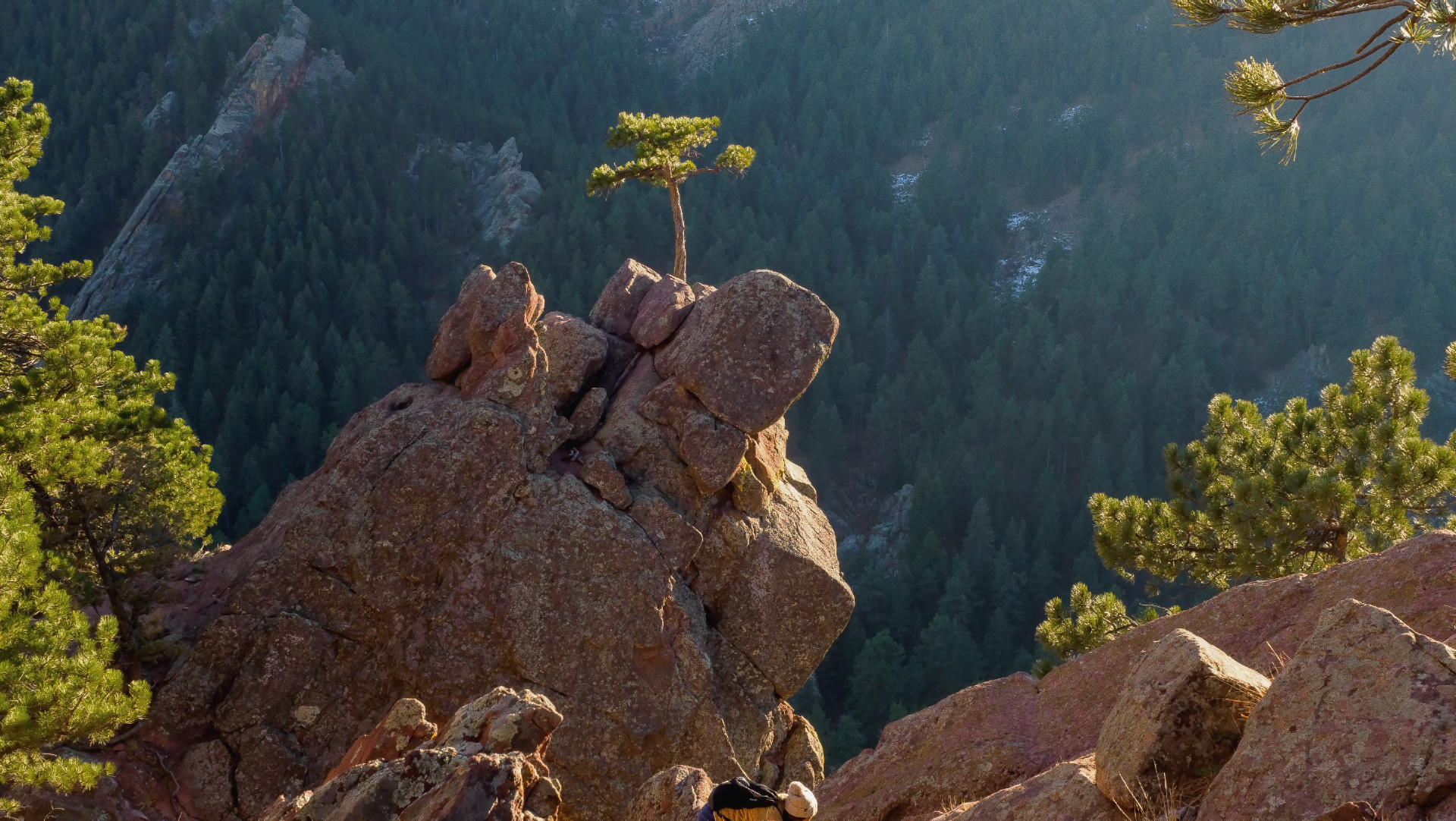
Hello Charles, thank you for sharing the beautiful photo. Looking at the picture makes me want to visit this place to experience the enchanting scene of the magnificent creatures amidst the unique colors of nature that you captured. The photo is truly perfect, as you captured the majestic deer in a well-balanced arrangement. The colorful sky looks stunning, like something out of an animated film. In my opinion, you don't need to crop this picture because the grassy foreground adds a sense of openness to the image. Thank you. |
Jun 30th |
4 comments - 0 replies for Group 88
|
10 comments - 0 replies Total
|