|
| Group |
Round |
C/R |
Comment |
Date |
Image |
| 86 |
Jul 22 |
Reply |
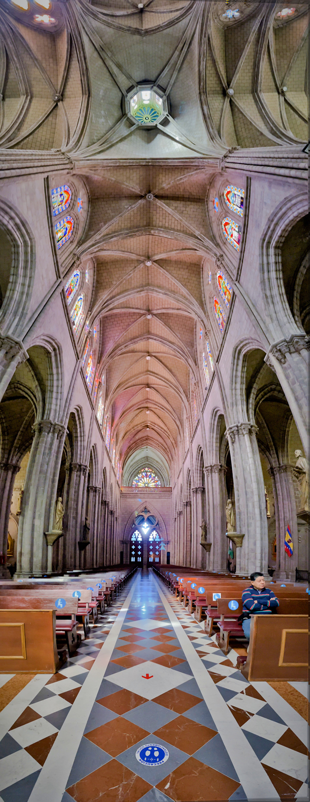
Thanks Kieu Hanh for your suggestions. The reason I did not face to another way to take the picture because of the crowd and there are many subjects that make the image complicated. I agreed with you about a man sitting there face to the camera. Thanks |
Jul 27th |
| 86 |
Jul 22 |
Reply |
Hi Jack, thank you about suggestion the present of decals in the front. I would remove it in post processing. Best regards |
Jul 9th |
| 86 |
Jul 22 |
Reply |
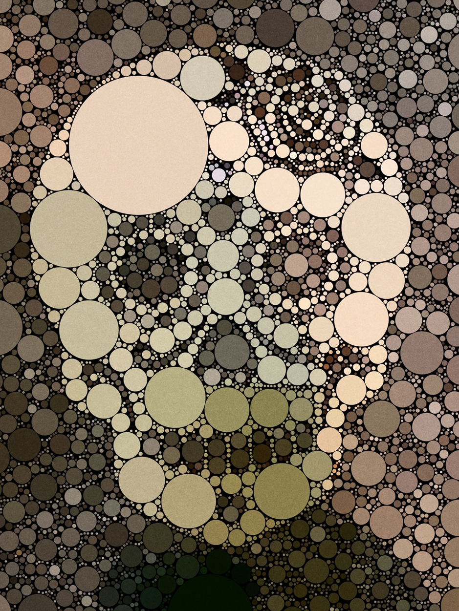
Hi Bob, I agreed with you about editing by app. I like very much about creative image, I would think it can be submitted to a category of Creative Photography. I would learn to do so and appreciate the sharing. I have installed some apps to my phone, and I will apply it some days. Thanks |
Jul 8th |
| 86 |
Jul 22 |
Comment |
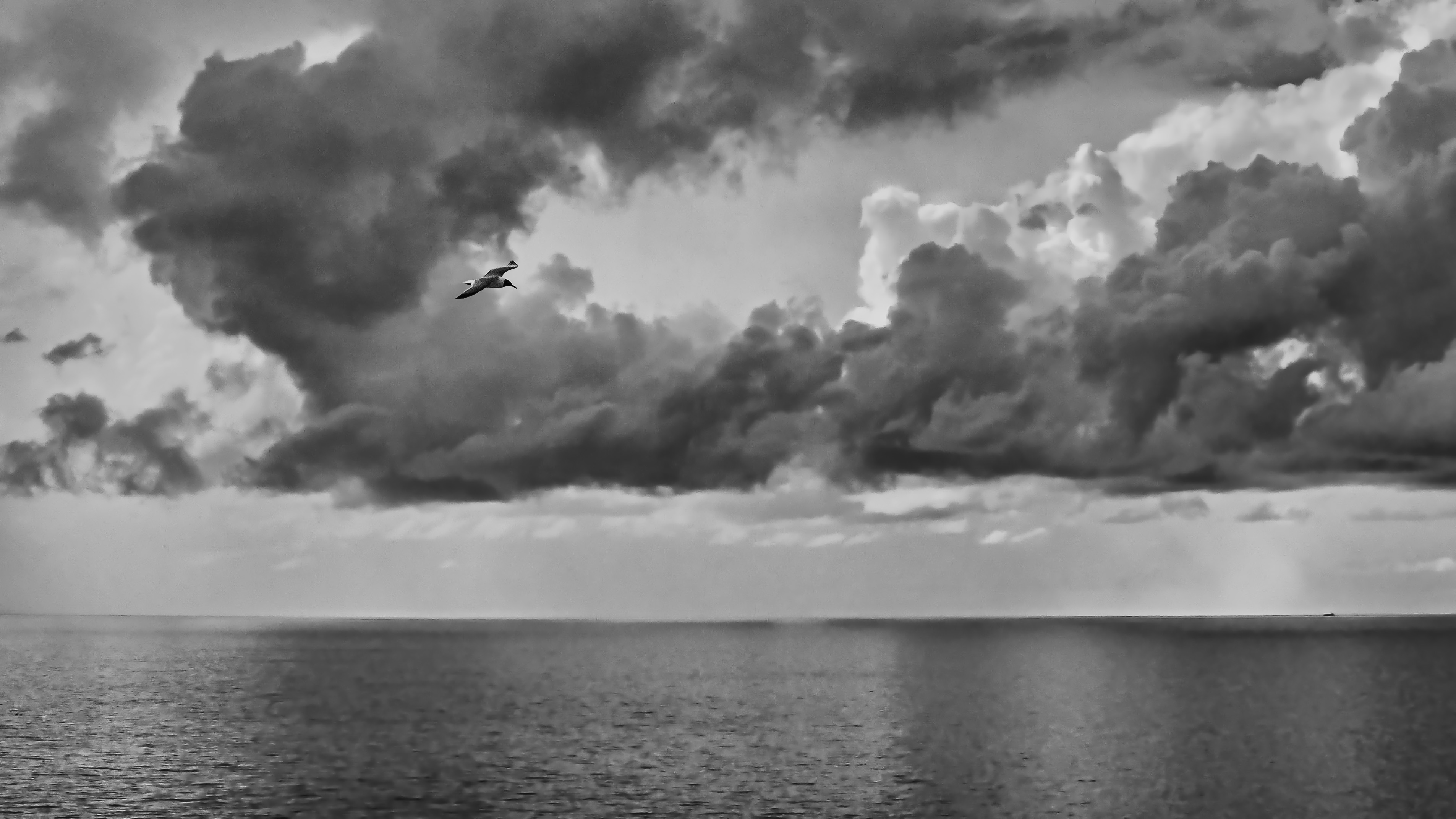
Hi Pat, thank you for sharing this photo and thank you for your detailed explanation of post-processing. The title of the photo also made me curious and looked up the name of this Anhinga bird. The curve of the branch that Anhinga perched on contributed to the viewer's enjoyment. Compared to the original photo, in my opinion, this image captures the nature balance of light and color elements. I think the editing process can lose the realism of the image. You can crop the left side a bit to cut out the dark areas of the image. Best regards, |
Jul 7th |
| 86 |
Jul 22 |
Comment |
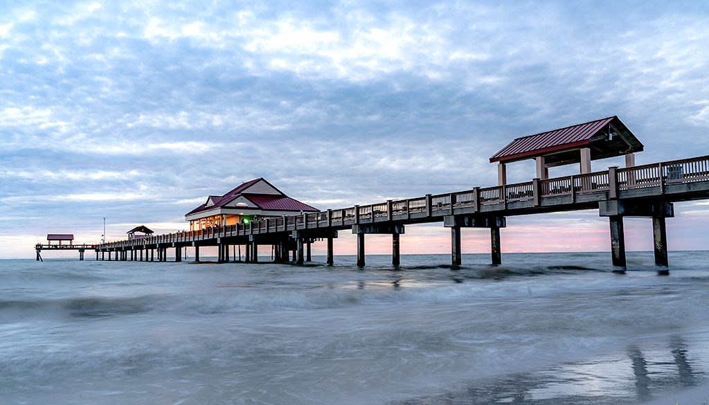
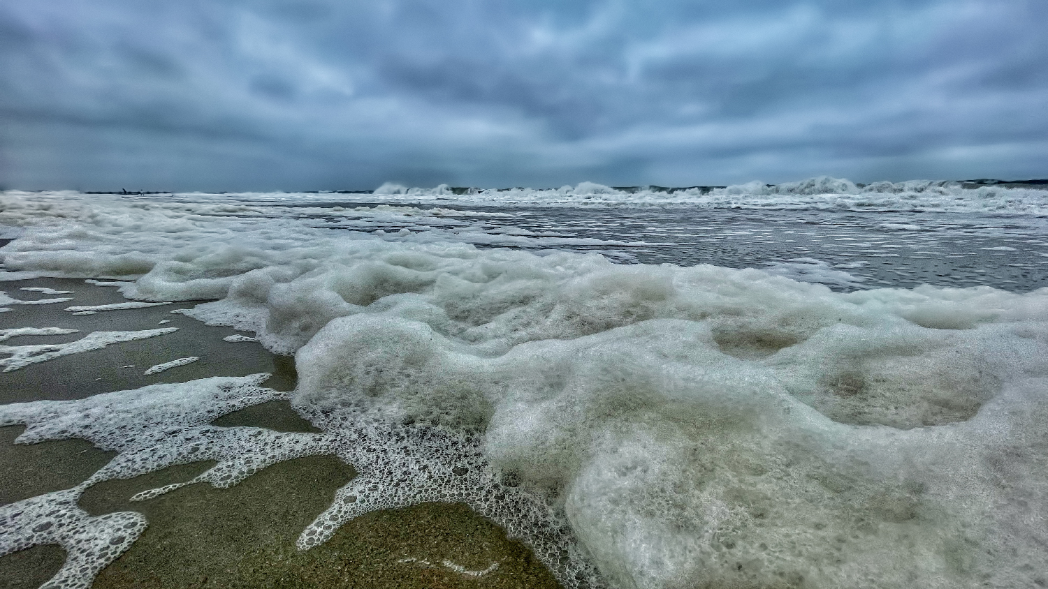
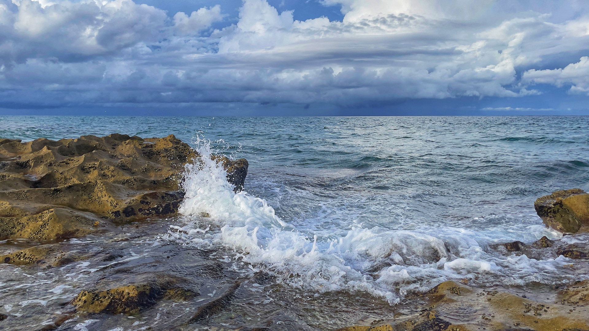
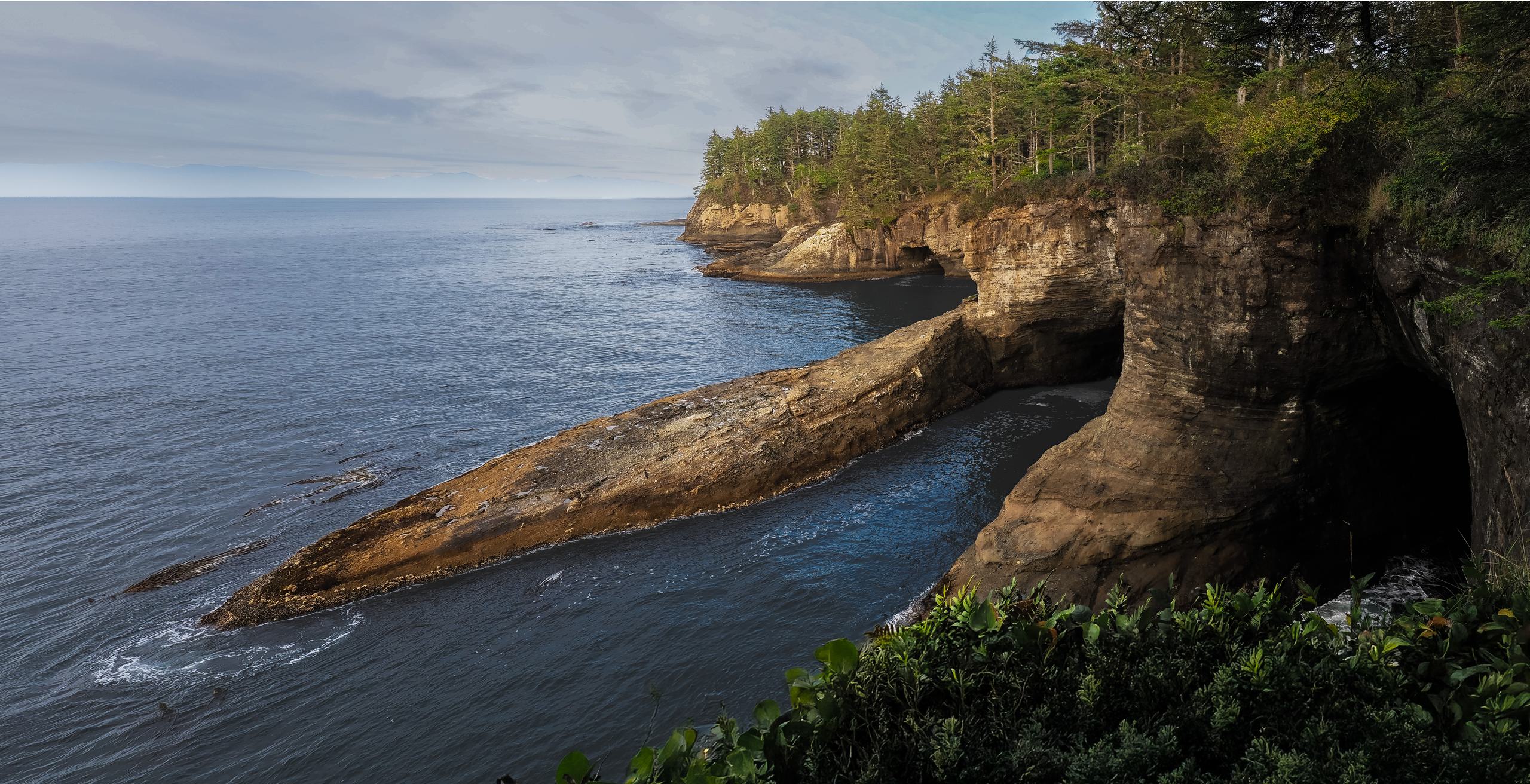
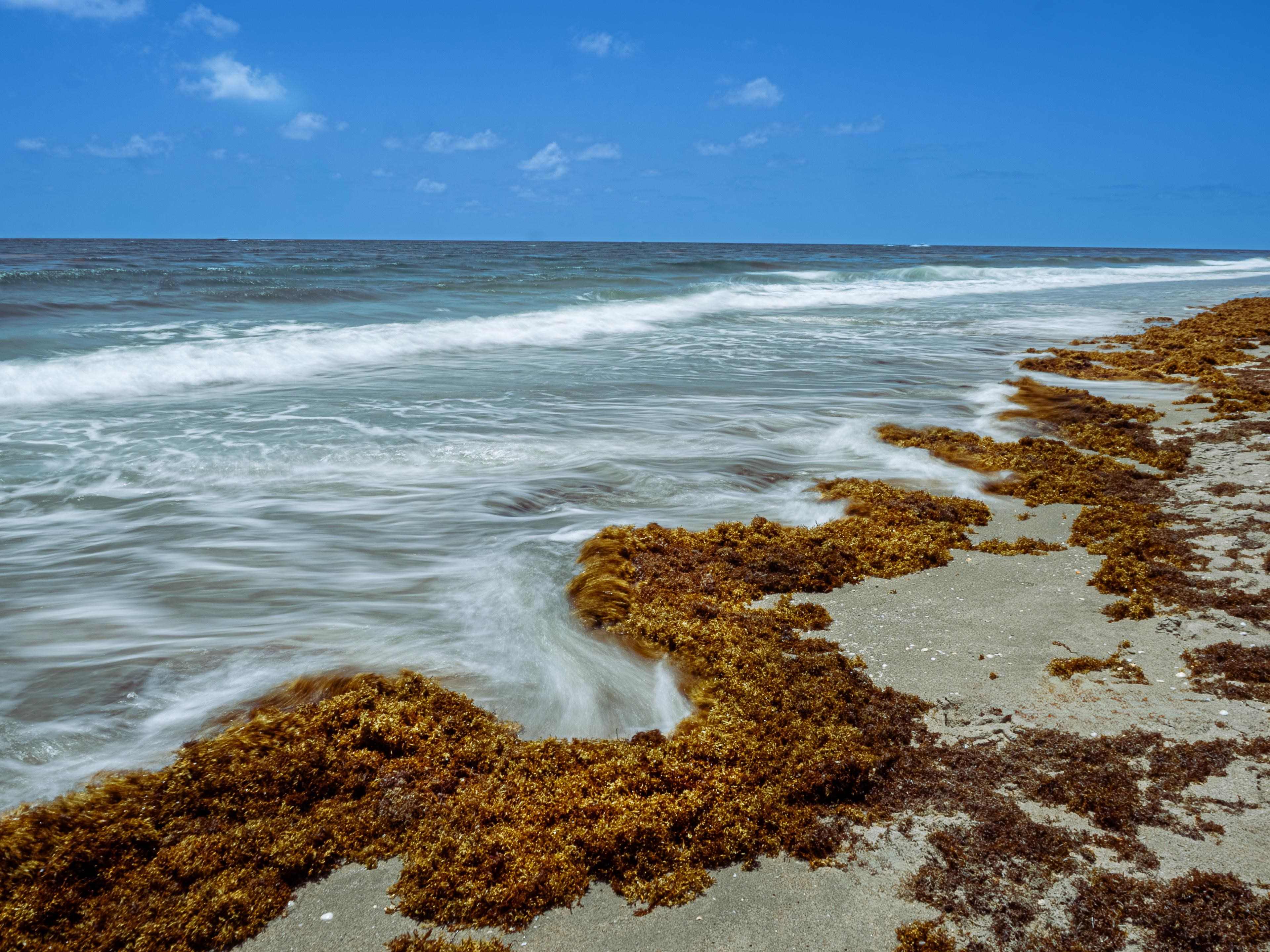
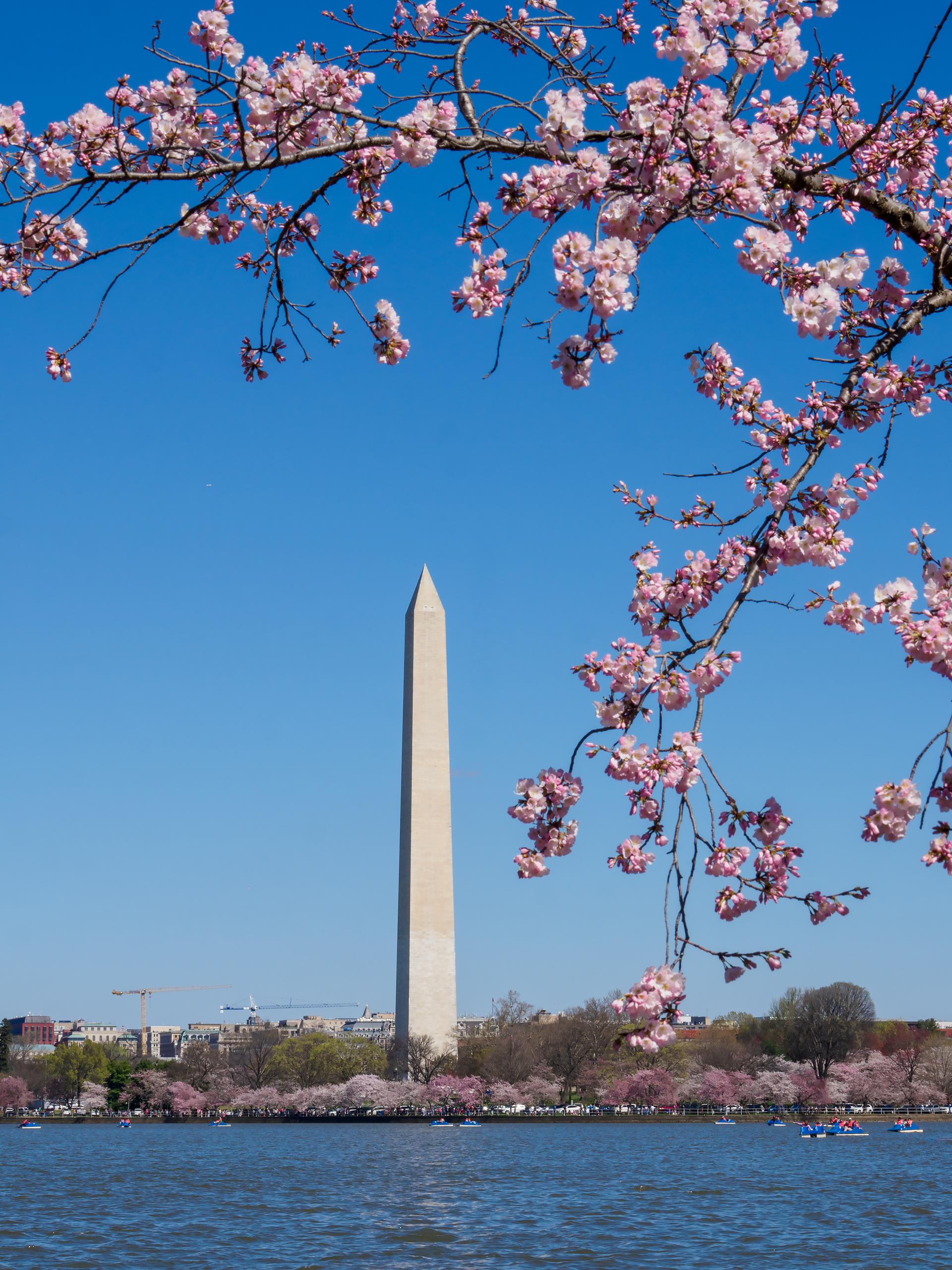
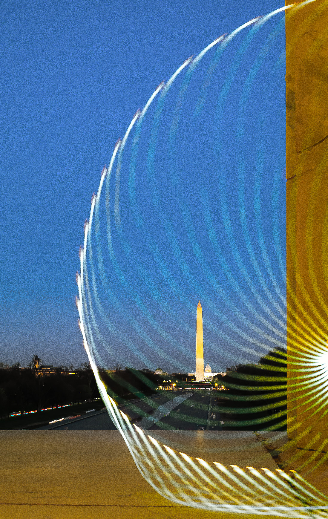
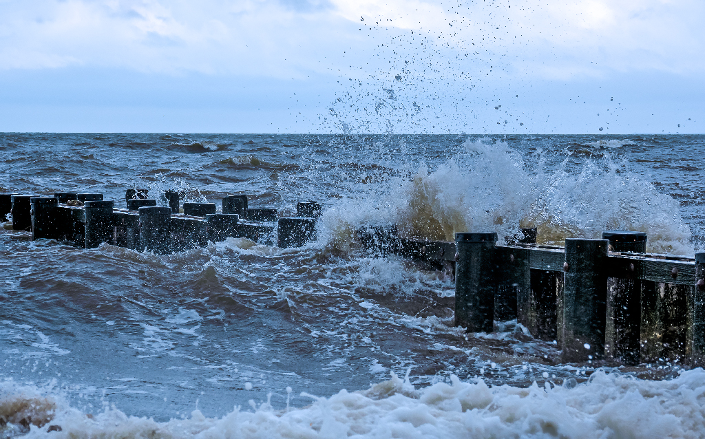
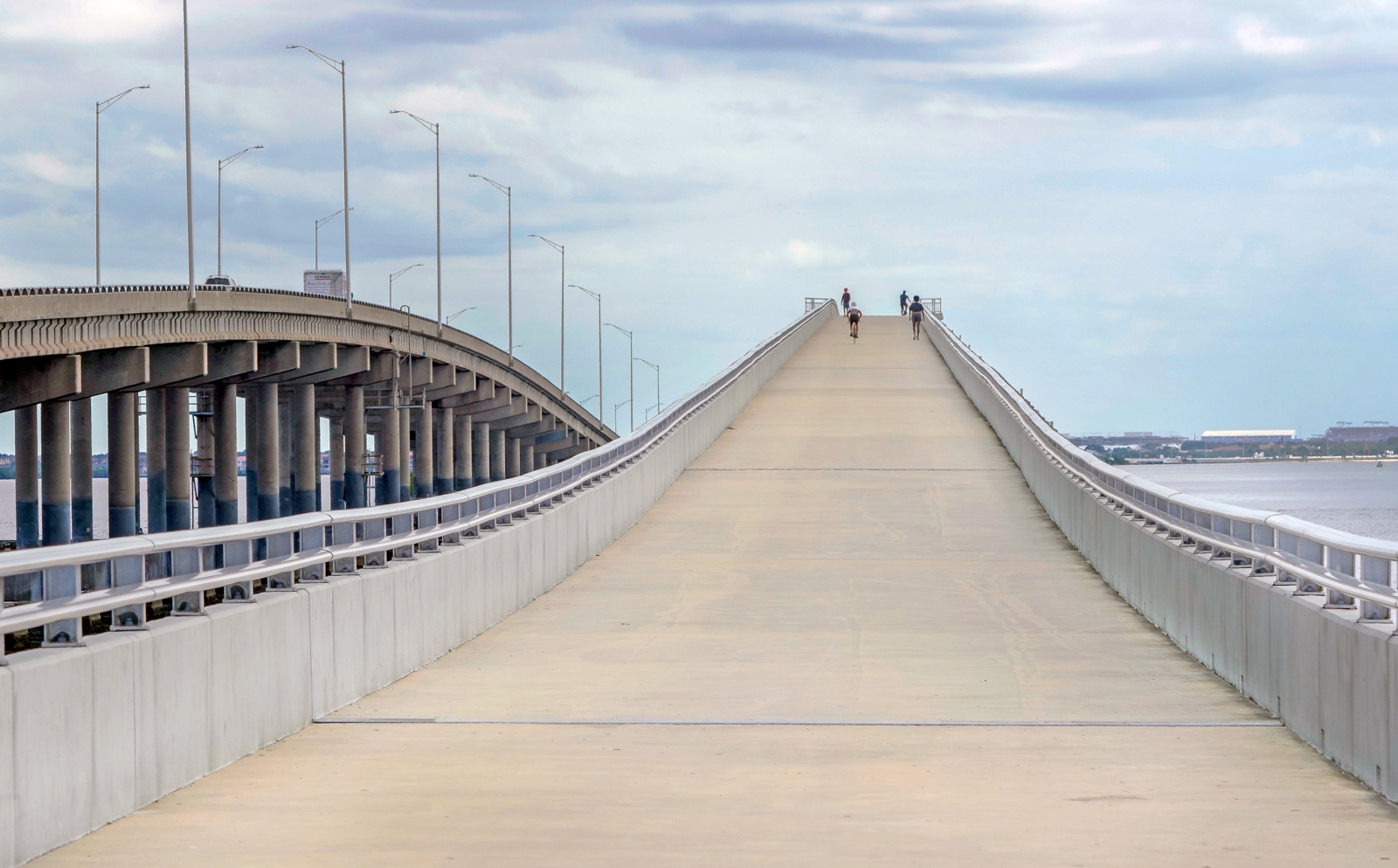
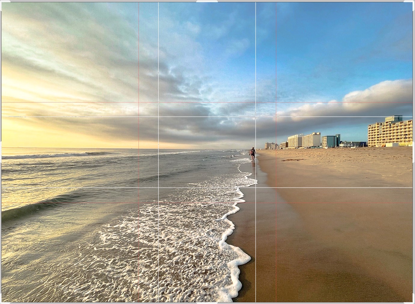
Dear Ms. Kieu Hanh, thank you for sharing a very attractive mobile phone photo. Before this pioneering landscape photo, I feel very comfortable because there is a spacious and empty space of nature in its composition. The leading lines you have used are the border of the white foam waves full of contrast and the dark shadow of the descending wave is very clever and clear. You've found a point of interest (treasure hunter) to bring the viewer's eye to the end of the leading lines. I really admire the way you have captured the light, it's such a nice balance. Sharpness is the strong point of this photo, I can hardly tell if this photo was taken with a phone or a camera. The highlight of the clouds is very prominent, increasing the depth of the image. The pattern of wave foam extending from the front to the convergence point in a triangular shape adds more depth. I took the liberty of taking the photo and using the ACR Geometry tool to correct the distortion caused by the phone's wide-angle lens. Also I try to use Golden ratio in PS to crop (the white lines on image below) to contribute more. |
Jul 7th |
 |
| 86 |
Jul 22 |
Comment |
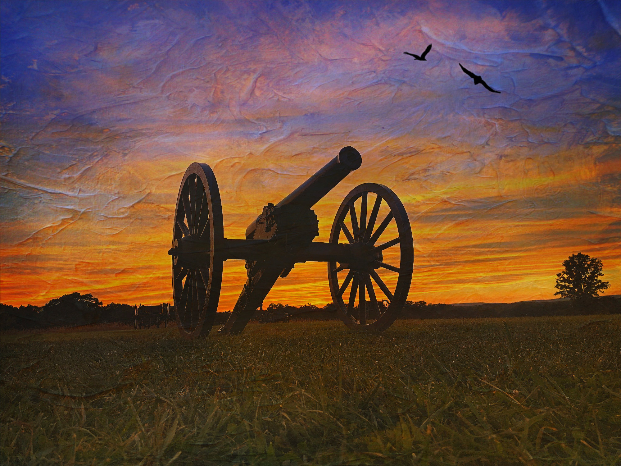
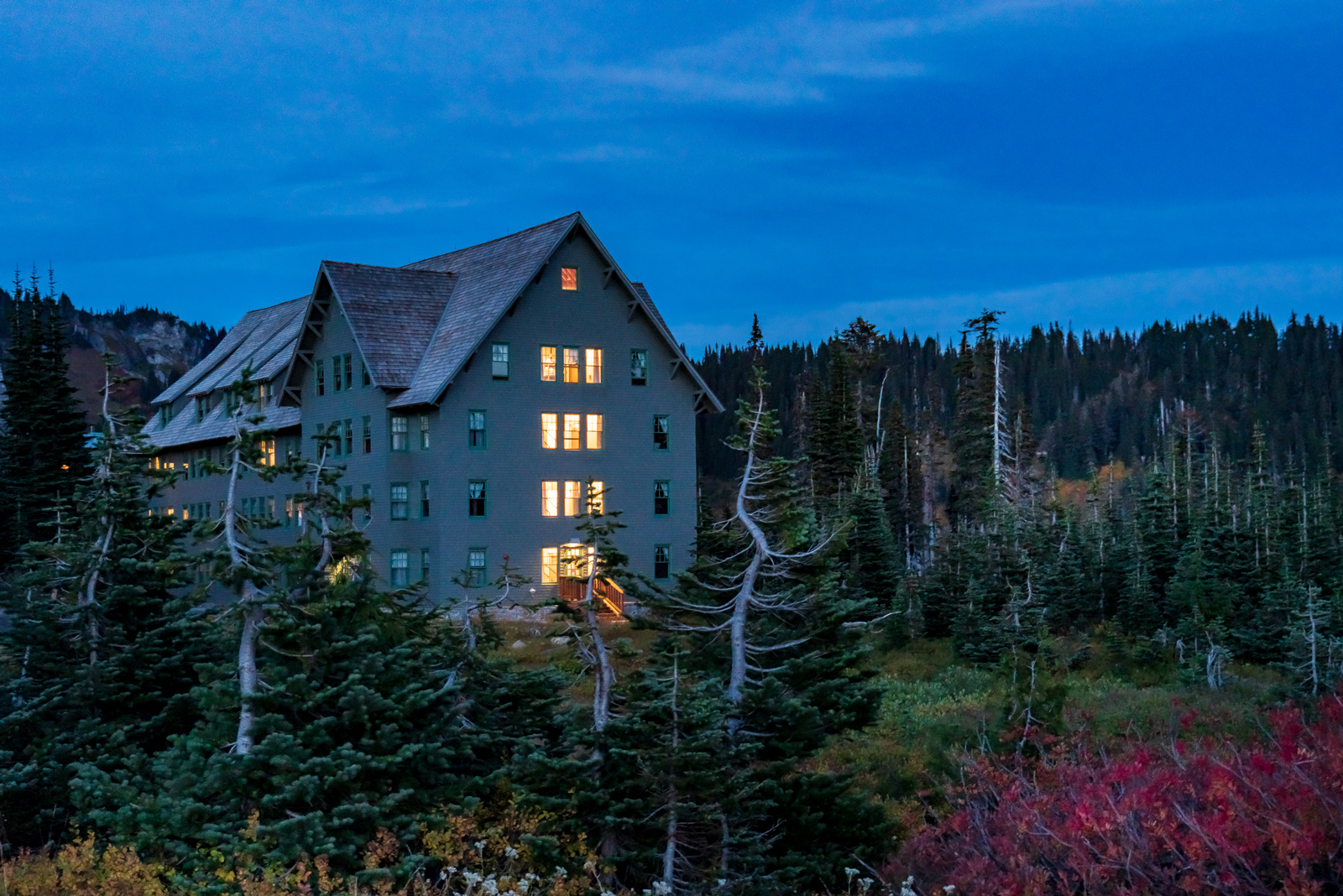
Hi Bob, Thank you for sharing with me the beautiful and quite interesting nature photos. At first glance at the original photo, I was intrigued by its colors and composition. The three branches can be distracting to the viewer, but it can represent the kind of well-framed composition that brings the viewer's eye to this delightful floating house on the river. Take a look at the main photo that you used the Prisma app to change into a stroke. Some apps may limit different tools for editing posts. There would be little to show me the water and waves of the scene if I hadn't looked at the original image. I also noticed the cloud was lost through this app. However, I noticed that if I look at the image from further away, it is much better and has much more depth. Through this photo, I learned a new application. Thanks very much. Best regards, |
Jul 7th |
| 86 |
Jul 22 |
Comment |
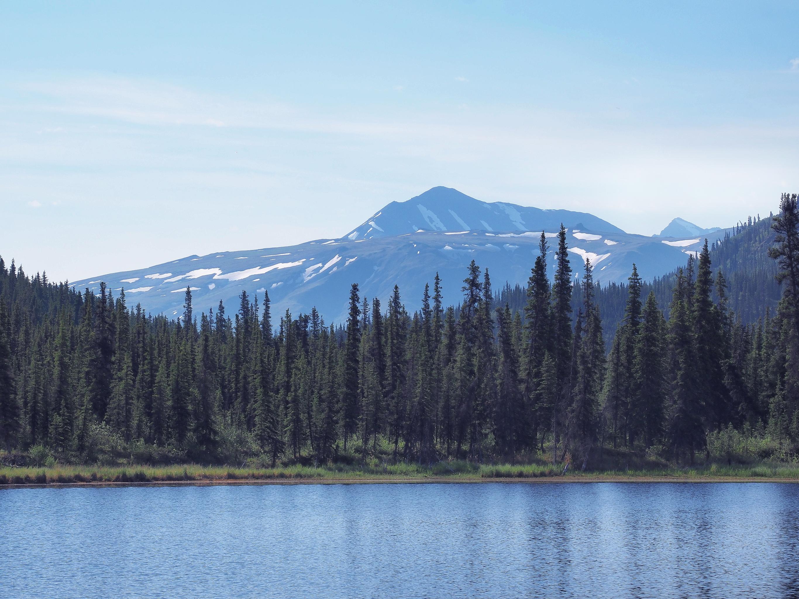
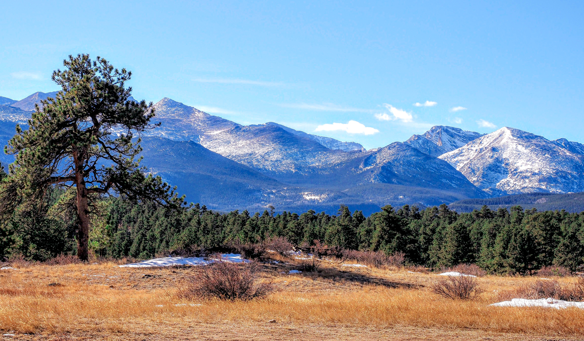
Hi Jack, thanks for sharing the beautiful image. The bright and attractive colors of the yellow flowers stretching from the foreground to the far back of the image show that you have skillfully used your phone to capture it. In addition, the background of the mountains is very clear and the open light is very attractive for the human eye to take the whole picture. The area you have devoted to the subject (golden flowers) is very attractive. With a phone like this I admire and learn from your photography. Well done. |
Jul 7th |
| 86 |
Jul 22 |
Comment |
Hi Gene, thank for sharing the image. The main point that drew my eye to this photo was its depth. At the same time, the pattern of the petals is very harmonious. I think the lighting in the upper part of the photo can be quite dark on the 2 corners. The texture of the petals may not be visible. With the phone picture I noticed that you took quite a detailed and close-up shot that's what I learned through this photo. Best regards |
Jul 7th |
| 86 |
Jul 22 |
Comment |
Hi Ruth, thank you for sharing the image. Buttercup was showned very nice in this image. I am very impressed with the sharpness of the image created by phone. Image has very nice colors balance. Light balance is very pleased to viewers. If the eyes position could be upper half of the image then it will would be more attractive. Thanks |
Jul 7th |
6 comments - 3 replies for Group 86
|
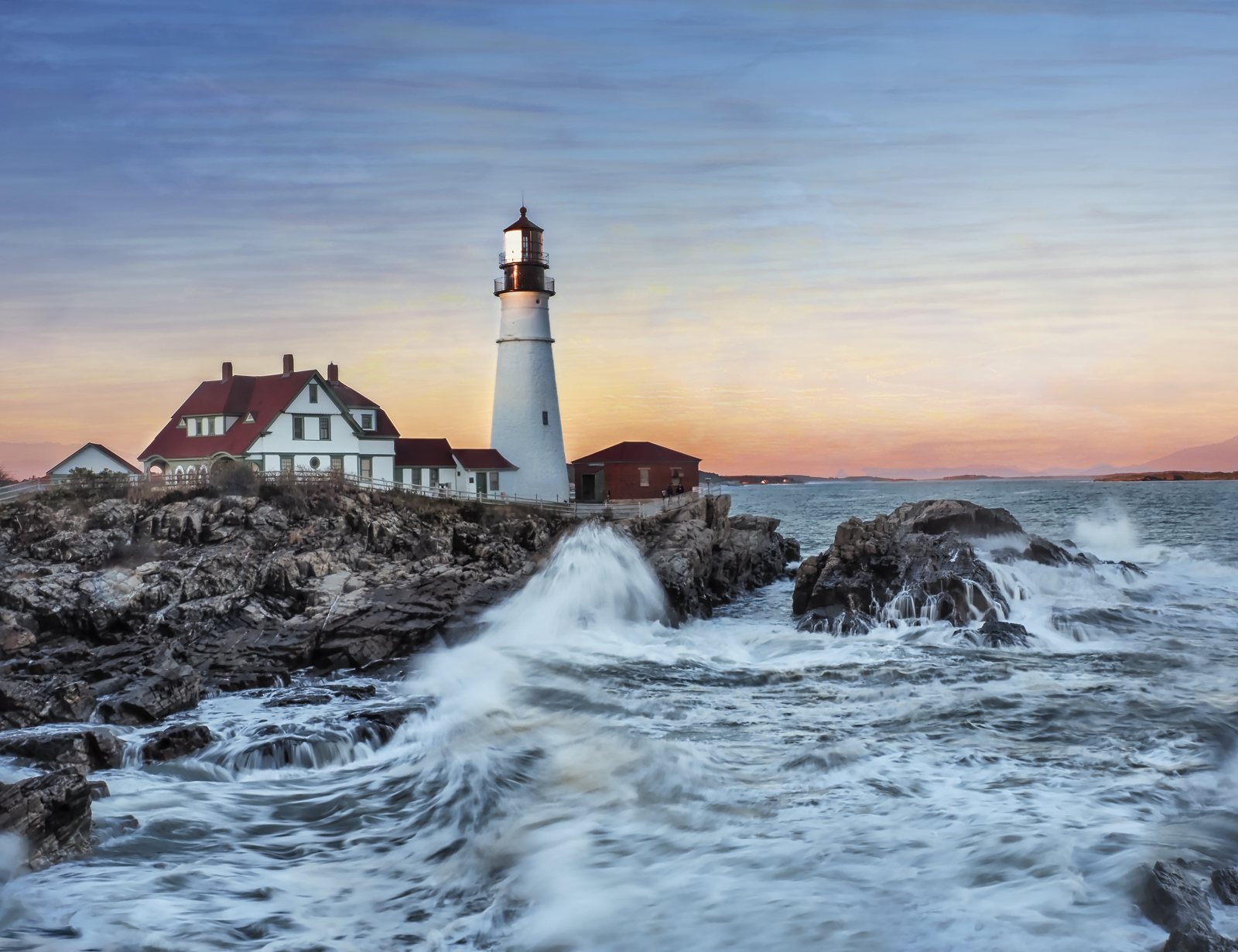
| 88 |
Jul 22 |
Comment |
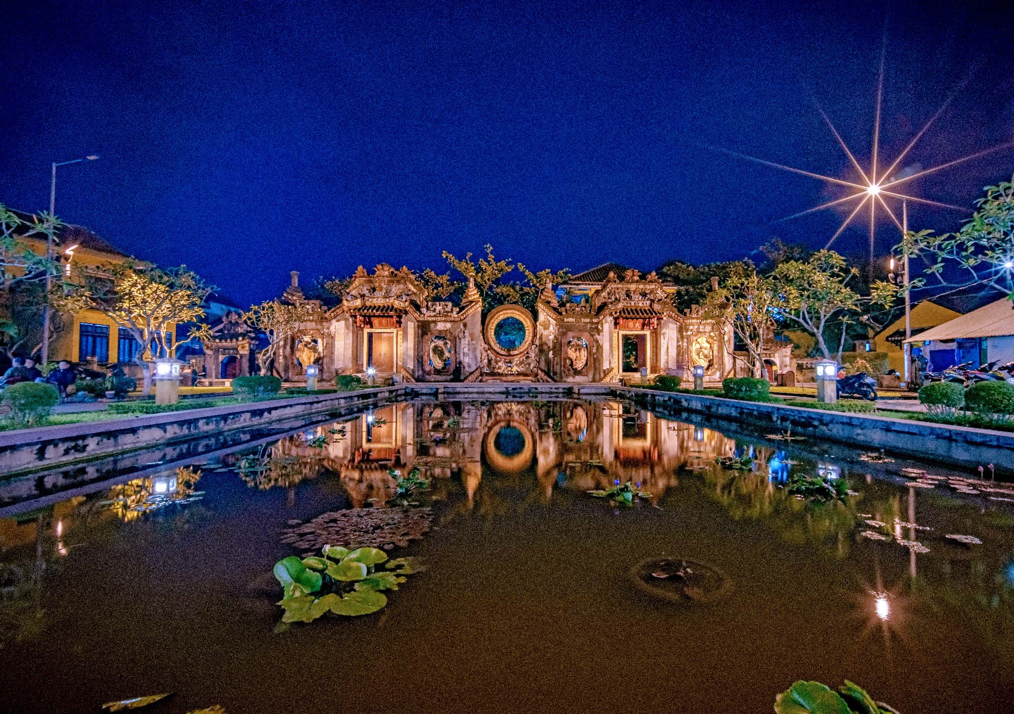
Hi Rich, thanks for sharing the image and place I need to know for future visit. The color of the whole image is very harmonious. Elegant composition and overall image balance. You have cleverly replaced the sky to match the color of the photo. The waveform can be white and light, I recommend 1/250s, then increase the rest of the shadow. Nice done. |
Jul 26th |
| 88 |
Jul 22 |
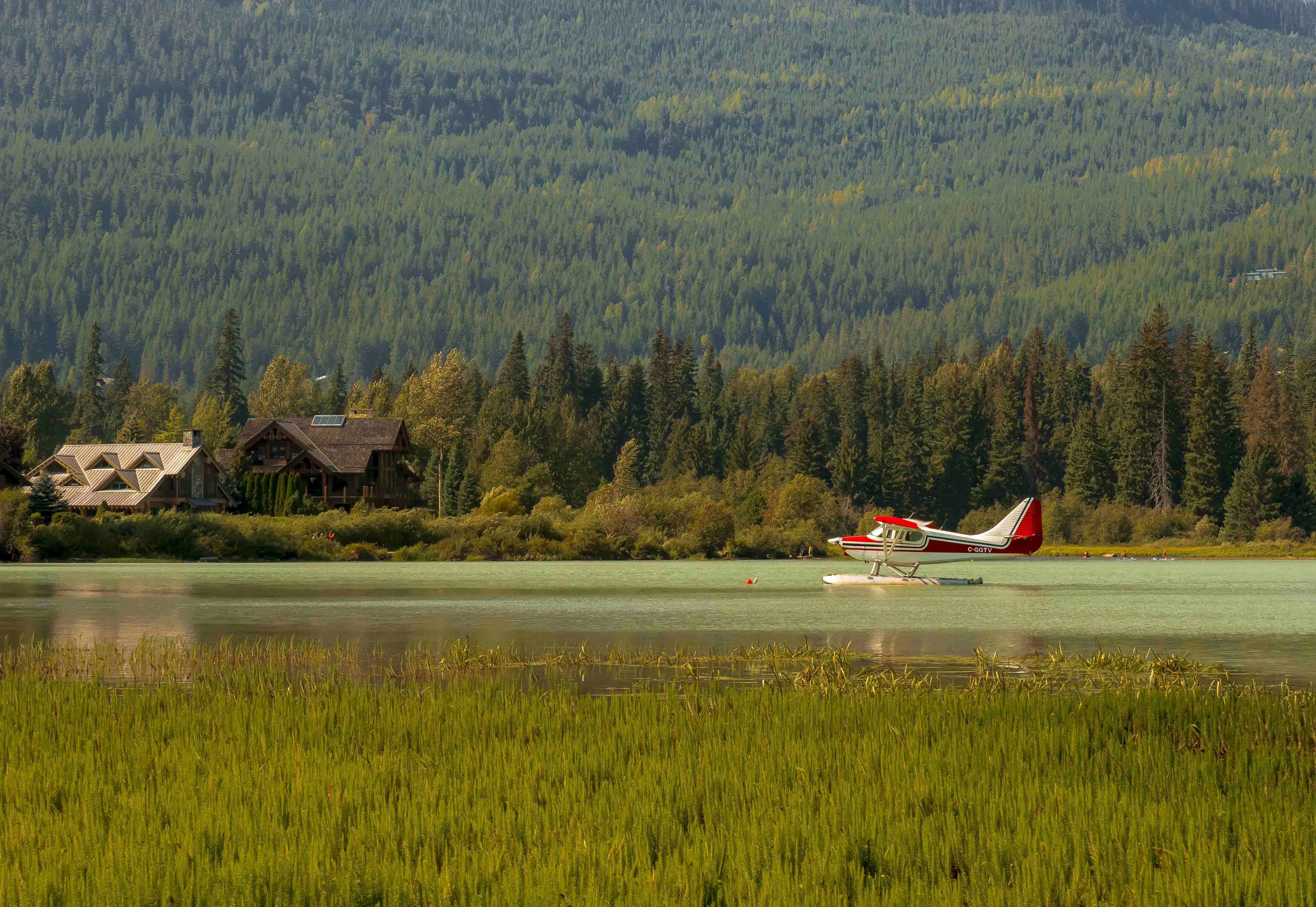
Comment |
Hi Louis, thanks for sharing. The scene you capture makes an immediate impression on the viewer. Color is the main factor that makes a photo stand out. The image has a clear depth of field and partly because you have captured the rolling cloudy sky very prominently. You have chosen the leading lines very cleverly to bring some attention to the viewer's camping objects. Well done. Thanks |
Jul 26th |
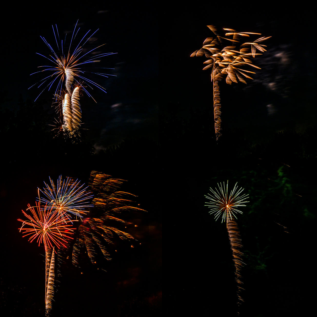
| 88 |
Jul 22 |
Reply |
Thanks Bev, I have learned this from the internet and found out my mistake. I just want to improve it. But fireworks only show once a year so it is a slow improvement ! Thanks for encourage me. |
Jul 7th |
| 88 |
Jul 22 |
Comment |
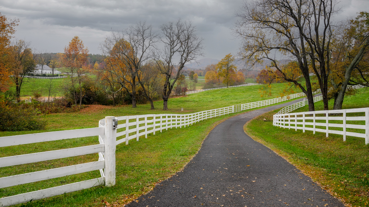
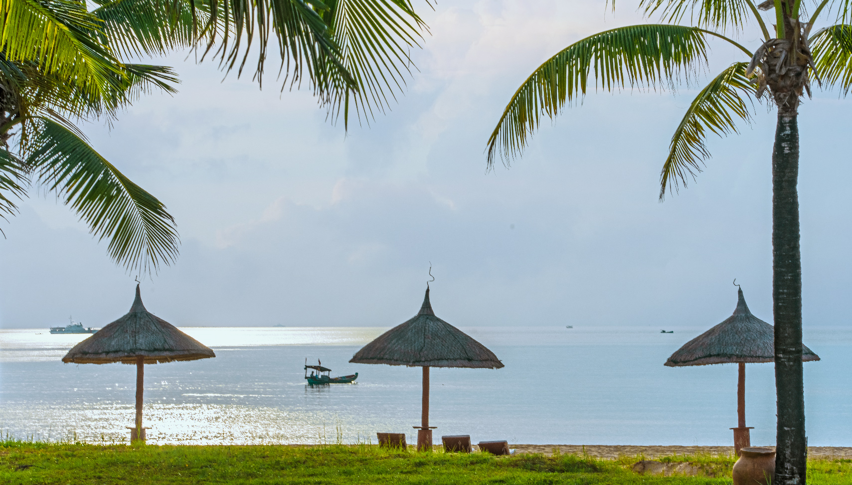
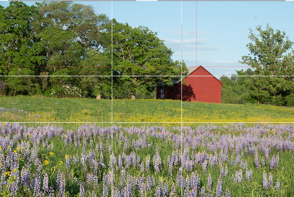
Hi Trey, thank you for sharing this beautiful photo with attractive colors. Every art elements and design in this image is perfect. The balance of color and light makes me feel very peacefull in this landscape image. I would like to suggest that the original image was perfect on both composition (Golden ratio) and saturation of colors (right brightness and saturation). See my suggestive while overlay. Thanks and Best regards |
Jul 6th |
 |
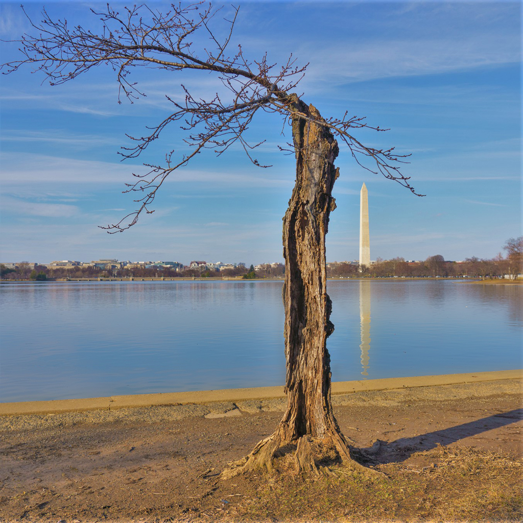
| 88 |
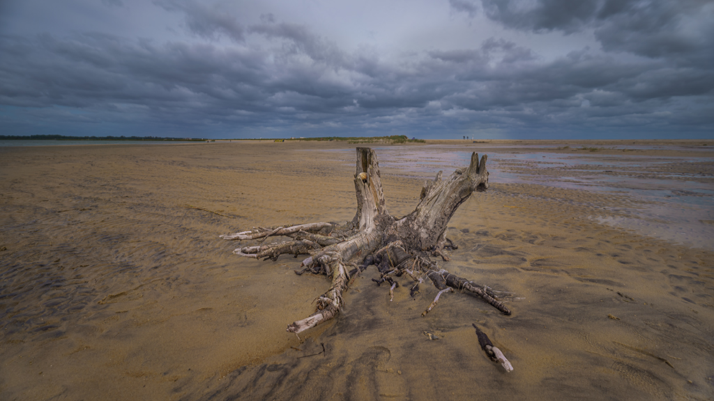
Jul 22 |
Comment |
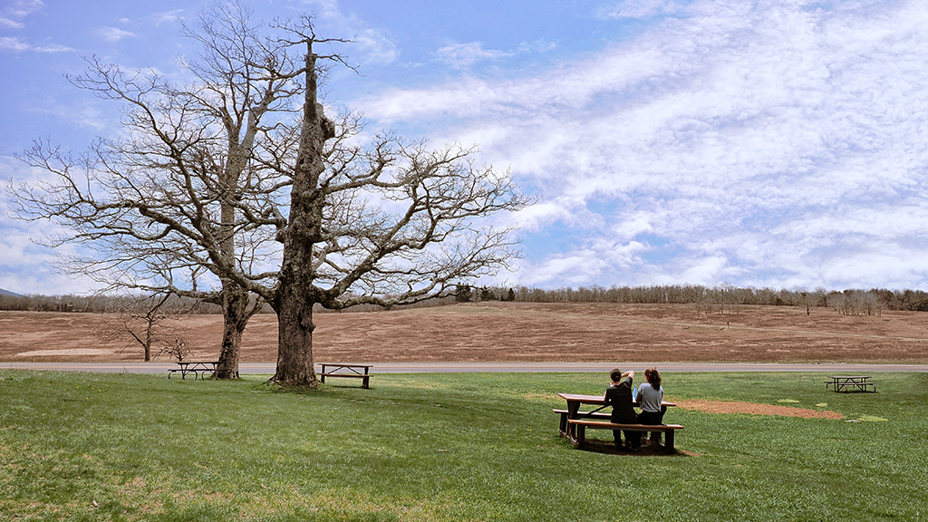
Hi Sanat. Thank you for sharing this photo. I am very interested in the standing pose of the dried tree stump, it catches the eye quickly, the subject of the photo is clearly expressed. The layout is very neat. Thank you for sharing. |
Jul 6th |
| 88 |
Jul 22 |
Comment |
Hi Charles. Your photo absolutely shows a very nice and well-composed scene. In my opinion, reduce saturation the most is blue, and orange I agree with you to keep the same color and contrast (using mask), I would like to leave the foreground on the right. Thank you. |
Jul 6th |
 |
5 comments - 1 reply for Group 88
|
11 comments - 4 replies Total
|