|
| Group |
Round |
C/R |
Comment |
Date |
Image |
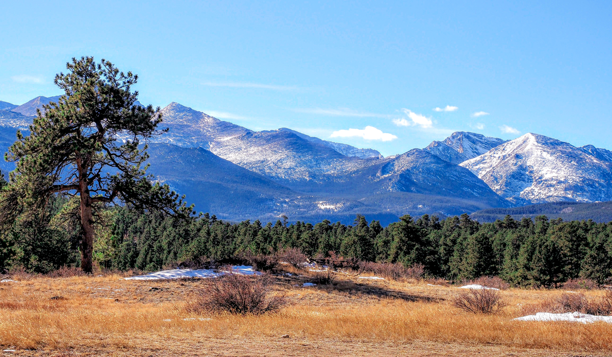
| 88 |
Oct 21 |
Comment |
Thank you all for useful comments. I agreed with you all the helpful suggestions. Thanks Trey for the video. Yes there are some distracted foreground subjects I should have planned to move my position to take this picture. Your opinion is very helpful. Best Regards, |
Oct 25th |
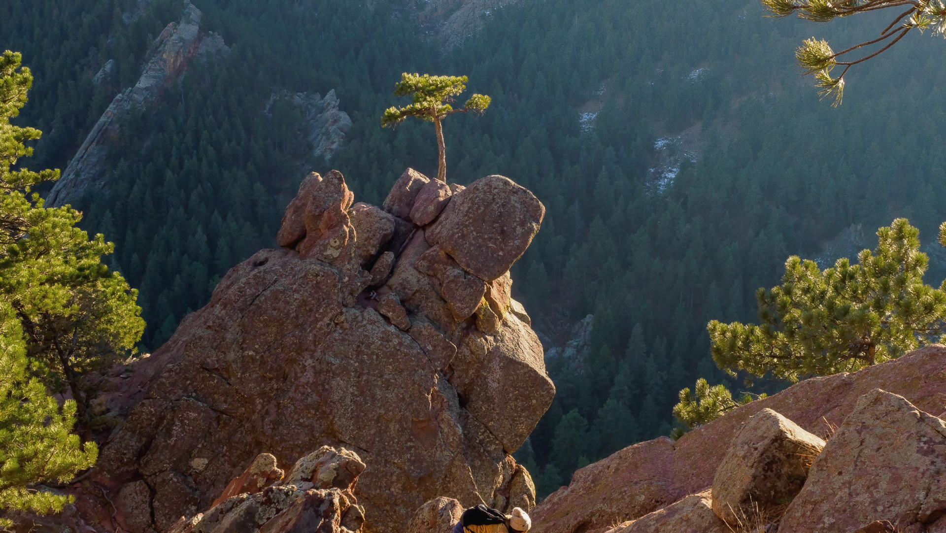
| 88 |
Oct 21 |
Comment |
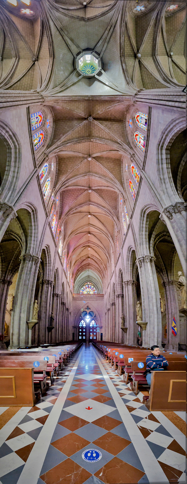
Hi Sanat, thank you for sharing valuable pictures of nature in India. I think you still have a lot of pictures to share because this place is so fascinating. For me, in this image you have successfully represented the points of interest and subject matter of the image. Colors are well balanced. Pattern elements are giving a good impact to the viewer. I just think you can find an alternative layout by moving around to find a good one to balance out the space. Sincerely thank you |
Oct 13th |
| 88 |
Oct 21 |
Comment |
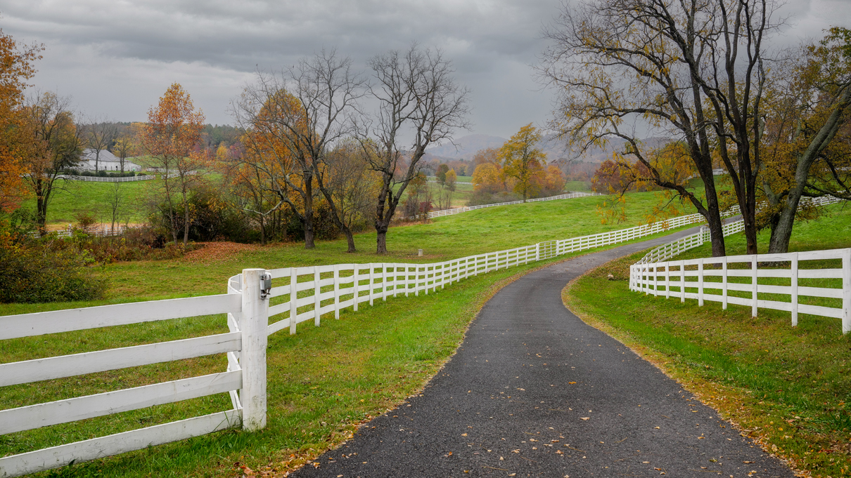
Hi Charles, what a beautiful image and well done in all elements. I would say simplicity is helped to your perfect image. The image is well done in balance design. I like the effect of the white broken dividend of the road. It leads my eyes go deeper to your image. Both sides of the road have nothing that could tell a deserted and peaceful atmosphere of the area. Well done. Thanks for sharing. Best Regards, |
Oct 13th |
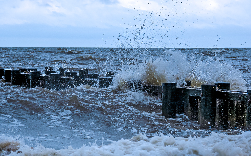
| 88 |
Oct 21 |
Comment |
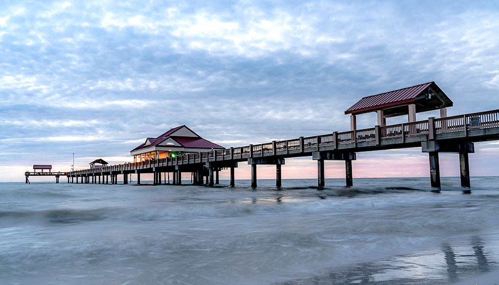
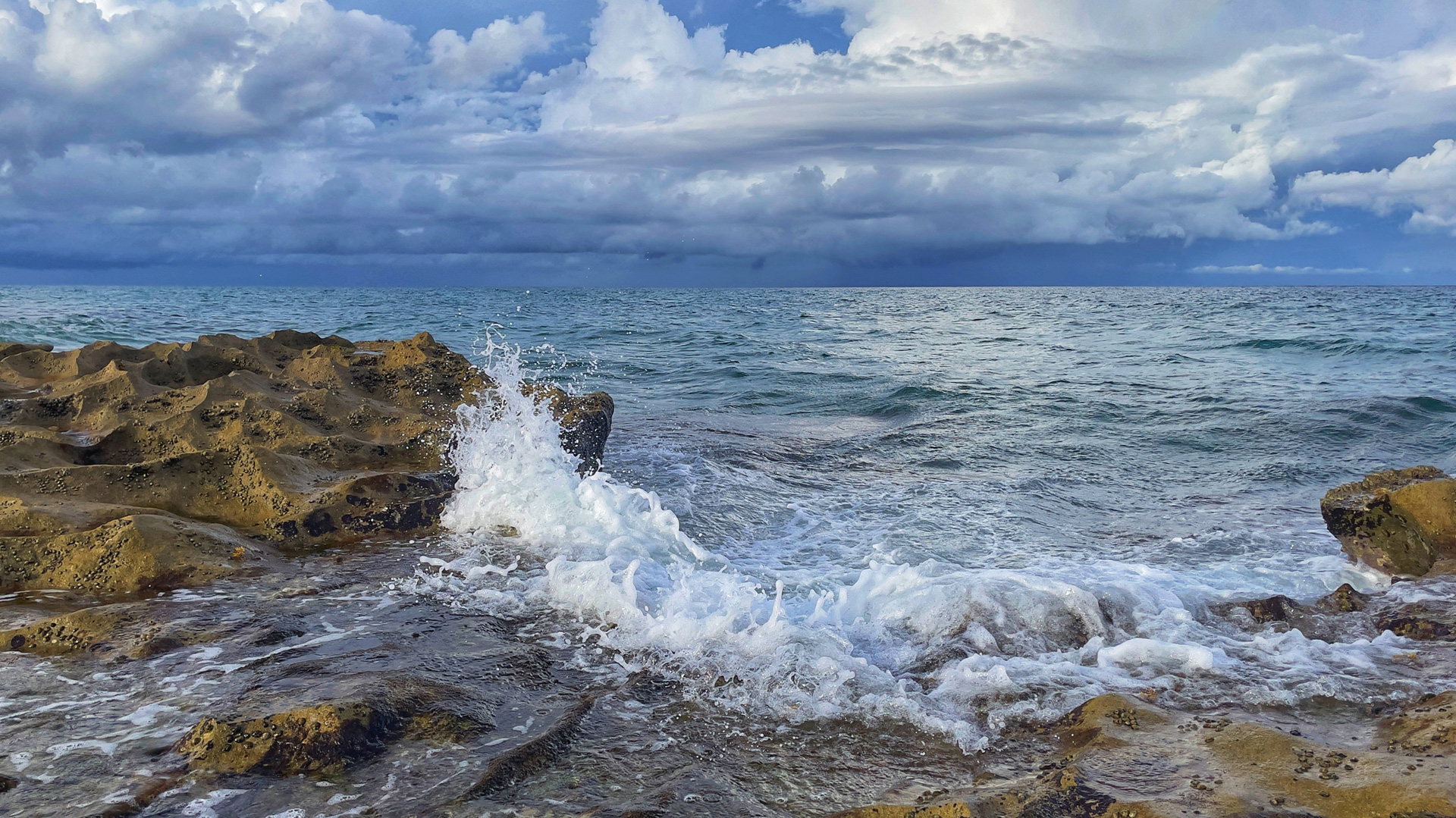
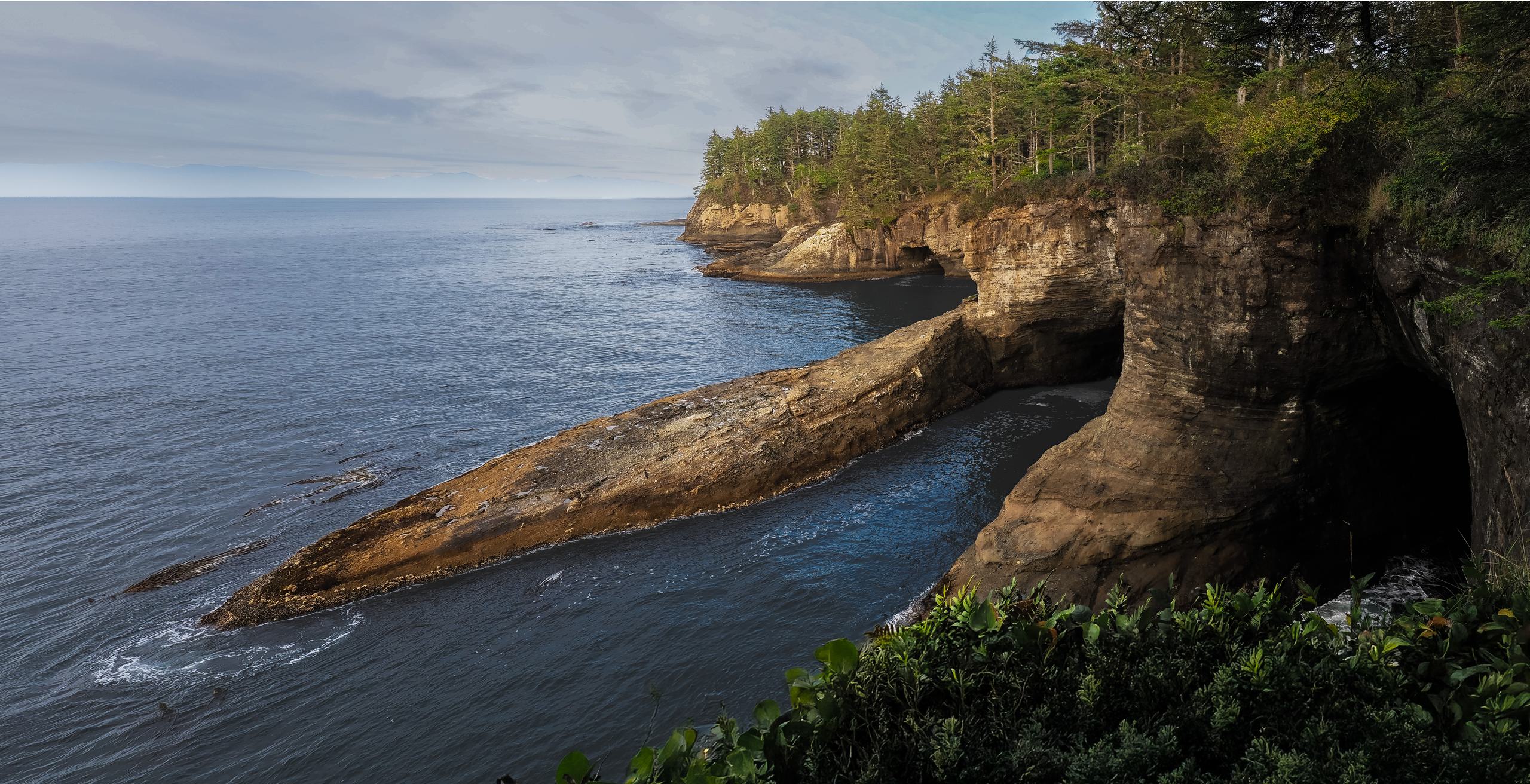
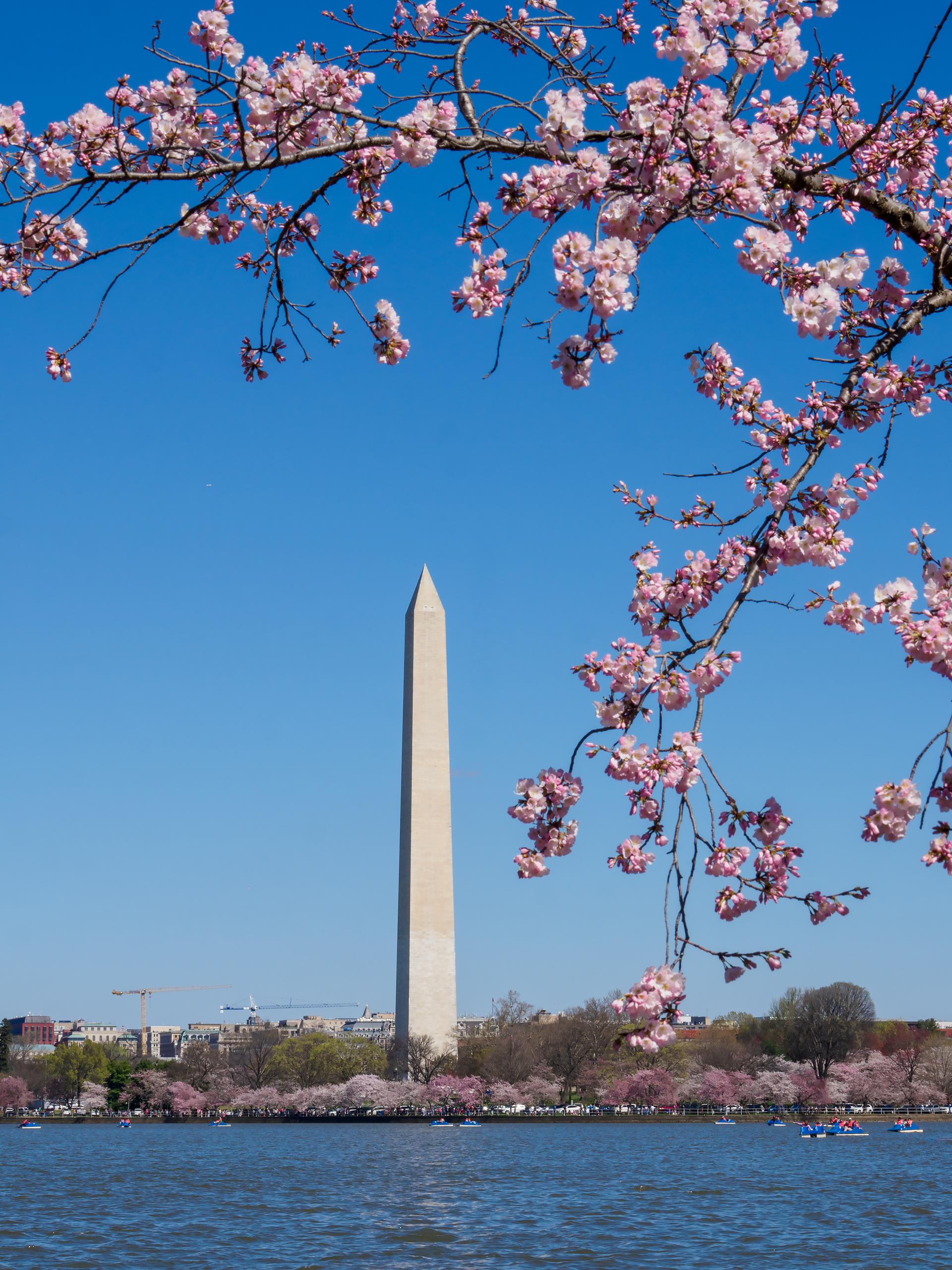
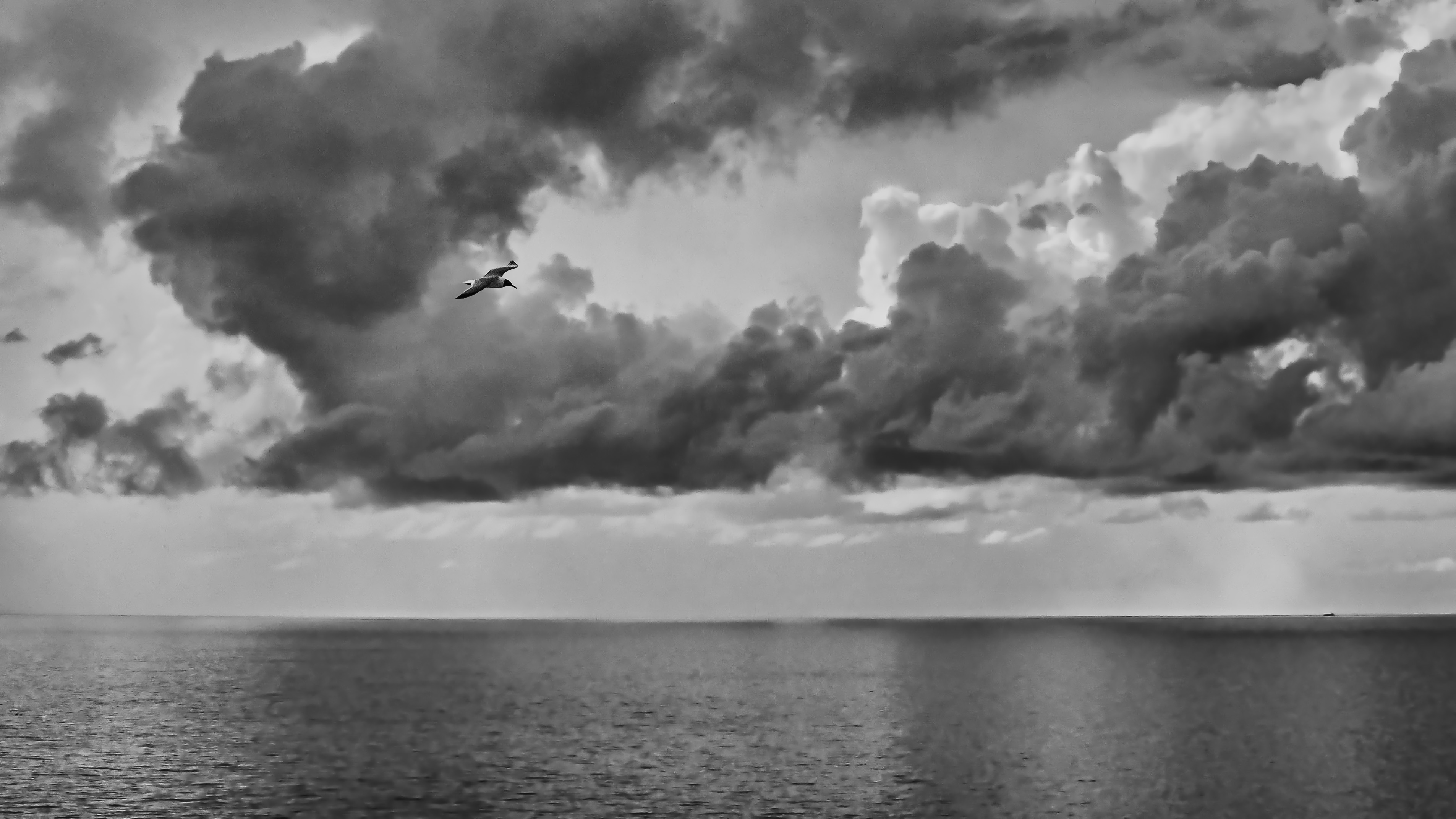
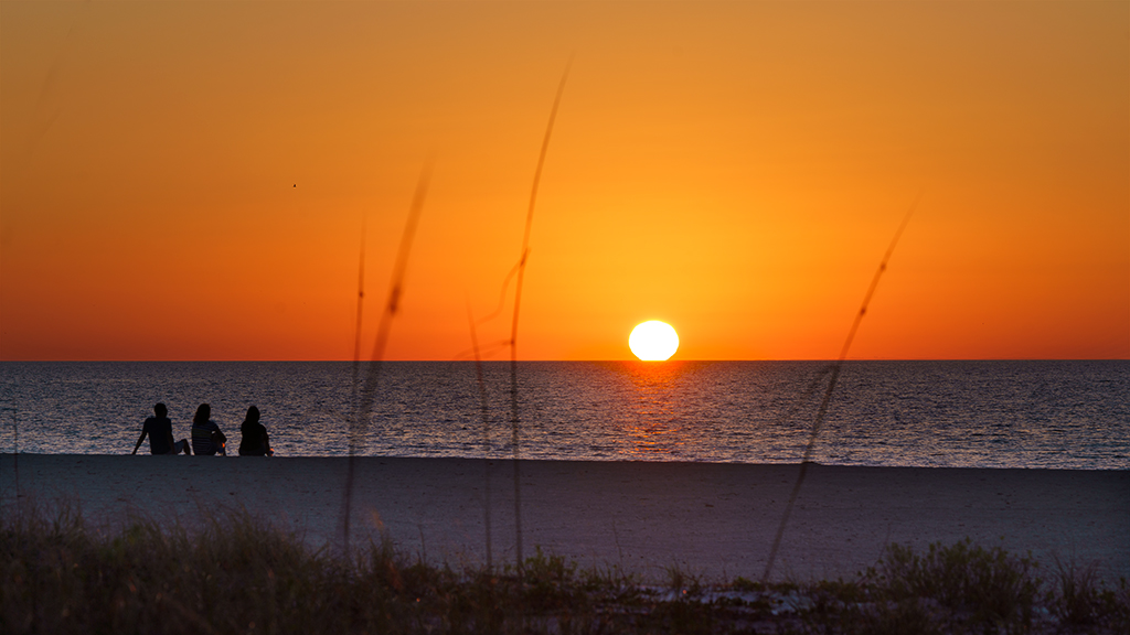
Hi Rich, you took this photo in a wonderful place, full of wildflowers on the way to a rocky beach. The image composition is well done with the leading curved walkway, and the space is balanced, the colors are balanced. I'm sorry that the foreground rock was dropped, it could be a key for showing foreground interest. You can expand the sky by filling in the awareness, then you can get the symmetry line for the horizontal line. For me, I would suggest reducing color saturation with just two colors: green and pink, Blue is fine. Adding a bird is a very clever idea to fill the empty area. Thanks for sharing. Best regards, |
Oct 13th |
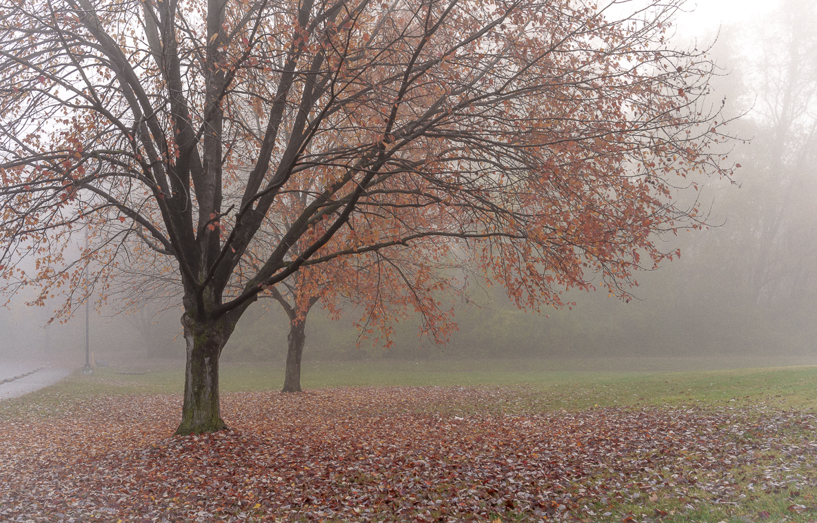
| 88 |
Oct 21 |
Comment |
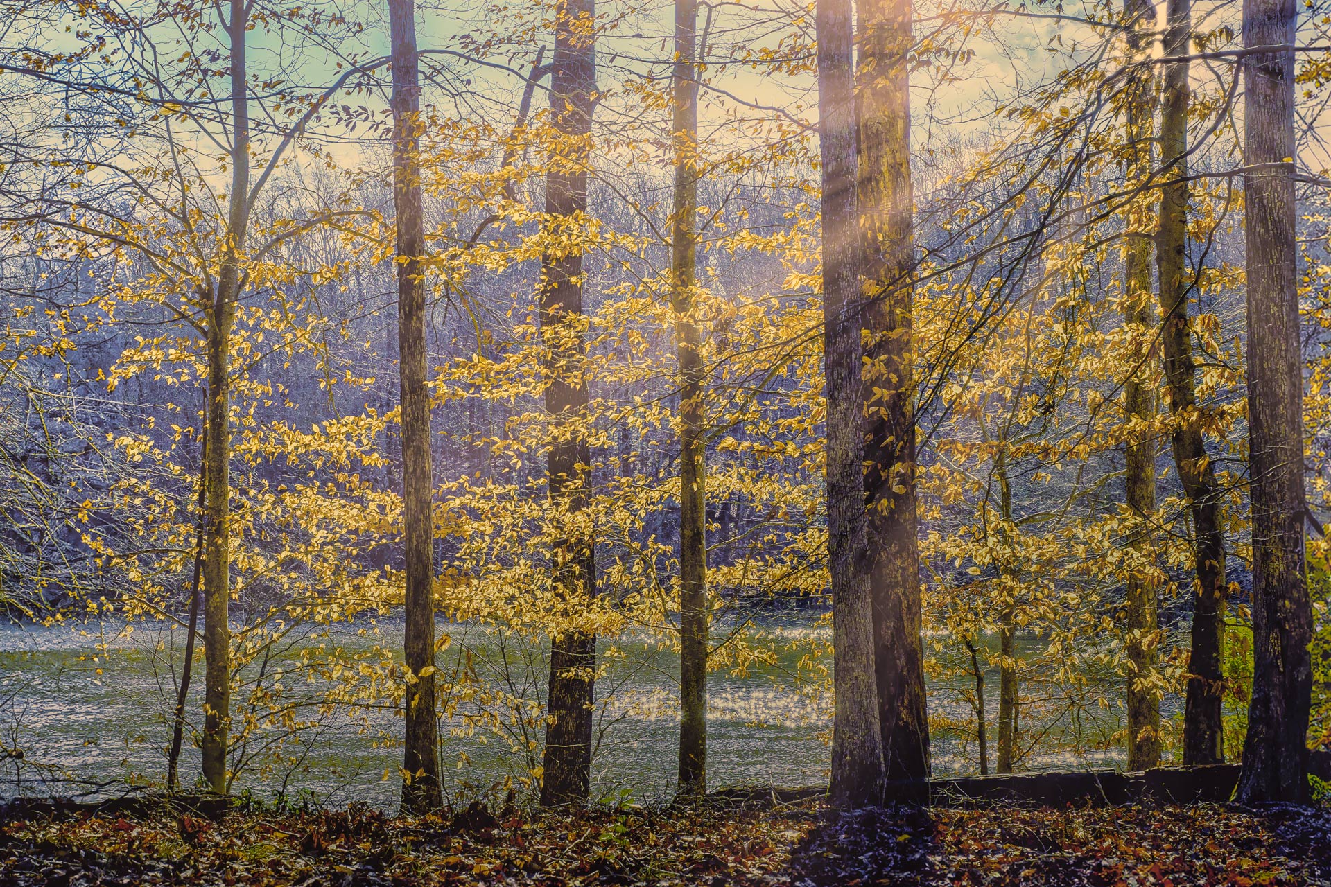
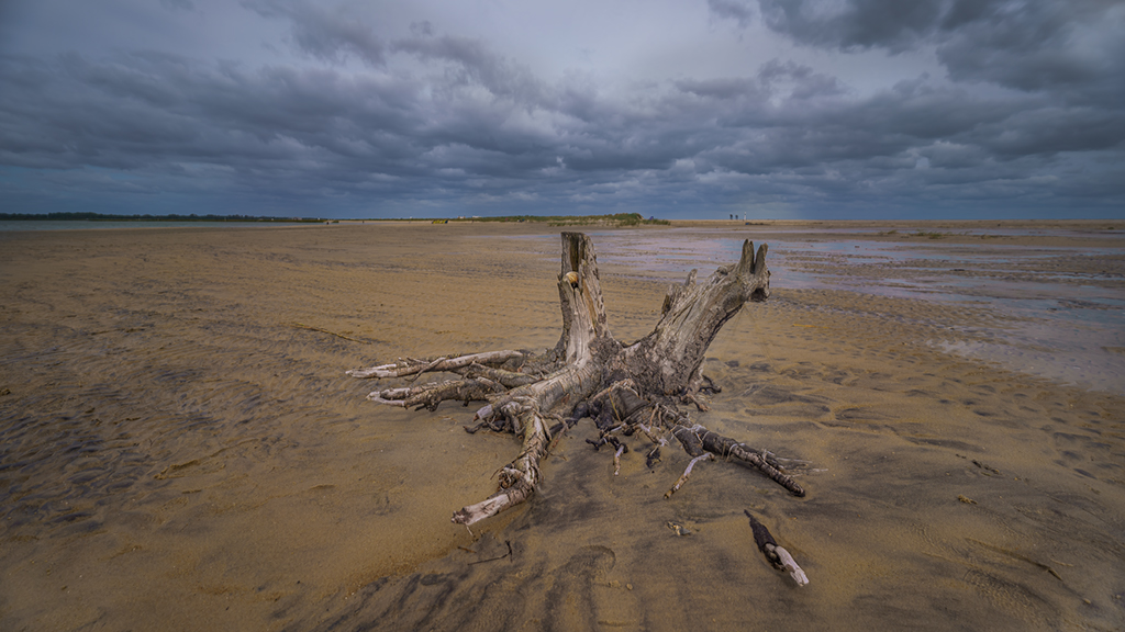
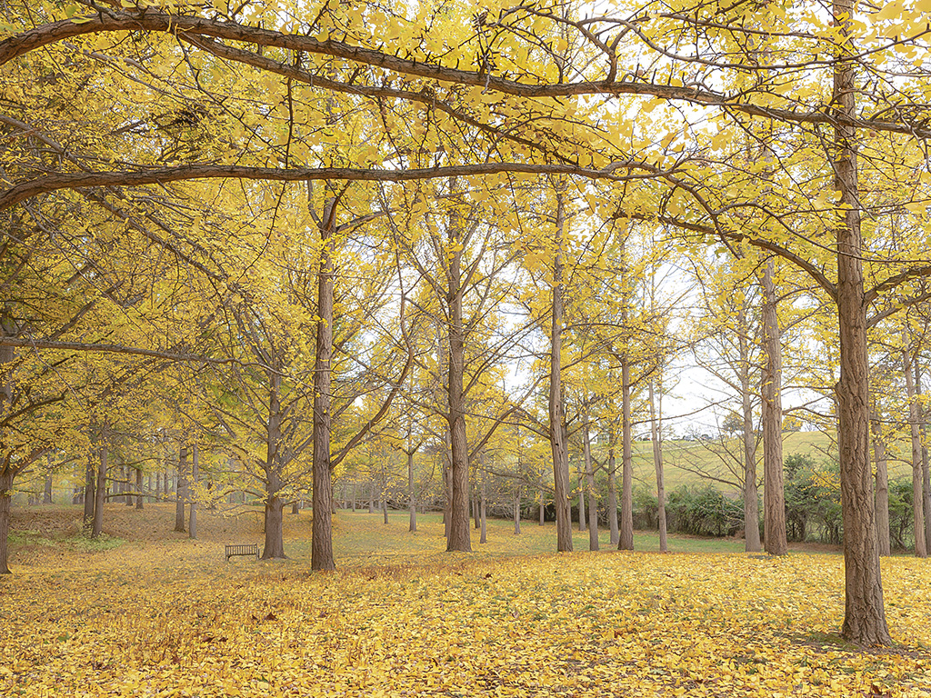
Hi Charles, I like the overall color of the image, especially the white of the trunk goes well with this image. The layout that you design closely between the top and bottom gives the impression of the tree's height and emphasizes the theme and main color of the autumn leaves. The post processing part in the upper leaf array, I suggest that you may not need it, you can only increase the brightness of the main board. Thank you for sharing and making a very interesting impression when you see this work of art. Best regards |
Oct 13th |
| 88 |
Oct 21 |
Comment |
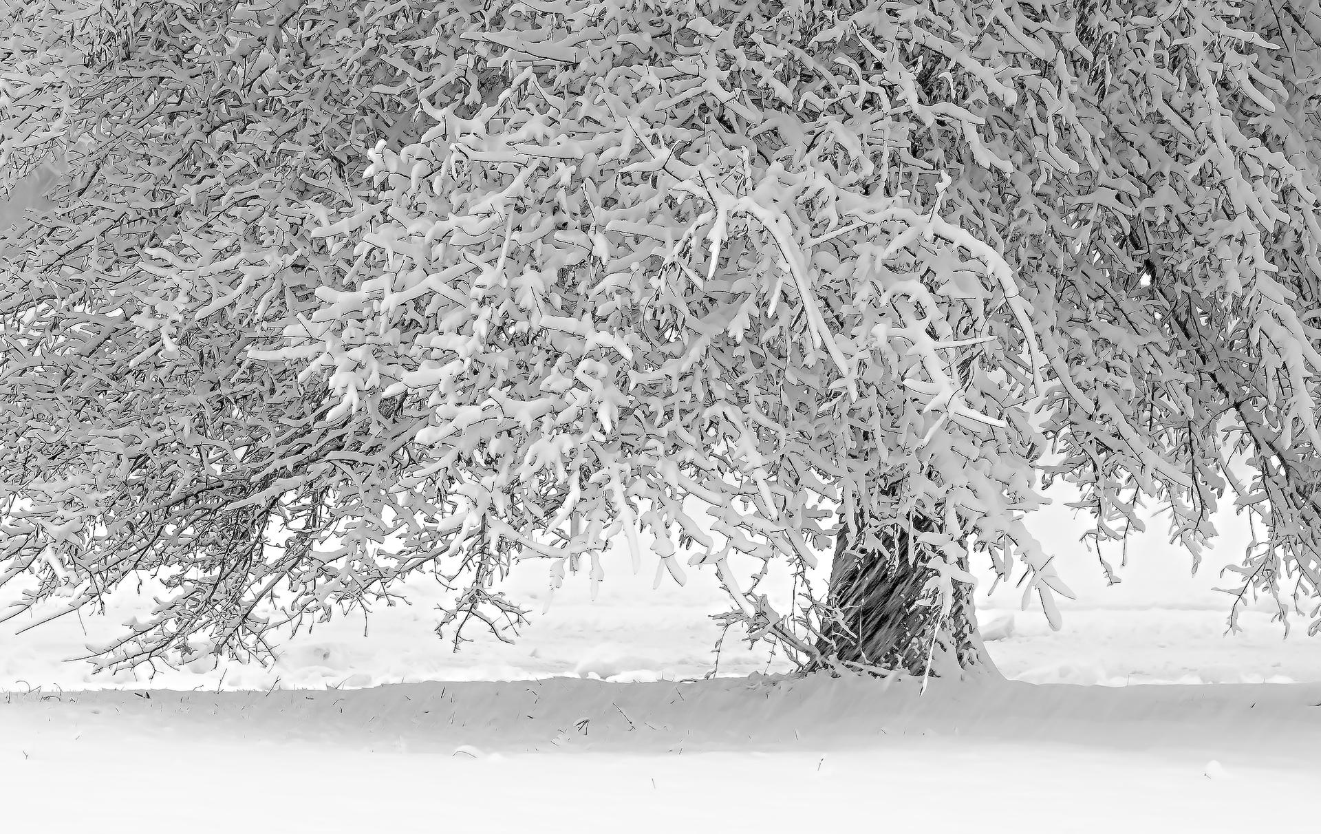
Hi John, thanks for showing the image. I have same comments with Charles. I looked your updated image. The image is clearer, the green color of the tree should be de-saturated a little bit. I like your composition very much, either original picture or post crop is good. The DOF of this image is very impact to viewers' eyes. The balance of spaces in your image is very well designed. Best regards, |
Oct 13th |
| 88 |
Oct 21 |
Reply |
Dear Charles, thanks for valuable and helpful comments. I agreed both of suggestions: desaturate the jacket and replace sky (even if it is very small area). If I have time I will adjust and post the updated image. Thanks again, best regards, |
Oct 13th |
6 comments - 1 reply for Group 88
|
6 comments - 1 reply Total
|