|
| Group |
Round |
C/R |
Comment |
Date |
Image |
| 14 |
Mar 21 |
Comment |
Hi Greg, I like the nature color of the image, I feel fun with the people you took in the image. That is the success to show this street photo image. In my opinion, you may take this image larger to create spaces for the scene and I agreed with Xiao about not to use oil painting for this image. |
Mar 14th |
| 14 |
Mar 21 |
Comment |
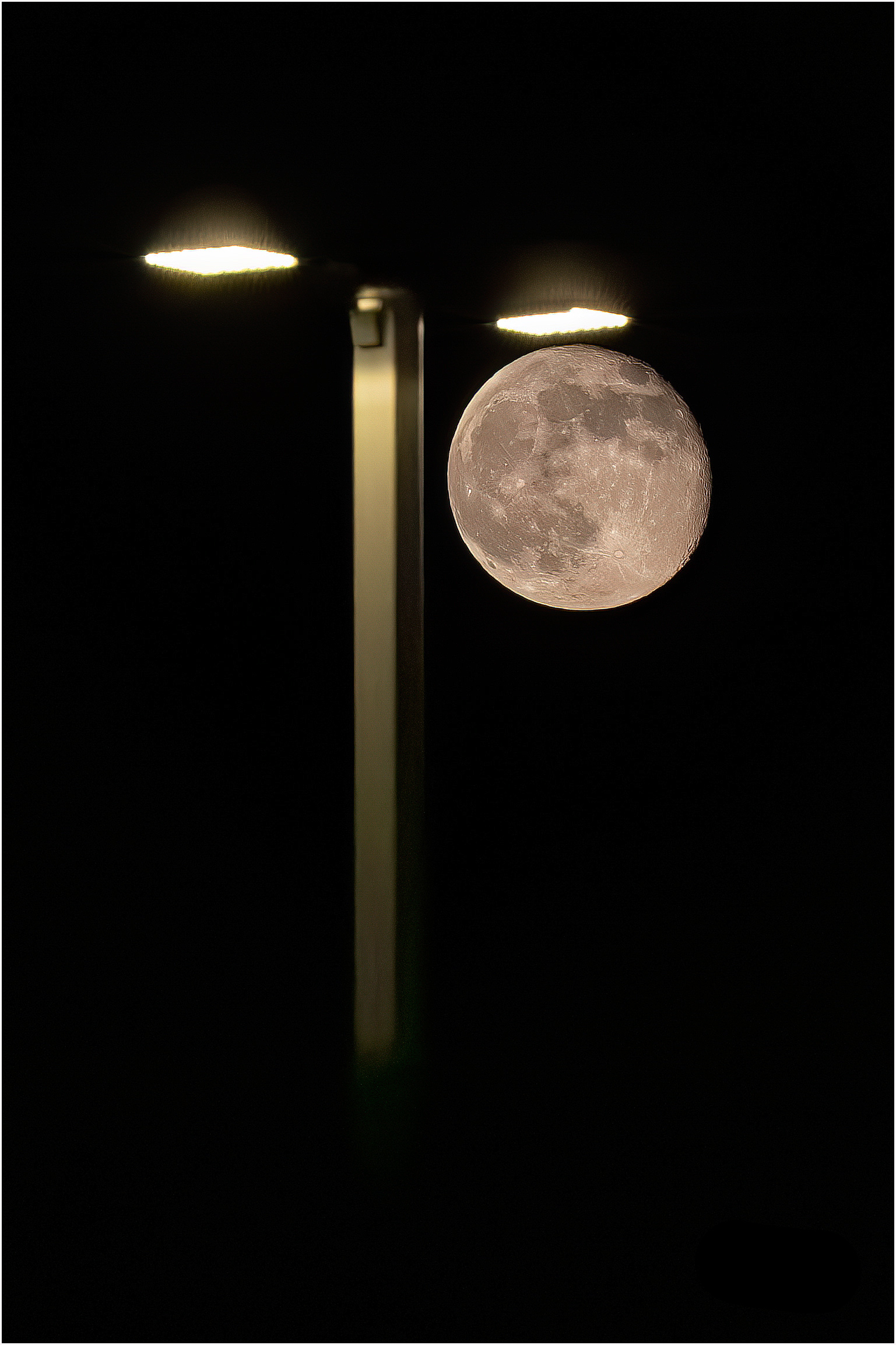
Hi Syed, It is beautiful nightscape. Colors and brightness are well balanced for night picture. I would agree with Xiao, the image need to rotate a little bit to the left. Thanks |
Mar 14th |
| 14 |
Mar 21 |
Comment |
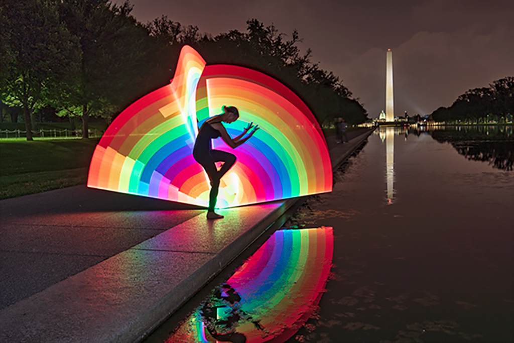
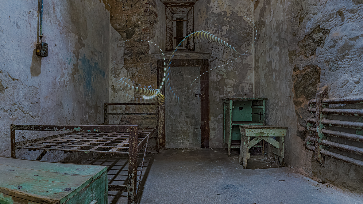
Hi Xiao. What a nice composition for the image. You must have a good thought to set up the subject standing in front of reflection material. Well done. Im my opinion, the original color balance of the image is much better and natural. In addition I like the soft shading of the original image. Thank you. |
Mar 14th |
| 14 |
Mar 21 |
Comment |
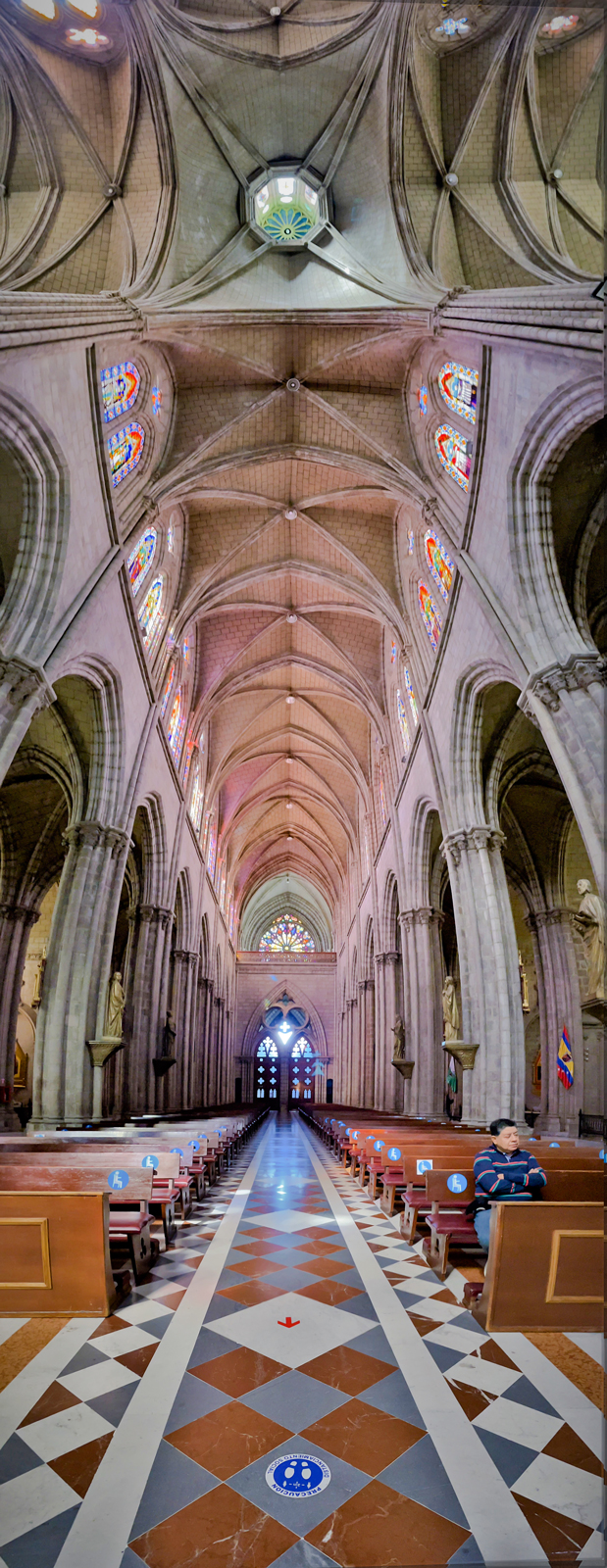
Hi Tom, Thanks for showing the image. I have seen and learned technique to turn architecture image from day light to night light image. In my view, the composition is well done. I agreed with Darcy, the light leads viewer to the entrance. The image is very sharp. In my opinion, I suggest the level of contrast is little high and I could some uneven area of the columns, and upper right corner of the building.
I plan to go out to take some architecture like you in the covid time, thanks for reminding. Well done. |
Mar 14th |
| 14 |
Mar 21 |
Comment |
Darcy, thanks for showing the image. Your image has nice combination of colors. The softness of petals give a feeling of calm and relax. In my view, I would like to see a small area of focus and softer around to draw attention to the eyes of viewers. I agreed with other comments. I would hesitate to suggest the dark grey color of the both corners could be dodge for brighter. Thank you very much, I would think you must spend a lot time to arrange this flower. |
Mar 14th |
5 comments - 0 replies for Group 14
|
| 88 |
Mar 21 |
Comment |
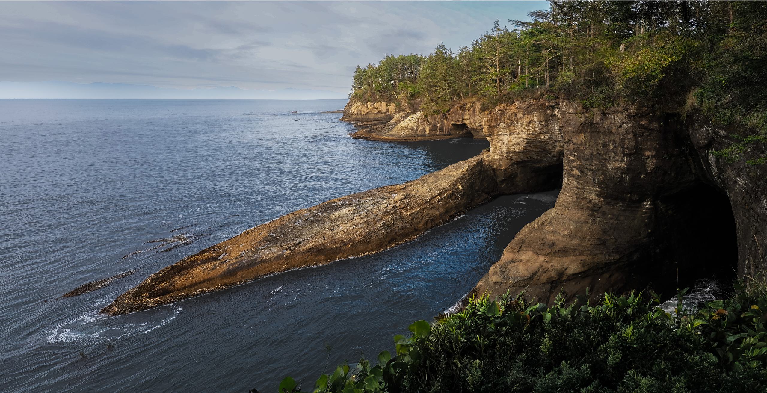
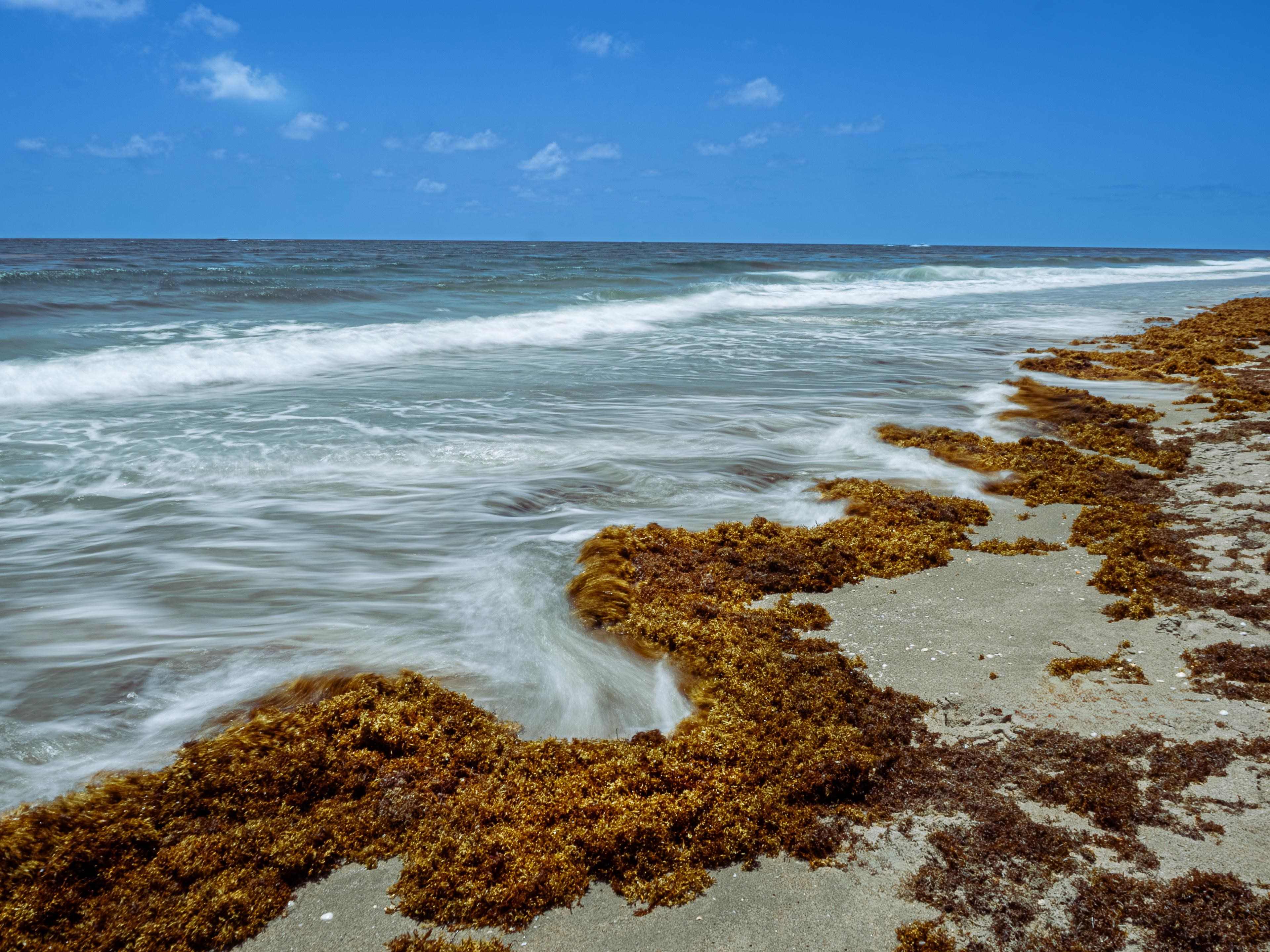
Hi Sanat, It is a beautiful scene. The image show layers of mountain and good depth and clear from front to back. In my opinion, the blue color is over saturated compared to original image. If the is a chance to take the whole tent on the left in my view it should more balances. The cloud replacement on sky is nice but somehow in my eyes it was blend well. Thanks for show the interesting place. Best regards |
Mar 14th |
| 88 |
Mar 21 |
Comment |
Hi Rich, this month I see 2 images that have colors very distinct. Your image is well composed and have nice colors blend. I my opinion, if there was not a limit of you lens, I would like to see more star effects because this scene has good chance to take rays from lights. I like this image a lot. Thanks |
Mar 14th |
| 88 |
Mar 21 |
Comment |
Hi Trey, thanks for your hard work to stack 46 shots to this pano image. It must be very detailed if I could see the original. I like the light saturation color, it make the image more color of white winter. It is hard to image it is a lake if you don't tell. In my opinion, foot print could be extend but pano image limit to do that. Have you think about to use Patch tool. Thanks, Best Regards |
Mar 14th |
| 88 |
Mar 21 |
Comment |
Hi Charles, It is a wow image. Colors combination from front and back is fantastic, you must took it in a right moment of set up the car to stop at the right position. Adding a person who standing in front of the car is excellent idea. I really like your image. Very nice photo that I could think it is rarely to find place to take. Thanks |
Mar 14th |
| 88 |
Mar 21 |
Comment |
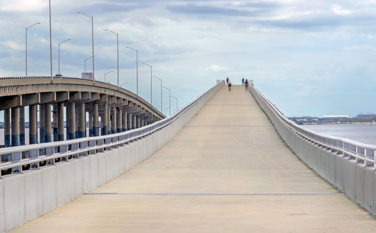
Hi Louis, what a nice picture. A perfect crop on your portrait to landscape image. The curve of the bridge you took is very attactractive. I really like the color of the sun goes throughout the bridge, it show the bridge is strong and popped. The brightness of light from front to back is well balance. It is perfect. Just a little suggestion in my view, I would want to keep a little blue sky as original image. Best regards |
Mar 14th |
| 88 |
Mar 21 |
Comment |
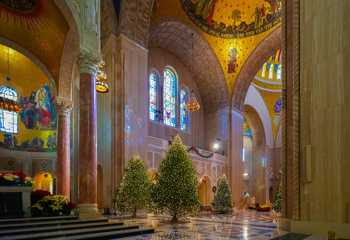
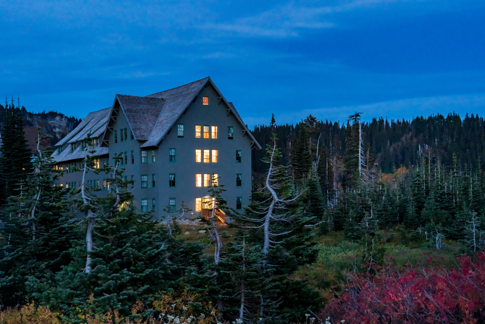
Hi Gary, I like the way you change the image to have story and much live. The colors after you do post processing is very balance around the house. In my opinion, the cowboy there is OK and well blending, however I would suggest make the light in the house darker to be more real. Best regards |
Mar 14th |
6 comments - 0 replies for Group 88
|
11 comments - 0 replies Total
|