|
| Group |
Round |
C/R |
Comment |
Date |
Image |
| 2 |
Apr 22 |
Comment |
Martin,
I love this one! I wish I had seen it on my drive around the South Island several years ago. Replacing the lake and mountains was a terrific addition to the image and I did not find the transition disturbing. What I really focused on was the grass and the direction to the fronds. Makes me want to go back!! |
Apr 14th |
| 2 |
Apr 22 |
Comment |
Hey, Karen! Love this kind of scene to photograph. I agree with Jim that the pontoon boat is really a distraction for the rest of the image. I would crop it out. I also would spend some time highlighting the texture of the wooden structure as I find that really captivating. |
Apr 14th |
| 2 |
Apr 22 |
Comment |
Shirley, Beautiful tulips! My resident rabbit just ate all my tulips so I am very jealous of how pretty these are. In would like to see what would happen if you could shoot it again and make the depth of field a bit deeper so that the red tulips came into focus. I also would love to see what would happen if you moved your camera to the right so that the two lines of pink tulips (one on the far left and the other one row over) lead the eye into the frame with the red tulips in focus at the back. Not sure any of that would improve on your lovely shot but the thoughts just occurred to me as I viewed the image. |
Apr 14th |
| 2 |
Apr 22 |
Comment |
Adding a bit of framing is the perfect addition to a very nice image. I personally like the bud because it seems to be pointing to the flower which helps the viewer get to the subject. Well done! |
Apr 14th |
| 2 |
Apr 22 |
Comment |
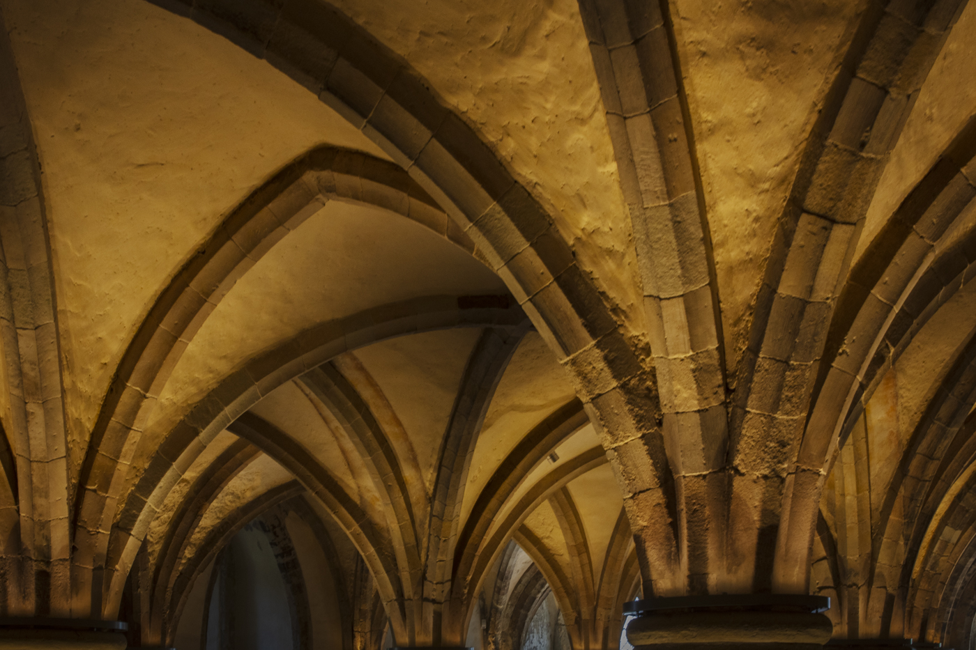
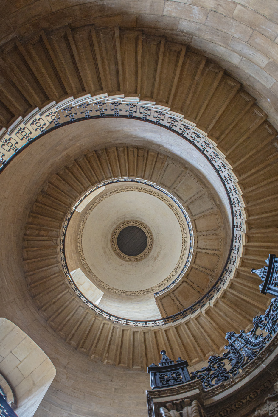
Oh my! I love your story and the image. I really would love to go to the exhibit as well as to experience the architecture. I think that darkening it really works well. One thing that continues to bother me is that at the top there seems to be an ending point that is cut off. How did the design end? I would like to see the end of the window at the top. I also think that if you cropped out the left side of the image so that you only see the central bending line, it might add to emphasis of the design element that is so lovely. |
Apr 14th |
| 2 |
Apr 22 |
Comment |
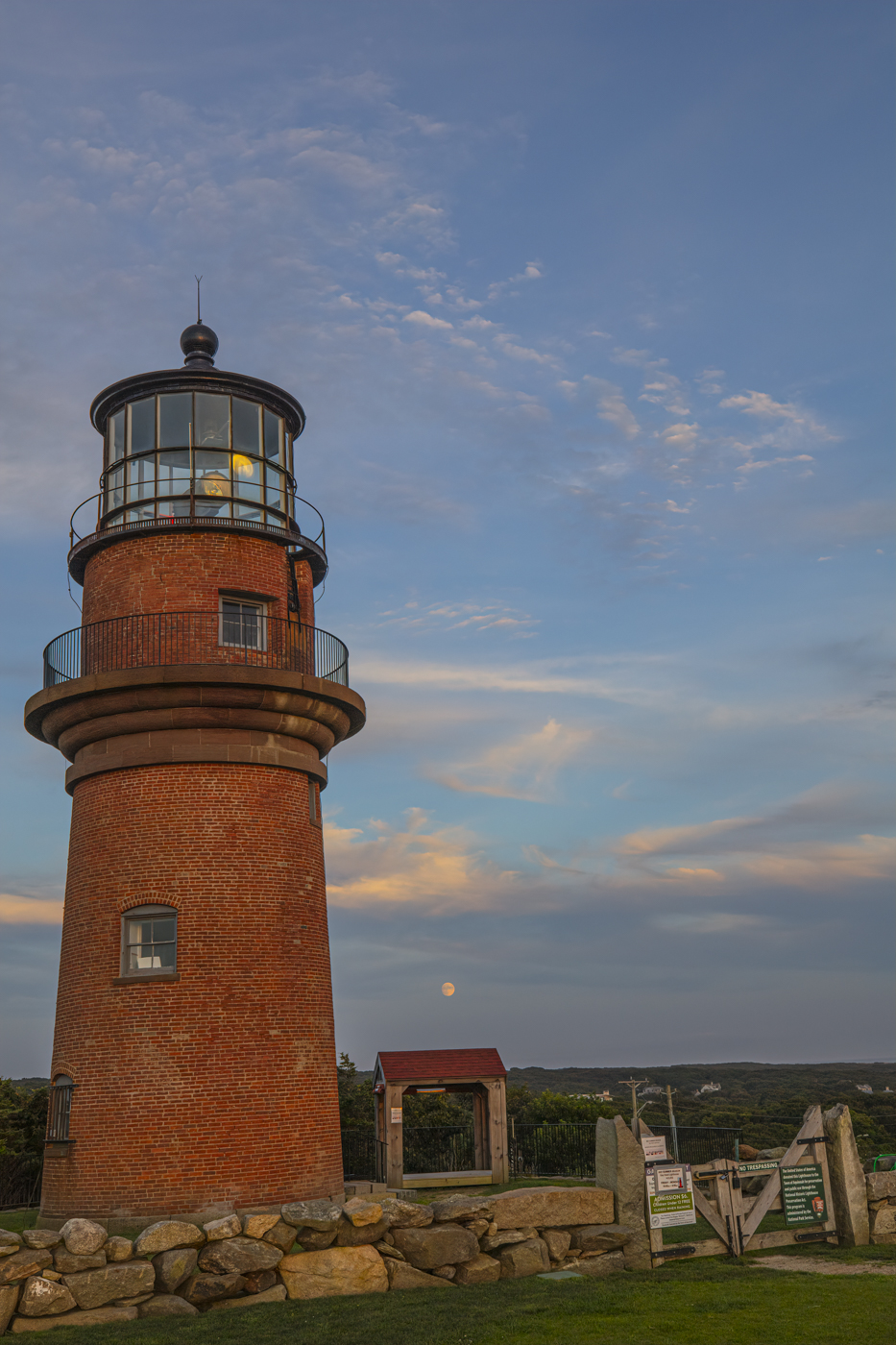
Thank you all for the comments! I agree that the image is much better with more added to the left. It really gives the lighthouse more space to dominate. I love that gate but the signage adds nothing. I think rather than get rid of it I might try to do a fill with content aware or use one of the photoshop tools to reconstruct the gate. I straightened the lighthouse and tried several different angles for it so not sure that one can really be more corrected than it already is. I totally ignored the house on the right of the lighthouse so maybe if I straightened it the whole things would be good!
The Lighthouse is on Martha's Vineyard at Gay Head which is at the western most tip of the island. Beautiful place but go in the fall when there are less people! |
Apr 14th |
6 comments - 0 replies for Group 2
|
6 comments - 0 replies Total
|