|
| Group |
Round |
C/R |
Comment |
Date |
Image |
| 2 |
Jun 21 |
Comment |
I just wanted to thank you all for the wonderful feedback! I think from the varied responses there would be a different way to portray the story than what I have chosen. Maybe too much of a mixed metaphor and too much left for the viewer to figure out. Anyway, maybe I will take a look around and find a different way to portray the story of this wonderful place that my father left for his family to enjoy. It has been interesting and I am really glad I posted this! |
Jun 17th |
| 2 |
Jun 21 |
Reply |
So interesting, Piers! Love to see what you have done. I am going back to the image and give it a try! |
Jun 8th |
| 2 |
Jun 21 |
Comment |
Wow! great editing. I know what you mean about moving all the sliders in lightroom to turn a picture into something worth taking a look at! The only change I could suggest is that the sky is toned down a bit. I think it presents too much of a contrast with the rest of the photograph. Looks like a great place to spend a bit of time! |
Jun 8th |
| 2 |
Jun 21 |
Reply |
Thank you Shirley for your comments. You can read below my explanation to Karen about the "back story" of the picture. it has been fun to explore some different ideas and presentations to see what happens! |
Jun 8th |
| 2 |
Jun 21 |
Reply |
Karen, you are correct and I think that is why this photo did poorly in competition. However, it is really a lovely story behind the pictures. The gravestones are my parents and grandparents, and my grandson and his father are able to play so happily because of the cottage that was a part of our heritage from the people in the graveyard. So, not somber at all but very joyful. Probably needed to express it in a different manor. But, I wanted to explore the idea and see where it went! |
Jun 8th |
| 2 |
Jun 21 |
Reply |
Thank you for your comments. I had not thought of darkening the gravestones individually to make them clearer. It was difficult to get the correct balance because if I took the opacity of the top photo too low a cross hatch pattern would appear. I am sure there is a way to prevent that but I did not know how. You might have suggested the correct solution. |
Jun 8th |
| 2 |
Jun 21 |
Comment |
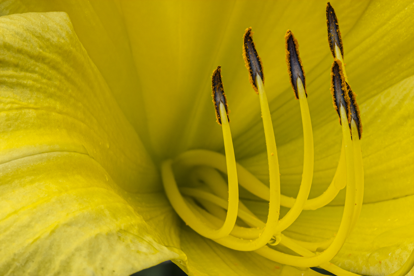
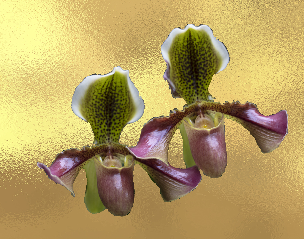
Shooting the light! This is what makes this photo so strong. I also appreciate the negative space on the right. It enhances the strength of the composition. I will look forward to more gladiolas from you! |
Jun 8th |
| 2 |
Jun 21 |
Comment |
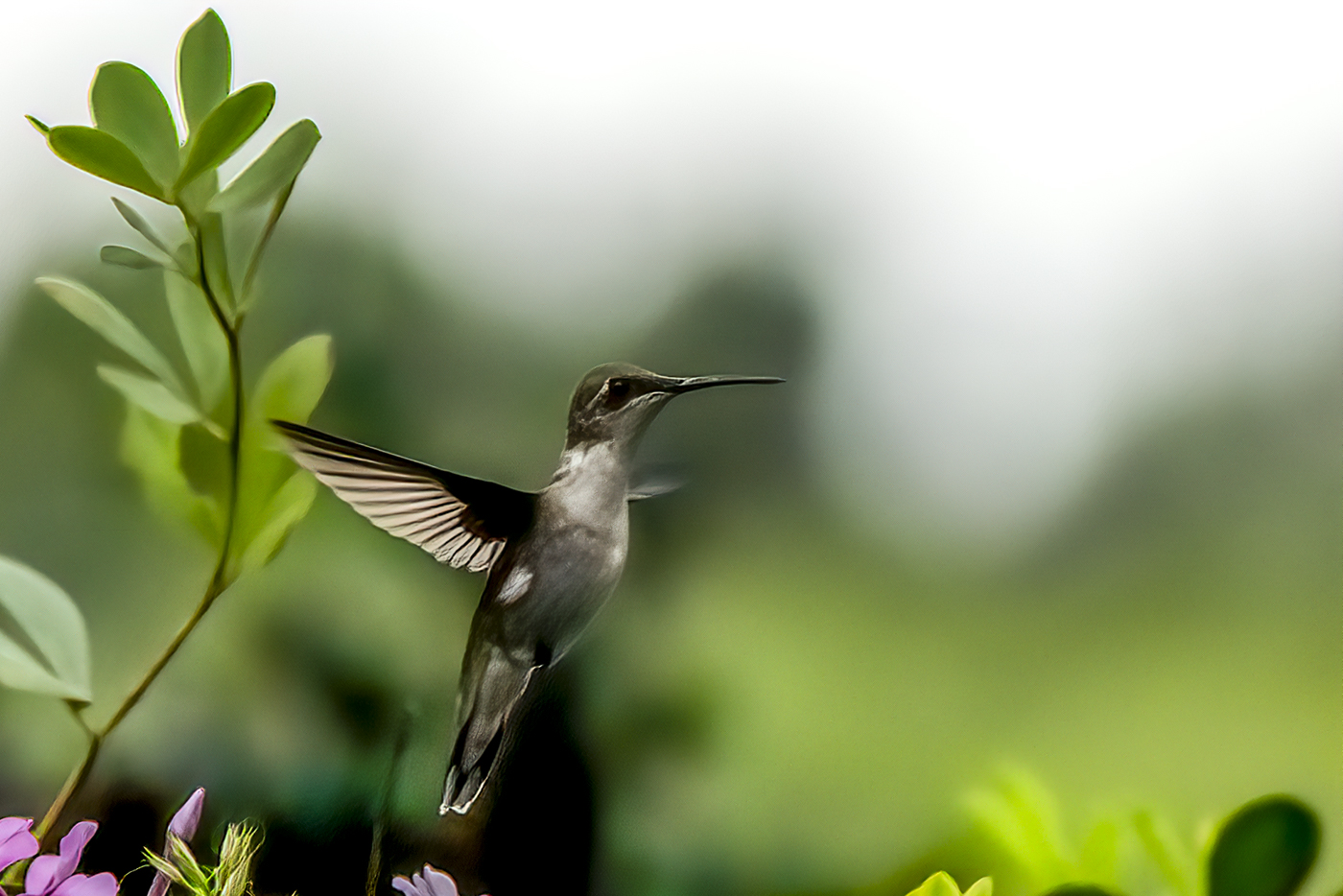
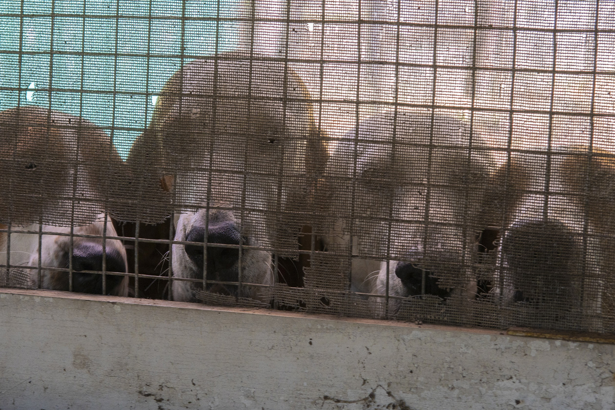
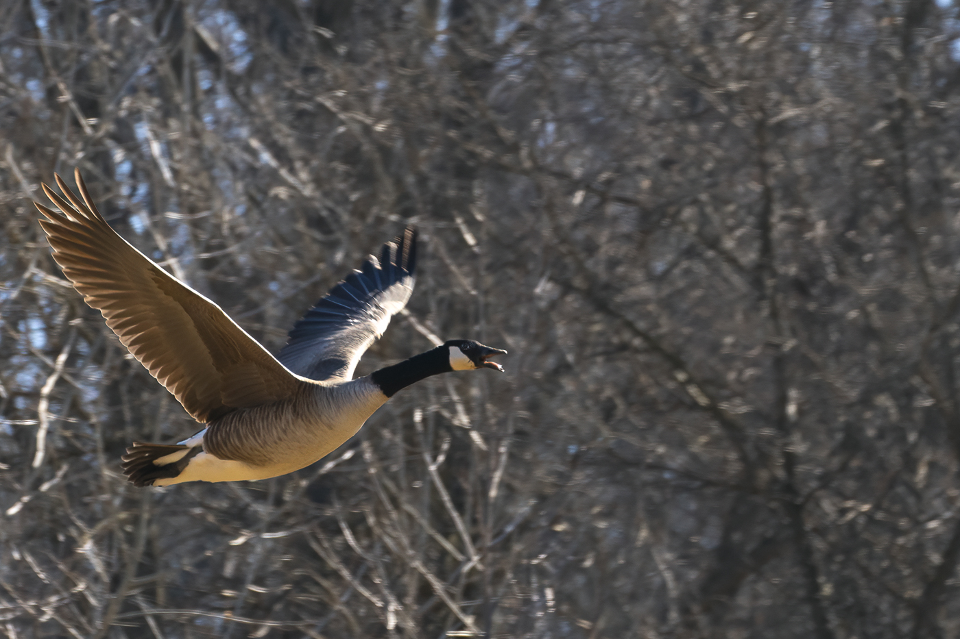
I would also like to see what happens if you do it as B&W. The bird is spot on sharp which makes it really spectacular. I keep thinking about the position of the neck. How in the world does that bird get there! What is nice is that your photo creates a conversation with the viewer! |
Jun 8th |
| 2 |
Jun 21 |
Comment |
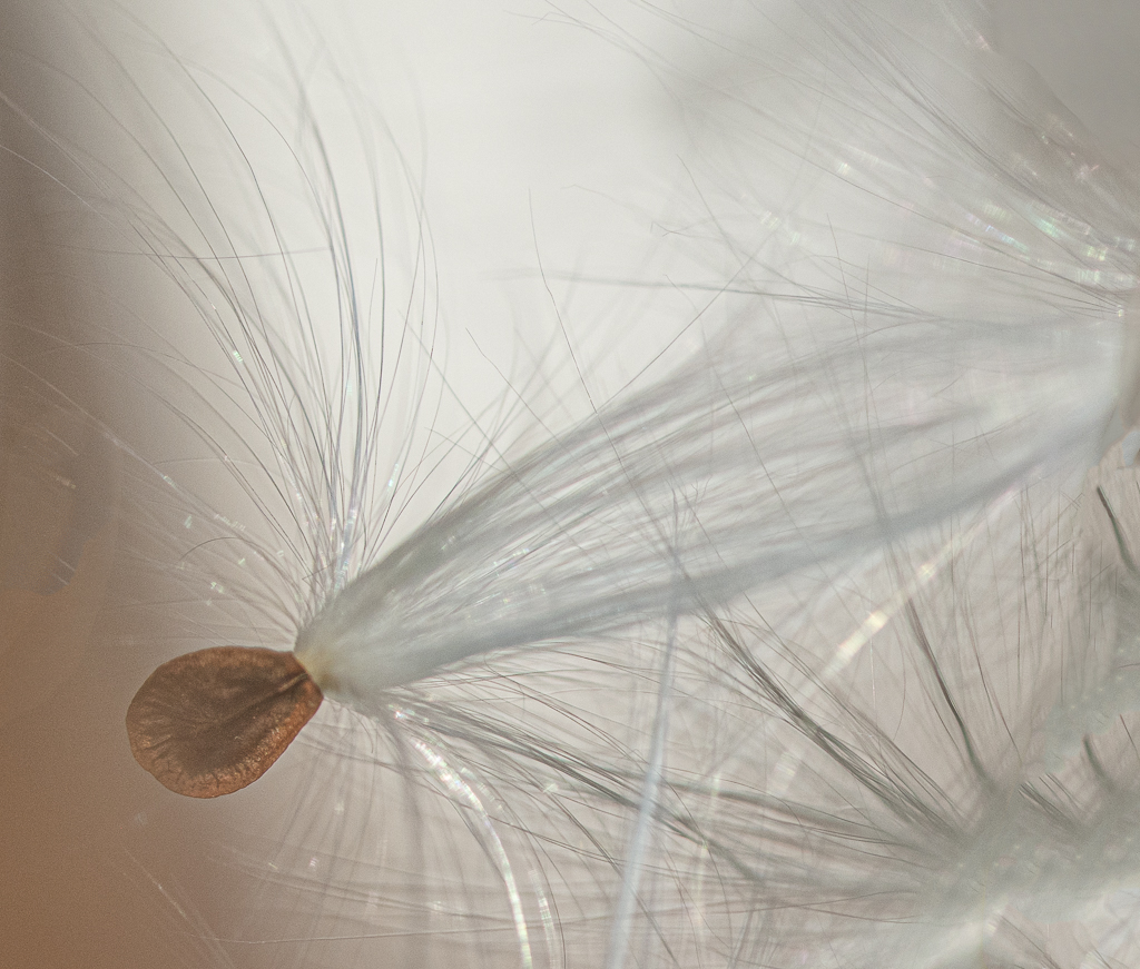
This is very nice, Shirley! I do think that changing the background was a good choice, and the wood grain does not subtract from the simplicity of the blossom. Would there have been a way to get the grain of the background running ths same way as the grain texture in the top petal? Not necessary at all but it might make a fun variation! |
Jun 8th |
| 2 |
Jun 21 |
Comment |
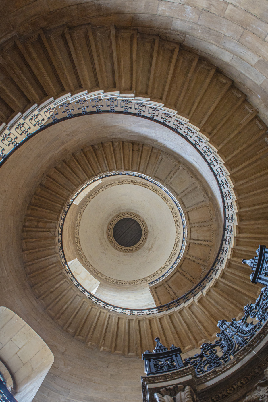
I like the sense of length you get both horizontal and vertical. the sun rays really add to the vertical sense of space and complement the central path at center. It is interesting how the sense of space is my primary take away from the photograph. I love it! |
Jun 8th |
| 2 |
Jun 21 |
Comment |
Really beautiful! I agree with getting rid of the Unbrella and to straightening the horizon. You might consider cropping out some of the top white stone as the eye is focused on the glass of the doors and travels to the sea and sunset behind. Overall though, great capture! |
Jun 8th |
7 comments - 4 replies for Group 2
|
7 comments - 4 replies Total
|