|
| Group |
Round |
C/R |
Comment |
Date |
Image |
| 2 |
Jan 21 |
Comment |
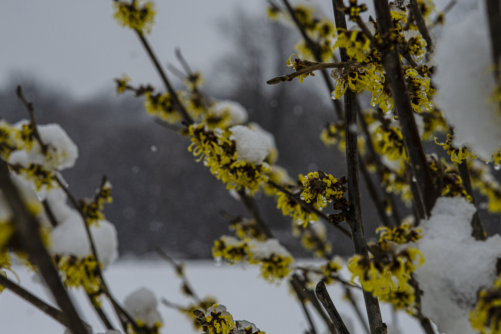
Your 1:1 crop really works! My eye goes immediately to that fabulous mill and desaturation of the flowers is exactly what the image needed to direct the eye where you want it to be. I have spent a great deal of time in the "Valley" but have never been to this location. I will put it on my list! You have a beautiful photograph. |
Jan 10th |
| 2 |
Jan 21 |
Comment |
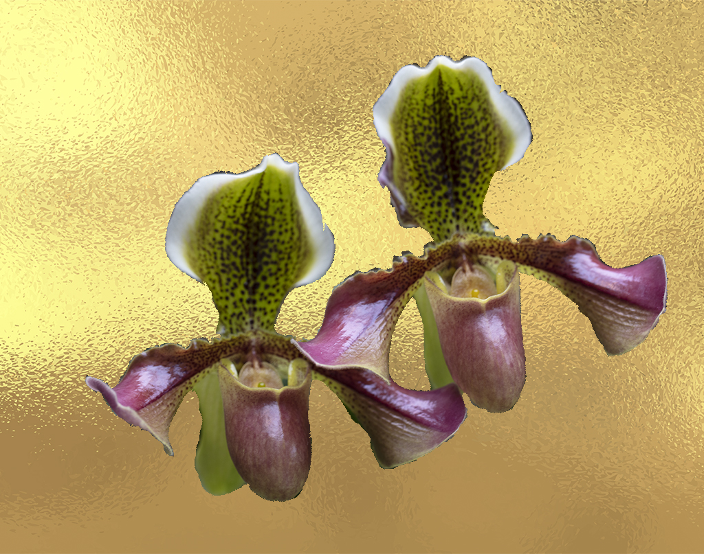
I actually think I like the smooth background better! the textured background is absolutely fascinating but I found that I was looking at that more than the flowers in the image. With the smooth background I was able to notice the detail of the petals. They look almost like a watercolor painting to me. What would happen if you changed the textured background color to something lighter and not the deep gray tones? Not sure that would make any improvements. Did you try that and see that the darker color was much better? Love the experimentation here! |
Jan 10th |
| 2 |
Jan 21 |
Comment |
I love how you treated the coloration of the truck to soften the effect. I think I agree with Piers that toning down the sky would focus the viewers eye on the truck more. I have a similar abandoned vehicle with trees growing out of the center, very strange and I have been pondering the best way to photograph it. You have inspired me to go give it a try! Great work here. |
Jan 10th |
| 2 |
Jan 21 |
Comment |
Well, Shirley and Piers, you have addressed all my issues with this lovely image.I felt that the focus of the composition whouyld really be the bridge and that the sunset was the backlighting that brought drama to the photograph. That said cropping from the right and from the bottom really heightened the impact. Love it! |
Jan 10th |
| 2 |
Jan 21 |
Reply |
I will take a look at the Refine edge tool. I have never played with that so will give it a try. Part of the problem is that the edges of the orchids really have small hairs on them and so they do not have a hard edge to follow. I guess in that case you need to define yourlown hard edge rather than letting the reality of the flower dictate how you treat it. More work to be done but that is what makes this all so interesting! |
Jan 10th |
| 2 |
Jan 21 |
Reply |
I love the idea of highlighting parts of the flowers. I am going to go in and try that. the gradient tool would also be an excellent idea. I think that I got so used to looking at the image that I did not notice how flat it is and getting some 3D effect going on will really improve it. I am going to go play with your ideas...Thanks! |
Jan 10th |
4 comments - 2 replies for Group 2
|
4 comments - 2 replies Total
|