|
| Group |
Round |
C/R |
Comment |
Date |
Image |
| 90 |
Jun 23 |
Comment |
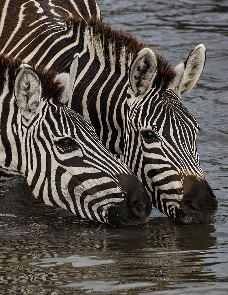
Finally here's the B&W with adjusted curve:
|
Jun 21st |
 |
| 90 |
Jun 23 |
Reply |
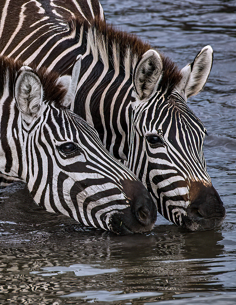
Here's the adjust WB/brightness intermediary image:
|
Jun 21st |
 |
| 90 |
Jun 23 |
Comment |
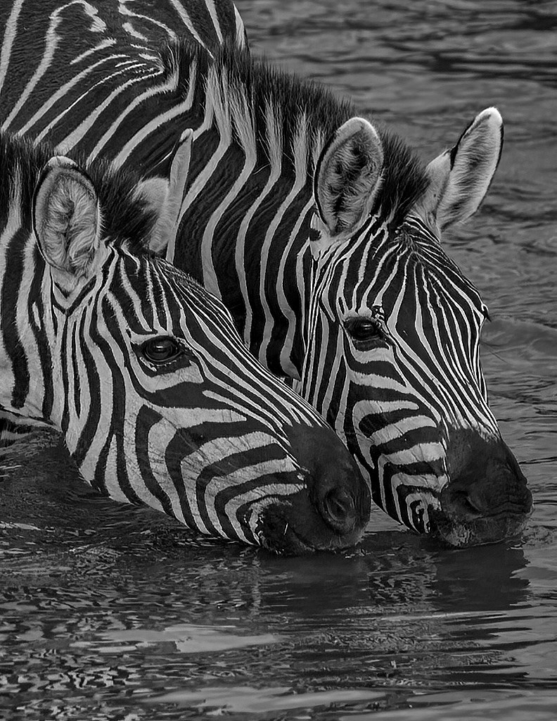
First to answer your question: I prefer the original color version because it's already almost b&w already but the finer shading on the zebras shows up better in color. Part of that is that a lot of the auto-convert filters available need a bit of tweaking to show the same sort of details.
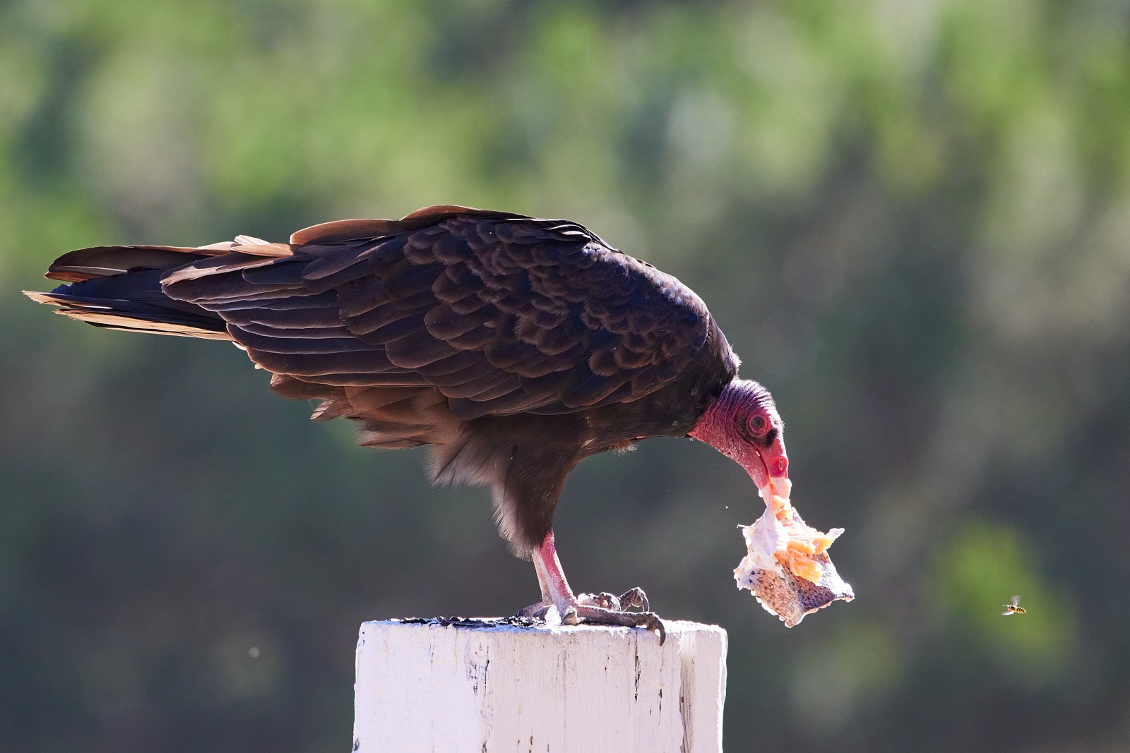
The color image is a bit fuzzy focus wise so I pushed it through Topaz Sharpen and it really brought up the finer details. I then adjusted the white balance and dropped down the midtone brightness. Then I used a CaptureOne built in filter to convert it to B&W and tweak the RGB curve to bring the red channel down -22, yellow up 26, cyan down 23 and blue down 42. I used the slider tool and those are the resulting numbers.
I'll post the various results below, but firs there is the simple sharpened image:
|
Jun 21st |
 |
| 90 |
Jun 23 |
Comment |
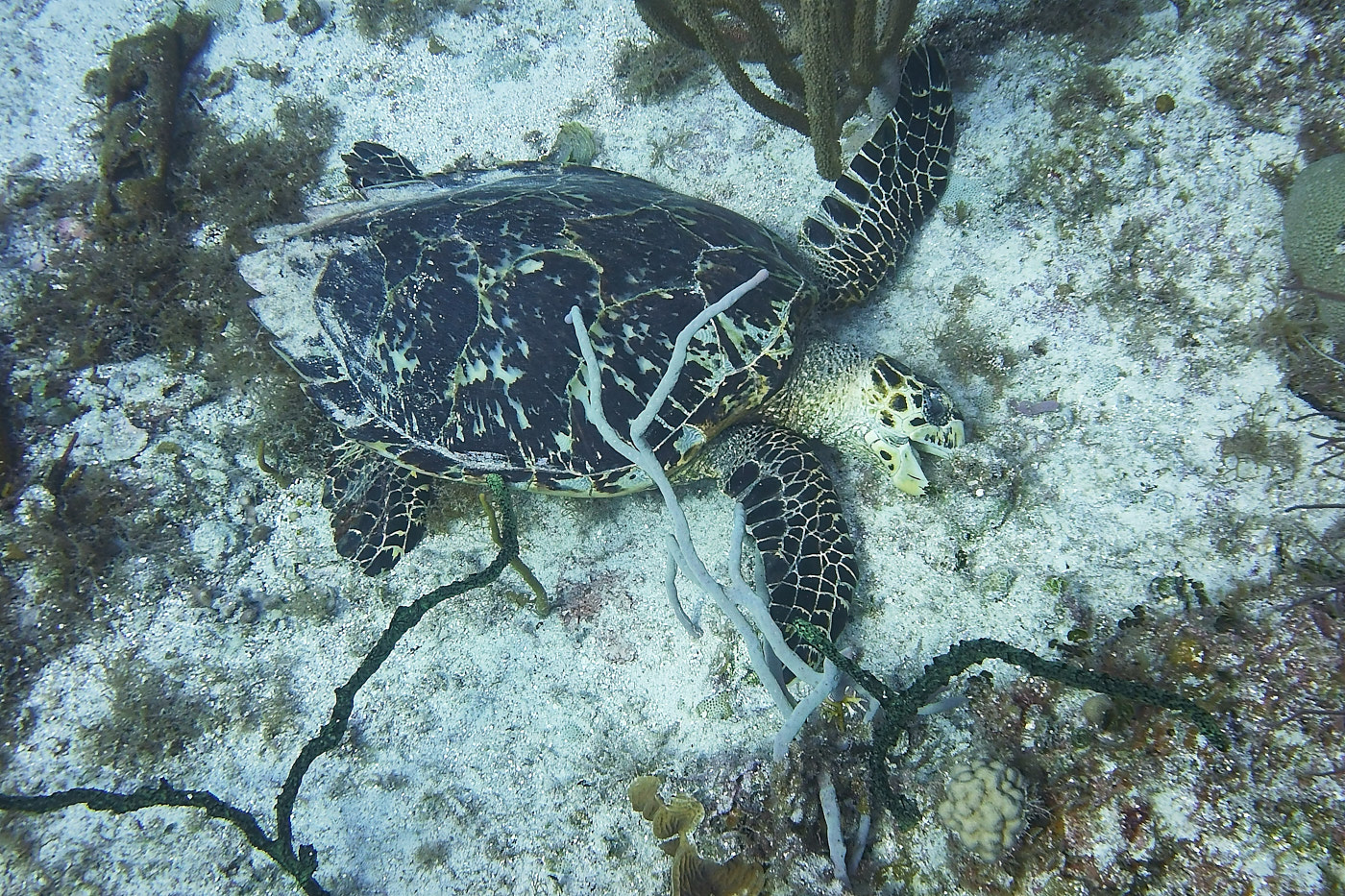
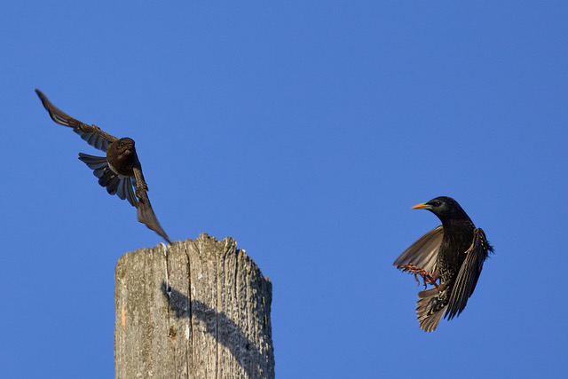
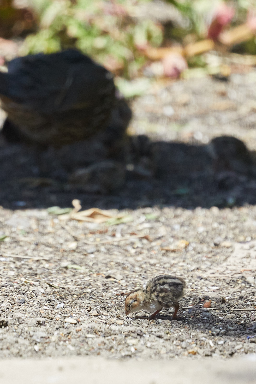
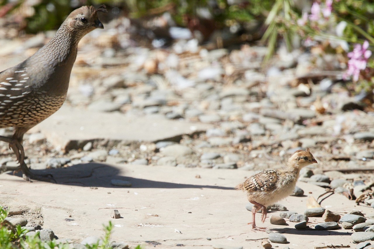
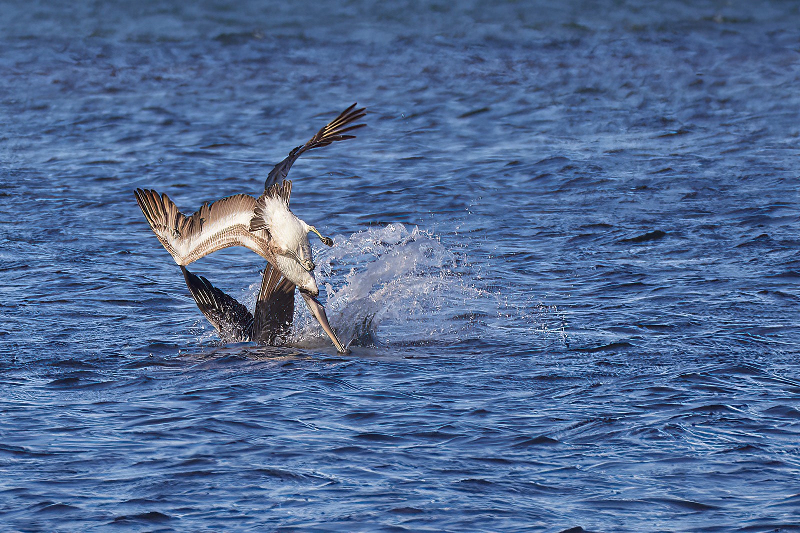
This image is really hard to critique because it's so tiny, enlarging it means lots of noise and I can't tell if it's sharp. I looked at the size and it's only 12KB. You may want to check your tool's export settings and set up something that produces a larger image in terms of resolution and dimensions. Another thing to check is when you send your image to Ginny, make sure your email client sends the full size version you have created and isn't trying to be smart and scale it down (I've had that happen a few times in the past and it's very annoying.)
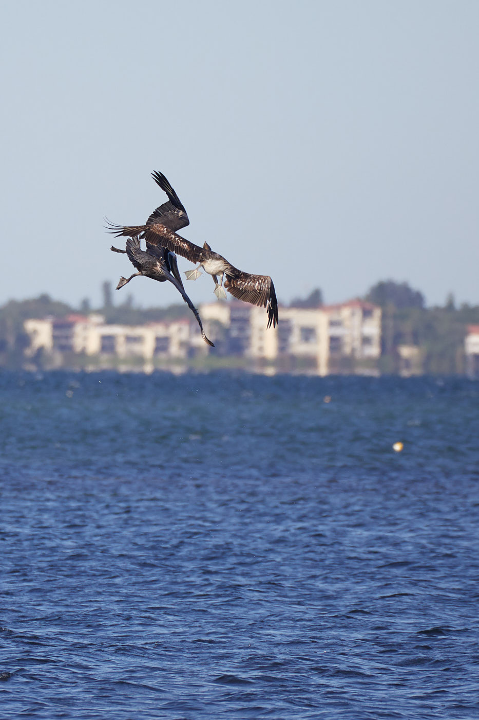
That said, the composition is interesting, but the square crop really constrains the action. Consider opening it up just a bit: perhaps a portrait orientation with some negative space below the birds to help accentuate the movement of the foreground Purple Martin.
|
Jun 21st |
| 90 |
Jun 23 |
Comment |
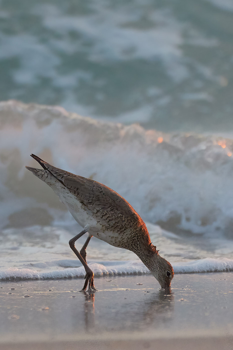
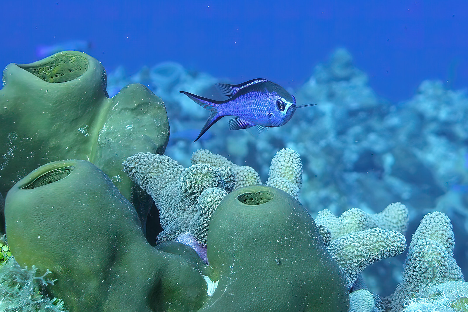
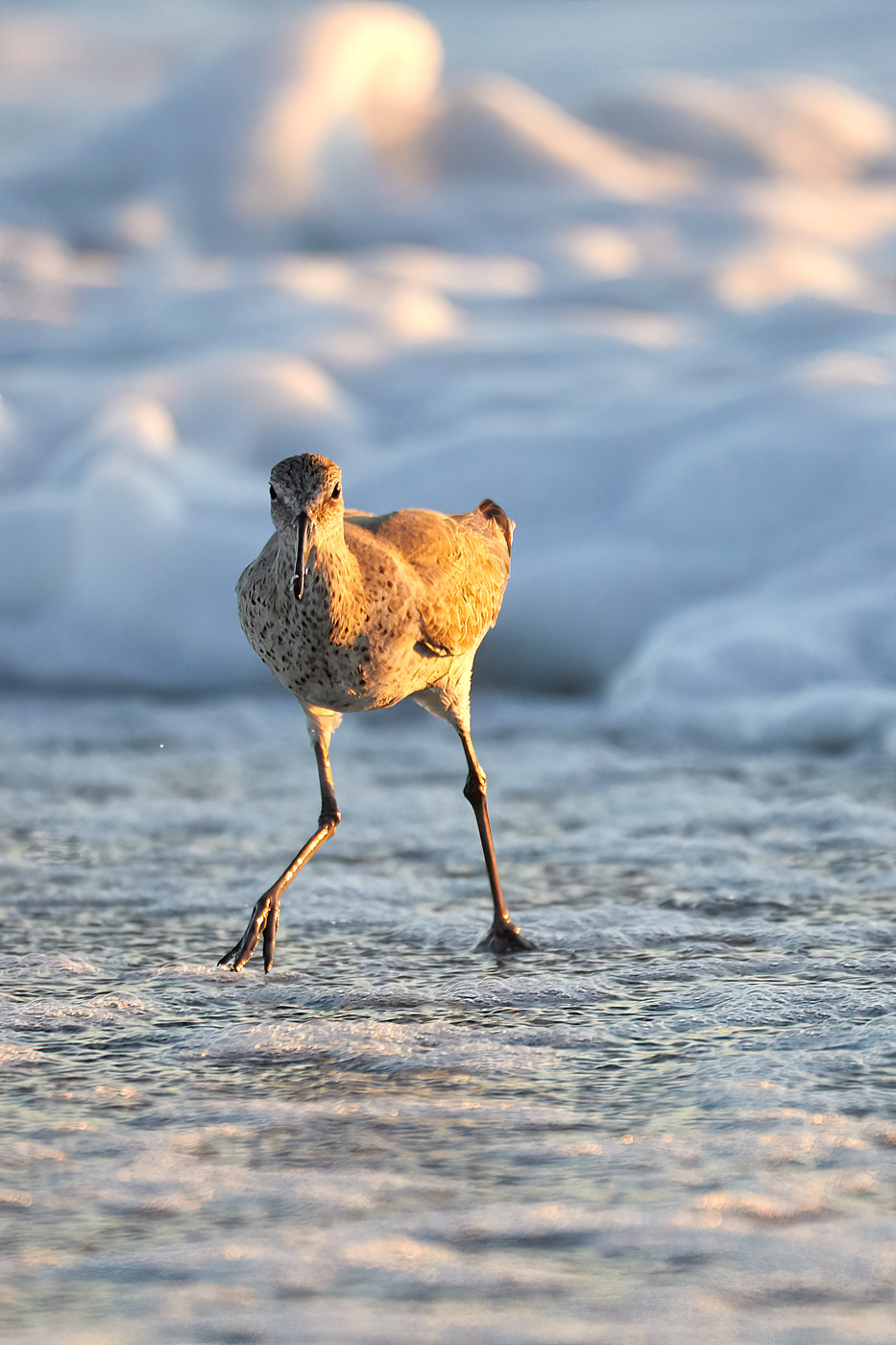
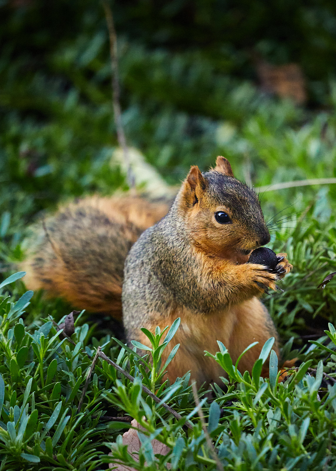
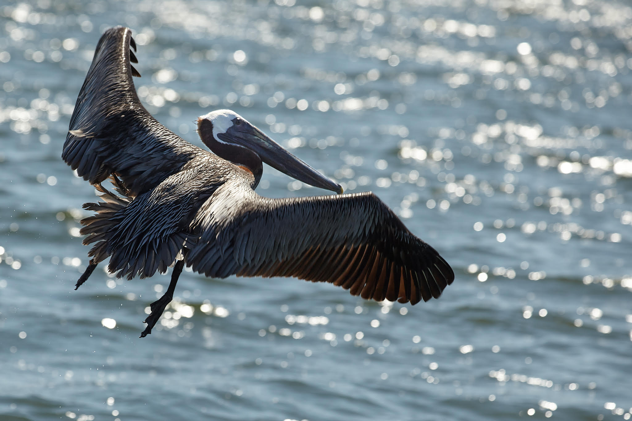
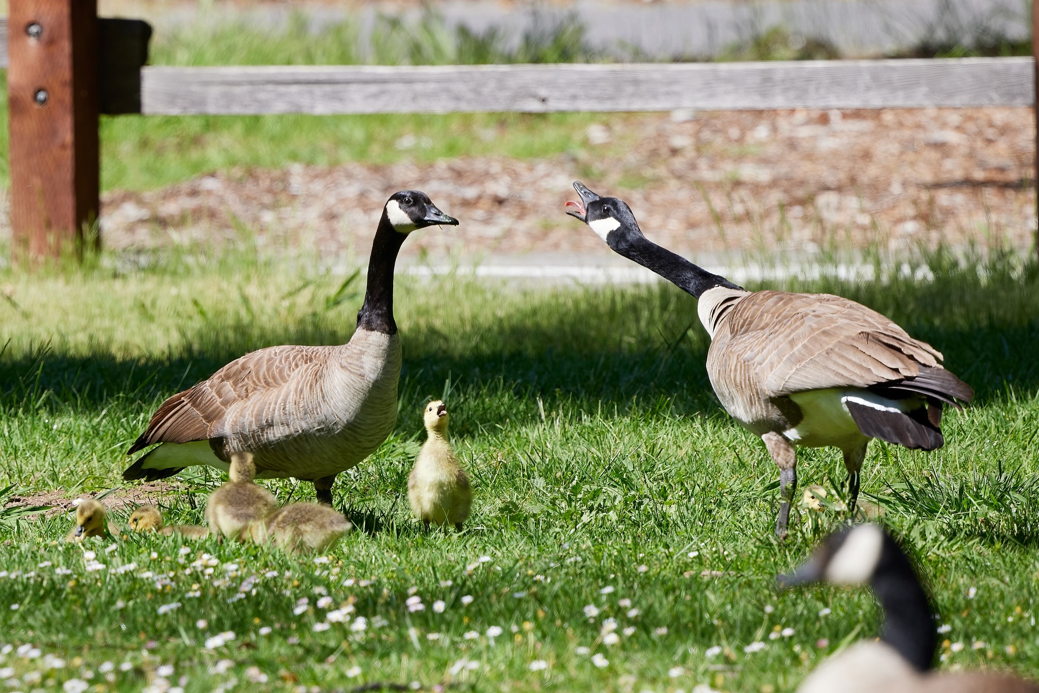
A lovely image: yes there is a bit of sharpness lost considering your original res ult is a much larger image that you have compressed down, but that's easily forgiven. There is quite a bit of noise in the upper background: if that's present in the larger file you may want to dodge it down a bit.
Here's an exaggerated example: |
Jun 21st |
 |
| 90 |
Jun 23 |
Comment |
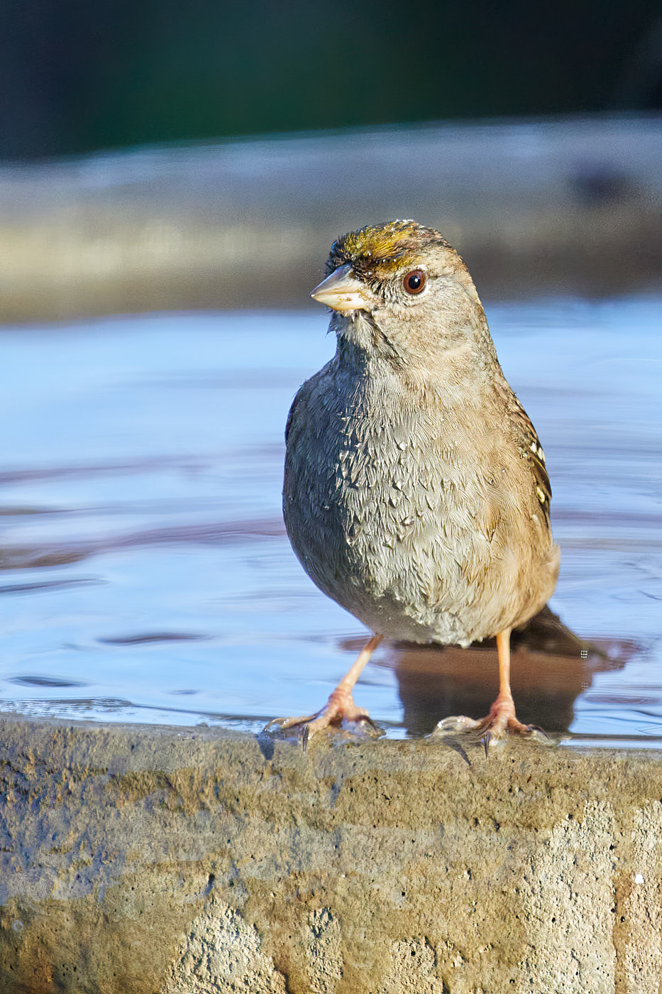
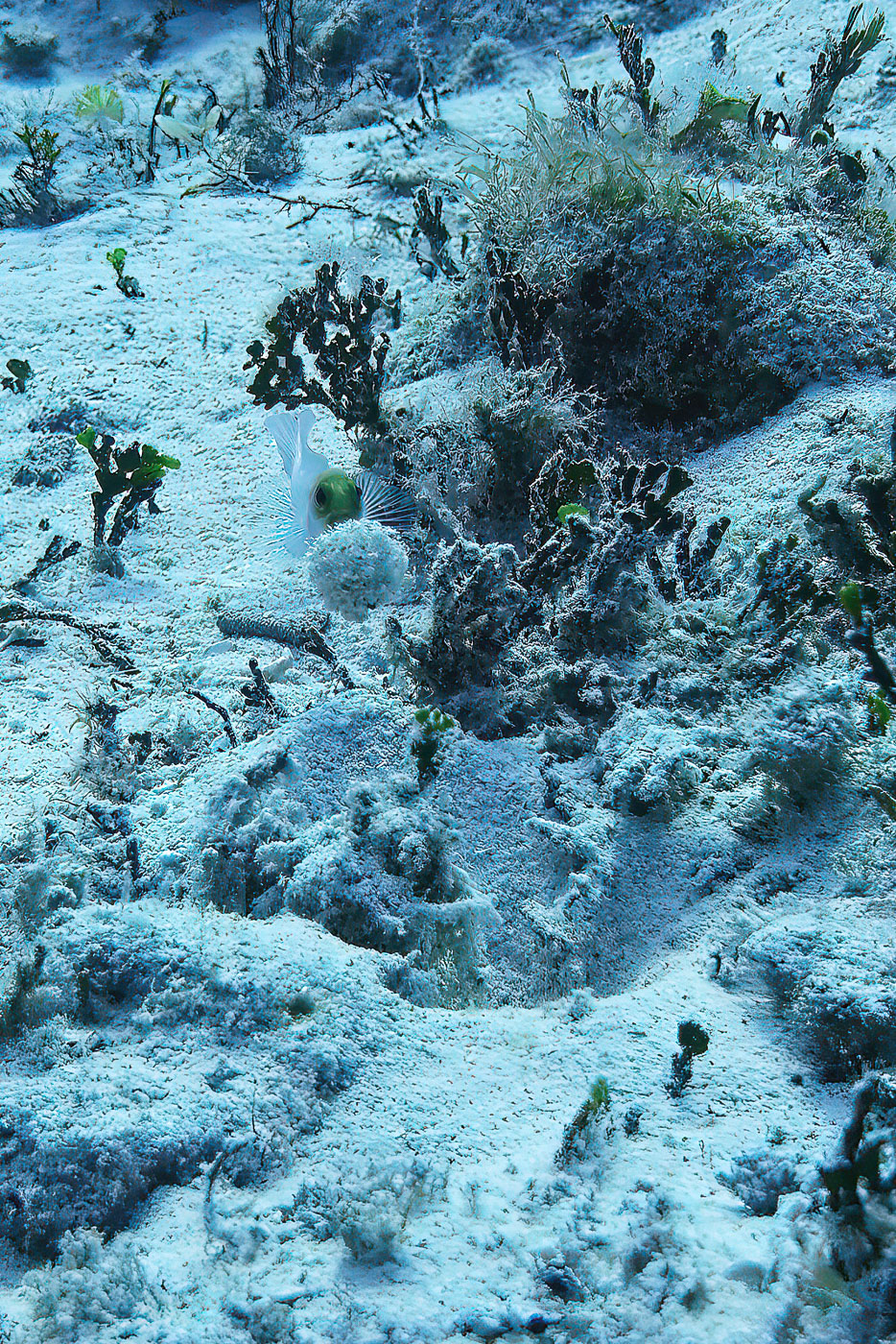
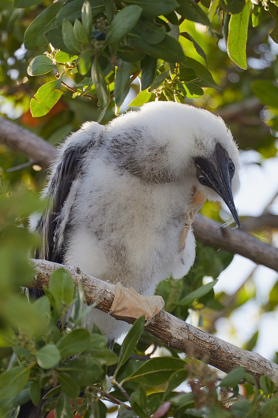
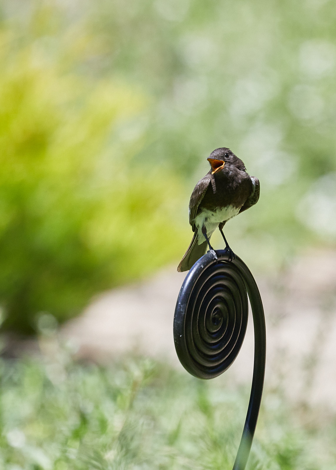
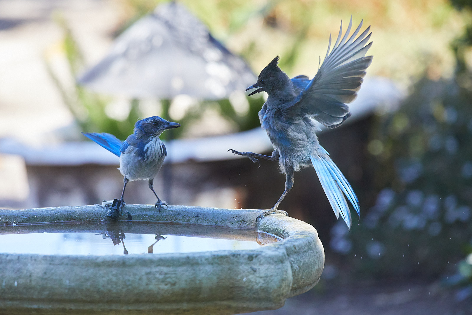
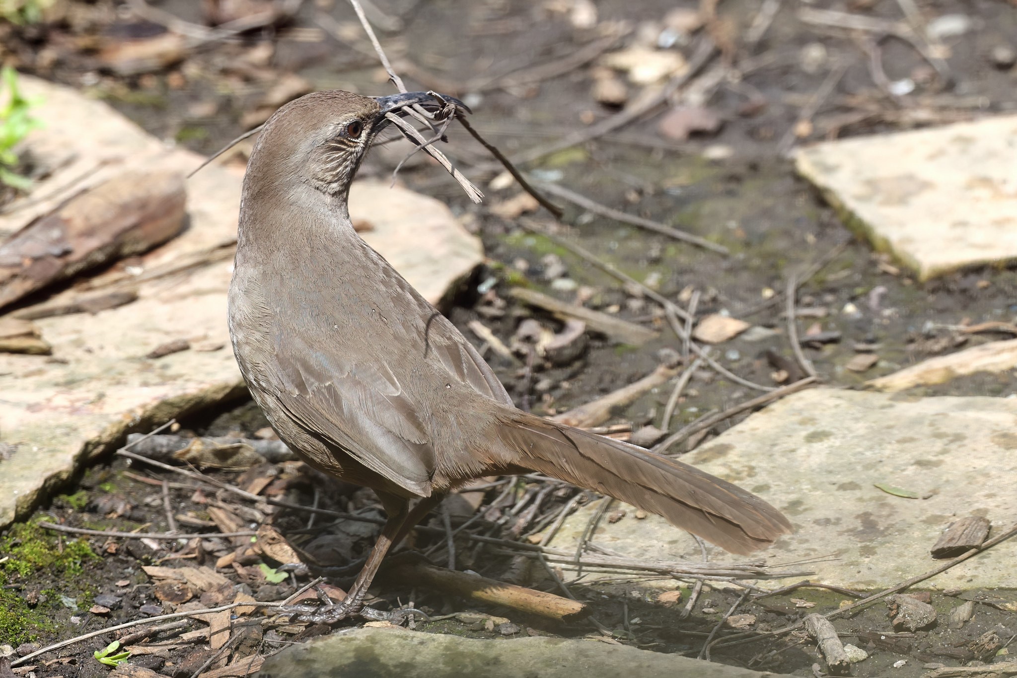
I like the peeking nature of the image. Your hues are well balanced, but I agree with earlier comments regarding darkening down the foreground foliage: probably best to use a mask. I also noticed your image is only 90KB and the res is only 600x400. You may want to try exporting for a larger image as at its current size when I try to enlarge it on my screen it gets very noisy quickly. |
Jun 21st |
5 comments - 1 reply for Group 90
|
5 comments - 1 reply Total
|