|
| Group |
Round |
C/R |
Comment |
Date |
Image |
| 52 |
Nov 22 |
Comment |
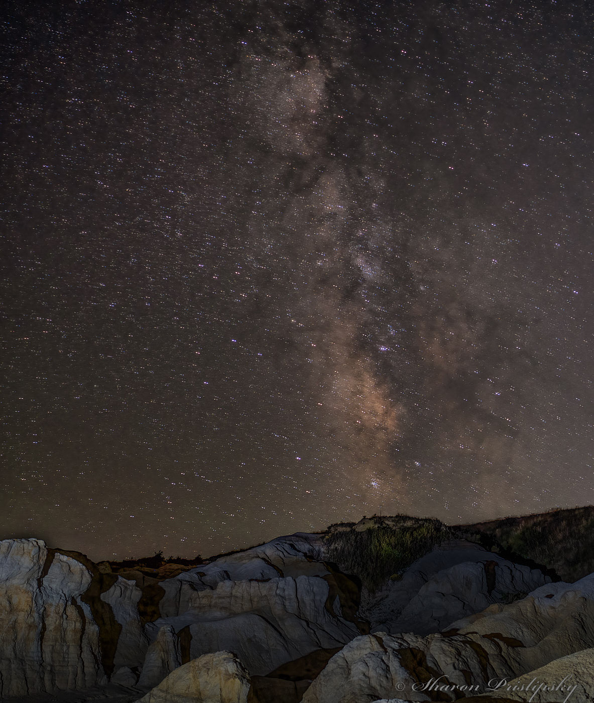
I took Judith's idea and flipped it for another option for you: I tried out a gradient mask in CaptureOne on just the rocks to bring down the exposure and midtone brightness but that ended up darkening the horizon too much so I used the same settings for a targeted mask. (Had time to play with everyone's images this month thanks to be stuck in a hold queue��what fun!) I liked the composition and subject but felt that some of the rocks were just too bright and detracted from the sky.
|
Nov 14th |
 |
| 52 |
Nov 22 |
Reply |
and since I provided tool SS to others: this is what CaptureOne settings were. Once again, not sure how perfectly it will translate to Adobe products. |
Nov 14th |
 |
| 52 |
Nov 22 |
Comment |
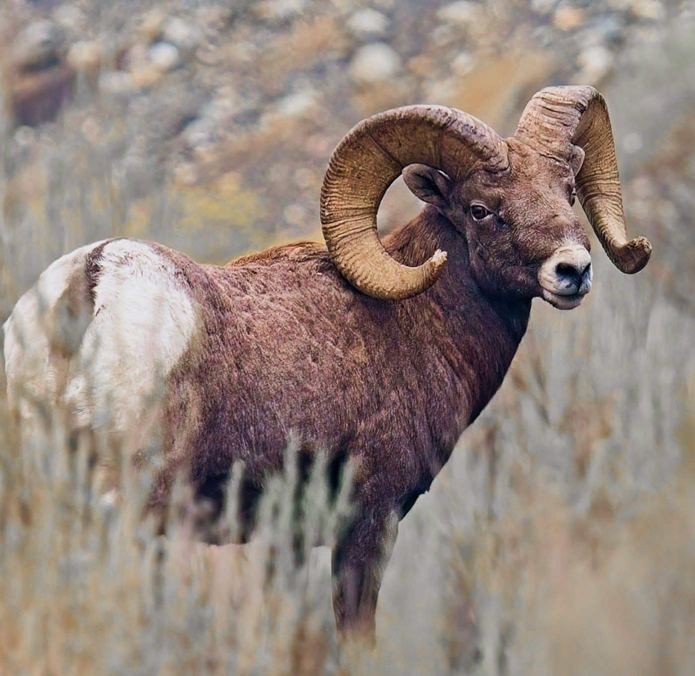
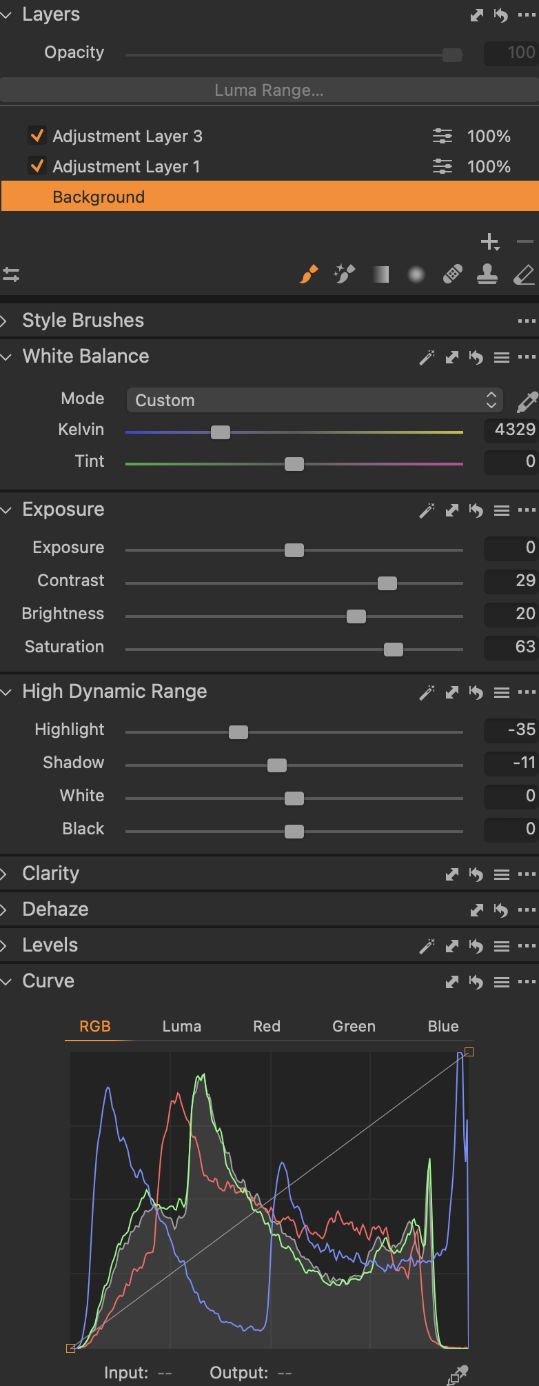
Seems everyone likes playing with your image. I too ran it through a few options. Namely I cranked up the contrast and saturation first: good idea when you want to figure out what other tools to use first. Then adjusted the white balance and brought down the exposure half a stop while pulling up the brightness (midtones) and then a tiny pull on the overall levels. Finally made it a full square crop and a flip to help get rid of the sage grass of which you aren't fond. |
Nov 14th |
 |
| 52 |
Nov 22 |
Reply |
SS of tool specs also I forgot to mention I used a gradient mask to bring down the sky's brightness. Not sure the exact transfer into Adobe tools: as I'm not sure how it handles adjusting midtowns: Capture One uses "Brightness" and a few other options. |
Nov 14th |
 |
| 52 |
Nov 22 |
Comment |
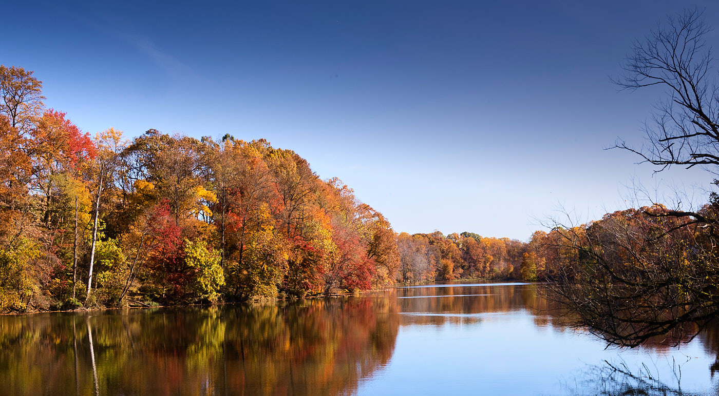
Since I was stuck in a long phone hold queue and had already pulled Mike's image into my tools, I played with your's as well. I punched it up (maybe a bit too much!) to really bring out the colors. In cases like this don't be afraid to crop with a non-traditional aspect ratio: I found the foreground too much of a distraction plus that bit of tree in the upper right. |
Nov 14th |
 |
| 52 |
Nov 22 |
Comment |
Nice B&W abstract feel going. My only suggestion is to flip it so the weight reads more left to right. I especially like how the water splotches on the original are an icky distraction BUT when you processed the image they turned into these lovely bits of foggy atmosphere. |
Nov 14th |
| 52 |
Nov 22 |
Reply |
SS of my tools: |
Nov 14th |
 |
| 52 |
Nov 22 |
Comment |
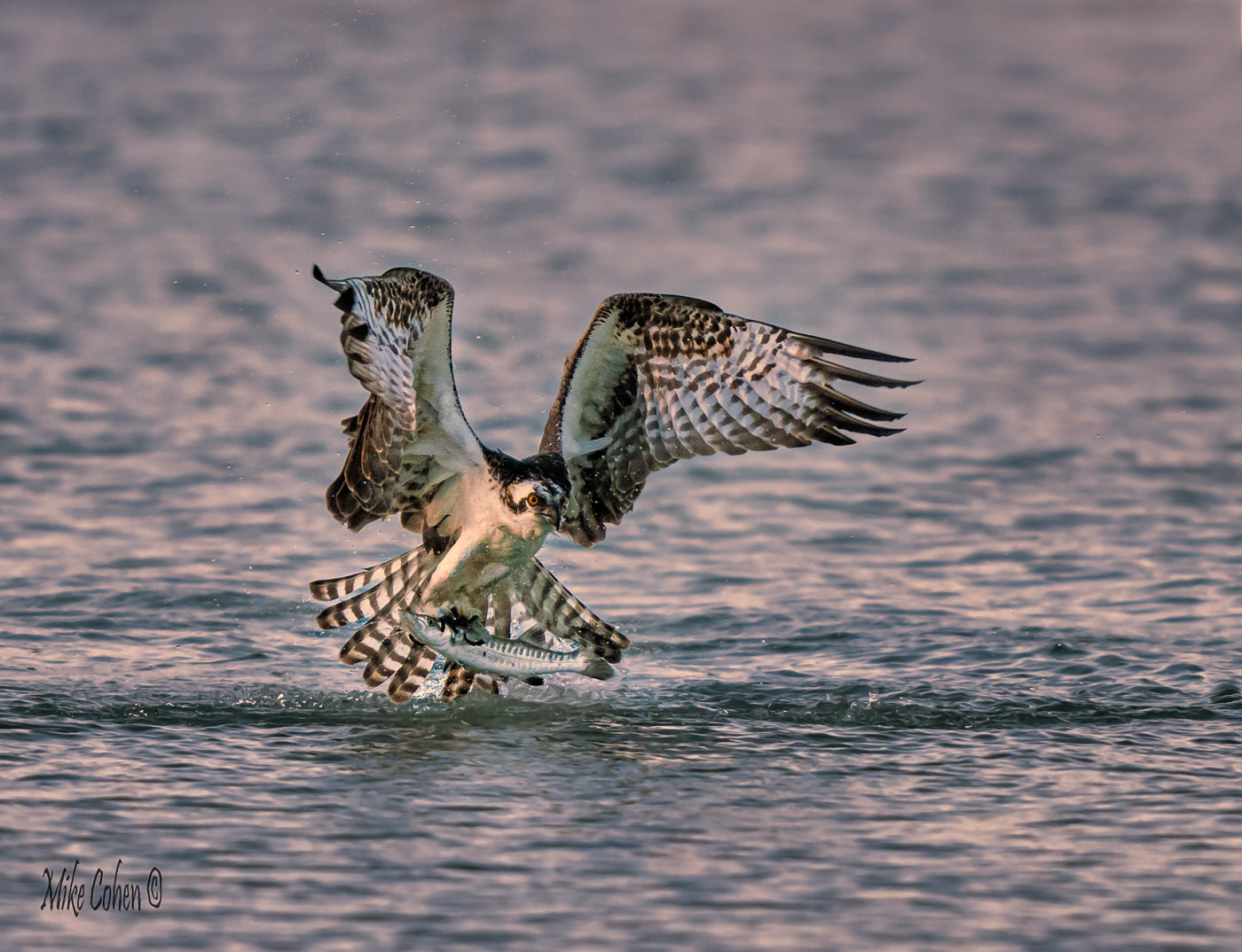
Good capture: you're right about the color as they seem a bit weird on my screen. The white balance seems off especially on the wings. I pulled the image into CaptureOne and did an auto white balance using the right-side wing (viewer perspective.) Then I pulled down the Brightness (mid-tones) and adjusted the Highlights/Shadows and further reduced the white. Attached is the resulting image ANDD a SS of the settings. Not sure how that will translate to Adobe products, but it's a start. One final tweak to the curves make it look like more of a dawn or dusk shot.
|
Nov 14th |
 |
5 comments - 3 replies for Group 52
|
5 comments - 3 replies Total
|