|
| Group |
Round |
C/R |
Comment |
Date |
Image |
| 52 |
Jul 21 |
Comment |
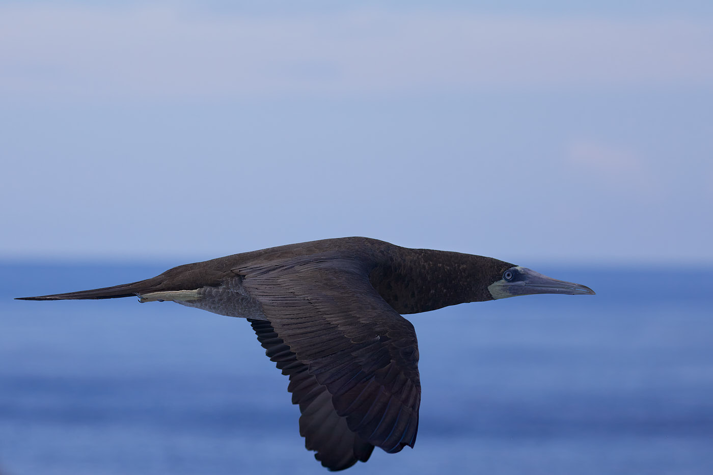
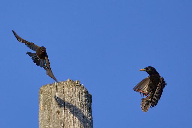
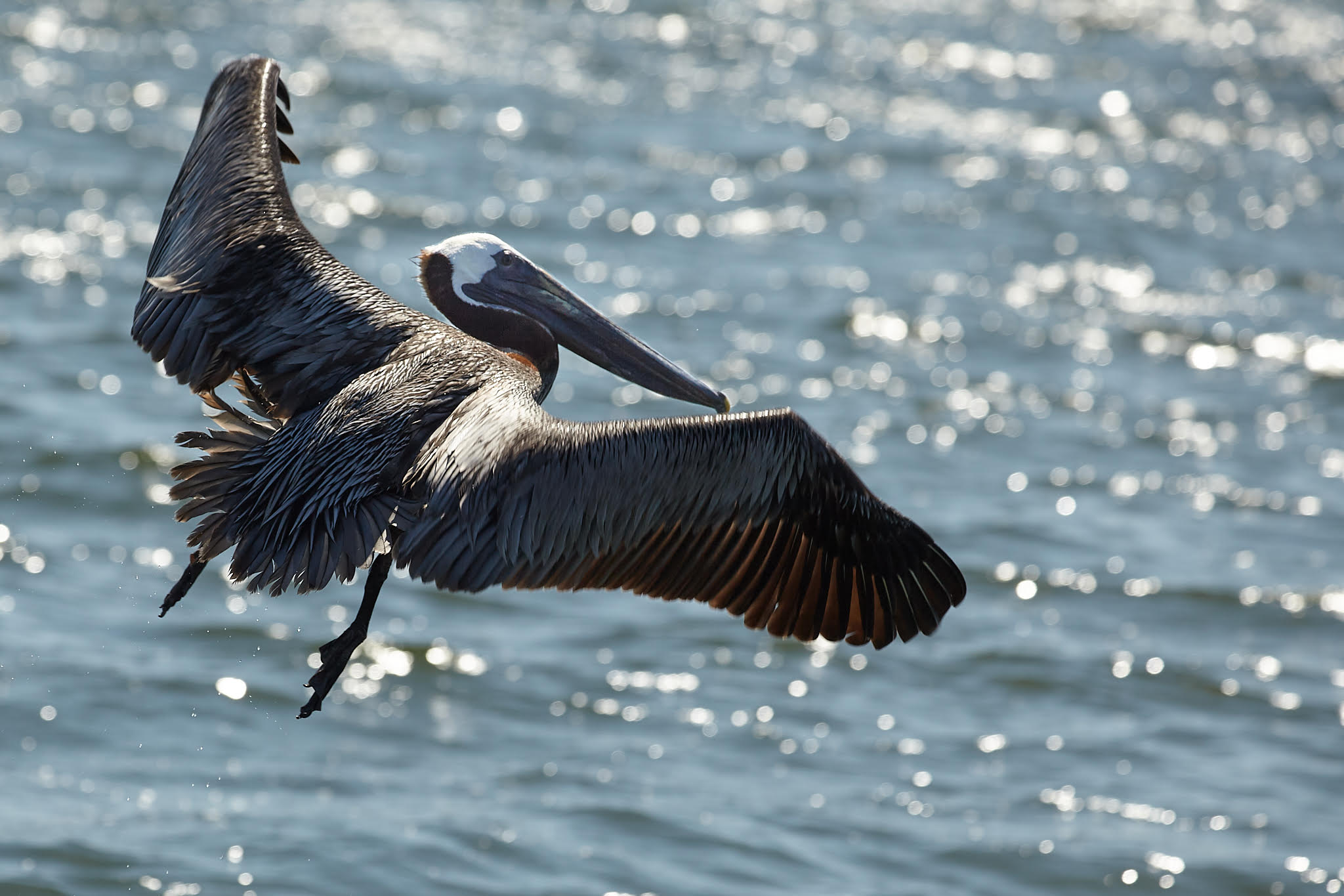
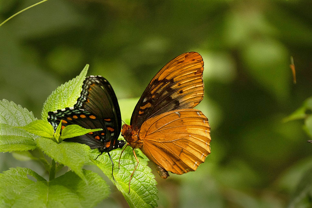
I like the capture: the adjustments are well done and while the bit of green on the lef does hide some of the wing its not a big issue to me.
You might want to play with the story a bit: one option would be to flip the image so the viewer's eye might surmise the Diana might get pushed off. |
Jul 16th |
 |
| 52 |
Jul 21 |
Comment |
A soft gentle sunset on the landscape image: glomming on and going off on a tangent from Sharon's suggestions....consider the occasional portrait orientation/crop for landscapes with lots of horizontal lines.
Here's a super quick edit of what I mean.
Horizontal crops are unexpected but they can really help draw the viewer in and across an image: often instead of reading left right, the view gets to look from the bottom to the top. |
Jul 15th |
 |
| 52 |
Jul 21 |
Comment |
I think this is a lovely capture: good sharpness and lots of shading on all the greens make what could be a rather "boring" flora image quite interesting. My only suggestion would be to consider cropping just a bit of the bottom and right side while maintaining the current aspect ration. |
Jul 15th |
| 52 |
Jul 21 |
Comment |
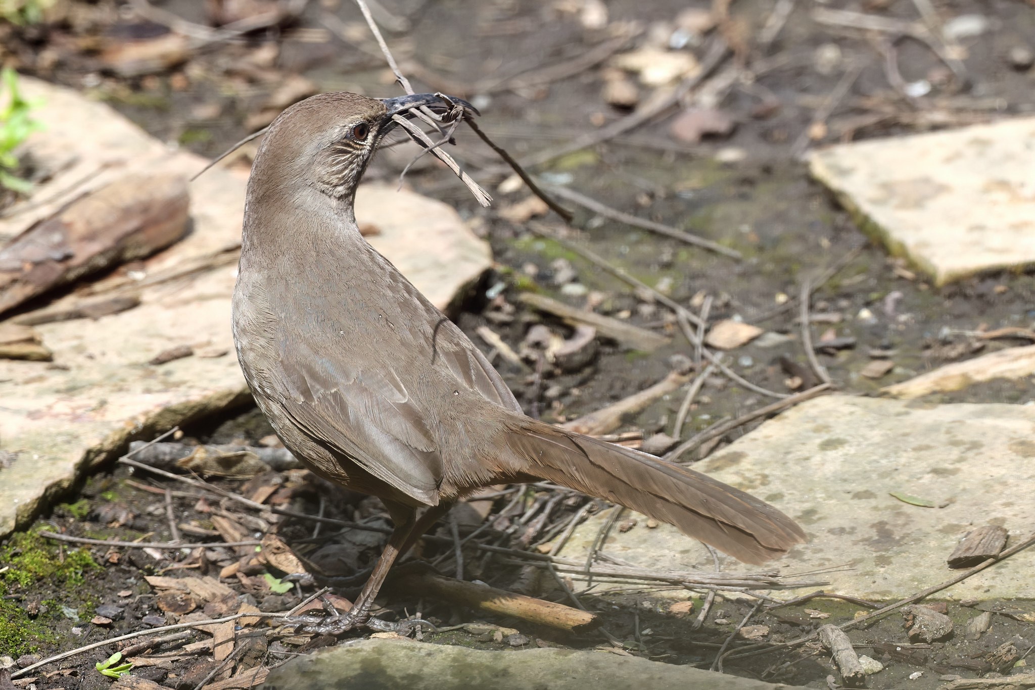
I think the image is quite well done: the darkness of the trees works for me.
My only two suggestions are firstlike Mike said, and leave a bit more on the left side and then flip the image so that the dark weight of the tree is on the left and the sun no the right. |
Jul 15th |
| 52 |
Jul 21 |
Comment |
Where has my week gone? I'm sooo late to the comment party.
I agree with most of the earlier ones: I think the image would actually be stronger if the coin weren't the focus and instead the plant were flowering (almost all species of the various air plants flower as part of their life cycle).
The Spanish moss behind the Tillandsia is sharper and richer in colors than the primary subject: not sure if this is a result of your post work. Would be interesting to see the same composition with a greater depth of field and perhaps a more square crop as right now the rock formation on the right is a bit of a distraction. |
Jul 15th |
| 52 |
Jul 21 |
Comment |
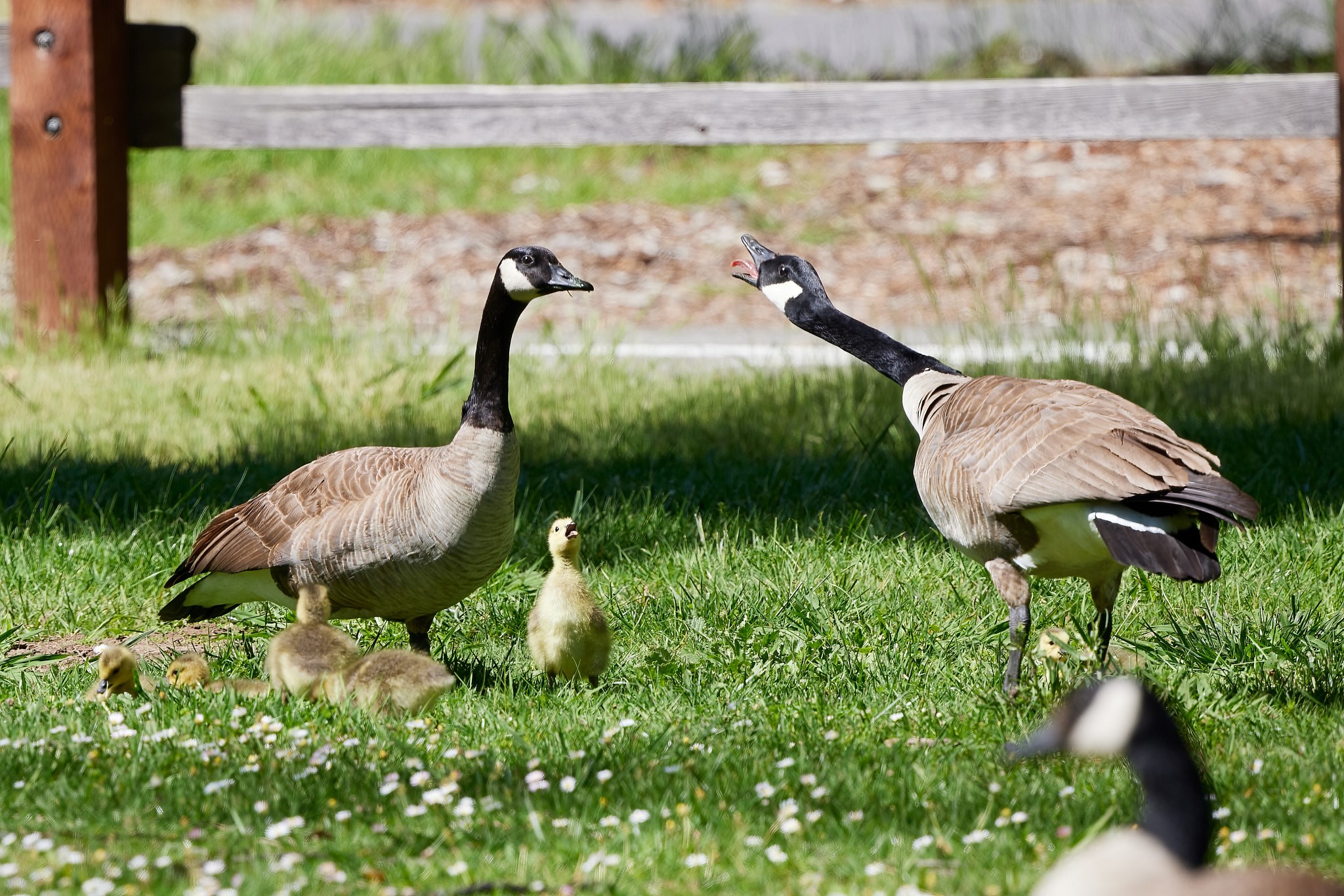
I am sad! you sort of kind of probably drove past Purgatory Auto Works and Dinosaur Farm and no chance for a visit!
Now for the critique....while an interesting idea for a shot I think the composition needs a swoosh more negative space on the right for the horses to move to as right now it's pretty static. I also agree with Sharon that a bit more sharpness on the subjects is necessary. The light and shadows though are great.
|
Jul 15th |
6 comments - 0 replies for Group 52
|
6 comments - 0 replies Total
|