|
| Group |
Round |
C/R |
Comment |
Date |
Image |
| 52 |
Feb 21 |
Comment |
I think you're right and that you're too close to the process. :)
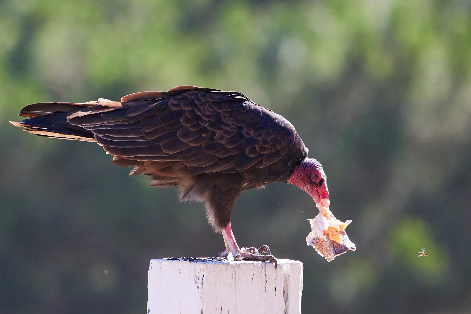
Overall I really like the image but have two kvetches: the masking around the head is too obvious and I would like to see a bit more space on the right (I'm talking like just doubling the existing space between the wing tip and the image edge. Right now the composition feels too caged for my tastes.
One last thing to try once you fix the head mask, perhaps bring up the saturation on the shoulders or perhaps feather/blend it to the head mask. |
Feb 19th |
| 52 |
Feb 21 |
Comment |
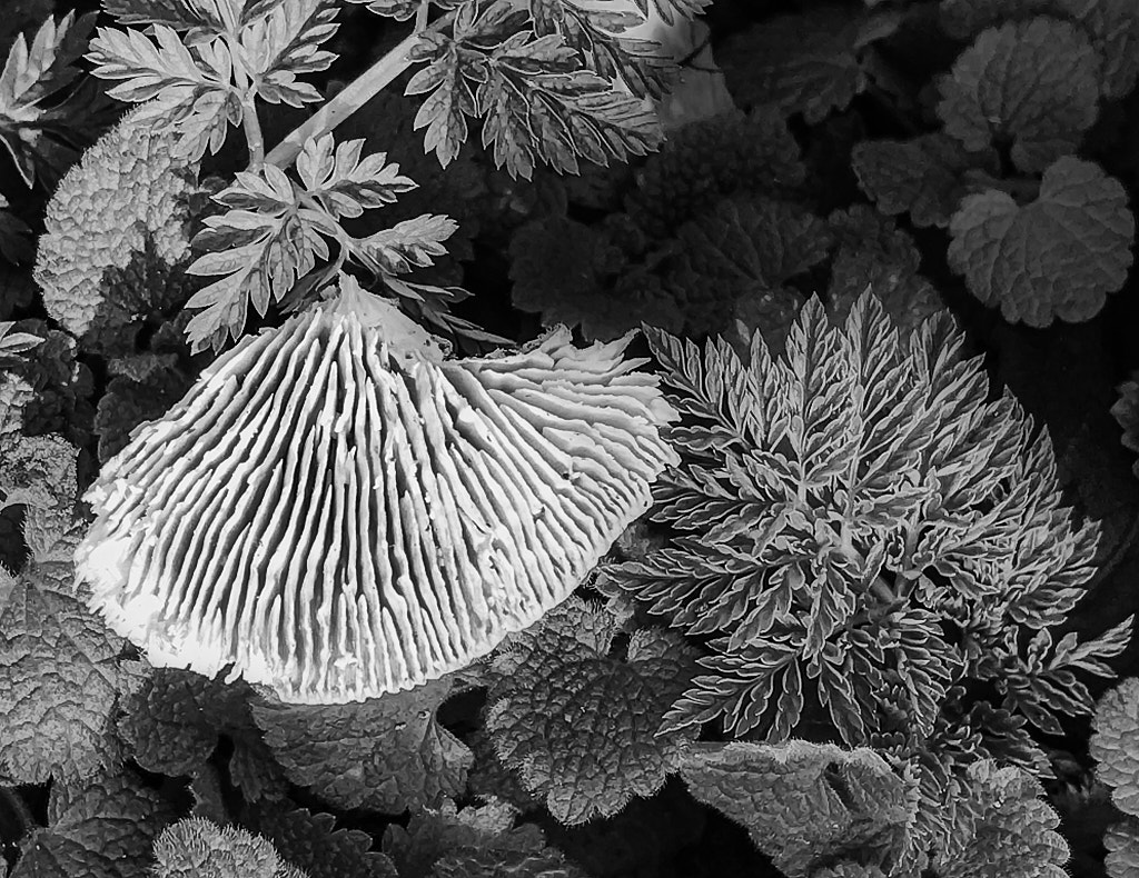
Image first: DAM stuff after
I think this is an interesting image and the fine details are well focussed. You might want to play even further and darken some leaves/areas down and see how that affects the composition. I popped it into my tools and messed around with a few sloppy/quick masks just to help illustrate. Focussing on different subjects can really add to the composition and pull the eye across an image.
As for DAM stuff: as someone with close to 13000 images/videos in Photos (I use my iPhone for ranch documentation work and prune monthly) I cannot stress enough how great that app can be with regular care and feeding. Just like the big management packages you can organize images in countless ways: keywords, faces, geolocation, date, smart subject, etc. I used to be a heavy Aperture user and only jumped to CaptureOne two years after Apple EoL'd it (when it I upgraded my DSLR Aperture didn't support my new RAWs,) but a ton of the old Aperture features, including native non-destructive editing, are now built in to Photos.����
As for the dying hard drive, you might want to upgrade your DAM setup. Consider an off-site solution like Backblaze or, if you have a .Mac/iCloud account, use that. I too use an external drive for my photo libraries (anything not shot with my iPhone) which I then have sync regularly to a file server that sits in another building here at the ranch. Then that machine (which houses a lot of other stuff) syncs to a server off-site. Feel free to hit me up if you have questions about this kind of thing. |
Feb 19th |
 |
| 52 |
Feb 21 |
Comment |
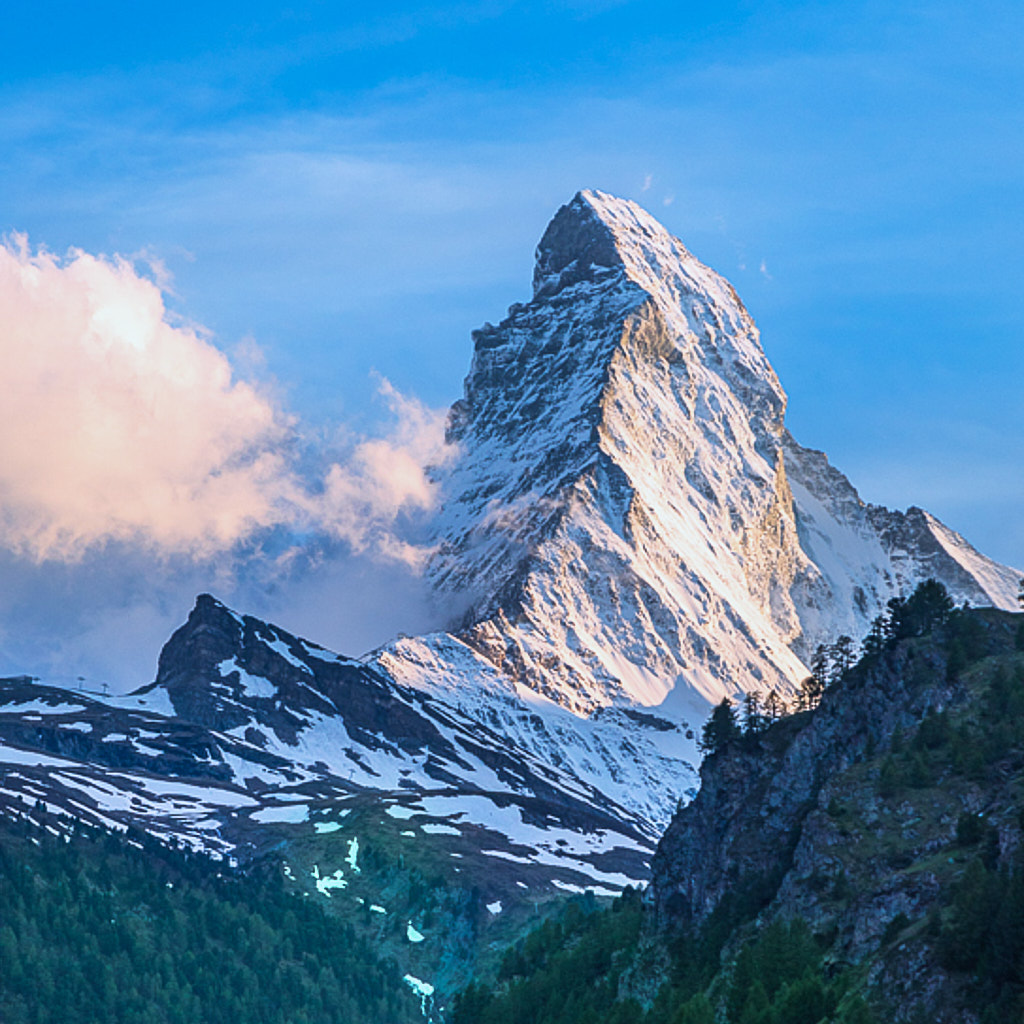
I passed out last night when playing with this image and popped on to post my comments only to discover that once again I'm just echoing Mike's ideas. I warmed the mountain, used a quick sloppy mask to green up the trees and then tested out a square crop to frame it.
|
Feb 19th |
 |
| 52 |
Feb 21 |
Reply |
just had a thought: you also might want to play with this as a black and white image. |
Feb 19th |
| 52 |
Feb 21 |
Reply |
my comments are pretty much in line with Mike's. |
Feb 19th |
| 52 |
Feb 21 |
Comment |
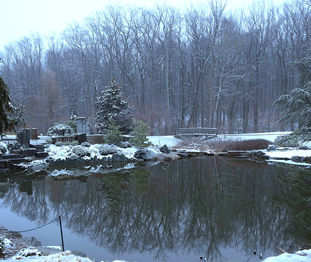
As a winter scene I appreciate what you are working towards, but for me this image is problematic. Mainly because the foreground is so cluttered it fights for my eye's attention: instead of gazing into the the water and its reflections. I would adjust your crop to remove much of the foreground and restore more of the tree tops in the background. This would maintain the symmetry of original. You said you cropped because the sky didn't offer anything, but because this is a reflection image and the sky is present in the pond, not having it also visible above the tree tops, breaks the trope.����
Additionally I prefer the color/levels of the water in the unedited version. You might want to try white balancing off the snow in the background and adjusting your levels to cool things even more and unmuddied the water. I'd shoot to bring out the greens of the pine trees. This would also help make the sky a bit less grey. |
Feb 19th |
 |
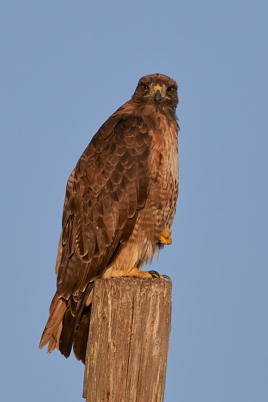
| 52 |
Feb 21 |
Comment |
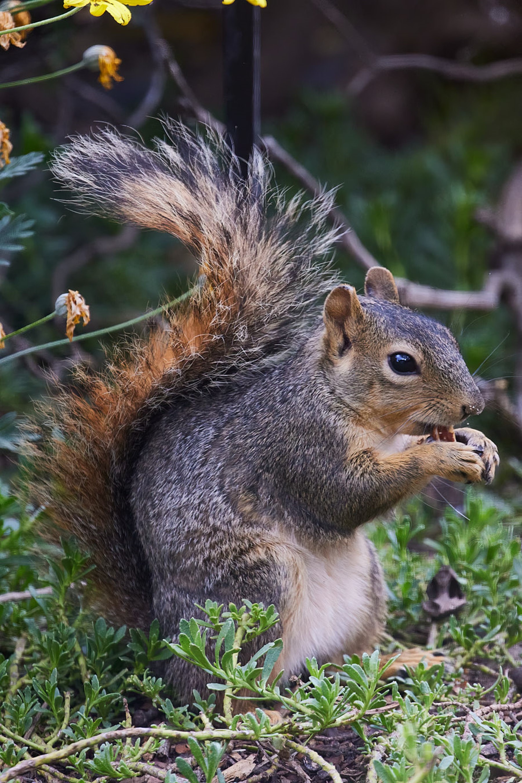
As a portrait shot I think this works well. You work in post to push the highlights makes for a pleasing balance of highlights and colors, but I think it's actually a tiny bit too pushed.����
Quibbles: there is a bit of artifacting left from the branch removal. Also I don't think the square crop works in this case. I would move to a full portrait ratio as well as played with a flip for fun. Here's a quick edit that also drops the saturation down just a tiny bit. |
Feb 19th |
 |
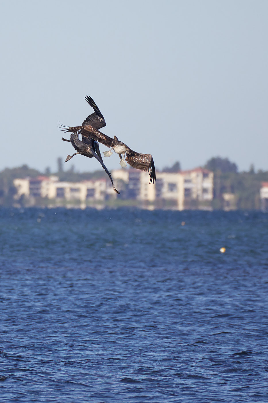
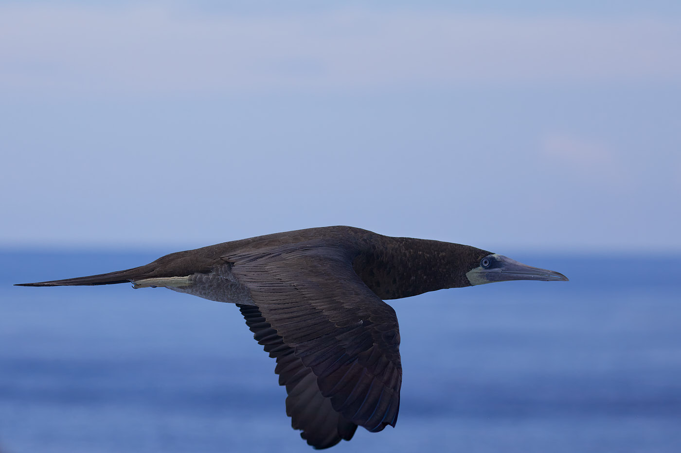
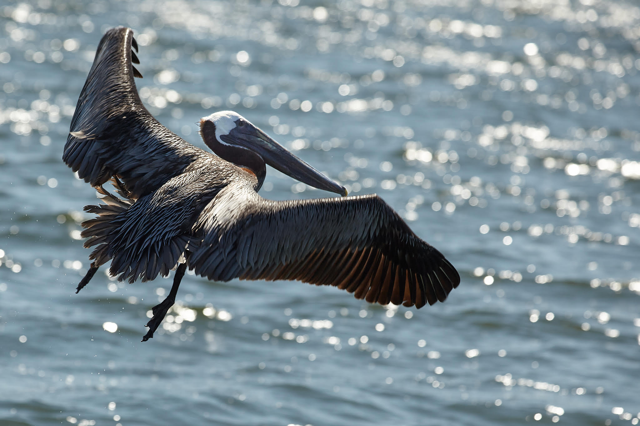
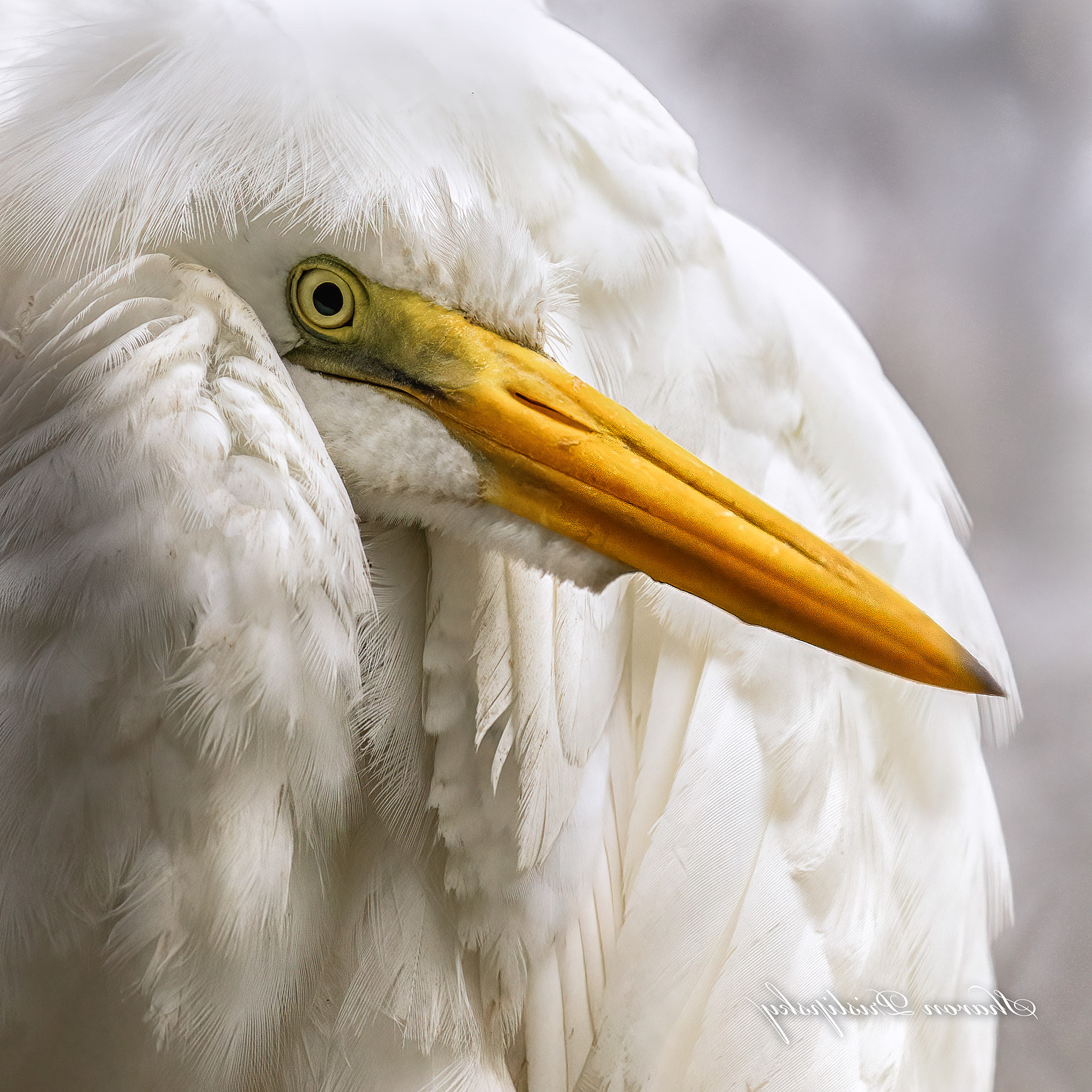
| 52 |
Feb 21 |
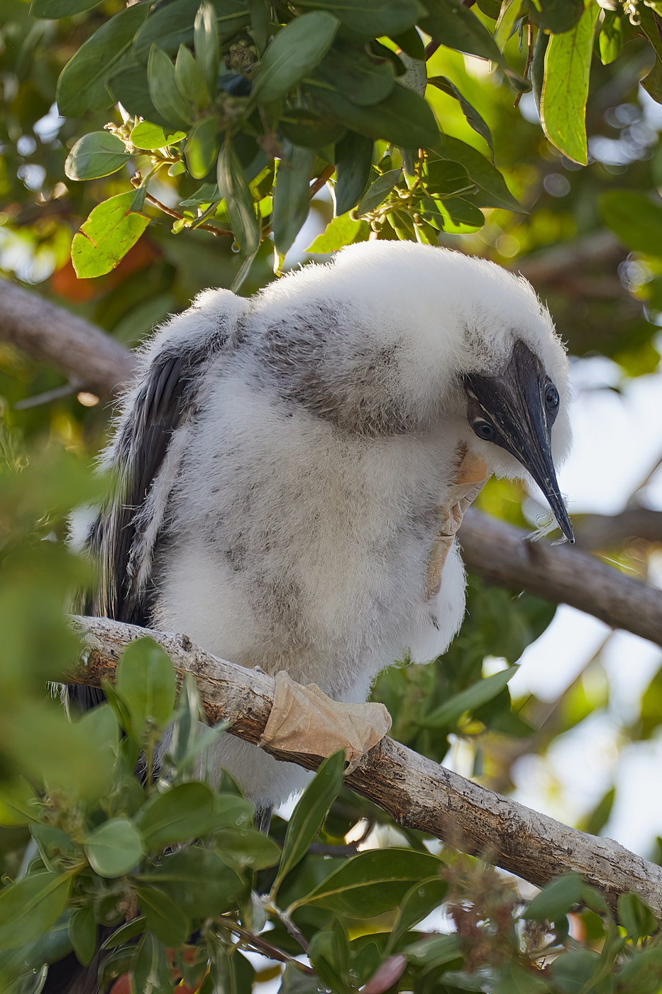
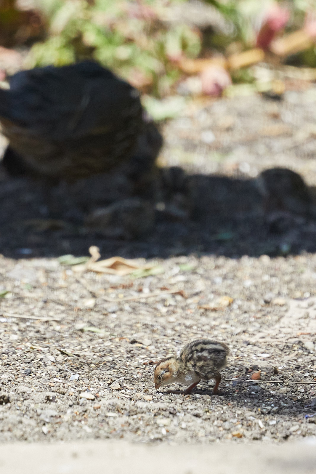
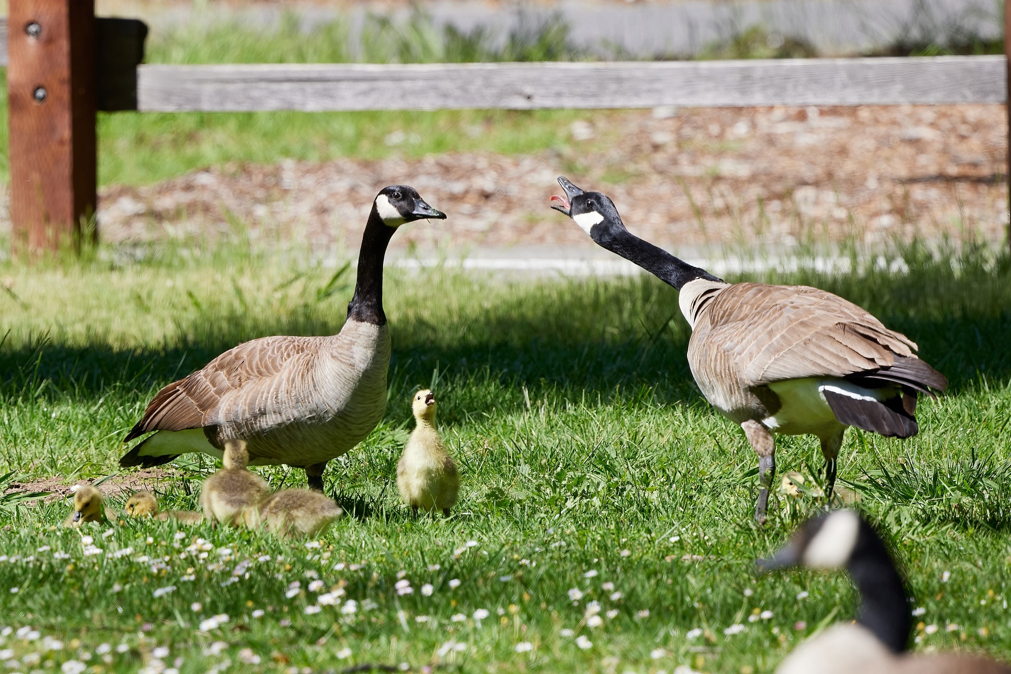
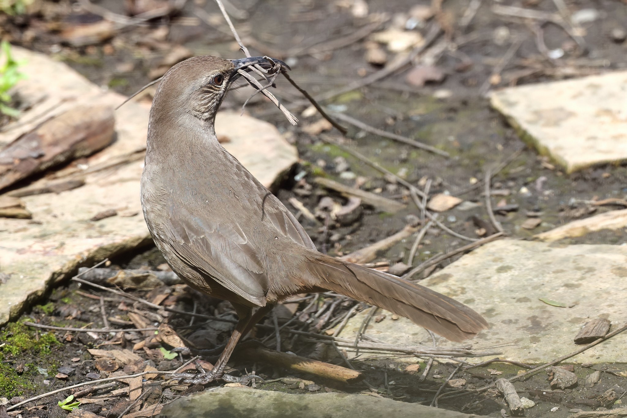
Comment |
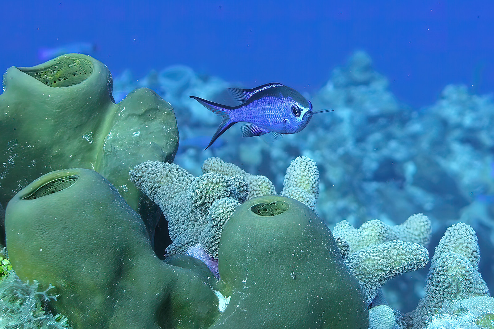
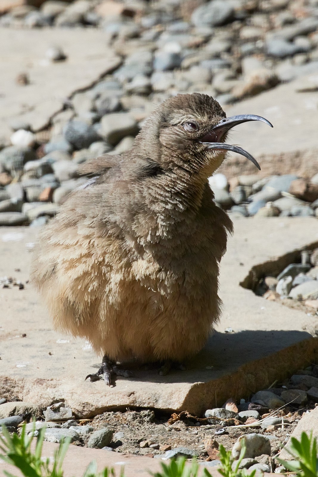
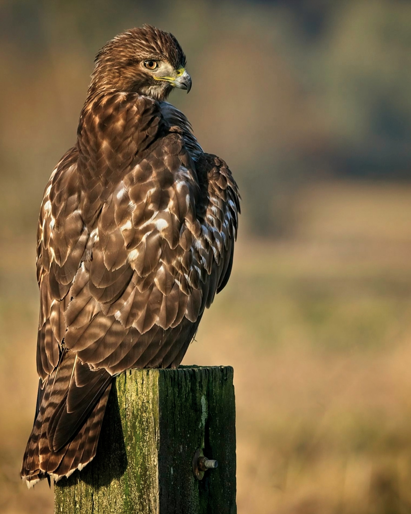
Overall I like this image. I think you captured the subject well. The loss of focus towards the tip of the bird's bill is a bit distracting as is the tiny bit of feathers at the very top. A mask to try to recover some focus detail on the bill and perhaps cropping closer or alternatively cloning out that bit of fluff might be a ways to address these bits.
For long beaked birds a good trick is to set focus on the nostrils.
Here's what I mean: cloned out the fluff, increased sharpness and detail on the beak with a mask but could only recover the midsection.
����Also I think the image is improved and thus reads more strongly if flipped. |
Feb 19th |
 |
6 comments - 2 replies for Group 52
|
6 comments - 2 replies Total
|