|
| Group |
Round |
C/R |
Comment |
Date |
Image |
| 52 |
Nov 20 |
Reply |
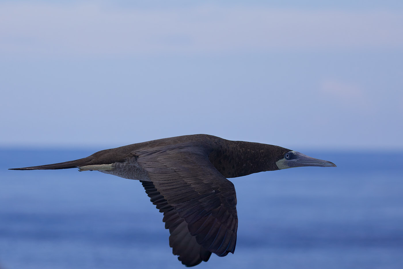
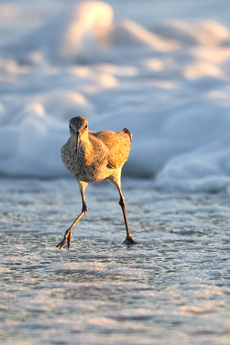
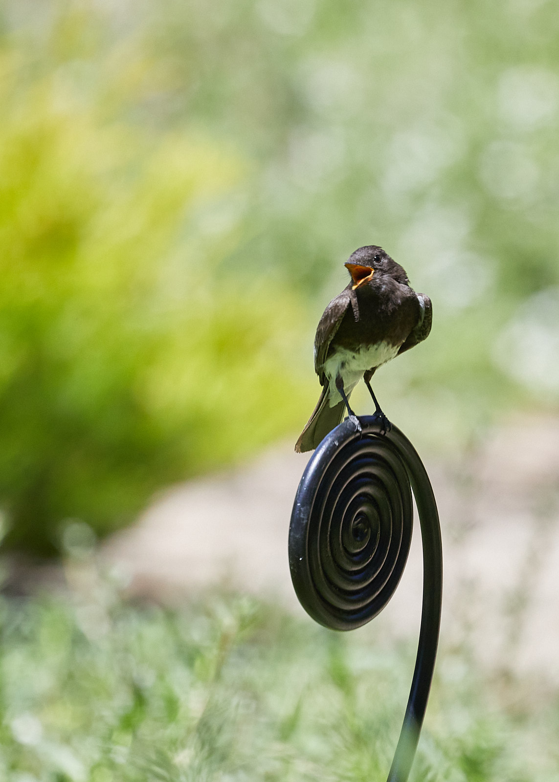
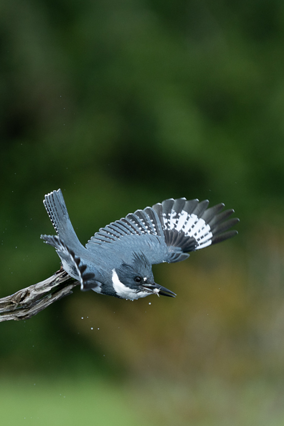
going to quibble with you a bit. :)
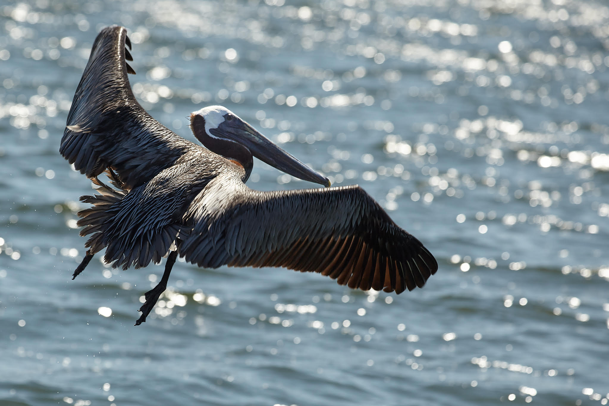
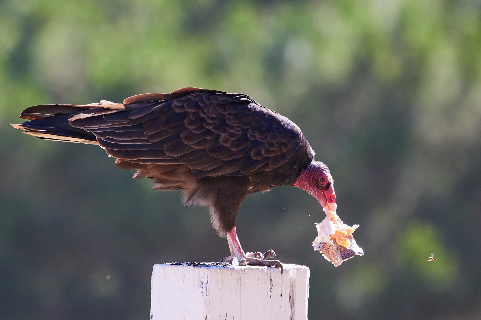
Since the bird has a morsel in its mouth, story-wise it isn't going to leave the space to go fish, and while you know because you captured the moment, that the bird was flushed/scared from its spot, the viewer does not. Thus in my opinion, the story telling would be stronger if instead of leaving space for the bird and viewer's eye to go, you leave the space where the bird was: that way the viewer can infer that the bird was on the perch about to enjoy its meal, but for some reason (up to the viewer) is now vamoosing. |
Nov 16th |
| 52 |
Nov 20 |
Reply |
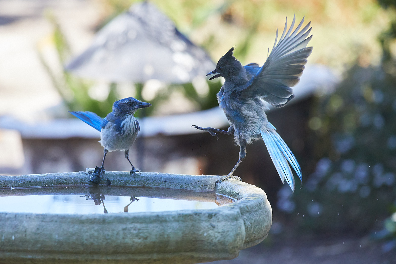
I'm viewing the image on a 27" Retina 5K _BUT_ I did some testing and discovered something interesting/weird .
I'm pretty certain that the graininess I noted originally is a result as the website code wanting to fill my screen: as I download the image to pop it into my DAM tools to mess with and the lack of extreme grain was the first thing I noticed and the image was displayed at 1900�� x 1267 with 240x240 RGB
If I click your image to view it in a new browser window/tab, the image is displayed at a substantially larger size/zoomed. The same is true for Judith's image for this month although that image at 3437�� x �� 3937 is gigantic. I'm going through several other groups/images and looking for similar issues as I suspect it's a result of the website code trying to handle/display images and not getting it quite right.
Thus ignore my graininess comments! I do still wish a bit more of the vegetation registered in the valley though.
|
Nov 16th |
| 52 |
Nov 20 |
Comment |
I agree with Pamela that a bit of wing blur when the bird is in motion is fine since it adds to the story. (The blur is a bit distracting at higher resolution viewing though.)
I think the color balnce/metering are well done and my only niggly concern is the composition. My best advice would be to redo the crop and flip the orientation. I think that would help tell the story of "bird was on perch and got startled" more strongly.
Will try to show what I mean...hope uploading works this time. |
Nov 9th |
 |
| 52 |
Nov 20 |
Comment |
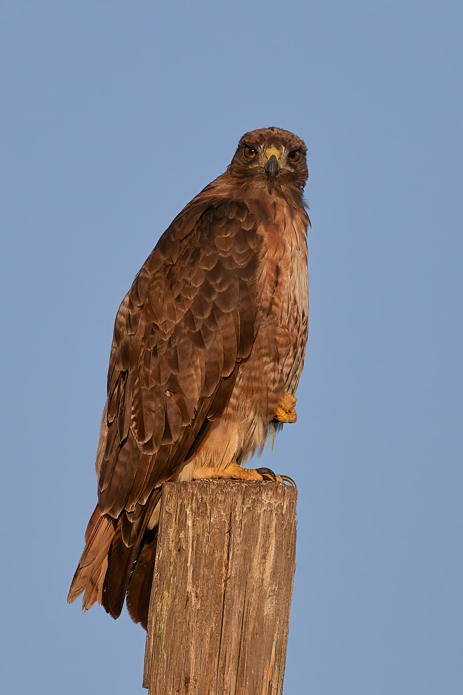
I again agree with Mike's first comment: the focus is fuzzy when at full res. It might be the window (I shoot through a window daily and have to keep it clean regularly,) but that's a huge range for a lens and I don't know much about Tamron lenses so I went and looked them up at DPReview: their consensus is that at max range fuzziness ensues.
Also since you're already shooting through a window, pay attention to which what glass it is (coatings and thickness esp) and what direction it faces: I've found that since my windows point due north I can eschew a polarizer and thus not affect my shooting speeds adversely.
https://www.dpreview.com/reviews/tamron-16-300mm-f-3-5-6-3-di-ii-vc-pzd-macro/4 |
Nov 9th |
| 52 |
Nov 20 |
Comment |
I agree with Mike and would go even farther with the sky to create more contrast with the mountains: a filter to blue it up would go a long way.
I find the composition of this image disjointed. The lovely yellow draws the eye from the right to valley on the left but not additional element brings my eye easily out of the valley. Adding a punch of blue might help this. |
Nov 9th |
| 52 |
Nov 20 |
Comment |
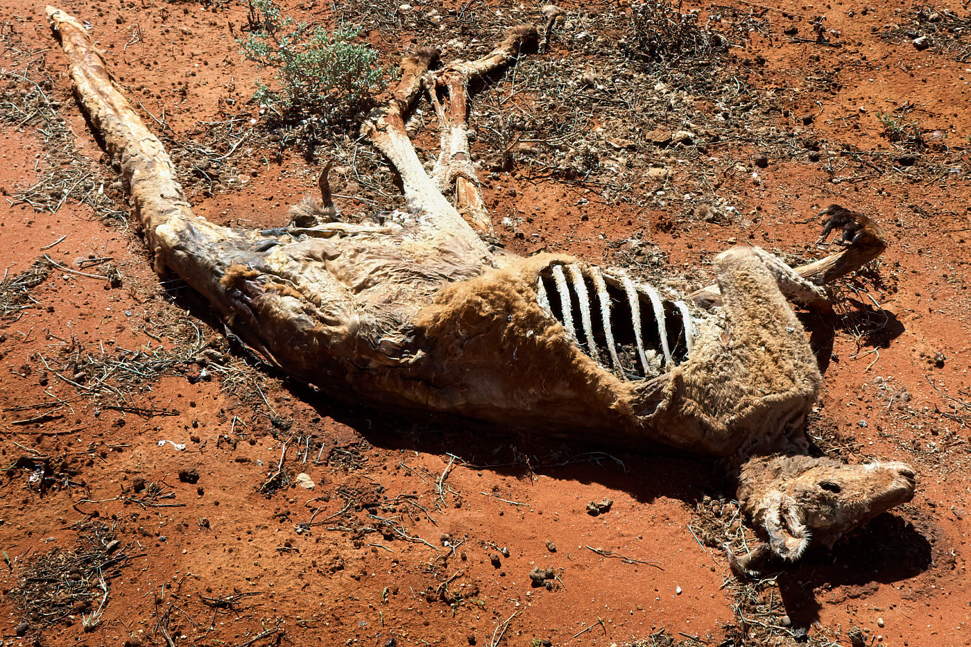
good job rescuing and image I would have just sent to /dev/nul! I think you did admirably with the color/exposure adjustments.
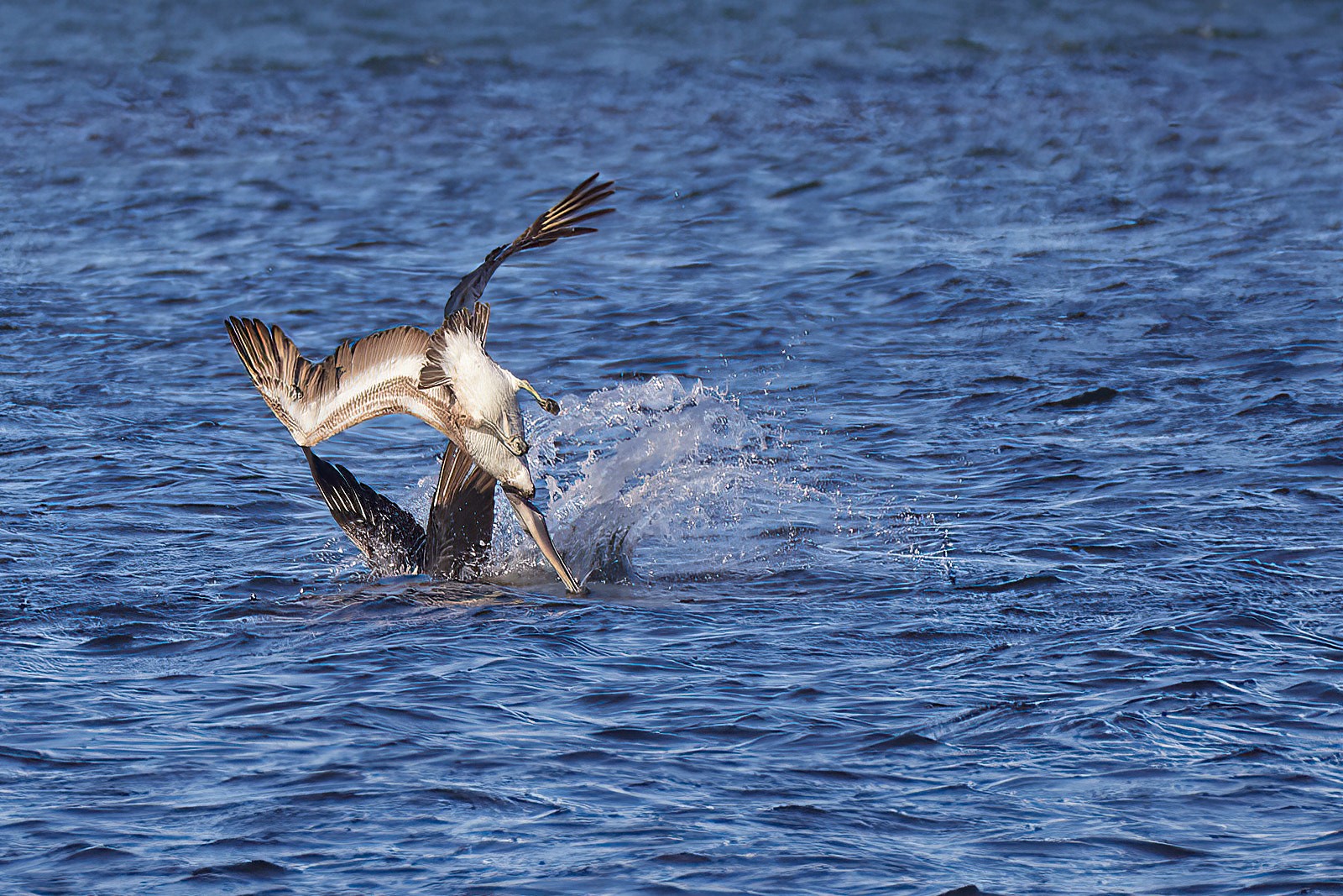
My only kvetch is that the final version seems off-kilter: like it needs a slight rotation to have the shoreline tilt upwards to the right a few degrees as right now my eyes go down into the water in the middle of the image. My eye doesn't notice this on the original and I think it's because of the flip. |
Nov 9th |
| 52 |
Nov 20 |
Comment |
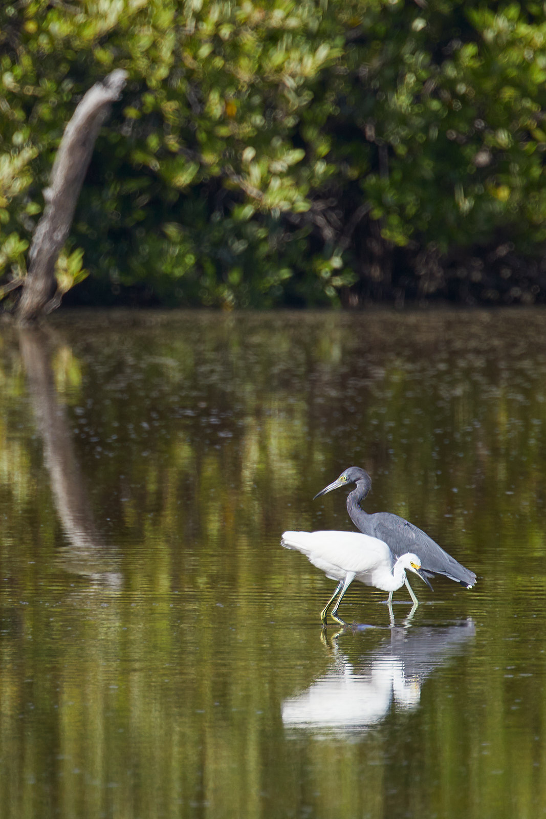
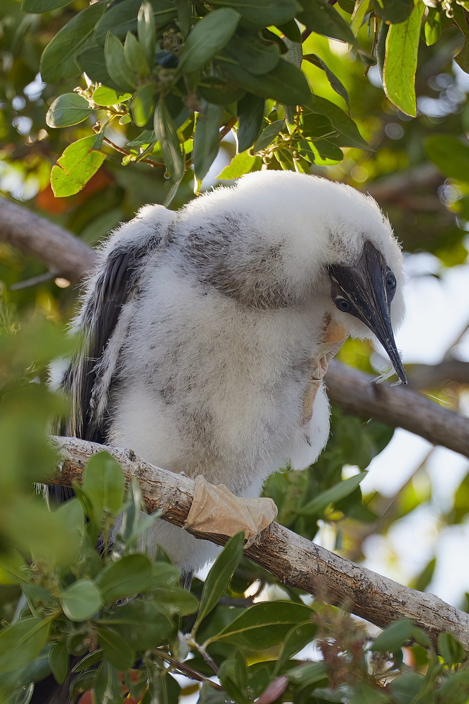
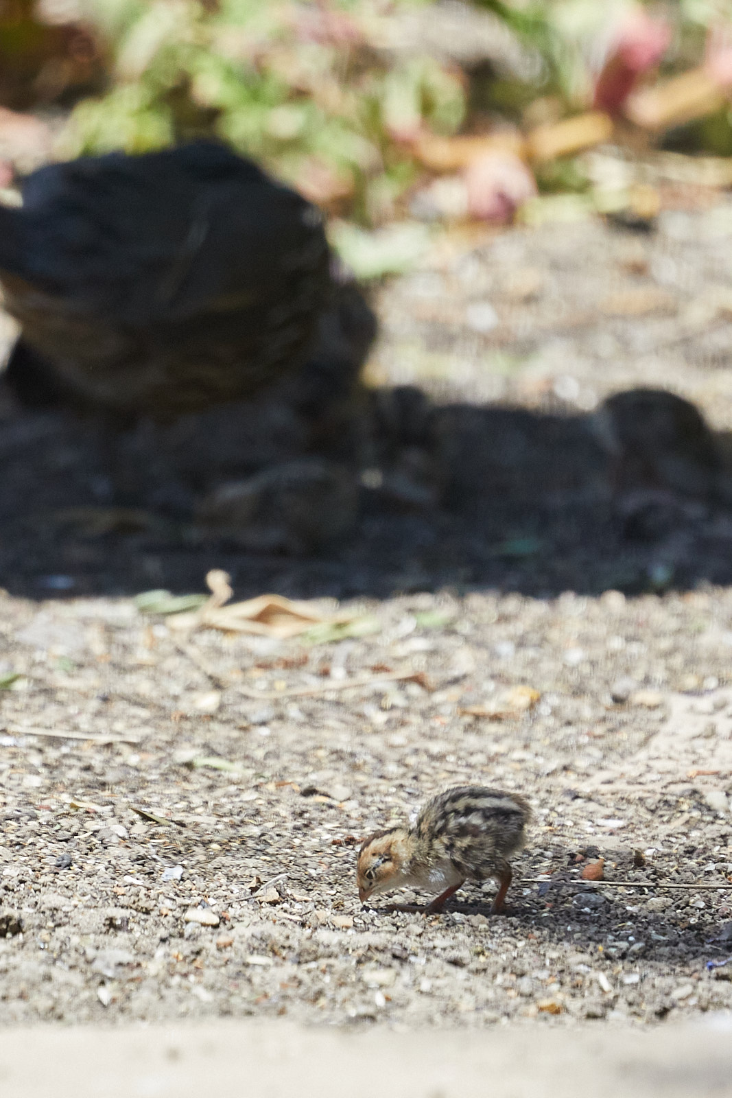
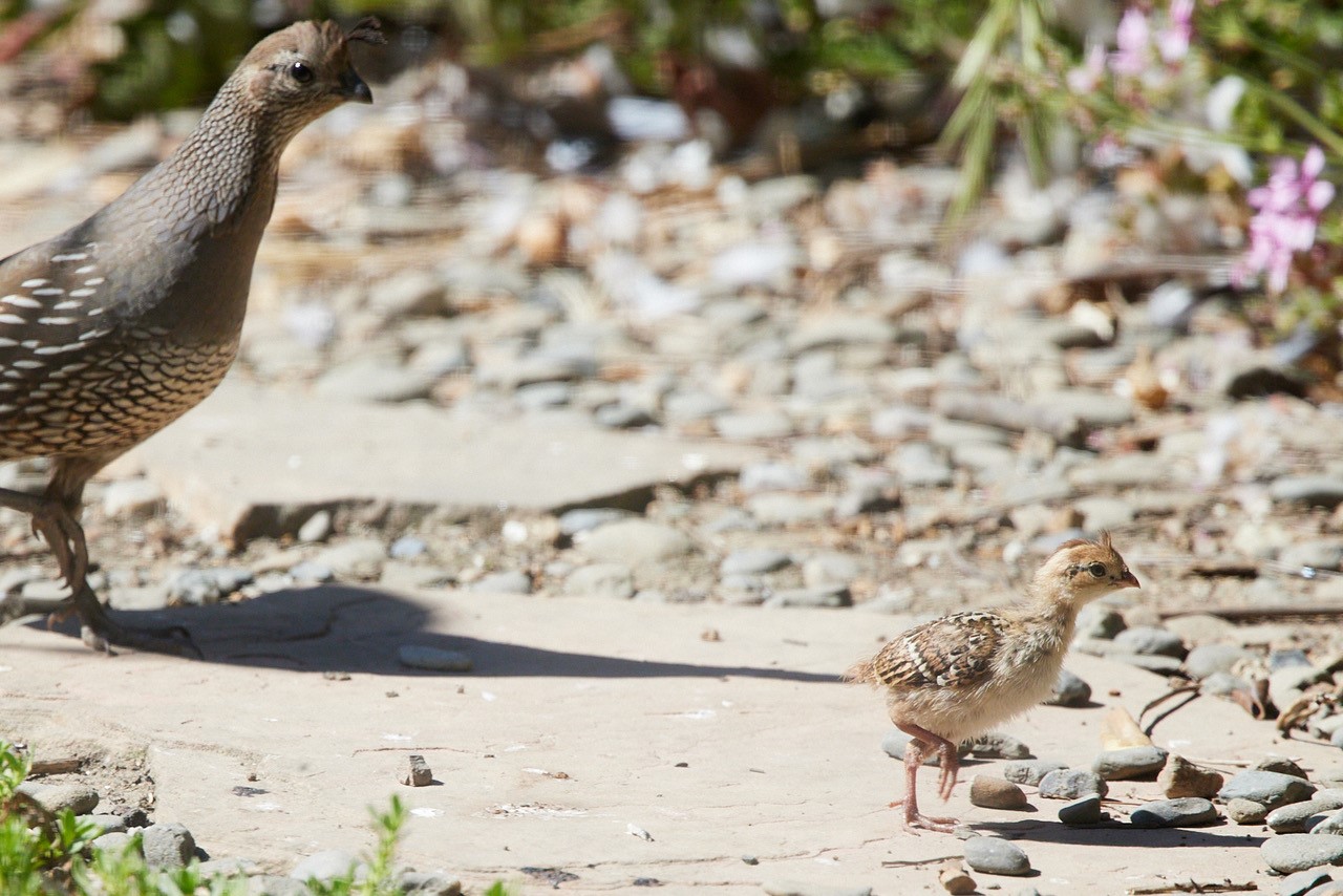
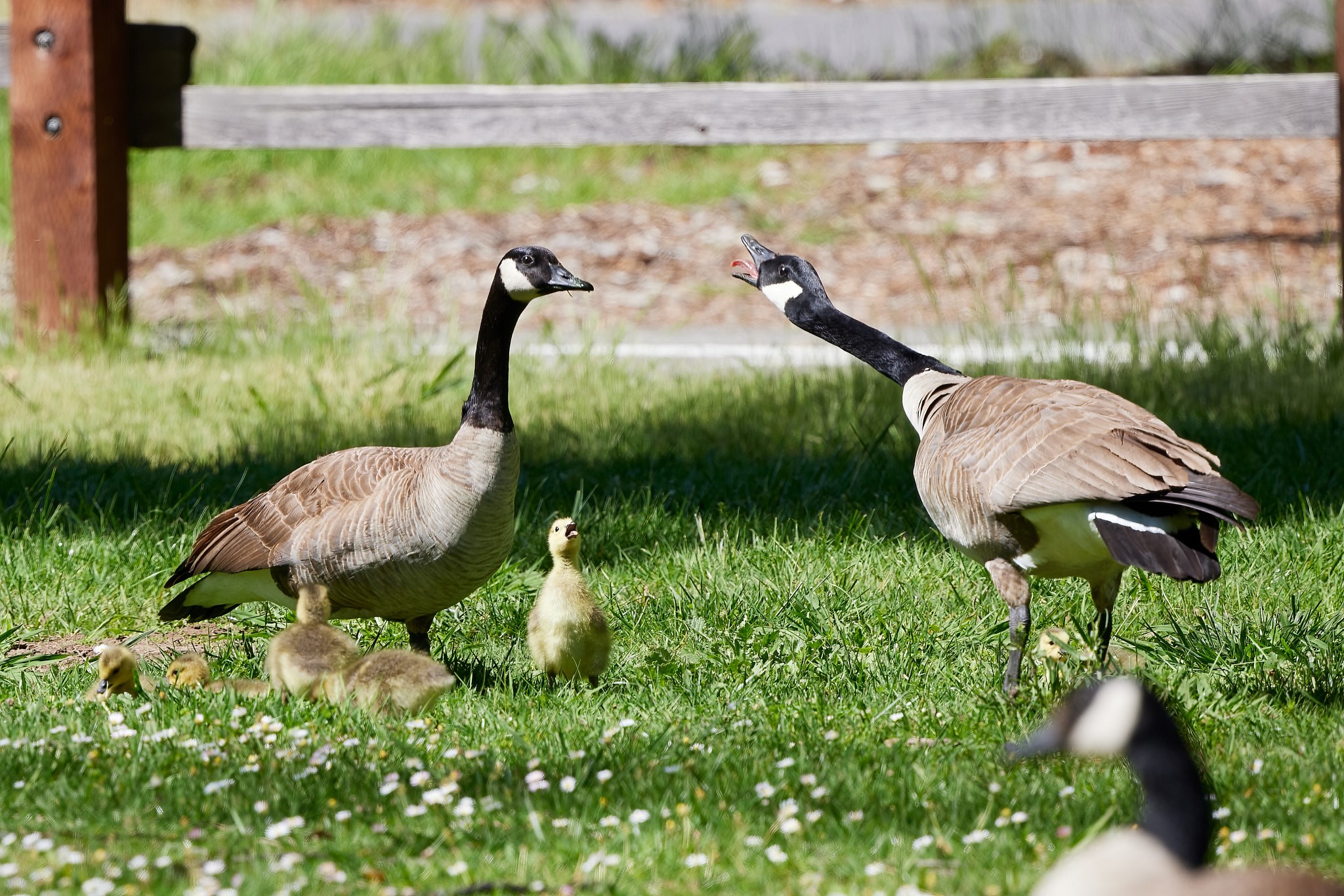
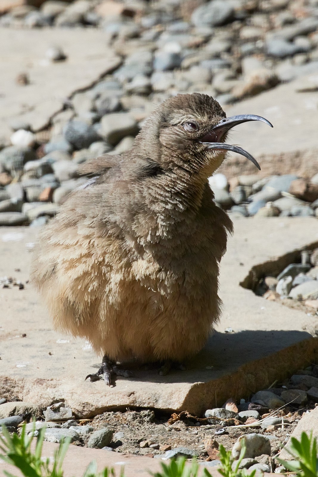
I like the image and think you did well with the color correction. Given the original image, I think this crop works well. My only quibble is I wish more of the chick was in focus. |
Nov 9th |
| 52 |
Nov 20 |
Comment |
I like the composition of the image as my eye is drawn across the entire image to take in multiple areas. I think the image, upon close inspection is over sharpened and the saturation in the foreground makes it very grainy. I like the original better as the colors in the valley allow the vegetation and surfaces to be seen: instead of warming the entire image, perhaps masking areas where the rising light is certain to hit and the allowing that to fall off and the greys of the deeper canyon sections to maintain a more natural state.
I think the monochrome version would benefit from greater contrast between the canyon floor and peaks on the left. |
Nov 9th |
6 comments - 2 replies for Group 52
|
6 comments - 2 replies Total
|