|
| Group |
Round |
C/R |
Comment |
Date |
Image |
| 45 |
Jan 26 |
Reply |
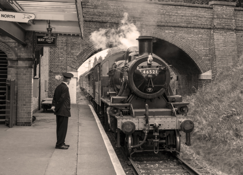
Thanks David. I have modified the image incorporating your suggestions and Paul's and you will see it below after Paul's comments. |
Jan 19th |
| 45 |
Jan 26 |
Reply |
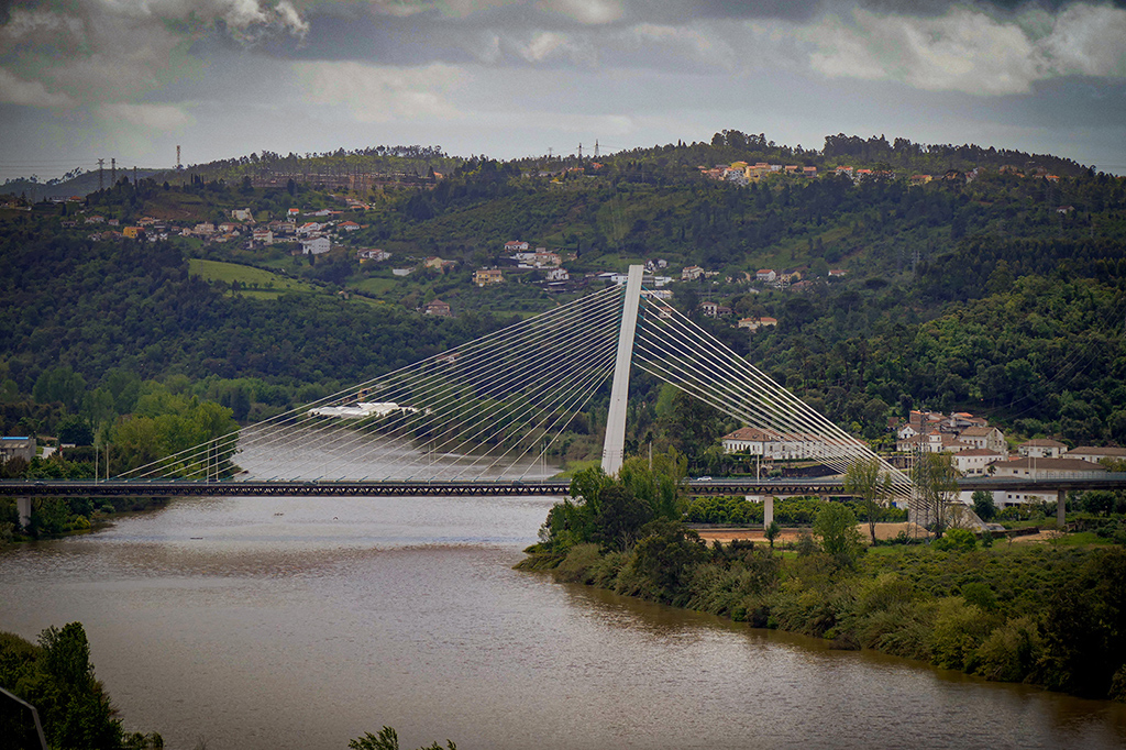
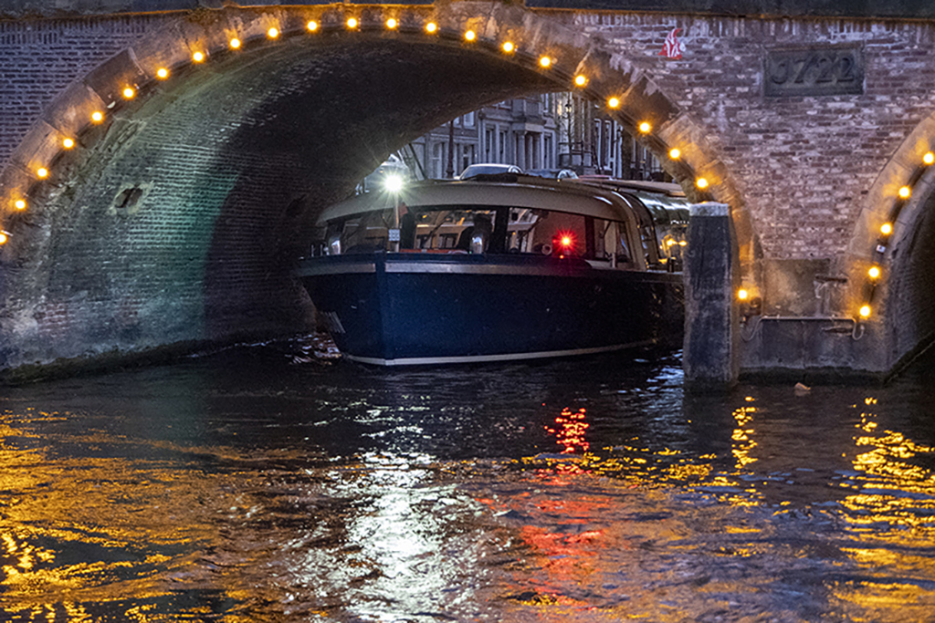
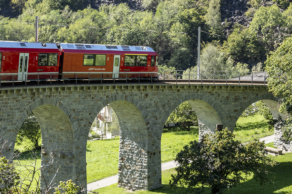
Thanks Paul, in the B&W conversion I have darkened the reds and lightened the yellows on the bridge. The mist was quite high up so I am not concerned about the clarity of the bridge in the distance. I have brought out more detail under the first two arches of the bridge and finally cropped a bit off the bottom and reduced the highlights in the water as per David's suggestions. |
Jan 19th |
 |
| 45 |
Jan 26 |
Comment |
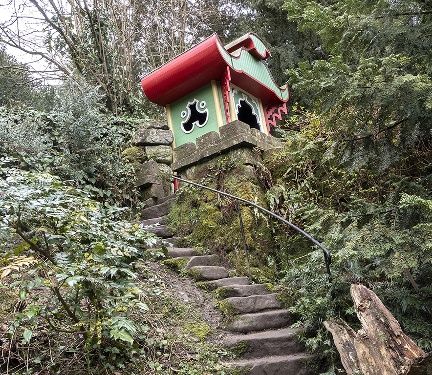
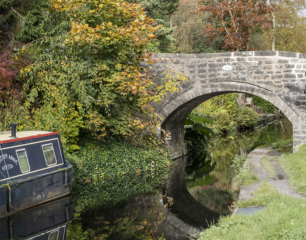
I think this is a very pleasant woodland scene. I like the saturation of the background colours but, as you say in your narrative, you have liberally enhanced the colours and I feel that the reds are rather overdone. However, it depends on why you did it because we all have different reasons for taking and processing our images so it all depends on how it works for you. The bright reds have definitely produced a striking image and I sit here trying to identify what leaves they could be, Japanese Maple (Acer) or Copper Beech for instance. The vignette works well to emphasize the stream and the red leaves which are the strong focal point of the image. So lots of interesting discussion points and I look forward to more of your images and comments on our photos in future. |
Jan 18th |
| 45 |
Jan 26 |
Comment |
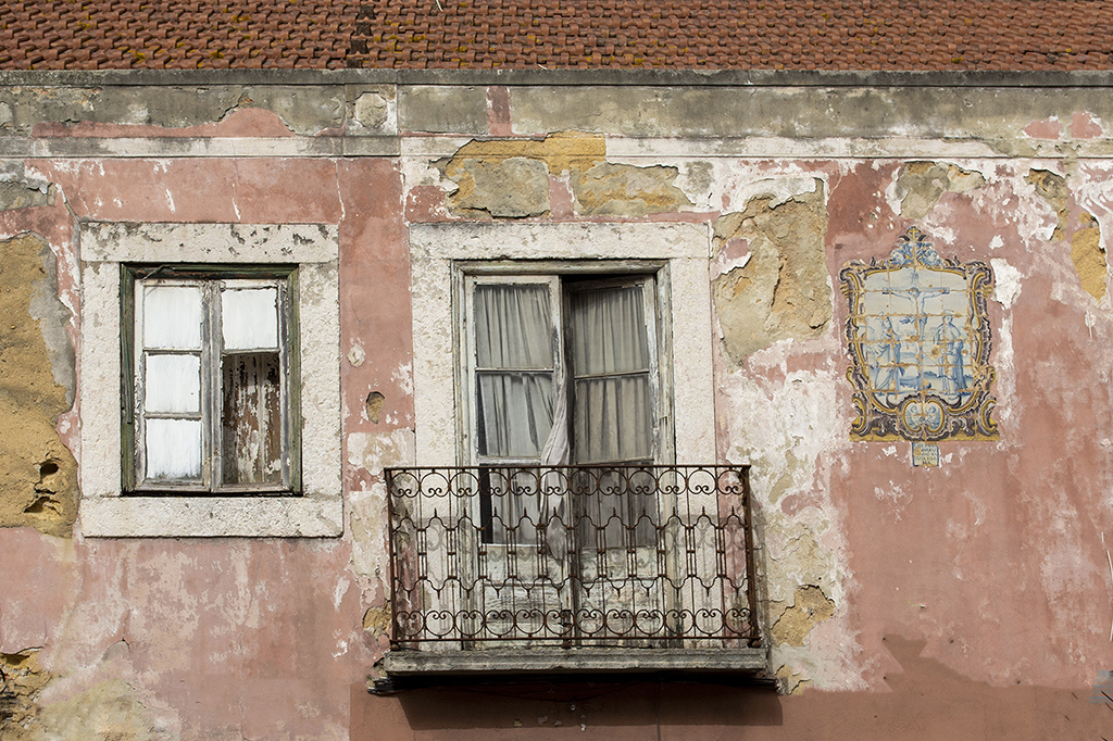
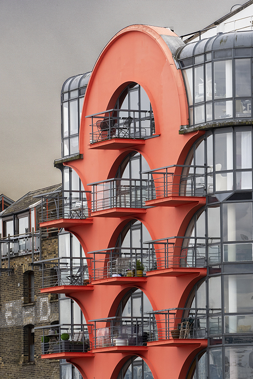
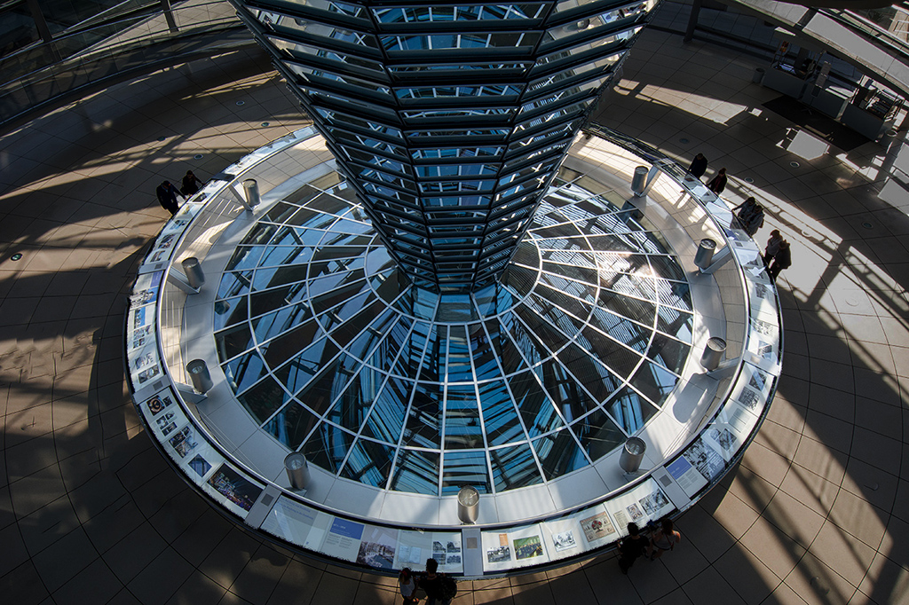
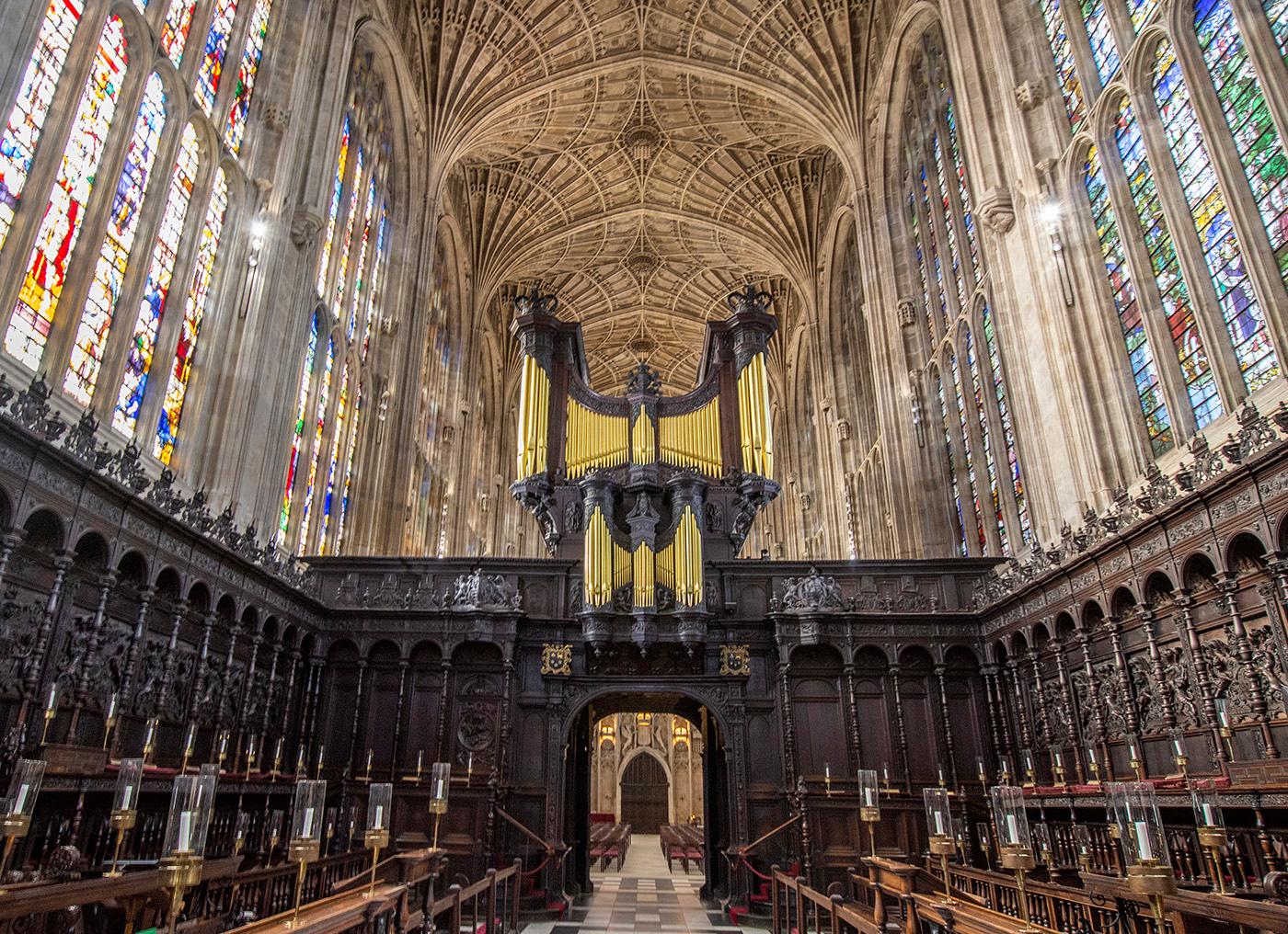
Your crop and post processing are spot on and you have produced an eye-catching and colourful image. I agree with your crop to remove the distraction on the right which has also balanced the picture. One observation that you could obviously do nothing about is that the decorative ceiling on the right only extends half way, which from an architectural point of view seems strange. |
Jan 14th |
| 45 |
Jan 26 |
Comment |
I agree with Cindy and David about the darkening of the background to emphasize the alligator and would add that reducing the highlights on the animal's body has brought out more detail and also some subtle colours to make it a very enjoyable image. The diagonal angle of the alligator adds to the quality of the picture. |
Jan 14th |
| 45 |
Jan 26 |
Comment |
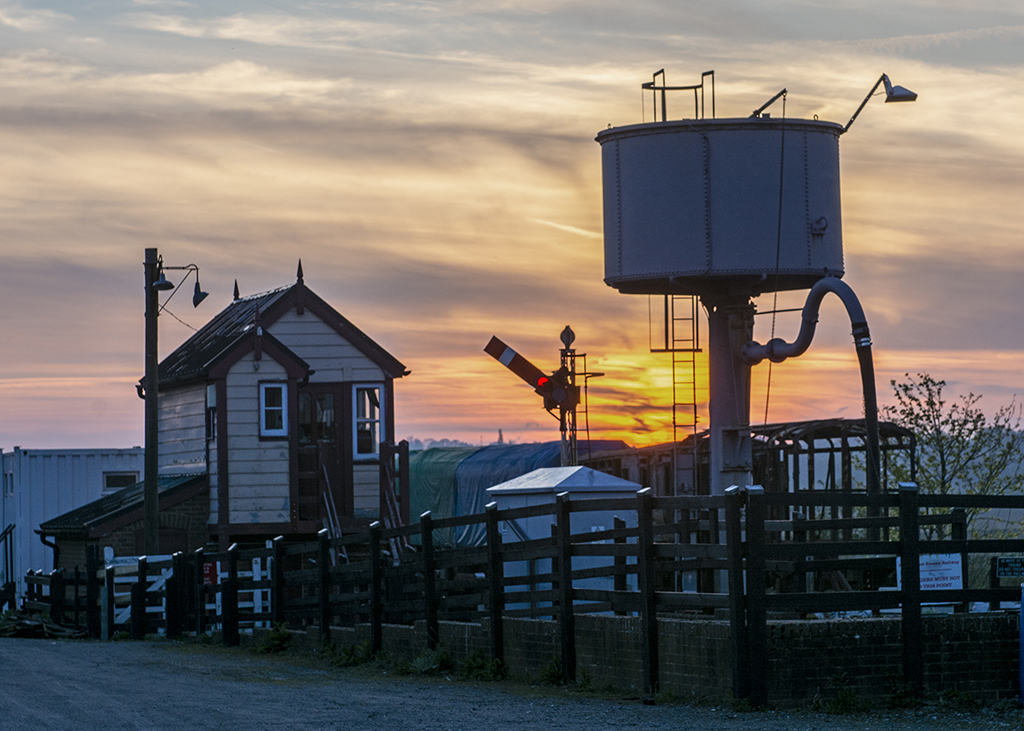
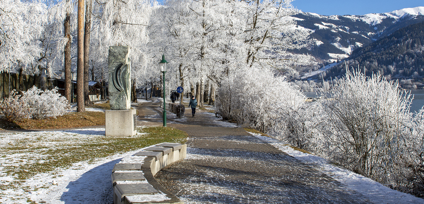
I like the combination of the trees in silhouette and the subtle colours in the diffused clouds in the sky behind them. The moon is nicely positioned in the frame. I think the removal of the branch in the top right was a good choice. Maybe darkening the clouds slightly in the top left might provide a bit better balance with the foliage bottom right but not if you lost the colours in the process. A very enjoyable image. |
Jan 14th |
| 45 |
Jan 26 |
Comment |
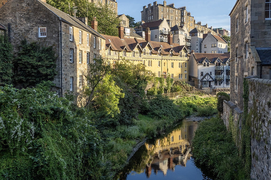
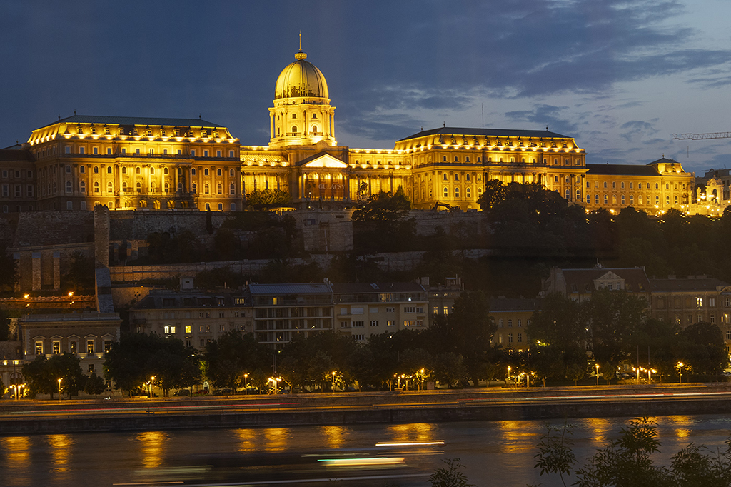
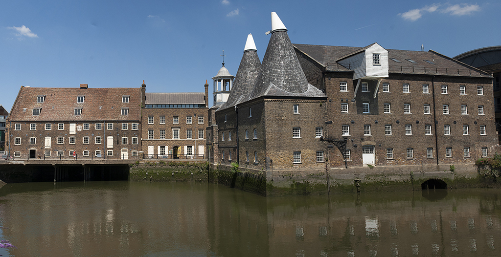
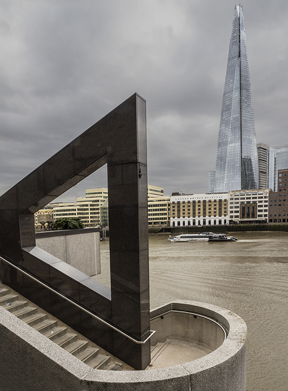
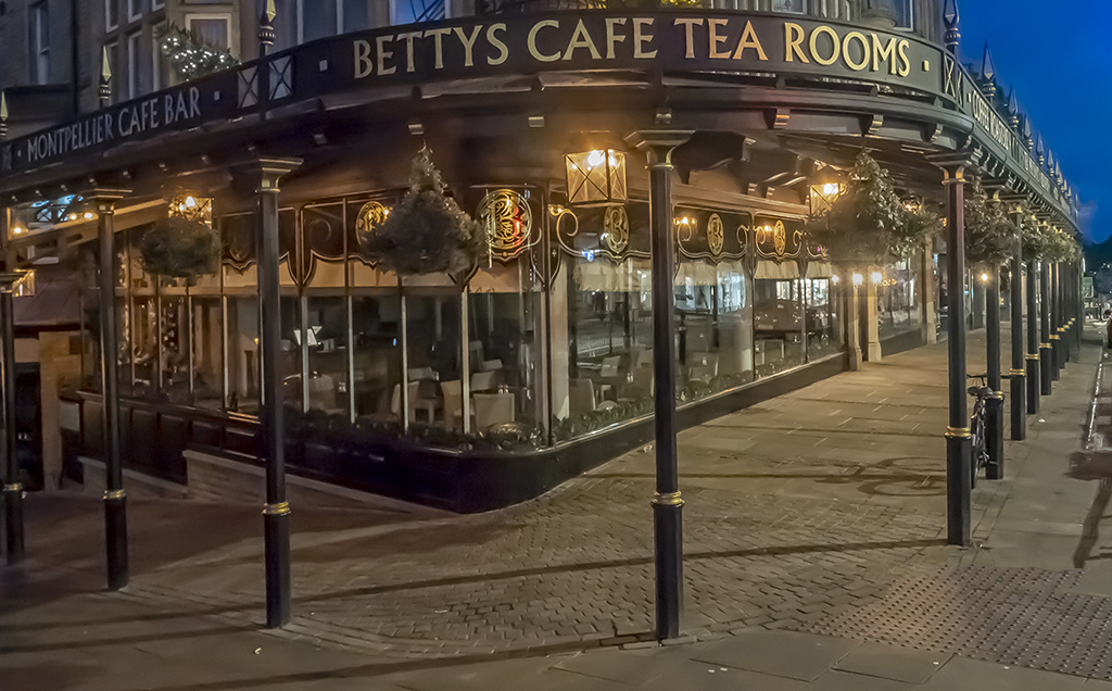
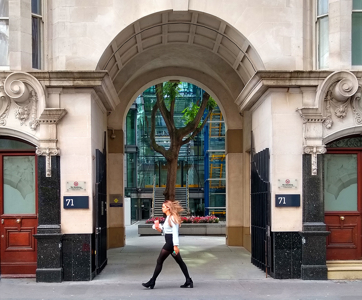
I like the way you have framed this shot and also the complimentary shapes between the frame and the bridge in the background. It would be interesting to see the original to see the extent to which you have saturated the colours because they look very bright on my monitors. I enjoy having people in architectural shots to give a sense of proportion and the people in your image provide that very well and also create the atmosphere of a well used cityscape. |
Jan 14th |
5 comments - 2 replies for Group 45
|
5 comments - 2 replies Total
|