|
| Group |
Round |
C/R |
Comment |
Date |
Image |
| 45 |
Jul 25 |
Reply |
Thanks for your suggestion Cindy. I fixed up the wires and when I printed it for a competition entry I found some other distractions which were not obvious on the Group 45 submission, so thanks again. |
Jul 22nd |
| 45 |
Jul 25 |
Comment |
A very good image of the orchid which has been improved by your response to David's suggestion. It stands out beautifully from the background but we see enough of the background to locate the flower, which I like to see. |
Jul 8th |
| 45 |
Jul 25 |
Reply |
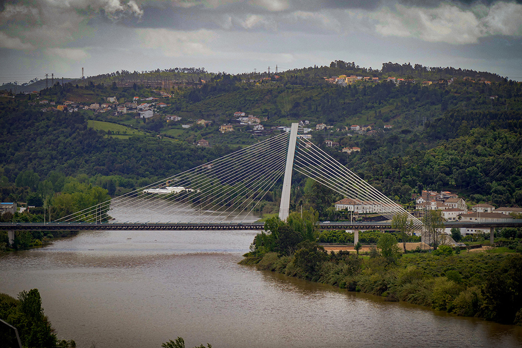
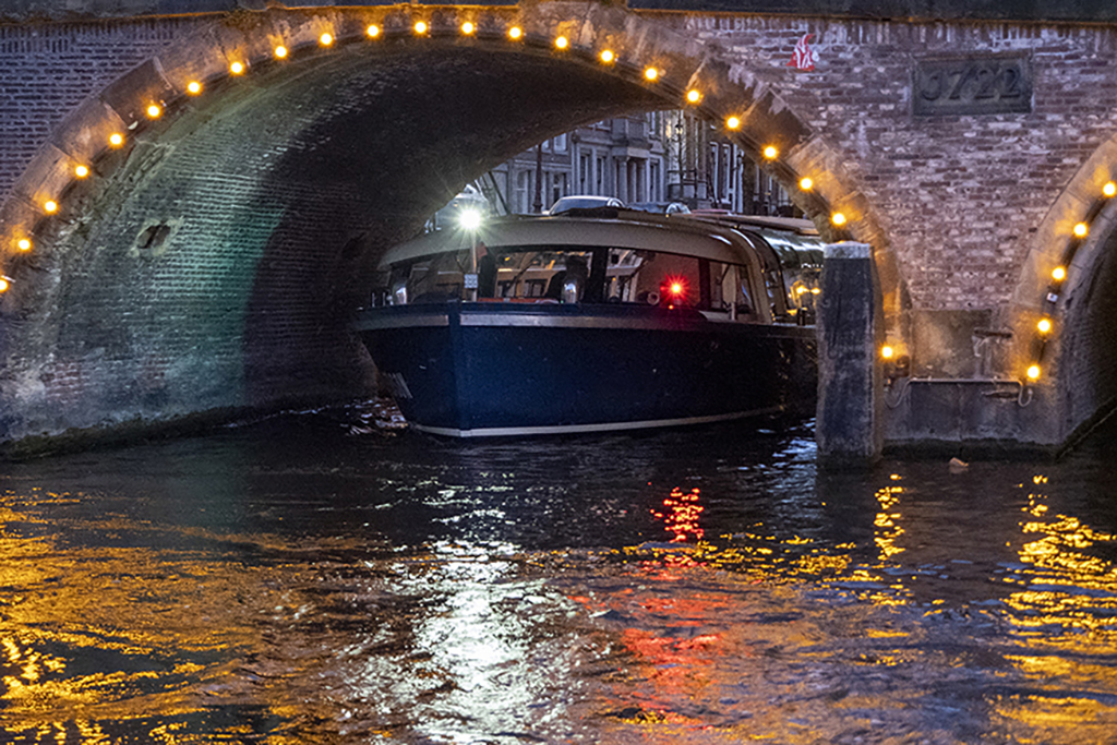
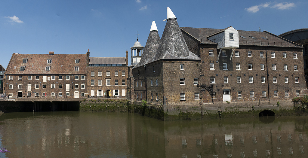
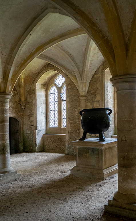
Thanks David. I also did a black and white conversion which brought out a rather dramatic sky and which I also like. I thought about trying to remove the bridge but decided that you can't move too far away from reality and it would probably have been rather a messy result and the bridge is an integral part of the building after all. |
Jul 8th |
| 45 |
Jul 25 |
Comment |
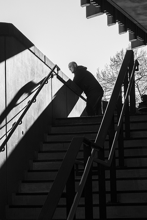
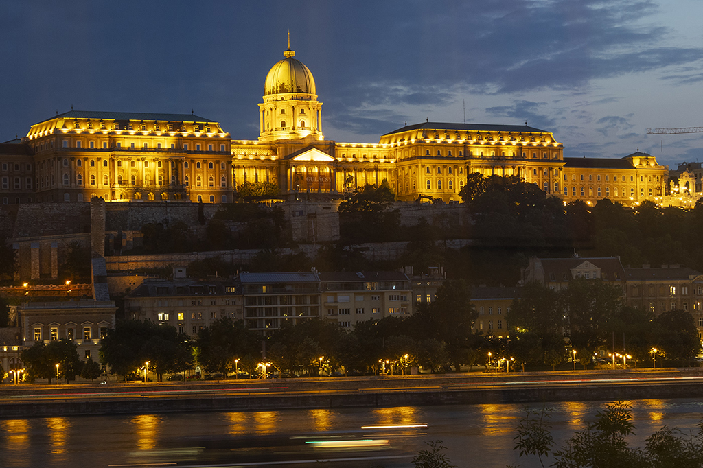
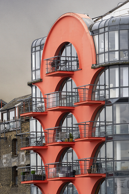
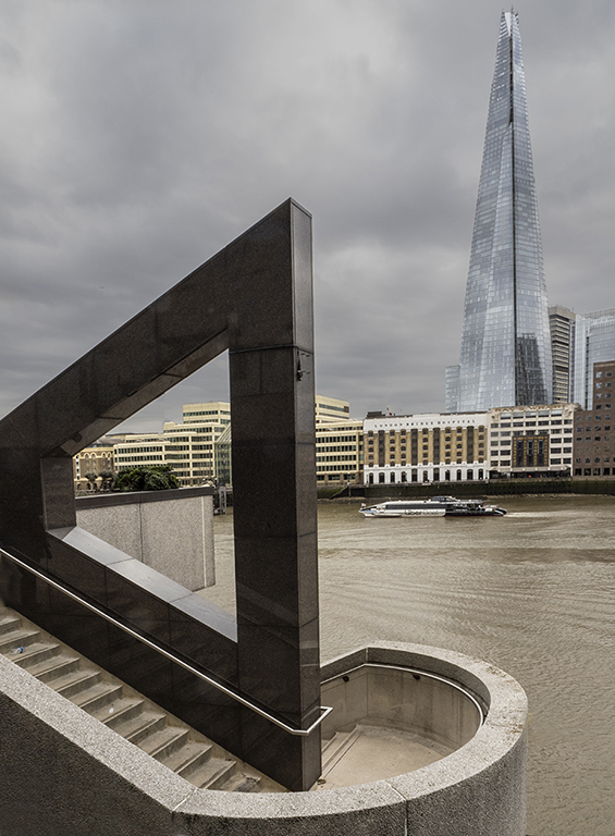
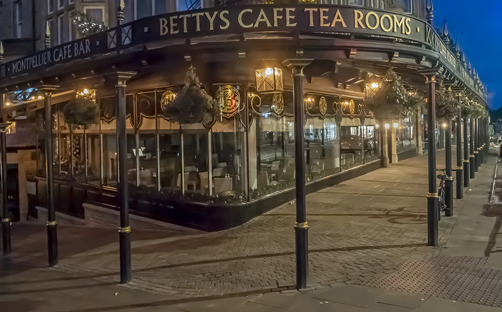
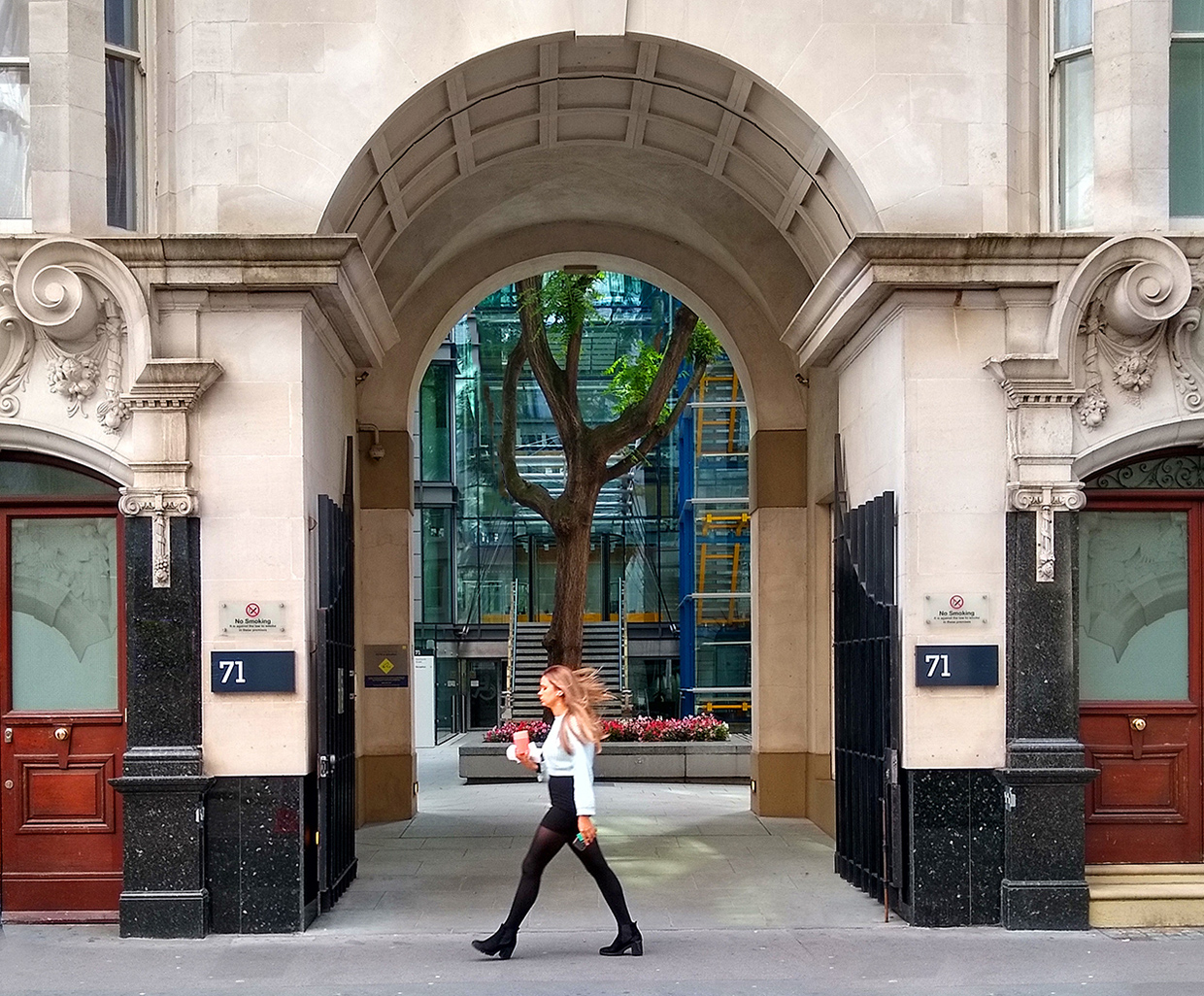
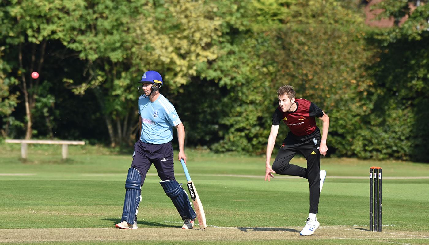
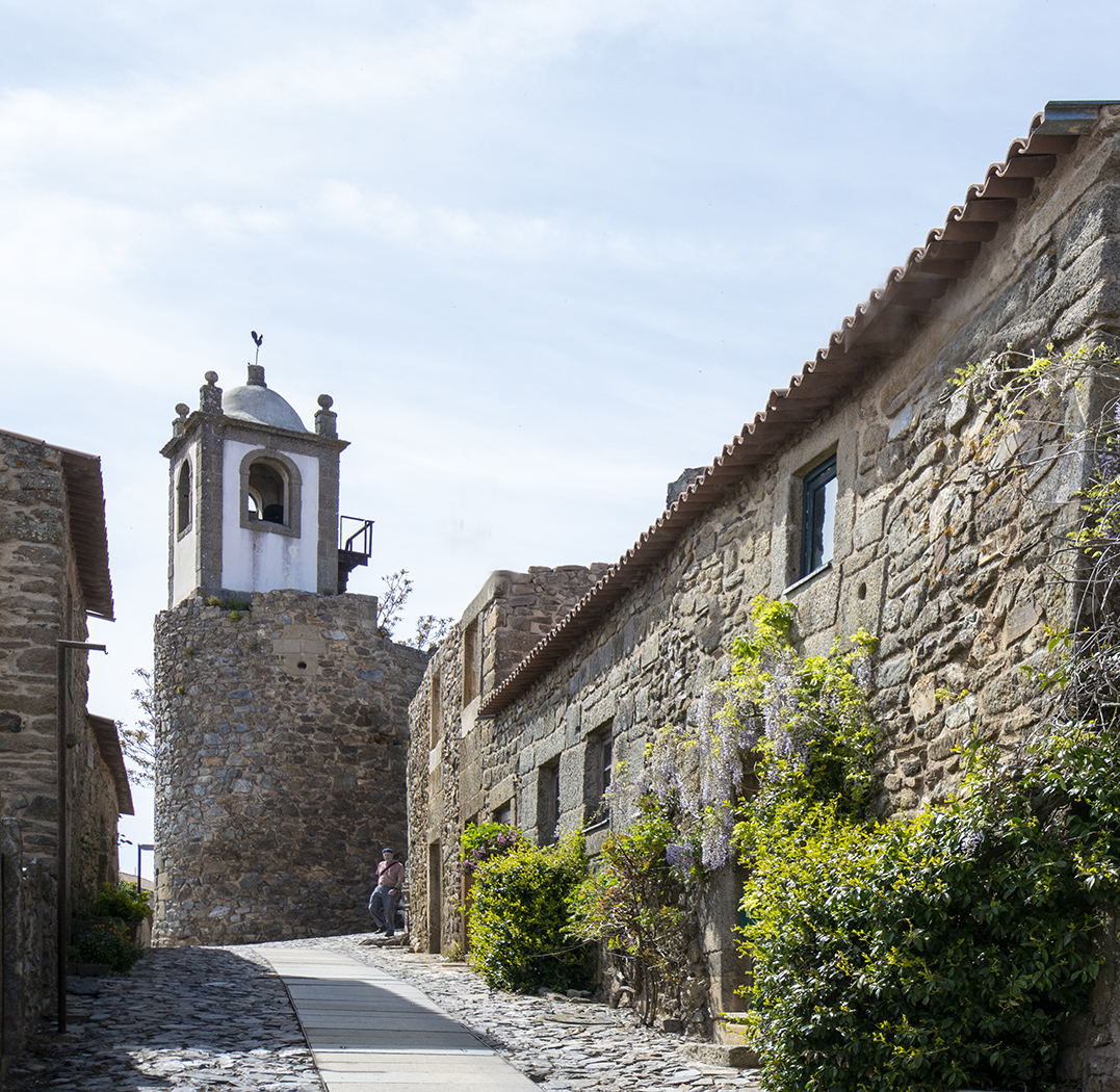
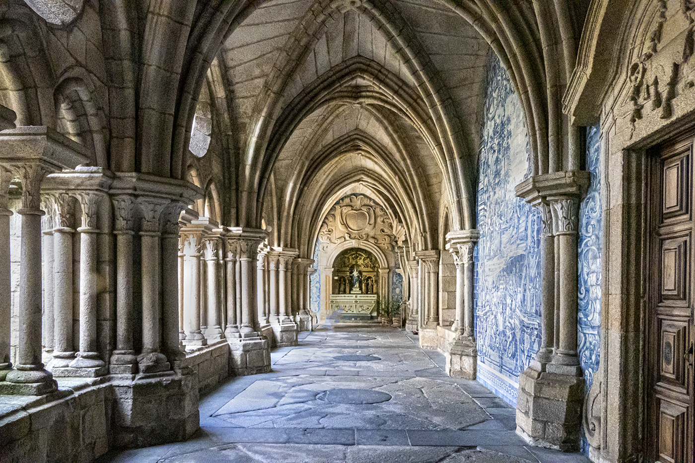
This is a very pleasant image and I like the way you have kept the pillars vertical. The people definitely give a sense of scale and I like to keep some in my architectural shots but I would have removed them all except the three in the middle distance. The lady at the front is very distracting. The Remove tool in Photoshop is very powerful and would do a good job on the people at the back but might not be quite so successful at the front because the front lady overlaps with the lady in the middle, but it is worth a try. |
Jul 7th |
| 45 |
Jul 25 |
Comment |
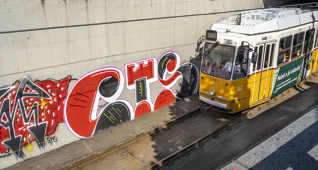
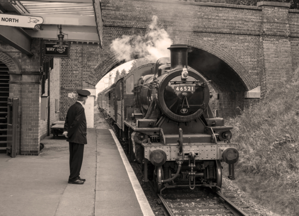
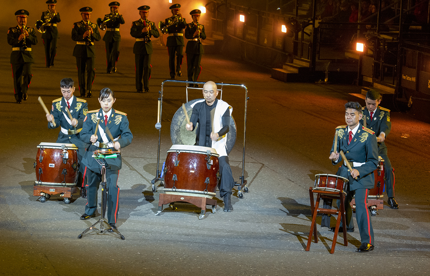
I take Charlie's point about submitting the uncleaned-up image and will comment on Cindy's version which is closer to what Charlie intended. I would have removed all the overhead cables. By straightening the converging verticals the main building in the distance has been flattened. I struggle with this in my architectural images and have found that the Skew tool often does a better job that the Perspective tool. What do other members use and is there a way to straighten converging verticals without flattening the image? |
Jul 7th |
| 45 |
Jul 25 |
Comment |
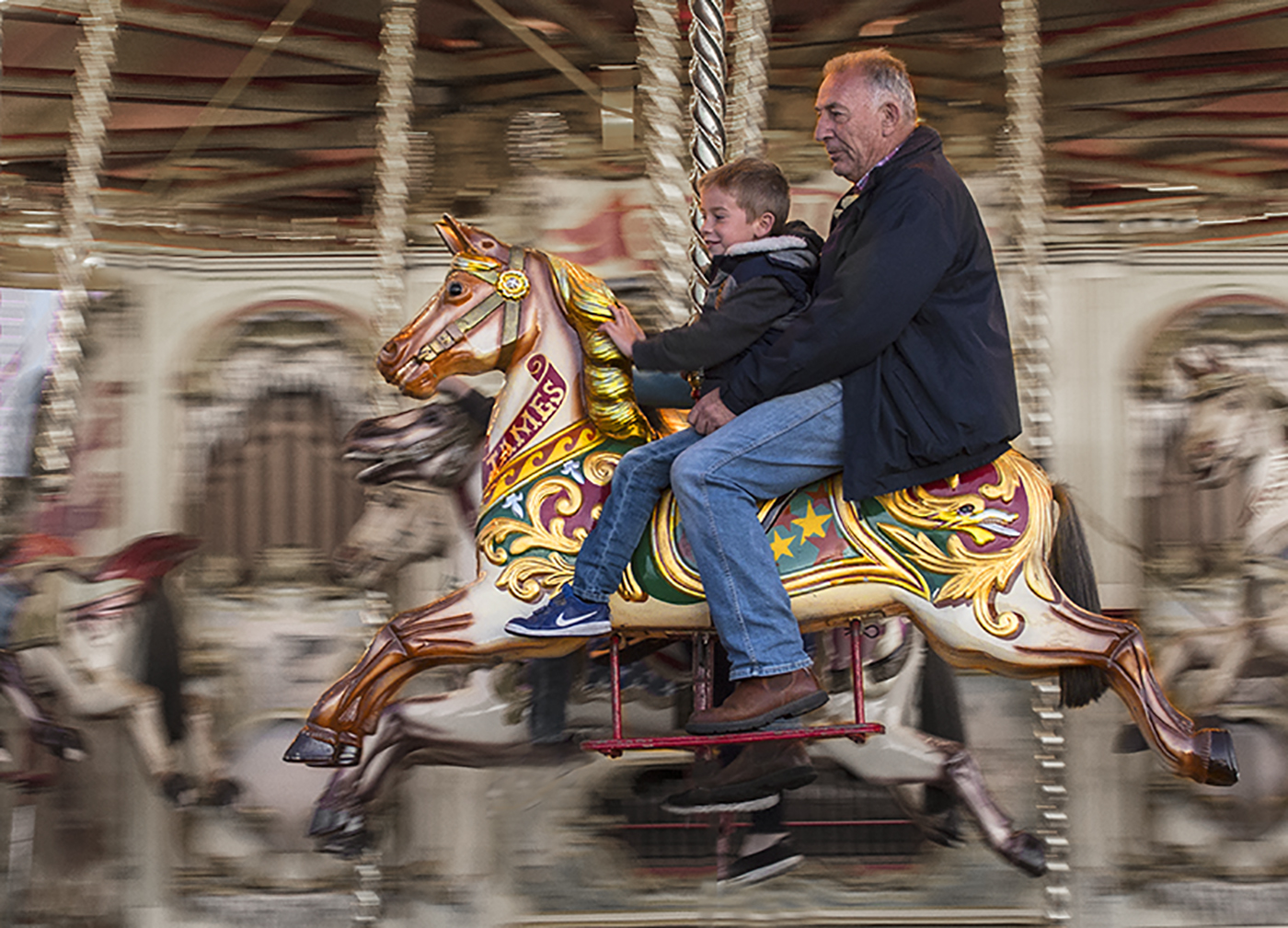
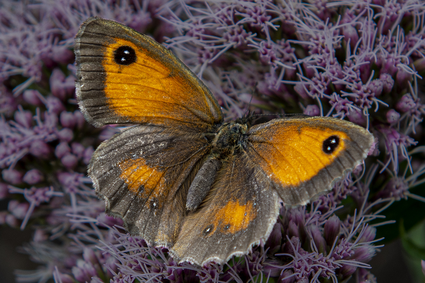
Great post production work with a good shot of the butterfly to start with. I like the slightly mottled background and the patch of green in front of the butterfly which locates it and also emphasizes it. Cindy suggests printing it and I think a lustre, pearl or oyster paper would work well, definitely not gloss. |
Jul 7th |
| 45 |
Jul 25 |
Comment |
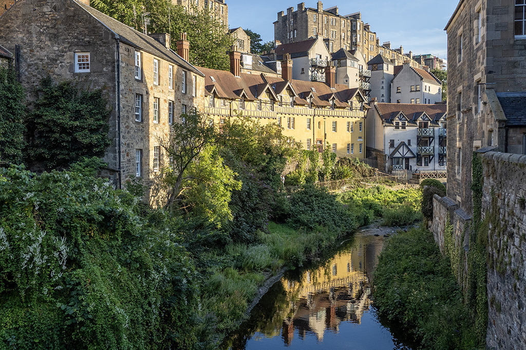
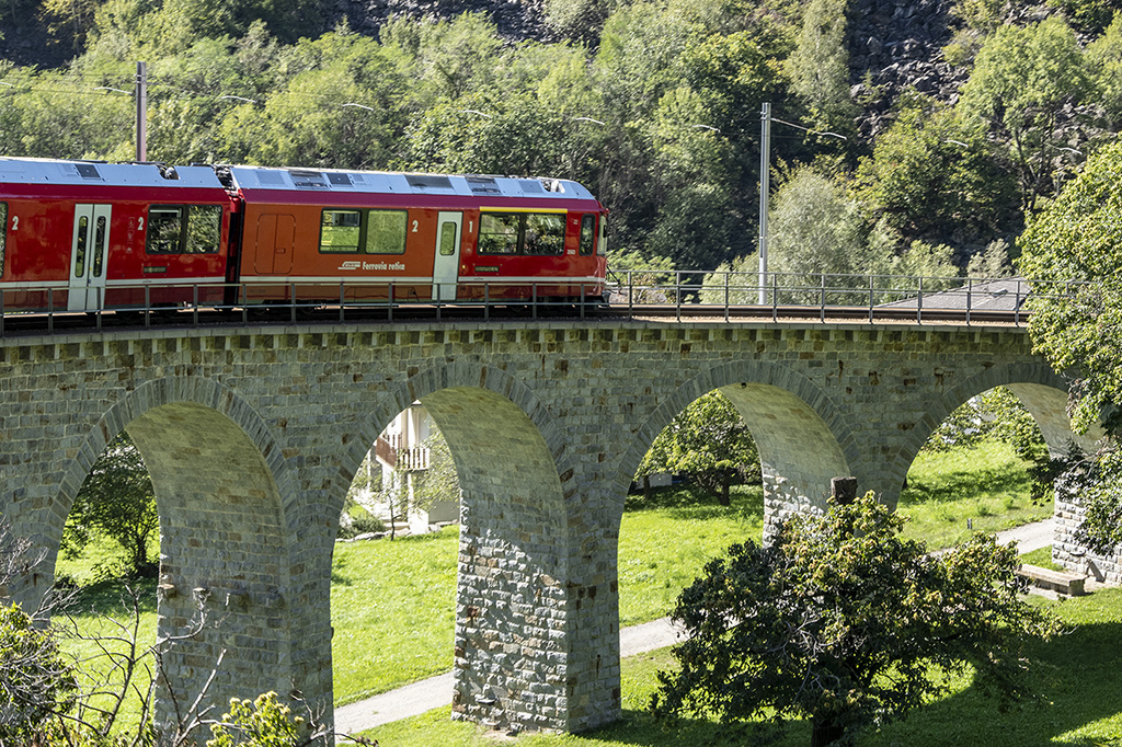
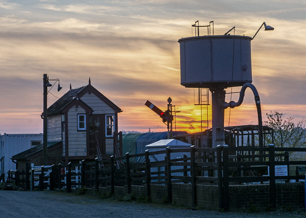
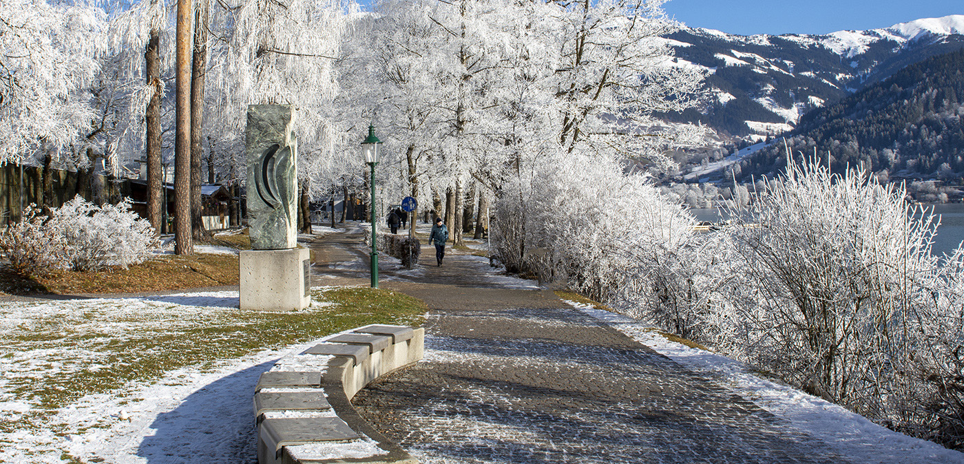
A pleasant scene with the foliage in the foreground giving depth to the image, I like the areas of mist in the mountains. I think an improvement would be to try to get more detail in the sky which is rather bland. |
Jul 7th |
5 comments - 2 replies for Group 45
|
5 comments - 2 replies Total
|