|
| Group |
Round |
C/R |
Comment |
Date |
Image |
| 45 |
Nov 24 |
Reply |
Thanks Cindy. Please see my reply to Charlie below. |
Nov 18th |
| 45 |
Nov 24 |
Reply |
Thanks Chuck. Please see my reply to Charlie above. |
Nov 18th |
| 45 |
Nov 24 |
Reply |
Thanks Charlie. I have lightened the dark area below the platform of the restaurant but as I recall there was very little detail in that part of the building, only faint horizontal lines that were only noticeable from nearer to the building. I have also removed the spots that Cindy refers to. I think I will go back and take a little more time because I was in a group and the amount of time we each had from that vantage point was limited. |
Nov 18th |
 |
| 45 |
Nov 24 |
Comment |
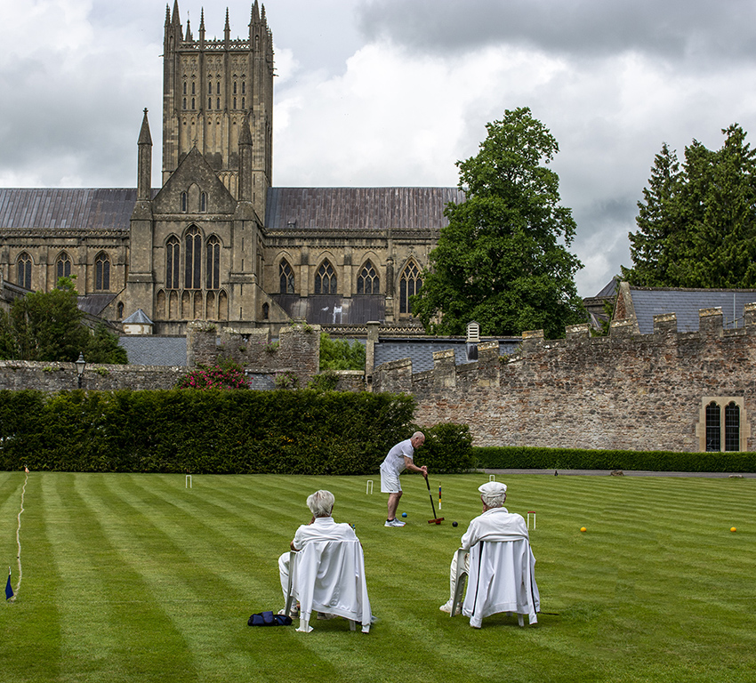
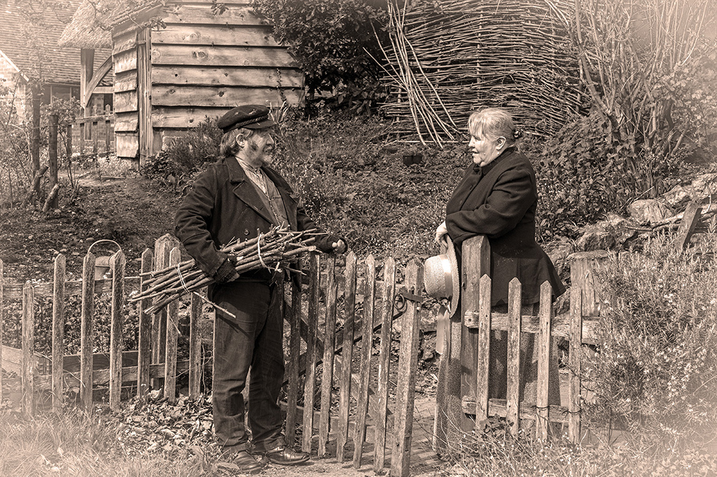
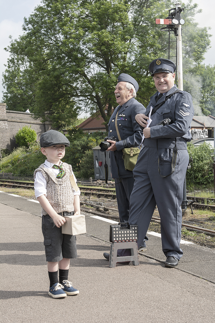
An image like this won a competition at our club. Its simplicity obviously appealed to the judge. I think the peg between the hats adds a lot more interest and is an attractive part of the image. I like Cindy's version as well. |
Nov 12th |
| 45 |
Nov 24 |
Comment |
The broken cart is sharp and well photographed to be the subject of the image. For me the background spoils it and if you like playing around in Photoshop (or other software) this is probably a candidate for being cut out and put into another background. I like David's offering but it does change the image substantially and takes away most of the main subject which is what I think appealed to you. I tried converting it to black and white but it didn't really improve it so a different background would be my choice. |
Nov 12th |
| 45 |
Nov 24 |
Comment |
The lighting is attractive and the background pleasantly diffused although a little more blur might be better. I would probably clone some foliage into the black area behind her head and tell her a funny story to cheer her up. Halloween has become big over here but I have to admit that I don't really understand it. |
Nov 12th |
| 45 |
Nov 24 |
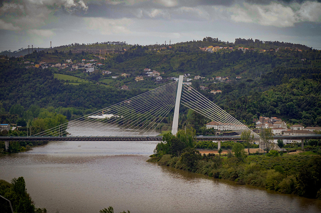
Comment |
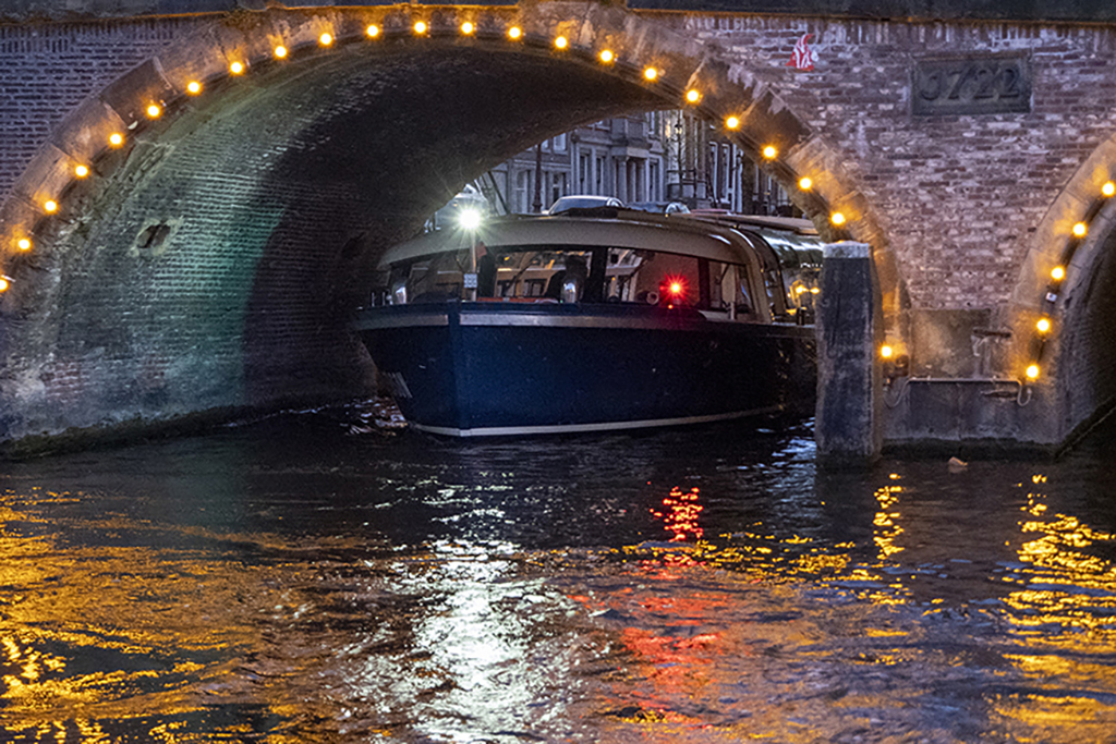
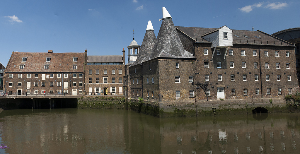
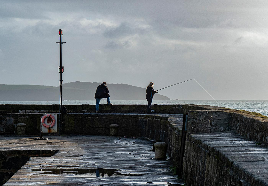
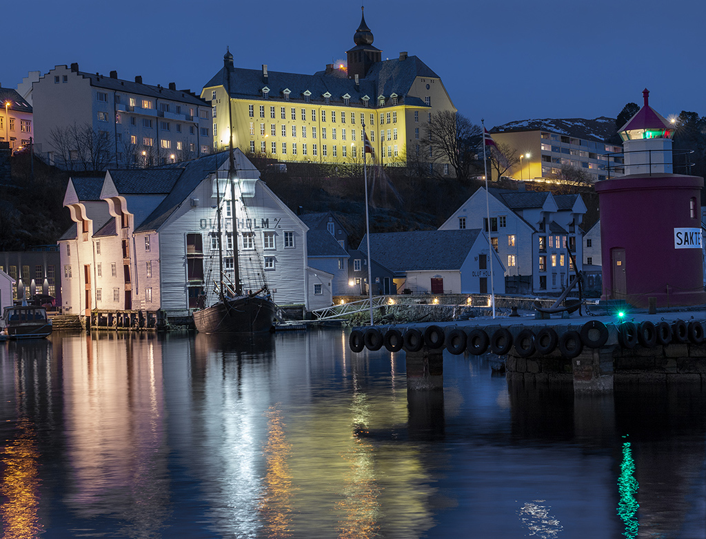
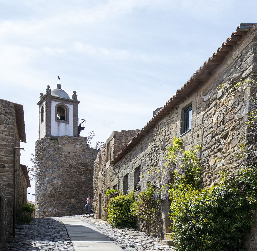
The buildings stand out well from the dark sky and the colours in the buildings and reflections are very attractive. I like Cindy's version with the verticals corrected. |
Nov 12th |
| 45 |
Nov 24 |
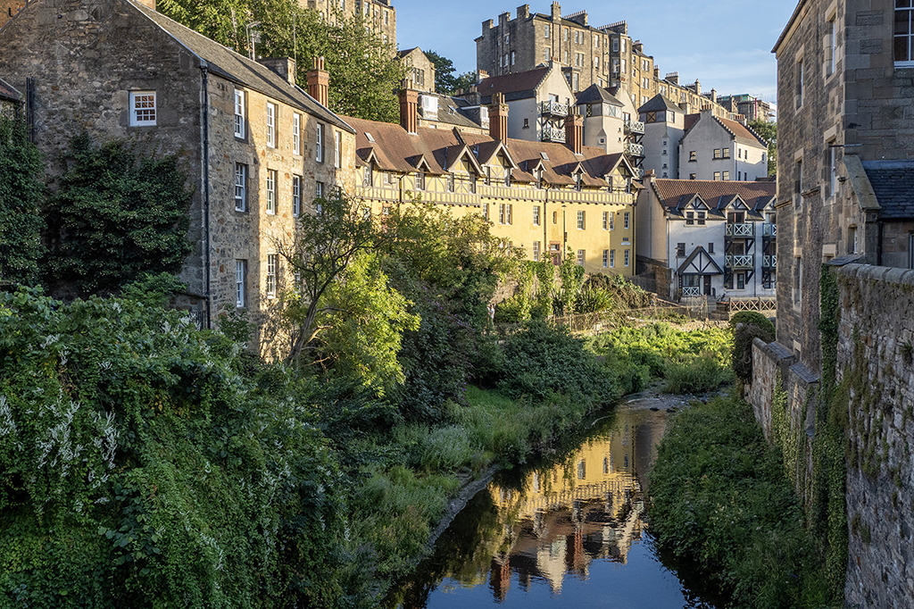
Comment |
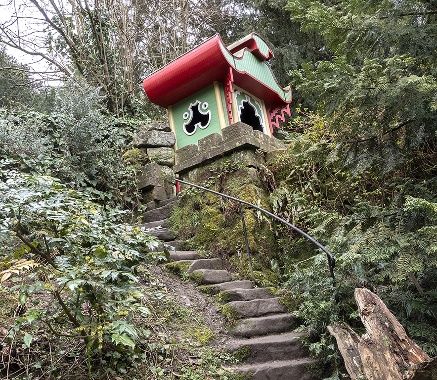
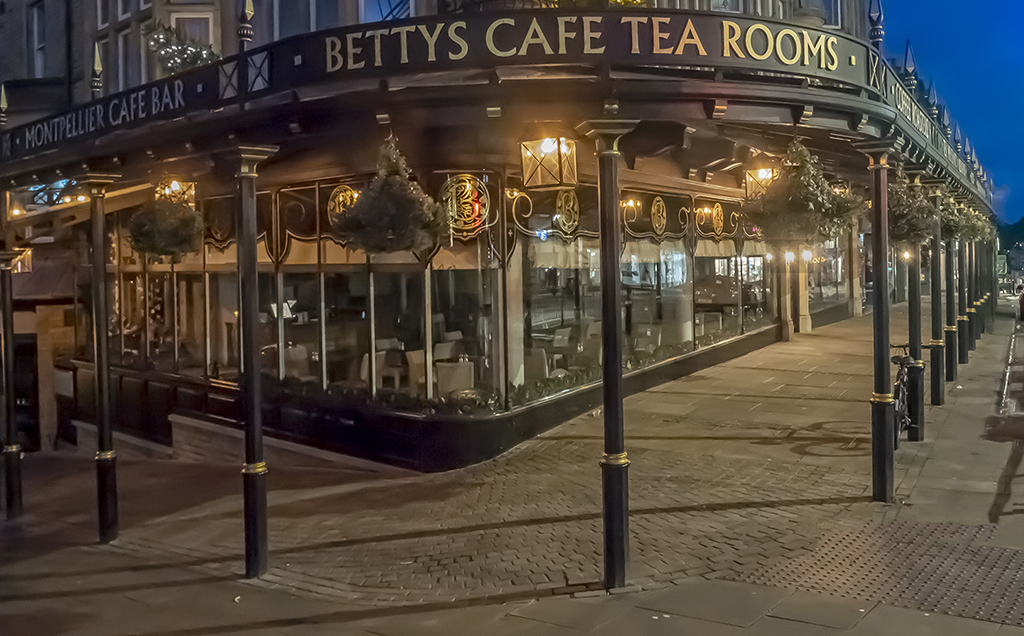
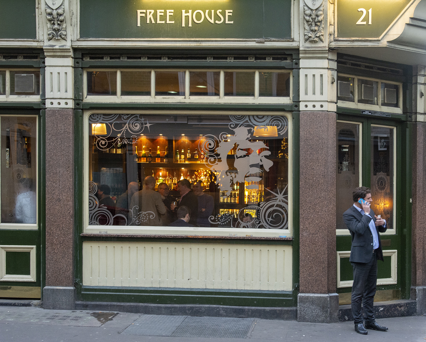
Your post processing has really brought this image to life and the elimination of the bright road in the foreground concentrates the eye on the building. The building is attractive too and the signs are in keeping with the building. Modern signs often spoil these older buildings. One tiny point is that the leg of the plant stand disappears off the bottom of the picture. I would have cloned a small bit off the bottom of it. Very attractive image. |
Nov 3rd |
| 45 |
Nov 24 |
Comment |
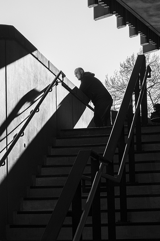
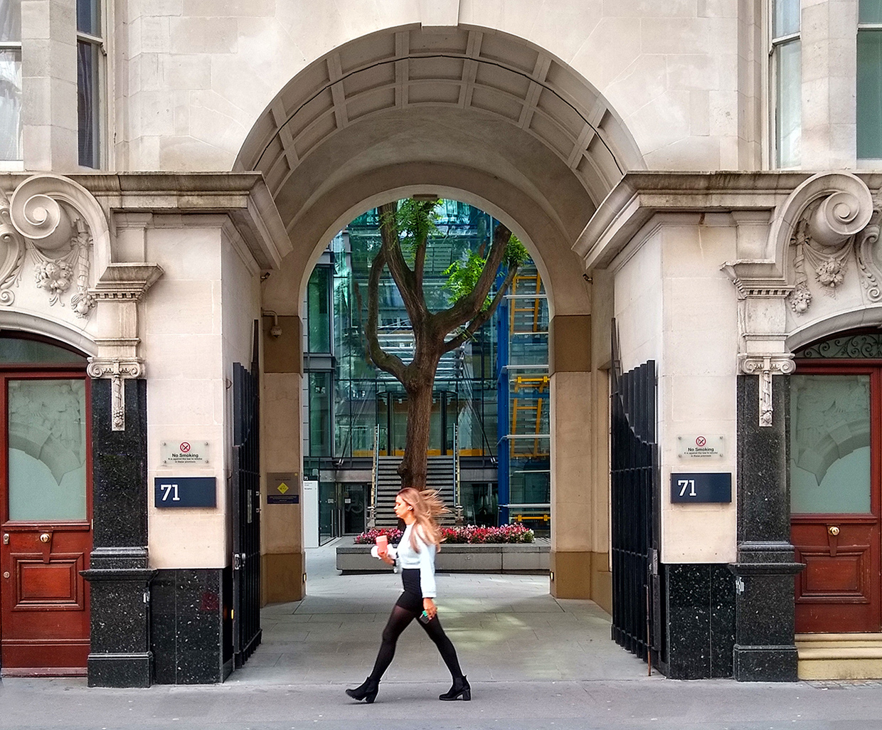
A really good and opportunistic piece of street photography. The crop makes the image much stronger by getting rid of the grass at the front and concentrating on the man and it emphasizes the match between the leaves and his jacket. The lighting works too because the wall in the background is muted and does not detract from the main scene. The toning down of the bright section of the foreground also works well. A winner. |
Nov 3rd |
6 comments - 3 replies for Group 45
|
6 comments - 3 replies Total
|