|
| Group |
Round |
C/R |
Comment |
Date |
Image |
| 45 |
Jan 24 |
Reply |
Thanks Phyllis. I noticed the light bit on the upper wall and I don't know what caused it. I haven't made any adjustments in that area. It was a wet spell of weather when I took the picture so it might be a wet area. |
Jan 12th |
| 45 |
Jan 24 |
Comment |
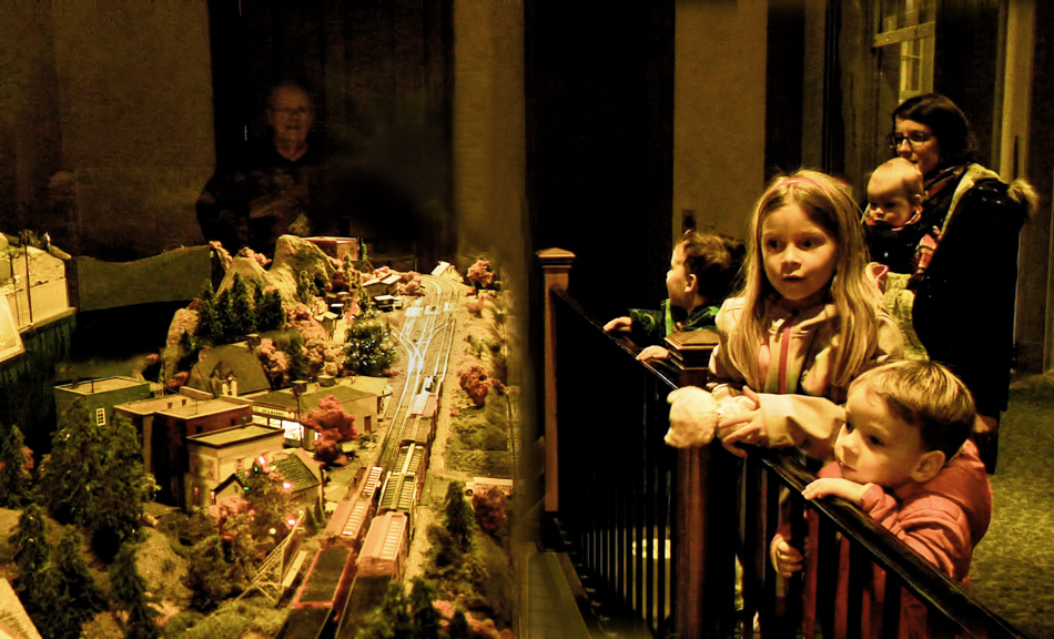
I agree with the comments above and have had a go at trying to incorporate the suggestions. My changes are a bit ragged but I hope you see the general idea. I removed the light at the back and the barrier between the children and the railway and brought the children closer. I also reduced the colour cast and brightened the picture up a bit. What do you think? |
Jan 8th |
 |
| 45 |
Jan 24 |
Comment |
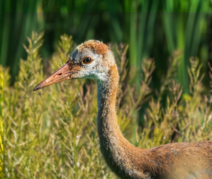
This is a good shot of the crane and its surroundings but for me, the main interest is the crane itself without all the distracting surroundings. You have focussed well on the eye. The shape of the crane's neck and the upper body is very attractive so I have concentrated my interpretation on that. I have desaturated the background a little and added some blur. What do you think? |
Jan 7th |
 |
| 45 |
Jan 24 |
Reply |
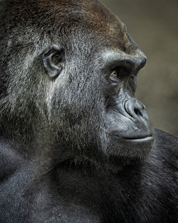
I have gone for a lighter background to separate the gorilla's head. I think your darker background improves the original but it loses the separation between the background and his (or her) head. |
Jan 7th |
 |
| 45 |
Jan 24 |
Reply |
Cindy, thanks for your comments. I have removed the white wave as you suggested. I also found a better technique for isolating the sky and have incorporated that as well. What do you think? |
Jan 6th |
 |
| 45 |
Jan 24 |
Comment |
Your post processing always makes an impact in your images and this one is very good too. I like the gentle colours on the gorilla's head and the slight crop helps to concentrate more on the face. I think I would lighten the dark background in front of the gorilla's eyes to match the background above it but it is still a very enjoyable image. |
Jan 2nd |
| 45 |
Jan 24 |
Comment |
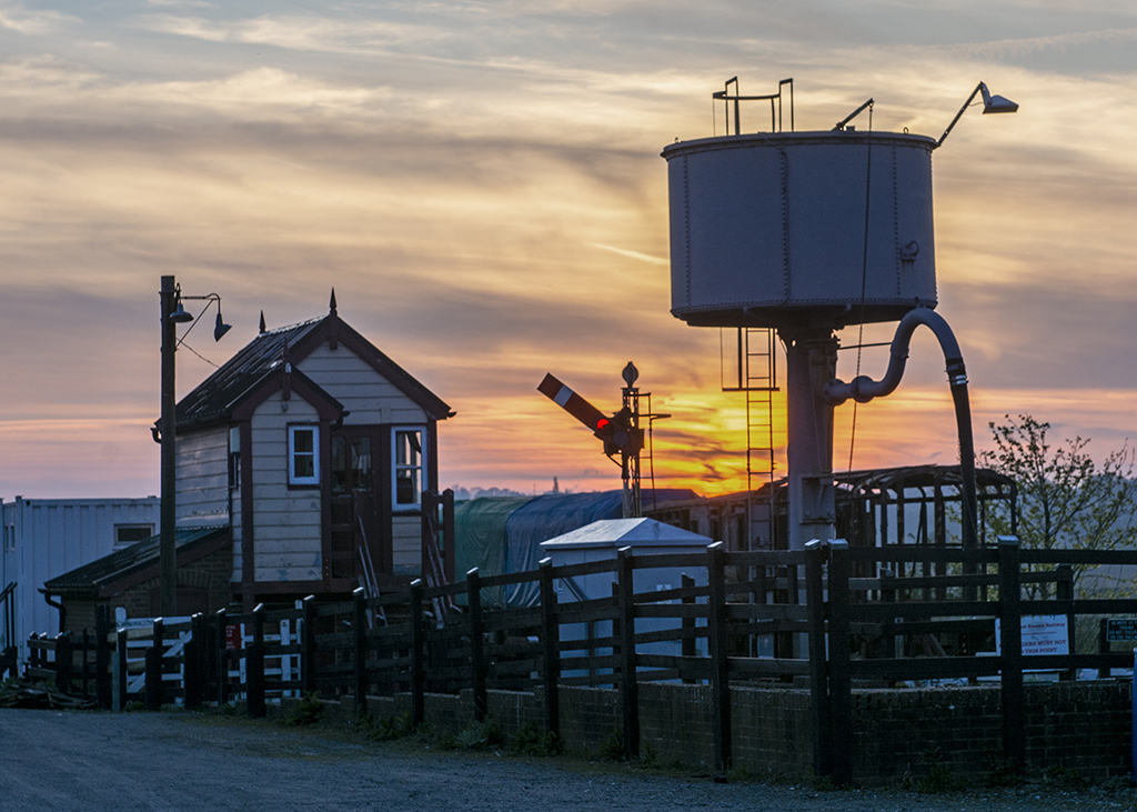
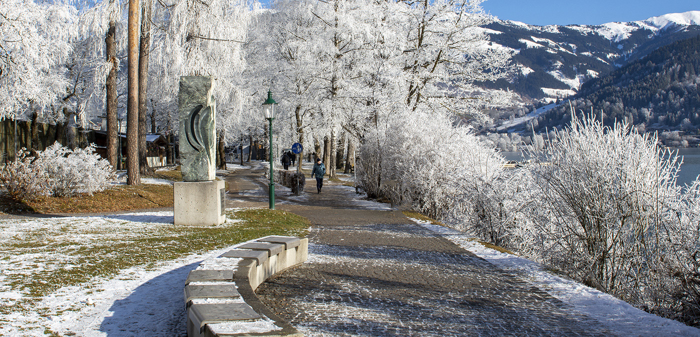
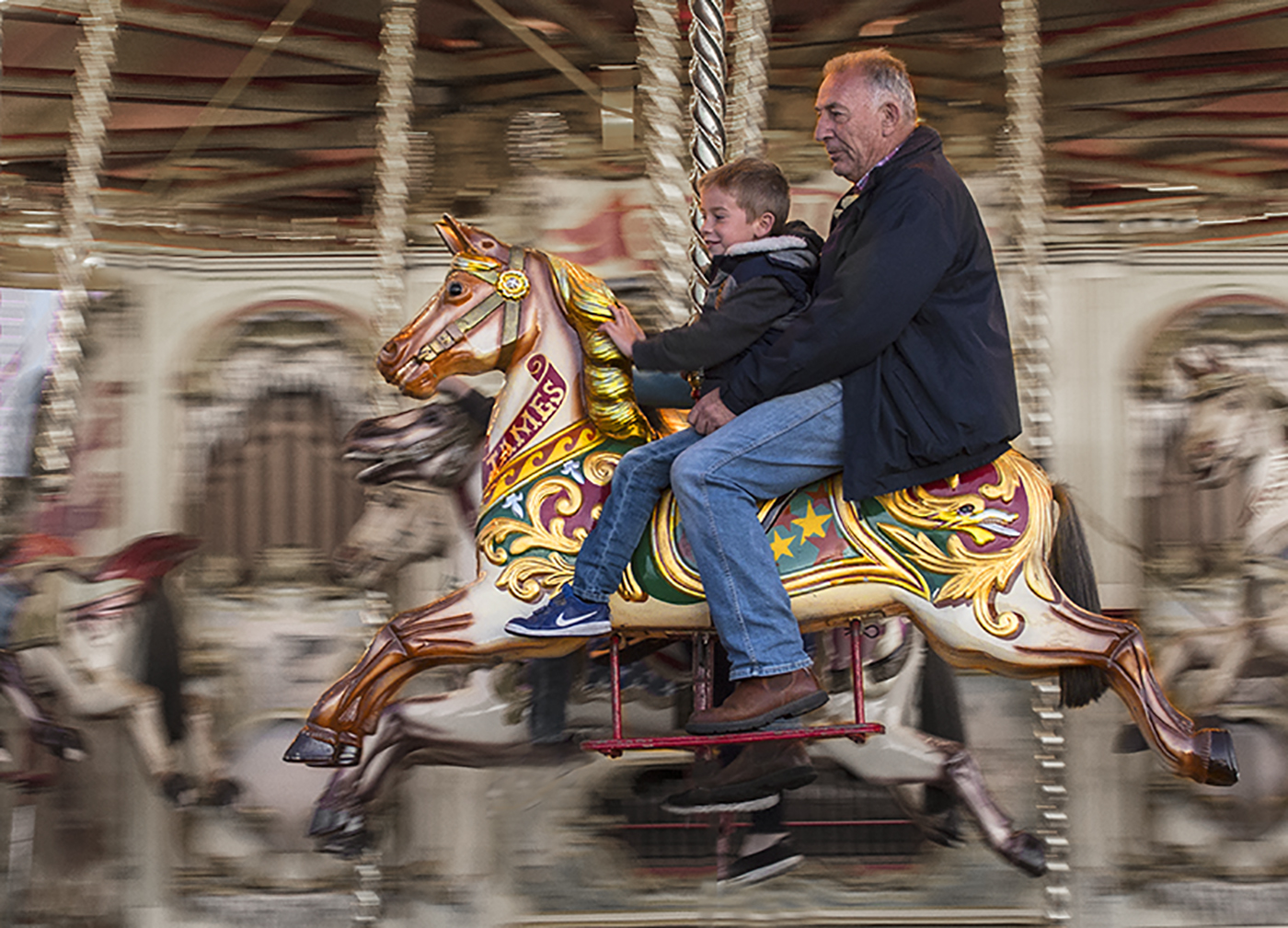
I like the atmosphere in this image and the scene is enhanced by the "letterbox" (as we call it) approach. Personally I don't think the border improves the image because it is a timeless image and is unlikely to have changed with the passage of time so a tidier border would be more appropriate for me. |
Jan 1st |
| 45 |
Jan 24 |
Comment |
This is a good imaginative image which I hope does well in your club competition. I wonder if it would be improved if the ripples in the reflection were taken all the way to the "bank" but maybe not quite as strong as those in the foreground. I like the subtle range of colours in the staples. |
Jan 1st |
| 45 |
Jan 24 |
Comment |
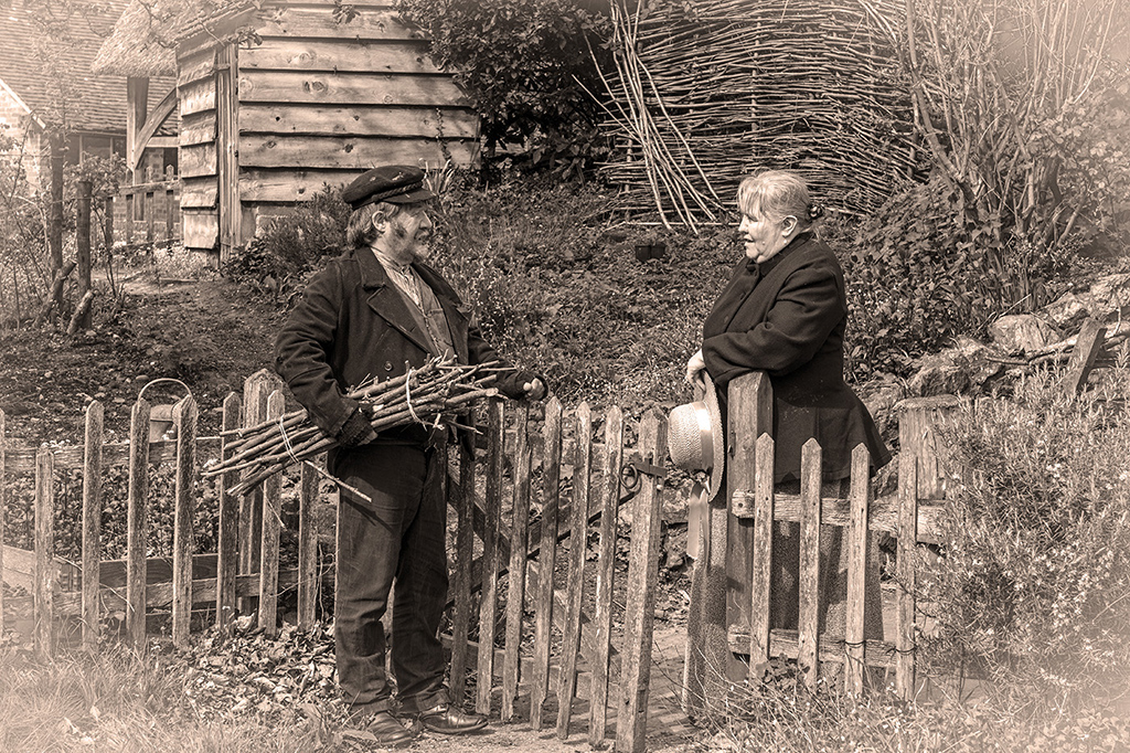
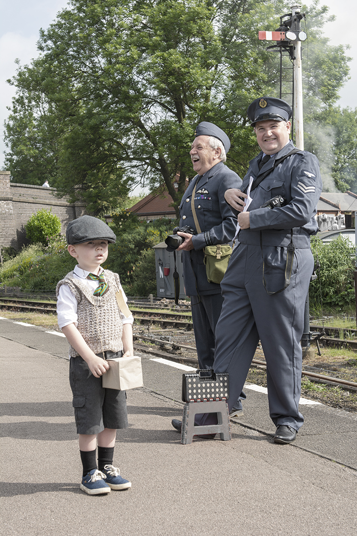
This is a good street scene with lots of activity. I notice that you blurred the background but it looks to me that you blurred the legs of the children as well. It doesn't look quite right unless that was your intention. The faces of some children are sharp and their expressions are attractive. |
Jan 1st |
6 comments - 3 replies for Group 45
|
6 comments - 3 replies Total
|