|
| Group |
Round |
C/R |
Comment |
Date |
Image |
| 45 |
Jan 23 |
Reply |
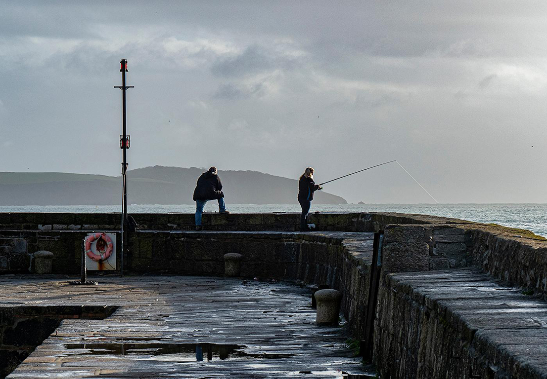
Hi Ray, I have been studying architectural photography and many presenters and authors agree with you so I will add people (or animals) in future. In this instance, it was early on new year's day and my colleague and I were the only people around. Of course, I could have used him as a subject!! |
Jan 27th |
| 45 |
Jan 23 |
Reply |
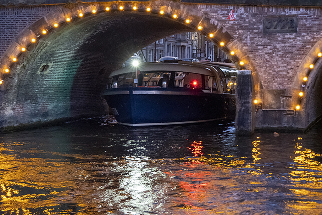
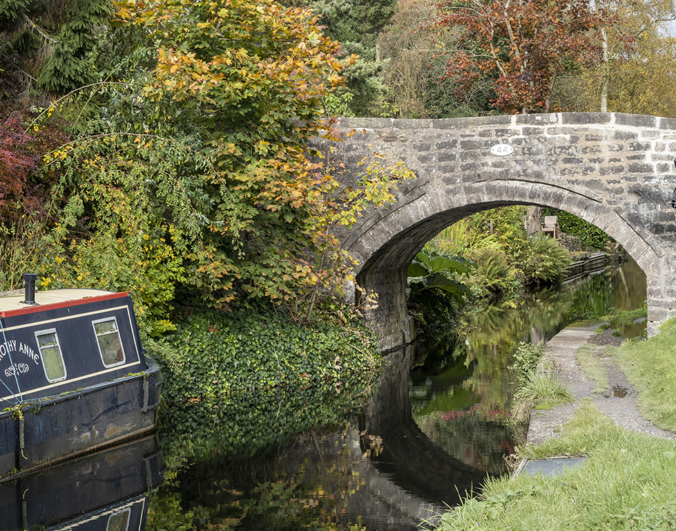
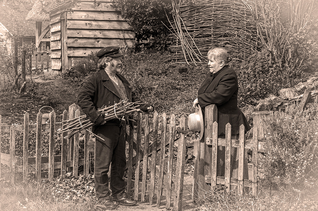
Agreed. One final thing, remove the small boat behind the left hand boat. |
Jan 10th |
| 45 |
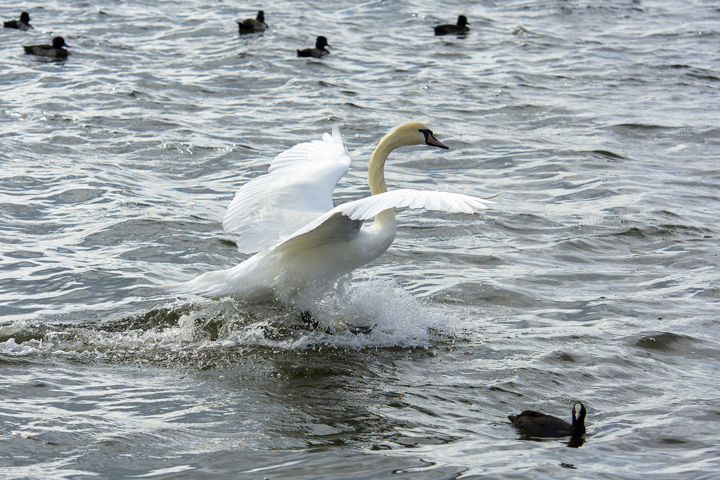
Jan 23 |
Comment |
I also like David's crop but would also extend the canvas a little to the left to give the birds space to fly into. |
Jan 9th |
| 45 |
Jan 23 |
Reply |
I also like your monochrome interpretation because you have created a strong impact (see my comments to Cindy below) but you seem to have converted summer into winter with the speckles on the leaves of the trees looking a little like frost. |
Jan 9th |
| 45 |
Jan 23 |
Comment |
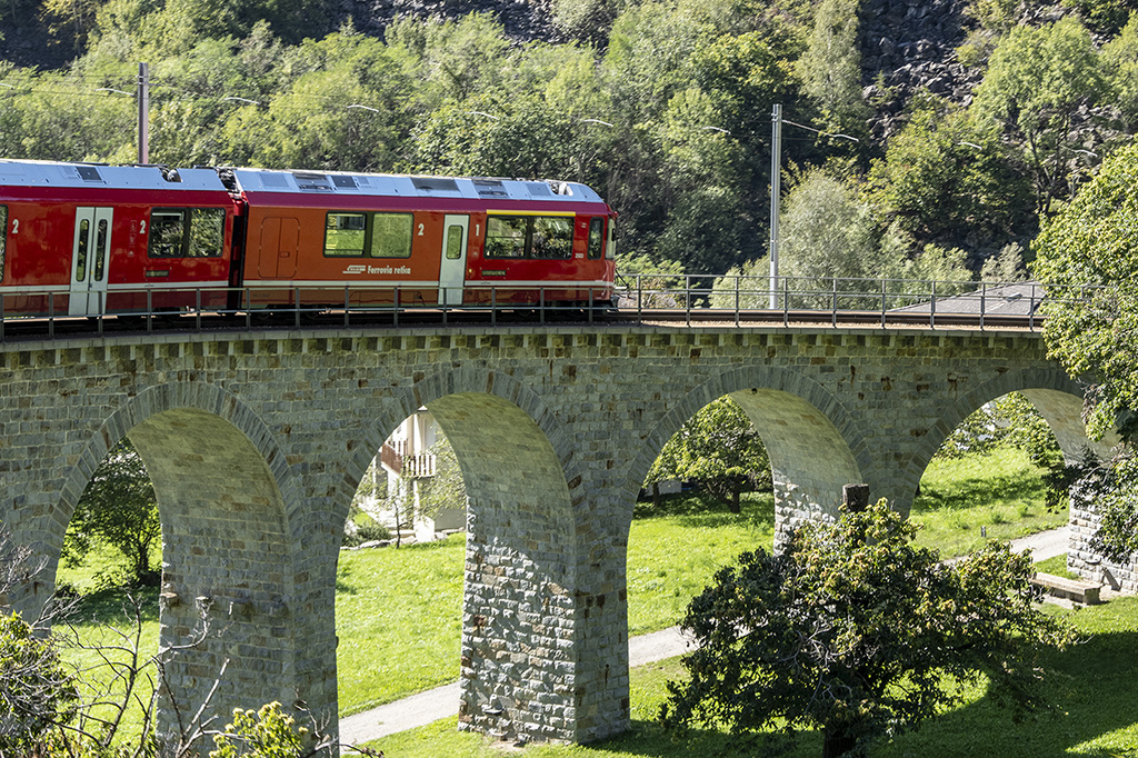
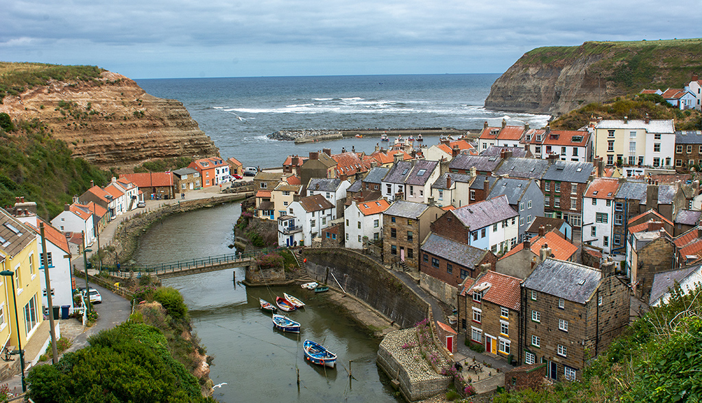
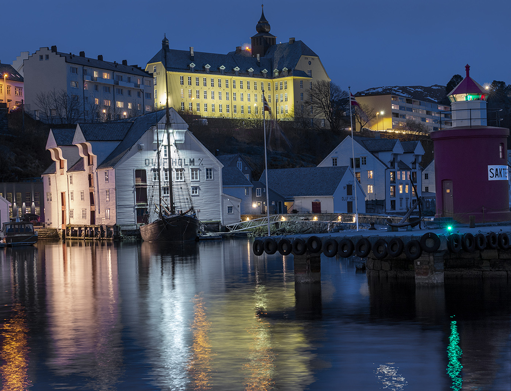
You have created impact where there was none in the original image. I like the way you have brightened up the boats and surrounding trees but I think I would tone down the trees a little as David suggests in his narrative. For me, the picture is the boats and reducing the brightness of the green would make them more prominent. The reflections in the ripples of the water are very attractive. |
Jan 9th |
| 45 |
Jan 23 |
Reply |
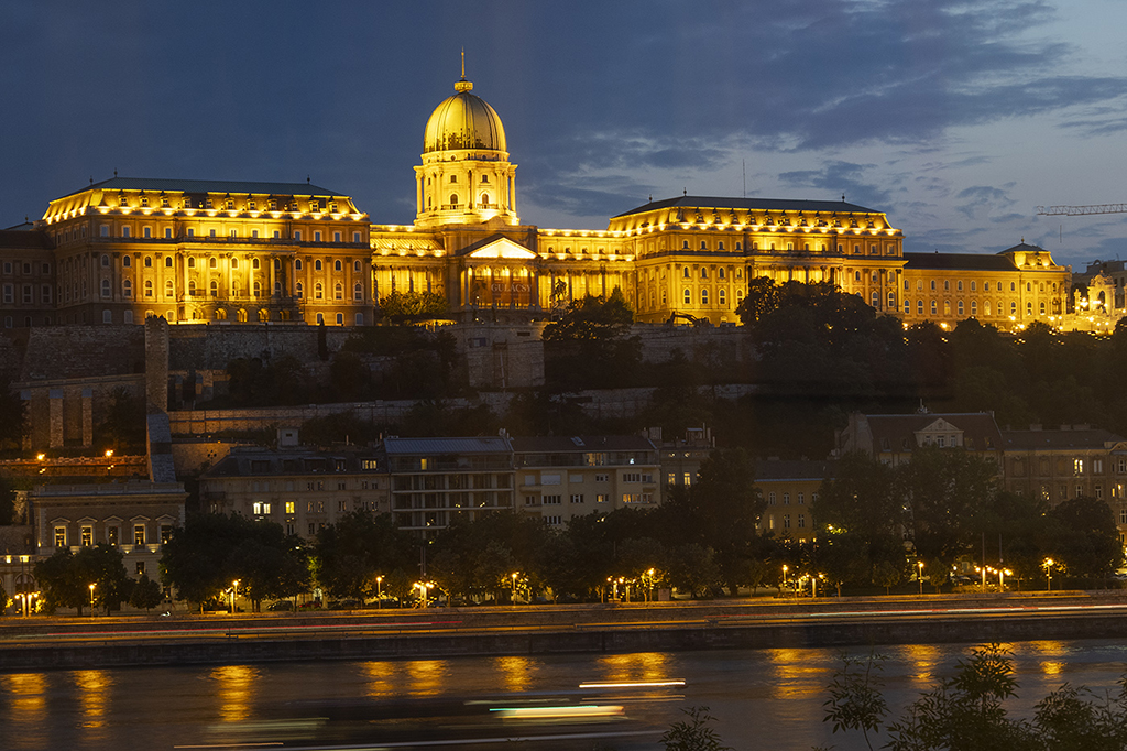
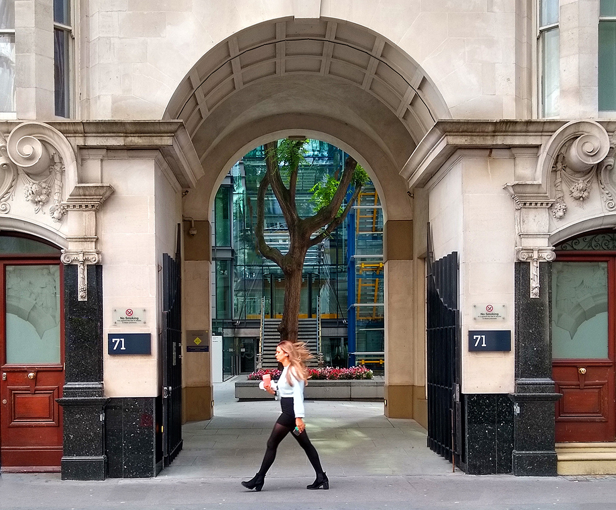
Thanks Cindy. I went out with a friend who was equipped with all the gear including a tripod but I have yet to see his images. I could probably straighten the verticals a little but the building is on the corner of a steep hill going down to the left (which was a bit of a challenge to walk up). I blame the builders for a wonky building !!! |
Jan 9th |
| 45 |
Jan 23 |
Comment |
The image is all about the roses and I like Stuart's crop which concentrates the eye on the main subject. The picture is enhanced by the attractive building with its muted colours which complement the strong colours of the roses. An image for a calendar perhaps. |
Jan 9th |
| 45 |
Jan 23 |
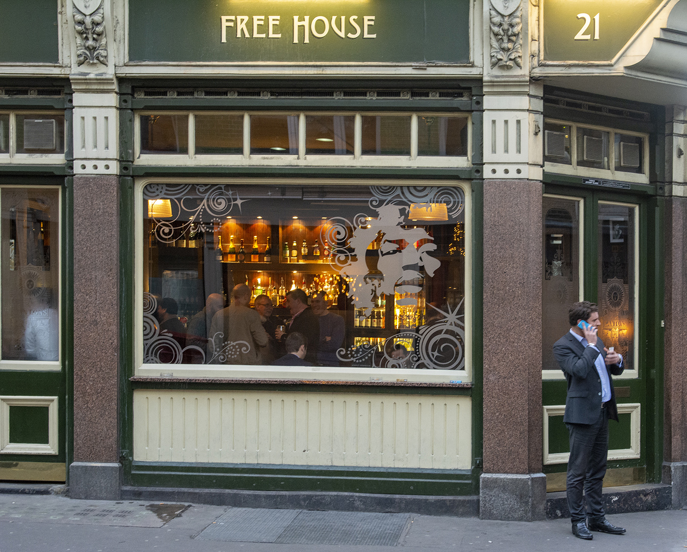
Comment |
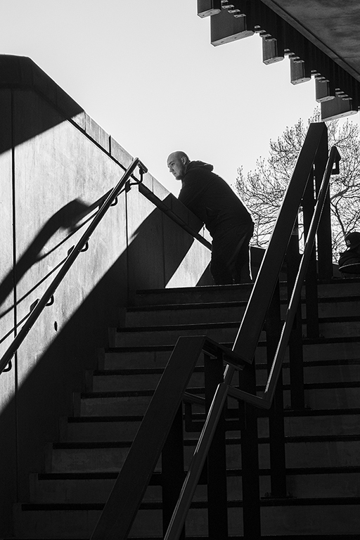
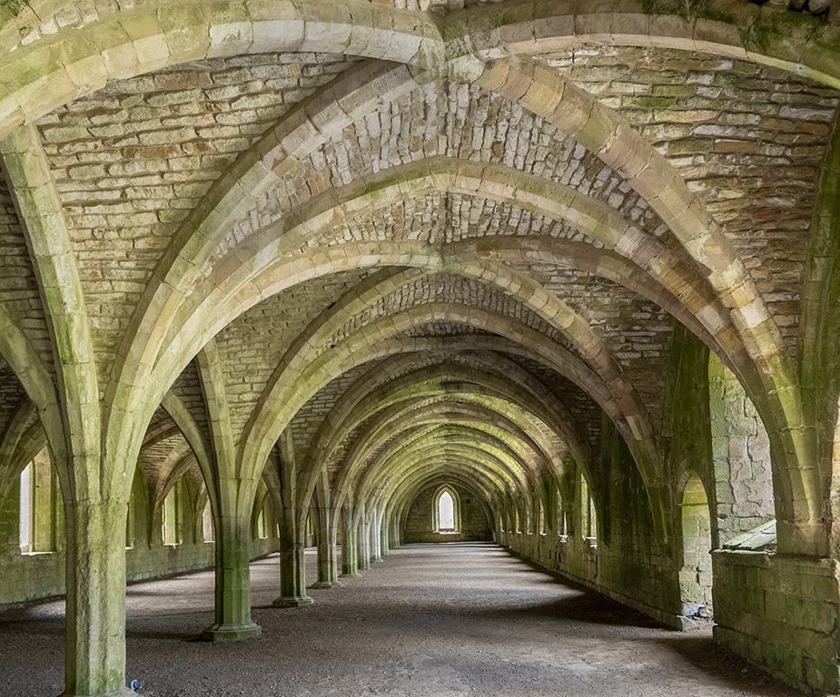
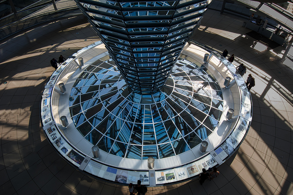
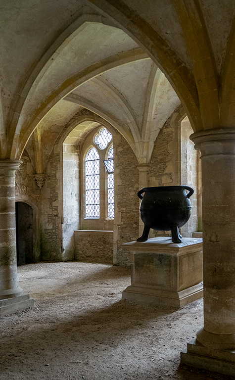
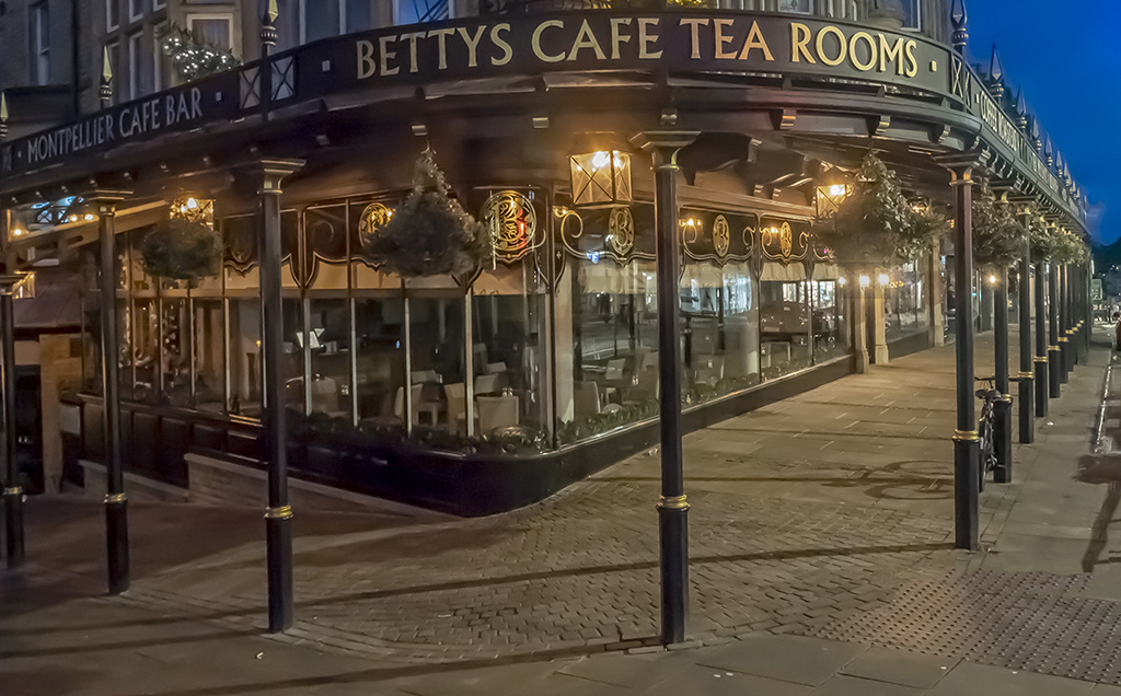
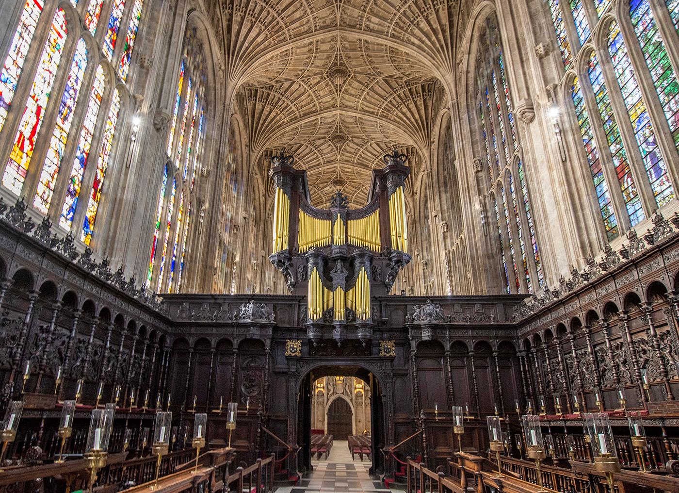
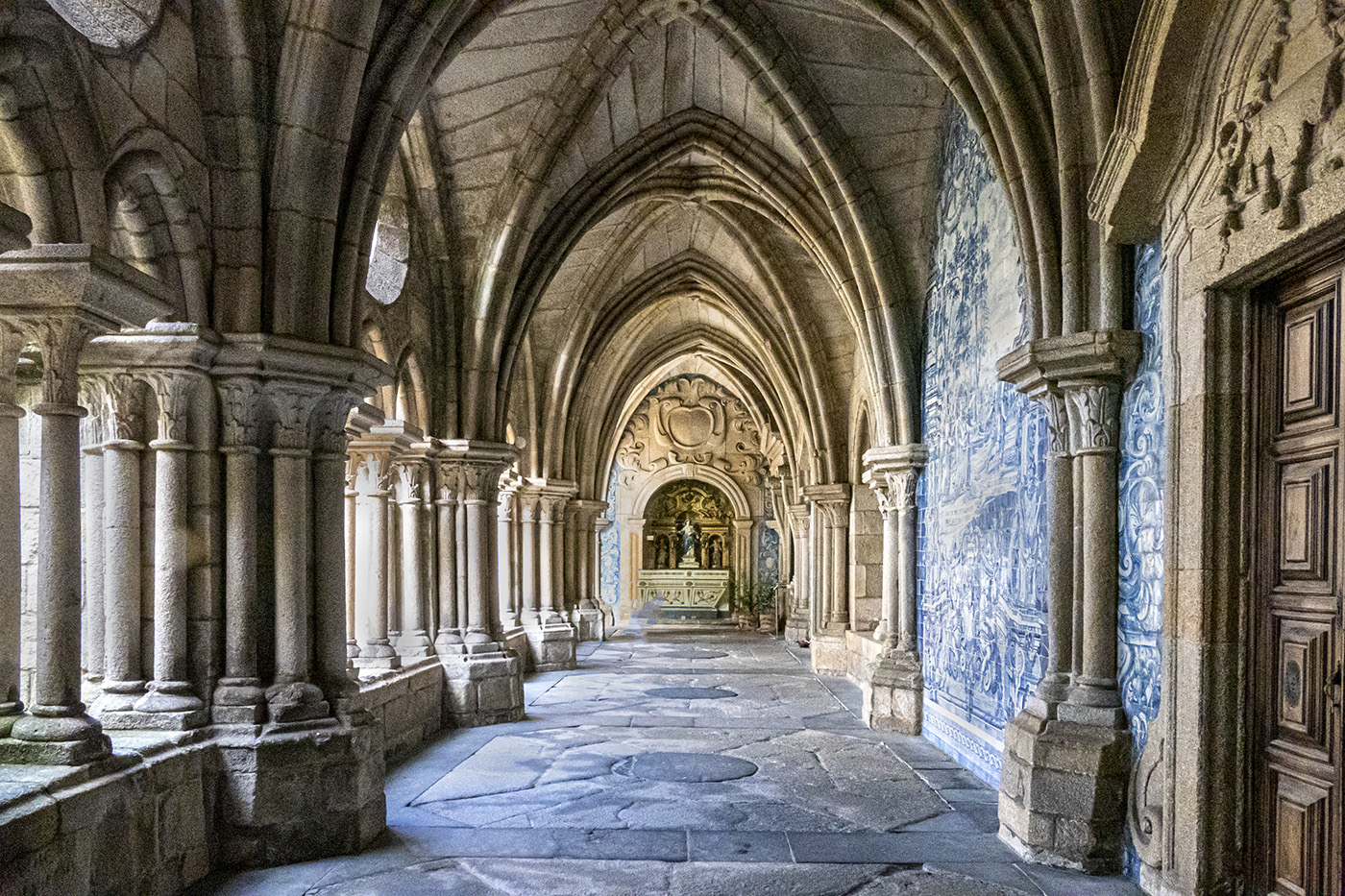
Pleasant architectural shot with strong lines going in all directions. The light falling on both sides of the image is presumably artificial light which has, by accident or design, balanced the picture nicely. I also agree with David that increasing the contrast would improve the impact. |
Jan 9th |
| 45 |
Jan 23 |
Comment |
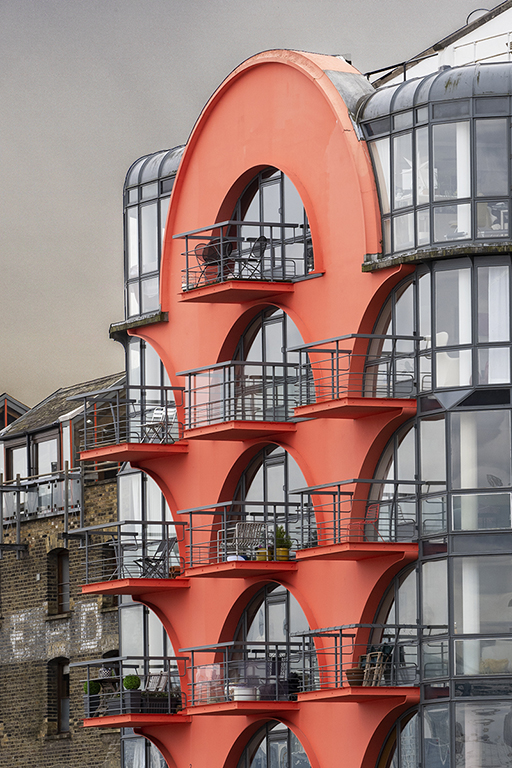
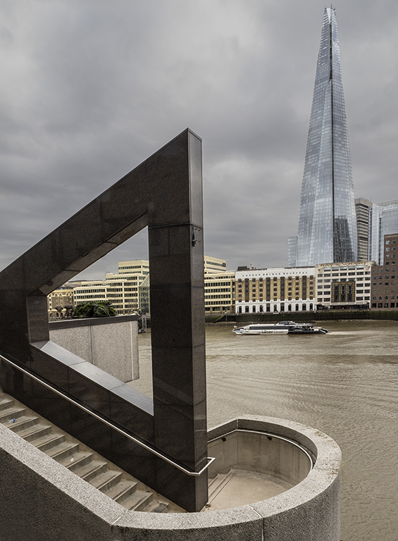
To me, this shot is all about geometric shapes and from that point of view it works well. I like Cindy's version because it removes the rather uninteresting bits on the left and concentrates on the shapes of the buildings. I think the bland sky helps to highlight the shapes of the buildings without any distraction. |
Jan 9th |
| 45 |
Jan 23 |
Comment |
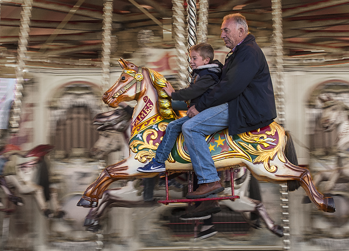
The way you have lightened the boy's face absolutely makes this shot and his expression is wonderful. The extra work you have done round the edges is good but the face is the shot. |
Jan 9th |
6 comments - 4 replies for Group 45
|
6 comments - 4 replies Total
|