|
| Group |
Round |
C/R |
Comment |
Date |
Image |
| 45 |
Feb 22 |
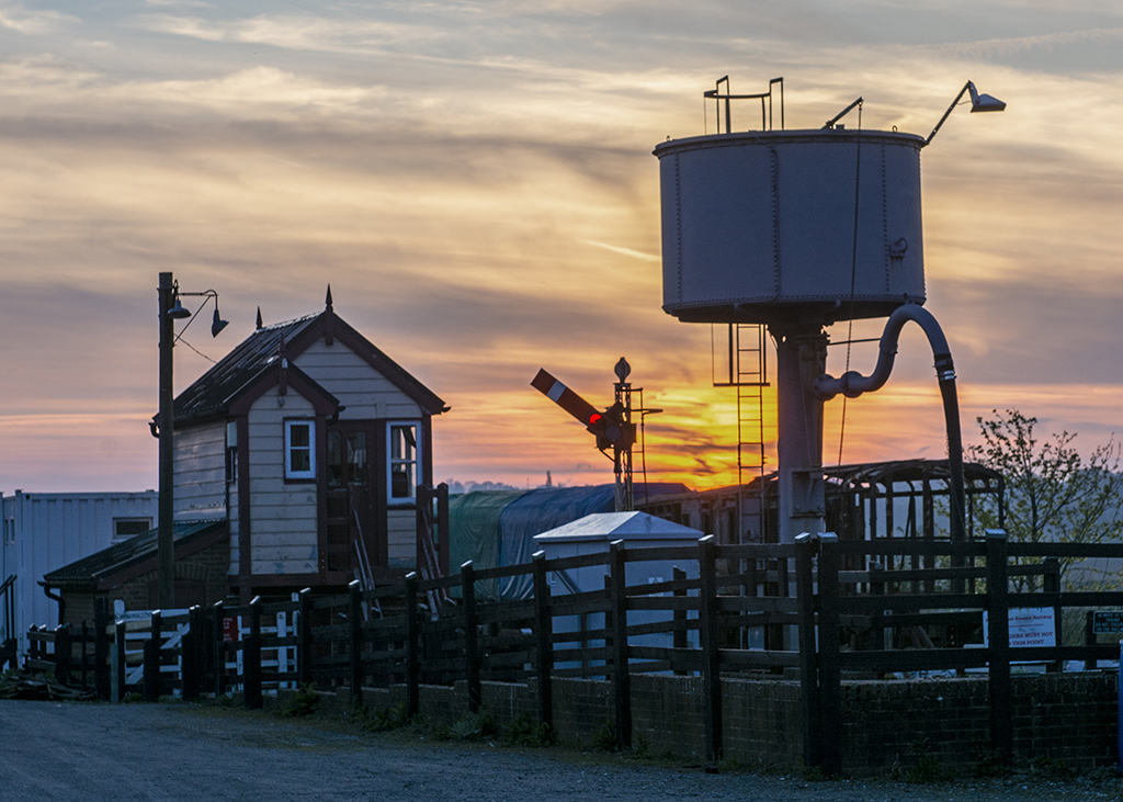
Comment |
I like the position from which you took the image, particularly the way that the two fences cross towards the top. You have sharpened the image very nicely and the grasses in the foreground concentrate the eye very well. Good detail in the sand and subtle colours make a very attractive image. |
Feb 18th |
| 45 |
Feb 22 |
Reply |
Thanks Ray. If you have access to the BBC website in USA, the programme recorded last Christmas is still on their iplayer, if it works over there. |
Feb 18th |
| 45 |
Feb 22 |
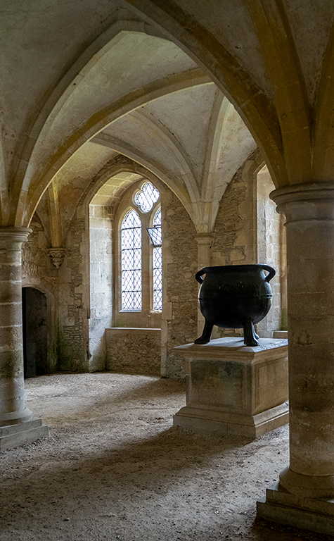
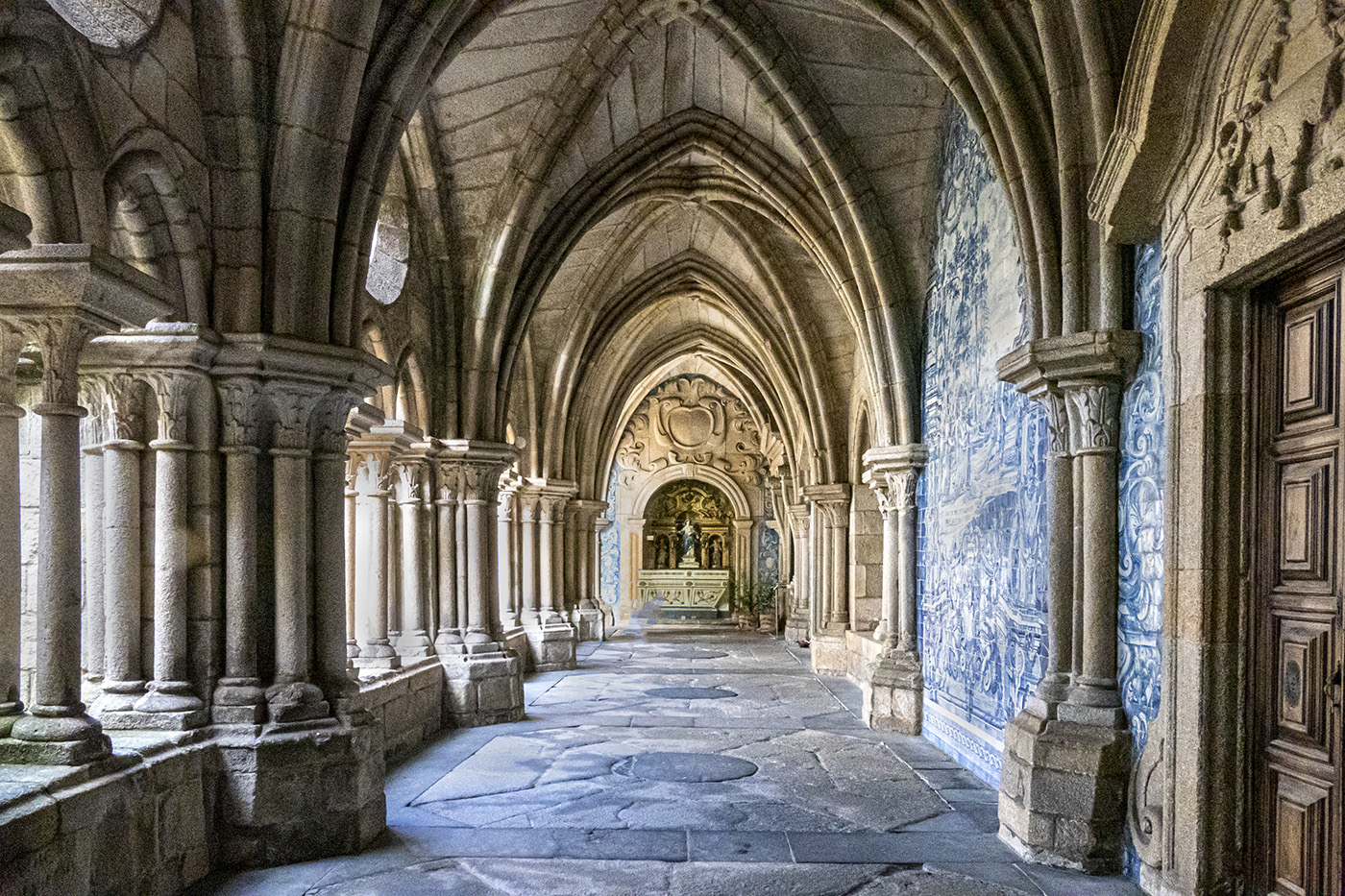
Reply |
Thanks Stephen. Good to hear from you again. There were many great images to be had in the chapel and I was lucky that there were very few visitors at the time. |
Feb 18th |
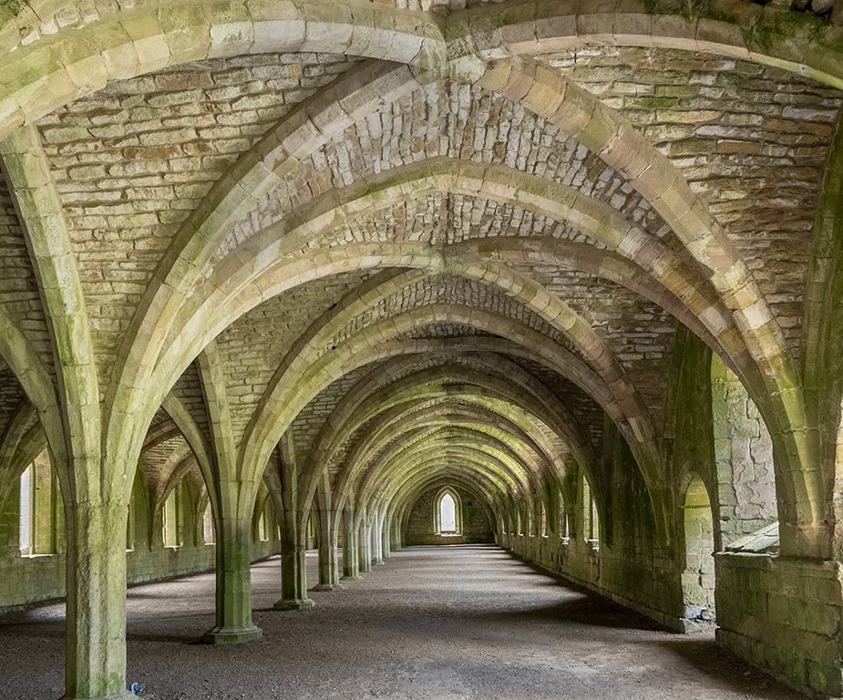
| 45 |
Feb 22 |
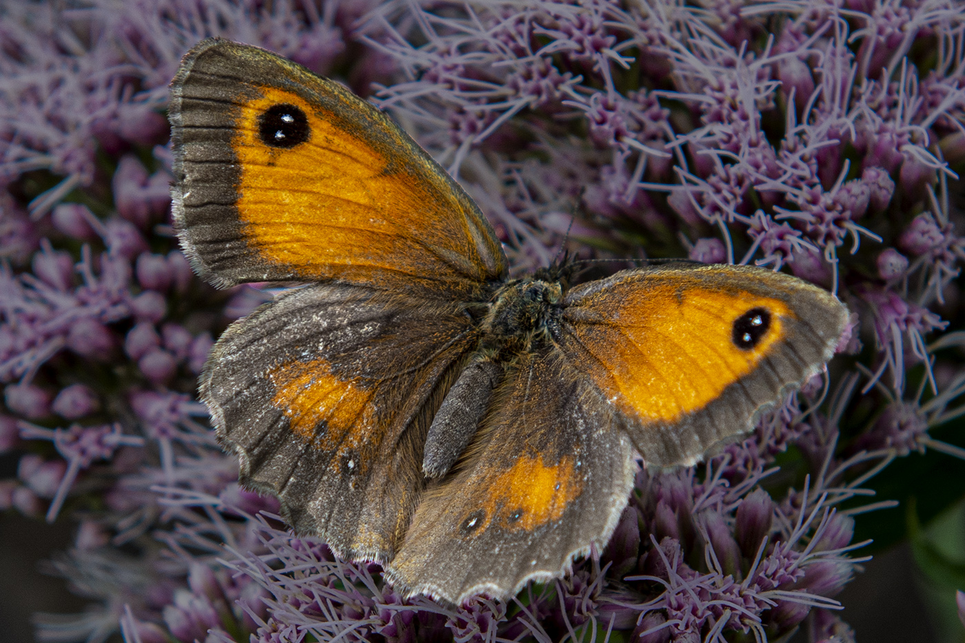
Comment |
I would be interested to know how many images were in your stack. It is quite a flat subject for lots of images and I imagine the differences in focal lengths between them were tiny. I like the details in the feather and the very vibrant colours and the black background makes them even more prominent. |
Feb 18th |
| 45 |
Feb 22 |
Comment |
I agree with Ray about the contrast between the sky and the flowers. You have achieved a good depth of field at f2.8. I suggest that if you want to capture more of the field, then taking the shot from higher up would achieve that but the sky is very attractive and it would be a shame to lose any of that. |
Feb 18th |
| 45 |
Feb 22 |
Comment |
Very attractive shapes in the icicles and it lends itself well to the black and white conversion. I agree with others about the blown out bits and personally, I would have cropped a little off the bottom to concentrate more on the attractive icicles. It would be interesting to see the original image. |
Feb 18th |
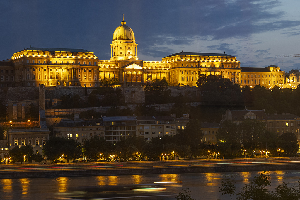
| 45 |
Feb 22 |
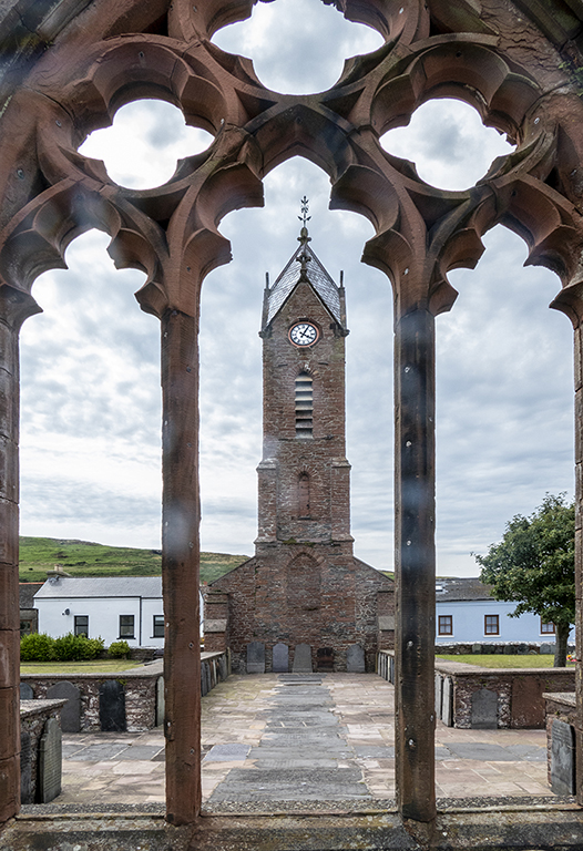
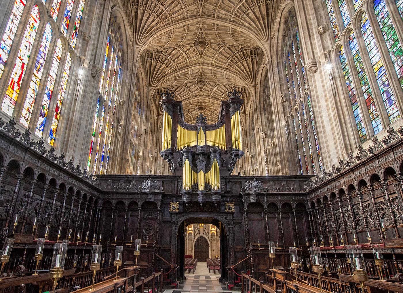
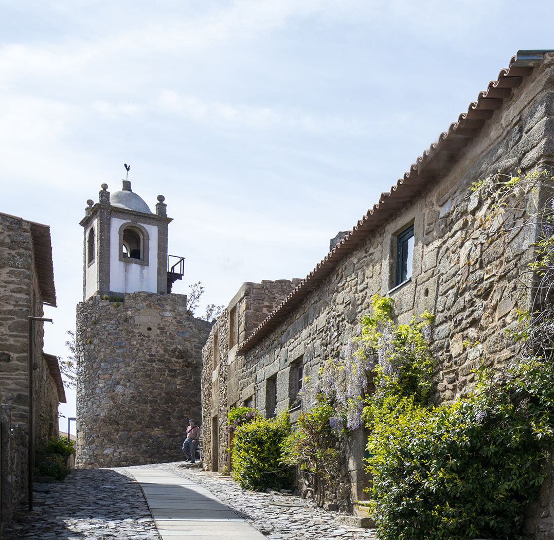
Comment |
I like the grand architecture and I think your most recent version is the best one after comments by others. You have brought out more detail in the statues which I like and the subtle contrast between the grey and yellow is very attractive. |
Feb 18th |
| 45 |
Feb 22 |
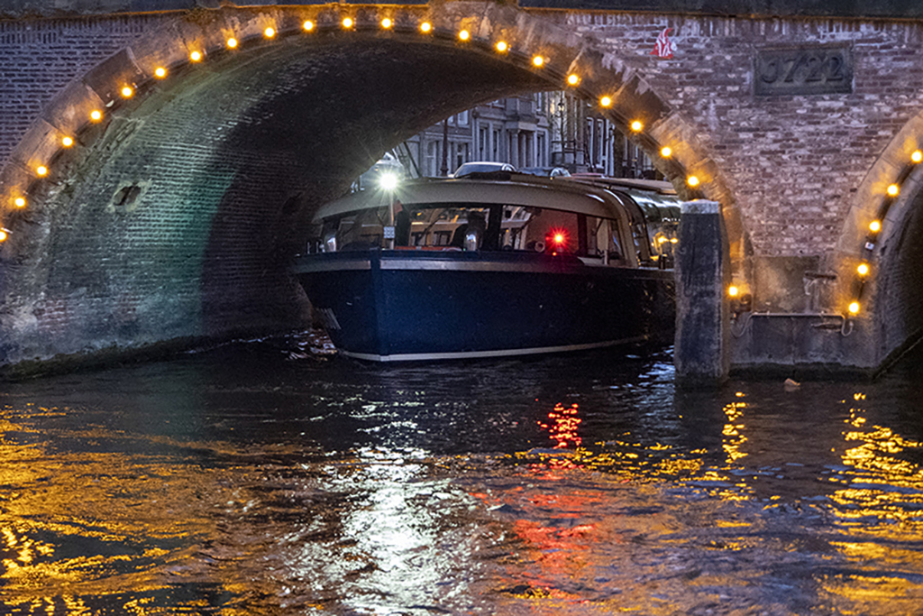
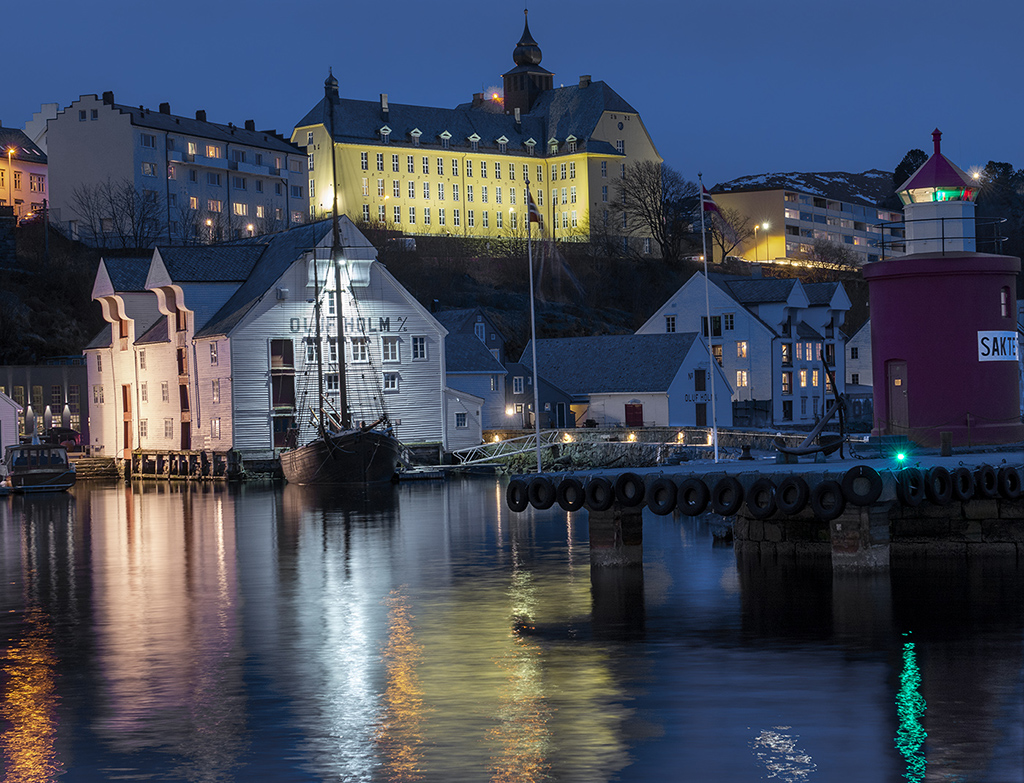
Comment |
The colours and reflections are very attractive and I think David's suggestion has improved the image by taking away the distractions on the right. |
Feb 11th |
| 45 |
Feb 22 |
Reply |
Thanks Cindy. I usually also try to straighten out the converging verticals but in this image, an attempt to do that would flatten the image so much that it would take away the splendour of the chapel. Next time I go to Cambridge I will see if Kings College will allow me to take a tripod and then I can try the HDR. I have a little Fuji X100V that sits on a gorilla pod so I could maybe try that without offending the chapel. |
Feb 11th |
6 comments - 3 replies for Group 45
|
6 comments - 3 replies Total
|