|
| Group |
Round |
C/R |
Comment |
Date |
Image |
| 37 |
May 23 |
Comment |
Very pretty, nice color, sharpness. It's a very good subject. But I think the posts stand out as the main subject and I don't think that's what you want.
I'd cut them entirely and crop out a bunch of sky and foreground. I think if it's done right then the water becomes a leading line in to the house on the right which is were I think you want your focus.
I'd probably cut the sky by half so that it balances out the foreground grass. That will give nice thirds--foreground grass, sky and the loose section that includes the house, the water and the brighter grass int he middle. Probably consider trimming some of the foreground for the balance
I'm not sure the houses across the bay are important. I think it's a very good shot that will stand out more if you play with cropping and tell the story you want to tell |
May 20th |
| 37 |
May 23 |
Reply |
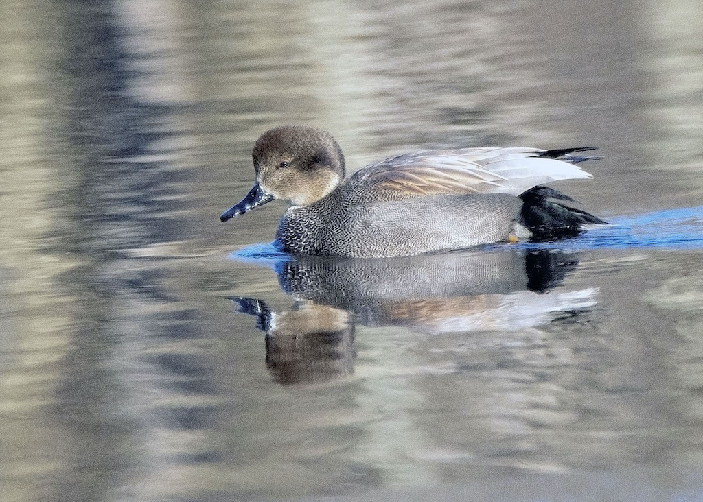
Actually, we were fairly close 60 feet.
The reason for the tight crop was trying to avoid having grass over everything. It was tough enough just keeping a clear view of the animal's facts
thanks. It was a fun sight |
May 20th |
| 37 |
May 23 |
Comment |
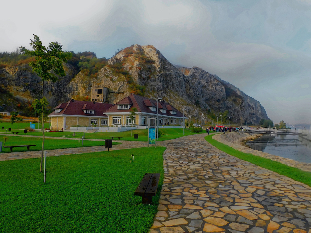
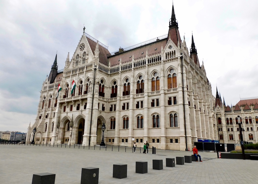
Lee Ann
A very pretty building. I think the pitch of the building needs to be straightened. there don't appear to be any vertical lines and I think getting at least closer would be more effective
I'd crop in from both the left and right Since the right. part of the building disappears in the branches, I don't t think it matters if y ou lose a lot of the wall. (but keep the tree just to the left of the building) Same with the top--lose about an inch of tree branches as they don't do much visually and on the left crop in. That way you can reduce some of the glare before playing with highlights. There's sort of a big hole in the branches right above the ground.
The winds are a problem but ideally, I'd underexpose for the whites so they aren't so glaring, especially the chimney, and some of the windows. I'd try a combo of lowering the ISO with a higher f/stop although the depth of field is good so making the ISO is a better bet. Obviously, that's for the next shot.
You can either take a second picture for the darks and then merge the pictures. The easier thing is probably to balance out the lights and darks in processing. This might be a place for playing with curves. |
May 11th |
| 37 |
May 23 |
Comment |
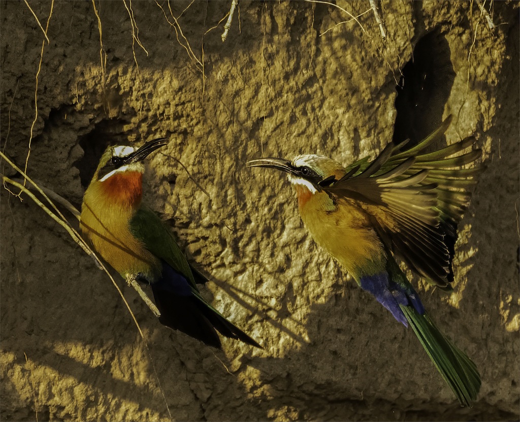
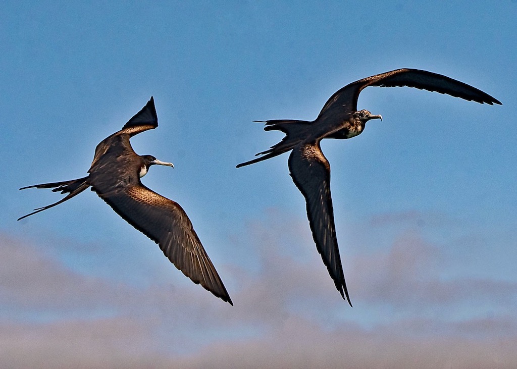
I can't improve on Lee Ann's suggestions. It's a more effective picture when the birds stand out more from the background. I'd try darkening the top bill of the lower bird--I think that will make it look sharper at the tip. In fact, a bit of sharpening overall might help. It's a very nice capture. |
May 11th |
| 37 |
May 23 |
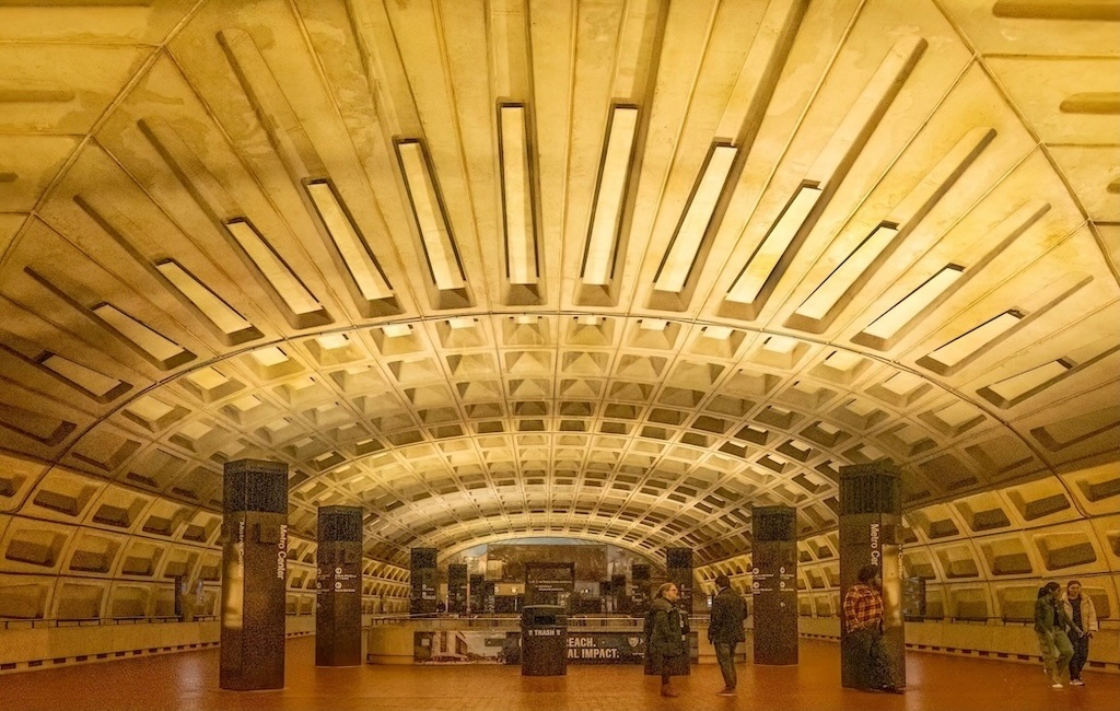
Comment |
Howard Really good shot with color and texture and making good composition out of something that I think is tough to organize visually My only concern is the ceiling. The first cross-beam is so bowed you'd think the building is on the verge of collapse. I will play with it but my first thought is to crop from the top to just above where the cord for the chandelier starts but without cutting the corner of the opening on the left or the top of the first. cornice Save you some time with playing with the geometry. |
May 11th |
| 37 |
May 23 |
Comment |
thanks |
May 11th |
5 comments - 1 reply for Group 37
|
5 comments - 1 reply Total
|