|
| Group |
Round |
C/R |
Comment |
Date |
Image |
| 37 |
Nov 22 |
Comment |
thanks |
Nov 26th |
| 37 |
Nov 22 |
Comment |
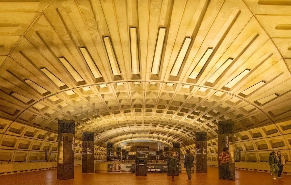
Because the story is the rails, I don't think the structure on the left contributes. I think some cropping or darkening will make the rails more effective. There's also a stray light off near the upper left corner I'd remove.
I think it is a train car looking at the direction the rails go in relationship to the lights toward the middle
I played with brightening the rails and darkening the background. It becomes more of a design, I suppose, than a photo, but it has some interest |
Nov 17th |
| 37 |
Nov 22 |
Reply |
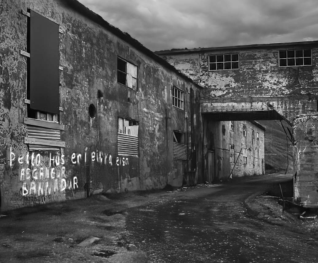
The white letters are a function of how far you slide the red slider when doing a black and white adjustment layer in photoshop. It can been done not at all all the way up to bright white. |
Nov 17th |
| 37 |
Nov 22 |
Comment |
thanks |
Nov 17th |
| 37 |
Nov 22 |
Comment |
Nice mood. Did you think about b/w. I tried it. I cropped in on the left because I didn't think that missing surface in the wall helped and on the right because my eye kept getting drawn to that door, away from the road. It's the road that works really well with the photo so I would make sure nothing distracts from that
You can play with how the letter shows in B/w. It shows white if you push the red filter and you can go with varying degrees from partly white to really bright. I thought that having the letters bright goes a long with the leading line, but that may just be personal preference. |
Nov 15th |
 |
| 37 |
Nov 22 |
Comment |
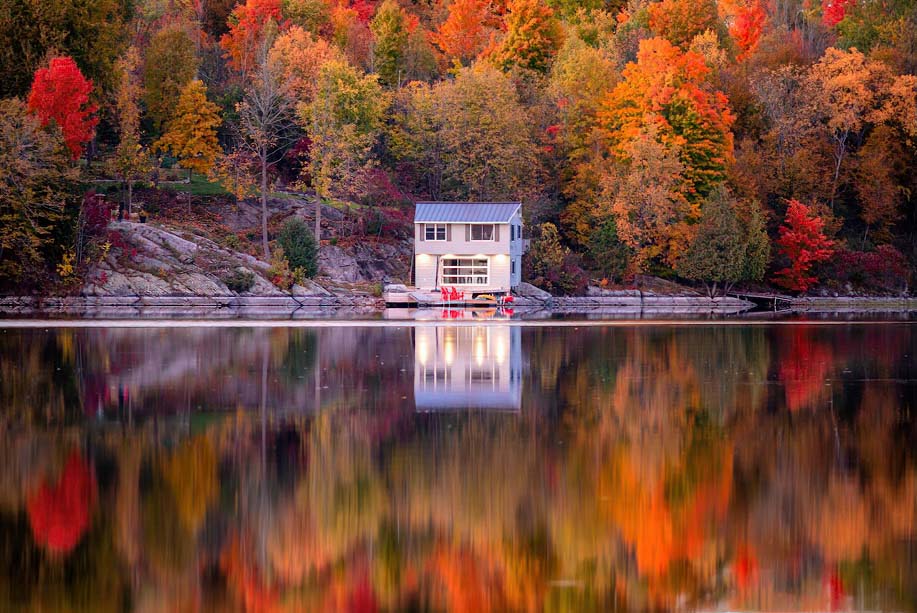
Pretty scene. I would clone out what looks like dry plants that extend into the grassy area on the lower left and there are small dead branches here and there I'd consider getting rid off. I'd crop down and eliminate about half of the top part of the sky-maybe more. Too bad the whole tree on the lower left is not in the frame. It's a nice shape. |
Nov 12th |
| 37 |
Nov 22 |
Comment |
The burned out branches stand out. But I think the bigger problem for me is the black space in the middle doesn't work as the center of interest. Also, there is just not enough detail on the branches and leaves on the three trees. |
Nov 12th |
| 37 |
Nov 22 |
Comment |
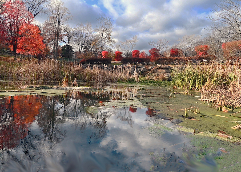
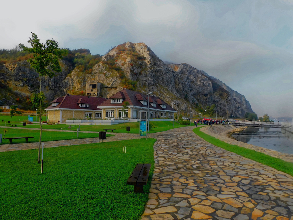
Beautiful color. good symmetry. I'd crop out the edge of the building that's on the upper left edge. There appears to be some kind of non natural material above the rocks on the left--two red vertical slashes and a bright white horizontal one above the red ones on the left--easy to clone out I cropped in on both sides to get rid of more of the less color trees--trying to make sure symmetry was maintained. That way there are brighter trees nearer both edges |
Nov 12th |
 |
7 comments - 1 reply for Group 37
|
7 comments - 1 reply Total
|