|
| Group |
Round |
C/R |
Comment |
Date |
Image |
| 37 |
Oct 21 |
Comment |
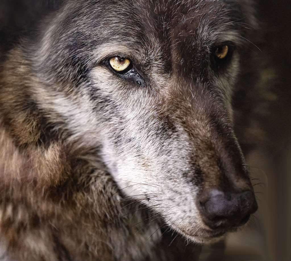
Hard not to love the eyes, so. sharp Great capture |
Oct 16th |
| 37 |
Oct 21 |
Comment |
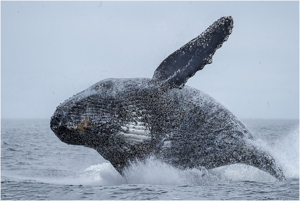
Very nice as is although I would crop so the boat moves to the left.You would lose some of the hill in the background and that little bit of land sticking out in the upper left but it can do without the latter. Love the colors Nice mood and just enough detail |
Oct 16th |
| 37 |
Oct 21 |
Comment |
The original is very nice on its own, although maybe stepping back a few feet to give space leading into the disks and lying on the ground t(It doesn't look like it was done that way) to shoot the photo with the disks more prominent would give a more dramatic perspective. The invert would make a very good poster but it looks chopped off on my screen |
Oct 16th |
| 37 |
Oct 21 |
Comment |
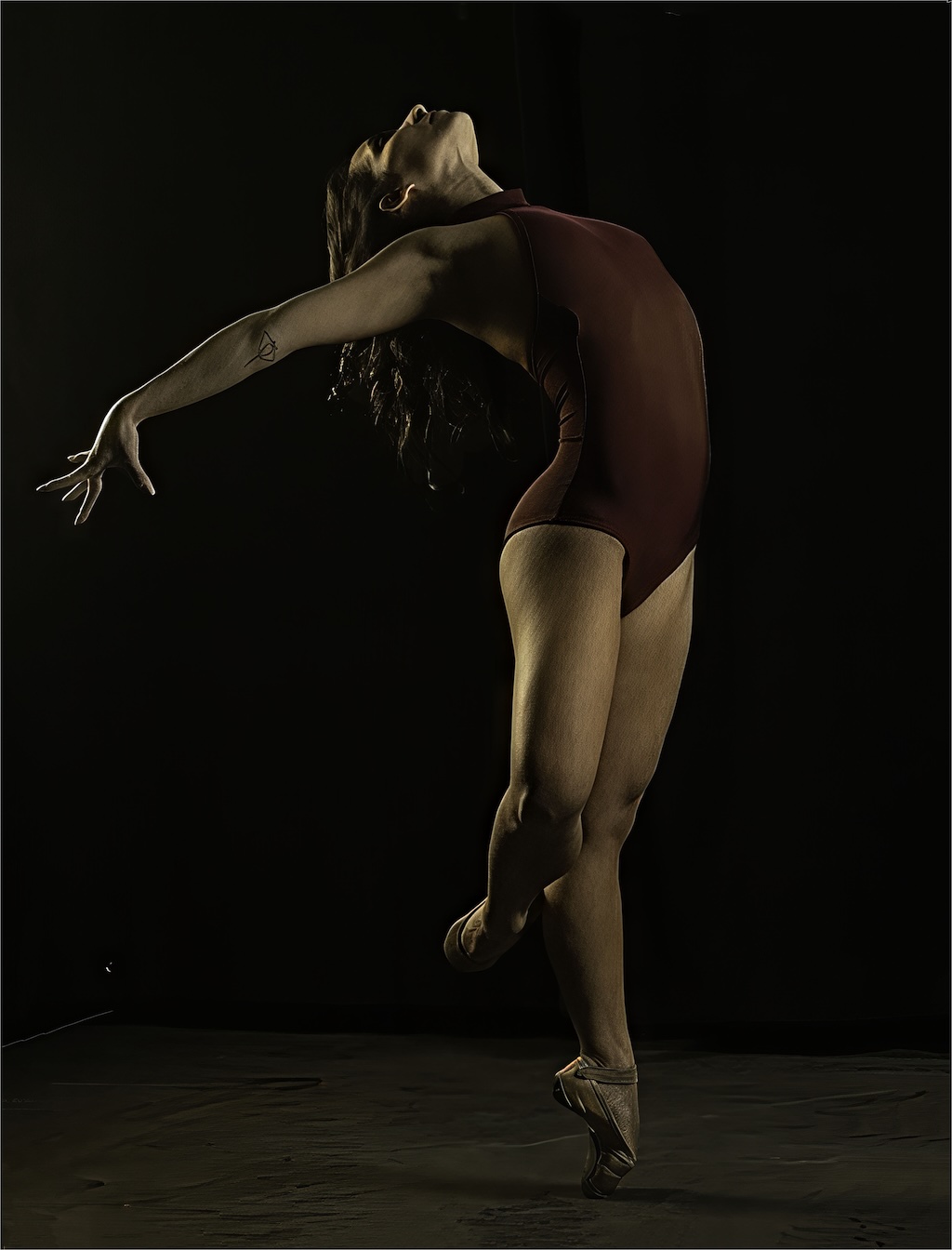
I think the design (still life I guess) is what I the strength of this photo and I really like that. I have mixed feelings on the white space on the left, Part of me thinks it adds to the design; part of me thinks it's unnecessary but my balance is towards using it. Maybe I didn't have my glasses on but I thought the pottery looks soft. Since I see the design the the basic strength it should be razor-sharp for maximum effectiveness. |
Oct 16th |
| 37 |
Oct 21 |
Comment |
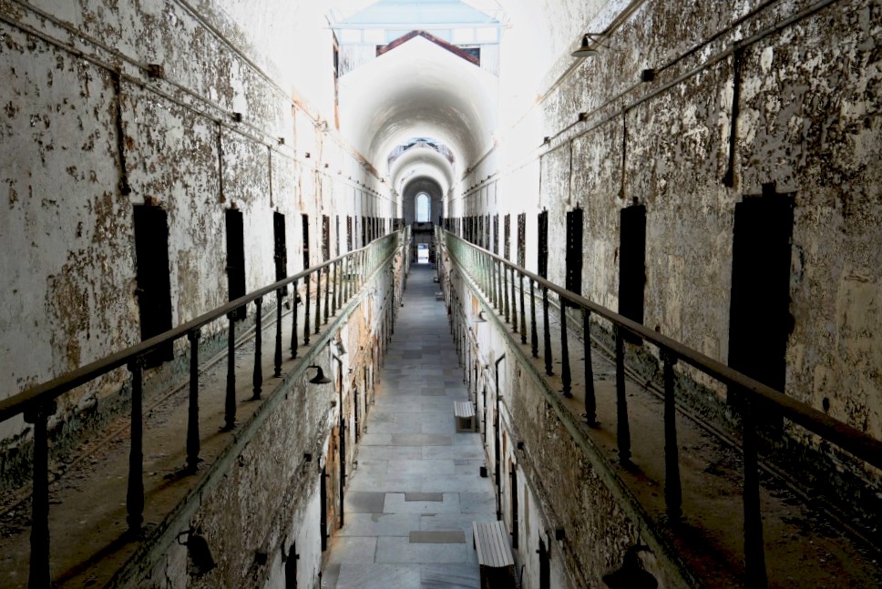
I like the lines. I would crop in to eliminate the black walls on the left or right. Personally, I think going straight to the parallel walls leadingn is fine I think whites are a bit much and that in black and white (or largely as in this case), it's the details that make the photo. Greater detail of the peeling paint and crud on the walls would boost t his significantly. I cropped the image as discussed. I don't know you can do much with the whites, but I lightened the shadows to bring out the foreground . I also straightened the picture. |
Oct 16th |
 |
| 37 |
Oct 21 |
Comment |
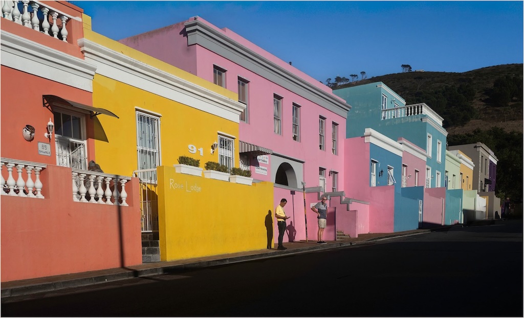
There's everything to like about this one, which is made by the time of day with the colors in the sky and the lights on in the buildings. Great leading lines. I tend to like painting light images so the idea over overprocessing doesn't bother me. I might try to get rid of the glaring light on the center against the left edge since it's white and bright. The green in the other street lights softens the glare and work well |
Oct 13th |
6 comments - 0 replies for Group 37
|
6 comments - 0 replies Total
|