|
| Group |
Round |
C/R |
Comment |
Date |
Image |
| 79 |
Oct 22 |
Comment |
It can be, of course, any story you want. I think peoples' interpretations cover a wide range of stories/emotions...at least, that's my hope.
|
Oct 26th |
| 79 |
Oct 22 |
Comment |
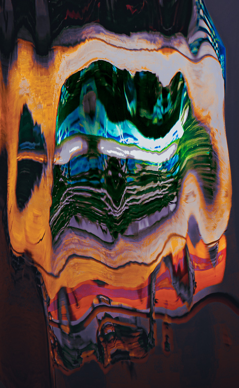
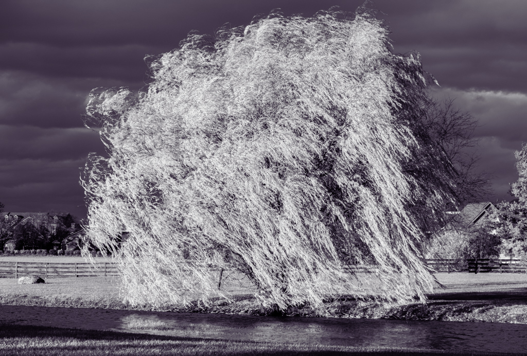
You're right, Lynne: it does look like a beating heart!
I have a medical background, too( radiology). I can see that a beating heart may not be everyone's cup of tea when it comes to imagery!! |
Oct 18th |
| 79 |
Oct 22 |
Comment |
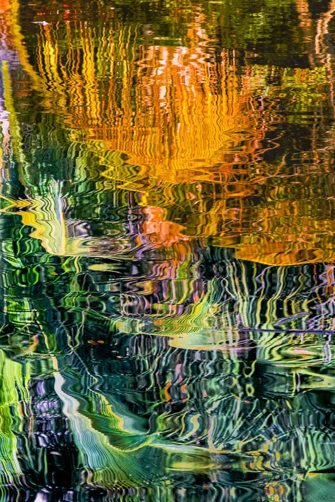
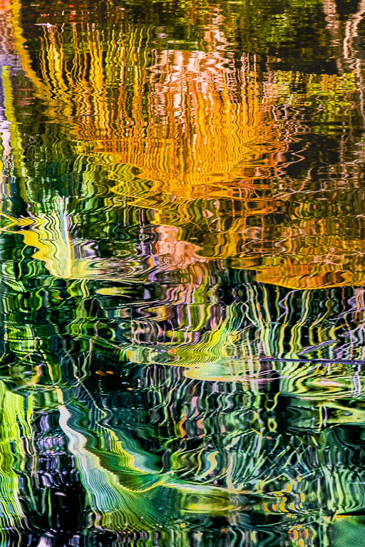
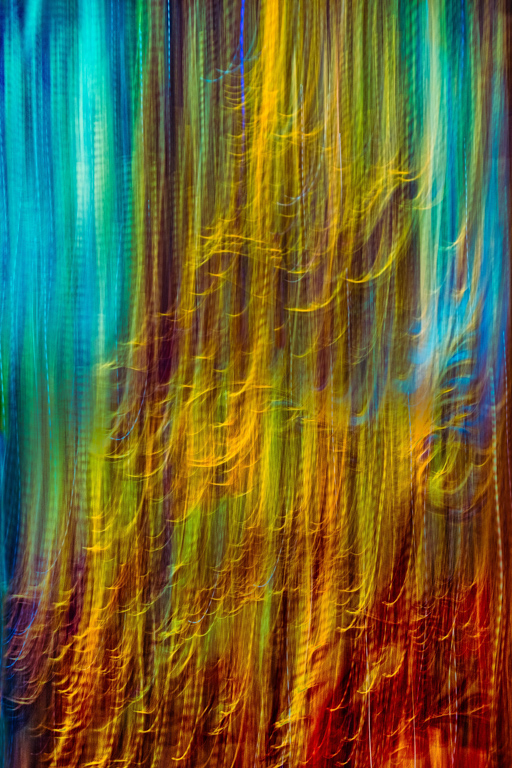
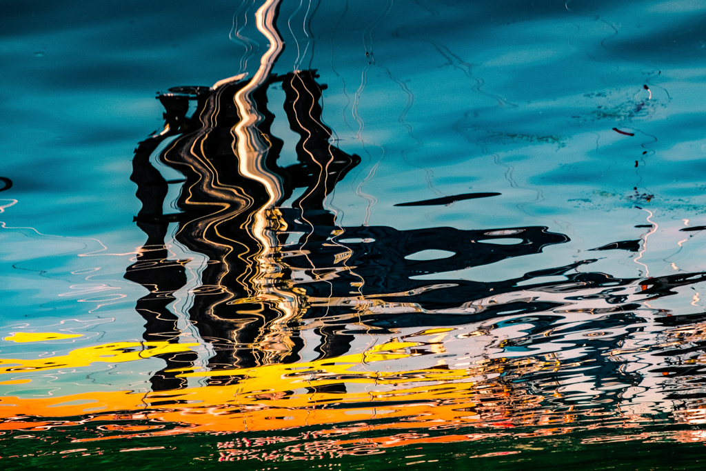
Both these images are stunning and, like Gerard says, has a wonderful resemblance to a Turner painting.
I think I prefer Linda's approach, for the reflection of the boat looks a bit contrived given the dense, swirling background.
This image would make a great large-scale exhibit piece that viewers will positively drool over. |
Oct 17th |
| 79 |
Oct 22 |
Comment |
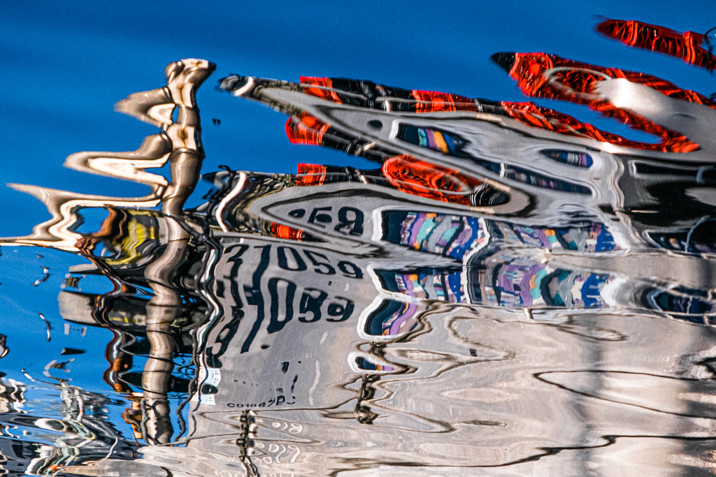
This is an intriguing image, especially as I suffer from an obsession with reflections. Unlike Karl, I am bothered by the strip just off-center rather than the strip on the left: it's too "in my face!", and the detail is almost washed out.
On the other hand, many might like its bright glare...so who am I to say?
I agree with Karl that this would make a great aluminium print, especially if we toned it down a wee bit. |
Oct 17th |
| 79 |
Oct 22 |
Comment |
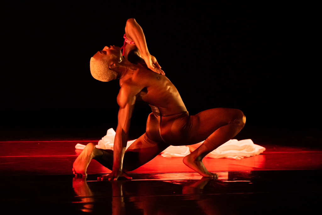
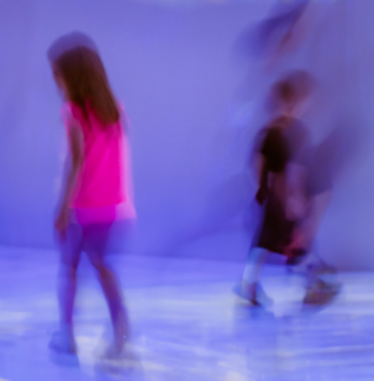
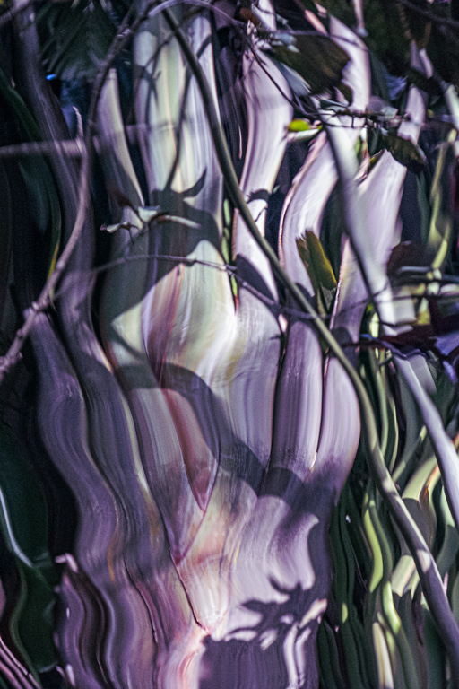
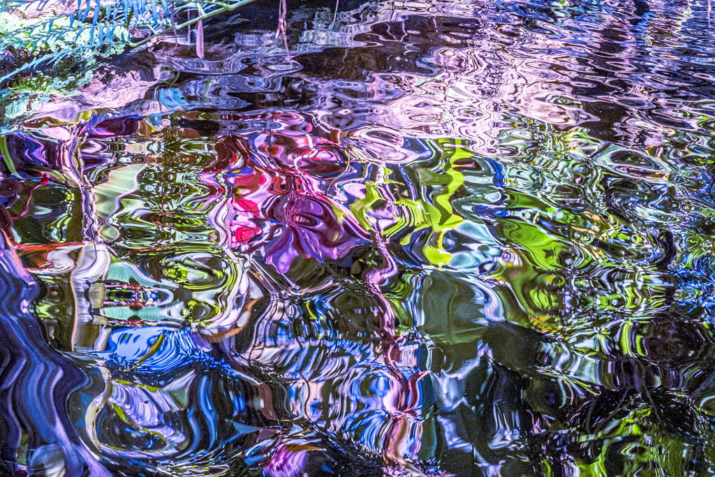
I love the composition of this...it's hard to go wrong in the lily ponds of Longwood! I agree with the others that the colors, at least for my taste, are far too saturated -especially as the image is a realistic one and not at all abstract. Karl's dark background is really effective, and adds a whole new dimension to the image he chose. (When I shoot dance, I crave for a dark background so the dancers really stand out - but I don't always get it) |
Oct 17th |
| 79 |
Oct 22 |
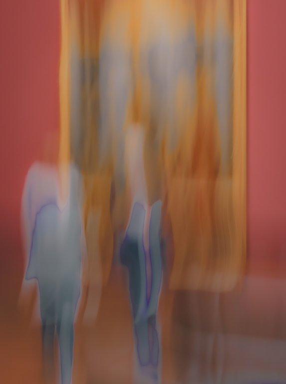
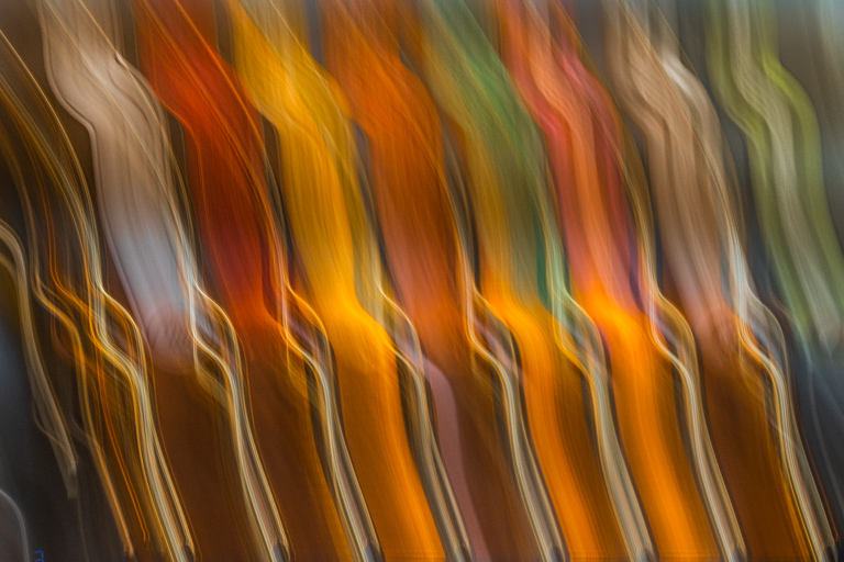
Comment |
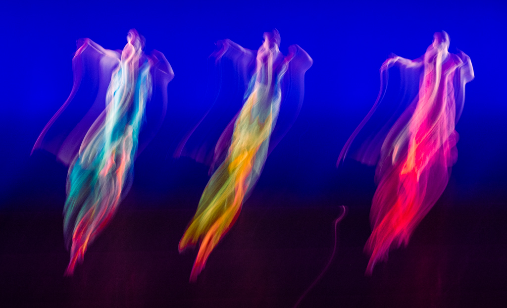
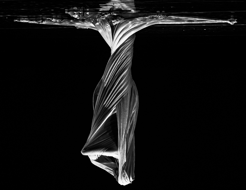
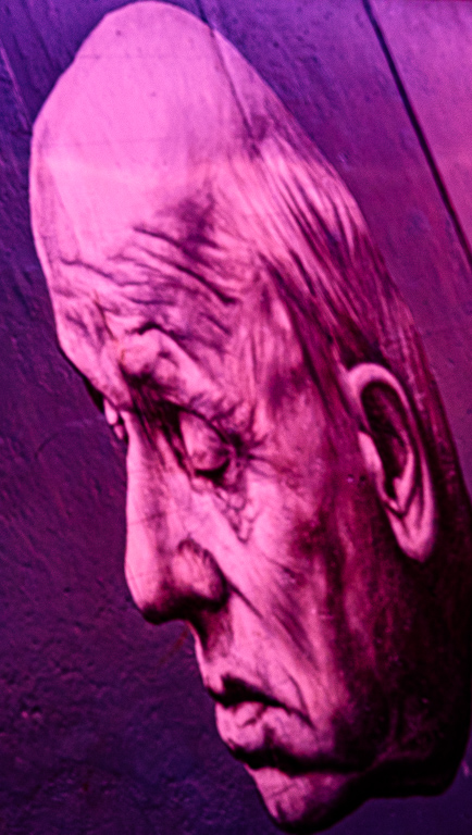
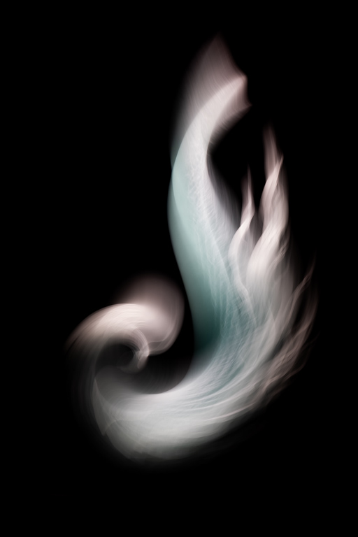
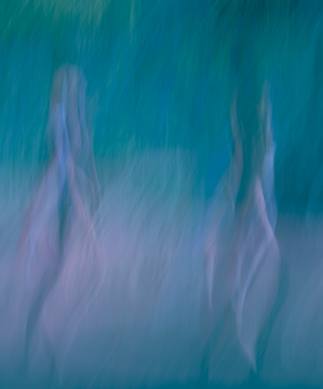
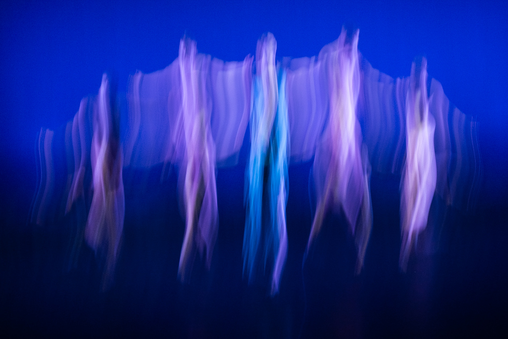
This is quite extraordinary, Karl! I find the trio more compelling, but the slim Klimt-like version of Gerard's is very elegant. I am truly amazed what techniques like these can achieve! |
Oct 11th |
| 79 |
Oct 22 |
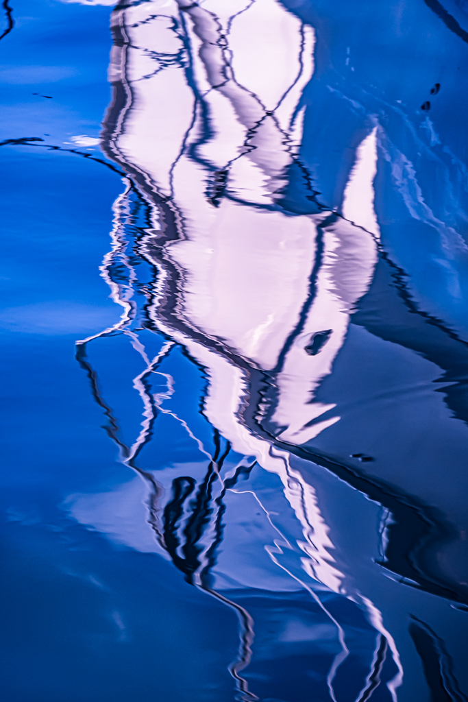
Comment |
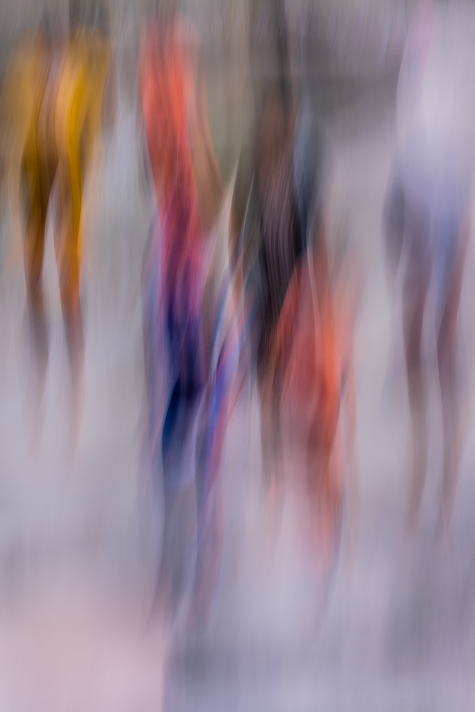
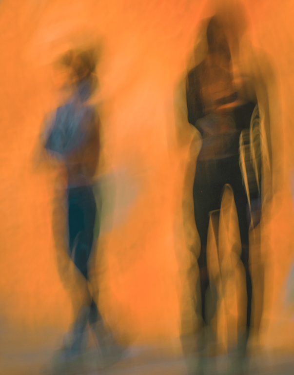
Gerard's vertical presentation is far more appealing than my horizontal take. By increasing the highlights, you've also increased the drama considerably. This combination is far more dynamic than my version. Thanks!!! |
Oct 11th |
| 79 |
Oct 22 |
Comment |
Like Gerard, I prefer the original 2. Karl's cleanup helps greatly, but I would suggest lightening the tone a bit more.
The original image is very striking, and a great capture. |
Oct 11th |
8 comments - 0 replies for Group 79
|
8 comments - 0 replies Total
|