|
| Group |
Round |
C/R |
Comment |
Date |
Image |
| 5 |
May 21 |
Comment |
Richard and Nick,
I think you are both right in that blue would have been a better choice for the dominant color. Lavender or purple seems to be my default color, and I need to get away from them more often! |
May 9th |
| 5 |
May 21 |
Comment |
Barbara, I fully realize abstracts are not everyone's cup of tea. This one is weirder than most, and more experimental than I usually attempt. I enjoy pushing the boundaries! |
May 6th |
| 5 |
May 21 |
Comment |
We can only guess what is happening between the two; its mystery is gripping. I totally agree with eliminating the dark mound.
The cat is rather distracting, and seems to take away some of the impact of the main subject. |
May 2nd |
| 5 |
May 21 |
Comment |
The others have said it; your imagination knows no bounds.
The composite has a delightfully humorous quality, even more than with your earlier works. Wow!! |
May 2nd |
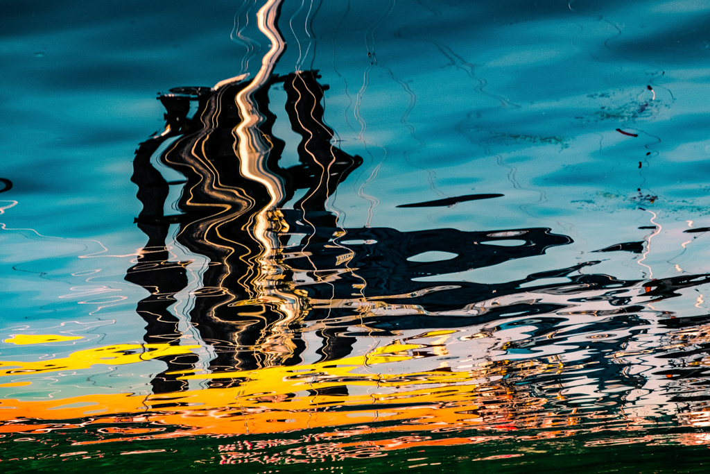
| 5 |
May 21 |
Comment |
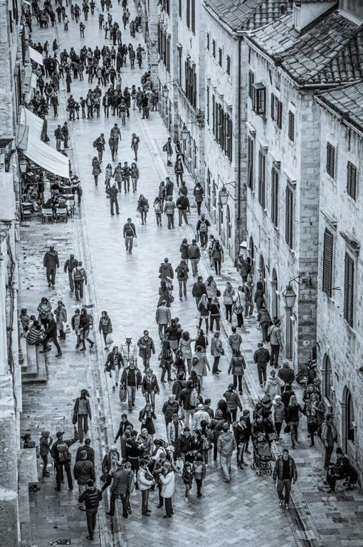
Zabriskie Point: I remember being there, and how crowded it became with so many tripods. You have really added so much drama by adjusting the contrast and saturation, and thereby holding our attention. This is a wonderful landscape vista that you captured and enhanced. |
May 2nd |
| 5 |
May 21 |
Comment |
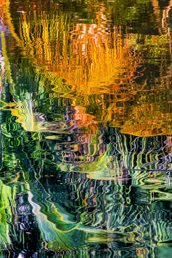
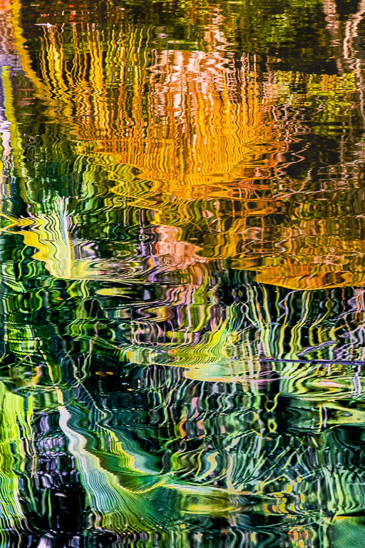
This is very thought-provoking, carrying such a strong story.I really love the lines within the image, as well as the different textures. . |
May 2nd |
| 5 |
May 21 |
Comment |
What a fascinating shot. I agree that changing the stripes on the cup from blue to red really enhances the image. The cracked lines of the broken egg and the texture of the strip of toast are very intriguing. I'm sure this would make a wonderful advertisement for the egg industry! |
May 2nd |
| 5 |
May 21 |
Comment |
I love this image. What a moment to have captured! The colors are so delicate, and the cropping makes for a superb composition. The dreamlike nature of what you saw is very striking. |
May 2nd |
8 comments - 0 replies for Group 5
|
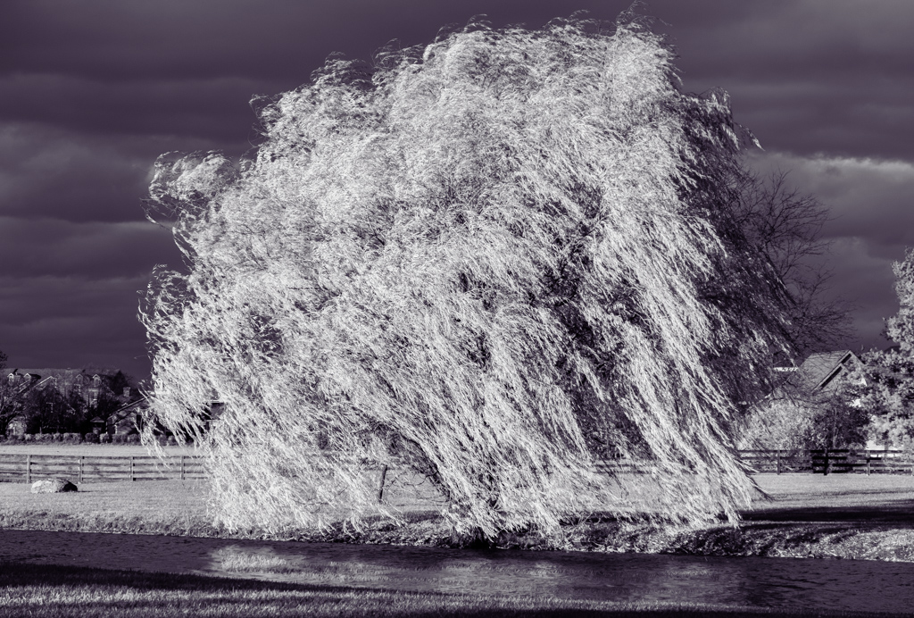
| 79 |
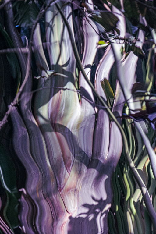
May 21 |
Comment |
I love the softness of this image, and the unusual coloring due to the infrared technique. The bottom left stem is rather bold and distracting, but may be necessary for compositional reasons. Perhaps it could be softened a little? |
May 20th |
| 79 |
May 21 |
Comment |
I am torn between the monochrome and the colored version. I may be too simplistic in saying this, but I would prefer more contrast in the monochrome version. The colors in the other version are stunning! |
May 20th |
| 79 |
May 21 |
Comment |
I am torn between the monochrome and the colored version. I may be too simplistic in saying this, but I would prefer more contrast in the monochrome version. The colors in the other version are stunning! |
May 20th |
| 79 |
May 21 |
Comment |
I love this image; it is really engaging, and open to many interpretations. To me, it is a handsome pig! I wonder if toning down and blurring the forest might help us stay focussed on the main subject? |
May 20th |
| 79 |
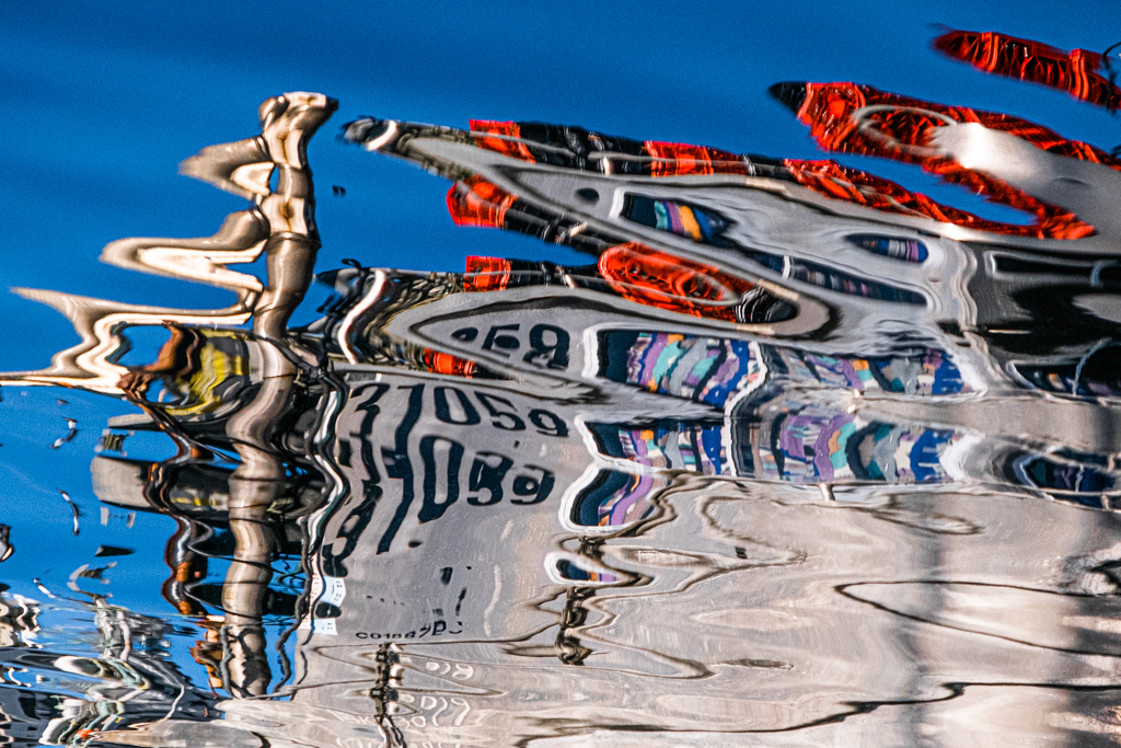
May 21 |
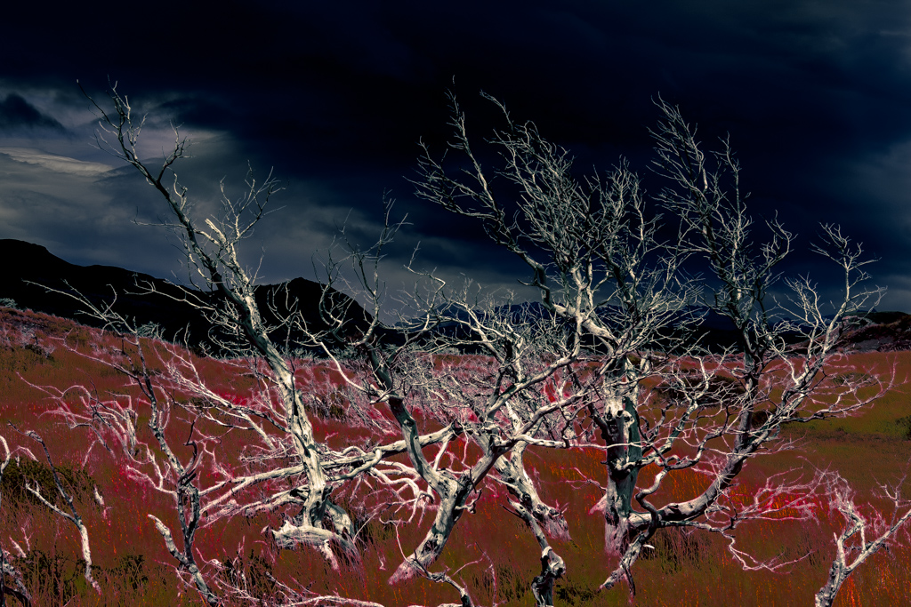
Comment |
What an interesting blend!The contrast between the somber sky and the joyous foreground is captivating.
I wonder if the image would be even stronger if some of the upper part was cropped out? |
May 16th |
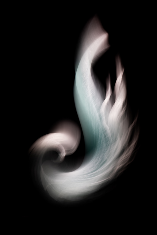
| 79 |
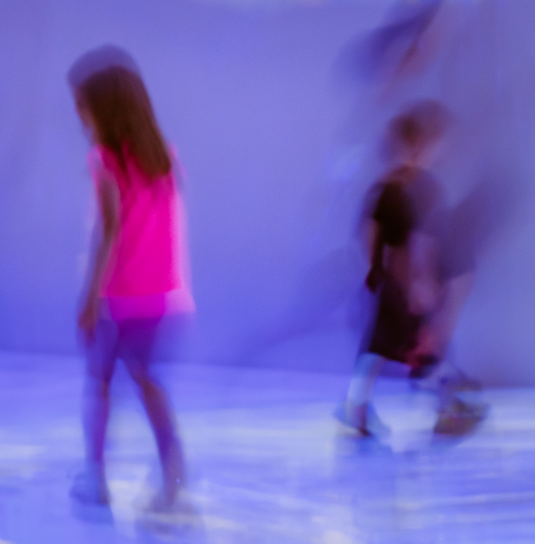
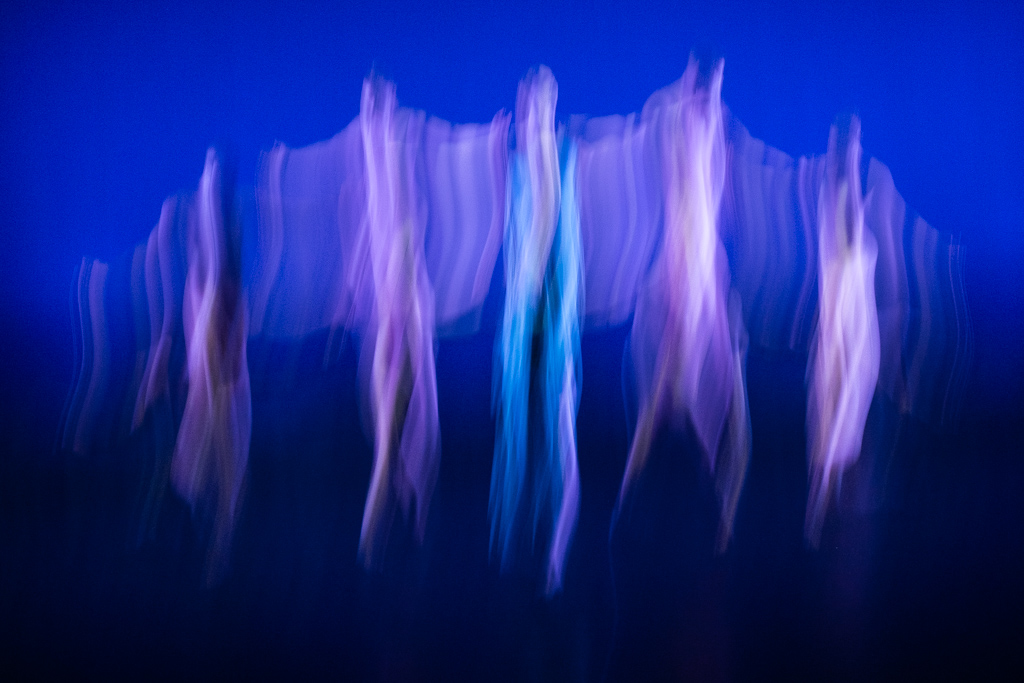
May 21 |
Reply |
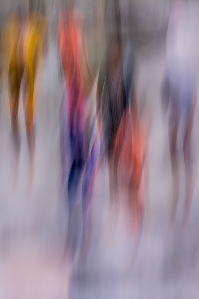
Thank you for the suggestions, Peter. Bracketing will be especially useful for dance with rapidly changing lighting.
I've tried blending a still with an ICM; itis fun but quite tricky...need to try more.
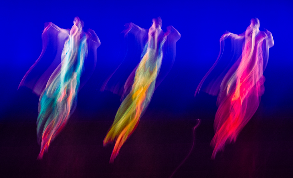
Thanks, Karl. You are right; the possibilities with dance ICM are endless!! |
May 16th |
5 comments - 1 reply for Group 79
|
13 comments - 1 reply Total
|