|
| Group |
Round |
C/R |
Comment |
Date |
Image |
| 5 |
Dec 25 |
Comment |
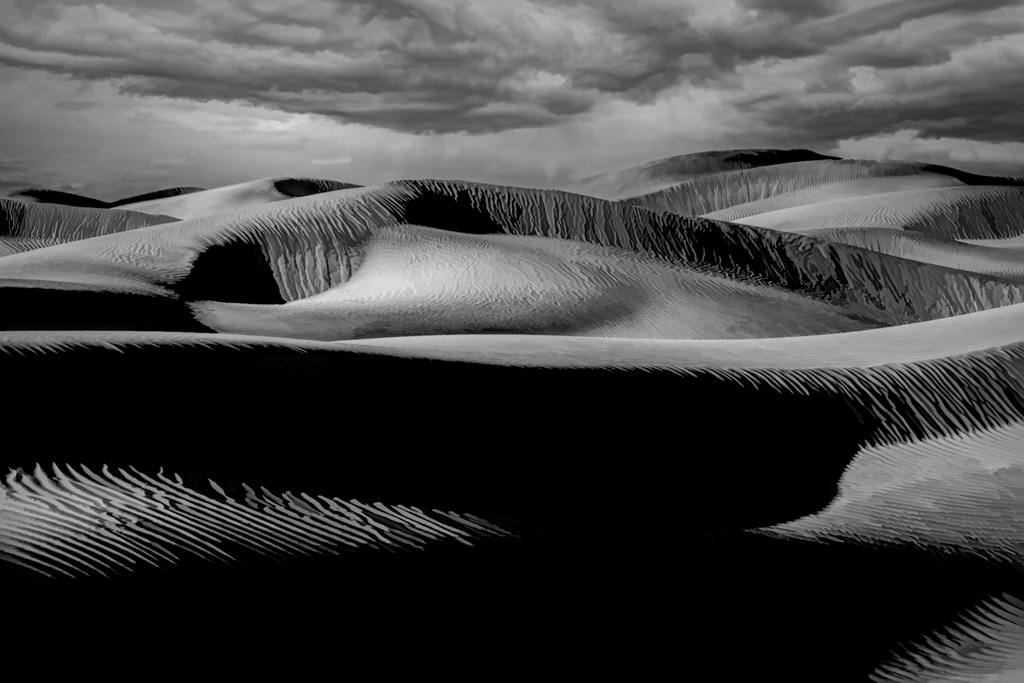
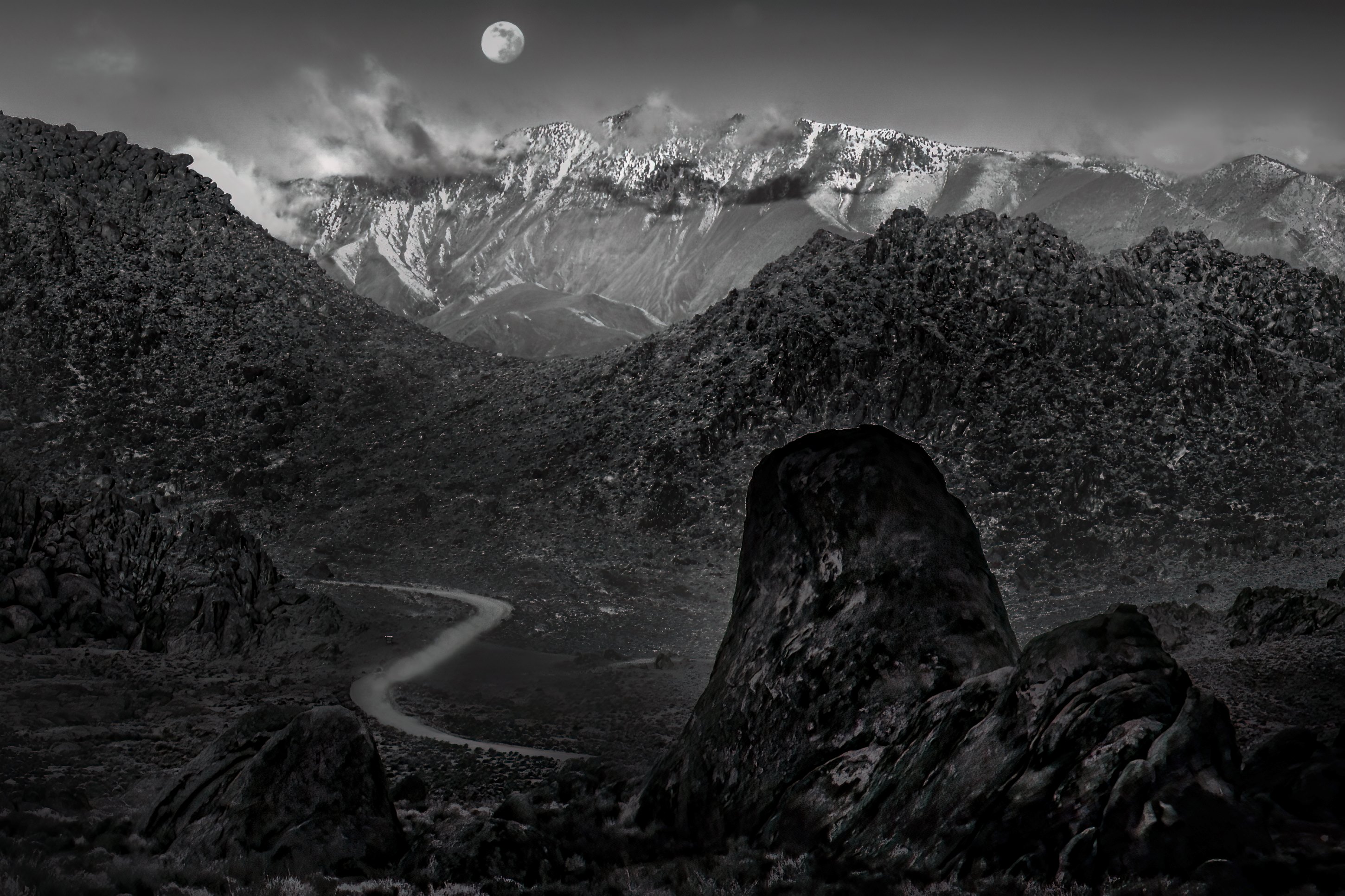
Beautiful scene and a fantastic black-and-white choice.
The layered mountains are gorgeous, but the eye doesn't quite know where to settle. Consider subtly increasing contrast or local clarity on one dominant ridge or light band (perhaps where the light hits mid-distance peaks) so there's a clear visual anchor that guides the viewer through the layers.
The grassy foreground adds depth, but it slightly overpowers the scene. A small crop from the bottom or a gentle reduction in brightness/texture there would help keep attention moving into the mountains rather than lingering too long at the front.
|
Dec 15th |
| 5 |
Dec 25 |
Reply |
Thank you Mark, I have couple more photos and will go back and look and see. Thank you for your comment. |
Dec 15th |
| 5 |
Dec 25 |
Reply |
Anna, Thank you |
Dec 15th |
| 5 |
Dec 25 |
Reply |
Thank you Suzanne, I agree with you |
Dec 15th |
| 5 |
Dec 25 |
Reply |
Thank you Pete. I did tied it but your come out much better. I will continue to work on this image. |
Dec 15th |
| 5 |
Dec 25 |
Comment |
Ann, This is a strong, minimalist image Fantastic job! You might want to consider:
Tighten the composition slightly - A subtle crop from the top (or right) could reduce excess negative space and place more emphasis on the tree's branching structure, strengthening its visual impact without losing the calm mood.
A gentle increase in contrast or localized dodge on the tree and rocks would help them stand out more clearly from the sky and water, adding depth while preserving the elegant, quiet feel of the scene.
Overall, it's a beautifully balanced photo. |
Dec 15th |
| 5 |
Dec 25 |
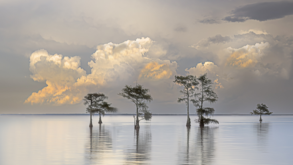
Comment |
Suzanne, atmosphere and composition are excellent! You might consider a Slightly lift midtones on the central island to give it a touch more separation from the darker mountains behind it, helping guide the eye to the natural focal point without losing the dramatic mood.
I totally agree with Anna's suggestionse
Fantastic photo! |
Dec 15th |
| 5 |
Dec 25 |
Comment |
The matching hats and relaxed posture of the couple immediately draw the viewer in, creating an emotional anchor. Consider a tighter crop from the right side to reduce empty space and bring the focus closer to the couple without losing context.
The soft fall colors and scattered leaves add a peaceful seasonal atmosphere, and the leading line of benches guides the eye deeper into the frame. However, The bright background on the right pulls some attention away from the couple. A touch more separation between the subjects and the background would help emphasize the intimacy you captured
Slightly lower the brightness/exposure on the far-right background so the couple remains the brightest, most prominent element. blur to the background (especially the bright area near the exit) to reduce distractions.
|
Dec 3rd |
| 5 |
Dec 25 |
Comment |
What a fantastic portrait that beautifully captures the character and tradition of the bagpiper. The lighting on his face is flattering and highlights his concentration. The vibrant tartan and rich blue of the bagpipe add wonderful color contrast, and the shallow depth of field helps separate him from the background.
Here are couple things to consider:
Cropping a little tighter on the top to reduce empty space can create a stronger portrait composition and bring more attention to his expression and instrument.
The background is busy in a few spots, especially the bright bokeh patches that pull attention from the performer. Softening or gently darkening the background would help keep the focus on the subject.
The blue bag and red tartan are beautiful-slightly increasing clarity and texture (just on the subject, not the background) would make them pop more, especially in a print.
His left sleeve is slightly over-bright. Bringing back a bit of detail there keeps the exposure more balanced. |
Dec 3rd |
| 5 |
Dec 25 |
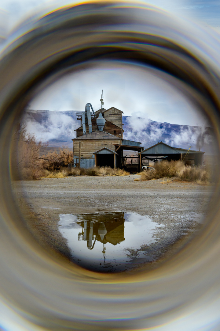
Comment |
Hi Natalia, thanks for sharing your knowledge about St Petersburg!
I love live what Peter did with your photo and I could not offer any improvements..maybe add the reflection of the leaves since you have the puddle of water |
Dec 2nd |
6 comments - 4 replies for Group 5
|
6 comments - 4 replies Total
|