|
| Group |
Round |
C/R |
Comment |
Date |
Image |
| 27 |
Jul 20 |
Comment |
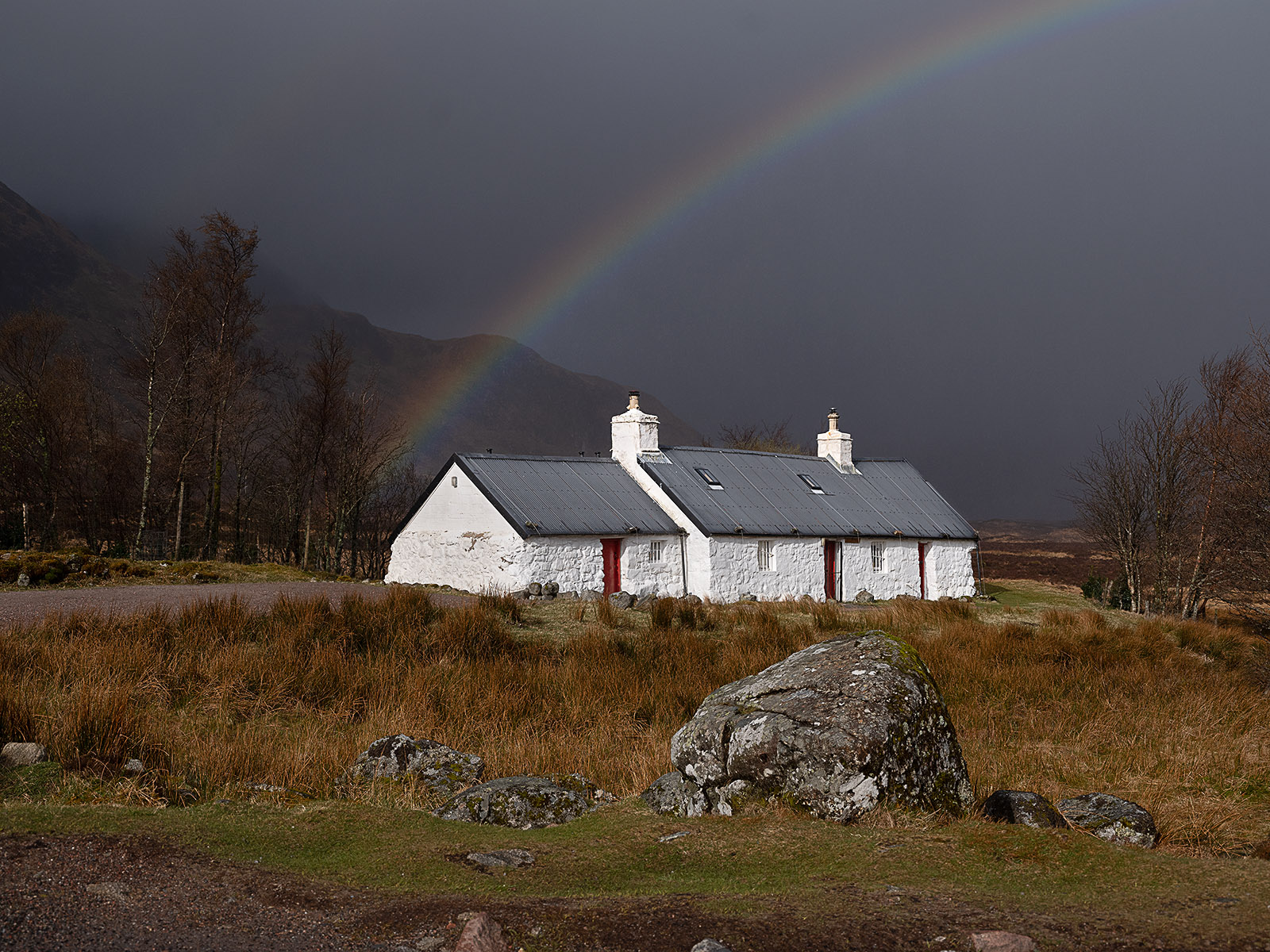
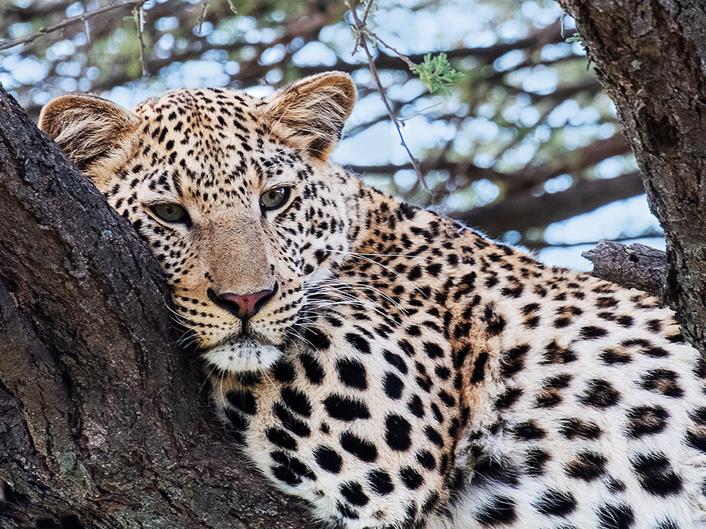
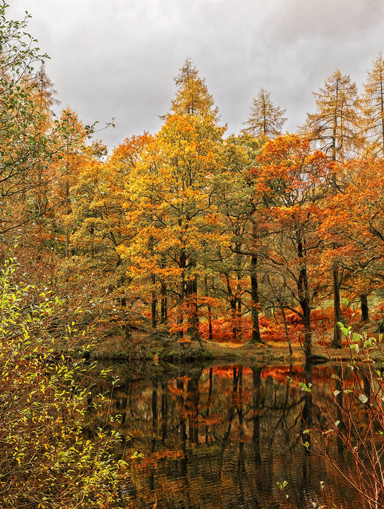
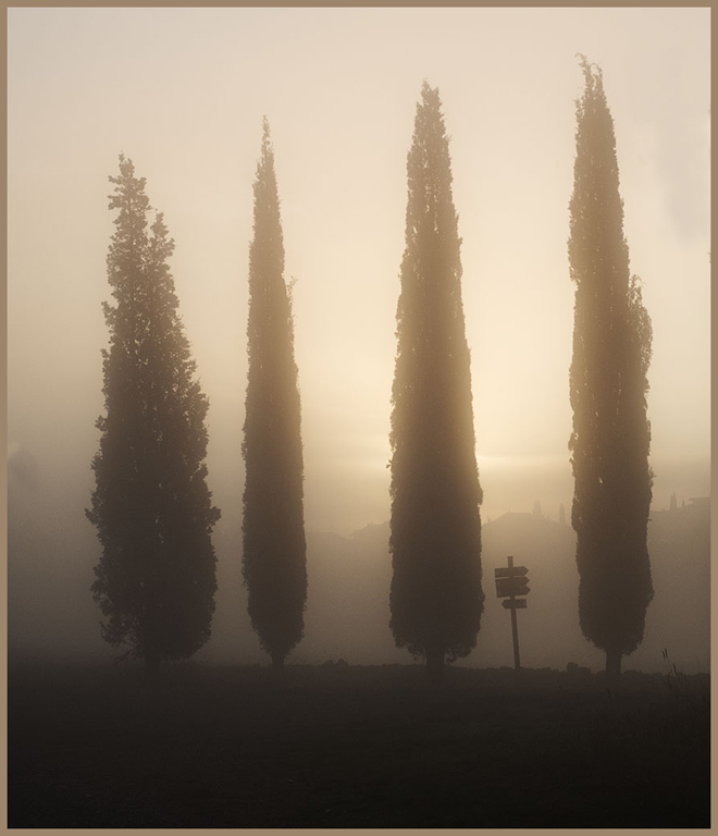
The cove is the bend that if you had used a single sheet of paper for the background, it would be the curve where it goes from horizontal to vertical.
It is best to keep your raw or original files away from any you are post processing working on. All my original or raw files are on a separate hard disc, using a large number of small Lightroom catalogues ie '2020 Venice' then folders by the date. Images to be worked on are exported from Lightroom to my computer's hard disc and arranged/catalogued in a similar way to the raw/original files. Using this system I can locate the original/raw file to almost every image I have had made use of for the last 15 years. |
Jul 21st |
| 27 |
Jul 20 |
Comment |
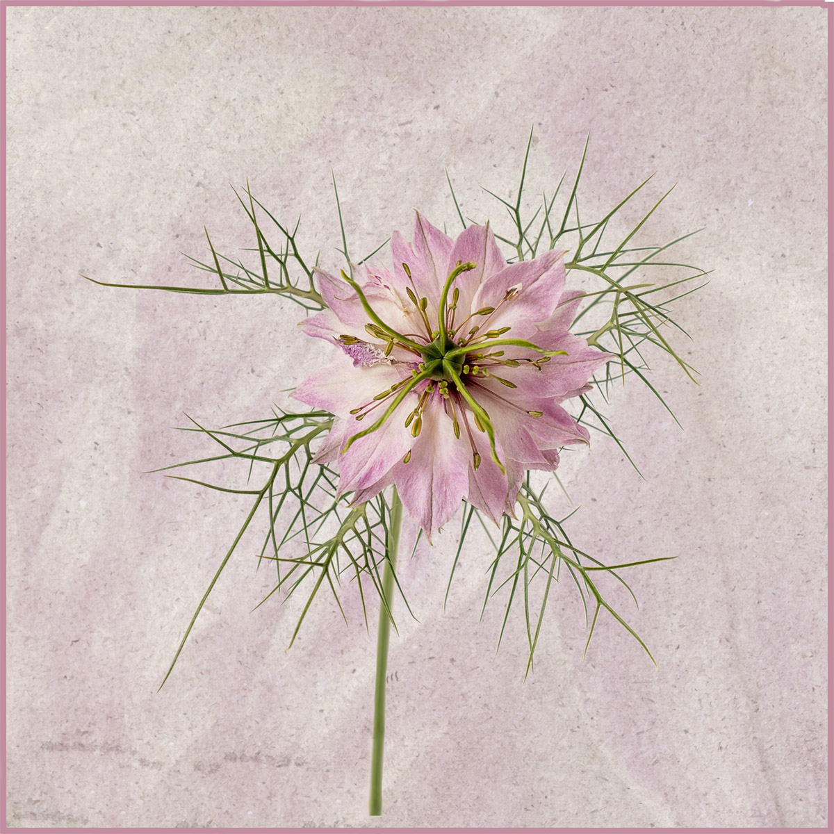
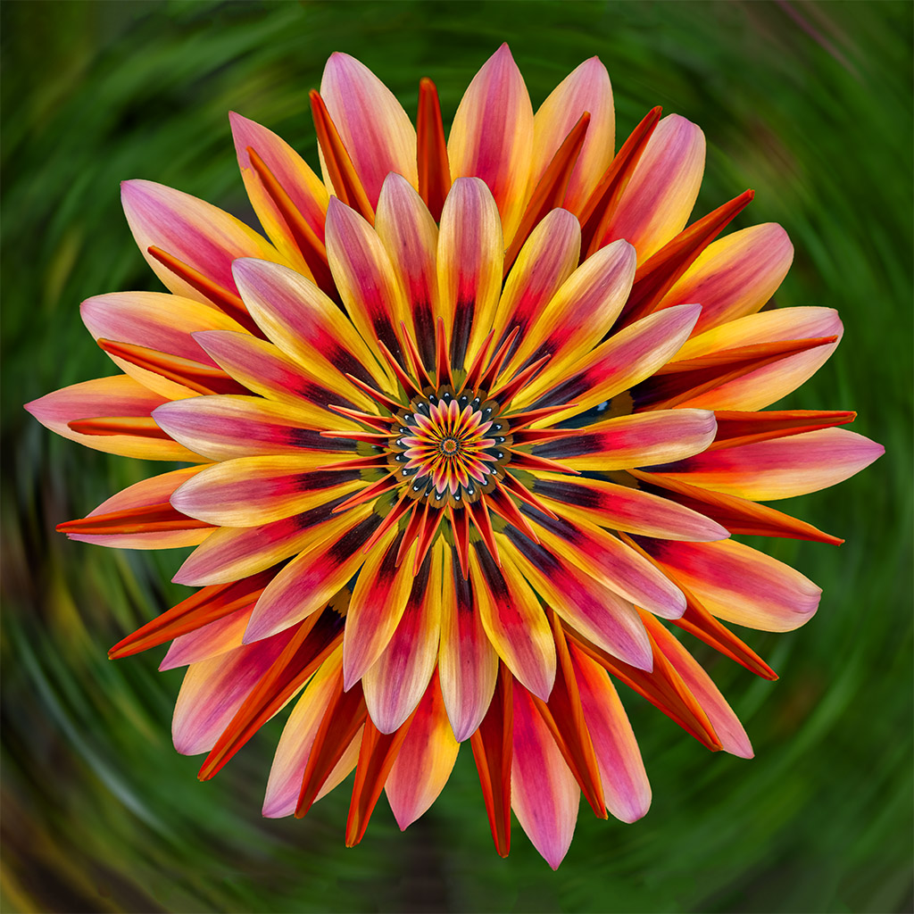
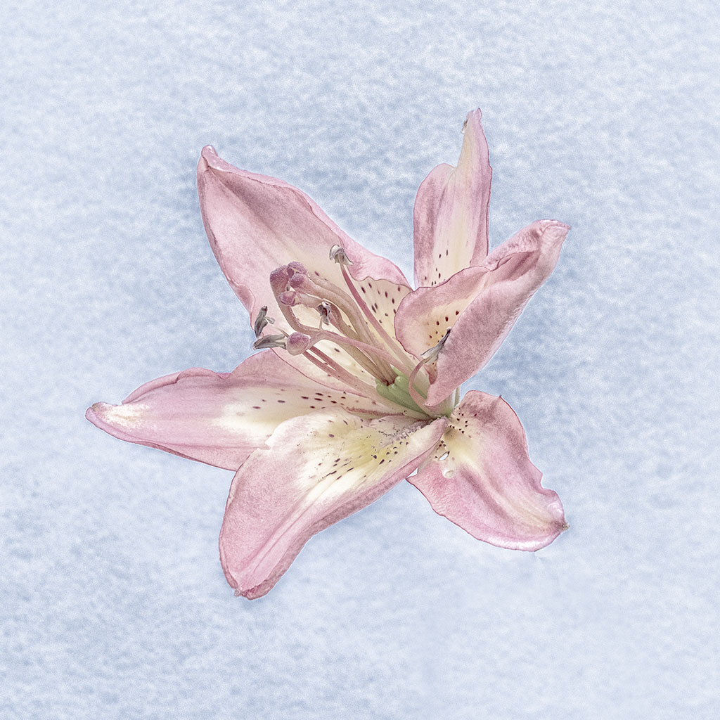
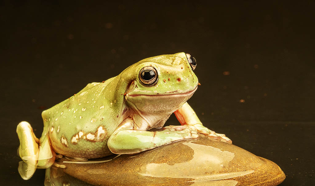
To me this is a very artistic image setting the flower against the brown and green background and the addition of a signature. I feel that some of the petals at the top of the flower are over-bright and would be better toned down slightly which would increase the detail on them. |
Jul 14th |
| 27 |
Jul 20 |
Comment |
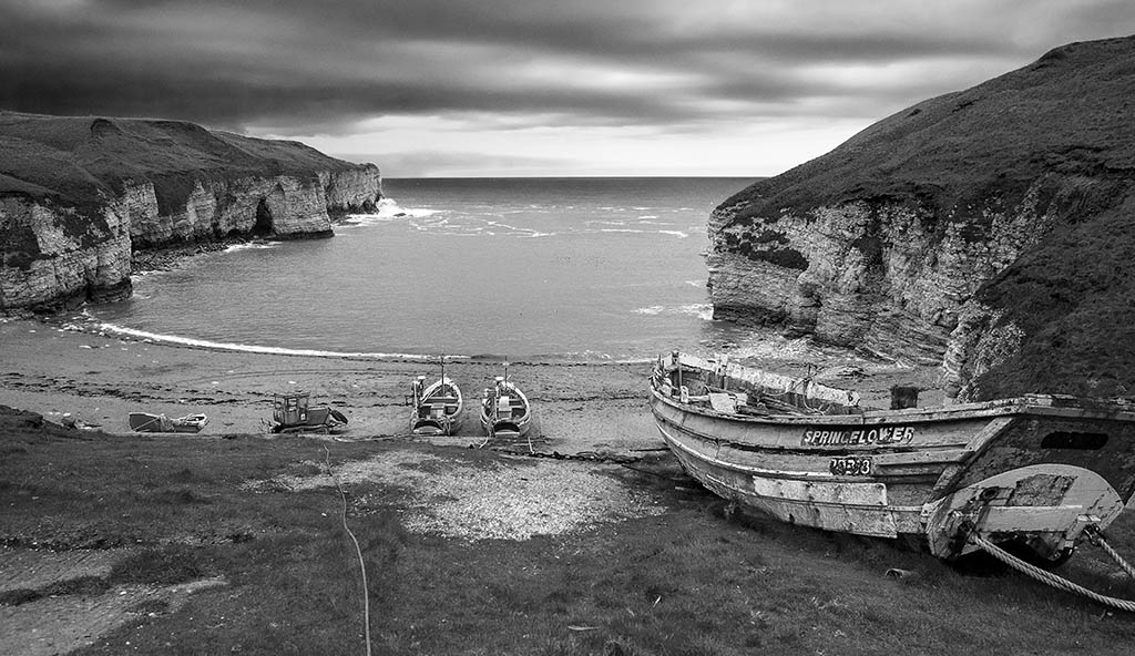
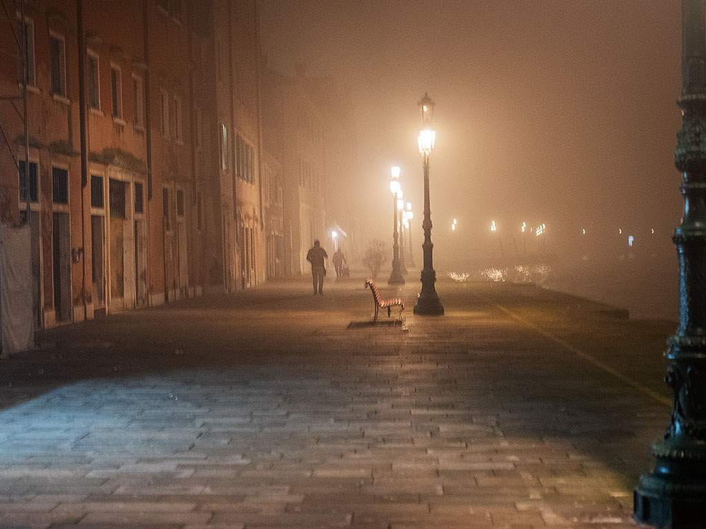
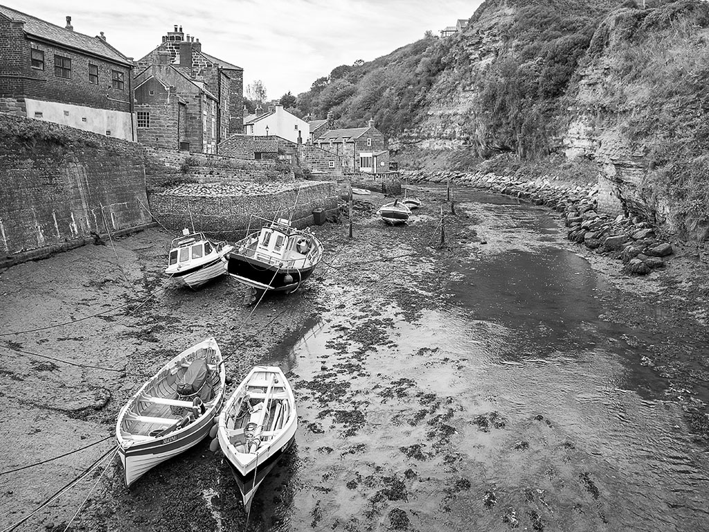
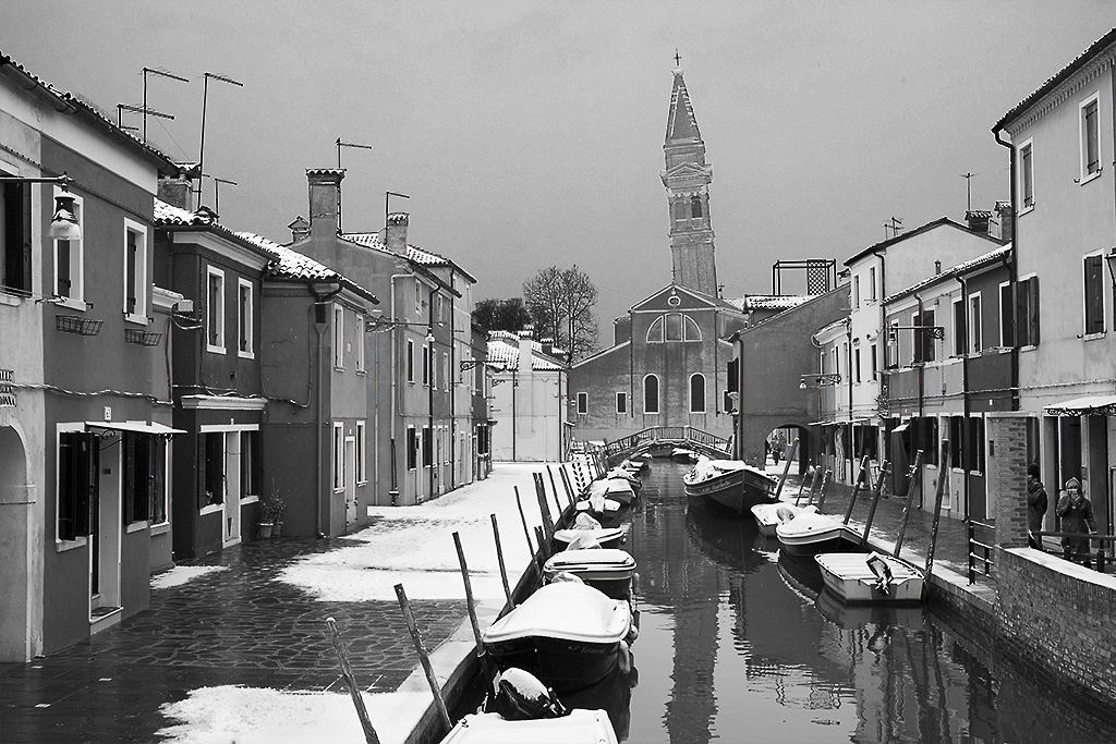
I like the simplicity of this image, taken at a time of day when there was good lighting on the fishermen and jetty but leaving the forest slope of the background in shadow.
I feel that I would have toned down the yellow of the right hand jetty as it draws the eye away from the main subject of the fishermen. |
Jul 14th |
| 27 |
Jul 20 |
Comment |
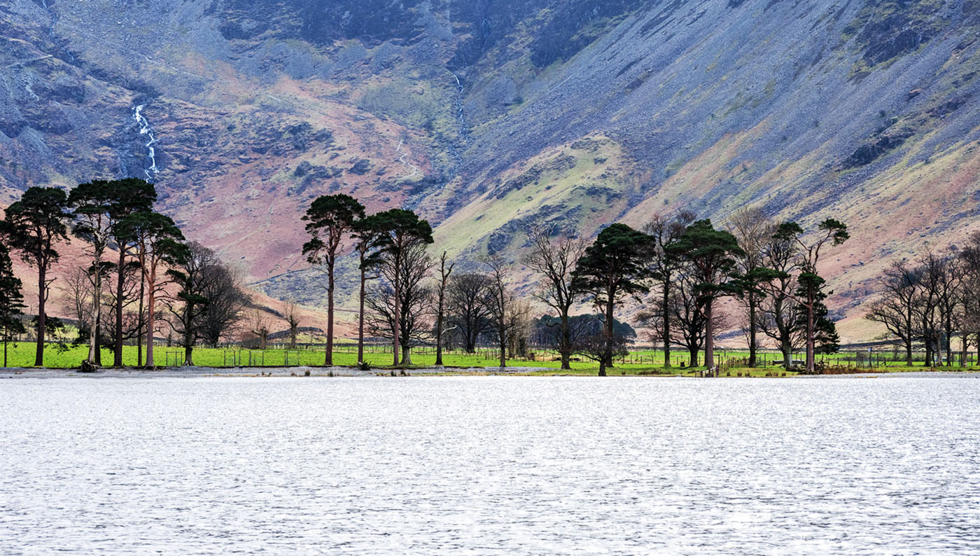
I really like the simplicity of this image, the very limited colour palette of green and purple works very well. I think that the hard line between the white and grey of the background lets the image down, and I would have preferred to see a continuous colour with a 'cove' between the horizontal and vertical aspects of the background. I think it may have worked better if both the vertical and horizontal surfaces were grey as it would bring out more detail in the glass. |
Jul 14th |
| 27 |
Jul 20 |
Comment |
I feel like Danny that the image is about the 2 domes, and the lemons in the foreground are a distraction because of their bright colour. I think that had you been able to move a couple of steps to the right, you could have avoided the lemons and it would have placed the 2 domes more on a diagonal. As they are the lemons appear to be too sharp, as if the auto focus on your camera had picked on the leaves towards the centre of the image rather than the blue dome which was your main subject. |
Jul 14th |
| 27 |
Jul 20 |
Comment |
In many ways this image breaks the rules that say items should be moving into the image rather than out of it, but like all photographic rules, breaking them can make a more effective image particularly if it telling a story. You have used the donkey's direction of travel and the roads as good leadings for the eye. I agree with Danny that some of the sky should be cropped off, not to create more width but to remove the cloud top right which is the nearly brightest part of the image and can therefor draw the eye away from the donkey cart and driver. |
Jul 14th |
| 27 |
Jul 20 |
Comment |
I can see that a fair amount of work went into achieving the final image, a large amount of the 'leaning back' and perspective problem was caused by the use of the wide angle lens. To me there was relatively little you could do to the perspective problem using a transform procedure without creating unacceptable distortion elsewhere to the image. There was a slight sidewards lean on the original that could have been acceptably removed without affecting the rest of the image. In this scene it is better if possible to get further away and use a longer focus lens to reduce any perspective distortion. |
Jul 14th |
7 comments - 0 replies for Group 27
|
7 comments - 0 replies Total
|