|
| Group |
Round |
C/R |
Comment |
Date |
Image |
| 27 |
May 20 |
Comment |
To me this image looks overexposed and appears as if taken in daylight and the stars added.
I took your image into Lightroom and applied a 2 stop reduction in exposure which give a very realistic darker image. I saved that image as a JPEG and tried to upload it as part of this comment. Each time I tried it then appeared as bright as your main image rather what I was seeing as the image I was uploading . So I have come to the conclusion that the high level of brightness, was not what you originally uploaded but was created by the website software. |
May 9th |
| 27 |
May 20 |
Reply |
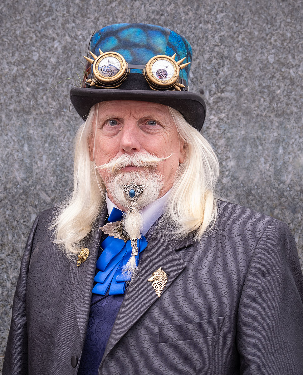
I know you use Luminar which is program I am not familiar with as I do everything in a Lightroom/ Photoshop sequence. One approach to images like this is to do two processings - one for the background and one for the man then put him on top and mask accordingly - this could allow you to mask off a halo round his head.
Halos are a problem they can start in the camera and the sharpening process makes them appear stronger. If you are working with a series of layers, you need to find which layer starts the halo and try to remove it at that level. Another technique is to combine all layers into one or flatten the image then using a small soft clone in darken mode clone the halos out. |
May 9th |
| 27 |
May 20 |
Comment |
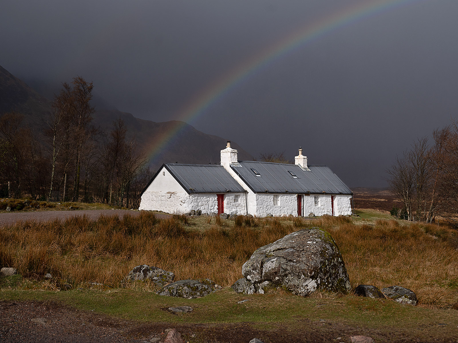
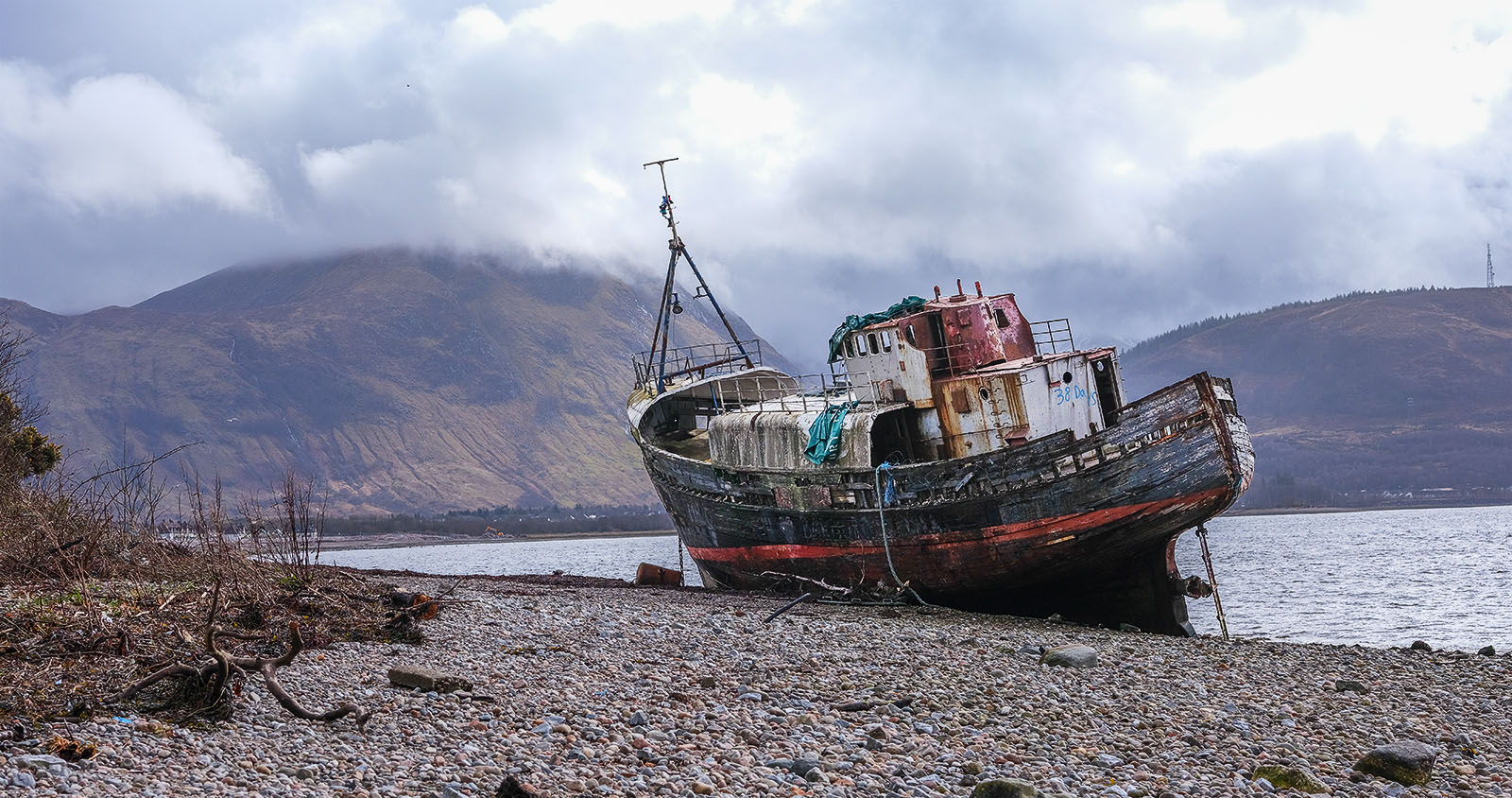
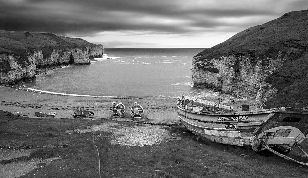
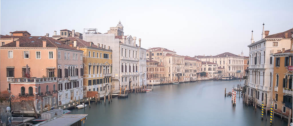
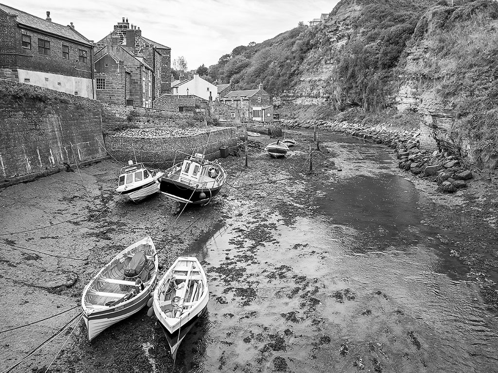
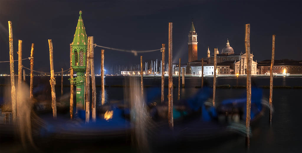
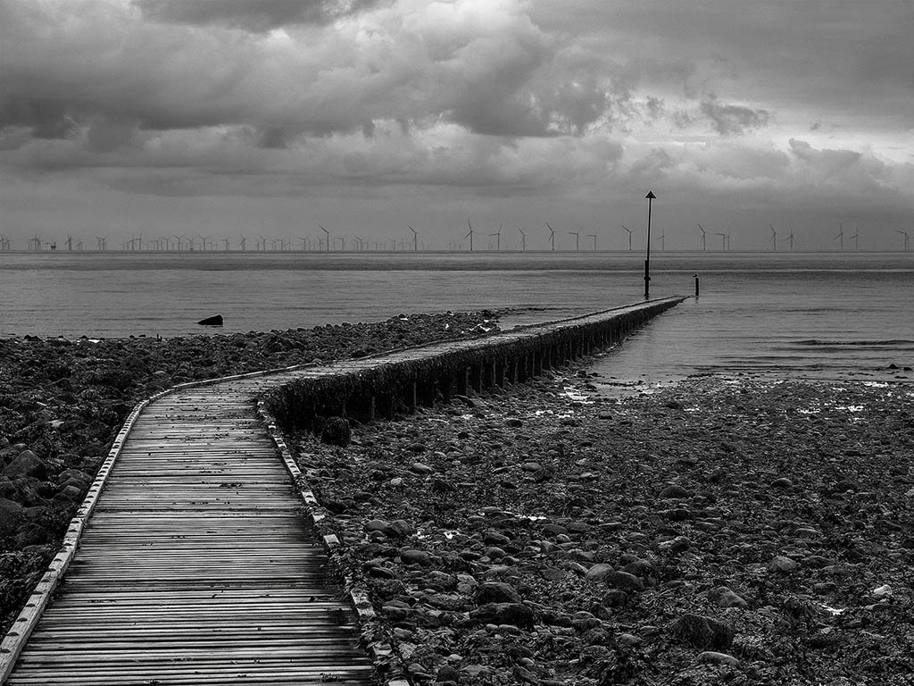
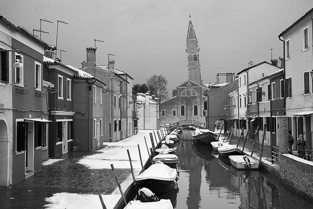
This is an informative image of the town and harbour, and its situation along the coast line. The rock in the foreground helps to give a sense of scale in indicating how high above the harbour the view point is. The ship also helps to give the image a sense of scale. I am not sure if we need all the headland at the top of the image, we need a little of the land to show that the harbour is in a bay rather than facing open sea. |
May 8th |
| 27 |
May 20 |
Comment |
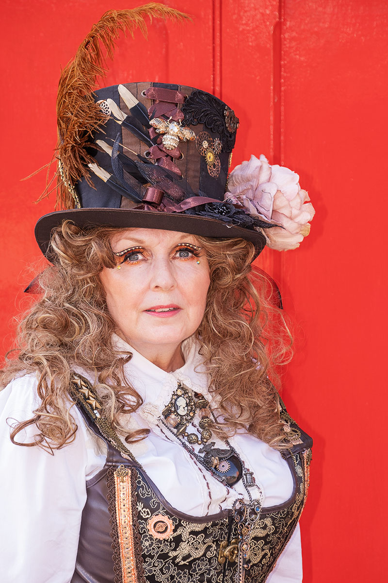
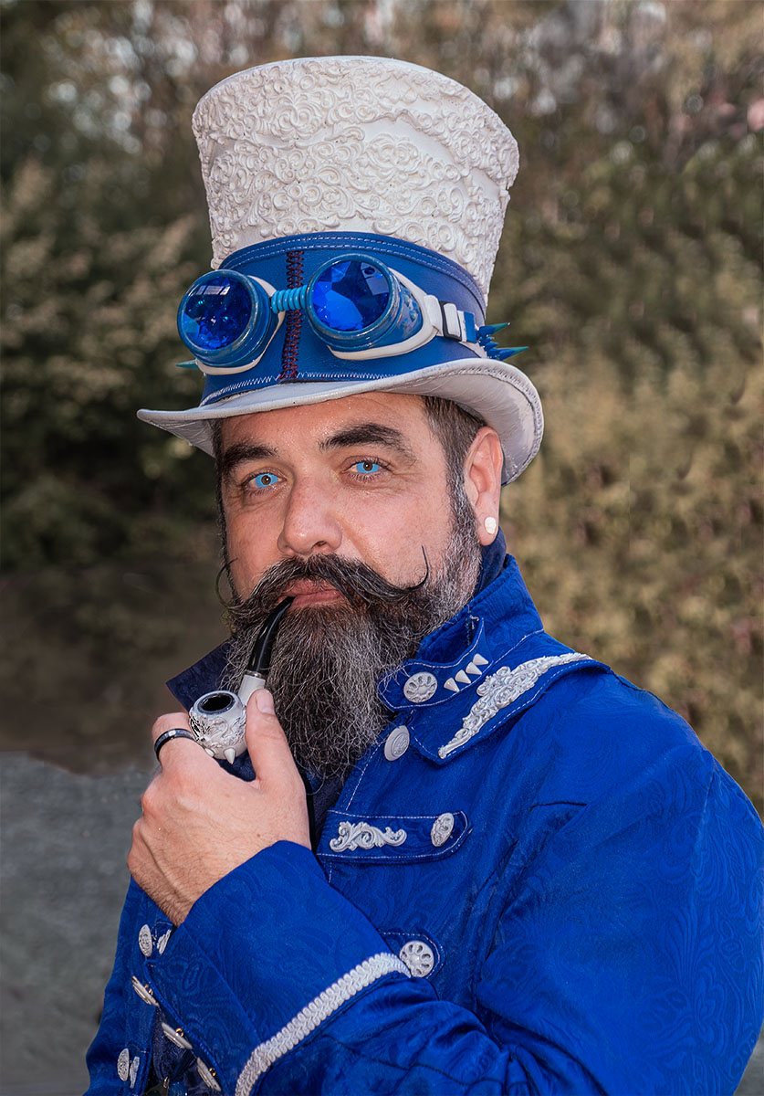
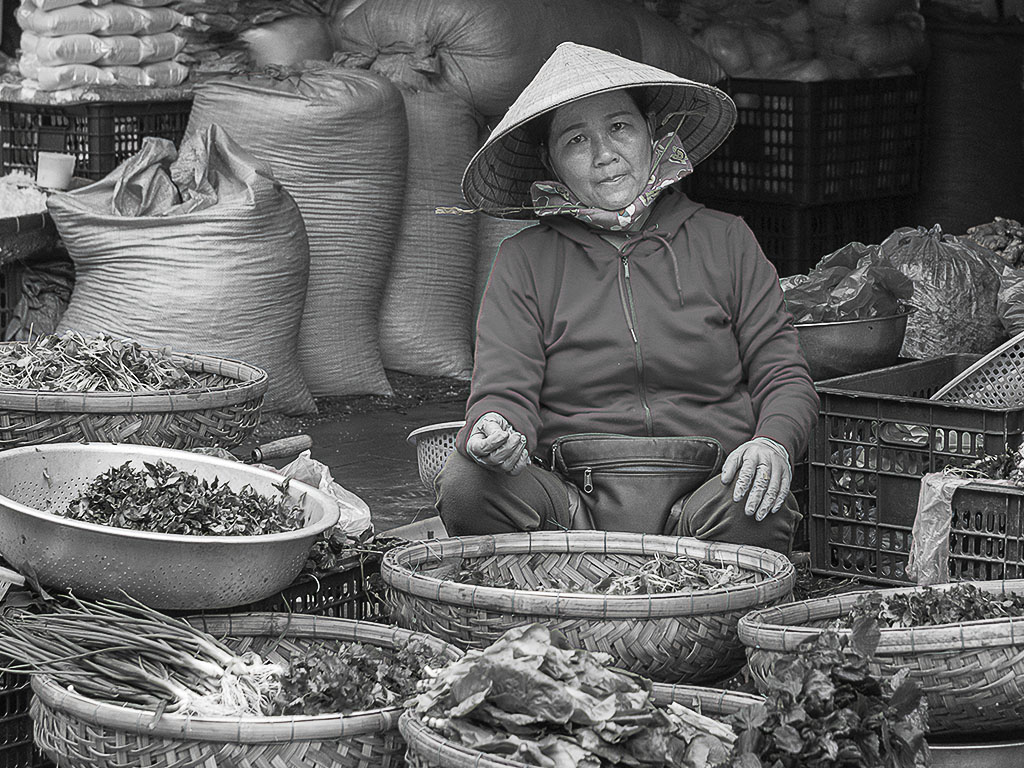
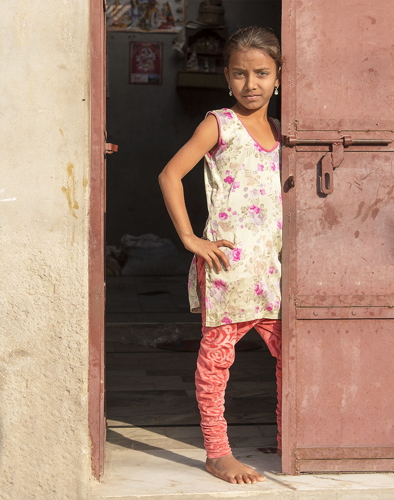
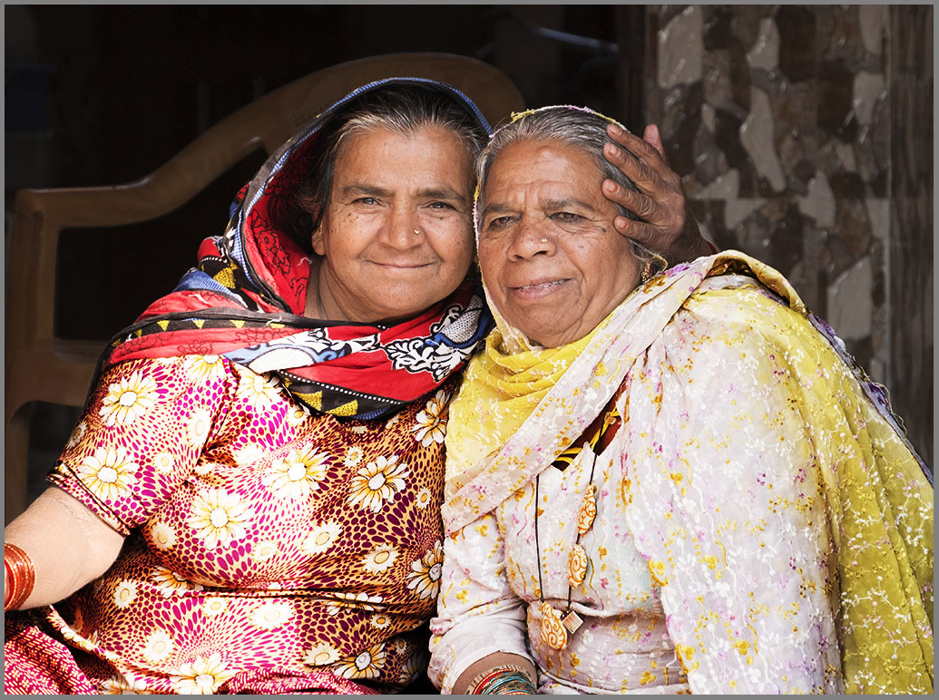
It is always interesting to see how the combination of a couple of dis-similar items can be made to create an effective image. Here we have a very simple set up of the doll in front of the plate. The colour contrast between orange and blue always makes an effective picture, and here the face makes a strong centre of interest. Working indoors often creates problems with the lighting, usually it is not very strong and can introduce unwanted shadows, highlights and reflections, and I can see couple of minor ones in your image. It appears to be little grainy in the shadow areas, have you lightened up the image in post- processing on was a high ISO to blame? |
May 8th |
| 27 |
May 20 |
Comment |
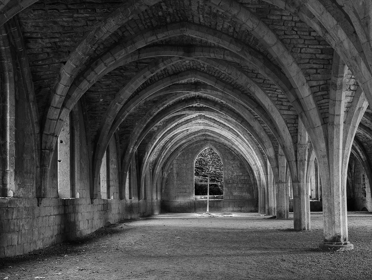
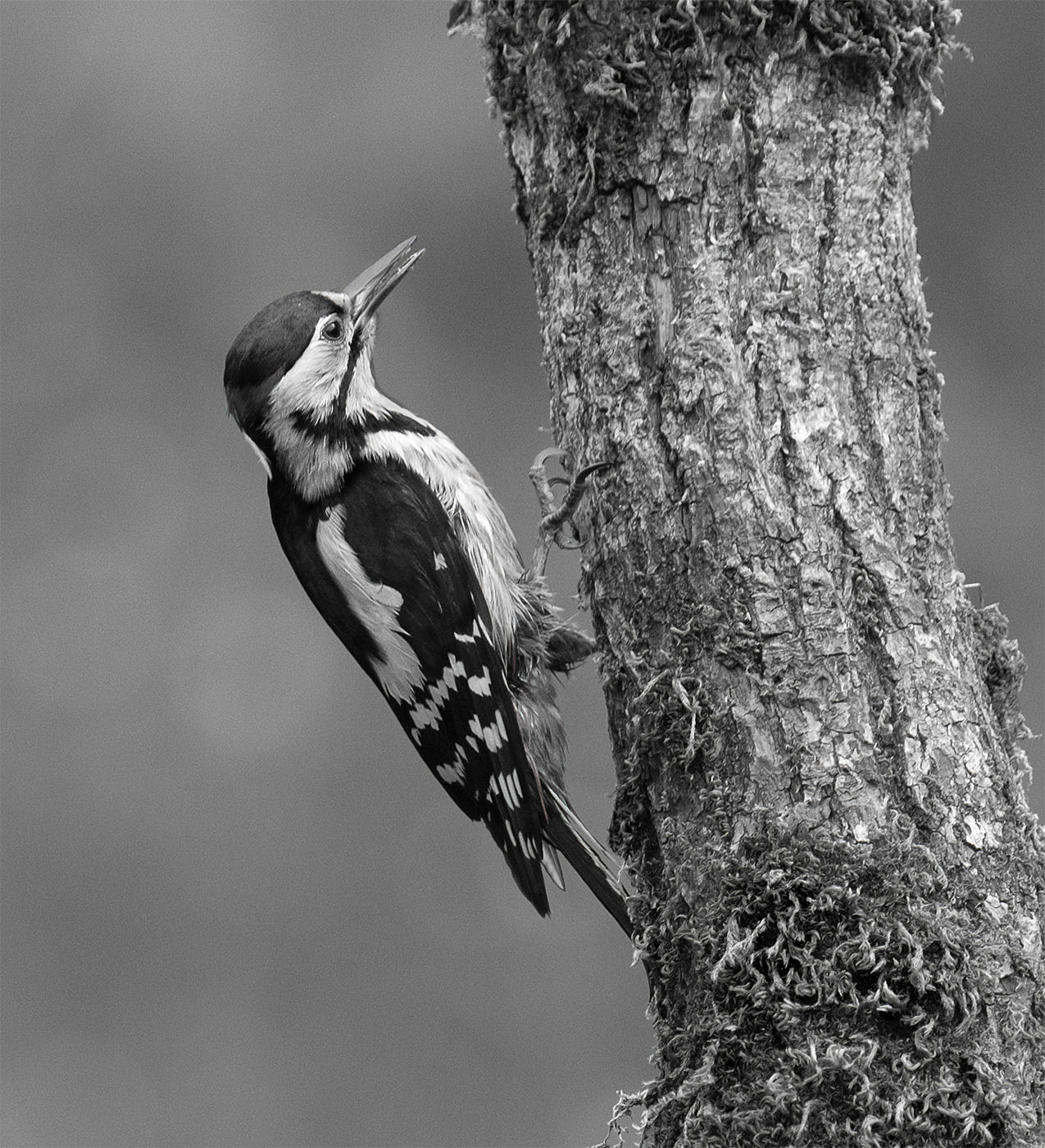
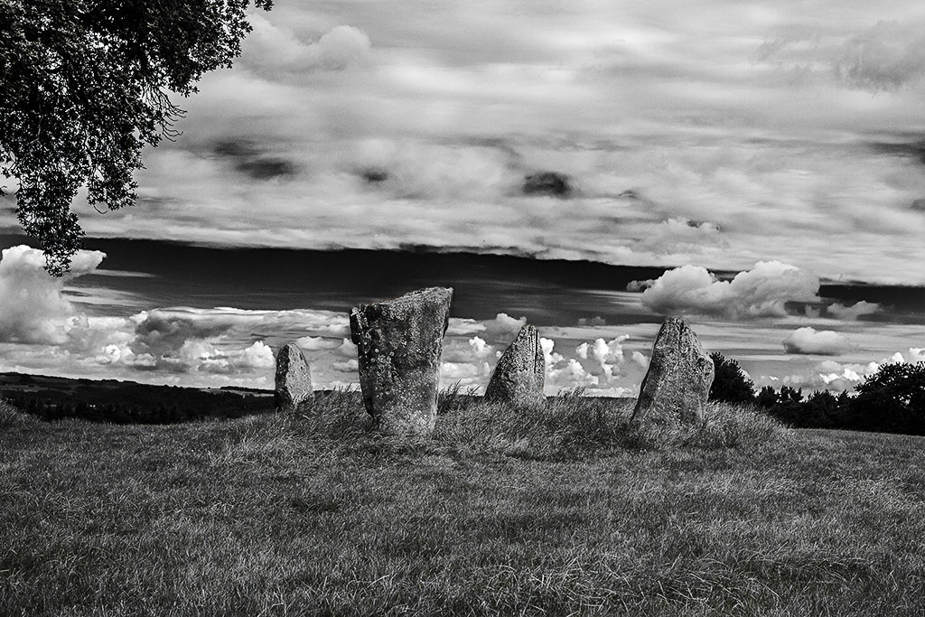
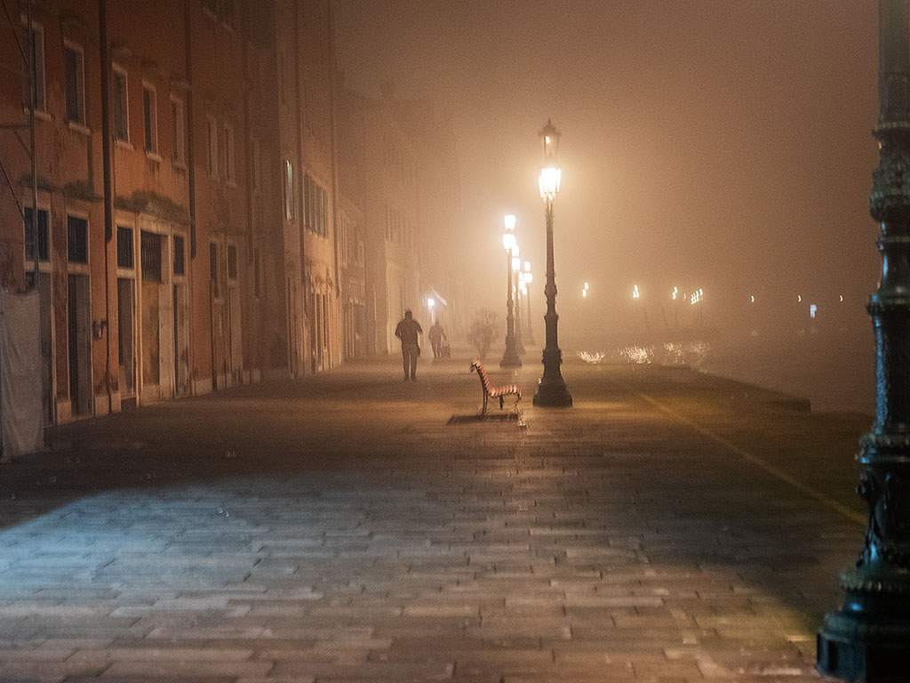
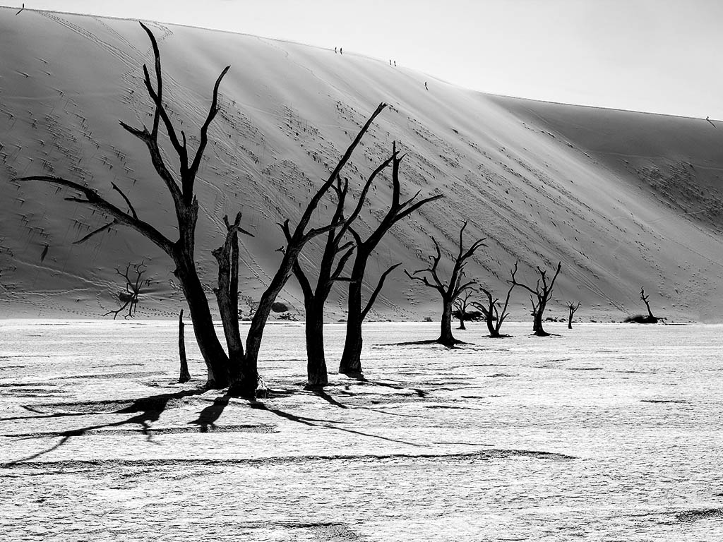
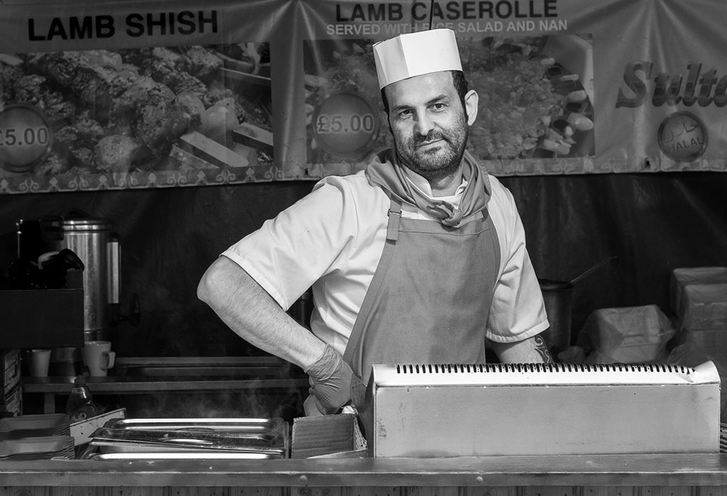
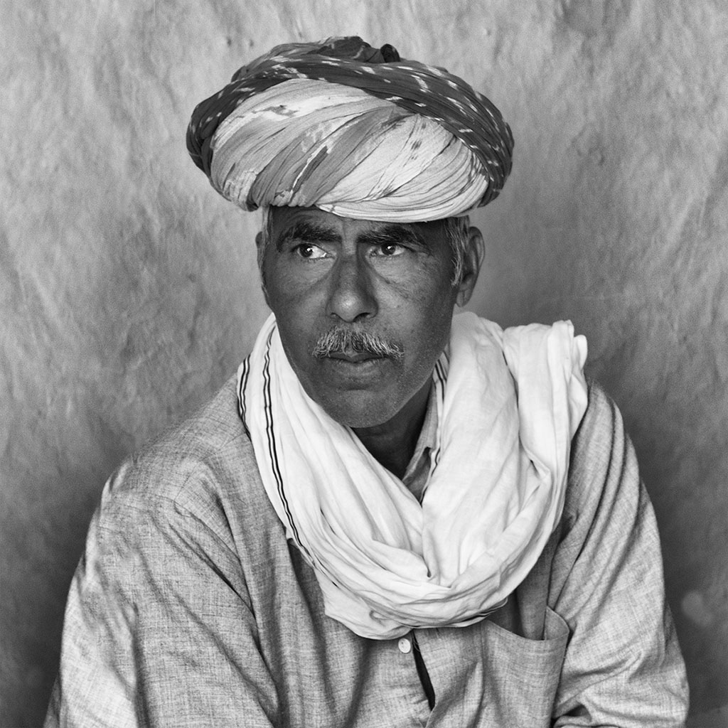
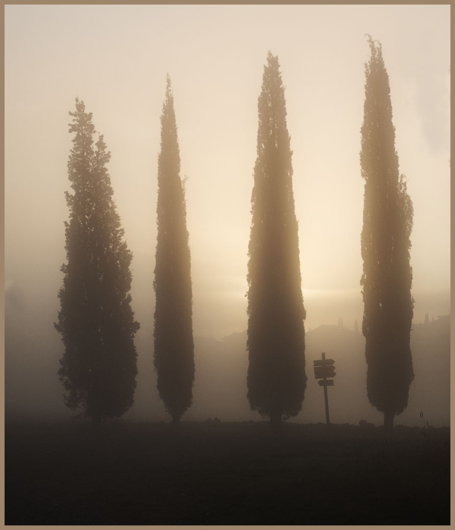
There was definitely far too much clutter of poles and tree etc in your original file, and they definitely needed to be removed, and or cropped out. I agree that the mono version is more expressive than the colour one. To me the increase in contrast as you converted to mono as made the stones to the left of his head appear to be the sharpest part of the image and also being being lighter than his face, therefore attract attention. I would suggest that you either go back and selectively sharpen the image, or you try reducing the contrast on the stones. I also feel that a little more drama could be introduced to the sky. |
May 8th |
| 27 |
May 20 |
Comment |
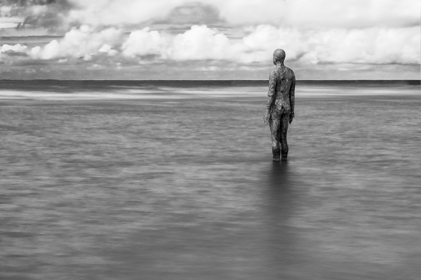
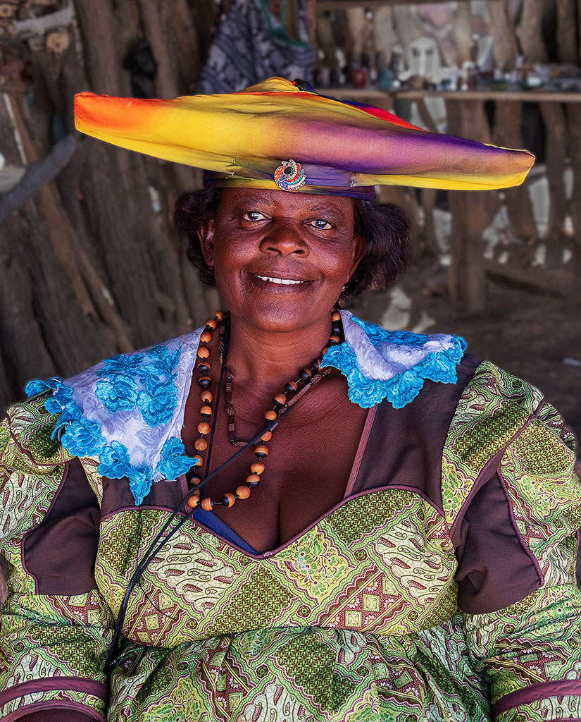
Your monochrome treatment and tidying up of the image has been very effective, and the eyes of graffiti lady create a very strong centre of attention. The monk needed careful treatment to bring out the detail in his dress and face, and you have achieved it very successfully. |
May 8th |
| 27 |
May 20 |
Comment |
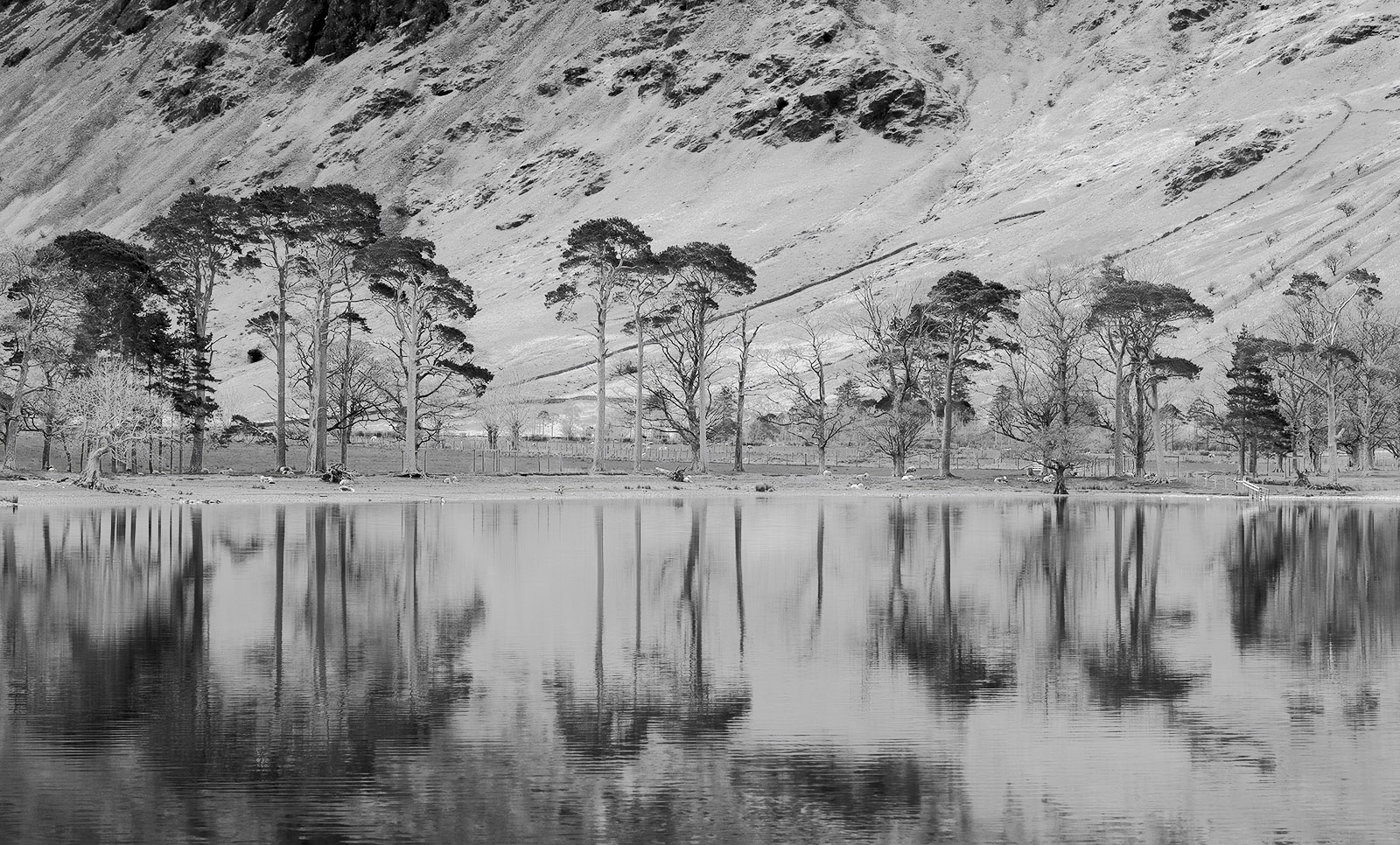
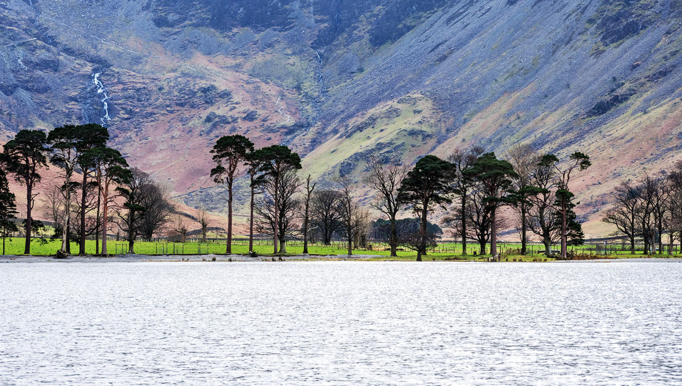
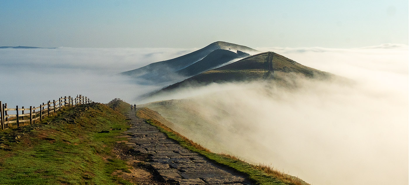
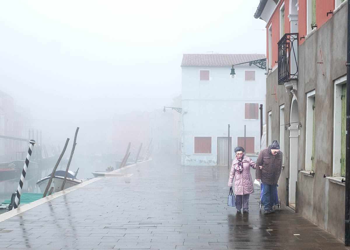
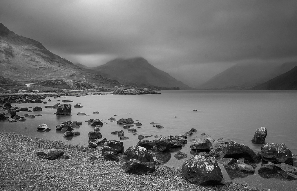
A very dramatic and atmospheric mountainous landscape. I like the way that the light is breaking through light up small mountain in the background. I would like to see a little more of the buildings that are in the foreground at the base. |
May 8th |
| 27 |
May 20 |
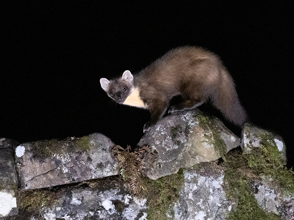
Reply |
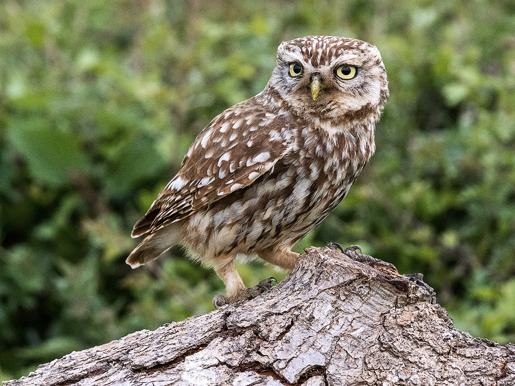
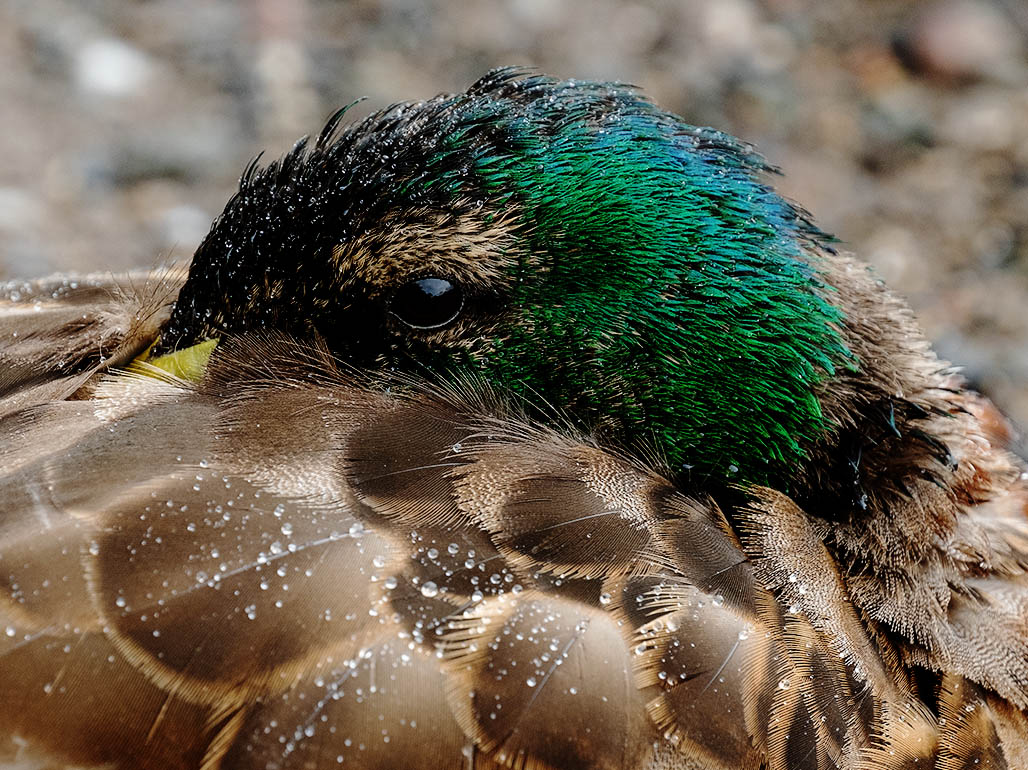
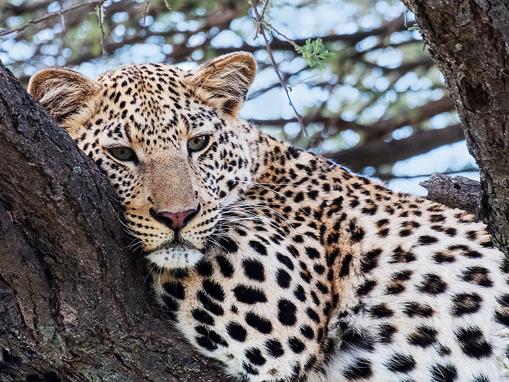
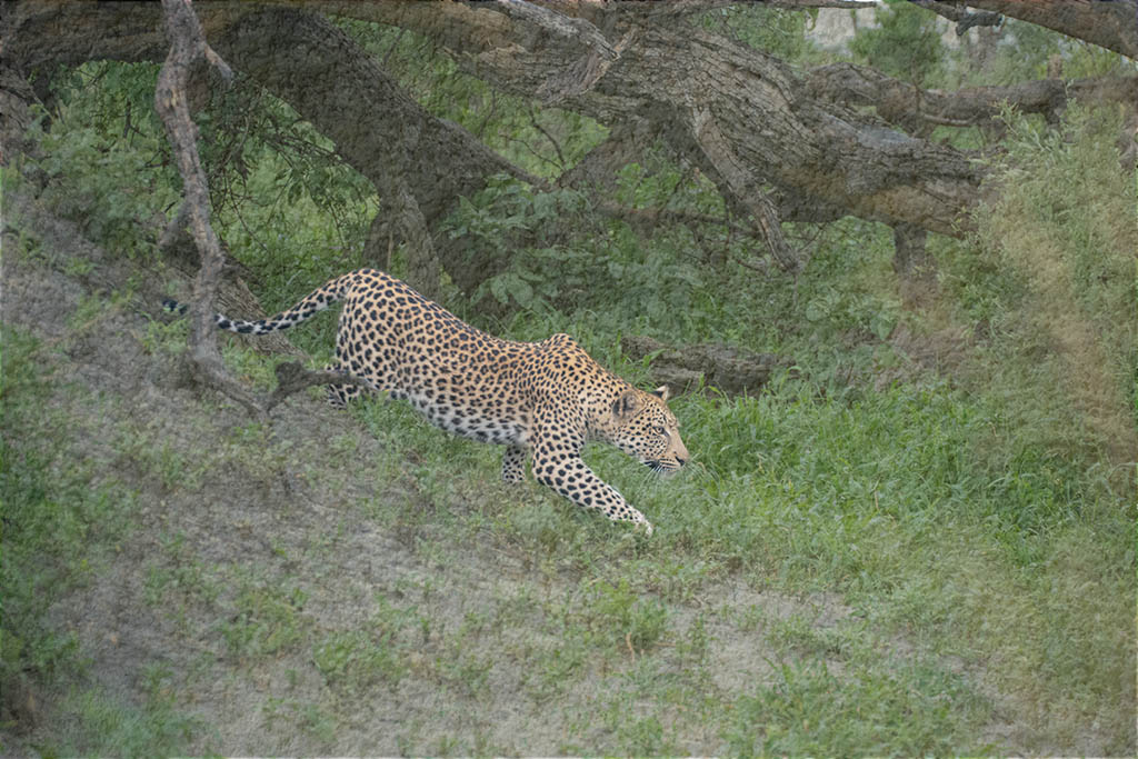
I have lightened the eyes slightly on my master file and it does make a good improvement. The slight softness that you see on some of the fur, isa product of reducing the file size and the JPEG conversion and subsequent further size/qulity reaction for this web site. |
May 8th |
6 comments - 2 replies for Group 27
|
6 comments - 2 replies Total
|