|
| Group |
Round |
C/R |
Comment |
Date |
Image |
| 27 |
Nov 19 |
Comment |
We get regular news reports of the fire situations in both Australia and the USA, fortunately we get very few wild fires here in the UK. To me this is a great image showing the firefighters proceeding forwards behind their wall of water. It clearly shows the situation and gives an indication of the force that the water has coming rom the hoses. The fact that we cannot see their faces, and the way that the centre man is adding his strength to the other two really demonstrates the power of the situation. To me this is one of the best photojournalism mages I have seen for some time. |
Nov 15th |
| 27 |
Nov 19 |
Comment |
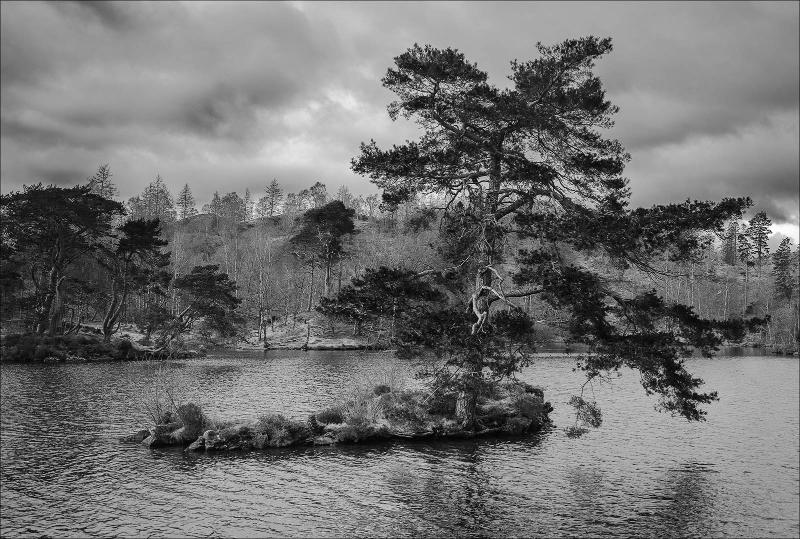
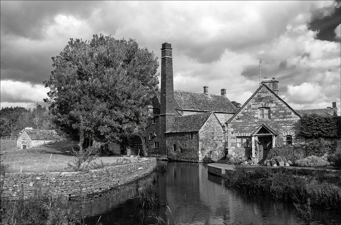
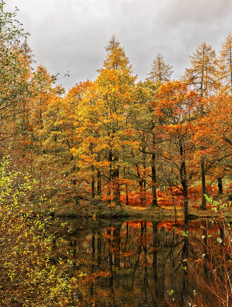
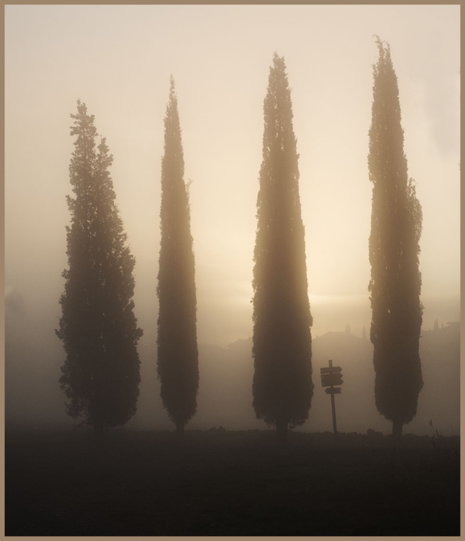
Looking at you original image, it helps to confirm the value of my process of putting all images though the auto processing in Lightroom - it does not create perfect results but it brings out the potential of the image by enhancing detail in both the shadow and sky areas, and then encourages you to enhance it further. I really like the recession and clouds you have in the distant hills and the range of autumn colours that you have in the closer trees. The water drop on the tree does not bother me too much but is relatively easy to eliminate. Personally I find the central lamp and the light pan to the right being slightly distracting I would be inclined to clone them out.
|
Nov 12th |
| 27 |
Nov 19 |
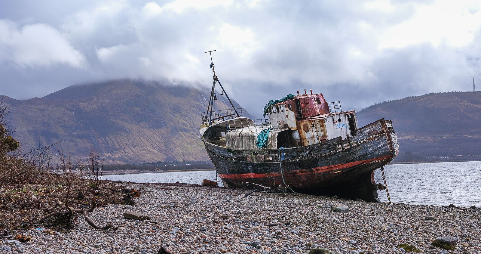
Comment |
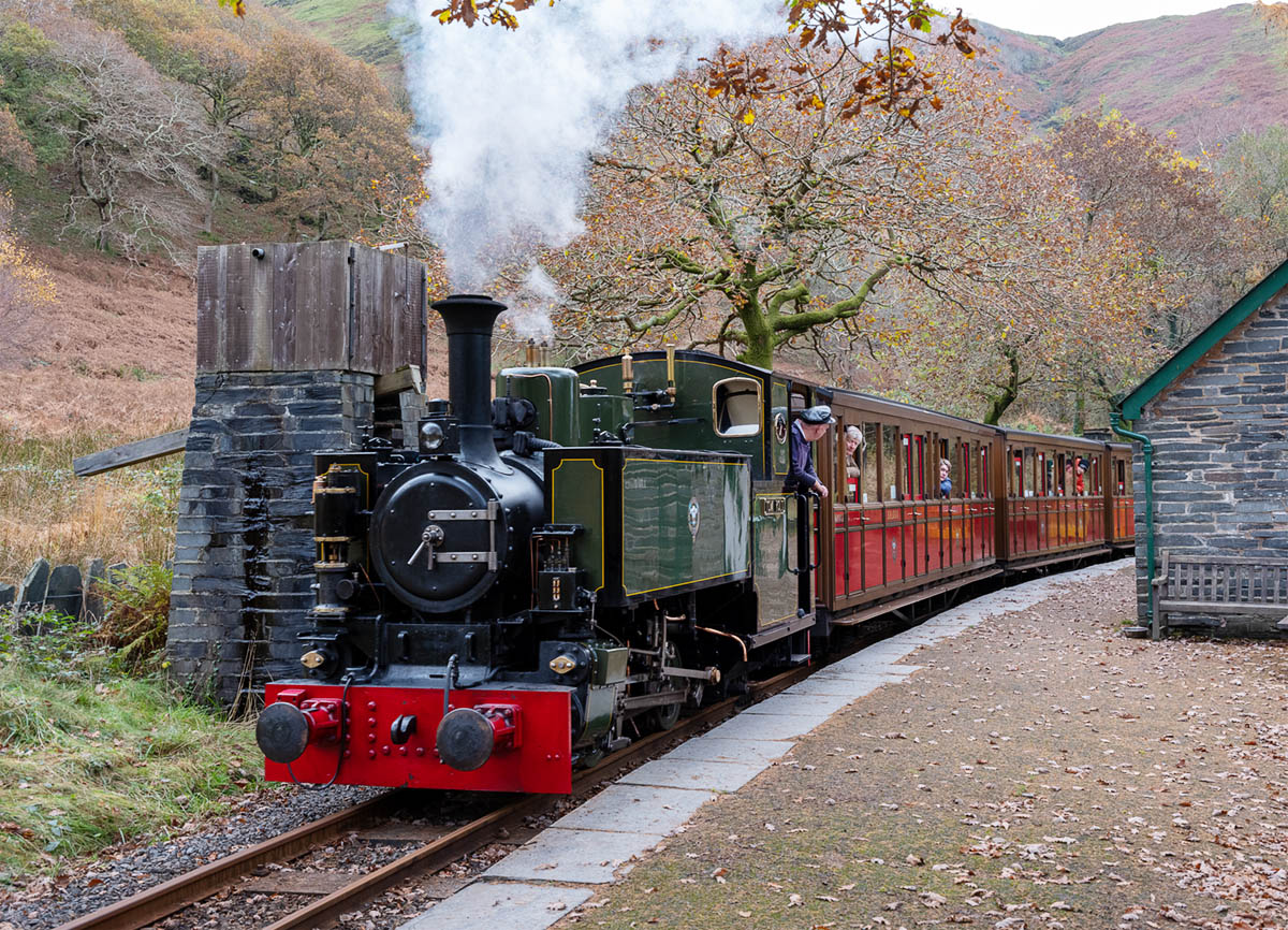
To me this is an image that how you process, depends on what you want to convey - is it the atmosphere of the abandoned building or do you want a accurate type record of it and its contents? I really like your version of the image, it creates a an atmosphere of dereliction and decay. However I like the treatment that Lauren has done, as it gives an impression of what the building was like in better times, and feel that the colour one more effective than the mono.
|
Nov 12th |
| 27 |
Nov 19 |
Comment |
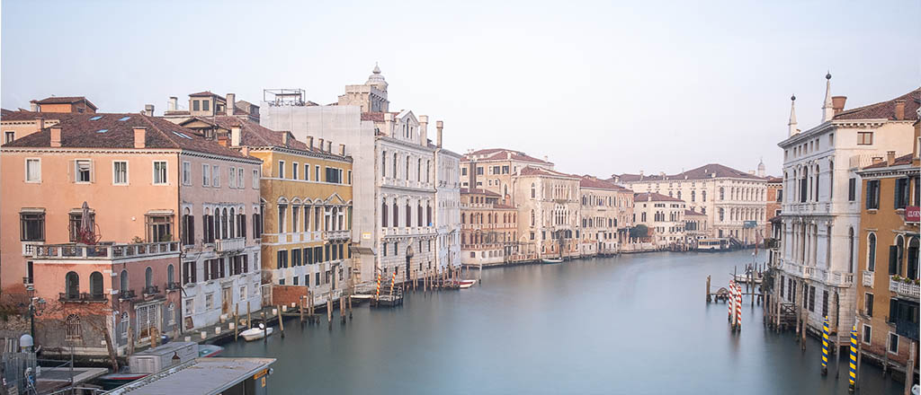
I was rather surprised to see that members felt that the image was over-sharpened, as I am very careful as I normally use selective High Pass sharpening and as I am usually criticised for not sharpening enough. As I run a digital circle similar to this in the UK, I am aware that the images seen my the members are usually inferior to the originals that they produce usually because of the reduction in file dimensions and quality due to the JPEG level required to create a small file size.
I have spent some time experimenting to find what has happened to this image between my original 6k x 4k pixel file and what you are seeing. I found that there was loss of contrast detail in the sky in the reduction to the 1024 x768 level 7 JPEG file that I submitted. It was great shock to me when I compared this to the image in this circle, there has been quite an increase in the sharpness (contrast?) of the image on the buildings and on the largest of the boats a complete loss of detail in the dark paint on the stern. I am asking Brad to circulate to you my comparison files. |
Nov 12th |
| 27 |
Nov 19 |
Comment |
I can see why you have taken this image and I feel that the in camera photo stacking has done an excellent job, as a keen monochrome worker I agree that we need to pre -visualise the effect we wish to achieve in mono. I feel that this subject would work equally well in colour or mono, and that the 'box' lower right is better cloned out. I agree that the piece of tape could be a distraction, and definitely requires toning down or better still replacing with pipe. I also feel that the pipe in the background is not contributing to the image. I cannot decide if you have too much in the image, as my eye keeps going to the tap wheel top right and in someways it is acting as a distraction, but feel that Stephen's crop has taken to much of the image away and kid of left the two tap wheels looking without any connections. |
Nov 12th |
| 27 |
Nov 19 |
Comment |
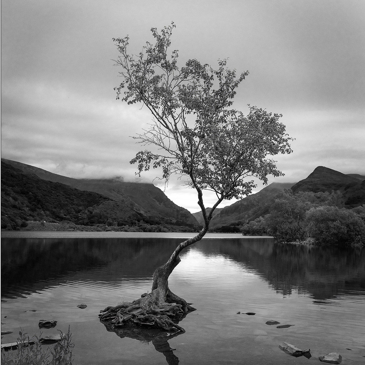
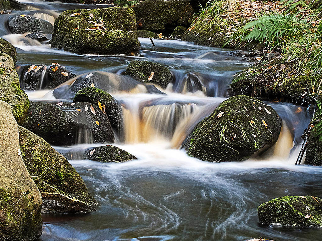
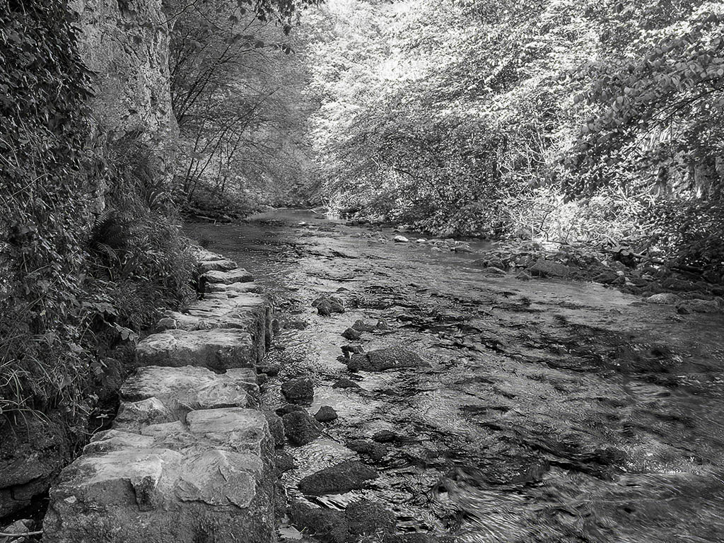
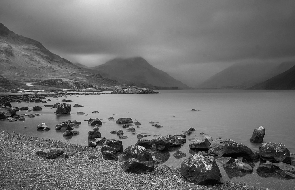
The appearance of it being taken whilst standing in the water does not bother me, and I feel that if there was a white rock in the foreground it would create a major distraction away from the diagonal flow of the water. To me your shutter sped is appropriate creating a smoothness in the water but still retaining detail of movement. The removal of the rock bottom right gets rid of bright area that would be a distraction. |
Nov 12th |
| 27 |
Nov 19 |
Comment |
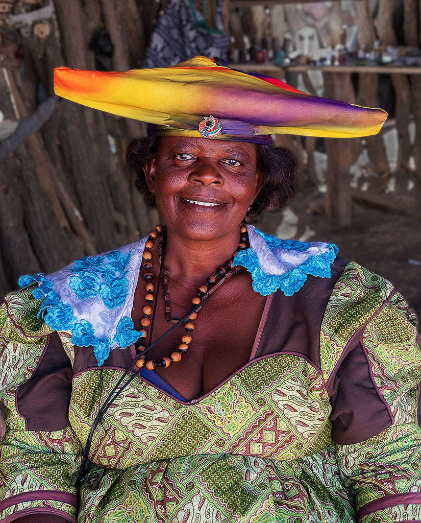
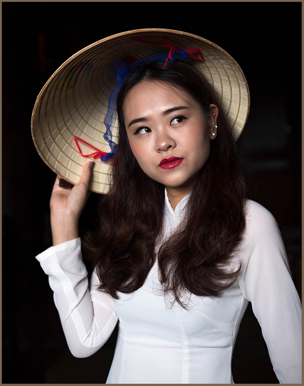
I really like your idea for this image, it is simple but highly effective. I feel however that a few minor tweaks could strengthen it. Lowering the top of the background to just above the shadows would raise the face to a stronger position on to an intersection of the thirds. There is a lighter area around an eye and some highlights on the face that would be better toned down and there are some coloured dots created by the sequins which could have their saturation/ brightness increased. |
Nov 12th |
7 comments - 0 replies for Group 27
|
7 comments - 0 replies Total
|