|
| Group |
Round |
C/R |
Comment |
Date |
Image |
| 4 |
Jul 21 |
Comment |
Hi Ian. Definitely a unique side-view mirror. The placement from where the hand extends into frame is great. A bit of menace in there. I noticed the red signage being reflected in the chrome. Kind of looks like blood or scars hahaha |
Jul 15th |
1 comment - 0 replies for Group 4
|
| 24 |
Jul 21 |
Reply |
Hi Albert, For me, the composition works. The entire mountain is reflected in the lake. That helps with exaggerating the size of Mt. Denali. I think the reason why the ridge line feels awkward to me is because I can't see the distance between it and the base of Mt. Denali. I guess I sense of lack of depth. Not really sure how to explain it. As for the red, not really a bother. The brightest parts of the image are on the mountain and reflected in the lake. Those are sufficient to keep my attention. |
Jul 17th |
| 24 |
Jul 21 |
Reply |
Thanks mate. |
Jul 15th |
| 24 |
Jul 21 |
Reply |
Hi Tam. I'm glad that you enjoy the image. Learning wildlife photography has been a lot of fun. |
Jul 15th |
| 24 |
Jul 21 |
Comment |
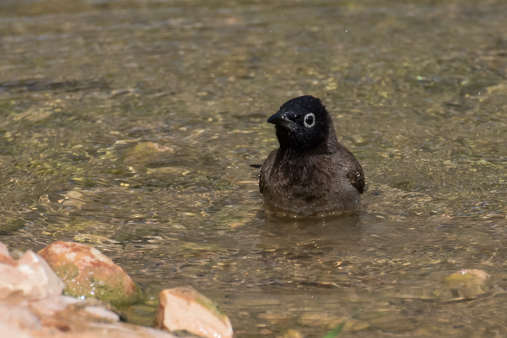
Hi Tam. Welcome to the group. My first impression is one of calmness. It is a lovely image that is peaceful. That most likely has to do with the varied hues of green throughout the image. Just as Ian did, I noticed that the subject of off-center and in the shade, while the center of the image is brighter. The brighter areas will draw the attention away from your intended subject. |
Jul 15th |
| 24 |
Jul 21 |
Reply |
Hi Ian. Thanks for the encouraging comments. Unfortunately this is not pin sharp image. At the time of shooting my focus was on other aspects of image capture, but I am sure that I will be able to take what I learned from this image and be able to capture similar images in the future. |
Jul 15th |
| 24 |
Jul 21 |
Reply |
Hi Albert. Sam's and your suggestion is something I had thought about but using photoshop to remove things is not what I do, so I decided to leave them in. But in the end, this image was never intended to be posted or shared. What I enjoy about these groups is it is a great place to experiment and test skills. There are times when I still struggle with capturing multiple subjects within the correct depth of field so that all are in focus and the background fades nicely. That is what I hoped to achieve when taking these photographs. The second part is then assessing the image, thinking about where I want to go with it and seeing whether or not I can produce that. I think I got what I was looking for. The suggestions that you and the others have made are exactly what I need as I continue to hone this skill set. |
Jul 14th |
| 24 |
Jul 21 |
Comment |
Hi Albert. I've been trying to get my hands on a Nikon F4 for a few months now. Great camera. About two weeks ago I got a Nikon FE. Nice little camera to carry around wherever I go. Is this a scan from a film slide? I love the colors that old film produced. Wonderful gradients of purples, indigos and blues with a pop of yellow and orange. The ridge line through the center of the image is an interesting feature and I'm not sure if it reduces or increases the grandeur of Mt. Denali or not. Maybe it is just because it cuts off the base of Mt. Denali that it feels that way. Anyways, I really enjoy the image. |
Jul 14th |
| 24 |
Jul 21 |
Comment |
Hi Laura. Having been able to visit Florence a few times, this image is a nice reminder of the beauty of the city. I took a copy of your original into LR and struggled to produce an image equal to your final edit. Clearly there is a lot more I need to learn :). Reading Albert's comments, I can see the reasoning behind his observations. There is a lot going on in the image, but for me I kind of like the fact that I can focus on multiple parts of the city and observe a few different aspects of the city within a single image. |
Jul 14th |
| 24 |
Jul 21 |
Reply |
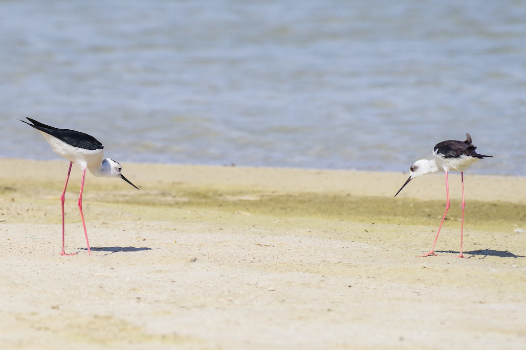
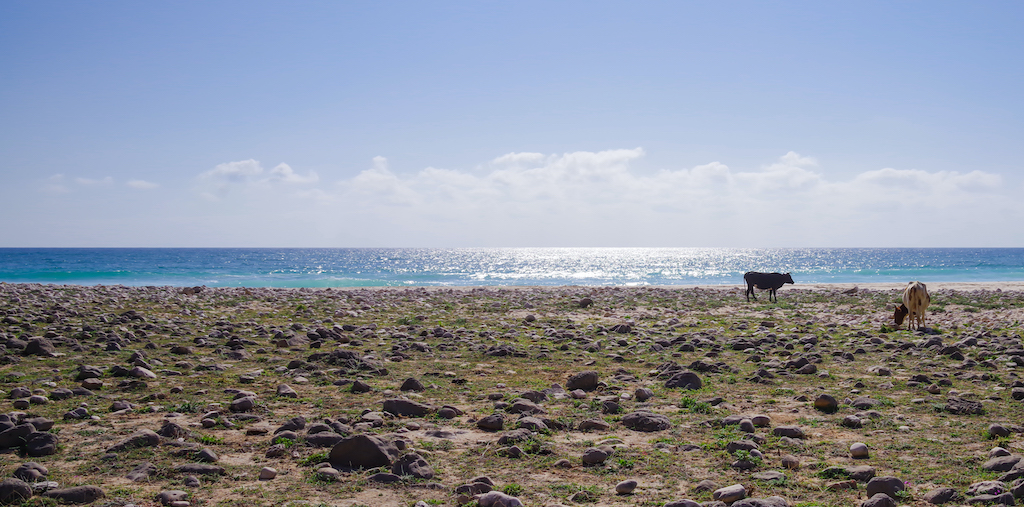
Hi Sam. Great advice. I would agree that it might be a touch too bright. There is definitely the potential to get more detail in the whites. The shot was taken in an estuary. It is a body of water that is separated by the sea by about 20 meters of beach. I guess that is an estuary? This is the shallow end closest to the beach. Many types of birds come here to wash and cool off. When taking the image, I really didn't know what was going to happen in the background, but quite happy with the result. |
Jul 7th |
| 24 |
Jul 21 |
Reply |
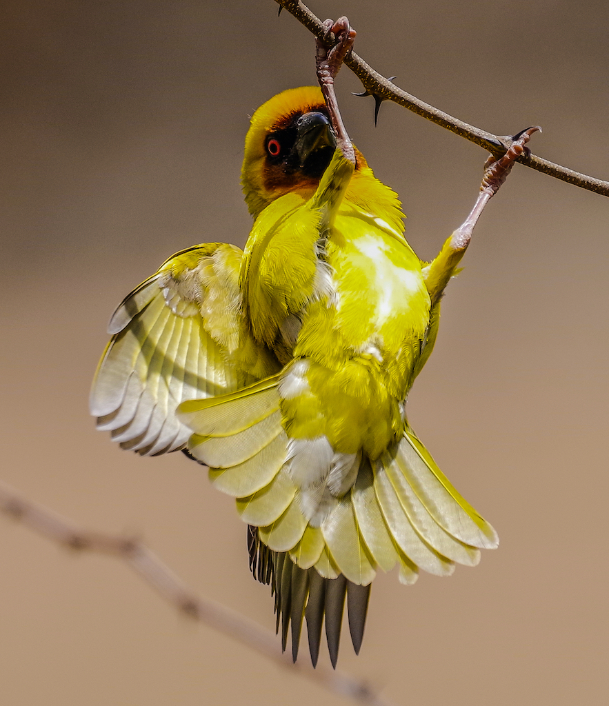
Hi Laura. I too am fairly new to bird photography. Before, I predominantly did B&W non-moving subjects. Learning wildlife photography has been quite the challenge but a lot fun (also with a ton of straight to the trash images haha). I don't have external lens filters, so I try to compensate for that by adjusting ISO, f-stop and exposure. One I have learned is that a slight under-exposure will give me more to play with in post-processing most of the time. As for multiple exposures, I haven't thought about that. I'll give it a shot. But as you pointed out, may not be ideal for moving subjects. Birds tend to not be very cooperative when I ask them to not move :) A good point about the eyes. If my intention is to focus on one bird, I will do my best to get the eyes sharp. In this image, my focus was on depth of field to capture multiple subjects in focus. The goal is to be able to understand the lens camera interaction to a point where I can see a scene and intuitively know which settings will be ideal to get the intended image. |
Jul 7th |
| 24 |
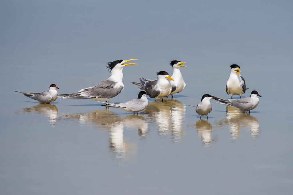
Jul 21 |
Comment |
Hi Jim. I agree with you about the positioning of the terns. It is not ideal, especially with the Common Terns as those overlaps make it a bit harder to distinguish the bird's markings. This image was taken during the time when I was working out how to photograph in fairly extreme conditions. I generally have mid afternoon available for photography and most of the time that time of day is far from ideal. So I would go out and just shoot and shoot while making small in-camera adjustments to compensate for the environment. For this set of images, I'm happy that all the whites aren't blown out and also happy with how the foreground and background blended together. |
Jul 6th |
| 24 |
Jul 21 |
Comment |
Hi Fernando. I like what you did and I think you picked the right composition for the tulips, but something feels flat. I don't know if it is because the black of my screen matches the black of your background. The image has all the look of an exceptional flower portrait but I see the background as being on the same plane as the leaves. |
Jul 5th |
| 24 |
Jul 21 |
Comment |
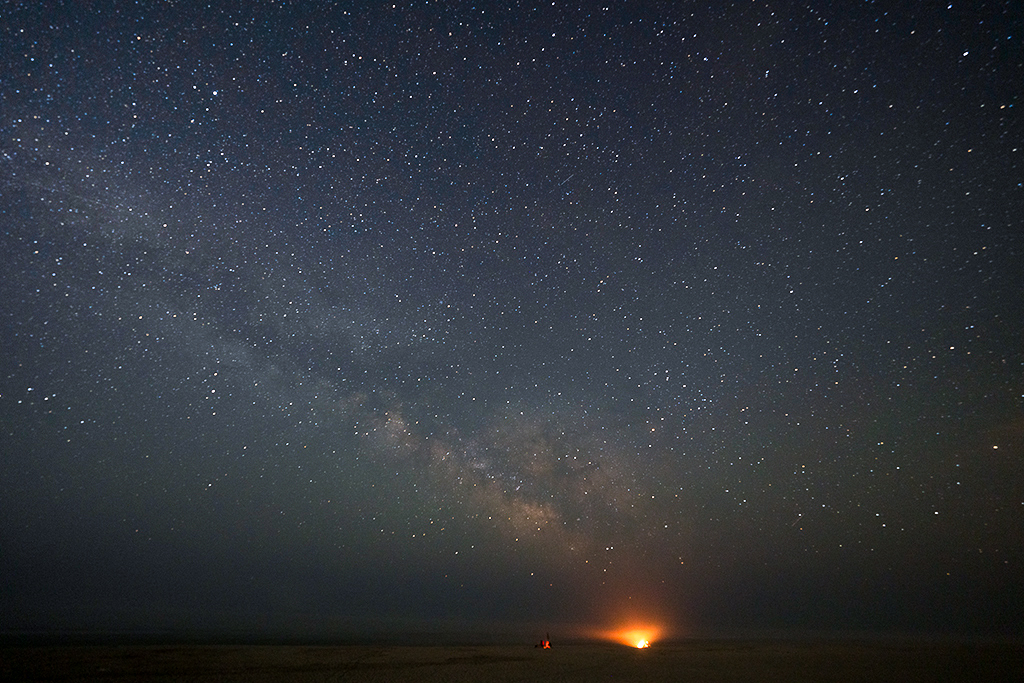
Hi Jim. As I have never tried to go as far as you did into milky way long exposure, I don't think I can offer any advice here. As for the image that you have presented, I like the composition that you have chosen. I think the fires on the horizon add great narrative to the image, as well as great anchors and interest into the image. But the area where we differ is in what we would want the final image to look like. I prefer a darker warm toned final image. You can see that in the quick edit I have attached. I bumped the exposure by .4 and increased contrast. I then adjusted whites and blacks to darken the borders and add a bit of luminosity to the center of the image. I did some individual color adjustments to get the warm tones that I wanted. |
Jul 5th |
 |
6 comments - 7 replies for Group 24
|
| 31 |
Jul 21 |
Comment |
Hi Ian. No doubt you have handled the tonal contrast beautifully. It is not always easy to make machinery look interesting, especially when you are dealing with polished chrome. I do have two things to point out. Not sure if they really matter in improving the image. First is the sun reflection off the chrome of the air filter at the top of the image. I find that it wants to pull my attention. I don't find it particularly distracting, but it is a very bright spot. The other is the logo stamp on the exhaust on the left side of the frame. It is half in, half out. Again, minor minor detail. There are so many wonderful lines and curves for the eye to explore that I don't think the half logo detracts from the overall image in any way. |
Jul 15th |
1 comment - 0 replies for Group 31
|
| 97 |
Jul 21 |
Reply |
Hi Ian, no question that I do love nature hahahaha. I am fascinated by the natural environment because there is so much to learn about it and with enough patience it will reveal some of its secrets. |
Jul 21st |
| 97 |
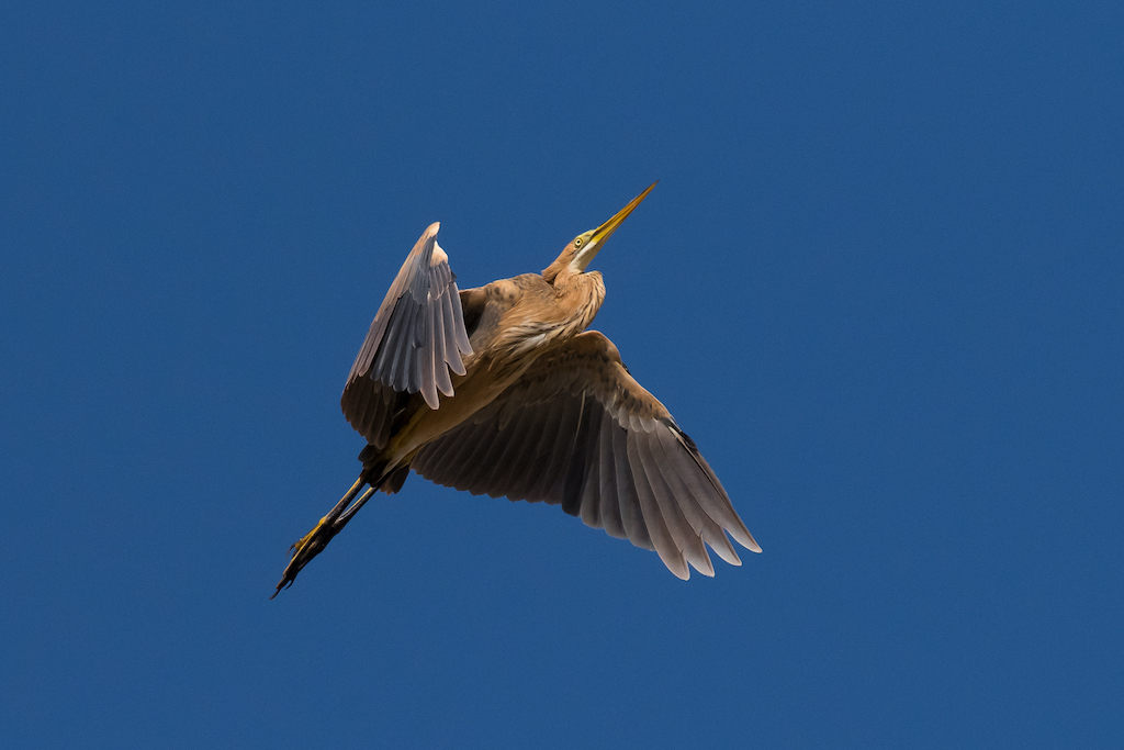
Jul 21 |
Reply |
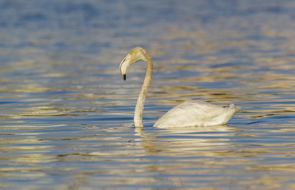
Thanks for the info on the heron. This is the first Purple Heron that I have ever seen so it wasn't a straight forward ID for me. I got about 60 keepers from this shoot. I have attached another one with the body in light. Images like this can be taken in a few directions depending on the desire of the photographer. For me, I'm generally more focused on trying to present the image to match the experience. The sky was clear, the sun was bright, the shadows are crisp and well defined and the colors were solid. As the heron did slow circles above me the way light and shadow changed was the most interesting visual aspect of this encounter. I thought it important to keep this visual aspect while still softening the shadows a bit to get a hint of the hidden detail. |
Jul 9th |
 |
| 97 |
Jul 21 |
Reply |
Hahaha I forgot to include the hungry predators into the experience. I sometimes do something similar when I go out. I have a bean bag built to fit my FJ Cruiser windows. |
Jul 8th |
| 97 |
Jul 21 |
Reply |
Interesting, I didn't even notice the horizon was tilted. I am totally focused on the action of the birds. The horizon lines do not seem to be disruptive to me at all. |
Jul 6th |
| 97 |
Jul 21 |
Reply |
If I slide the shadows to the far right, I would be removing the shadows, which would remove depth while also removing the reality of the situation. For me, shadows are absolutely necessary. Of course, they do need to be adjusted from time to time. I did reduce shadows a bit in this image.
I always adjust using highlights, shadows, whites and blacks. I just didn't mention those in the description. |
Jul 5th |
| 97 |
Jul 21 |
Comment |
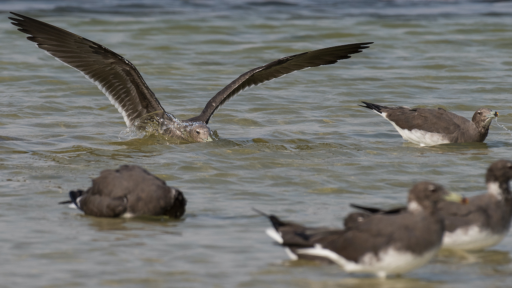
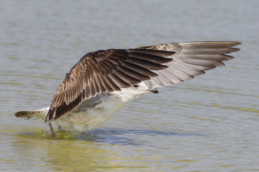
Hi Stanley. I had never heard of Jaegers before so it was interesting to do some research about them. As you have already pointed out the sharpness of the image is not ideal, but some images are about the experience, seeing something unique and recording that moment. As you mentioned, that original is missing. Would have been nice to see how much space around the subjects there was to play with for different croppings. But, the way you have stuck the gull in the bottom right highlights the borders closing in on it, as does the jaeger positioned above it. What I like about the action I see is I can clearly tell that the Jaeger is coming in for an attack based on how it is using its tail feathers to control dive, speed and angle of approach. Well done. |
Jul 5th |
| 97 |
Jul 21 |
Comment |
Hi Jeffery. Looking at the original, it is quite impressive to me that you were able to draw out such vibrant colors. Well done on that. I've had a chance to take photos of European Rollers where I live and in my studies I have learned that they like bare branches and areas that give them a view. I have found that this can make it difficult at times to get sharp focus. You have done quite a solid job with this image. Were you using a tripod or was this handheld? |
Jul 5th |
2 comments - 5 replies for Group 97
|
10 comments - 12 replies Total
|