|
| Group |
Round |
C/R |
Comment |
Date |
Image |
| 24 |
May 21 |
Reply |
Hi Tab, I like the last one also. Definitely more humor going on in that one. As for the submitted photo, I totally recognize all the flaws in it, and I'm happy to see it peaked your creative mind. What you have done with it is quite impressive. |
May 24th |
| 24 |
May 21 |
Reply |
This is as close as it gets. |
May 17th |
 |
| 24 |
May 21 |
Reply |
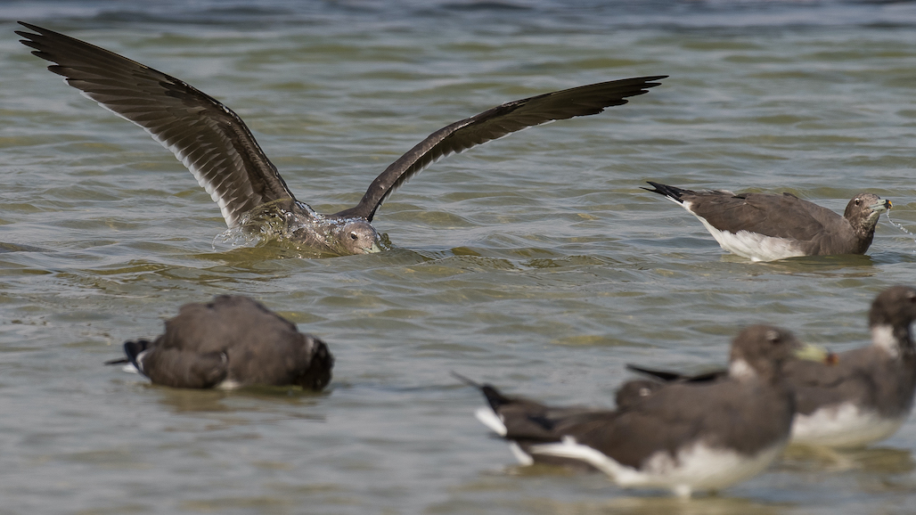
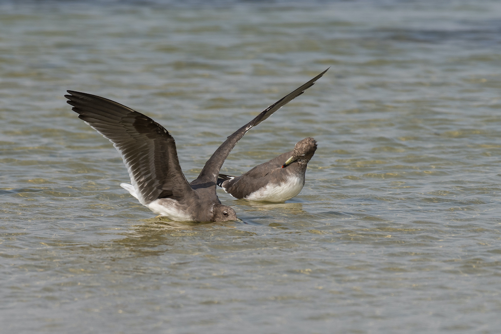
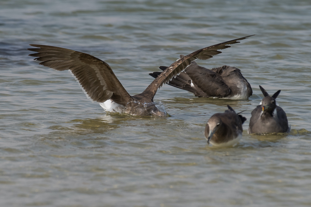
Hi Albert, sadly I don't have one. I have 14 keepers of the Sooty gulls, but only 2 clearly capture the head dunking behavior. I posted the other one in my reply to Sam. The two in the foreground a bit less blurry, but still not sharp. |
May 17th |
| 24 |
May 21 |
Reply |
Hi Sam, this is the final of the original. Unfortunately, all the birds are not in focus. I don't have one in which I capture the behavior of head dunking with all the birds in the frame in focus. |
May 17th |
 |
| 24 |
May 21 |
Reply |
Hi Albert, not exactly sure if I do. I'll have to go through the keepers. At the time, I was more interested in learning their behavior than than thinking about my aperture settings, so I'm not very confident that the depth of field was sufficient. |
May 17th |
| 24 |
May 21 |
Comment |
Hi Sam, two things stand out as my first impressions; the background behind the flowers is distinctly different than the rest of the background and the lines off the table and cutting board. I don't know if there has been a manipulation on the background behind the flowers, but there is a noticeable difference in texture that has created a bit of a halo effect. As for the wood grain of the table and cutting board, I find it a dissonance that detracts from the harmony of the image. |
May 14th |
| 24 |
May 21 |
Reply |
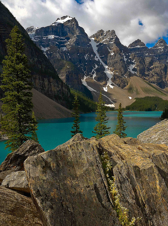
Hi John, I can see why you wanted the tree on the right, and in all honesty it doesn't bother me at all. I just wanted to see what it would look like without it. What I feel without the tree on the right is a feeling of needing something. As you said, there needs to be a right hand frame. |
May 14th |
| 24 |
May 21 |
Reply |
Good catch Sam, I had not noticed that. I got a lot of photos trying to capture this moment. Admin error on my side. |
May 14th |
| 24 |
May 21 |
Comment |
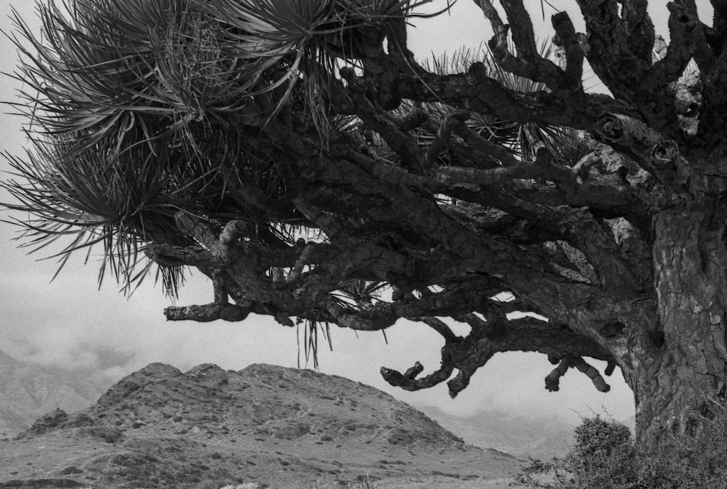
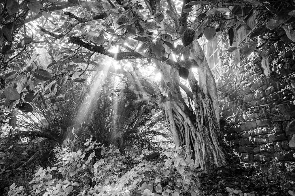
Hi Tab, sorry for not getting involved earlier. So let's get to it. First, I think you have submitted a wonderfully powerful image. I love the rocks kind of intruding into the foreground and really setting the image. For me, they establish the horizon line, where the three trees appear behind them, from which I will begin to explore the image. I like the textures, colors and the contrast elements in the image. I have tried to image what the image would look like without the partial tree on the right. I don't know if it makes the image too vertical. |
May 12th |
 |
| 24 |
May 21 |
Reply |
Hi Jim, those last two I only focused on manipulating the water hues and textures because I thought that the color edits you have done with the Osprey were spot on. Also, those weren't so much about suggestions on changes to make. I would say they were just experiments. Post-processing water can be a big challenge, at least for me, and it is not always easy to to get the final image to match the image in your head of what that moment looked like. So I decided to create an image in my head and then see if I could manipulate your image to match. I think I came fairly close hahaha |
May 12th |
| 24 |
May 21 |
Reply |
And I did another one. The basic changes are same as the previous edit. Differences are blue hue -65 saturation -81 luminance -54, yellow saturation +48 luminance -33, green hue +45 saturation +54 luminance +59, aqua hue -68 saturation -42 luminance -48, temp +8, tint -4 |
May 11th |
 |
| 24 |
May 21 |
Reply |
Hi Jim,
I copied your original to see how it would come out in LR for me. Came out better than I had expected, so I did some edits just focusing on the water hue. My question is, where do you want the water and the reflection to be in terms of color? For this edit, I looked at blues. I added .4 exposure, -35 contrast, in the presence slider I dropped clarity -26, +12 vibrance and -8 luminance. In the color sliders gave blue +68 vibrance, - 8 luminance. Don't know if it is that much different than your submission or not. But, it is always worth playing around with editing to keep honing skills. |
May 11th |
 |
| 24 |
May 21 |
Reply |
Hi Jim, I think it is a matter of personal preference at this point on which way to go with the colors of the water. Your latest edit has more textures and colors to the water, which I think adds more to the background and makes the overall image more interesting. My personal preference is to use temperature as a last resort. I like to address each color separately. I like to see how each color change affects the overall image, and if it gives me the desired result. As for the osprey, I think the color changes you made really bring out the lighter and deeper hues that make up the browns, especially on the wing tips and tail area. |
May 1st |
| 24 |
May 21 |
Reply |
I realize that Jim. For me, it makes more sense to start from the original, not the finished product. Everyone has their work flow, the post-processing programs they use and in what order. Then, do a hard downsize compress to get the correct submission parameters. This can lead to equivalency issues when it comes to making dramatic or multiple changes across various aspects of an image. Using a clean slate allows for better visual translation of the intended suggestions. |
May 1st |
| 24 |
May 21 |
Reply |
Hi Jim, thanks for that suggestion. Looks great. Subtle but evident. |
May 1st |
| 24 |
May 21 |
Comment |
Hi Thorro, I don't know why, but once I read the name of the boat I started laughing. Not sure if the name matches, but it is not about the name. I think you have very nice color vibrance and balance. Maybe crop some off the bottom? I stick to set ratios, so could be tough to do that if you do as well. A 16:9 ratio might be nice. Keep the width and cut the height. Attached is an example. I didn't touch anything else in the image because I think you got colors right. |
May 1st |
 |
| 24 |
May 21 |
Comment |
Hi Jim,
I'm glad I didn't pick the Osprey photography I had in mind for this month hahaha. Love the title for the image, very much what it looks like. I think that you are in a hard place with the water. Clearly, there is a lot of reflection in rather muted colors. I see three routes; increase yellows and oranges and brighten it up, drop blue saturation and luminance or go with both changes. It is a tough one because you don't want the osprey to blend into the background. I played around with your image for a while. I have taken a lot of osprey photos this month, and one thing I have learned is to up the color. Study the histogram and you can see how much orange, yellow and red is trapped in the image. Take a look at the my edit. Ignore the crop, it is more of an exercise in color. What I did was:
exposure +8, clarity +8, vibrance +8, saturation +14 whites +32, blacks -25, sharpness +35, noise reduction luminance +22, blue sat -70 lum -30, red hue +4 sat +25 lum +25, orange hue +4 sat +36 lum +36 yellow hue-7 sat +30 lum +30
What do you think? |
May 1st |
 |
4 comments - 13 replies for Group 24
|
| 97 |
May 21 |
Comment |
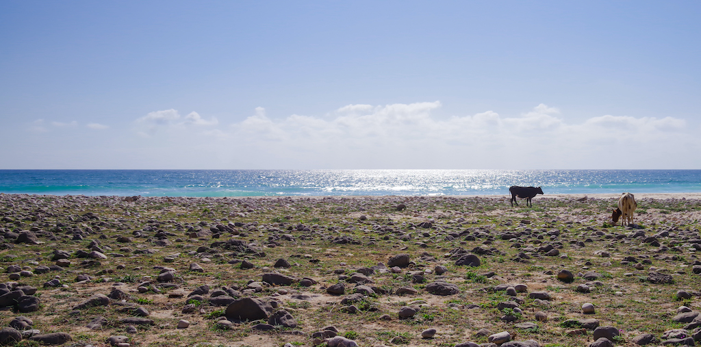
Hi Andy, what a beautiful animal. I like the ground level perspective. To address your question about the habitat detail, I don't find it distracting, although I could see why it could be. It happens to be a bit brighter and whiter than most other parts of the image. I don't find particularly distracting because I find that it mirrors the others undulations in the image (the beach and seal).
Moving onto the subject. I generally don't talk about what doesn't exist in an image, but in this case the lack of another discernible facial feature makes it difficult to identify what I am looking at. That being said, I'll move on to the image that you submitted. I have mulled this image over in my imagination and I can't help but think about the age of exploration when sailors would come back and tell fantastic tales of the strange creatures they encountered in far away lands. I also think of a baby sandworm from Dune. I don't think that was what you were going for in the image but from the visual cues I have in front of me, that is where this image takes me. |
May 19th |
| 97 |
May 21 |
Reply |
Hi Larry. I have a question, maybe two. In the flipped image, what do you see as the main subject? And based on that, what it the narrative that you see? |
May 14th |
| 97 |
May 21 |
Reply |
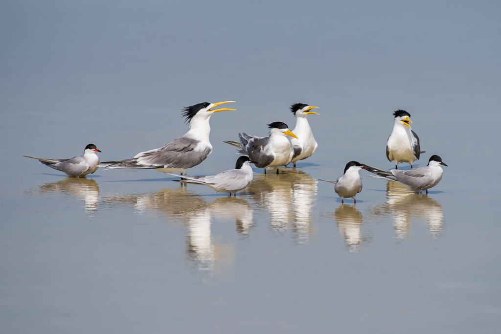
Hi Larry, I think the initial handicap here is that when I took the photo, I didn't have a plan for the image. All I wanted was to get a record of the tern. I'm not sure if I can say that its appearance at this location was highly unusual, but it is definitely not common, so my focus was more about study, when was it there, what did it do, how many were there, breeding or non-breeding adults / juveniles? Those kind of questions. In fact, I have this exact bird photographed about two weeks earlier when the flock of about two dozen were hanging around. I can tell from the small indentation on the bottom of its beak. |
May 14th |
| 97 |
May 21 |
Reply |
Hi Sophia, unfortunately I have not seen this bird again. These terns might have moved on. I agree that a more interesting environment would really add to the image, but he is in his happy place. I only saw these terns in these shallows in the late morning to early afternoon when the sun is at its worst for getting photos of white and black birds. This is where they came to wash up and relax. This was even a new bird to local wildlife photographer, so I don't know if it was just a unique occurrence that they were at this location for those few weeks. |
May 12th |
| 97 |
May 21 |
Reply |
I like what you did there Stanley. Most of the backdrop is unnecessary in telling the story. Bring everything forward, and we better narrative in front of us. |
May 4th |
| 97 |
May 21 |
Comment |
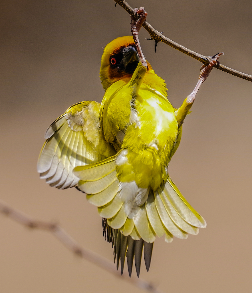
Hi Stanley, I took the challenge to address the feathers. I only use LR 4 (a true classic haha). This is what I did: presence clarity -55, noise reduction luminance +35, yellow saturation -35 luminance -55, green saturation -35 luminance -35, orange saturation +18 luminance -12, aqua hue +7 saturation + 14 luminance -8.
I don't know how much time everyone spends studying the histogram of their images before diving in to edit, but it can be incredibly useful. Your submission is a great example of both the independent nature of color and the dependent nature of color.
So, I guess the question is, do the feathers look more feather-like? |
May 4th |
 |
| 97 |
May 21 |
Reply |
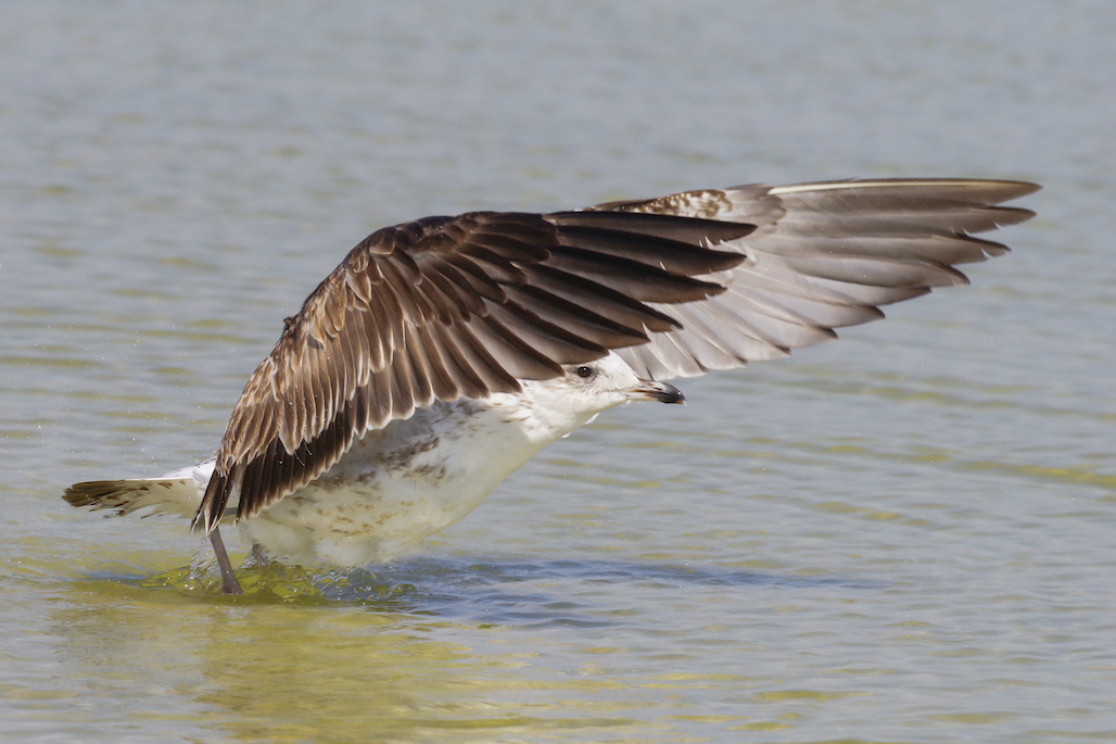
Hi Stanley, I agree with your assessment. The overall lack of shadows removes reference points that we visually use to calculate depth. I many ways, shadows are a necessity. I do like the discomfort, if that is the right word for it, that this image has. How big is white-winged black tern? The image offers zero reference. Now, I might be asking of the image. It appears to be almost at eye level, but is doesn't offer a distinctly different foreground and background, which also adds to its lack of depth. |
May 4th |
| 97 |
May 21 |
Comment |
Hi Sophia, the first thing that comes to mind is to mute the background a bit. Looking at your original, the background has depth and I feel that the depth has been removed in your final edit. I think this would add more focus to the subject.
I put my suggestion to the test. Not sure if it is better or worse. I used an old version of LR. shadow +40, vibrance -15, green saturation -15, yellow saturation -25 luminance -15. |
May 3rd |
 |
3 comments - 5 replies for Group 97
|
7 comments - 18 replies Total
|