|
| Group |
Round |
C/R |
Comment |
Date |
Image |
| 3 |
Jan 26 |
Reply |
Andres, some of my friends use technical equipment like a star tracker set up on one camera so that the stars stay focused and then they use a second camera for the foreground and merge the two in post-processing. And, some take like 20 images and then use another software to merge. I don't have the interest in it to go that far! |
Jan 19th |
| 3 |
Jan 26 |
Reply |
Thank you for your suggestion...I didn't notice the light there until you mentioned it! I guess I was concentrating more on the sky. There is a campground there by and behind those trees! |
Jan 19th |
| 3 |
Jan 26 |
Reply |
Thank you, Robert. |
Jan 19th |
| 3 |
Jan 26 |
Comment |
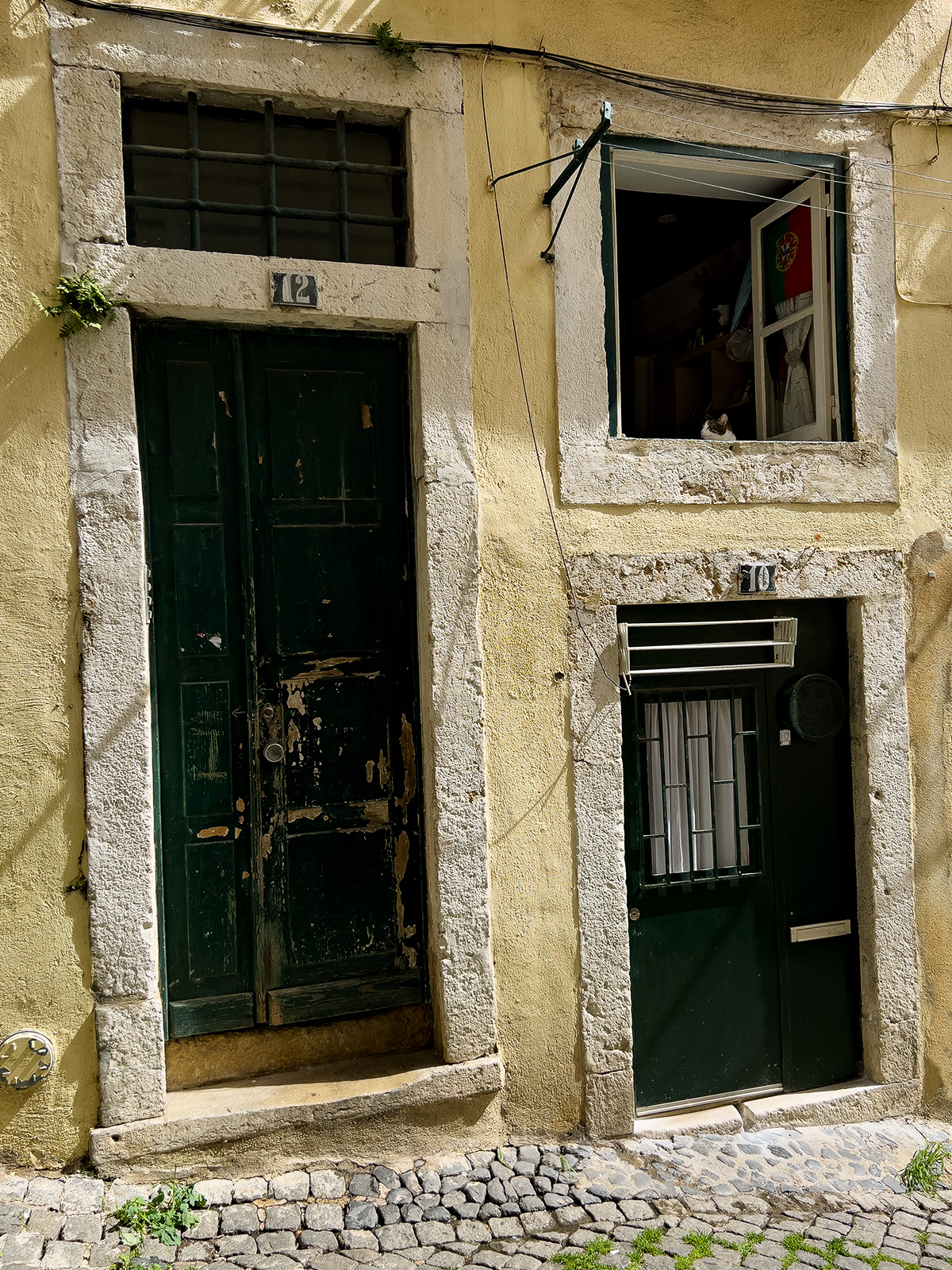
Kieu-Hanh, What an interesting building. It does have the look of a temple yet there is a sign (in English, no less!) that it is a bar. Very colorful and interesting. I personally am struggling with the perspective of looking up at it. I would prefer to see it from farther away so that it is more straight and grounded. I am enjoying all of your travel images! |
Jan 16th |
| 3 |
Jan 26 |
Comment |
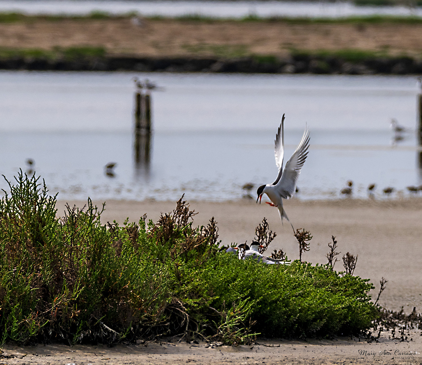
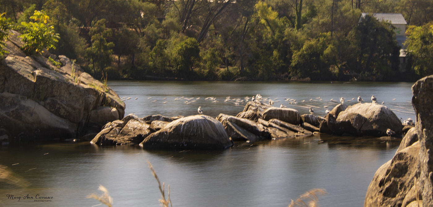
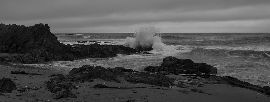
Ruth, I love this! We went to Yellowstone several years ago and saw only one moose in the brush and I have wanted to see a moose ever since! This image captures some reflection in the water and the look of the calf towards the mother. Just precious! I think you could get by without such a tight crop to show more of the environment but both tell a great story. |
Jan 9th |
| 3 |
Jan 26 |
Comment |
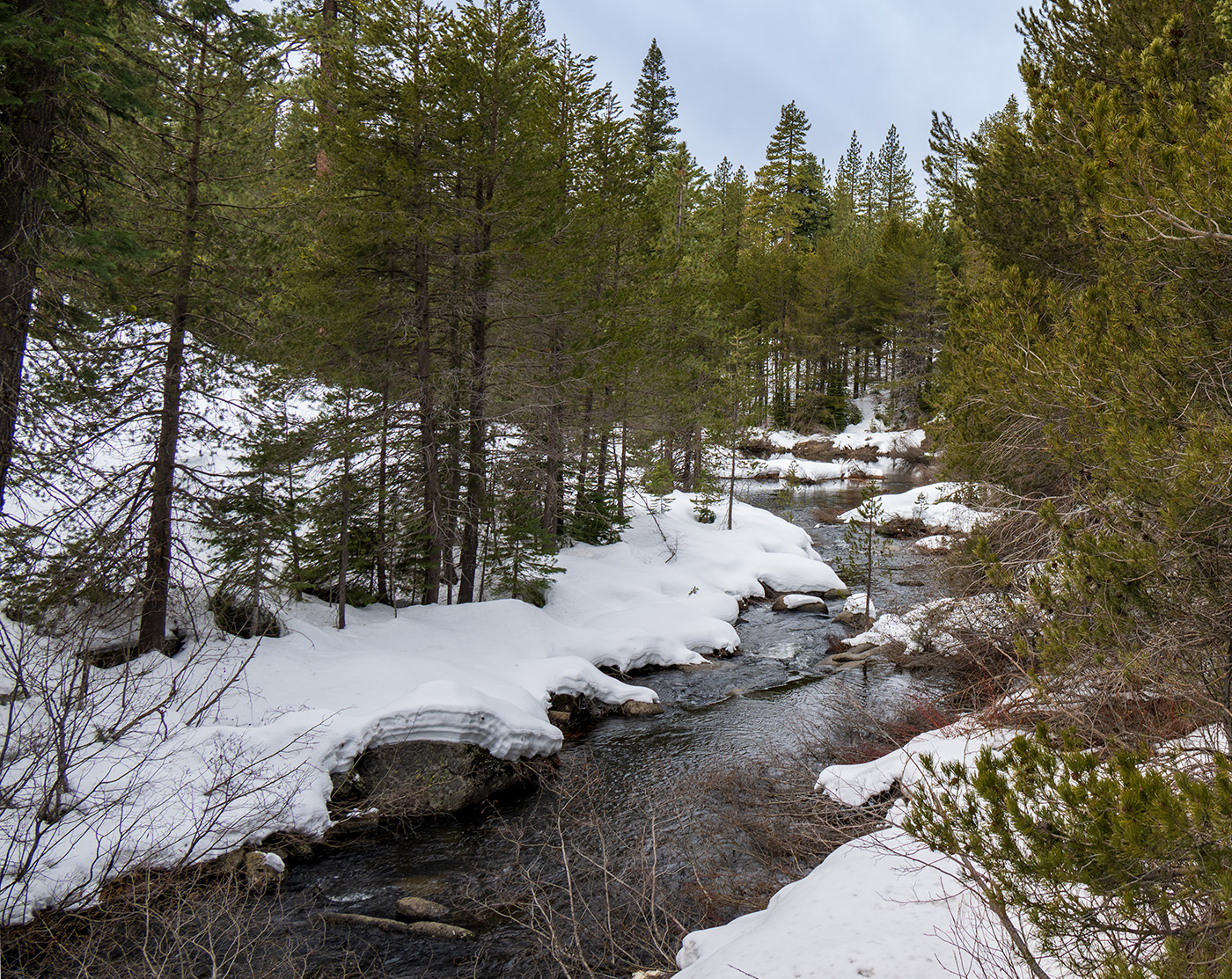
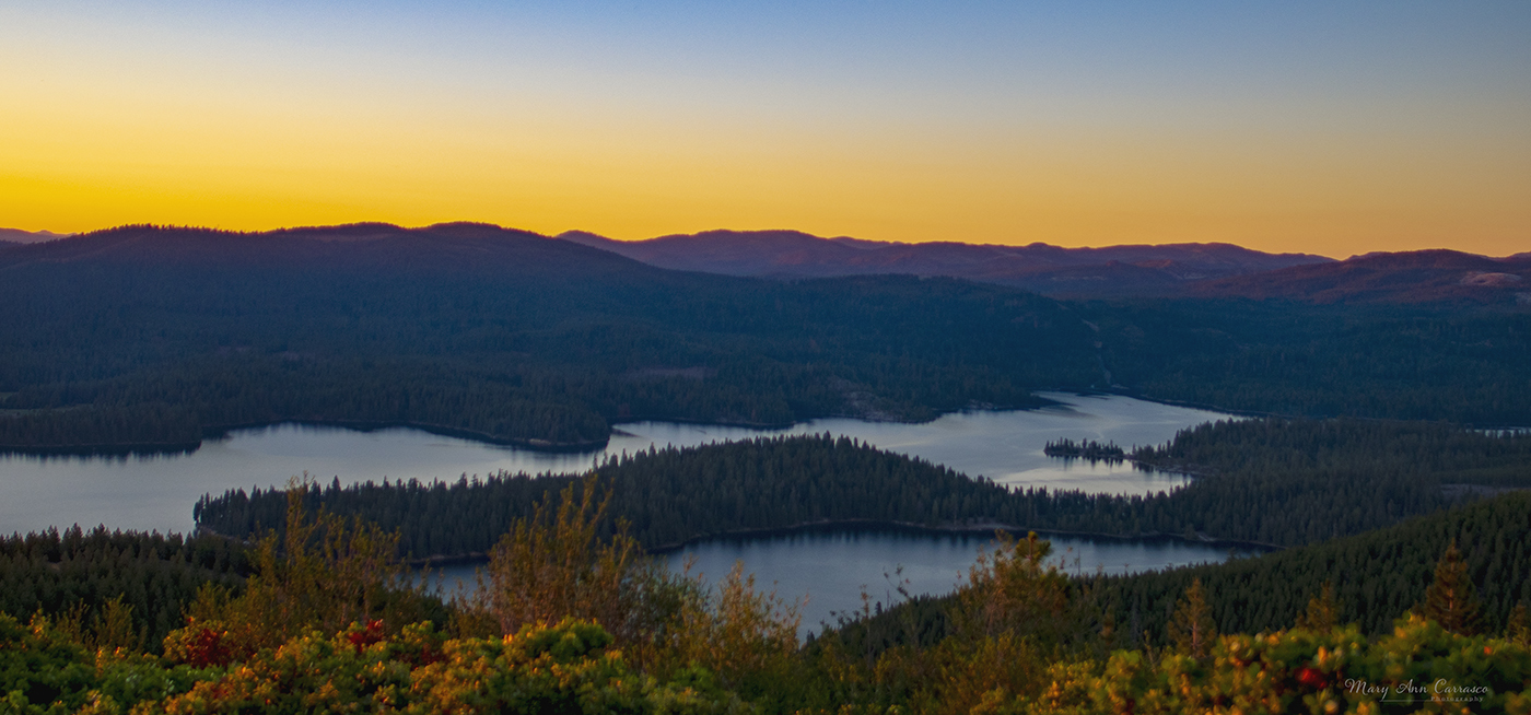
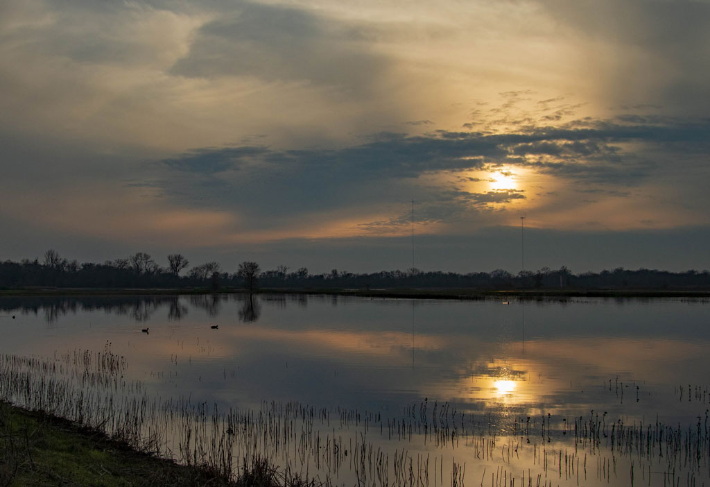
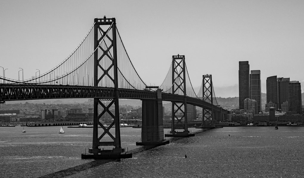
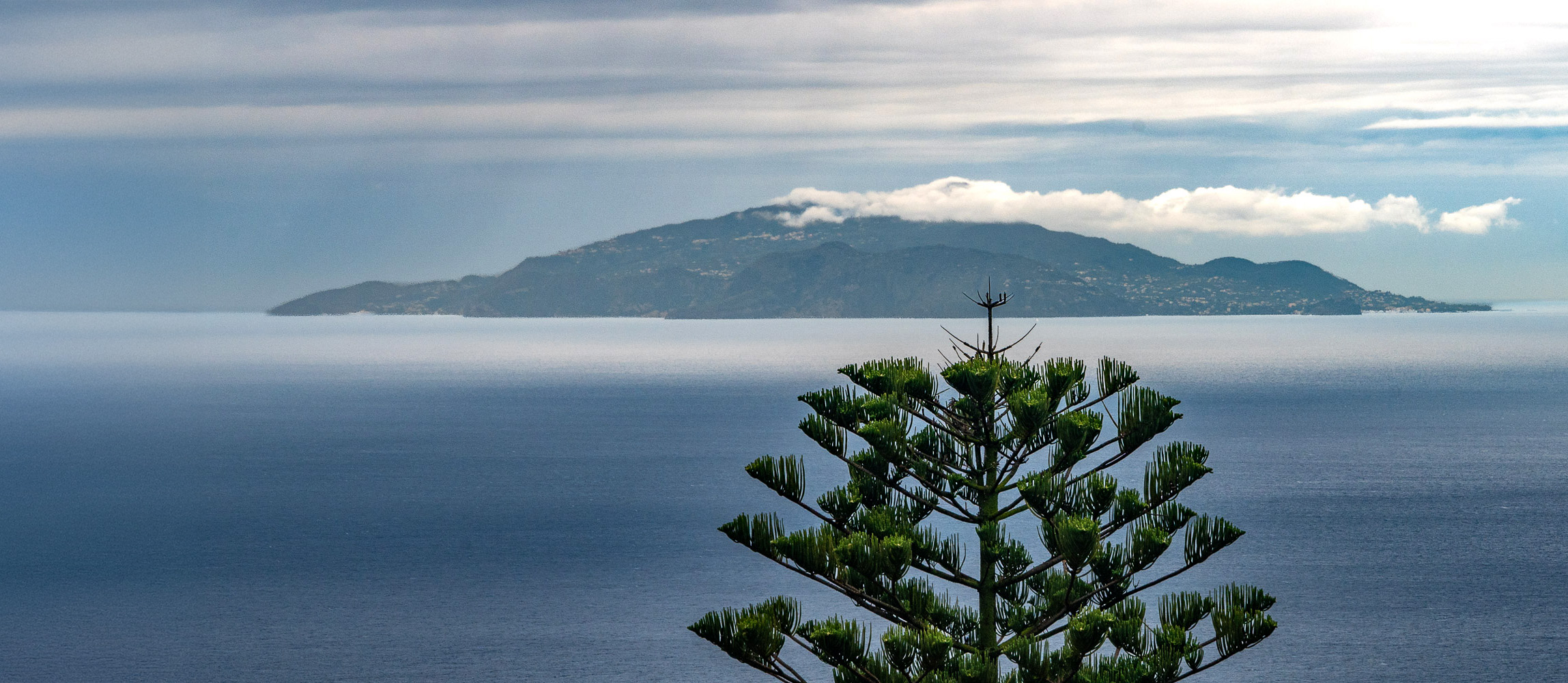
Robert, what a peaceful, lovely landscape to photograph. I like the color/detail of the tree in the foreground, the clouds over the island and the serene feeling. My preference would be to leave more of the tree in the photograph. I played with your edited version a bit because having the tree in the center took away from the island and clouds for me. I cropped the right and expanded the left a bit with generative fill after I used dehaze. Let me know your thoughts. |
Jan 9th |
 |
| 3 |
Jan 26 |
Comment |
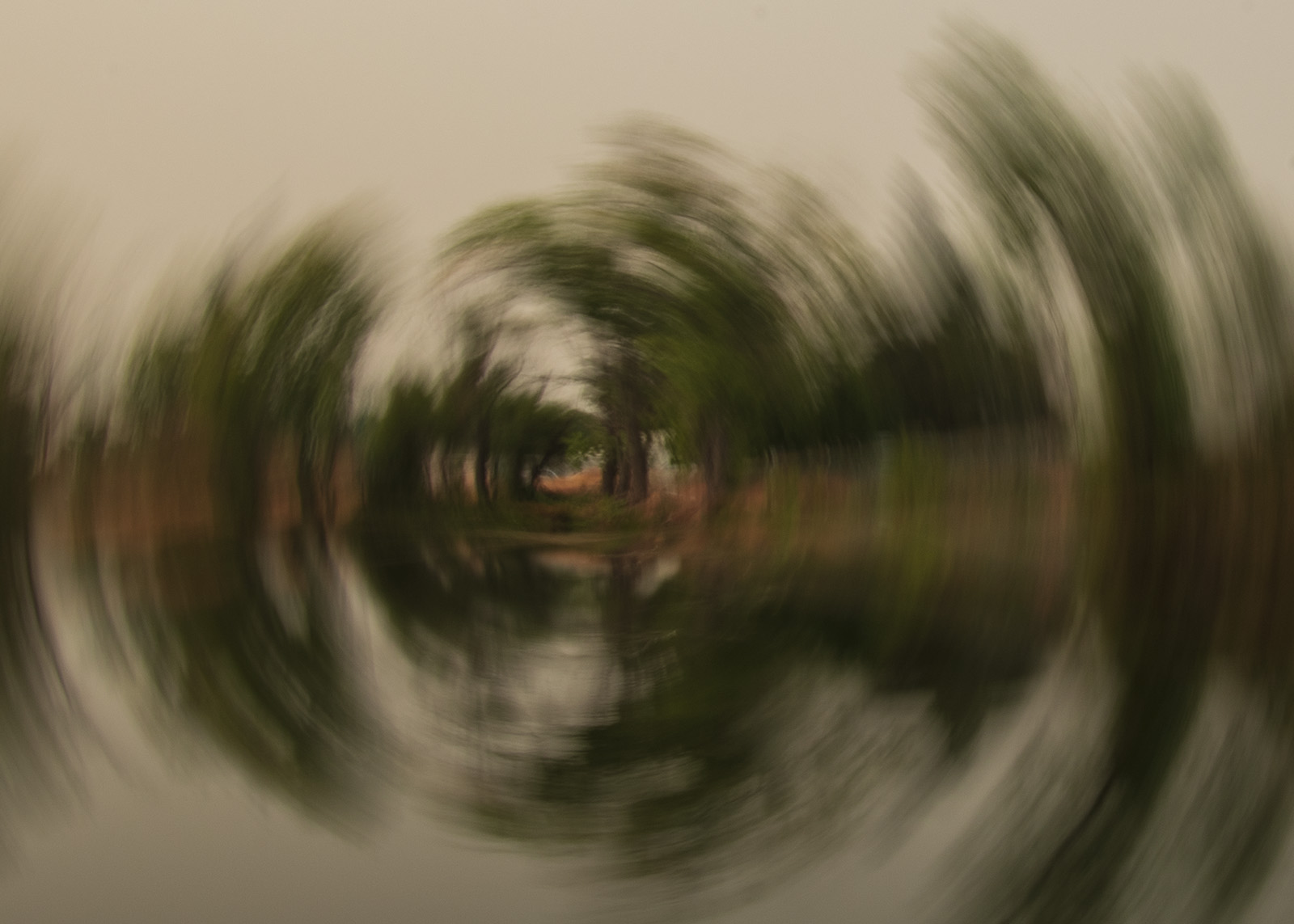
Joan, very interesting abstract image. The geometric patterns are not all symmetrical which adds more interest. My only idea is to add a bit more contrast but that is just me. Very interesting and nicely done. |
Jan 9th |
| 3 |
Jan 26 |
Comment |
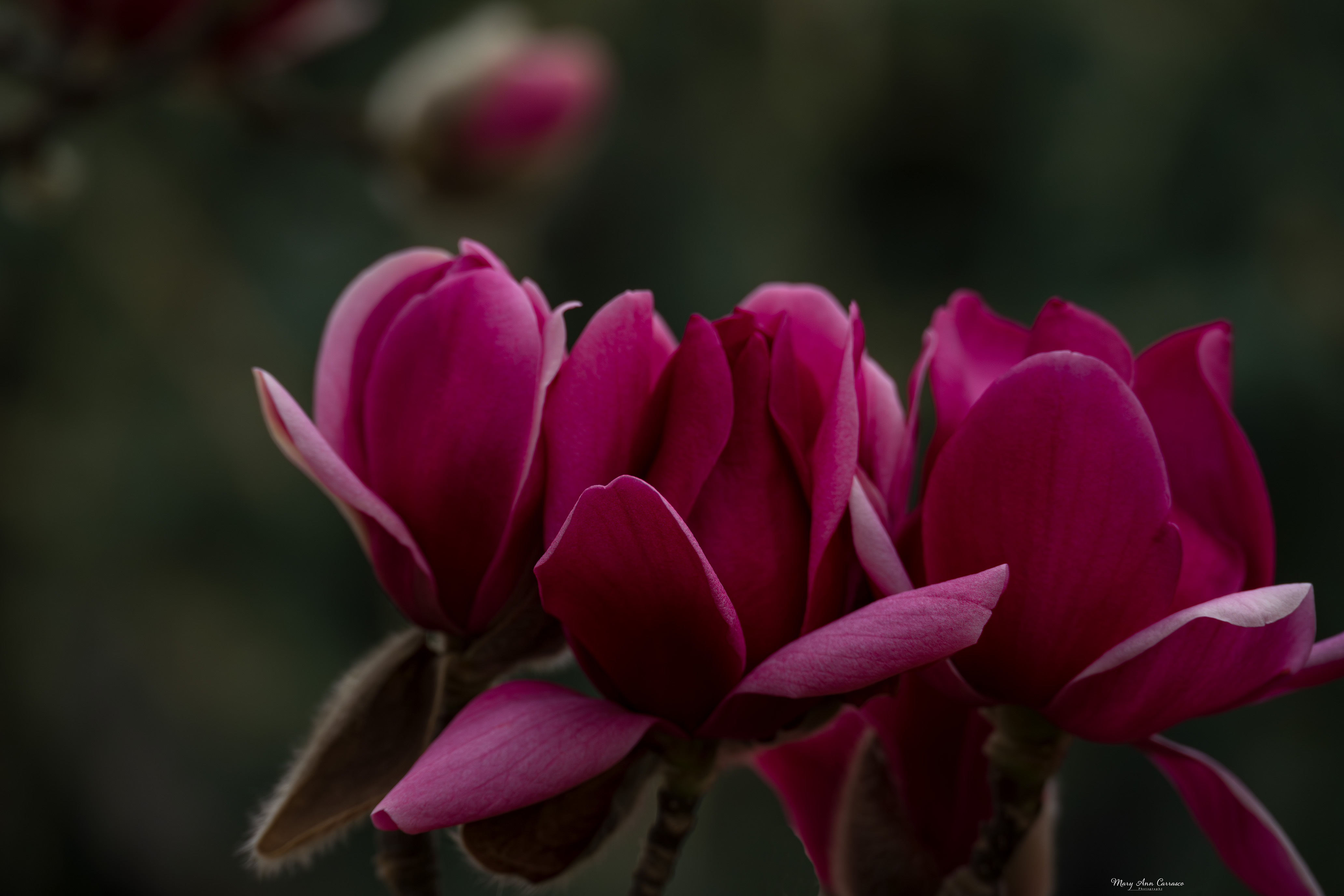
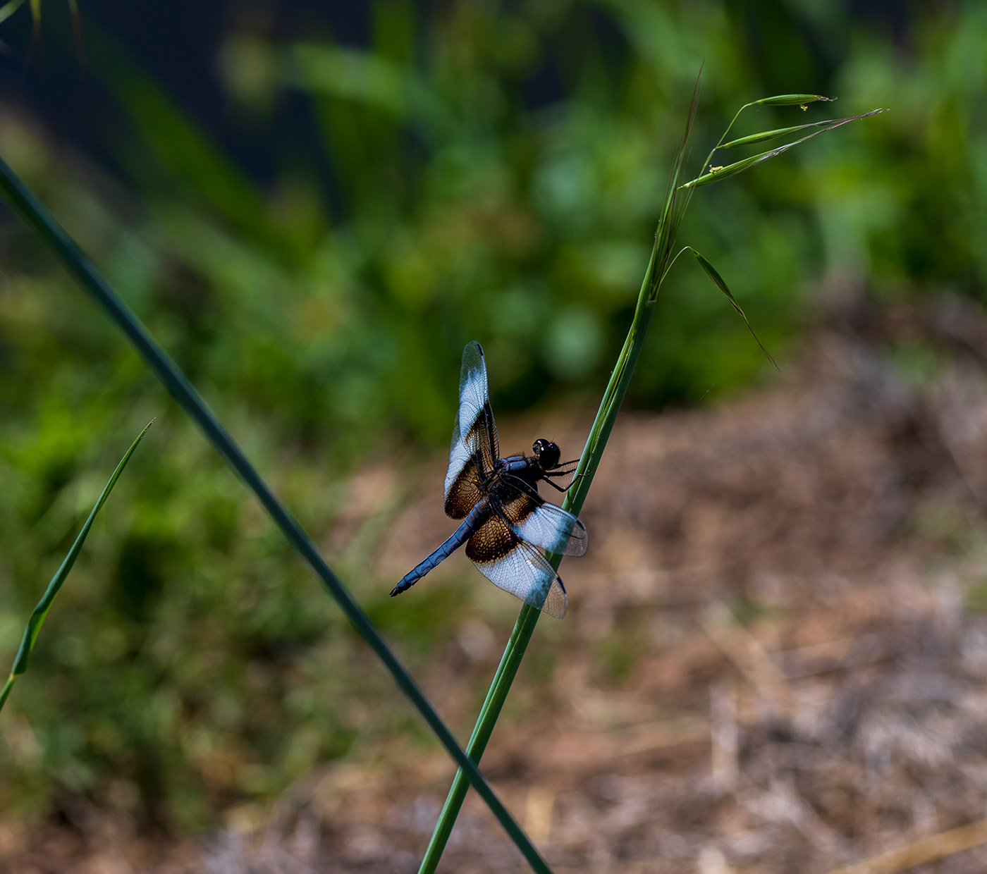
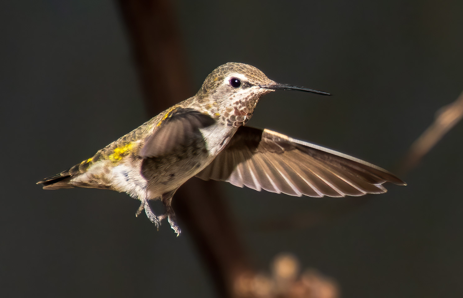
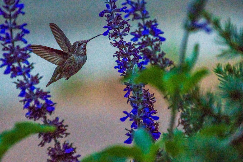
Andres, your editing has certainly brought out the color and detail of the cicada. The translucent wings and bright green are very pleasing to the eye. The texture of the tree, yet, blurred brings out the subject as well. I like that you added to the top of the frame so that there is some room above antennae. Nice image. |
Jan 9th |
| 3 |
Jan 26 |
Reply |
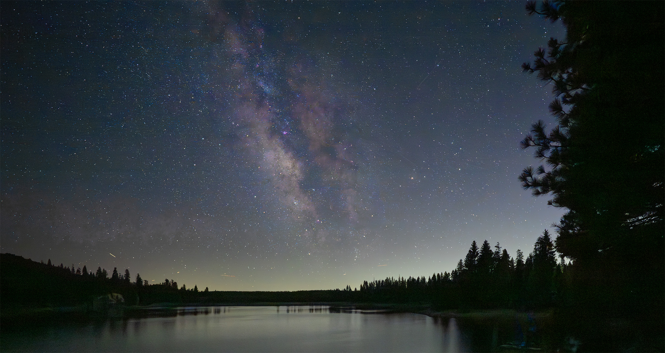
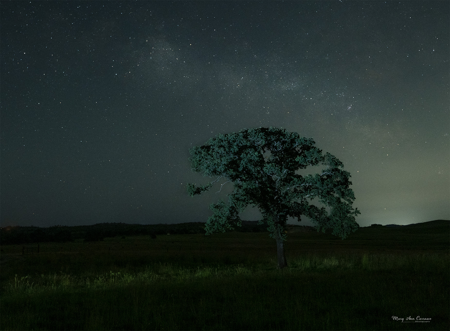
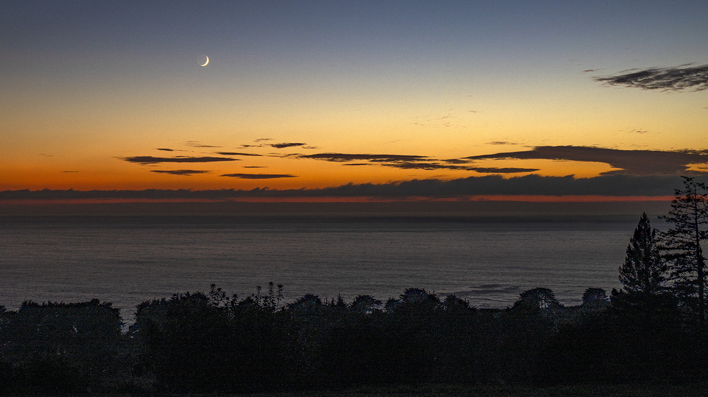
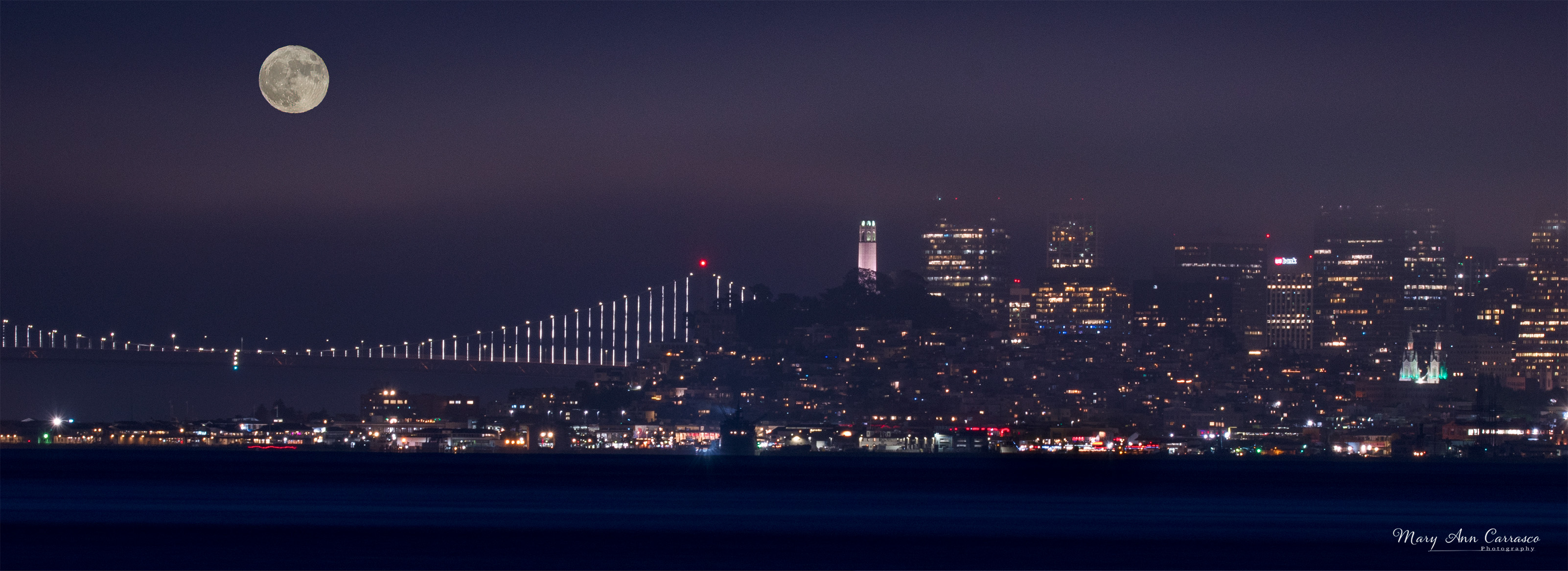
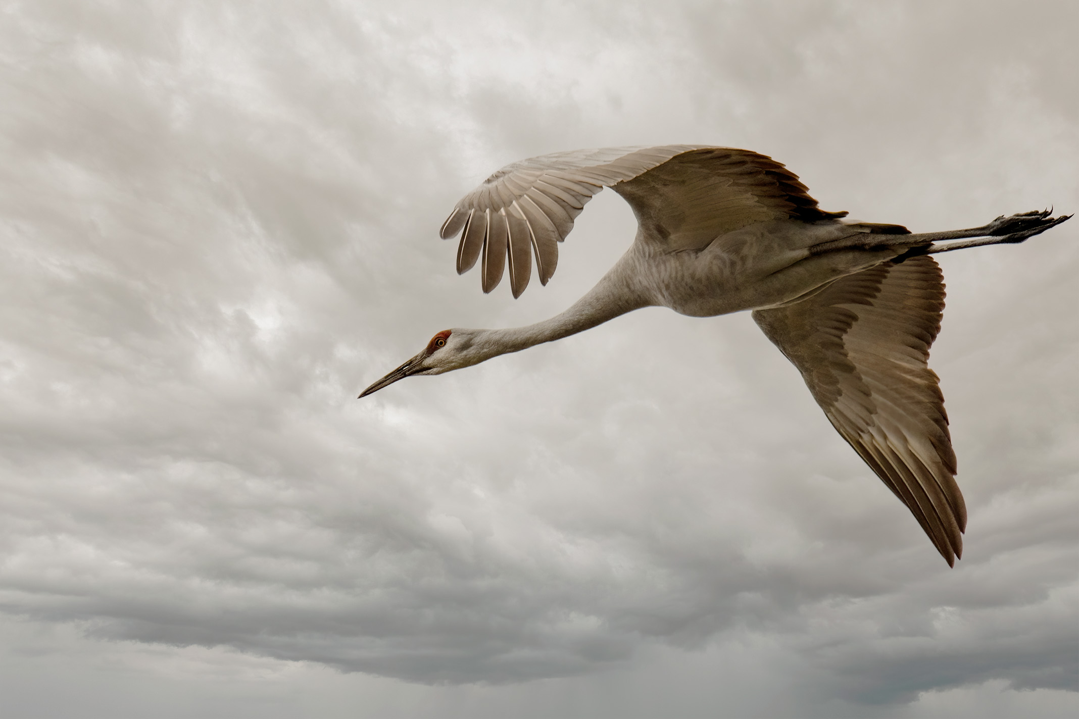
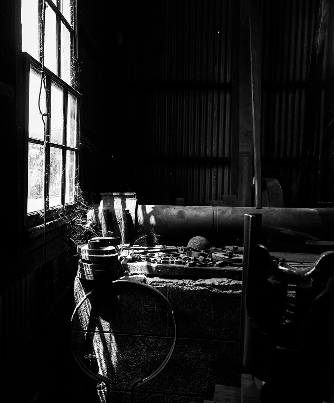
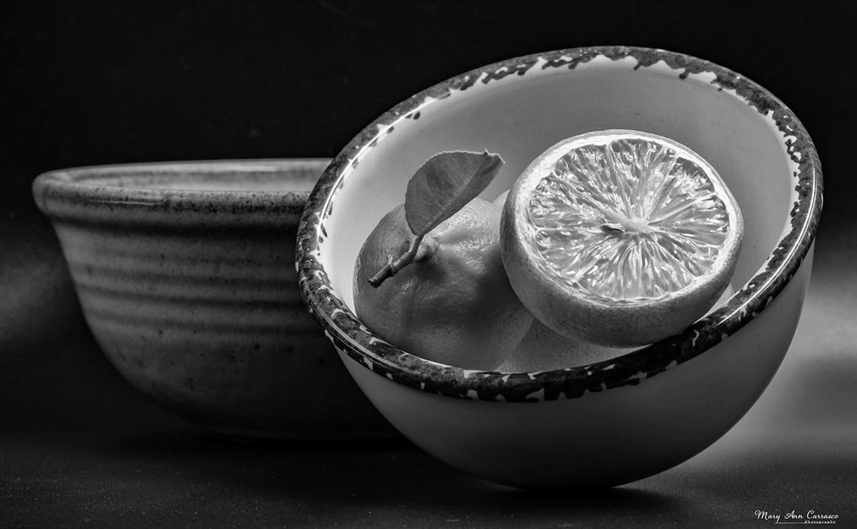
Thank you, Ruth. I just took a look back at the tiff file to see what I did besides lighten the foreground. I used the hue/staturation adjustment on the milky way itself to bring out some colors. I rented the lens because it was a f/2.8 to bring out more light. I don't own a lens that is good for milky way photography. I guess, ideally, f/1.4 and a prime lens would work best. |
Jan 9th |
5 comments - 4 replies for Group 3
|
| 39 |
Jan 26 |
Reply |
Thank you for your suggestions and comments. |
Jan 16th |
| 39 |
Jan 26 |
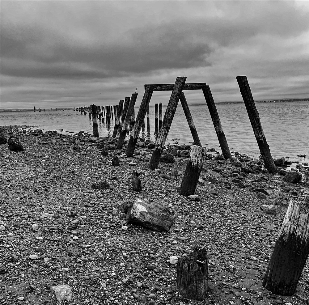
Comment |
Vincent, this works well in black and white. I am glad you shared the story behind it. I am struggling with the perspective. I wonder how it would work if you captured it from afar showing the structure in the ground. There are many possibilities here with the patterns and close up options as well. Interesting subject to work with. |
Jan 16th |
| 39 |
Jan 26 |
Comment |
Paul, thank you for sharing the story behind this image. You have done a nice job with light painting and composition. The fabric in the lower left does not bother me as it gives some placement to the clarinet almost as if it is in a case with protective material around it. The tonal quality is nice and I like the diagonal position of the instrument. Nice image |
Jan 16th |
| 39 |
Jan 26 |
Comment |
Adrian, you have captured a nice architectural shot with added bonus of the people. I agree with Bob that it would not work well without the people. To have them taking the photo and the salute is another bonus. The composition is nice having the people in the lower right third. I think the added contrast works well but her dress then is too dark for my taste and she blends into the background. I think it might work using selections and adding the contrast to specific areas. I see some have commented on the red dress and I know you can convert to black and white and leave a bit of color. Some do not like that effect but it may work well with this image. Nice architectural/street photo! |
Jan 16th |
| 39 |
Jan 26 |
Comment |
Bob, interesting and provocative image! I like the composition especially the three triangles of light across the bottom edge. My eye keeps going to the white halo of light in the upper left third, but I like it as it breaks up the pattern. Nice contrast too. I have used focus stacking in my Nikon Z9 and then use photoshop to blend the images. Does helicon work better? |
Jan 16th |
| 39 |
Jan 26 |
Comment |
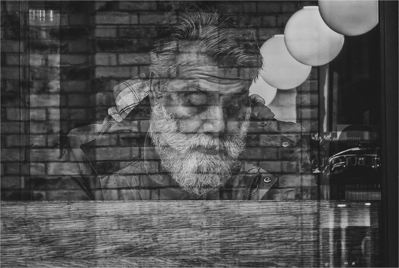
Paul, great reflection image. I like all the textures and the intense concentration on the face of the gentleman. I added some contrast and took down the brightness on the two lights nearest his face just to see what it would look like and give me some photoshop practice! |
Jan 11th |
 |
| 39 |
Jan 26 |
Comment |
David, I really like this image. The frame within a frame is very pleasing and leads one right into the image. The monochrome version makes the artwork on the tablecloth, pottery and painting stand out without the distraction of color. The border is a nice touch. Very nice image! |
Jan 11th |
| 39 |
Jan 26 |
Reply |
Thank you for your comments. |
Jan 11th |
| 39 |
Jan 26 |
Reply |
Thank you for your comments and suggestions. |
Jan 11th |
6 comments - 3 replies for Group 39
|
11 comments - 7 replies Total
|