|
| Group |
Round |
C/R |
Comment |
Date |
Image |
| 3 |
Nov 25 |
Comment |
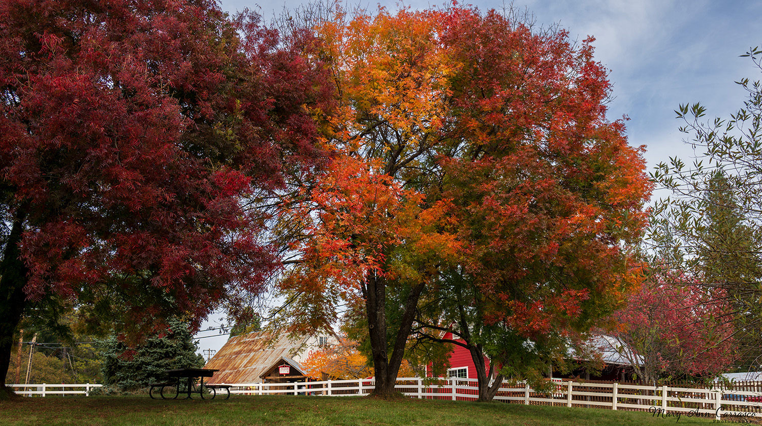
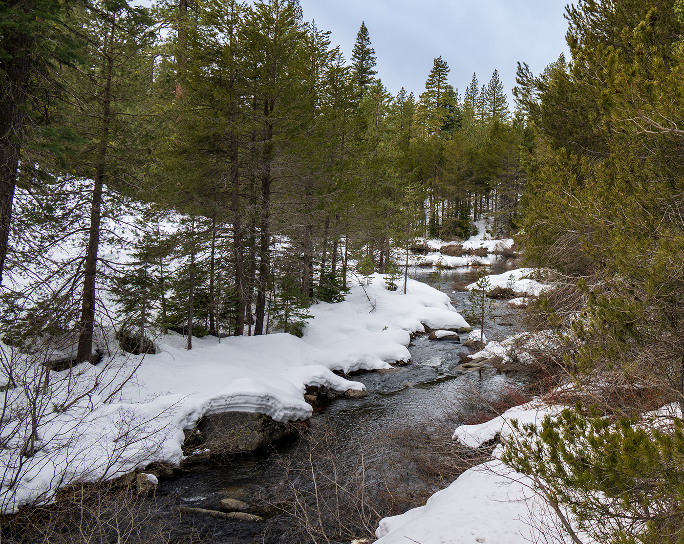
Joan, your revised version of this image really brings out the autumn colors of the California Sierras. The composition works well with the trees and all the leading lines to them. Very nicely done! |
Nov 14th |
| 3 |
Nov 25 |
Comment |
Kieu-Hanh, very nice travel image. Nice composition, lighting and tells a story. I feel when viewing this image that the miner is about to take a swing. Very well done |
Nov 14th |
| 3 |
Nov 25 |
Comment |
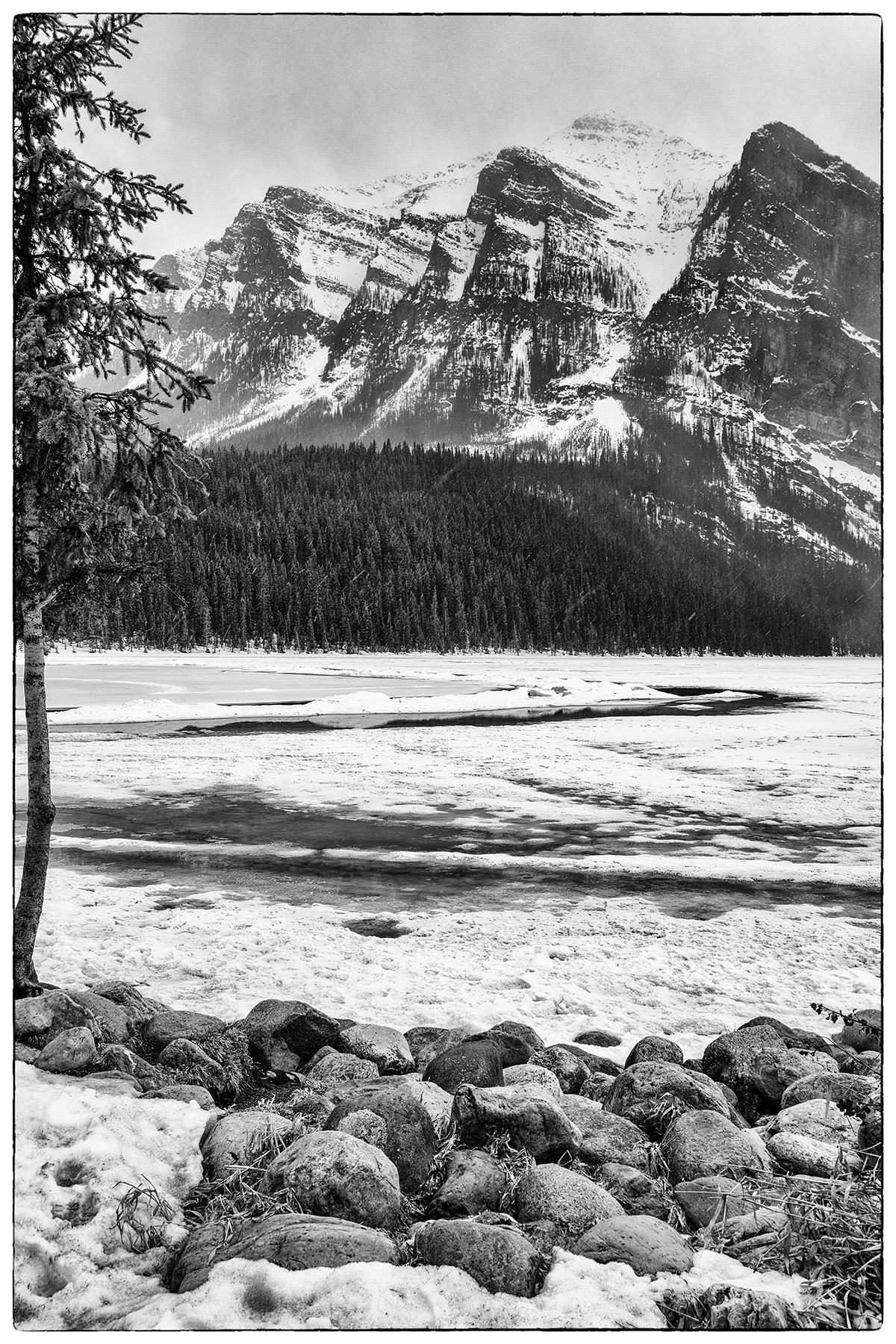
Ruth, another beautiful landscape image from Colorado! I really like the capture of the reflections in the water and the way you slowed down the waterfalls. I appreciate your explanation of leaving in the white branch as I had the same reaction as Joan. But, I understand now and agree with your version. I also like your re-edit in response to Kieu-Hanh. Lovely image. I feel like I visit Colorado each month and it is a joy! |
Nov 14th |
| 3 |
Nov 25 |
Comment |
Robert, what an experience. I like how you captured the scene as the background and buildings on the hill let the viewer know it is Italy. I struggle with skies too and I think Ruth has done a nice edit in that the trees and buildings are still very visible yet not prominent. |
Nov 13th |
| 3 |
Nov 25 |
Comment |
Andres, this image tells a great story. I like how the women are so engaged with the seller and looking so intently at the yarns with both right arms bent the same! I like the edits you did to bring out the colors and the detail of the yarn in the foreground and of the women. Your crop works well. Very nice! |
Nov 13th |
| 3 |
Nov 25 |
Reply |
Andres, thank you for your comments! |
Nov 13th |
| 3 |
Nov 25 |
Reply |
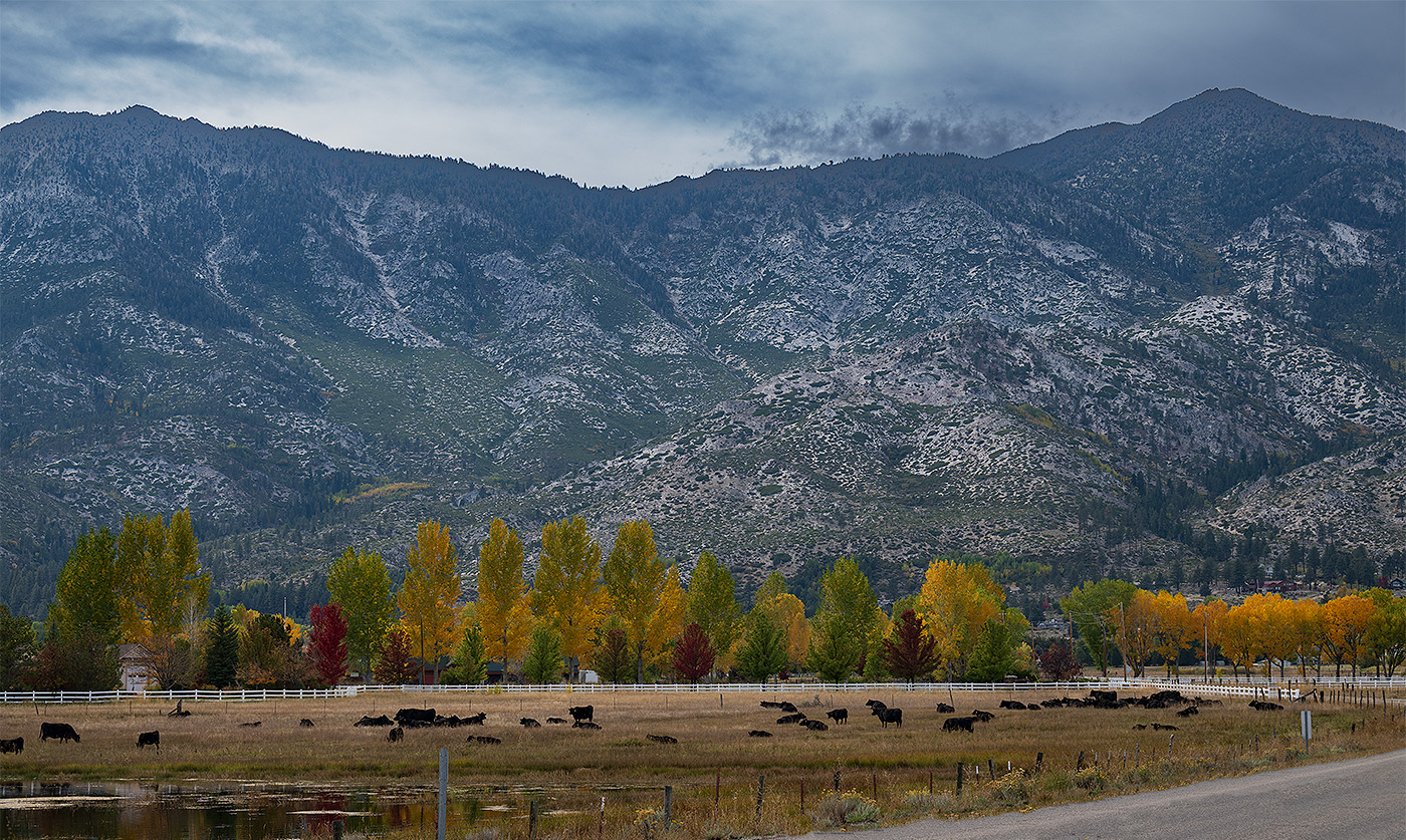
Joan, thank you for your comments! Hope Valley is 20 miles from Lake Tahoe's south shore in Alpine County. If you google it, a map comes up and you can se it is on Highway 88. |
Nov 13th |
| 3 |
Nov 25 |
Reply |
Ruth, thank you for your comments! |
Nov 13th |
| 3 |
Nov 25 |
Reply |
Hi Kieu-Hanh, Thank you for your comments and the suggestion...I see it now! |
Nov 13th |
5 comments - 4 replies for Group 3
|
| 39 |
Nov 25 |
Comment |
Vincent, I enjoy your images of dancers very much! This is a very nice one with the position of the dancers, the light and shadows. I agree that a bit more contrast will make it stronger. Very nice image! |
Nov 14th |
| 39 |
Nov 25 |
Comment |
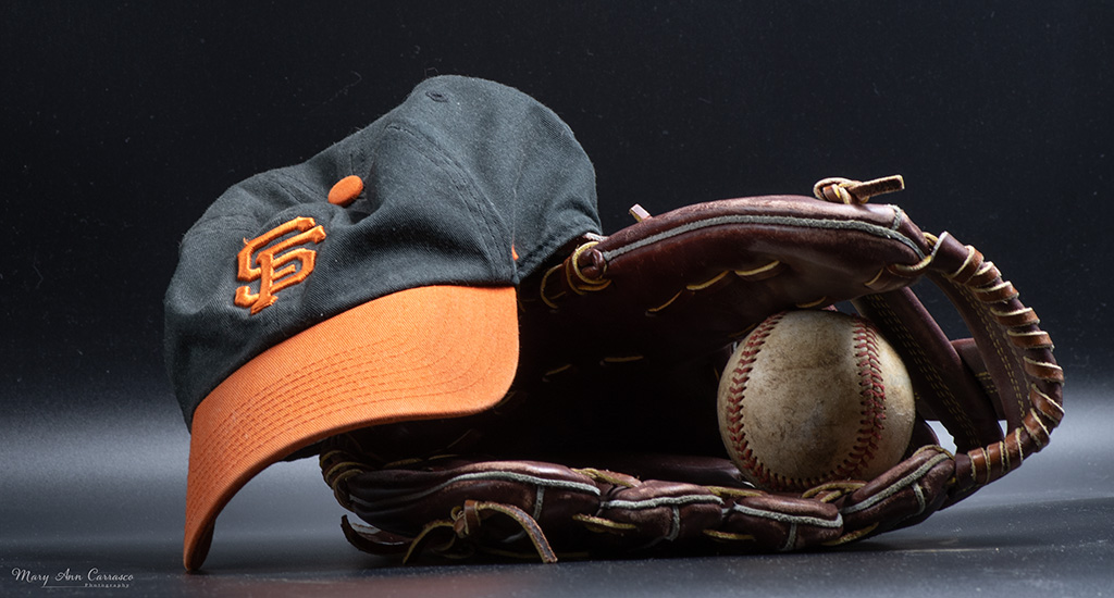
Paul, this is a clever image and I like it very much. When I first viewed it, I thought the hat was sitting on a ledge or table so your summary of it made it all the more delightful. I think there is a lack of depth from the hat to the background and that is why it makes one look longer to figure it out! The black and white makes the textures of the pews stand out more. I agree with Bob that removing the table in the foreground will make it that much stronger. |
Nov 14th |
| 39 |
Nov 25 |
Comment |
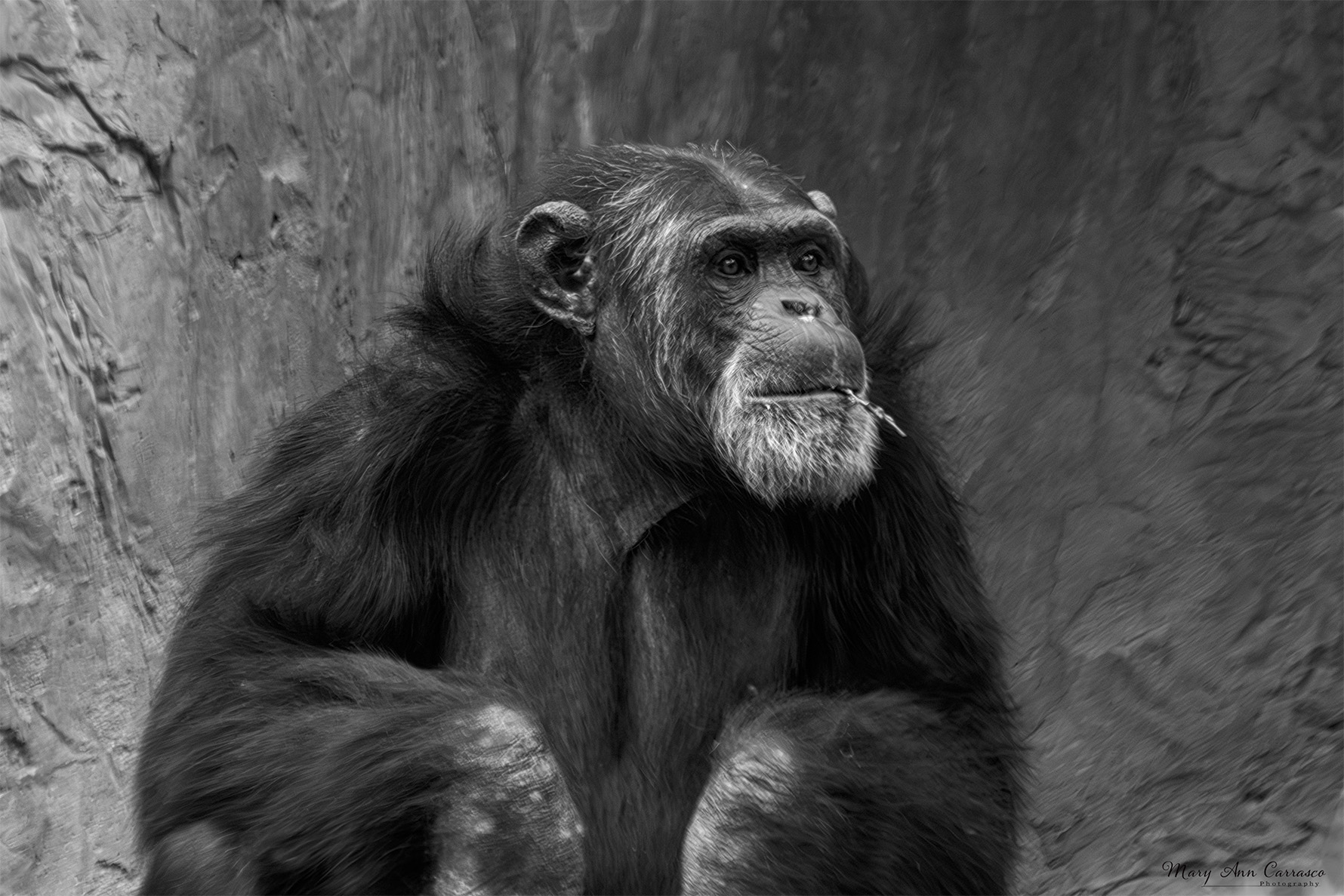
Adrian, I really like this image! You have captured a great moment of joy in the face of this fisherman. There is catch light in the eyes and his position is really nice. A great portait. I prefer the black and white version but I do like the light on the side of his face in the color version and that gets lost. Great portrait that tells a story! |
Nov 14th |
| 39 |
Nov 25 |
Comment |
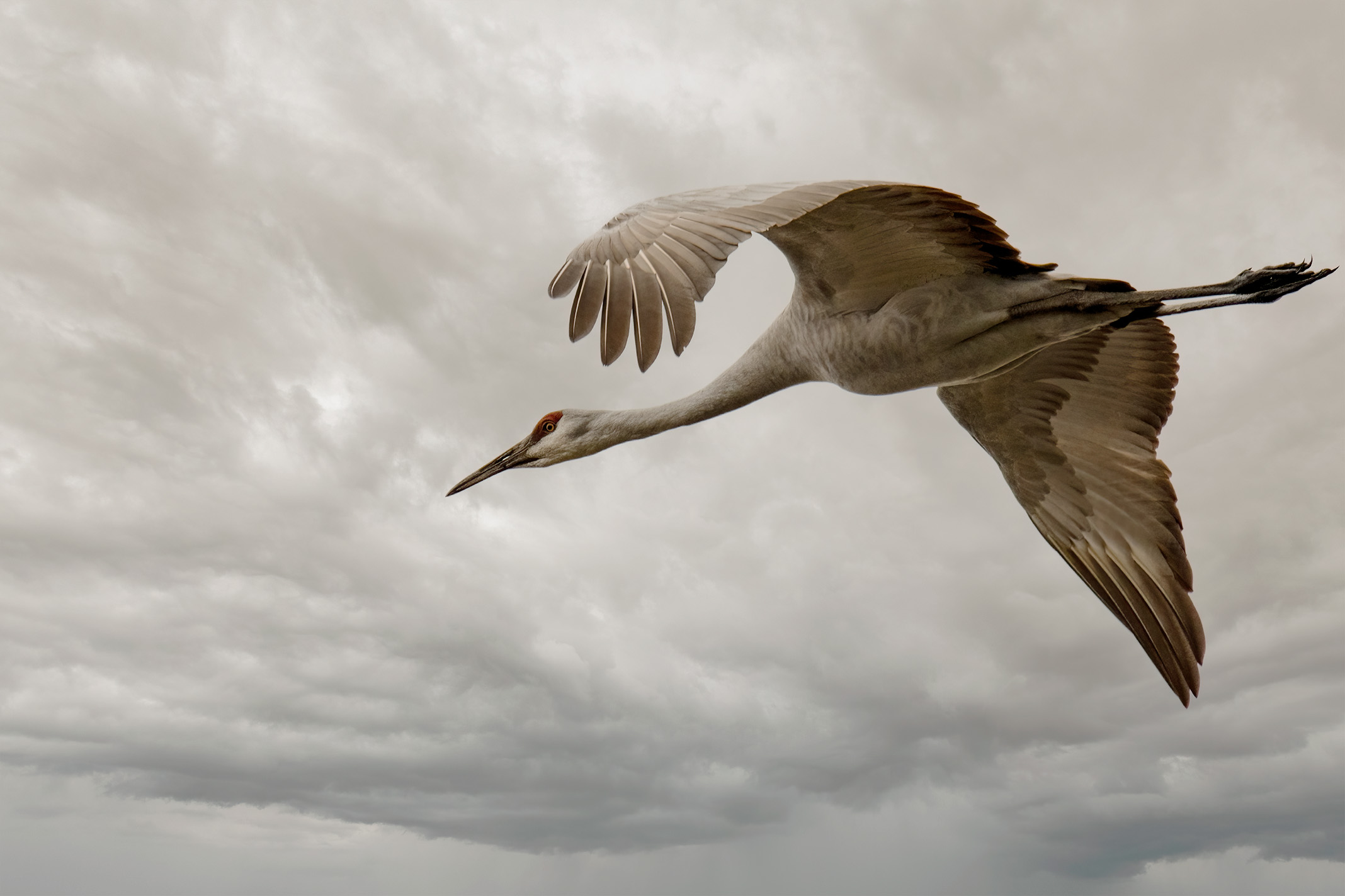
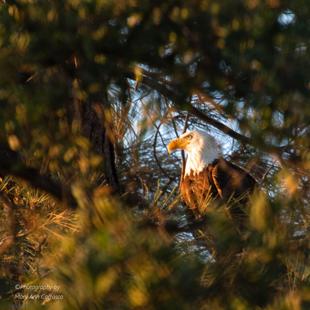
David, how creative! The original image of the eagle in flight is well composed and sharp. I like what you have achieved with the textured backgrounds as it feels very artistic/painterly. But, I also think that taking the original, removing the branches on the left and converting to black and white would be very nice and tell a different story. I took the original and used silver efex pro to change into monochrome just to see possibilities. |
Nov 14th |
 |
| 39 |
Nov 25 |
Comment |
Bob, I agree that the mono version is much stronger. The exposure is spot on and highlights the sign as well as the windows. I like the star effect of the street lamps. The mono version also brings out the different textures of the building. And, I like how you left in the buildings in the background as it brings out the juxtaposition of the old and new. Nice. |
Nov 14th |
| 39 |
Nov 25 |
Reply |
Bob, yes! It looks alot better to me. I really appreciate your feedback as I tend to struggle with post processing and obtaining the look I want. So, thank you! |
Nov 14th |
| 39 |
Nov 25 |
Comment |
Bob, thank you for the feedback. I went back into my edit and increased the whites and contrast. Does this version work better? |
Nov 13th |
 |
6 comments - 1 reply for Group 39
|
11 comments - 5 replies Total
|