|
| Group |
Round |
C/R |
Comment |
Date |
Image |
| 3 |
Oct 23 |
Comment |
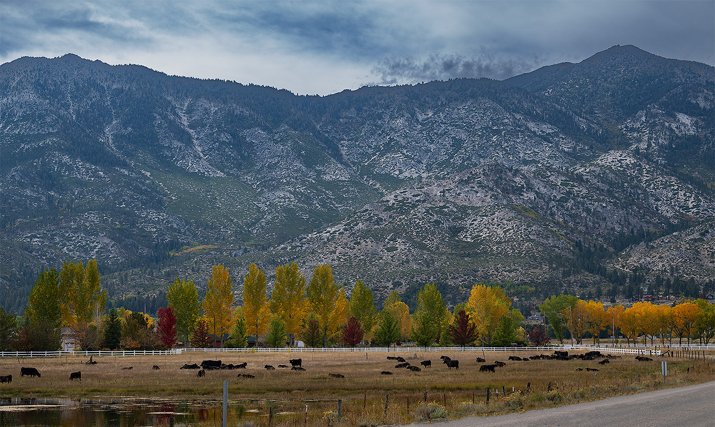
Kieu-Hanh, I see you have a beautiful image in the showcase! Congratulations and lovely fall image. I like the effect you used to make it painterly and with motion. Very nice! |
Oct 20th |
| 3 |
Oct 23 |
Comment |
Joan, I love Bodega Bay and all of the northern California coast! You have captured a beautiful view with the flowering ice plants in the foreground, the rocks with seaweed and, of course, the beautiful ocean in the background. I see you cropped it on the top only so I am curious why you chose portrait mode for the image. I can only imagine that you could not capture all you wanted in landscape mode. I do agree that a bit more on the left of image would be nice. Great capture of a beautiful place! |
Oct 18th |
| 3 |
Oct 23 |
Comment |
Hi Robert, I, too, am surprised that the okra plant has such a beautiful flower. The creamy white petals are a nice frame to the center and there is texture. The black background really makes the flower pop. I agree with the suggestions others have made but especially that the highlights on a couple of petals are a bit overblown. What I have learned is to expose for the highlights and you can bring up the darker areas in editing. Beautiful flower! Thank you for sharing it. |
Oct 18th |
| 3 |
Oct 23 |
Comment |
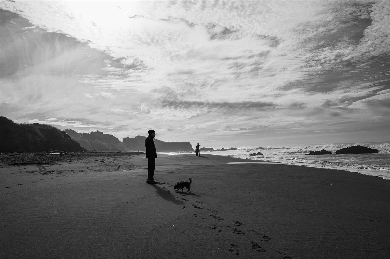
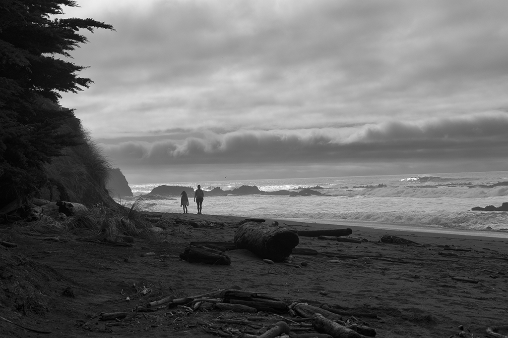
Ruth, what a great image and I like that you chose to convert it to monochrome. It is very dramatic with the contrast, the skeletal trees and the shadows of them. I also like the placement of the horizon and that you captured the waves coming in. I think this works better than blurring the water in this scene. Very nice! |
Oct 16th |
| 3 |
Oct 23 |
Comment |
Hi Kieu-Hanh, very nice conversion to monochrome. I am like Ruth in that I usually add contrast but I agree that this high key version really works. The symmetry of the lines with the darker horizontal ones lead the eye throughout the image. Very nice! |
Oct 16th |
| 3 |
Oct 23 |
Reply |
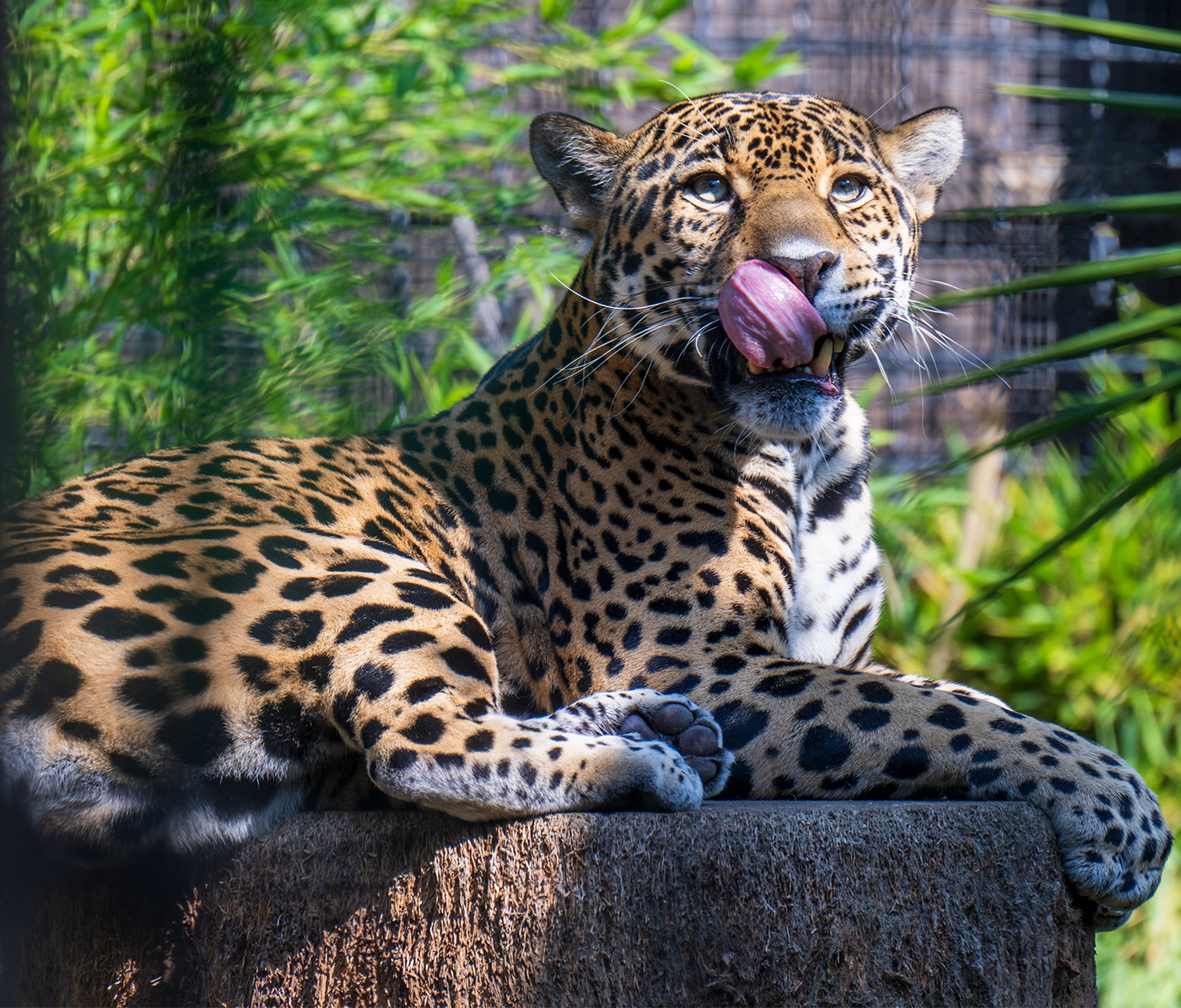
Thank you, Ruth. Yes, I couldn't believe that tongue...not sure if he was looking at me for lunch! Thank you for your suggestions. |
Oct 16th |
| 3 |
Oct 23 |
Reply |
Thank you, Michael, for your nice comments and suggestion. I had fun with this one and couldn't believe what I was seeing through the viewfinder! |
Oct 16th |
| 3 |
Oct 23 |
Reply |
Hi Kieu-Hanh, thank you for your nice comments and suggestions on the image. I see you have a great Fall image on the showcase this month....lovely image! |
Oct 16th |
| 3 |
Oct 23 |
Comment |
Hello Michael, Autumn is my favorite season and your image does it justice! Your editing is fantastic and I think you accomplished your goal of balancing the lighting and bringing out the shadows. I like the detail I can see through the window, the clarity of the pumpkins inside and then those beneath. It is very clear and sharp. I have learned alot in reading how you accomplished this....I, too, tend to do the global adjustments! |
Oct 16th |
6 comments - 3 replies for Group 3
|
| 50 |
Oct 23 |
Comment |
Hi Chuck, what a fun and whimsical idea. I like how you have them on a black blanket or tablecloth. I agree with Cindy and Lorna that positioning them interacting will provide more interest. I like the one on the left as he looks as though his hand is on his hip and the one in the background with arms raised. Lots of options here to play with. Fun image! |
Oct 18th |
| 50 |
Oct 23 |
Comment |
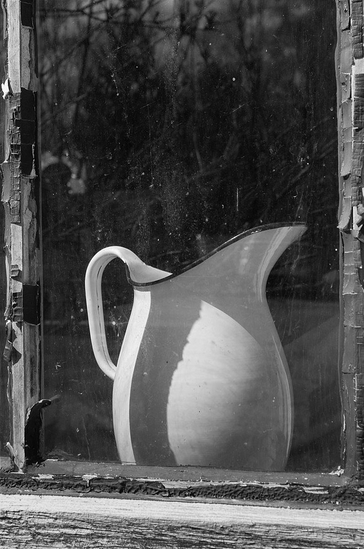
Hi Paul, I like this image of the pitcher in the old window. I agree that a wider view might work and cropping a bit from the top would focus on the pitcher. But I also thought the image did not have enough contrast so I played with it a bit by decreasing highlights, increasing contrast and used a linear gradient on the point from the top of the pitcher to the bottom window frame. It seems to show more of the reflection in the window which I found interesting. Just a thought and I look forward to your thoughts. |
Oct 18th |
 |
| 50 |
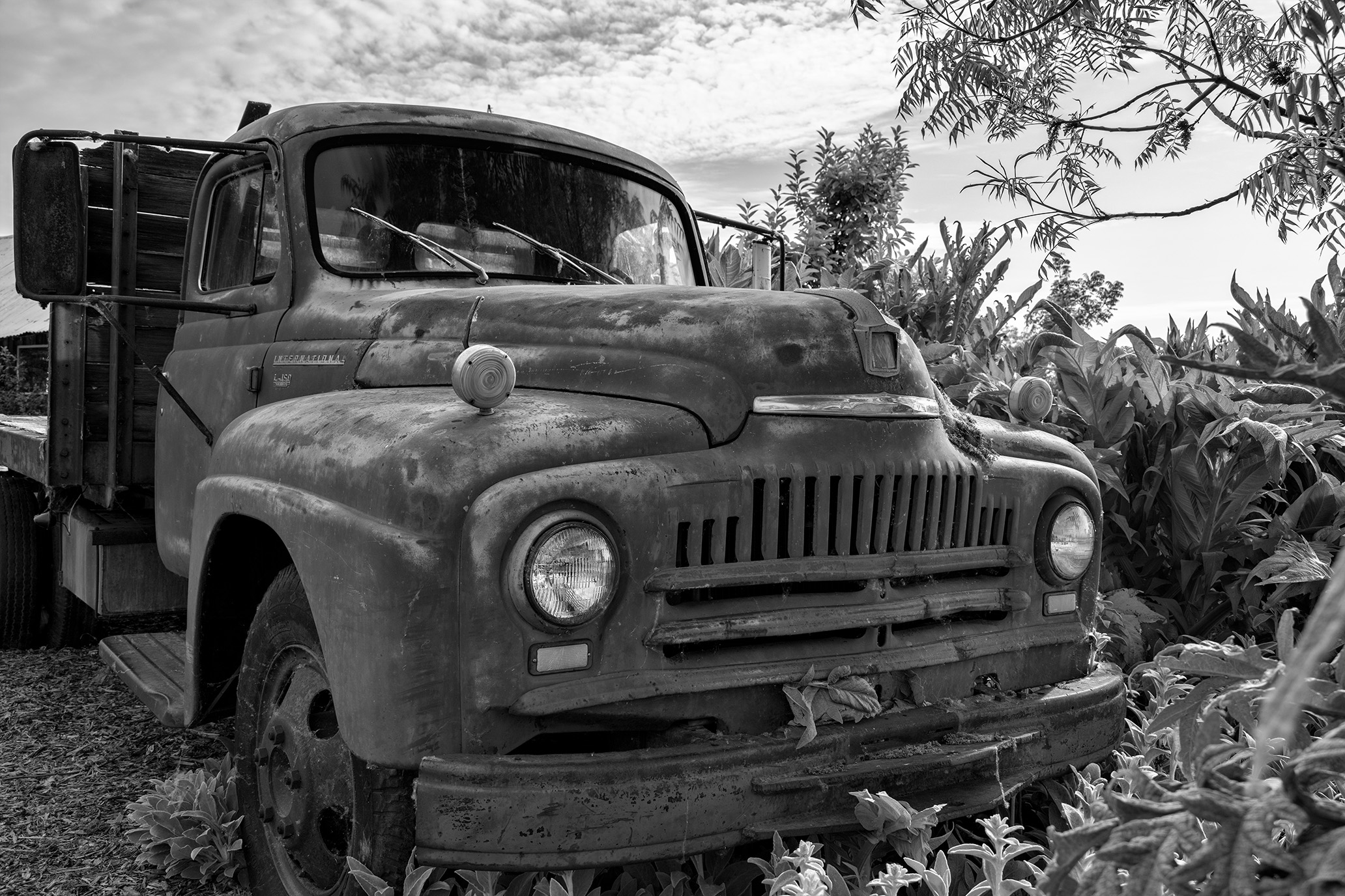
Oct 23 |
Comment |
James, I love old trucks and you have captured this one very well. I like the angle of the shot as it shows all the detail and leads my eye right through the frame. The phone number on the door tells the history! I feel leaving the space in front of the truck is nice and although it would be nice to have a bit more in the rear, I don't find it to be problematic. I like the detail, textures and angle. Very nice. |
Oct 18th |
| 50 |
Oct 23 |
Comment |
Cindy, Lovely image and your monochrome version really shows the textures in the background trees and the logs in the foreground. I agree with Cindy that the water blur is just enough. Very nice image. |
Oct 16th |
| 50 |
Oct 23 |
Comment |
Lorna, I like the idea of this image and the position from which you took it. I like how the petal in the lower left goes out of the frame. I do agree that it needs a bit of contrast as in Chuck's edit. Otherwise it seems too gray. |
Oct 16th |
| 50 |
Oct 23 |
Reply |
Chuck, I appreciate your take on the image vs. the original and the story. I think both tell a story...very different stories! I had to chuckle after reading your last line! |
Oct 16th |
| 50 |
Oct 23 |
Reply |
Lorna, thank you for your comments. |
Oct 16th |
| 50 |
Oct 23 |
Reply |
Thank you, Cindy. I do like your crop as it gives space for the subject to enter. Nice suggestions. |
Oct 16th |
5 comments - 3 replies for Group 50
|
11 comments - 6 replies Total
|