|
| Group |
Round |
C/R |
Comment |
Date |
Image |
| 3 |
Aug 23 |
Reply |
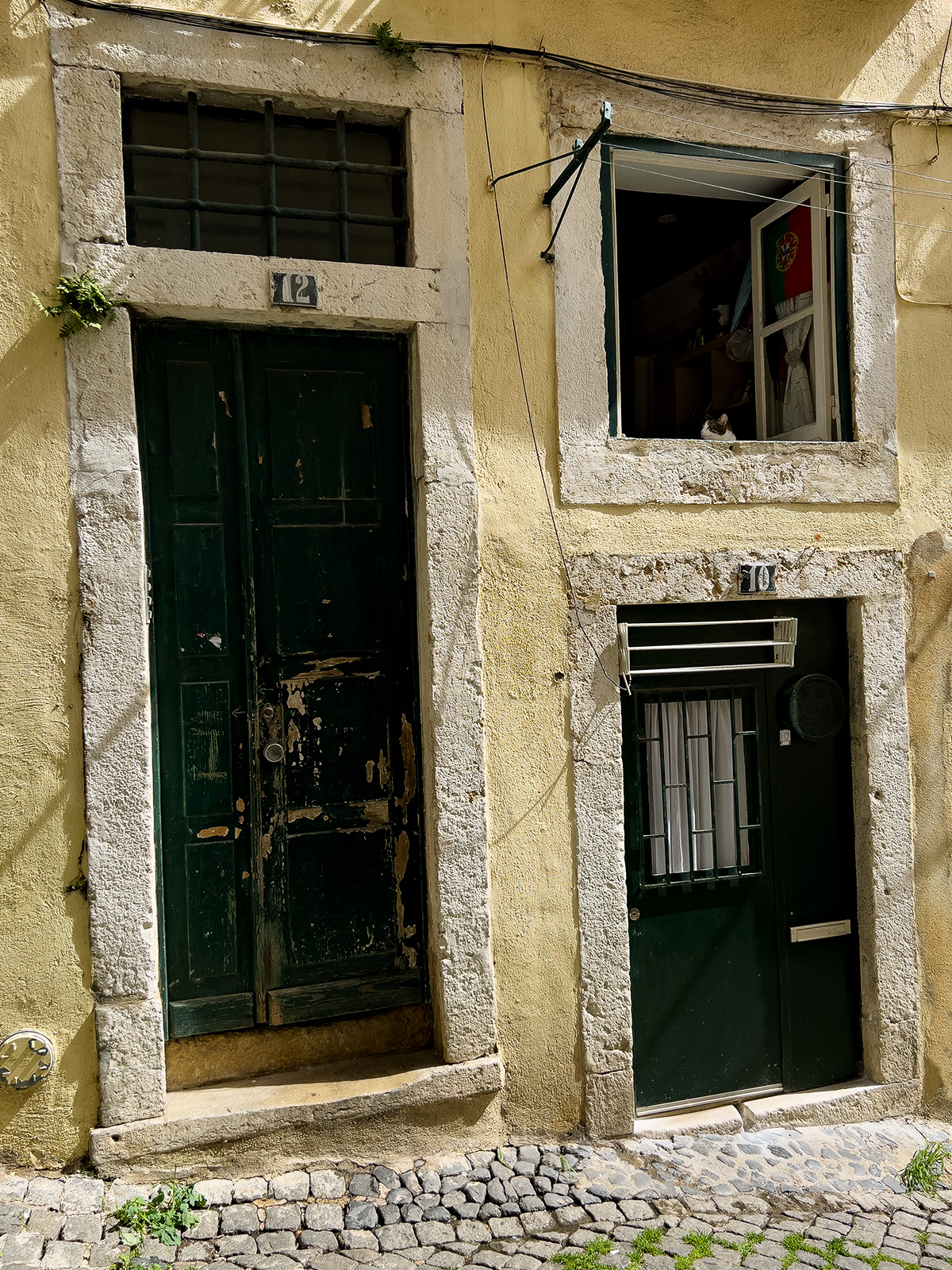
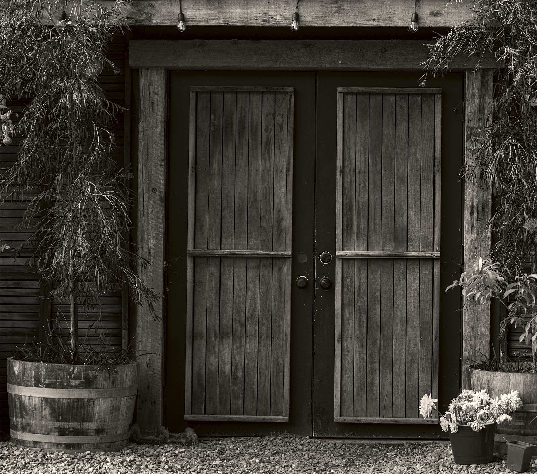
Thank you, Ruth, for your comments. No, I have no idea why the door height is so different between #12 and #10. I would certainly have to duck to enter #10! |
Aug 19th |
| 3 |
Aug 23 |
Comment |
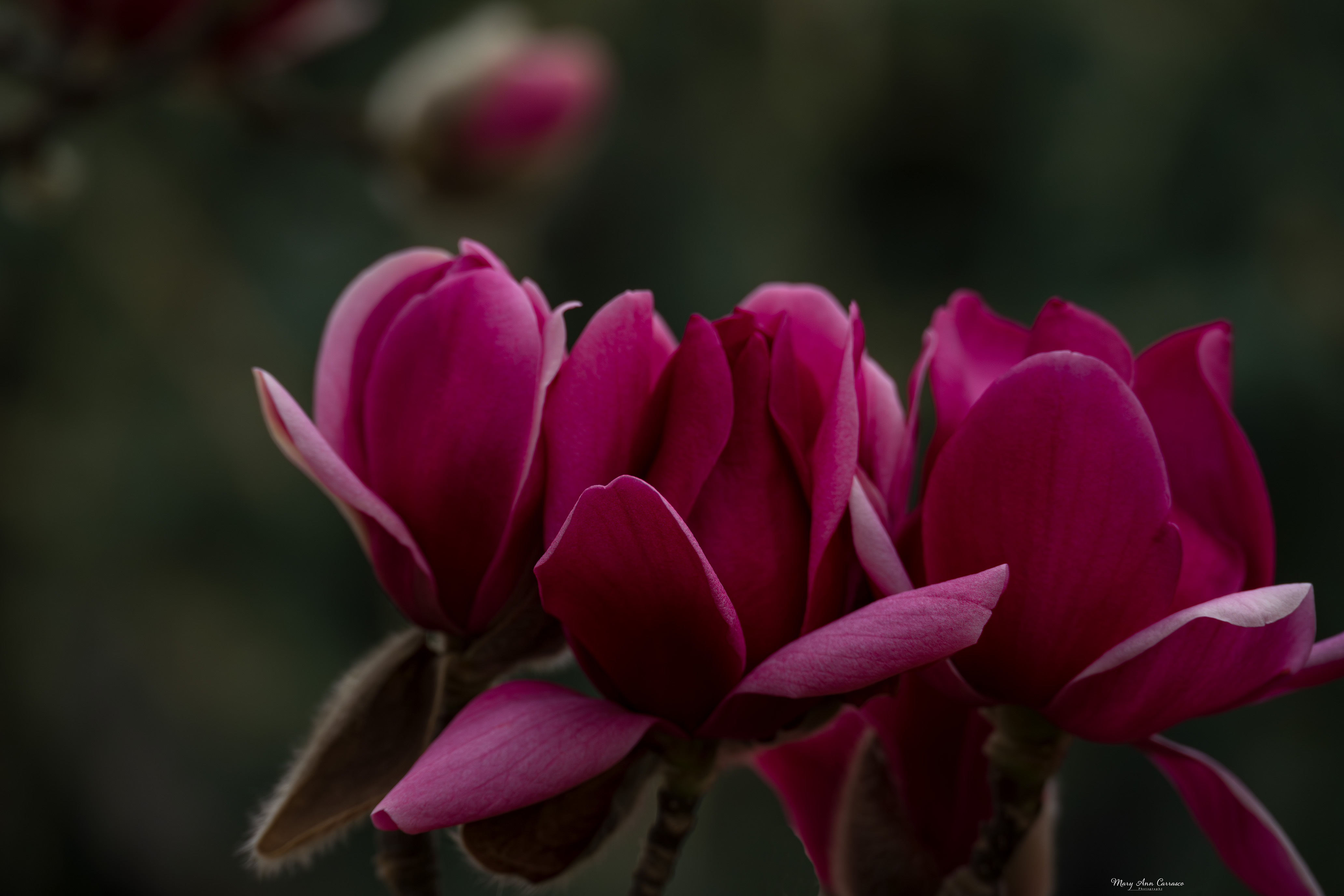
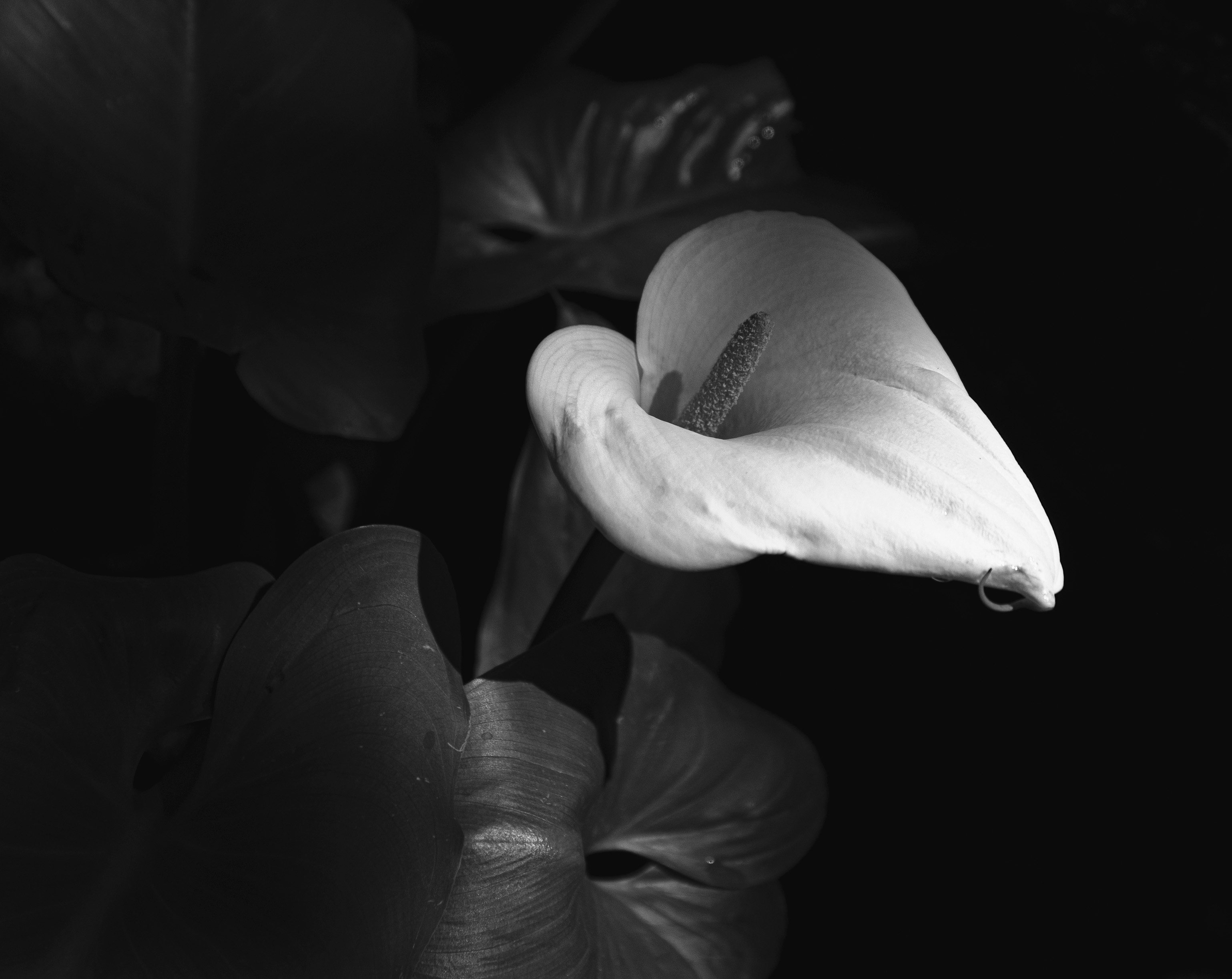
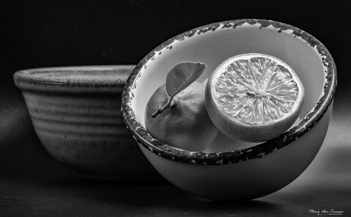
LuAnn, I really like this image in black and white. The flower really stands out and the detail within the petals with the light on it is just lovely. The composition is very pleasing in that the flower is definitely the main subject but my eye does wonder through the image to see the detail in the leaf above. I do not have any suggestions. Very nice edit on this image! |
Aug 14th |
| 3 |
Aug 23 |
Comment |
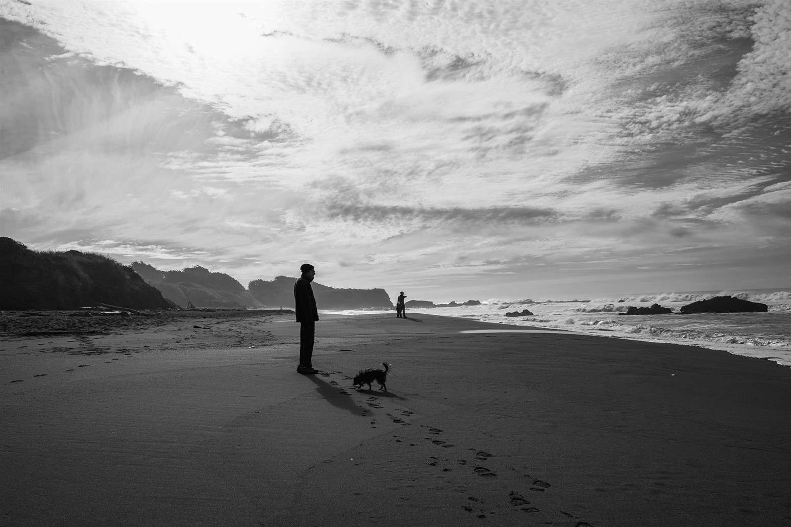
Hi Ruth, You met your goal of capturing the tundra blooms and the peaks in the background. The composition is nice with the curve flow of the rocks on the left leading into the mountain range and the shadows in the valley. My only thought is that I agree with LuAnn that the blue in the sky seems a bit too oversaturated. |
Aug 14th |
| 3 |
Aug 23 |
Comment |
Robert, welcome to Group 3! I have learned so much from participating in this group and I am sure you will as well. And, welcome to retirement! I picked up learning photography after work-like too. Your image is a beautiful scene of nature. I like your composition as far as the foreground leading into the reflections and mountain. I do agree with Michael's suggestions. I look forward to seeing more of your nature and travel images. |
Aug 14th |
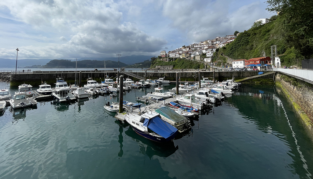
| 3 |
Aug 23 |
Comment |
Kieu-Hanh, what a beautiful travel image of the coast of Spain! The composition works very well with the break walls defining the harbor, the layers of the hillsides and sea beyond, and the village nestled above. The reflections in the harbor are nice as well. My only thought is to crop out some of the sky so that it is only one third of the frame. I tried it and still got the dramatic clouds. Let me know what you think. |
Aug 14th |
 |
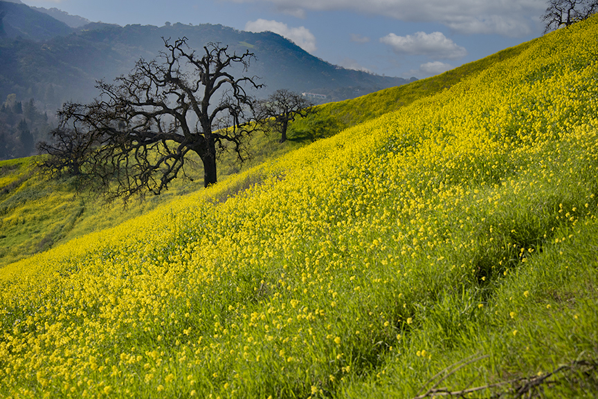
| 3 |
Aug 23 |
Comment |
Joan, this is a very nice image of the mustard and the tree (oak tree?). I like how the angle in which you took the image leads right to the tree. I don't think your sky replacement works well though with the brightness in the foreground. I played with your original and used the sky replacement tool to get a different look which also shows the mountains a bit more clearly. I am not sure this is a perfect fit but it gives a different feel to the image. Let me know what you think. |
Aug 14th |
 |
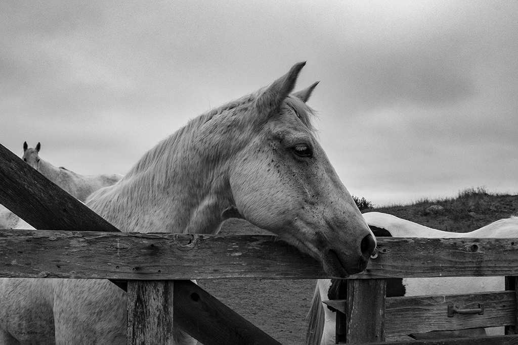
| 3 |
Aug 23 |
Reply |
Kieu-Hanh, thank you for your comments. I do have one image of the window with the cat but I agree that including #12 was more of a story. I appreciate your comments very much. |
Aug 14th |
| 3 |
Aug 23 |
Reply |
LuAnn, thank you for your comments and suggestions for my image this month. I like what you did in the editing and I went in to Photoshop and tried to replicate. I see how the transform tool is very useful in a photo like this. Can you elaborate about removing the black point on the curve? I did it when I replicated your suggestions but I am unclear on what effect that has. Does it bring up the shadows more? |
Aug 14th |
5 comments - 3 replies for Group 3
|
| 50 |
Aug 23 |
Reply |
Karl, looking at Cindy's version, I see that I did not lighten up the snow nearly enough! Her edits really bring out the details and contrasts. |
Aug 19th |
| 50 |
Aug 23 |
Reply |
Cindy, I can see that I did not lighten up my suggestion nearly enough! Nice edit for this image. |
Aug 19th |
| 50 |
Aug 23 |
Reply |
Thank you for your comments and suggestions, Cindy. I tried out the sepia and it works well for this image. |
Aug 19th |
| 50 |
Aug 23 |
Comment |
Paul, this is an interesting image but to me, the angle in which you took it doesn't work well. I find the framing with the trees too limiting so it is unclear what the image is. I think if you took it looking up or down river with some context it would work better. I am always impressed with long exposure water shots. I have tried a few and it is a challenge! |
Aug 15th |
| 50 |
Aug 23 |
Comment |
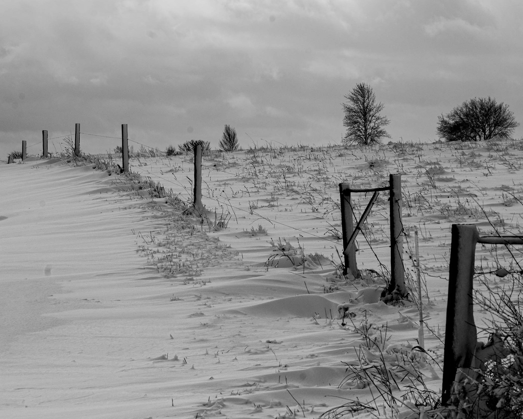
Karl, this image is nicely composed with the angle in which you took it and the fence leading into the winter scene and over the hill. It seems too gray to me so I tried to whiten up the snow without losing the shadows and added contrast to the sky. Then I tried to darken the fence posts (that did not turn out so well!) but you get the idea. When I did all this your lens spots showed up. I was trying to highlight the whiteness of the snow a bit and delineate it more from the snow. Let me know your thoughts on the idea. Great composition. |
Aug 15th |
 |
| 50 |
Aug 23 |
Comment |
James, this is a nice street image. It tells a story very well as I can smell the steaming hot dogs now! I like how you caught the vendor looking at his customers. Just a thought is to think about removing or lowering the highlights of the lights in the upper right as I find them distracting and lower the highlights a bit on the vendor to the left. Nice street photography. |
Aug 15th |
| 50 |
Aug 23 |
Comment |
Cindy, what an interesting image with so much detail to take in. I find both images appealing. The color version highlights the bus with the yellow color. The black and white gives more detail in the textures and I notice the old building in the background on the left more than in the color. Both images are very appealing telling the story of the old abandoned bus out to pasture! Very nice. |
Aug 15th |
| 50 |
Aug 23 |
Comment |
Lorna, this image of the 120 year old sailboat is lovely in that the black and white rendition really highlights the sailboat. The current/wake in the front leads the eye into the subject and the image is very sharp. The wispy clouds add to the feel of the wind. I agree that the square crop works nicely. I admire your steady hand! Nice image. |
Aug 15th |
| 50 |
Aug 23 |
Comment |
Chuck, thank you for your suggestions. After reading your comments, I have tried sepia and I like it much better. |
Aug 14th |
6 comments - 3 replies for Group 50
|
11 comments - 6 replies Total
|