|
| Group |
Round |
C/R |
Comment |
Date |
Image |
| 3 |
Mar 23 |
Reply |
LuAnn, I missed it! How clever! My friends and I were joking that day about all we needed was a moose to appear! |
Mar 17th |
| 3 |
Mar 23 |
Reply |
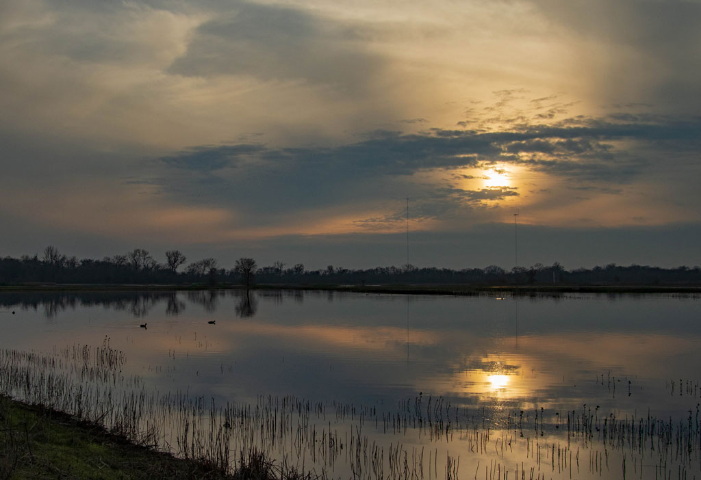
LuAnn, very nice editing! I like your version very much. I had intended to use this photo for the class but someone else had posted this scene so I picked another. It was the same scene I posted here a few months back of the sunset that kind of looked like a Georgia O'Keefe painting. This time it was during the day of course and before it got so overcast. Maybe I will share here for another month's post! |
Mar 17th |
| 3 |
Mar 23 |
Comment |
Hi Joan and Kieu-Hanh, thank you both for your comments and suggestions. I took them to heart and worked on this revision. Let me know your thoughts as to whether this works better. Thank you, again. |
Mar 12th |
 |
| 3 |
Mar 23 |
Comment |
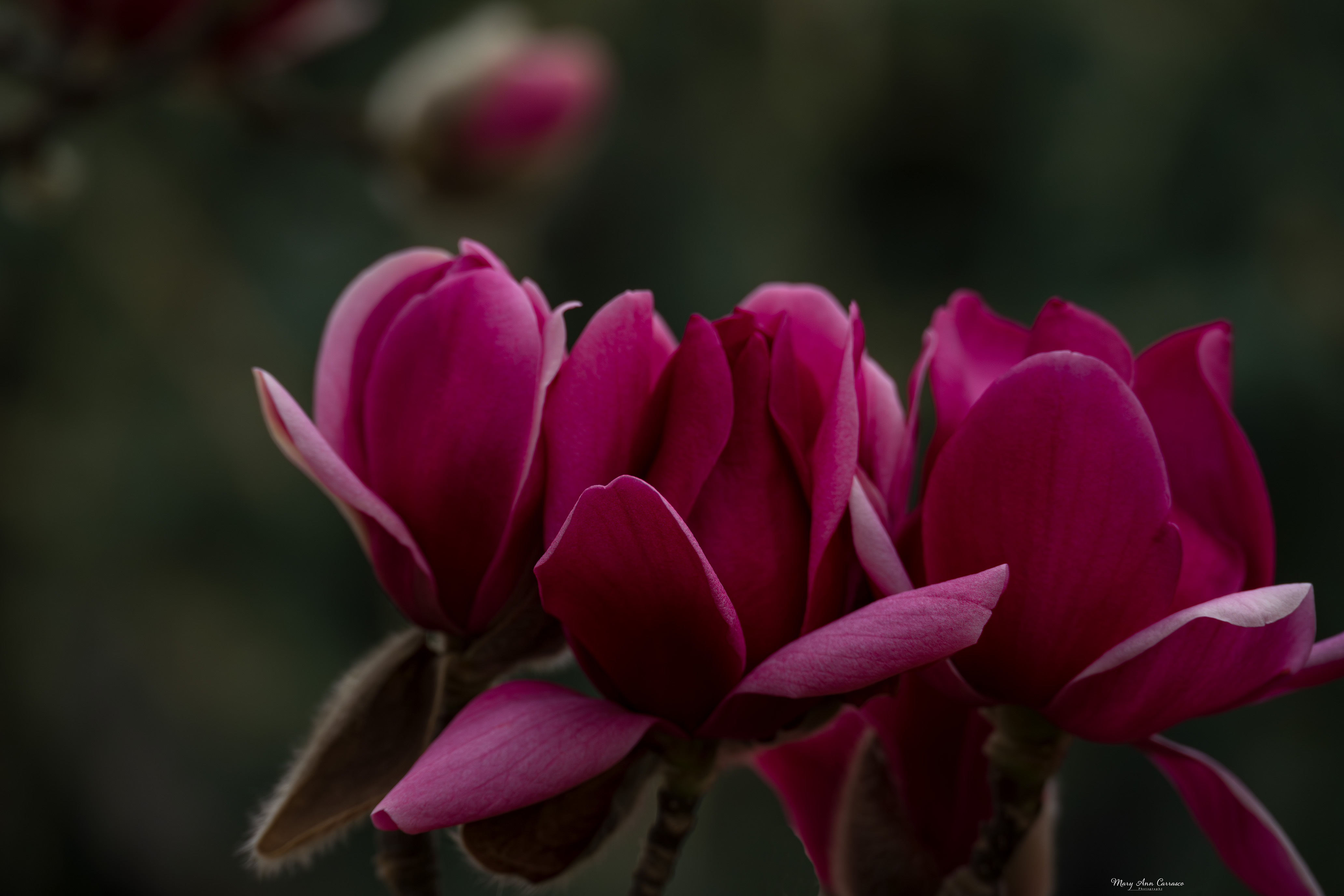
Joan, this is a beautifully colored image. I like the effect of the outline around the flowers and leaves. If I didn't know it was a photograph, I would have guessed stained glass. Nice artistic effects. |
Mar 12th |
| 3 |
Mar 23 |
Comment |
Kieu-Hanh, what a lovely fall scene. My eye is led through it by the curve behind the tree and then the line of trees takes me to the water in the background. The tree in the foreground makes a nice frame. Nice fall colors with the oranges and yellows of the different trees. I agree with Joan to bring out the boats a bit more to add some more interest. It is a very nice composition. |
Mar 12th |
| 3 |
Mar 23 |
Comment |
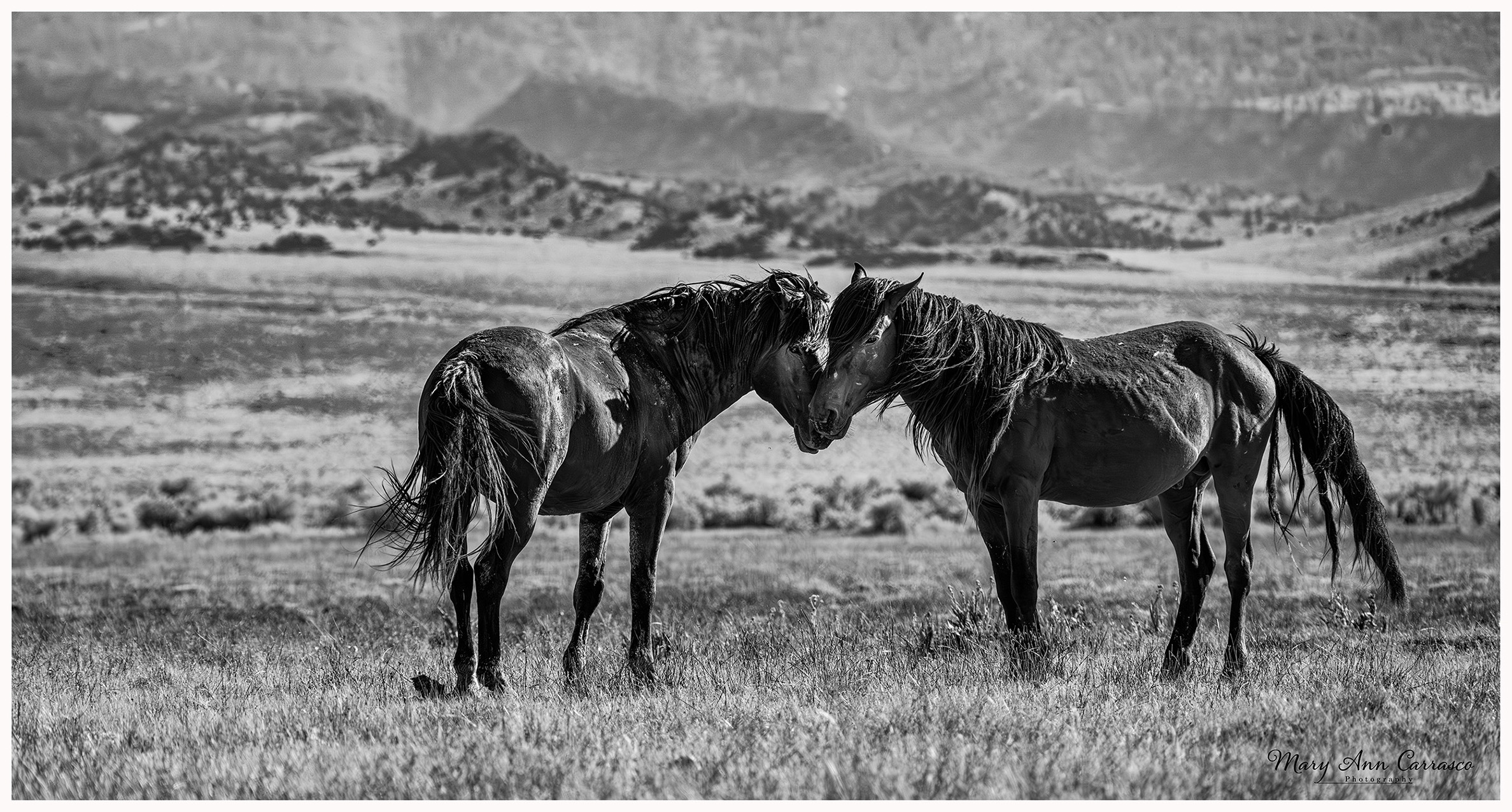
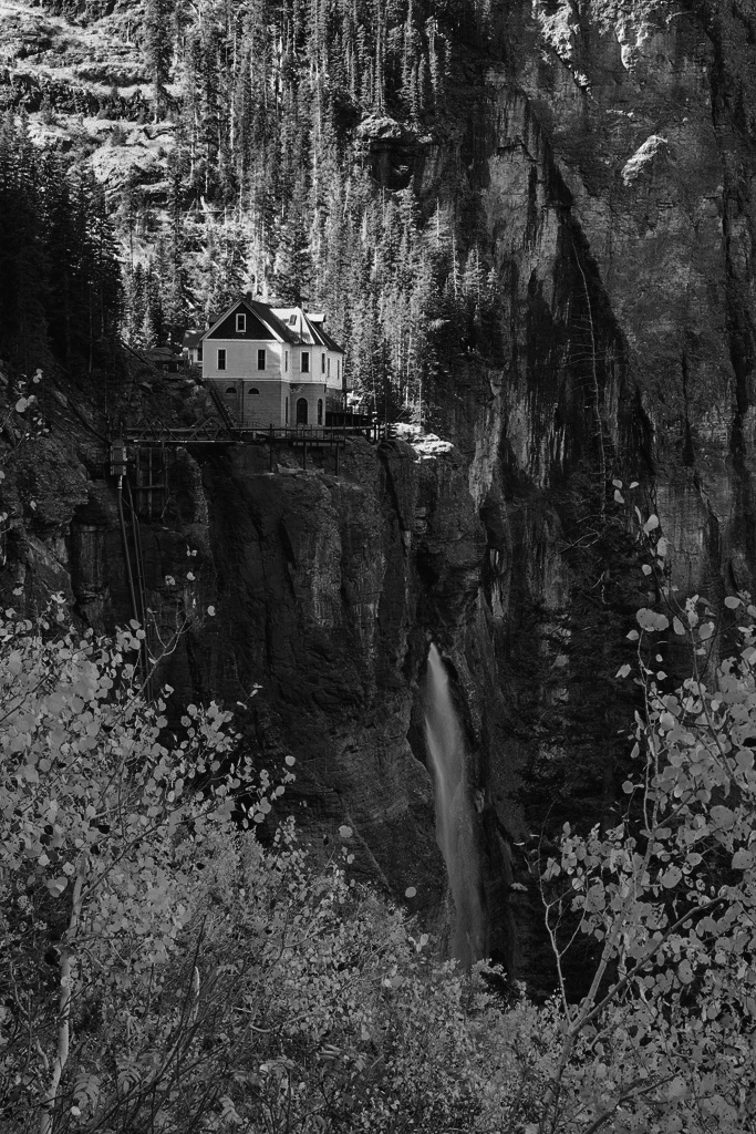
Hi Ruth, I really appreciate this image. The perspective from which it was taken, the colors, waterfall and lighting make it an interesting and beautiful scene. I do like the color version but I tried to take the challenge and play with the monochrome. I did edit it first in color before using Silver Efex Pro and picked a filter I liked. Then I played around with it using control points and then again with dodge and burn. I am not that masterful in editing but thought I would give it a try. Let me know if this works at all for you. |
Mar 12th |
 |
| 3 |
Mar 23 |
Comment |
Well, Michael, what can I write here? Just a beautiful image you have made! I do like it better than the version in Group 99. And, I like your crop as well which shows the environment. Very very nice! This may print very well on metal. Regardless of what medium, print this and hang it up! |
Mar 10th |
| 3 |
Mar 23 |
Comment |
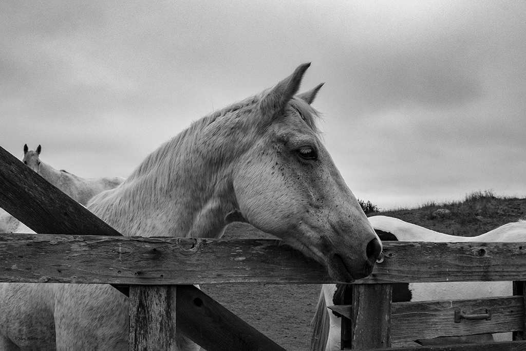
LuAnn, lovely image. Very sharp focus that clearly shows the texture and color. I appreciate your version with the blurred flower in the background. I also like Michael's version. It just depends on what you want the focus to be. Beautiful image! |
Mar 10th |
6 comments - 2 replies for Group 3
|
| 50 |
Mar 23 |
Comment |
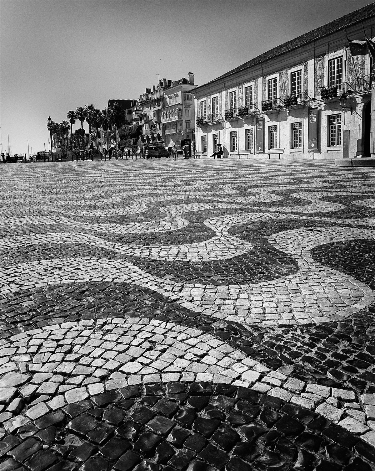
Lorna, I just love old European streets like this. The brick/cobble stone road leads right into the scene and the bicycles give it a very nice feel. I agree that the light coming in can make it more dramatic such as in Nick's edit but I also like your version. Maybe just add a bit of contrast to yours. I like the scene...makes me want to walk into it and see what is around the corner! |
Mar 17th |
| 50 |
Mar 23 |
Comment |
Paul, interesting image. I agree that the rocks in the foreground are too bright. Your new crop works better as the focus is then on the rock formations. You may want to bring down the white in the foreground a bit more so that the entire focus is on the pillars of rocks. |
Mar 17th |
| 50 |
Mar 23 |
Reply |
Karl, yes, I agree that James' crop works much better! |
Mar 17th |
| 50 |
Mar 23 |
Reply |
Cindy, thank you for your comments. I agree that James' crop is very nice. |
Mar 17th |
| 50 |
Mar 23 |
Reply |
James, thank you for your comments and I do like your crop very much! |
Mar 17th |
| 50 |
Mar 23 |
Reply |
Lorna, thank you for your comments and suggestion re the white of the snow. I tried to take care of that when taking the image by adjusting the exposure but I will have to give it a try in processing. |
Mar 17th |
| 50 |
Mar 23 |
Comment |
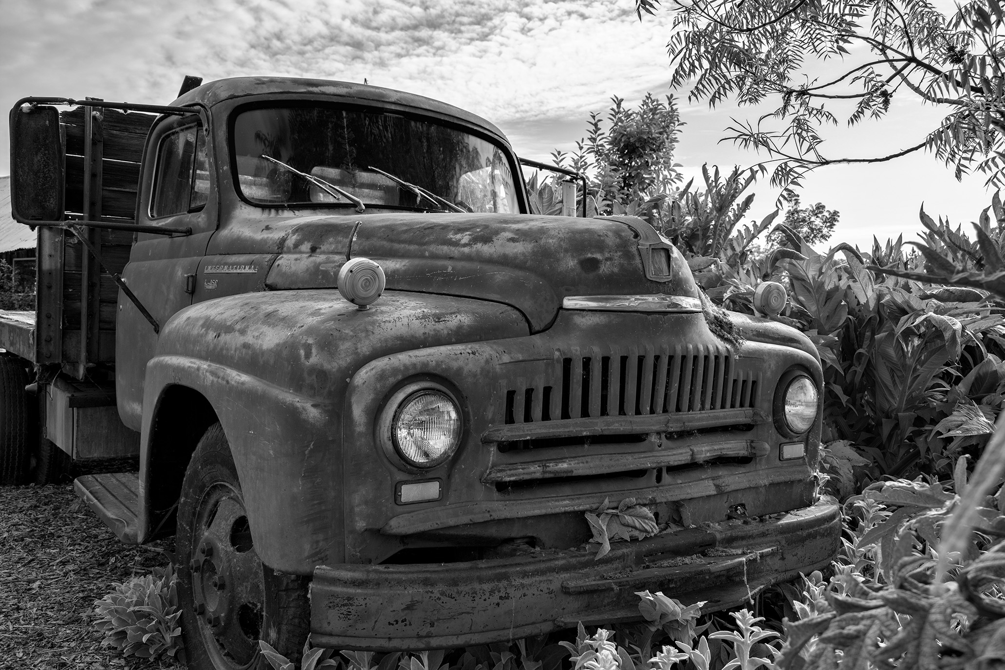
James, I like the angle at which you took this image. The B&W really shows the details of the grill on this vehicle and gives it a real vintage feel. |
Mar 10th |
| 50 |
Mar 23 |
Comment |
Chuck, nice depth of field and the B&W shows the textures of the yarn very nicely. |
Mar 10th |
| 50 |
Mar 23 |
Comment |
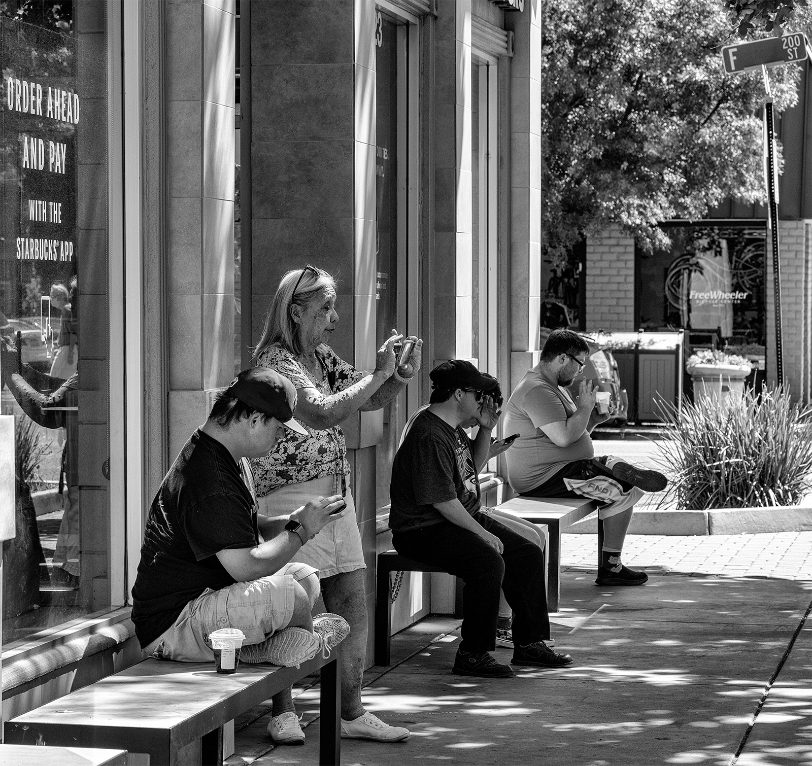
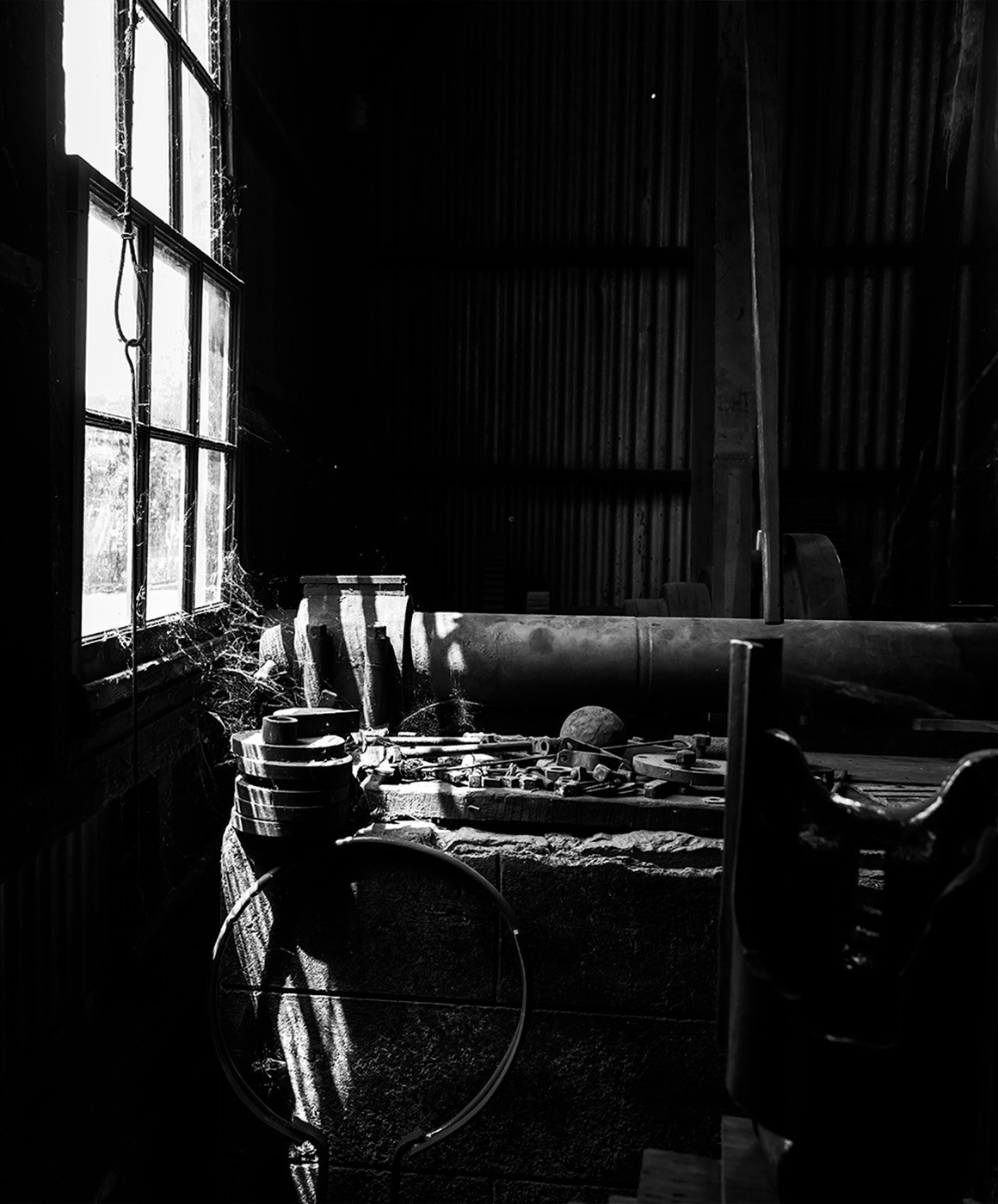
Cindy, I really appreciate the light in this photo as well! The black and white also shows the shadows and textures well. The composition works well too as the light from the window brings the viewer right into the benches and room. Nicely done. |
Mar 10th |
| 50 |
Mar 23 |
Comment |
Karl, this is a fantastic image. You have captured all the effort and effects of this broad jump! It works very well in black and white. In fact I think the color is a distraction. The B&W really brings out the facial expression and textures at the landing. My only suggestion would be to crop a bit less from the top so the entire head is visible. Nice shot! |
Mar 10th |
6 comments - 4 replies for Group 50
|
12 comments - 6 replies Total
|