|
| Group |
Round |
C/R |
Comment |
Date |
Image |
| 3 |
Jun 22 |
Reply |
Thank you, Lu Ann. Yes, I have learned quite a bit with the challenges! |
Jun 26th |
| 3 |
Jun 22 |
Reply |
Thank you, Ruth. |
Jun 26th |
| 3 |
Jun 22 |
Reply |
Thank you, Michael. |
Jun 19th |
| 3 |
Jun 22 |
Reply |
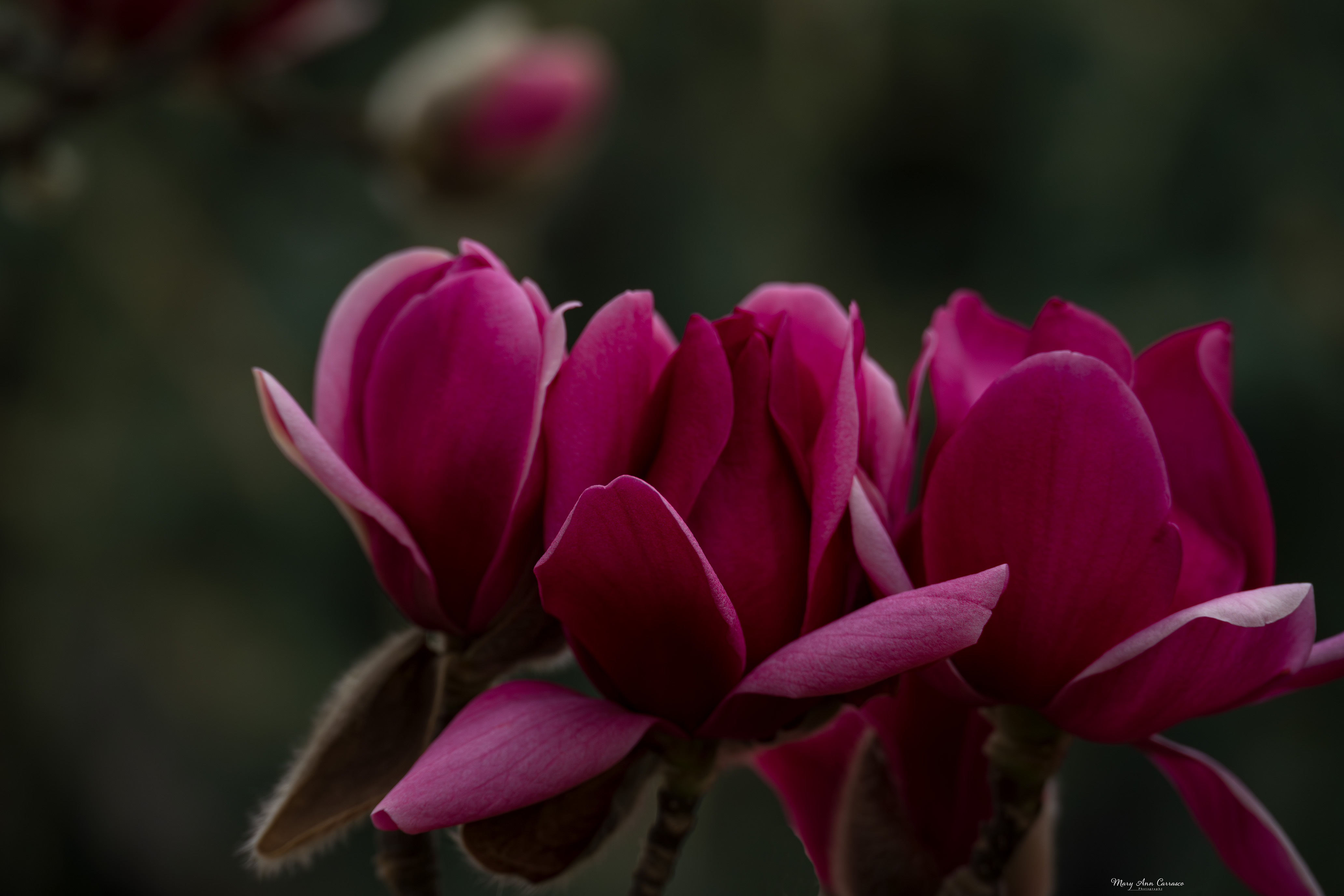
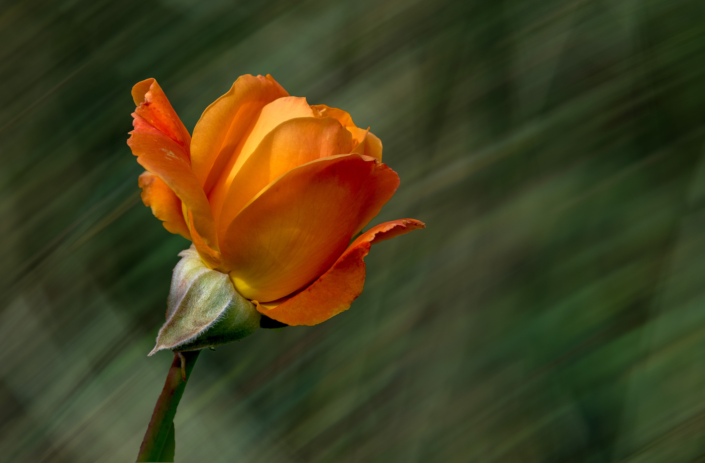
Kieu-Hanh, thank you for your comments. Your question is an interesting one as I used that background because I could work with the color/exposure to make it work. I had taken a couple images with the intent of using them for backgrounds in the future. I did not think about the diagonal lines but when you asked the question I realized that the lines go in the same direction as the rose so seem to complement it. Do you think it works well? |
Jun 19th |
| 3 |
Jun 22 |
Reply |
Bev, thank you for visiting and commenting on my image. |
Jun 15th |
| 3 |
Jun 22 |
Reply |
Hi LuAnn, I took Michael up on his challenge for a re-edit and did a composite. I had taken the image of the green grass with the intent of using it in the future as a background. I selected just the rose and used the new background. Let me know what you think. |
Jun 15th |
 |
| 3 |
Jun 22 |
Reply |
Michael, I gave some thought to your re-edit challenge and came up with this composite. I used one image I took with the intent of using it as a background and then selected just the rose on the new background. What do you think? |
Jun 15th |
 |
| 3 |
Jun 22 |
Reply |
Ruth, thank you for your comments and suggestions. I don't think I can do a better edit than LuAnn! |
Jun 14th |
| 3 |
Jun 22 |
Reply |
John, thank you for your comments. LuAnn did an excellent job in her edit. I like the bokeh and context in my original as well. |
Jun 14th |
| 3 |
Jun 22 |
Reply |
Thank you for your comments and suggestions, Michael. Not sure I can do better than LuAnn with her edited version! |
Jun 14th |
| 3 |
Jun 22 |
Reply |
Hi LuAnn,
I was definitely not offended at all by your edit. I really did not intend to give that impression in my comments. In fact, I was flattered by your comments regarding the exposure and clarity of the image. And, I appreciated your edit very much...I admire your skills. I am continuing to learn by being a part of the dialogue group and enjoy it very much. I appreciate everyone's comments and suggestions. I hope you will continue with your comments and edits and know that no offense taken! Mary Ann |
Jun 11th |
| 3 |
Jun 22 |
Comment |
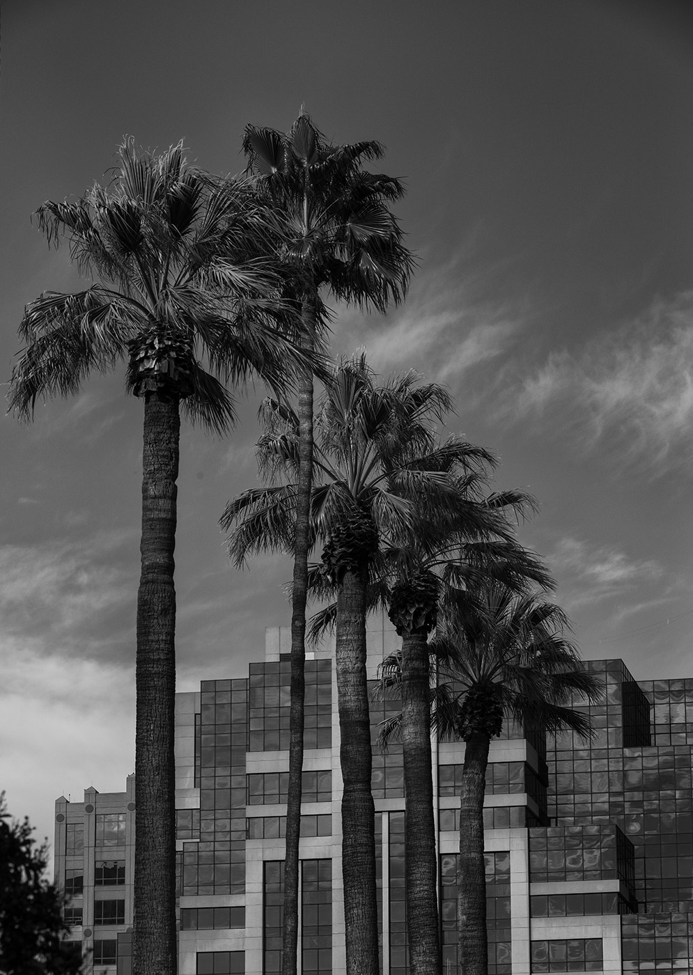
Hi John and welcome! I like how you captured the lighthouse and framed it with the palm tree. The edits you made during the discussion are very good but having been to Florida, I think your original edited sky looked pretty natural for those summer days. I do like how you removed alot of the distracting branches, etc. Very nice subject and composition. I enjoy this dialogue group very much as I have learned alot about how others view my images and various editing techniques. It is a fun and very engaged group! Again, welcome. |
Jun 10th |
| 3 |
Jun 22 |
Comment |
Oh Kieu-Hanh, what a poignant image. You have really touched me with this photograph. Memorial Day is such a day for remembering how much has been sacrificed. I like how you captured the moment the soldier is placing the flag and that you can see the headstones in the background to give it the perspective. My only suggestion is to tone down the highlights a bit as it seems to be a bit bright to me. Very meaningful image to me. Thank you for sharing it. |
Jun 10th |
| 3 |
Jun 22 |
Comment |
Hi Ruth, I really like how you captured the expression on this woman's face and the eye is drawn to her because of her red jacket. I do like all the birds in the original as I think they just add to beauty and poignancy of the shot. Very lovely image. |
Jun 10th |
| 3 |
Jun 22 |
Comment |
Hi John, What a flash from the past! I do like your re-edit and agree with Ruth about the one cord. I found the colors in the edited version a bit over-saturated for me but just my own personal preference. I find the image to be very intriguing and interesting. Very nostalgic capture. |
Jun 10th |
| 3 |
Jun 22 |
Comment |
Michael, this is a nice view of a sunset at the marina. You captured the reflection of the clouds in the water and it makes me feel very rested (and wanting to be there!). I do like your re-edit where you lowered the saturation etc. Nice image. |
Jun 10th |
| 3 |
Jun 22 |
Comment |
LuAnn, I really like how you have captured this errant voyageur! You have captured the light on the boat and the reflection in the water, the mist which leads me to feel a cool morning. I agree with leaving the tree line in as it really tells the story of an early morning glide through the forest. Very nicely done. |
Jun 10th |
| 3 |
Jun 22 |
Reply |
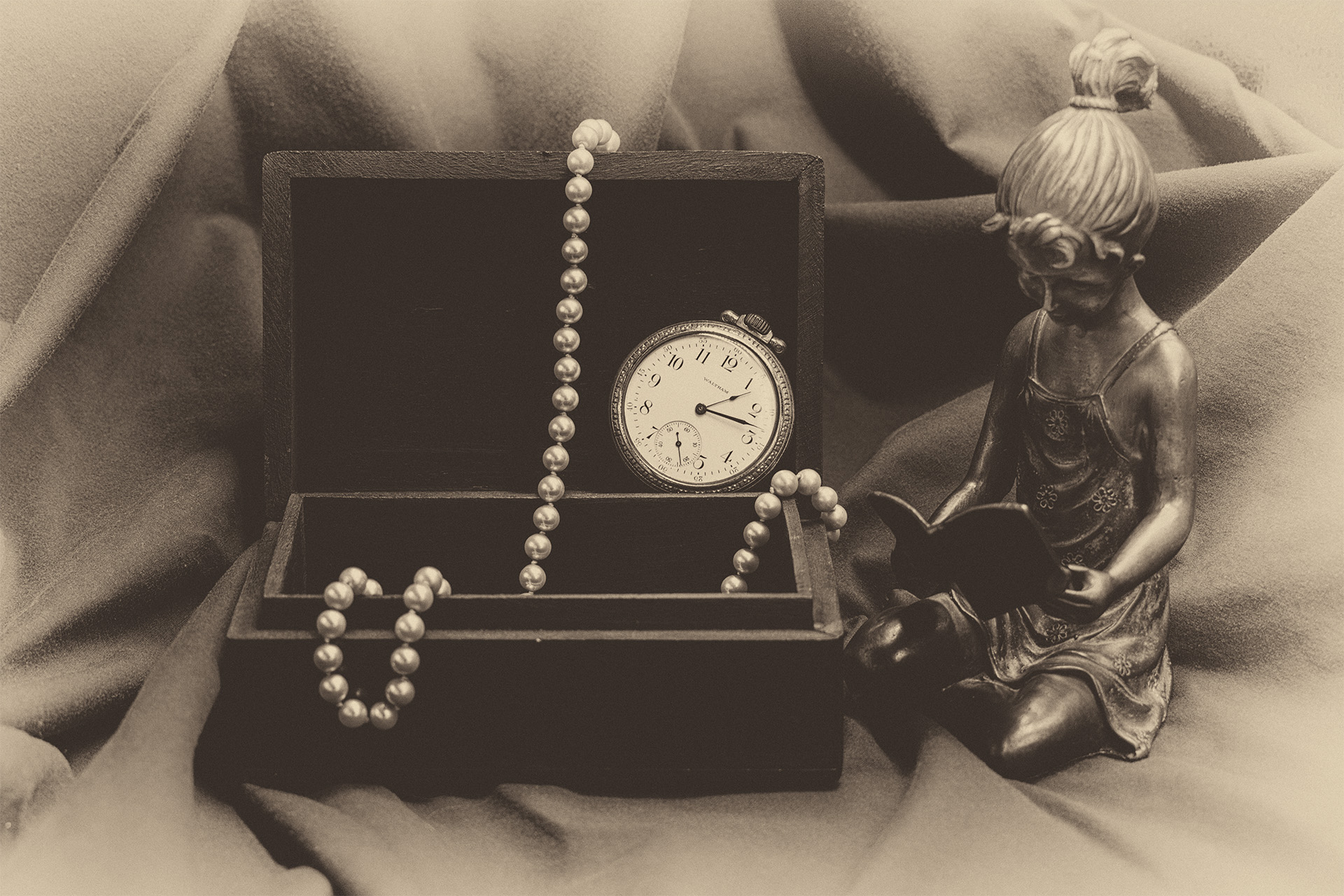
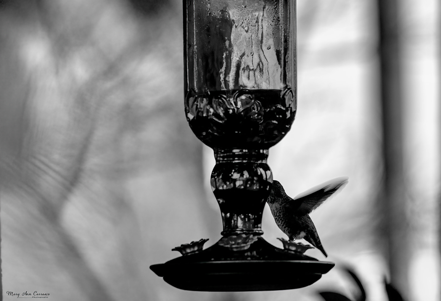
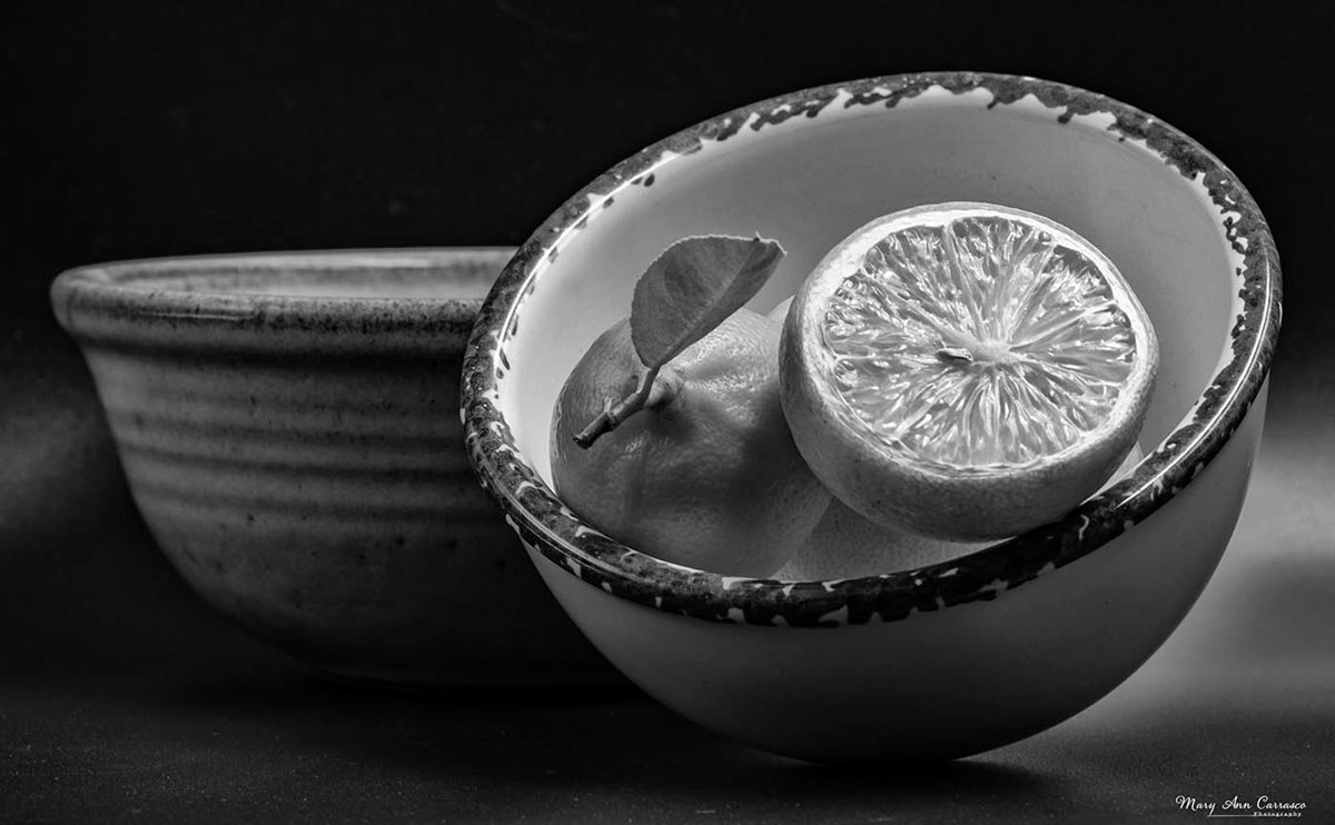
Hi LuAnn, What a beautiful edit you did on my rose! It is beautiful. And, it seems everyone on the chain here agrees that the background I left in is distracting. I have to say though that I left the background in and tried to take down the highlights in the rose behind it because I really like giving it context. And, I think the bokeh really isolates the subject rose. I also liked how the bud in the lower left and the blurred rose in the background framed the subject. It appears I am alone in my view of it! Thank you again for the edit....it is beautiful. Your editing skills always amaze me! |
Jun 10th |
6 comments - 12 replies for Group 3
|
| 50 |
Jun 22 |
Reply |
Thank you, Cindy. I don't live far from this location so I will have to give it a try. |
Jun 19th |
| 50 |
Jun 22 |
Reply |
Thank you, Lorna. I will have to go back and try that perspective. |
Jun 19th |
| 50 |
Jun 22 |
Reply |
Thank you, Chuck. |
Jun 14th |
| 50 |
Jun 22 |
Comment |
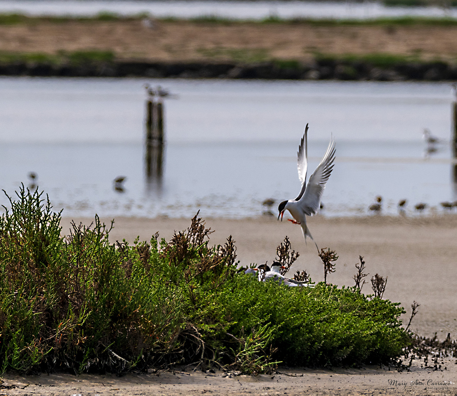
Karl, What a nice nature capture of these birds. I like to photograph of what I call shore birds, too. The poses are great as well as the reflection of them in the water. I don't know anything about what judges look for in these types of competitions so I cannot be of any assistance with that. You might try adjusting the contrast and sharpen a bit. I am curious to see what suggestions/comments are from our other group members. |
Jun 14th |
| 50 |
Jun 22 |
Comment |
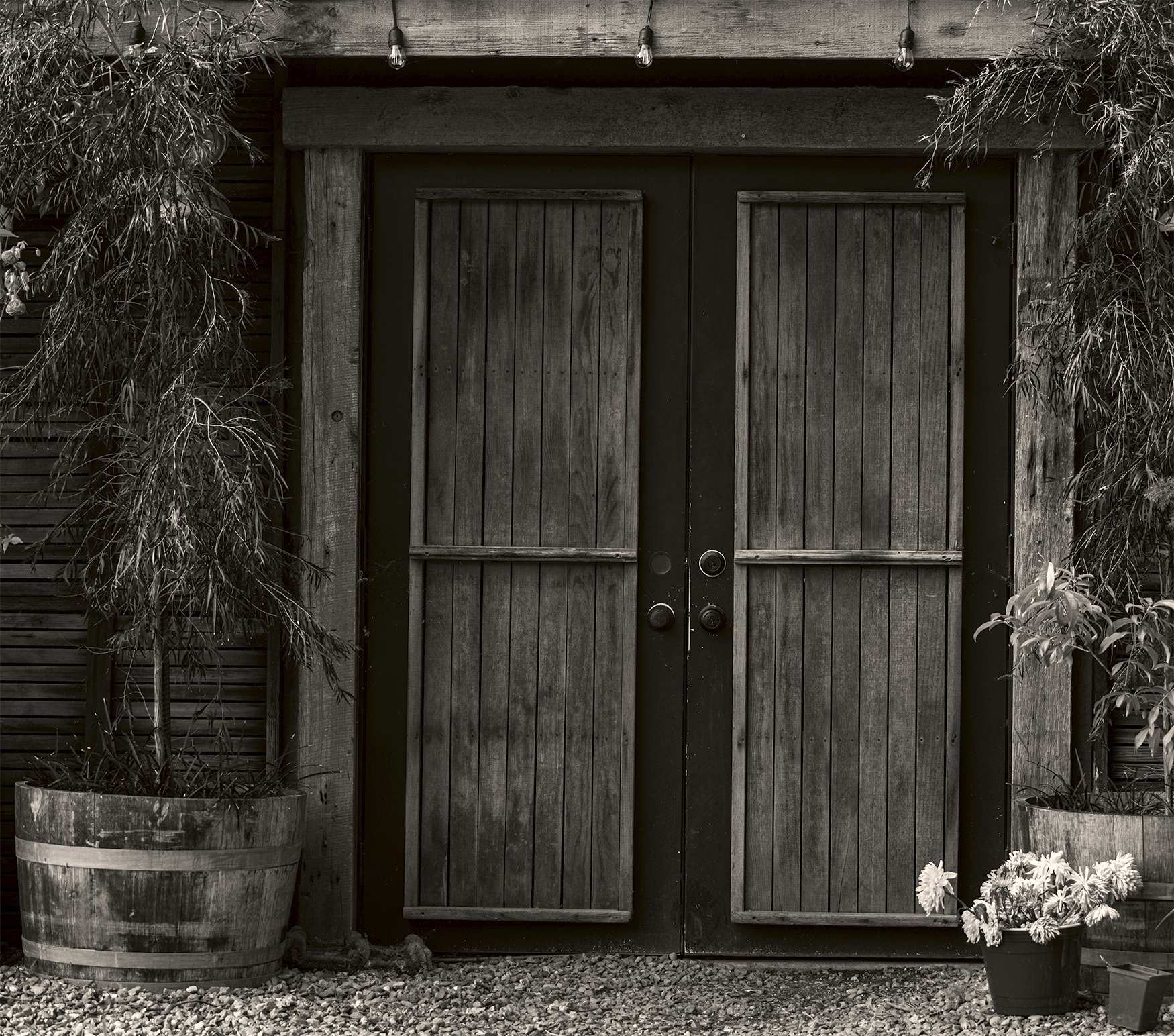
Cindy, yes, I agree. The contrast and shapes are wonderful. The light and dark really work well in this too. And, I like the texture in the art piece framed by the doorway. Very nice image. |
Jun 14th |
| 50 |
Jun 22 |
Comment |
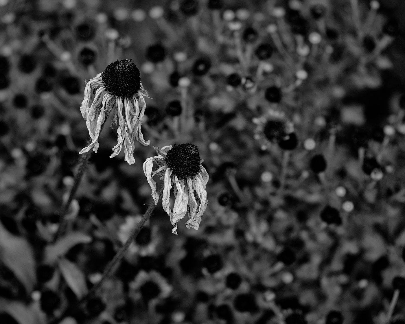
Lorna, what a great photo to convert to monochrome. You have brought out the texture in the flowers and the lines of the blades in the background lead the eye right into the subject. Very nice image. |
Jun 14th |
| 50 |
Jun 22 |
Comment |
Paul, I really like the propeller plan and in the clouds. This lends itself well to a monochrome version. I wondered what it would look like to give the clouds more definition so I took it into Siver Efex Pro and used the high structure smooth preset. I think it brings out the detail more in the plane and the sky. What do you think? |
Jun 14th |
 |
| 50 |
Jun 22 |
Reply |
I am glad you like it! Yes, I agree about the dialog groups. I am learning quite a bit. I am also in a general group (3) so both groups are really helping me. |
Jun 14th |
| 50 |
Jun 22 |
Comment |
Chuck, this is a great set up and lends itself to monochrome. The minion adds humor and interest. It seemed a bit bright to me so in Photoshop I used an adjustment to take down the brightness a bit and add contrast. It seems to bring out the texture in the donuts and the table cloth. Let me know what you think. |
Jun 11th |
 |
5 comments - 4 replies for Group 50
|
11 comments - 16 replies Total
|